In this article we take a look at How to Use Negative Space in Logo Design.
Negative space logos creatively utilize every element to achieve a powerful impact. By strategically considering the positioning of white space between shapes and lines, these logos convey deeper meanings.
They captivate the audience, offering a thrilling experience as hidden images are revealed. By appealing to the brain’s curiosity and pattern recognition, negative space logos forge stronger connections between customers and companies. Explore the potential of negative space in logo design.
Table of Contents
What is Negative Space in Logo Design?

Negative space is the area around an object that is not filled in. In logo design, negative space can be used to create a sense of depth, balance, and visual interest.
Why Use Negative Space in Logo Design?
There are several reasons why you might want to use negative space in your logo design:
- To create a sense of depth: Negative space can be used to create a sense of depth by creating the illusion of space between different elements of the logo. This can make your logo more visually interesting and appealing.
- To create balance: Negative space can be used to create balance in a logo by offsetting positive and negative elements. This can help to create a logo that is visually pleasing and easy to look at.
- To create a hidden image: Negative space can also be used to create a hidden image in your logo. This can be a fun and creative way to add interest to your logo, and it can also help to make your logo more memorable.
The Benefits of Using Negative Space in Logo Design
There are several benefits to using negative space in logo design:
- It can make your logo more visually interesting: Negative space can help to create a sense of depth and balance in your logo, which can make it more visually interesting and appealing.
- It can make your logo more memorable: A well-designed negative space logo can be more memorable than a logo that is simply filled in. This is because the negative space can create a unique and eye-catching image that people will be more likely to remember.
- It can make your logo more versatile: Negative space logos can be scaled down or up without losing their impact. This makes them a good choice for logos that will be used in a variety of applications, such as print, web, and mobile.
Negative space can be a powerful tool in logo design. By learning how to create a memorable negative space logo and applying these techniques effectively, you can design logos that are visually interesting, versatile, and impactful
How to Use Negative Space in Logo Design
Choose the Right Shapes and Colours
Choosing the right shapes and colours when designing a negative space logo is essential to creating a logo that is both visually appealing and effective.
Shapes

The shapes you choose for your negative space logo should be simple and easy to understand. They should also be relevant to your brand or business. For example, if you are a company that sells coffee, you might use a simple cup shape in your logo.
The shapes you choose should also be visually interesting. They should create a sense of balance and harmony in your logo. You can use contrasting shapes to create a more dynamic logo, or you can use similar shapes to create a more cohesive logo.
Read more about The Psychology of Shapes in Logo Design.
Colours
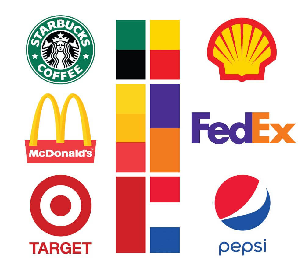
The colours you choose for your negative space logo are just as important as the shapes you choose. The colours should be complementary and should help to create the desired mood or feeling for your brand. For example, if you want your logo to convey a sense of peace and tranquillity, you might use soft, pastel colours.
The colours you choose should also be easy to read and understand. If your logo is going to be used in black and white, you need to make sure that the shapes and negative space are still visible.
Here are some tips for choosing the right shapes and colours for your negative space logo:
- Start with a simple design. Negative space logos are often more effective when the overall design is simple. This makes it easier for the viewer to see the hidden image in the negative space.
- Use contrasting colours. The use of contrasting colours can help to make the negative image stand out. For example, the FedEx logo uses a white arrow in a negative space formed by the letter’s “E” and “X.” The contrast between the colours makes the arrow easy to see.
- Be creative. There are no limits to what you can do with negative space in logo design. Get creative and see what you can come up with.
- Test your logo at different sizes. Make sure your logo looks good at different sizes, especially when it is small. The negative image may not be as clear at smaller sizes, so you may need to adjust the design accordingly.
Read more about colour psychology in logo design
Here are some examples of negative space logos that use effective shapes and colors:
FedEx Logo

The FedEx logo uses a simple arrow shape in a negative space formed by the letter’s “E” and “X.” The contrast between the white and colours makes the arrow easy to see, even at small sizes.
Toblerone Logo
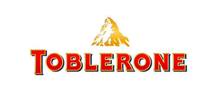
The Toblerone logo uses a simple mountain shape in a negative space formed by the white space between the peaks of the mountain. The contrast between the white and brown makes the mountain shape easy to see.
Read more about colour psychology in logo design
Creating a Sense of Balance When Designing Negative Space Logos
Here are some tips on how to create a sense of balance when designing negative space logos:
- Use symmetrical balance: This means that the positive and negative space are evenly distributed on either side of a central axis. This type of balance is often used in logos that are simple and easy to understand.
- Use asymmetrical balance: This means that the positive and negative space are not evenly distributed, but they are still balanced in terms of their visual weight. This type of balance is often used in logos that are more complex and visually interesting.
- Use leading lines: Leading lines are lines that lead the viewer’s eye through the logo. They can be used to create a sense of balance by leading the eye to the focal point of the logo.
- Use contrast: Contrast can be used to create a sense of balance by making the positive and negative space stand out from each other. This can be done by using different colors, shapes, or textures.
- Use negative space as a focal point: The negative space in a logo can be used as a focal point to draw the viewer’s eye to the logo. This can be done by making the negative space large or by using a contrasting color.
Here are some examples of negative space logos that create a sense of balance:
Just like before we are using Fedex and Toblerone as our examples as they work well all-round.
FedEx Negative Space Logo

The FedEx logo uses symmetrical balance to create a sense of stability and reliability. The negative space in the logo forms a white arrow, which is evenly distributed on either side of the central axis.
Toblerone Negative Space Logo
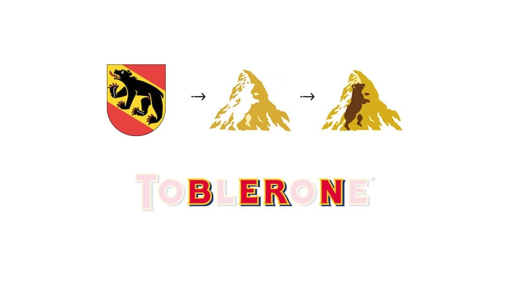
The Toblerone logo uses asymmetrical balance to create a sense of movement and dynamism. The mountain shape is the Matterhorn Mountain, and if you look closely the negative space within forms a hidden bear representing “Berne” the city of bears in Switzerland where the chocolate originated from.
The negative space and hidden meanings create a sense of visual interest and makes the logo more memorable.
The Benefits of Using Negative Space When Creating Logos
There are many benefits to using the negative space logo design style and it can be used to create a variety of effects, including:
Negative Space Logo Design Effects
- Creating a visual pun or hidden message: This is one of the most common uses of negative space in logo design. For example, the logo for the National Audubon Society features a bird silhouetted against a nest, which also forms the letter “A.”
- Creating a sense of depth or perspective: Negative space can be used to create the illusion of depth or perspective in a logo. For example, the logo for FedEx features an arrow pointing towards the right, which is created by the negative space between the two letters “E” and “X.”
- Simplifying the logo: Negative space can be used to simplify a logo by removing unnecessary elements. This can make the logo more visually appealing and easier to remember.
- Adding emphasis to the logo: Negative space can be used to add emphasis to certain elements of a logo. This can be done by surrounding the element with negative space or by making the element the only one in the logo.
Negative Space Logo Design Benefits
There are many benefits to using negative space when creating logos. Some of these benefits include:
- It can make the logo more memorable: When a logo uses negative space to create a visual pun or hidden message, it can be more memorable for viewers. This is because the viewer has to take a moment to figure out the meaning of the logo, which helps to create a lasting impression.
- It can make the logo more versatile: A logo that uses negative space can be used in a variety of contexts, without the need to change the design. For example, the logo for the National Audubon Society can be used on a variety of backgrounds, without the bird becoming lost in the negative space.
- It can make the logo more timeless: A logo that uses negative space is less likely to become dated, as it is not reliant on trends or fads. This is because the negative space creates a simple, timeless design that can be appreciated by viewers of all ages.
Overall, negative space can be a powerful tool for creating effective logos. If you are looking to create a logo that is memorable, versatile, and timeless, then using negative space is a great option.
What to Keep in Mind When Designing Negative Space Logos
If you are considering using negative space in your logo design, there are a few things to keep in mind:
- The negative space should be clear and easy to see: The negative space in your logo should be clear and easy to see, so that viewers can easily understand the meaning of the logo.
- The negative space should be balanced with the positive space: The negative space in your logo should be balanced with the positive space. This means that the negative space should not overwhelm the positive space, or vice versa.
- The negative space should be appropriate for the brand: The negative space in your logo should be appropriate for the brand. This means that the negative space should reflect the values and personality of the brand.
If you follow these tips, you can use negative space to create a logo that is both memorable and effective.
Examples of Negative Space Logos
I’m sure you will have seen most of these negative space logos, there may be some you have seen and not realised the negative space element within.
When a logo is designed with a strategy in mind a negative space logo design can bring good balance and composition to the overall design, not only that they are a real treat to admire.
FedEx Logo

The FedEx logo ingeniously utilizes negative space to create an arrow between the “E” and “x,” symbolizing speed, efficiency, and forward motion in their global shipping and logistics services.
World Wildlife Logo

The World Wildlife Fund (WWF) logo employs negative space to form a silhouette of a panda, representing their commitment to wildlife conservation and serving as a powerful symbol of their mission.
NBC Logo

The NBC logo incorporates a vibrant peacock formed by cleverly utilizing negative space, symbolizing the network’s commitment to diverse and captivating programming.
The Guild of Food Writers Logo

The Guild of Food Writers logo utilizes negative space to craft a subtle, stylized quill pen, embodying the artistry and craftsmanship of food writing.
Spartan Golf Logo

The Spartan Golf logo cleverly employs negative space to reveal a Spartan warrior’s helmet, symbolizing strength, resilience, and the competitive spirit within the sport of golf.
Toblerone Logo

The Toblerone logo incorporates a hidden image of a bear within the mountain peaks, utilizing negative space to represent the Swiss origin and heritage of the chocolate brand.
Continental Logo

The Continental logo’s negative space design skillfully integrates a tire tread pattern within the letter “C,” signifying the brand’s focus on innovative and high-performance automotive solutions.
Kolner Zoo Logo

The Kolner Zoo logo creatively employs negative space to form the silhouette of various animal species, exemplifying the diverse and enriching wildlife experiences offered at the zoo.
My Fonts Logo

The “My Fonts” logo showcases the power of negative space in wordmark design. While initially presenting a creative, handwritten style, a closer look reveals a hidden hand with four fingers and a thumb, symbolizing the ease of font selection from the website for designers.
Pittsburgh Zoo Logo

The Pittsburgh Zoo logo employs clever negative space design, incorporating the shape of a tree within the outline of a lion and ape’s head, and two fish jumping of the water representing the harmonious coexistence of wildlife and nature within the zoo’s conservation efforts.
Beats Logo

The Beats logo employs a sleek and minimalistic negative space design, utilizing a bold lowercase “b” to create the illusion of a dynamic, stylish, and iconic headphone silhouette.
The Bronx Zoo Logo

Negative space logos are prevalent in the zoo industry, evoking a sense of enchantment and exploration. The Bronx Zoo logo exemplifies this, cleverly crafting giraffes with legs resembling Bronx buildings, adding depth to the design while capturing the essence of its New York location.
USA network Logo

The USA Network logo captivates with its modern and minimalist approach to negative space design. By utilizing the whitespace between the “U” and “A” to form an “S,” the logo stands out, leaving a lasting impression and enhancing its memorability.
Conclusion
Negative space is an important element of logo design. It can be used to create a variety of effects, including visual puns, depth, simplicity, and emphasis. When used effectively, negative space can make a logo more memorable, versatile, and timeless.
Tips for Using Negative Space in Your Own Logo Design
- Start with a strong concept. The negative space in your logo should be based on a strong concept. This will help to ensure that the negative space is clear and easy to see.
- Balance the negative space with the positive space. The negative space in your logo should be balanced with the positive space. This means that the negative space should not overwhelm the positive space, or vice versa.
- Make sure the negative space is appropriate for the brand. The negative space in your logo should be appropriate for the brand. This means that the negative space should reflect the values and personality of the brand.
Negative Space in Logo Design
Negative space is a powerful tool that can be used to create effective logos. If you are considering using negative space in your logo design, keep these tips in mind and you will be well on your way to creating a logo that is both memorable and effective.
Further Reading:
- 10 Examples of Powerful Global Branding
- Learning from the World’s Most Famous Logos
- Best Global Rebrands and Logo Redesigns of Major Brands
- Unlocking the Magic of Logo Design: A Guide to Creating Memorable Logos
- Branding Beyond Borders: Elevating Your Global Presence through Impactful Logo Design
- Logo Design Trends to Watch Out for in 2023: Stay Ahead of the Curve!
- Most Expensive Logos In The World
- Every Good Logo Tells a Story! 40 Famous Brand Logos & Their Hidden Secrets
- Famous Logo Designers and Their Distinctive Style
- Using the Golden Ratio in Logo Design
- 20 Famous Brand Logos Constructed in Grid Systems
Join The Logo Community
We hope this article about How to Use Negative Space in Logo Design has been helpful. If you would like more personal tips, advice, insights, and access to our community threads and other goodies, join me in our community. You can comment directly on posts and have a discussion.
*TIP – We use and recommend DesignCuts for all your fonts, mockups and design bundles.


