Design, and art as a whole, are notably subjective pursuits. A wise man once said that beauty lies in the eye of the beholder, and most artists and critics still agree with this sentiment. In this article we discuss How To Use the Golden Ratio In Graphic Design.
A specific design deemed awe-inspiring by some may be regarded as drab or lacking by others, and you cannot always guarantee your work will be warmly received.
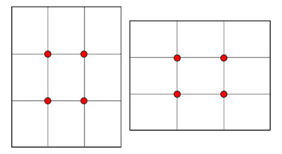
However, there are some tips and tricks that graphic designers can use to aid their design processes. You might already know about the Rule of Thirds, which divides images into three equal sections to maximise their visual harmony.
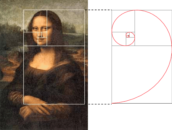
Another essential guide is the Golden Ratio; a scientifically proven measure of beauty that’s been used by the likes of artistic genius Leonardo da Vinci.
Have you ever wondered what made the Mona Lisa such a successful and renowned work of art? The answer lies in da Vinci’s use of the Golden Ratio in his masterpieces.
Also known as the Golden Mean, the Golden Section, or the Greek letter phi, this ratio is a decimal number.
It enables you to create perfectly balanced and proportioned designs that are aesthetically pleasing at a deeply psychological level.
It’s true that art and design should be powered primarily by creativity and artistic expression.
But combining these aspects with the Golden Ratio introduces an element of mathematics into the mix.
What results is a transformation in your ability to create proportionately flawless, beautiful designs that speak subconsciously to your viewers.
Here’s how it works.
Table of Contents
The Theory Behind The Golden Ratio
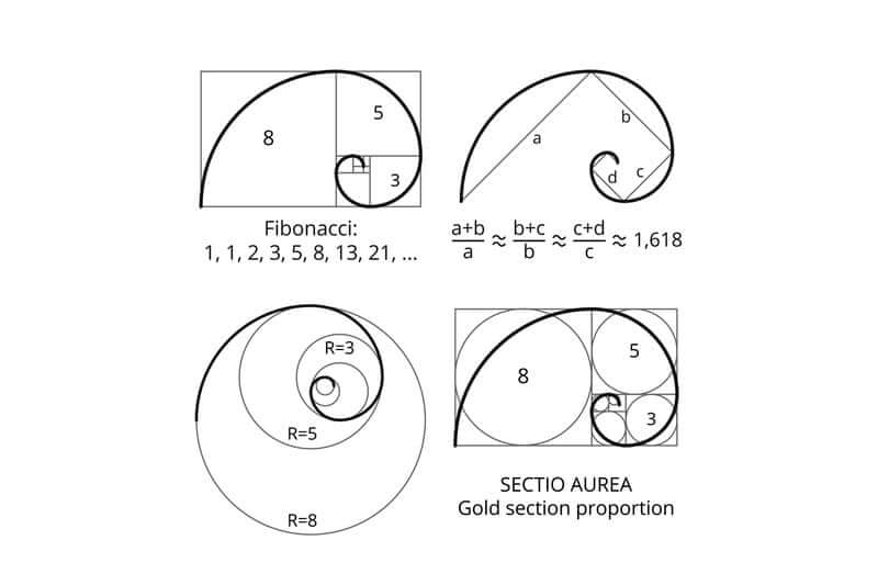
In a nutshell, the Golden Ratio is the number 1.618. This ratio is used when two numbers are divided in such a way that their ratio is identical to the ratio of their sum to the larger of the two numbers.
The simplest way to explain the ratio is by using the Fibonacci Sequence. This sequence progresses by adding the two numbers before the next, like so:
0, 1, 1, 2, 3, 5, 8, 13, 21, and so on.
The ancient Greeks used the Fibonacci Sequence to create a visual blueprint that aided their designs. It’s unsurprising that they’re still considered the ultimate masters of art, sculpture and design to this day.
Once the sequence has been turned into squares and laid down to form concentric rectangles, an exponentially growing ‘Golden Spiral’ emerges.
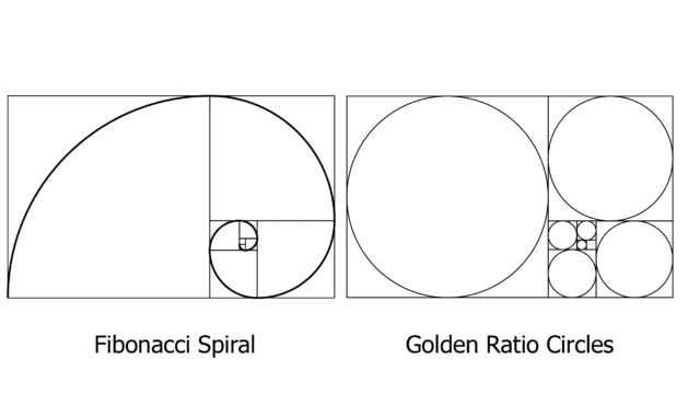
These technical and mathematical terms may seem intimidating, but they needn’t be. The Golden Ratio is far simpler than it appears, and it’s found in abundance in the natural world.
The forms of seashells, galaxies, honeycombs, flowers, storms and animals are all based on this number, hence their breathtaking visual perfection.
Putting the Golden Ratio Into Practice
In terms of graphic design, the Golden Ratio offers a simple number you can use to structure the otherwise artistic and spontaneous nature of design.
You can use it by multiplying any element’s size by 1.618 to determine the size of another element.
Some designers use it to determine the correct amount of white or blank space a design should include to prevent it from looking too stark or cluttered.
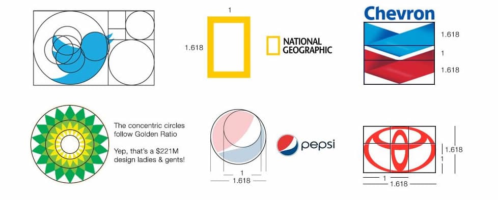
Alternatively, you could use the Golden Spiral as an overlay to adjust an element’s placement, or even use the ratio to design your basic layouts, imagery and typography.
Here are some handy tips for using the Golden Ratio to master your craft and imbue your graphic designs with scientific beauty.
- Use it in your typography layout. If you’re creating a design that includes text, consider adding a messaging hierarchy to your layout. Posters, websites and invitations all require varying sizes of text, and you can use this ratio to guide the size of your typography with no guesswork required.
So, let’s say you wish to determine your text hierarchy for important text (X), text of medium importance (Y) and not-so-important text (Z). If you choose 12px as your smallest font size, you can multiply 12 by 1.618 to obtain a guide for your larger text sizes.
- Use it to guide your image compositions. The images in your designs should always be visually harmonious, and at times you may need to step back and reassess your work. Even if you don’t have the time to do this, you can still use the Golden Spiral as a guide. Overlay the spiral onto your images to see which elements should be positioned where and if they truly are as harmonious as they may seem to the naked eye.
You can use the spiral to determine where your focal points should be, where to centralise headlines and text, and which elements should be moved to improve your design.
- Use it for logo design. A properly designed logo is an essential part of every company’s brand image, and any logos you design should convey a business’s core messages in a matter of seconds. You can use the Golden Ratio in your logo design to draw in potential customers immediately and help them connect to your brand. Interestingly, some of the world’s most successful brands like National Geographic, Google, Apple, Pepsi and Twitter have used the ratio in their logo designs.
When designing an effective logo, you can use the Golden Spiral as an overlay or re-imagine the Fibonacci sequence as a grid to use as the foundation of your creation.
- Use it in your work layouts. Design layouts can become complicated very quickly, especially if there are many different elements you need to include. Luckily, you can use the Golden Spiral to guide and position the placement of each crucial element easily. The human eye is naturally drawn to the centre of the spiral, so we recommend positioning your most important message or element here.
- Use it during your wire-framing stage. Using the ratio during wire-framing can assist you in planning a structure and correctly sizing the various facets of its user interface. It can also be used to crop images while maintaining their proportions and preventing stretching or unsightly visual distortion.
How to Create a Golden Rectangle
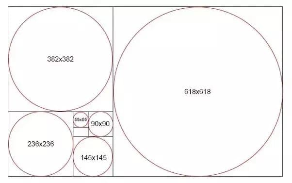
If using the Golden Spiral as an overlay doesn’t suit your needs, you can create a Golden Rectangle instead. This rectangle is one that fits the parameters laid out by the ratio.
The more you divide it by the Golden Ratio, the more useful it may become to your design process.
Start by creating a simple rectangle with ‘golden’ proportions. If it has a width of 1000px, for example, you can divide that number by 1.618 to obtain a height of roughly 618px.
From there, add a 618×618 square to the right of your canvas, leaving a 382×618 rectangle on the left-hand side. You’ll be left with another Golden Rectangle.
Take this new rectangle and create another square within it, and you will have created another one in the residual space.
You can continue to divide your canvas this way multiple times.
Watch how each time you divide your rectangle, the longest dividing line spirals in on itself, creating a coveted Golden Spiral.
The Golden Ratio in Other Shapes
The Golden Rectangle is the simplest and most easily applicable way to visualise 1.618. However, you can apply the ratio to triangles, circles and other shapes if you wish, too.
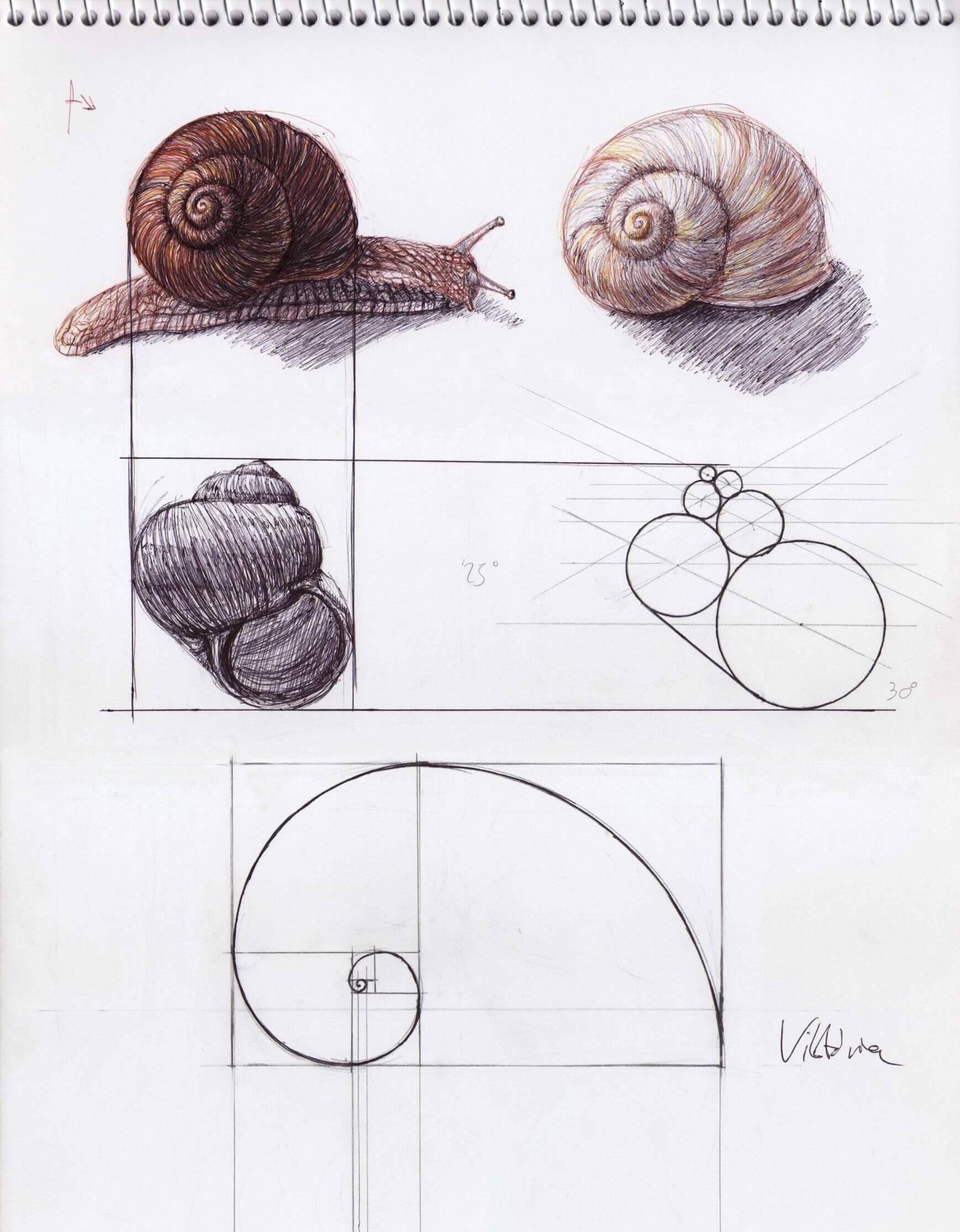
As an example, you can create a shape very similar to the ideal spiral using concentric circles. Those circles would fit flawlessly inside a series of Golden Rectangles and would create a pattern reminiscent of a snail’s shell.
You could also create Golden Triangles by using an isosceles triangle which has two sides of equal length and a third side that’s in golden proportion to the others.
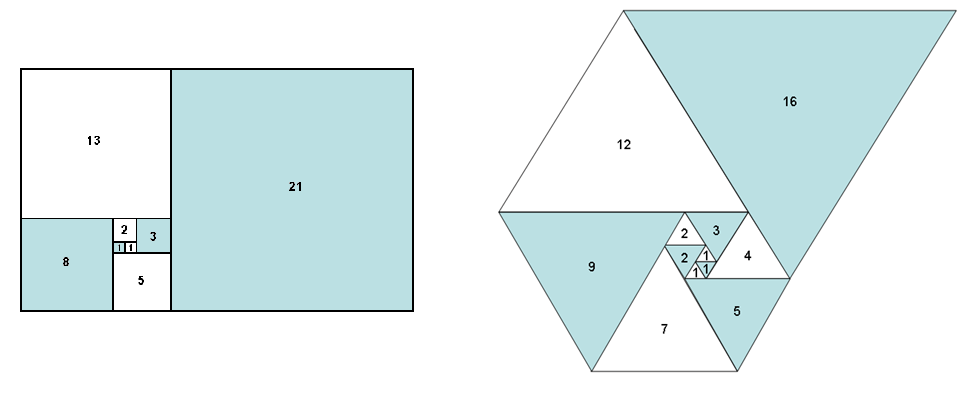
Once these triangles are nestled inside each other using phi as a size guide, they create another Golden Spiral shape that can guide your designs.
The Bottom Line
The number 1.618 might just become your new best friend once you incorporate it into your design process.
There are so many ways the Golden Ratio can guide your process, improve the visual balance of your creations, and catch the eye of your target audience.
You can easily use the Golden Spiral as a useful overlay to guide your work or multiply font and image sizes by the ratio to perfect your design’s proportions.
There are many apps available for desktop computers and mobile devices that offer custom Golden Ratio overlays and settings to help you perfect your creations.
GoldenRATIO, Phicalculator, Atrise Golden Section and PhiMatrix are just a few of the many options you can explore.
Thanks to the universal and scientific nature of the ratio, many of the world’s most renowned artists and designers have used it in their celebrated works.
Now, you can too. Naturally, art is not a science in itself—but a combination of the two can produce some truly remarkable results that your clients and viewers will love!
Join The Logo Community
We hope this has helped you in How To Use the Golden Ratio In Graphic Design. If you would like more personal tips, advice, insights, and access to our community threads and other goodies, join me in our community.
Learn from our Founder Andrew who personally writes our community newsletter. You can also comment directly on posts and have a discussion.
*TIP – Are you looking to Learn Adobe Illustrator CC? Look no further.
This Illustrator CC MasterClass course will set you up with a solid foundation to become a confident Illustrator CC designer. Join over 900 students who have already signed up for this course.
Normally £399 – Now only £20 for a limited time. Don’t wait – Claim Your Seat!

