The combination of bright colours and awesome typography has paved the way for unique flat interfaces. Minimalism is a big part of this design idea and trend, and you can see how popular these trends have become in recent years. In today’s design world It’s all About Flat Design These Days.
Flat website design and graphic design is a brilliant concept because it focuses solely on the content. But many people not from a design background are unfamiliar with the latest in design trends and don’t know what’s in fashion and what’s not. But most importantly what’s surpassed been know as a trend and is now a style and here to stay.
The flat design style has been around for a while now, and we have witnessed a major rise in the flat website and graphic design style, and this comes with plenty of good reason! Flat design mixed with page content is easier to read and easier to interact with.
As I mentioned earlier flat design has grown maturity within the design industry. It removes a lot of the more complicated textures, patterns, shadows, bubbles, gradients, and other shiny effects to focus on simplicity. Flat buttons still look clickable and the input fields still look editable. Flat website layouts in general still look interactive but without the more exquisitely refined graphics.
Table of Contents
Brief History of Flat Design Style
Flat design is by no means an entirely new style and was actually inspired by three already existing forms of art being The Swiss Style (or International Typographic Style), and the Bauhaus and Modernism style. Out of the three existing styles, it was probably the Swiss Style that indeed had a larger impact on the flat design style.
Flat design in the real world became popularized in the 1950s and 1960s but the digital world would be rather slow to catch up.
There is a good example of early digital flat design to be found in Microsoft’s ill-fated Zune MP3 player which was launched back in 2006. The interface was both clean and simple and used lower-case typography in large font size, silhouette styled logo design and plain monochromatic fonts.

The Zune is no longer with and never really captured the MP3 market’s imagination but its legacy lives on in flat design,
The Flat design and UI styling continued when it picked up steam from the Microsoft mobile platform with the release of Windows Phones that released in October of 2010 and later in August 2012 into the much-hated (though not for its flat design) Windows 8 operating system.
In 2013 Apple joined the flat design party with the release of iOS7 deliberately rejecting previous skeuomorphic designs. Both Microsoft and Apple have since progressed their operating systems further with the flat design style.
Metro design started a major trend that pushed the ball forward into flat layouts. Both web and mobile interfaces have seen a major push in trendy new user interfaces. And with responsive websites blurring the difference between desktop and mobile devices, flat UI has bridged the gap for simplicity with a bit of cultural class.
The biggest problems faced when designing a flat website are interactive elements. Visitors need to know which areas of the page are plain static content, while other areas are clickable and movable. Flat design can still use light shadows and edge effects to imply this interactivity. But subtlety is the name of the game and you can witness examples among many flat web design layouts.
Of course, flat design is not for every website or graphic design. There are so many various website trends and they are all popular for a reason – people like variety. Carefully-crafted flat 2-D interfaces stand out because they look really simple to use. And it keeps visitors focused more on your content than anything else.
Flattened Design Colours
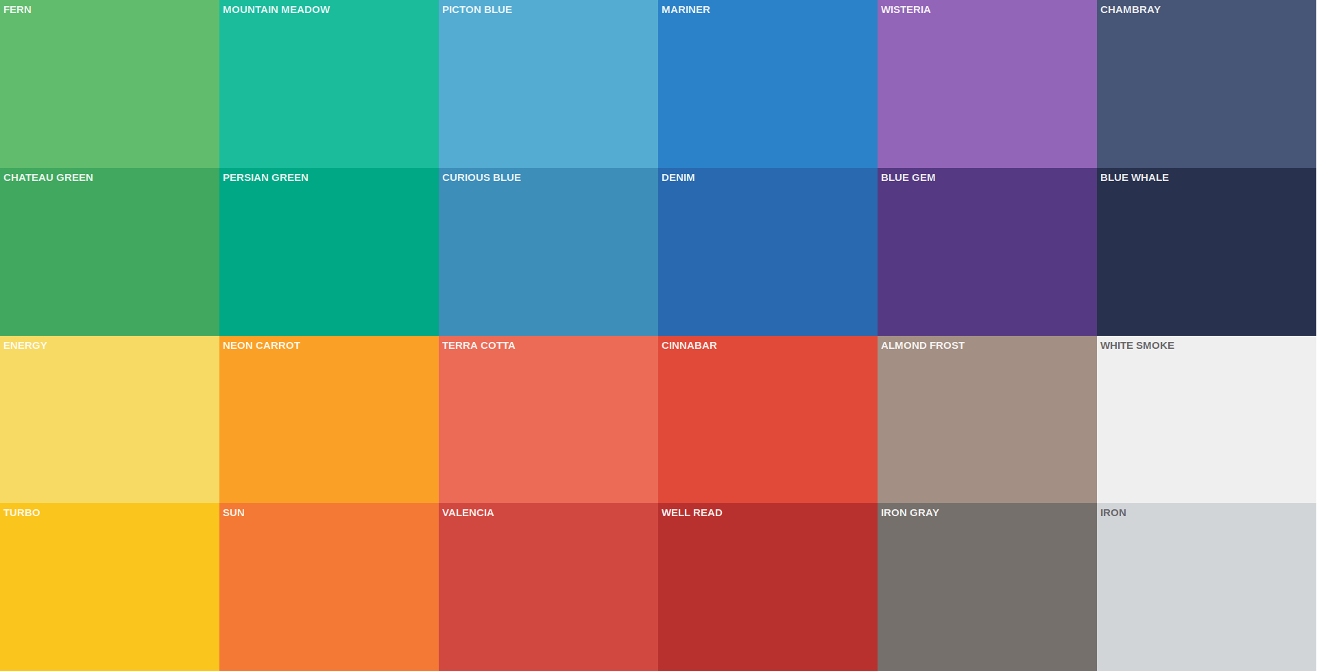
One of the most important parts of flat design is colour, the most saturated and bright colours stand out amongst any light or dark background. When it comes to colour, flat design works with a variety of colours, but most commonly designers are choosing to go bold and bright.

Other things that make the flat design different in terms of colour? Designers are expanding palettes from just a shade or two to three, even more, colours. Most of these choices are bright, fully saturated hues that are sometimes countered with greys or blacks.
When it comes to colour and flat design, many of the traditional rules about colour pairing and matching are thrown out of the window in favour of palettes that span the rainbow with lots of pop.
What we are seeing more of with flat design and colour though is the matching of tone and saturation. While designers may choose to use quite a few shades, they will often mirror each other in how deep the color is, whether it is a more primary or secondary colour combination or from another part of the colour wheel and whether colors contain more black or white mixes.
When it comes to colour, flat design schemes often trend as super-saturated and bright, more retro or monotone. That’s not to say these are the only options, but as the style has evolved they are the most popular.
Bright colour is often a characteristic associated with flat design because it creates a distinct feel. Bright colours typically work well against both light and dark backgrounds, creating contrast and engaging users. It is the most popular colour trend out there in relation to flat design.
Flat Design as a Response to the Problems of Skeuomorphism
“For every action, there is a reaction!” I love this quote it makes you constantly think about what you are doing, and how it will affect other people and yourself in the end. And in the world of digital design, flat imagery is cropping up more, in part as a reaction against skeuomorphism. But flat design is more than just an artistic treatment; it’s a response to the serious functionality issues that skeuomorphism presents.
What is Skeuomorphism?
If you’re unfamiliar with the term, skeuomorphism is the practice of incorporating the look of an object that was made in another material into a design: what was once functionality becomes ornamentation. The reference is meant to evoke a sense of familiarity when encountering a new concept/tool/app online. This principle of imitation is all around us; a plastic chair that duplicates the shape of its wooden original is a good example of how it manifests itself in the real world.
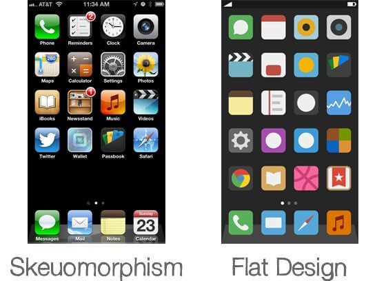
In the digital world, skeuomorphism is often associated with Apple products, which provide a great example of how it often looks in digital design. Just take a look at Apple’s skeuomorphism design compared to flat design.

Flat Design is the Perfect Style for Great UX (User Experience)
Flat design not only reconciles the goals of minimalism and skeuomorphism, it also is uniquely adaptable to usability considerations. By doing away with unnecessary styling, it makes for faster pages, cleaner code, and easy adaptability. It also lends itself beautifully to every type of application; whether viewed on a desktop or a mobile phone screen, flat design is always legible and adaptable.
Conclusion
Flat design has all the key attributes to make a site as functional as it is beautiful. It recognises that a sense of familiarity is important to the user experience, but it creates this sense in a way that fits with the medium. At the same time, it’s able to adapt to new discoveries, trends, and ideas. Flat design brings us a step closer to a new paradigm of digital design, where the functionality and aesthetic are in complete harmony.
We hope this article, about It’s all About Flat Design These Days has been interesting and be sure to leave your comments below.
Useful Links & Great Deals
- The Equipment We Use & Recommend
- Quality Design Bundles
- Get 2 Months free Skillshare
- Get an Exclusive 20% off Logo Package Express
- Learn Logo Design Online


