As a person, I have learned to love the harsh reality that “good” doesn’t always make the grade and that there is always room for improvement. I purchased this book quite some years ago and read through it numerous times and constantly refer to it for a dose of inspiration or as a gentle reminder to strive for more than just being “good” at something. So lets take a look at the super awesome book It’s Not How Good You Are, its How Good You Want To Be by Paul Arden
The author of the book Paul Arden was best known for his career in advertising – a veteran creative director at Saatchi & Saatchi, his campaigns were influential throughout the late ’80s and early ’90s. It’s Not How Good You Are, its How Good You Want To Be was originally published in 2003, and even though there are lots of books that can give you a quick dose of reality, I really like the style that Arden’s book has.
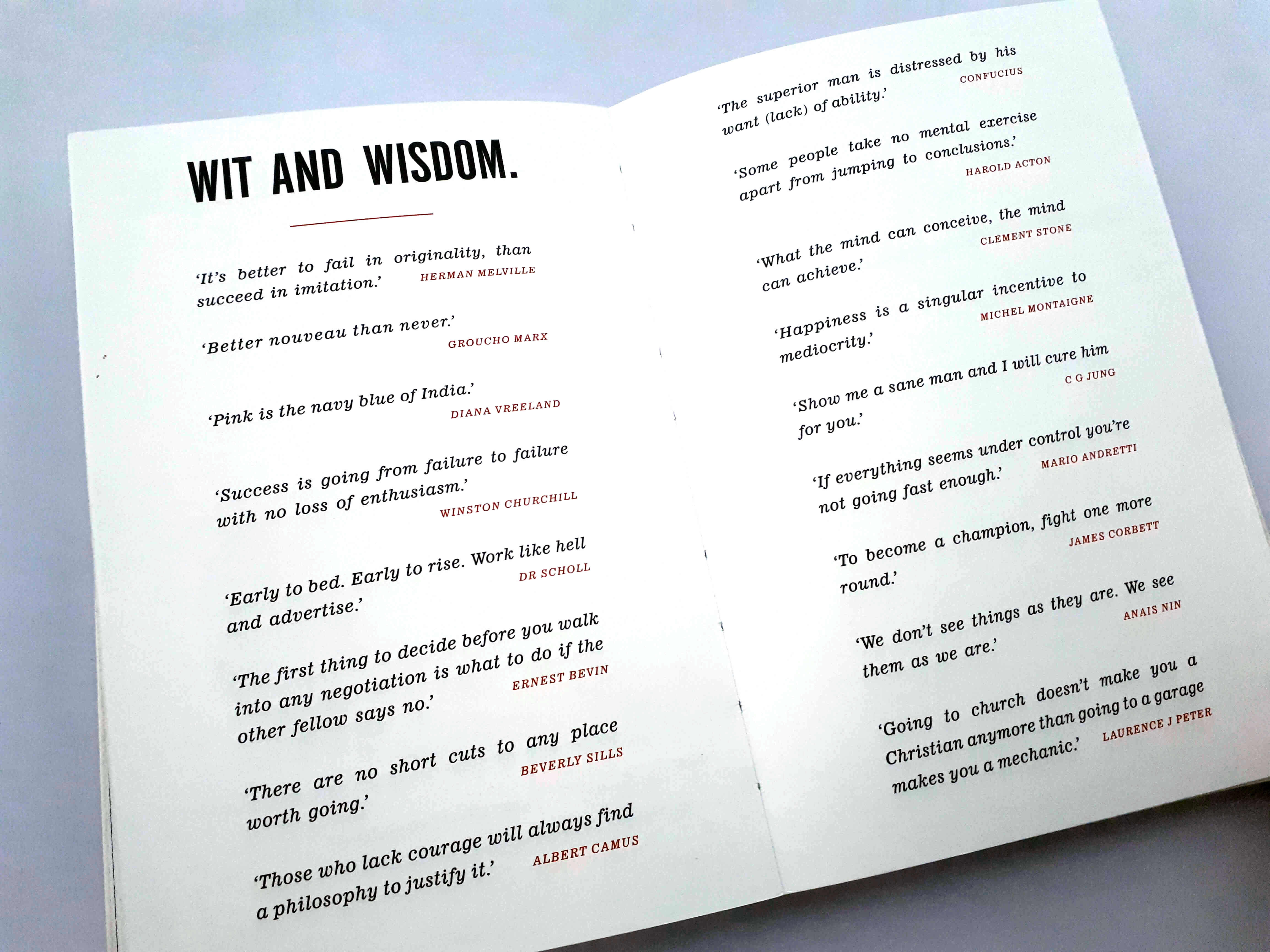
I recommend putting aside the typical Millennial need for praise or approval while reading this book – Arden will knock you down off your high horse while still inspiring you to share ideas and reach deep for creative inspiration. As a quick glimpse into the wisdom, you’ll find inside
I like that throughout the text there is sometimes more picture than words. Arden often confronts contradiction, showing that there are always two sides to everything, and you better know why each side is important.
It’s a book to read because we all want to be better at whatever we do – In our study, career, and just succeeding. Read this because it’s worth knowing the viewpoint of a respected member of our previous generation. And, read this because it will remind you to be more determined and courageous in everything you do.
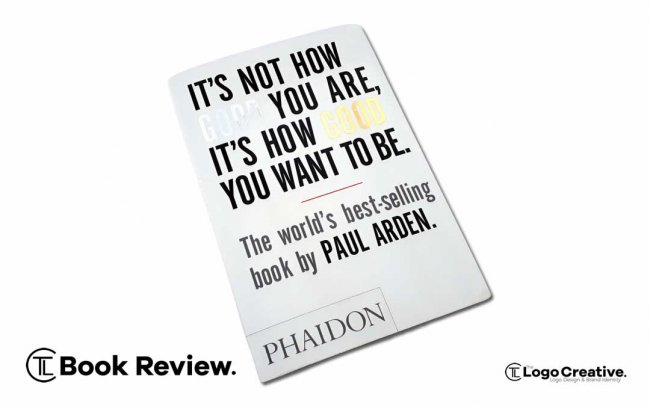
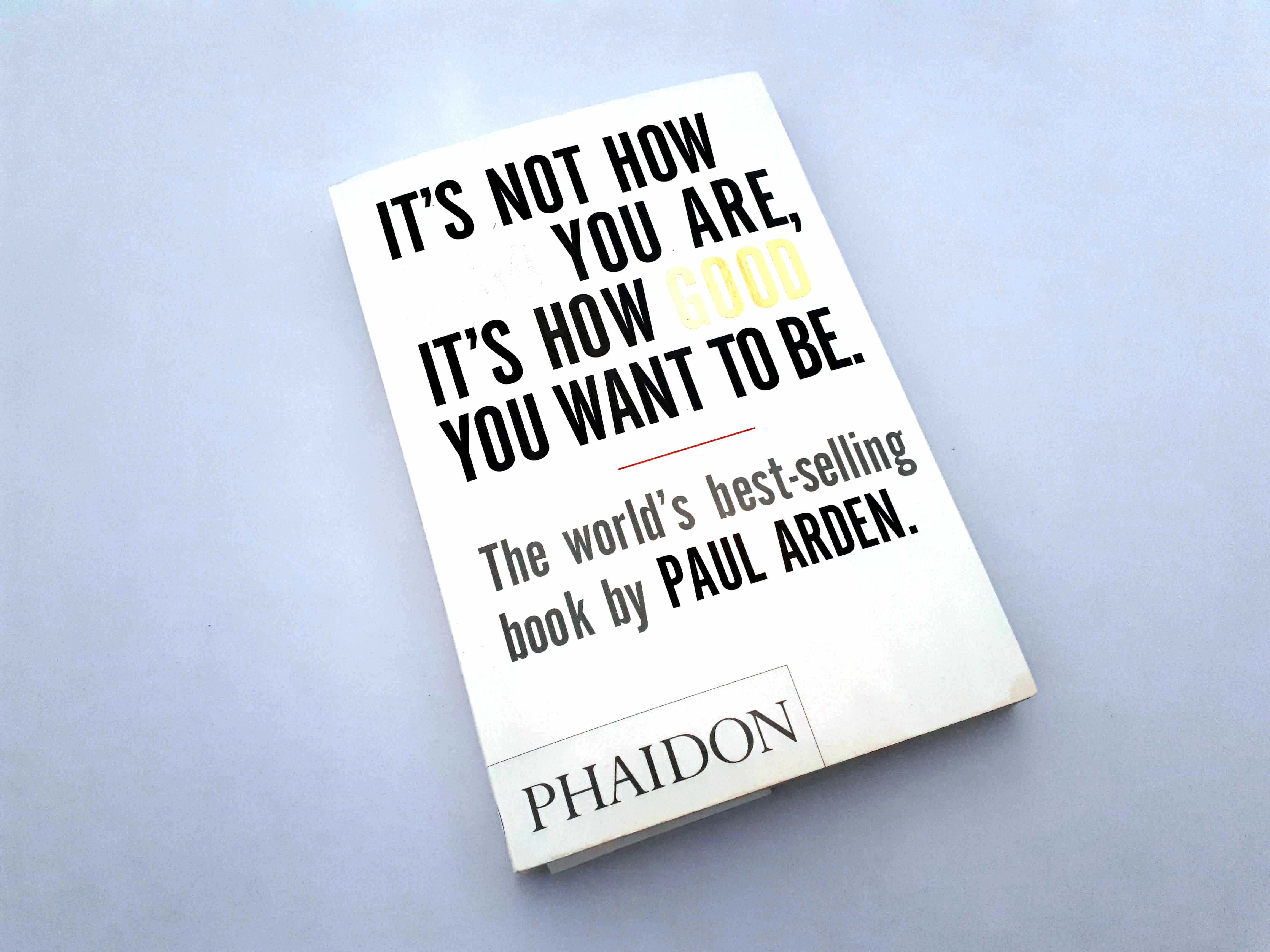
This book is great It’s Not How Good You Are, its How Good You Want To Be by Paul Arden. The first thing before we even look inside the cover design that is very interesting is how they highlight the word “good” twice in the title.
The first part “It’s not how good you are” is in silver meaning second place, and the second part “It’s how good you want to be” is in gold similar to a gold medal as in first place the winner. They are contrasting the two which is a nice visual message you first take away from the book.
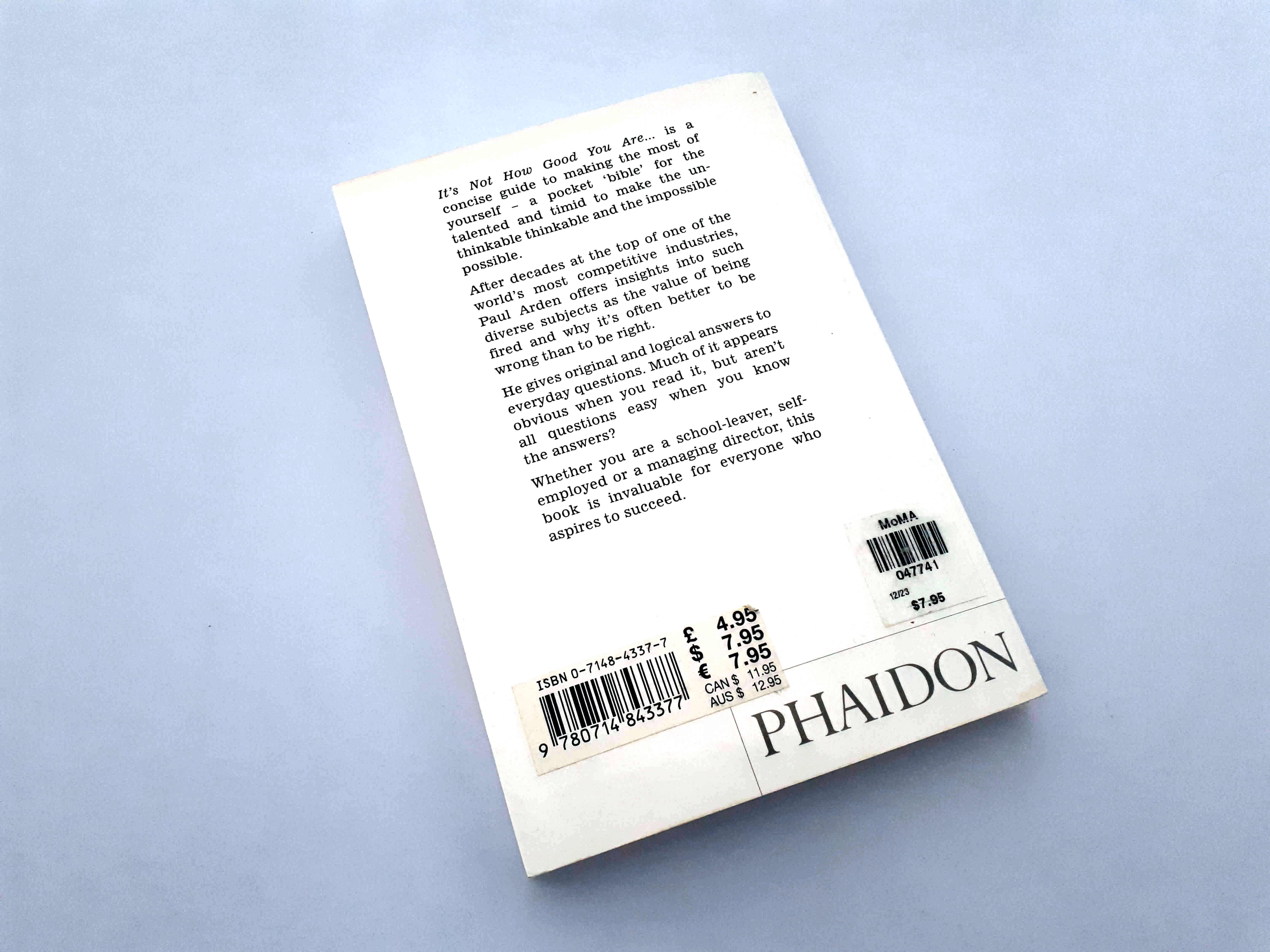
The words “good” on the cover are embossed to further highlight them, with nice solid text that’s loud and to the point, the overall book is well made with plenty of giving in the spine. Another nice thing about the book is its size its quite small and carryable which is really handy as it’s a book you may want to carry around with you for inspiration and the size of the book makes it possible to do so.
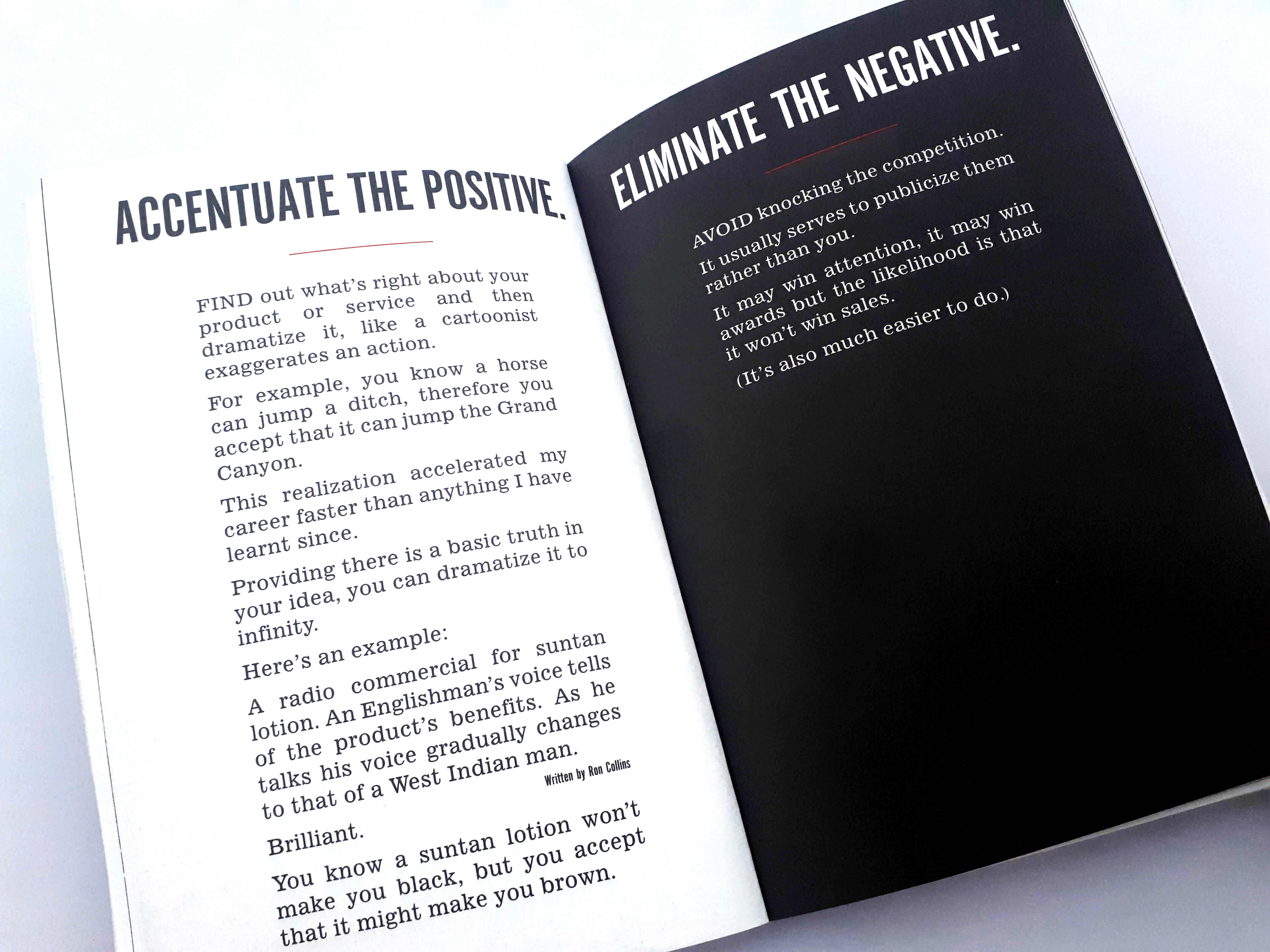
Digging into the content and the first thing that stands out is the font size as its nice and big and this bold lettering makes it easy to read and digest.
Another little design element I like is the use of the solid black pages with white text and it sections the book as well.
The book is great visually speaking and the overall experience of reading this book is very pleasing to the eye with supper enlightening content that’s inspirational and knowledgeable. The book does not get monotonous at all and has good use of images and drawings it’s strategically designed so the reader has a good experience while reading.
The main thing about this book is its golden content and the way it is highlighted and delivered in the book.
The first half of the book is about goal setting the direction you’re going and what you want to get out of life. Not letting your inner fears and insecurities hold you back as with the right mind set you can do and achieve anything you want to. As the saying goes most times you are your own worst enemy.
The second half of the book is geared towards the creative industry and people looking to go into the creative field. If you’re studying design this book is great for you it goes through everything from ideas and the creative industry and getting fired from a job position.
It takes the simple things that you don’t always think about and puts them into perspective. Such as getting fired from that job may actually be the best thing that could have happened t you.
The book really hammers home that it’s not where you come from or the stage your currently at it where you want to end up.
I want to highlight some of my favourite sections within the book that I think is really nice.
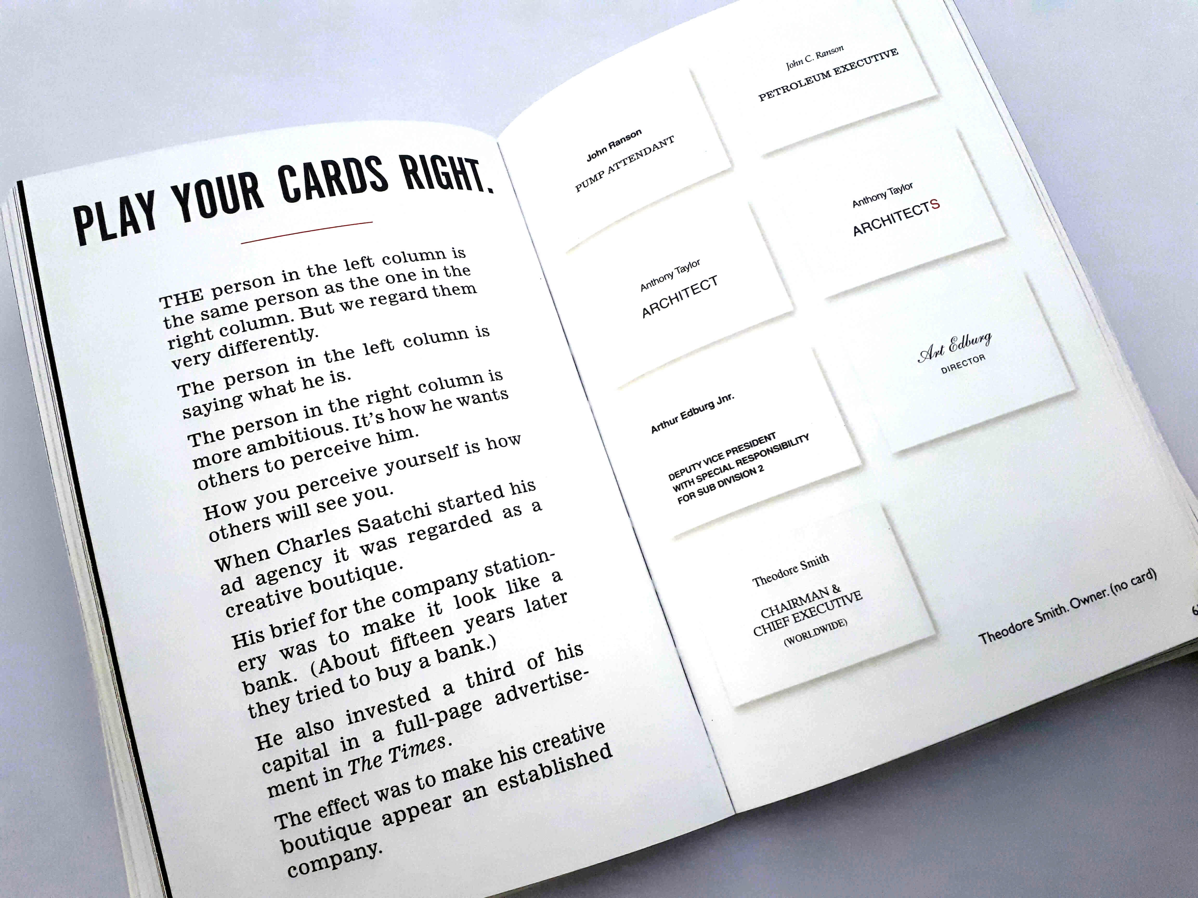
Play Your Cards Right
In this section the page on the right has a bunch of business card each row is the same person, the left side is who they are currently with the right side being who they aspire to be. This section is saying is how to perceive yourself is how others will see you and this can be communicated on something as simple as your business card.
As you can see from the first example of how it is been displayed the font choice as opposed to the opposite side which looks more professional.
The second set of cards which is displayed in the same typeface but the first one says “Architect” which gives the impression that the person is working alone. While the second version that displays the word “Architects” which makes the company sound bigger as in more than one person within the company.
The third example is showing how you display your information will give off a different image of the person whose business card is as the second one is more minimalist with cursive lettering looking more fancy and professional.
The last example is basically saying this person is the owner of the business so basically, he does not need a business card as he owns the company.
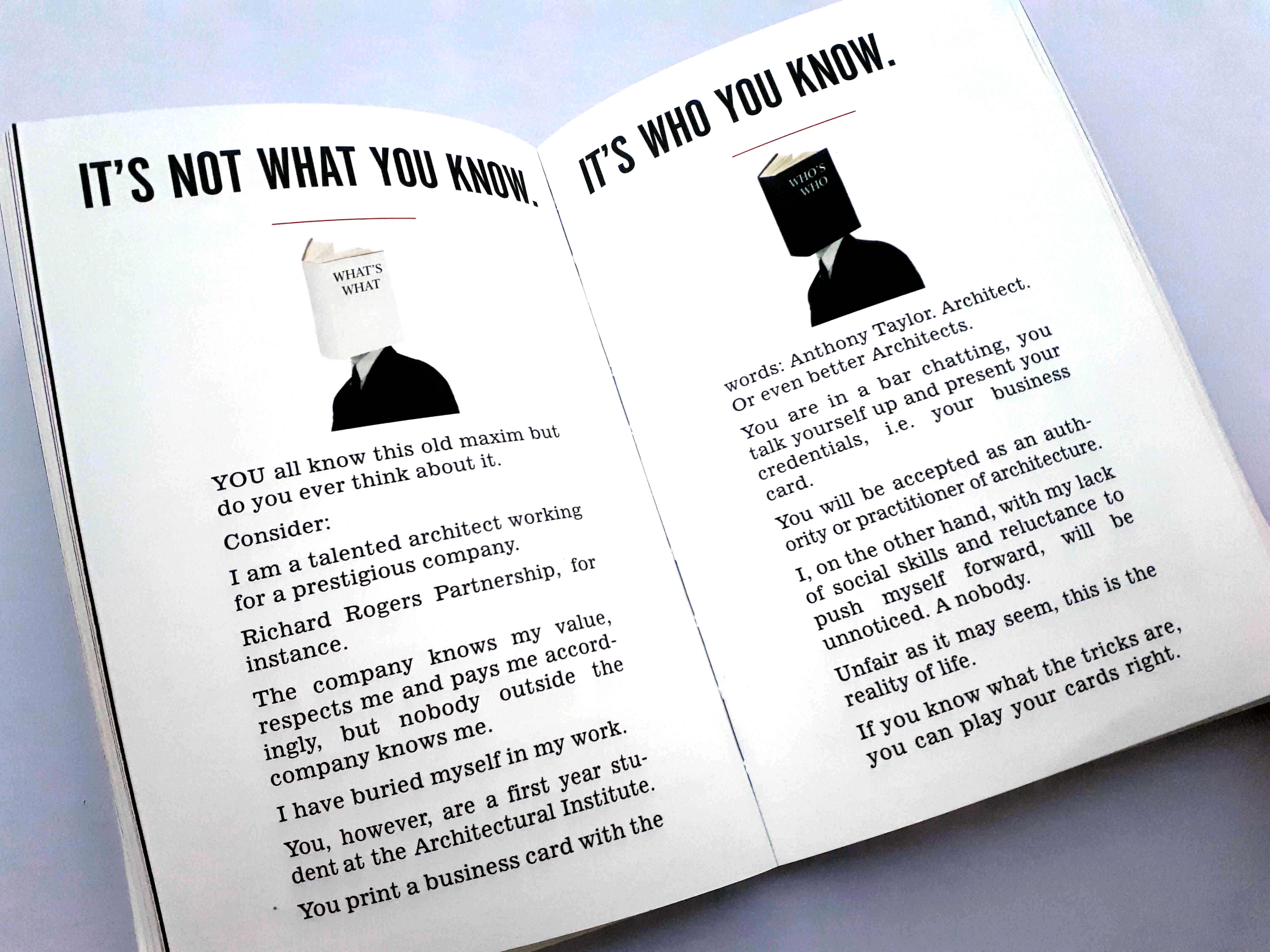
It’s Not What You Know, It’s Who You Know
As it says in the book we all know this saying but do we actually think about it? And it’s important to be reminded of this because we all want to move forward in our careers and a lot of designers spend a lot of time in their studios working on client projects, creating content and perfecting our craft…Myself included! When we should be getting out there and meeting people and bumping heads and establishing relationships by handing them your business card that perfectly perceives you and what you do as explained in the last section. This is something we could all improve on!
As it says in the book “Unfair as it may seem this is the reality of life, If you know the tricks you can play you’re your cards right” Once again referencing back to the business cards and the cards of life that we are all delt when we come in to this world.
Below are a few other sections I like and stood out to me when reading.
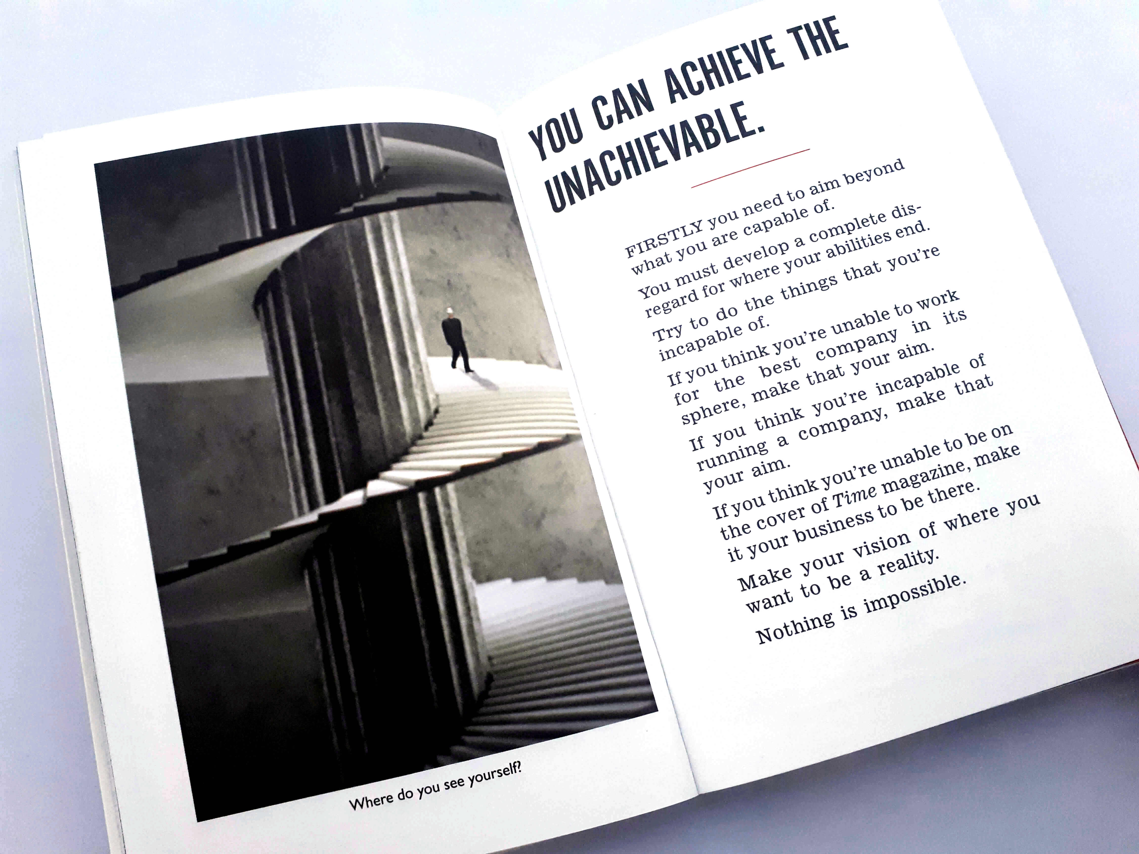
Page 17 – “You can achieve the unbelievable.” – Arden makes it clear to the reader that your perception of your ability will always limit your ability. So, what you should do, is aim for the incapable.
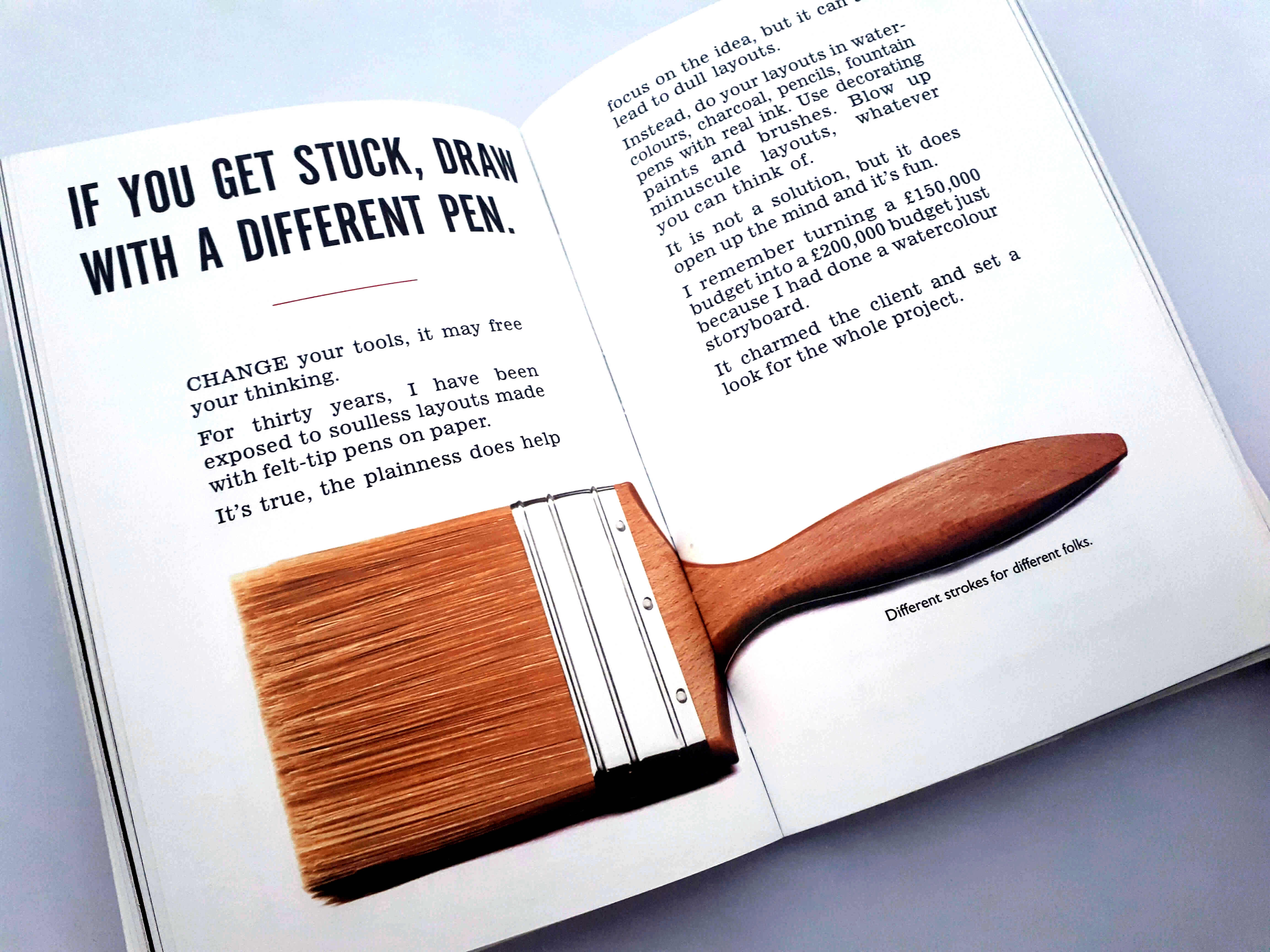
Page 26 – “If you get stuck, draw with a different pen..” – As Arden says by changing your tools, it may free your thinking, Charm your client and set a look for the whole project as i can increase the budget.
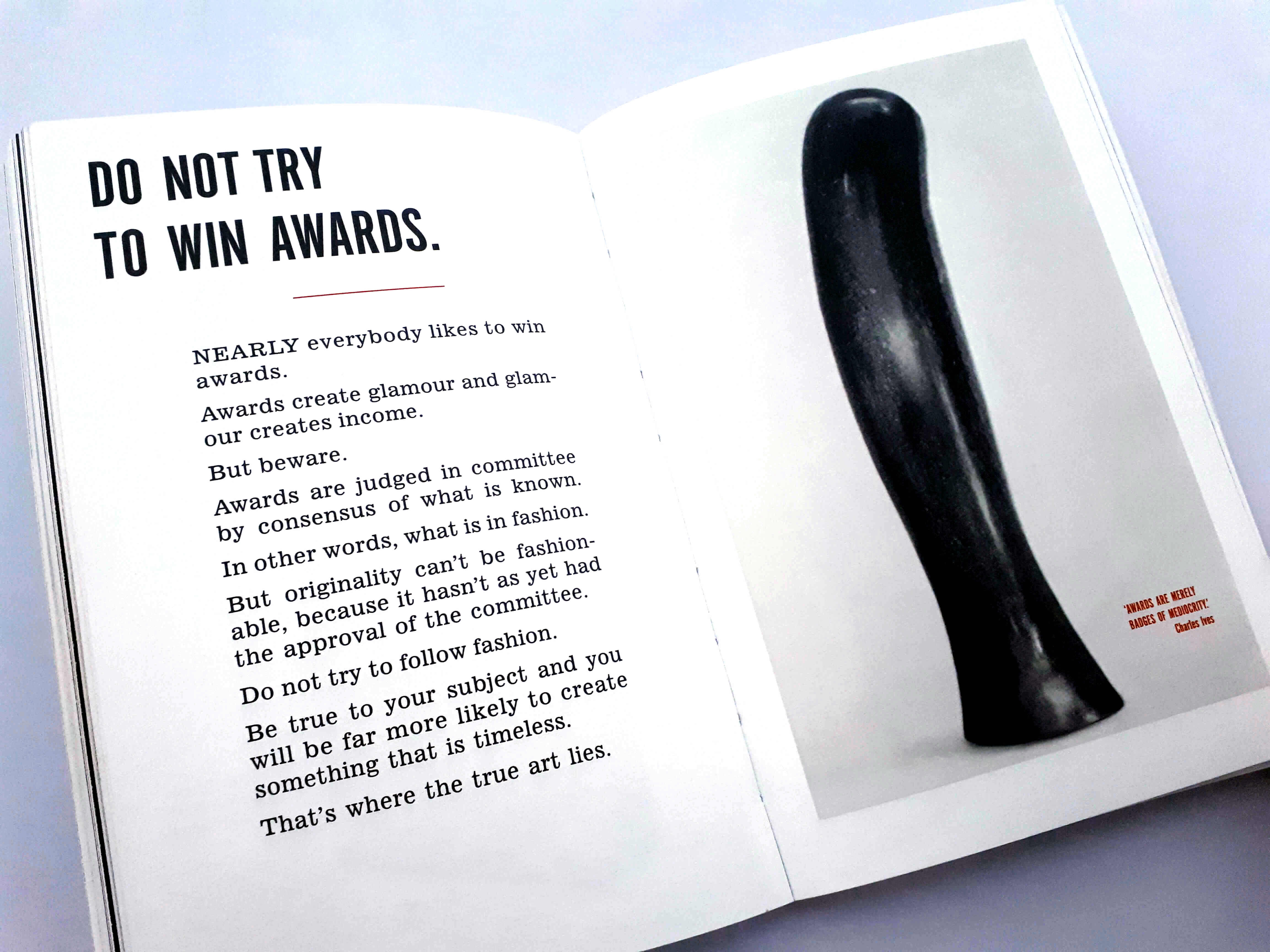
Page 38 – “Do not try to win awards.” – Awards are judged in committee by consensus of what is known. In other words, what is in fashion. But originality can’t be fashionable, because it hasn’t as yet had the approval of the committee. Do not try to follow fashion.
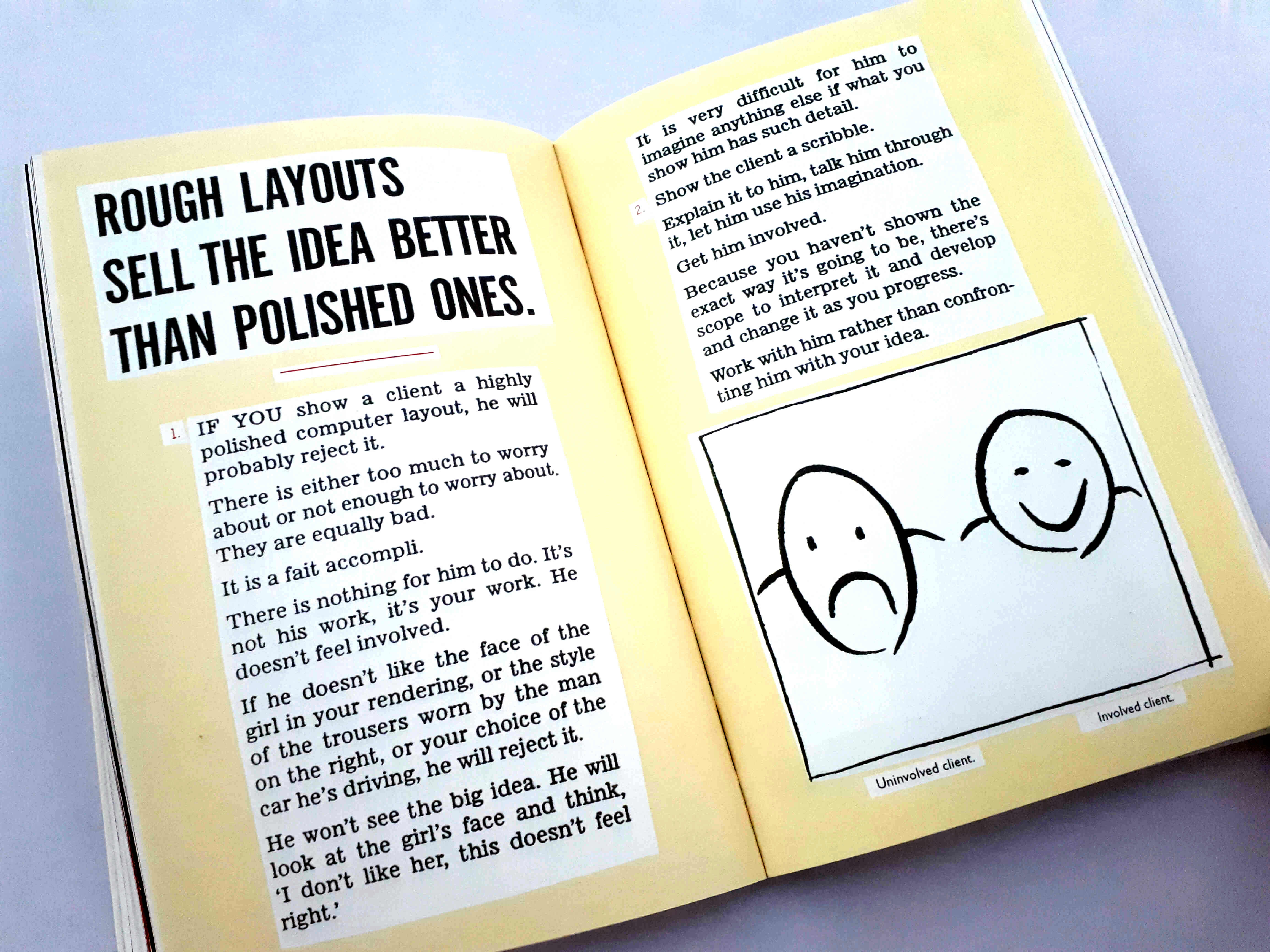
Page 49 – “Rough layouts sell the idea better than polished ones.” – If you show a client a highly polished computer layout, he will probably reject it. There is either too much to worry about or not enough to worry about. They are equally bad. There is nothing for the client to do. It’s your work. They don’t feel involved.
It’s a great little book that is very unique, nice to look at and read over a few times. It’s been super handy to me personally over the years and I would highly recommend owning a copy.

