Today Designer Spotlight: Juventus Brand Spotlight
Established in 1897, Juventus F.C. — or Juventus, or Juve, or I Bianconeri (the black-and-white) — is a professional Italian football club based in Turin and, arguably, one of the most famous and successful teams in soccer history. Juventus is the second oldest (and still active) team in the country — Genoa is the oldest — and has won 61 national and international official titles.
Juventus new club crest was designed by Interbrand, with hopes of successfully mixing tradition with a brand that goes “beyond football”.
The football giants have created a crest along with new ways of communication and visual expressions. Juventus, according to Manfredi Ricca, Interbrand chief strategy officer, want to “sustain its own growth both economic and sports-wise, and extend its influence over international markets, beyond football.”
Introduced as part of an international growth plan with the title Black and White and More, the rebranding was completed in Interbrand’s Milan studio.
From the Interbrand Project Page.
“Built upon heritage-founded principles of confidence, determination, and uncompromising conviction, Juventus has crafted a revolutionary growth plan—launched during the inaugural “Black and White and More” event and sustained by a new brand strategy and identity. Juventus aims to distil its essence into far-reaching experiences which can appeal to the football fan while being highly relevant to entertainment enthusiasts who are further away from football as a sport. The new logo is iconic and universal. It’s bold enough to make a statement, but flexible enough to appear alongside a wide range of new experiences—in the stadium and beyond. By leaving the team’s defining black-and-white stripes untouched, Juventus is bringing the illustrious legacy and spirit of one of Italy’s preeminent teams to new audiences and die-hard fans alike.”
The new identity launched in Milan on January 16, 2017, the first of many premier, immersive Juventus events. The new identity will then follow the team to showcase future digital, social, and retail experiences to loyal supporters, soccer enthusiasts, business partners, and entertainment enthusiasts. Juventus’s move is unprecedented—to become recognized for more than their performance on the field, but as a universal symbol for perseverance, ambition, and premium Italian style.
The video below is the Logo introduction.
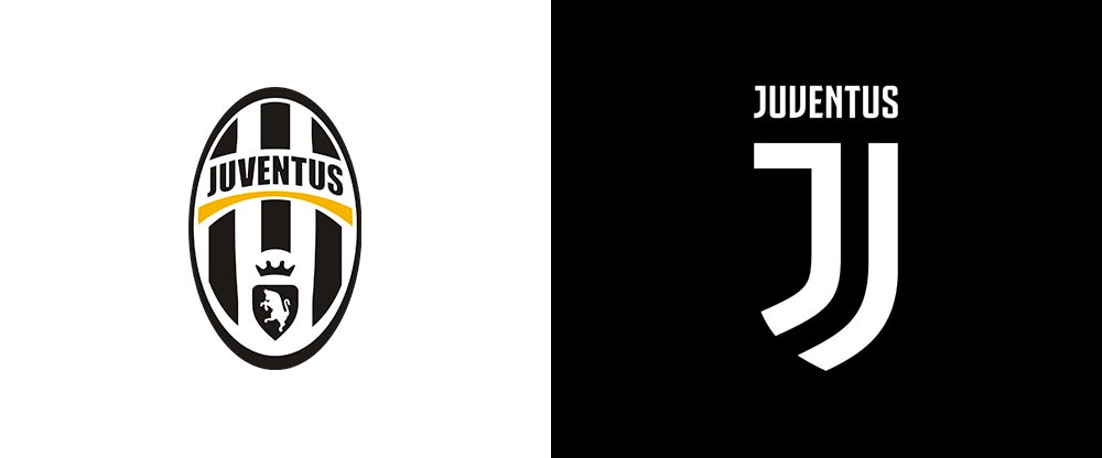
Many recognisable features of the old crest have been dropped including the bull which is the the symbol of Turin, the crown and oval badge.
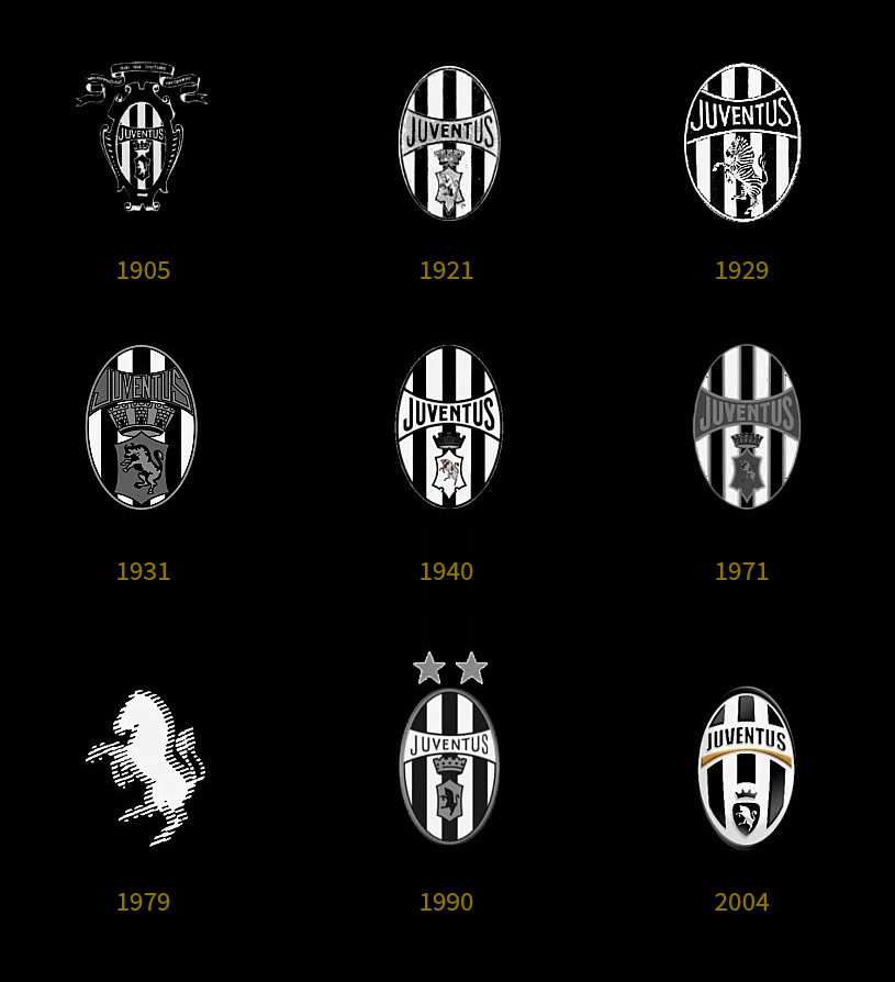
Logo Evolution (Image from Brandemia)
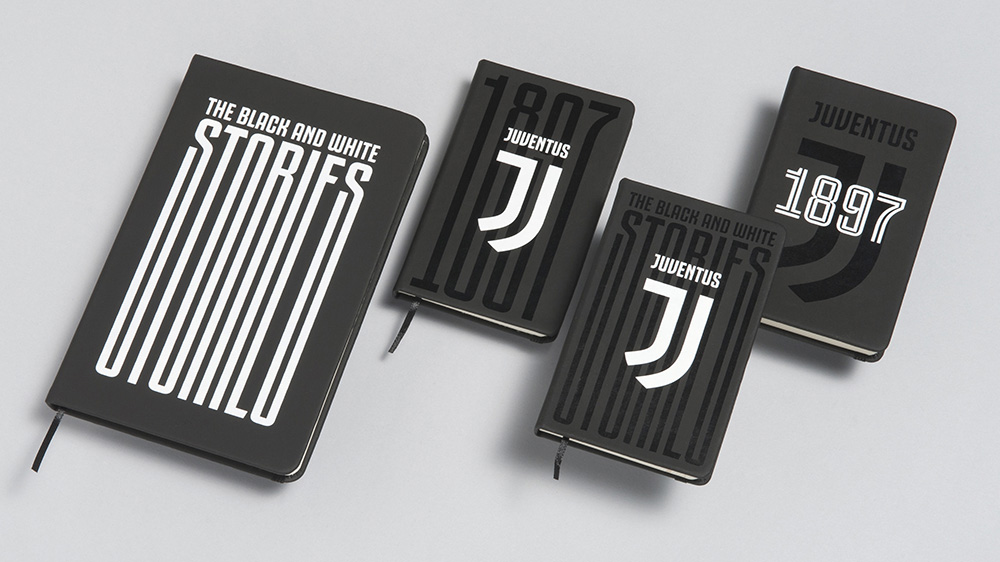
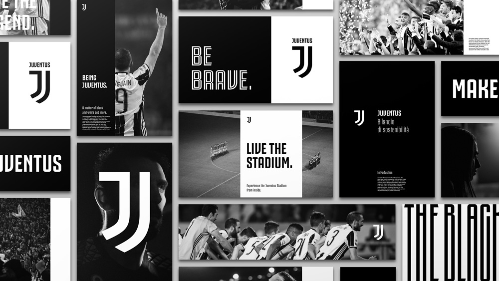
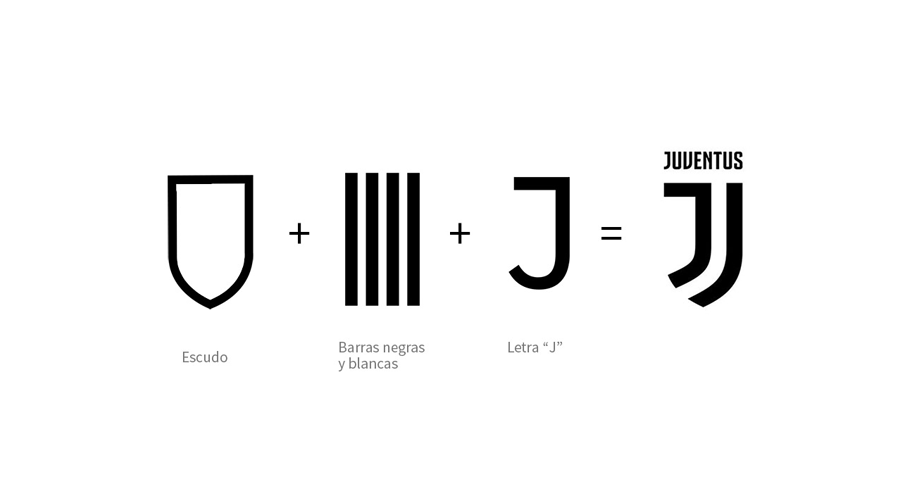 The new badge comprises of a modern stylised ’J’, which is a play on the famous black and white stripes that the team play in. This is accompanied by a wordmark using a new, bespoke typeface created for the project called Juventus Fans, in five different weights and styles.
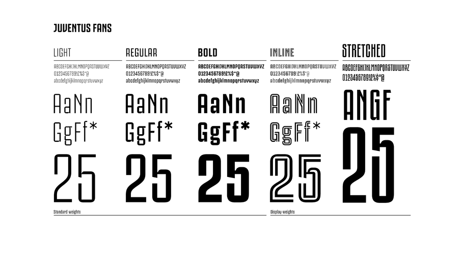

The new brand is heavily influenced by the club colours and is defined by “fearlessness”. Ricca adds “It’s about black and white. About winning and losing. It’s about contrast and going beyond. Striving for excellence.”
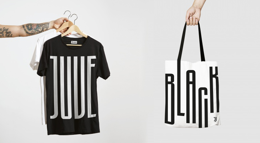
The new Juventus brand will be displayed in the academies, within local projects and all aspects of marketing and business ventures to inspire using the visual and verbal tone of voice of the football club says Ricca.
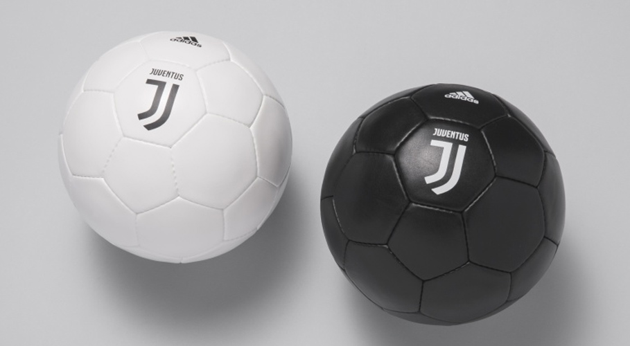




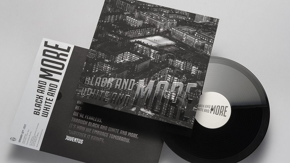
Above is the launch event invitation.
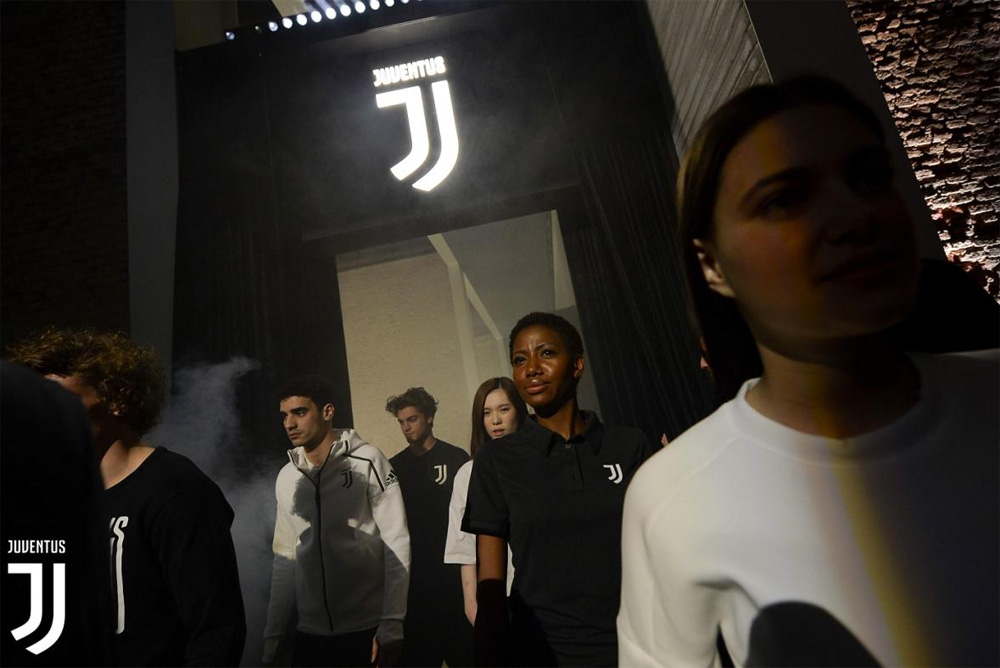



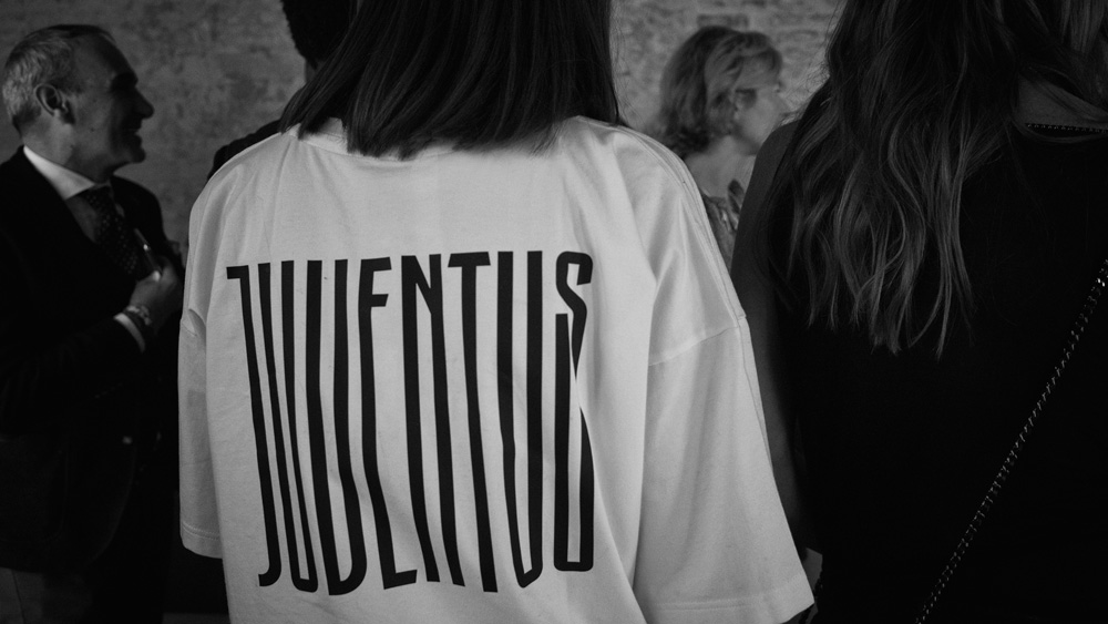


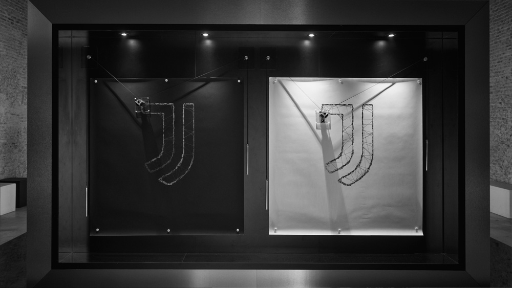
Above is the launch event.
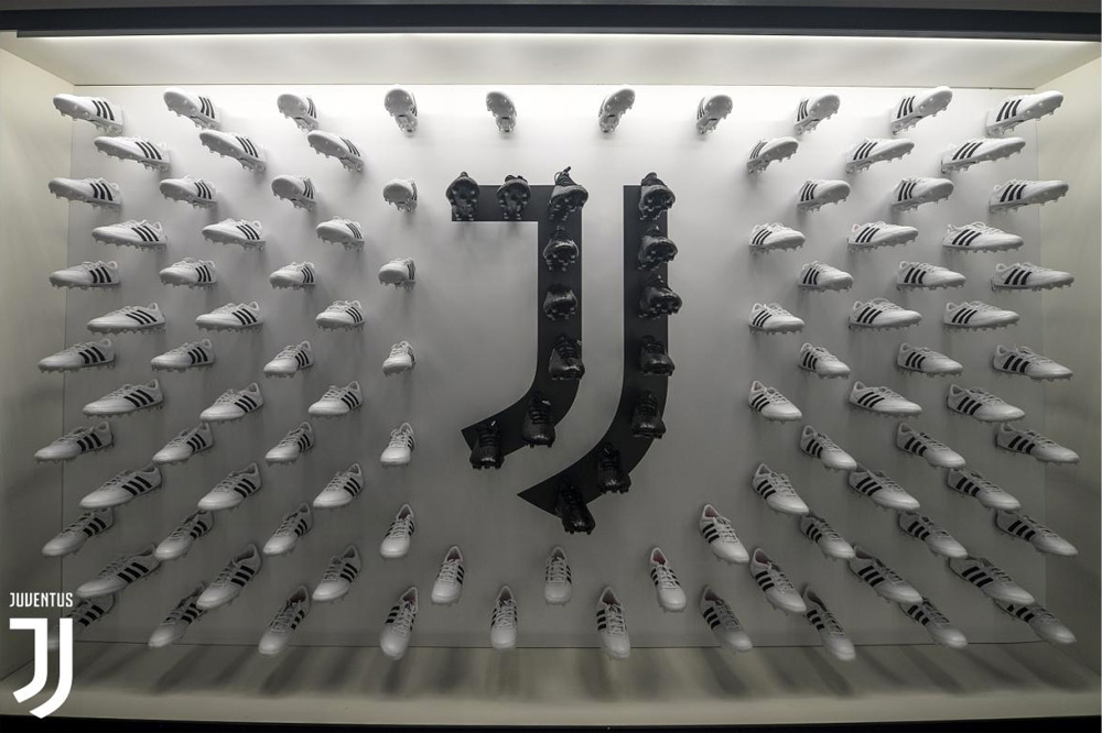
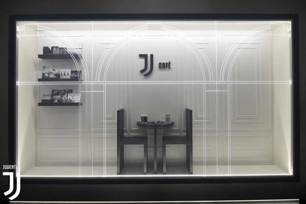
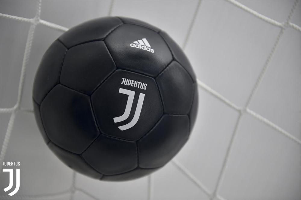
Displays at the event clearly showing the premium brand experiences fans can expect from Juventus.

