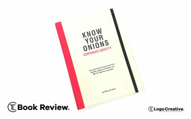
Know your onions: Corporate Identity by Drew de Soto is a very good read much like his other books, its packed full of knowledgeable advice from a designer who has been in the business for over 25 years.
As it states at the beginning of the book
“The Phase ‘Know Your Onions’ means that you are an expert in your field, top of your game and you really know your stuff”
Drew de Soto lives up to that saying he’s a veteran in the design industry and someone who I have learnt a lot from over the years, and the wealth of advice and knowledge he provides within the pages of his books is honest and golden information.
Drew was kind enough to send me a copy of the book and I would like to thank him again for that. Just like Know Your Onions – Graphic Design I highly enjoyed reading this not only once but twice as it’s a great book!
To start let’s take a look at the cover design before we jump in.
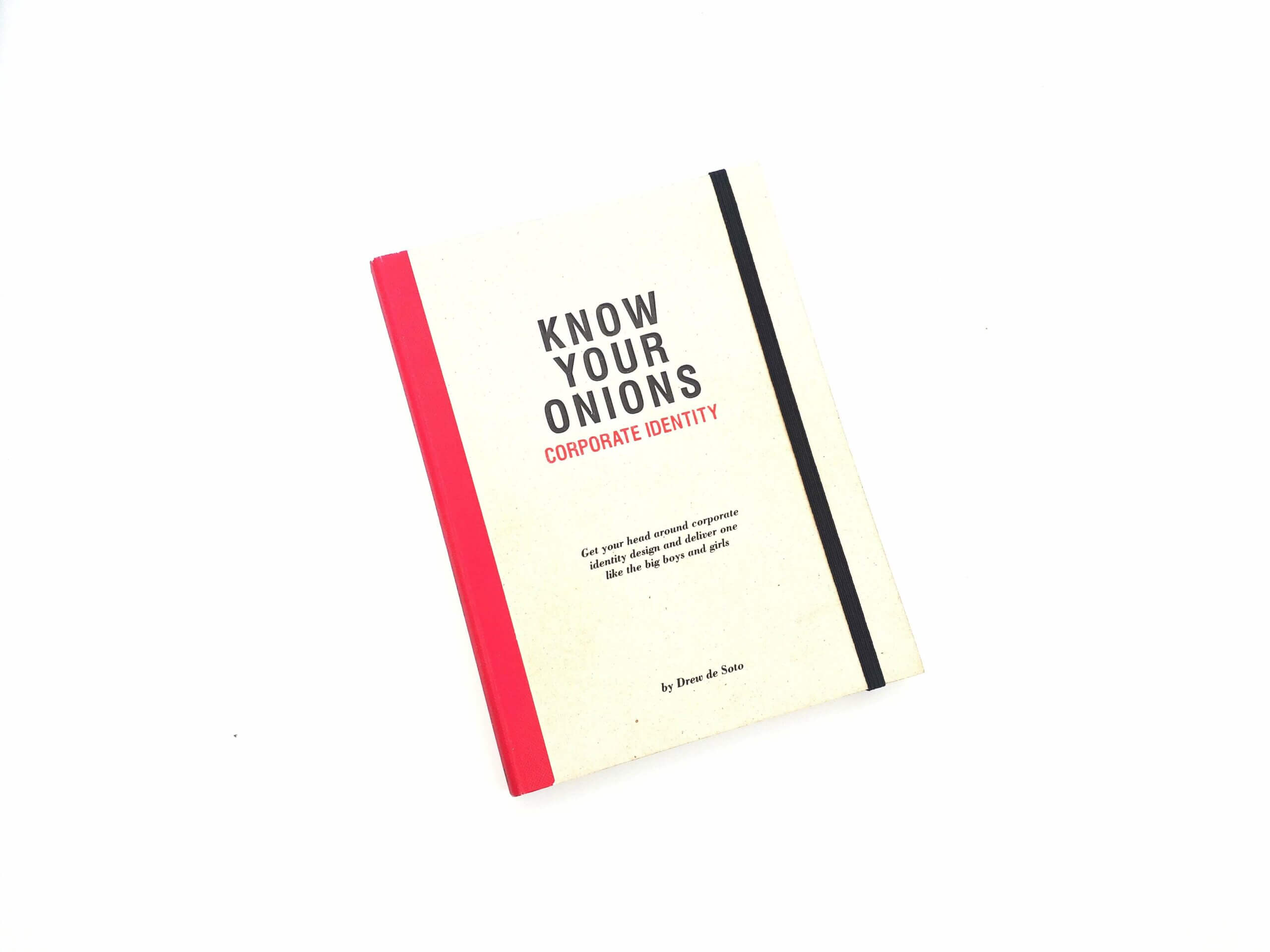
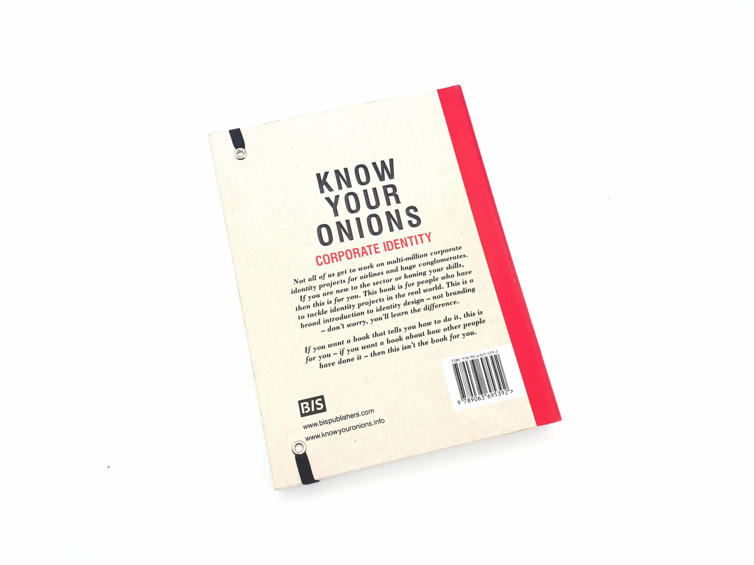
Just like Drew’s previous books you can see it’s a well-made book and holding it is a pleasure and I got that same feeling when I first held the previous book of “I’m going to learn something from reading this book”.
Just like the previous Know Your Onions books, it’s held together and bound using the quarter pound tape method which you can learn about if you read the Know Your Onions – Graphic Design book.
The spin of the book is solid with plenty to give when opening and closing the book.
The tape prevents damage when rereading and flicking through for reference the speckle card and notebook style acetic also used in previous books it’s very unique and pleasing to look at.
As mentioned in my previous book review of Know Your Onions – Graphic Design it’s a sterling example of great print and looks great when sitting comfortably on your book shelf, and if you have the full set their individual tape colours look very nice when sitting next to each other.
The design and layout of the book follows previous books in the Know Your Onions family, and from a distance without being able to read what it says on the cover, readers of the book series will know it’s a Drew de Soto Know Your Onions book.
For those that aren’t will be drawn in by the books simple but unique straight to the point design.
It’s like Drew mentions in the book:
“This is my scheme for this book and it sits under the “brand” of Know Your Onions but gives style and individuality to the book; it’s not like other books, but it is.”
He continues to mention that back in 2011 he chose a book cover design and format that he hoped would not date to quickly and avoided trends.
He used classic fonts and a traditional grid layout, and the framework has allowed Drew to change by introducing new colour palettes, with this book being magenta and previous books being cyan, and orange.
Nearly a decade later I think the books look great and have become a signature mark and style to the Know Your Onions series. Its uniqueness has also been copied by other books related to design, and although its wrong to copy others work, to me that signifies a good look and design. and its a design that is unique to Know Your Onions. and as the saying goes “They can imitate your style but they cant imitate your creativity”
Now let’s dive in and take a look at the content.
The book starts with an introduction and as Drew explains his reasons for creating the book.
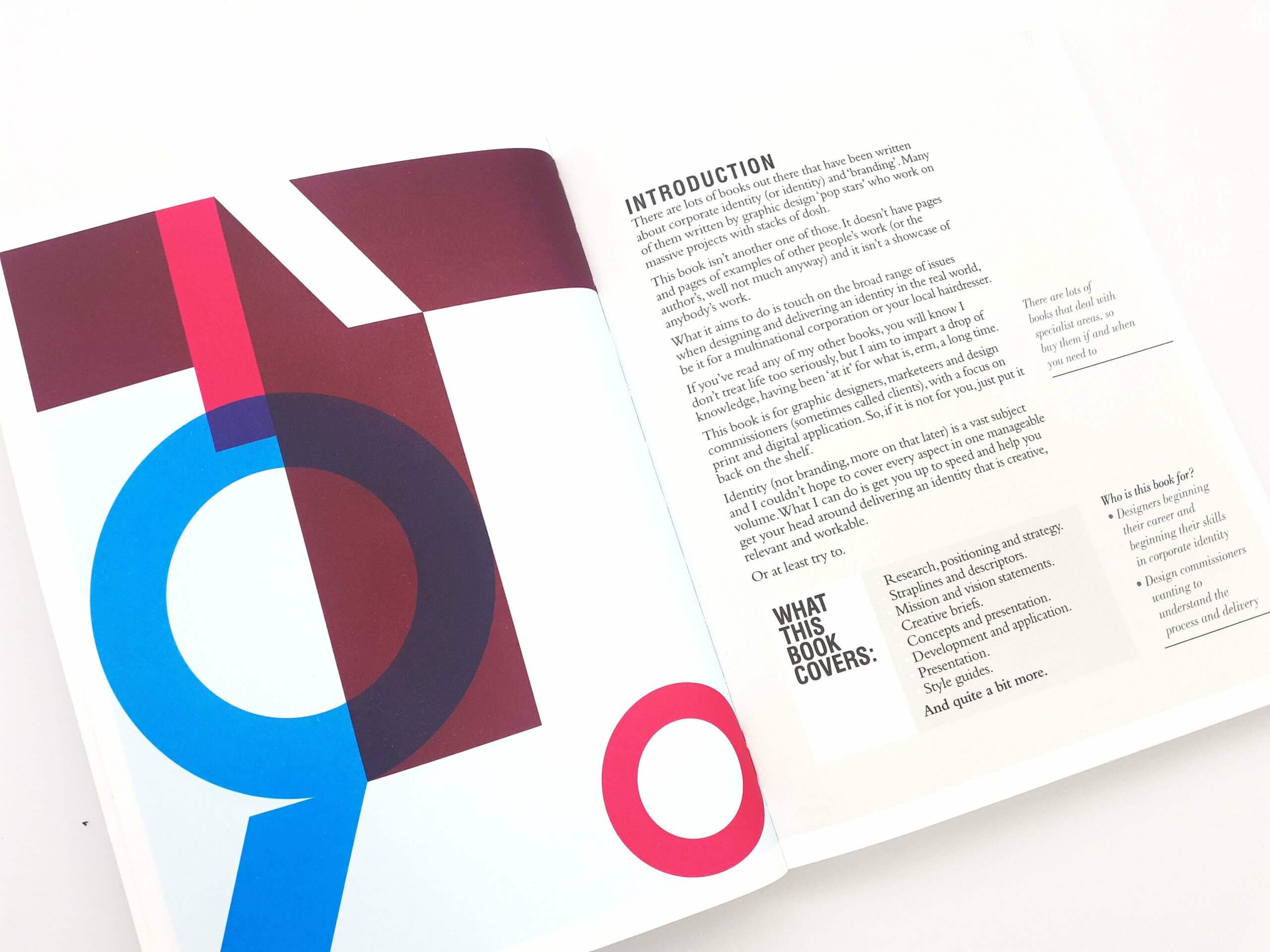
He mentions that there are a lot of books out there covering the topic of corporate identity and branding and in his words many of those books have been written by graphic design ‘pop stars’ who work on massive projects with stacks of cash.
This book is not another one of those books with pages and pages of examples of peoples work or a showcase of anybody’s work.
It’s aimed to touch on a broad range of issues when you are designing and delivering and identity design for a client regardless of its scale or scope.
It’s intended for graphic designers, marketers and design commissioners as we know them as clients, with the focus on print and digital applications.
Drew’s aim is to bring you up to speed and help you get your head around delivering an identity that is creative, relevant and workable.
The book is divided into seven sections; Thinking, Working, Designing, Managing, Trademarks, Real World Case Study, and Consistency.
The Thinking section which is packed full of information starts off the book at the early stages you are at when designing a corporate identity and the project processes you need to be thinking about such as doing market research, competitor analysis, positioning, strategy, naming, straplines, descriptor, mission and vision statement.
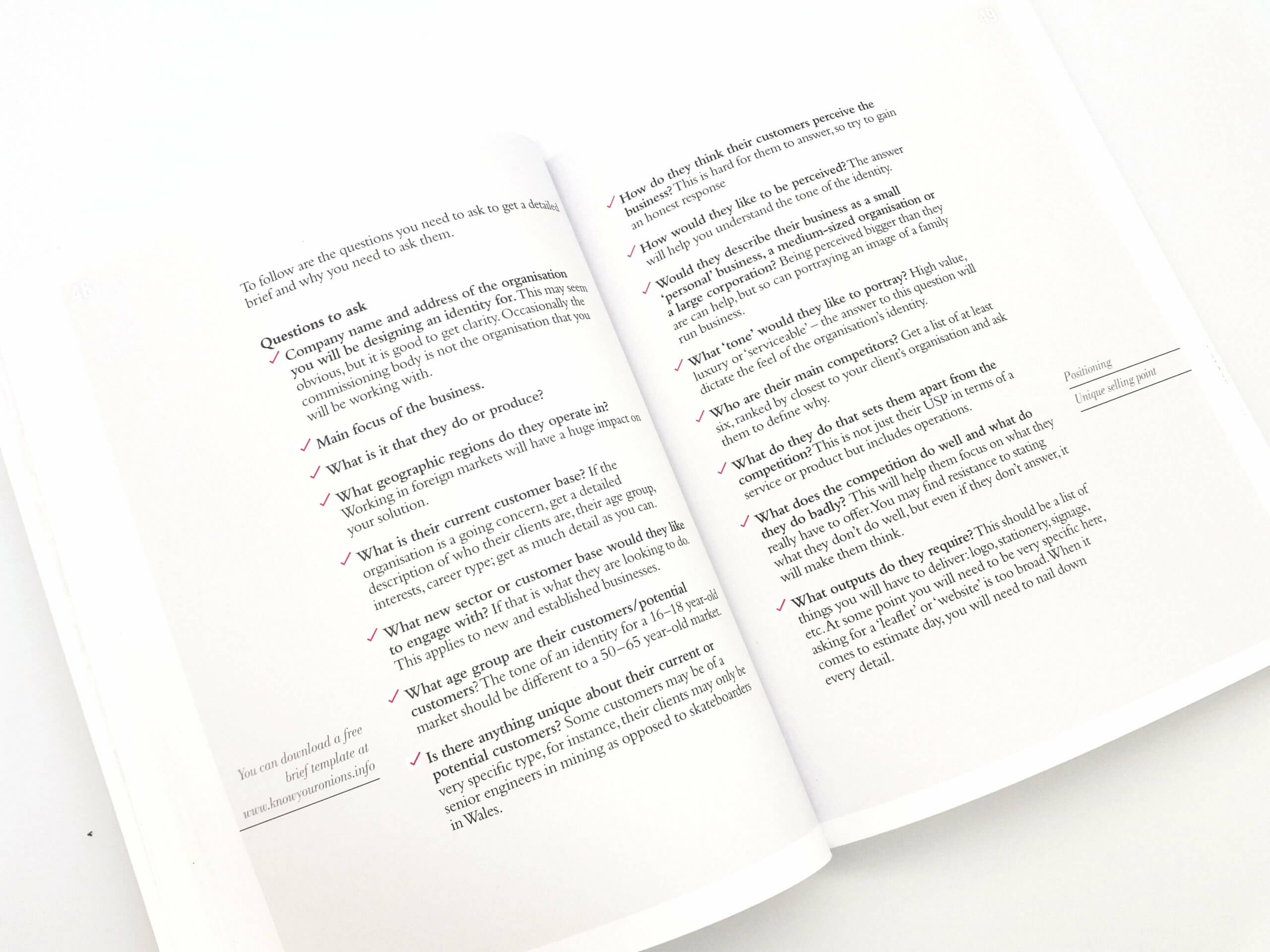
The Working section goes through areas such as briefs, meeting clients and the questions you should be asking them and most importantly why you should be asking them.
The third section jumps into the fun part of designing whether it be a new identity or a review one.
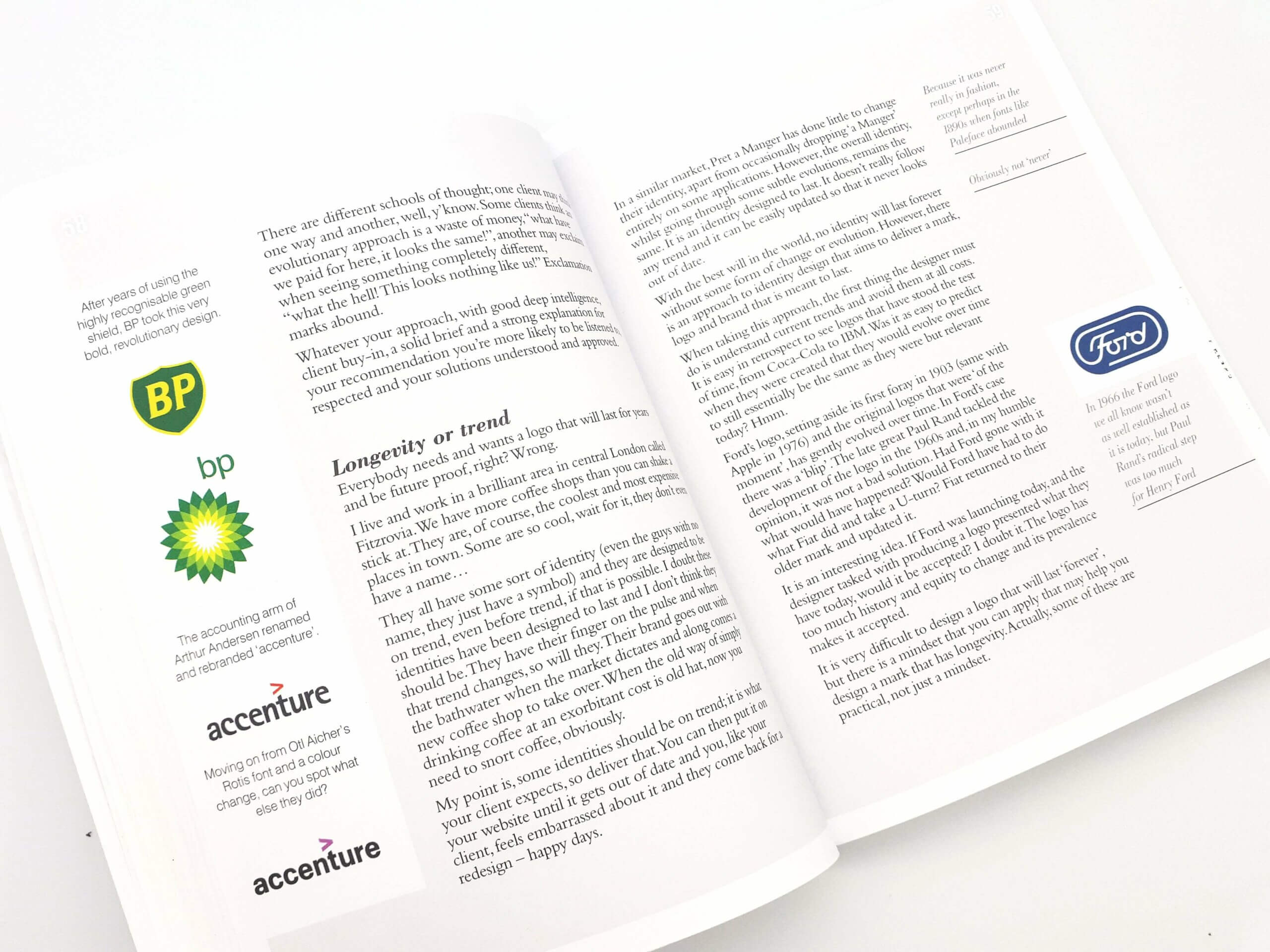
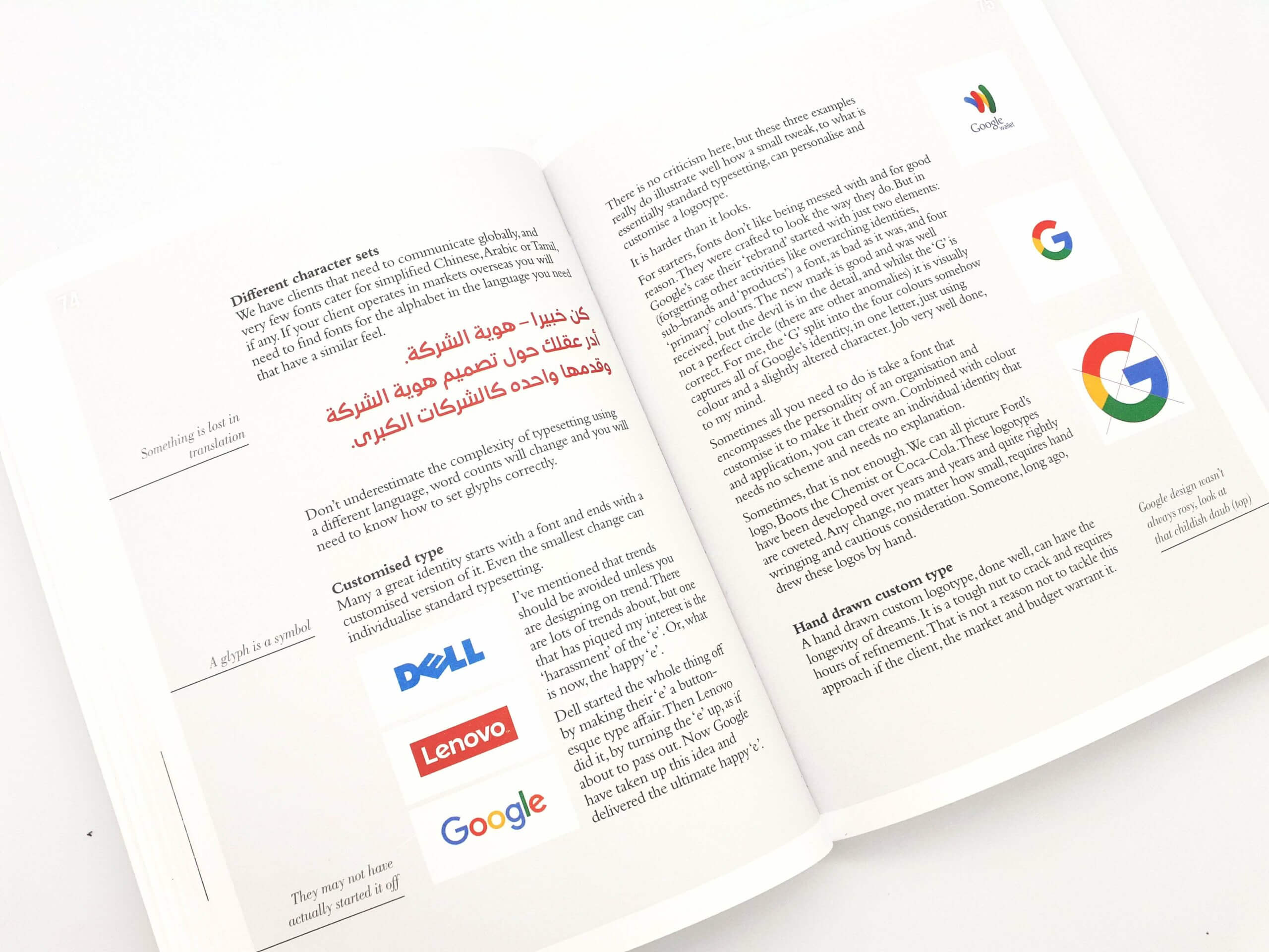
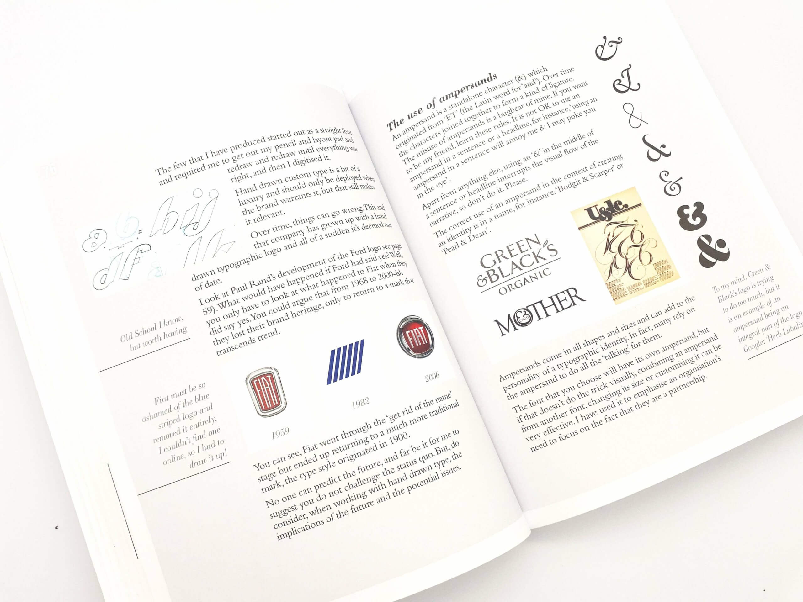
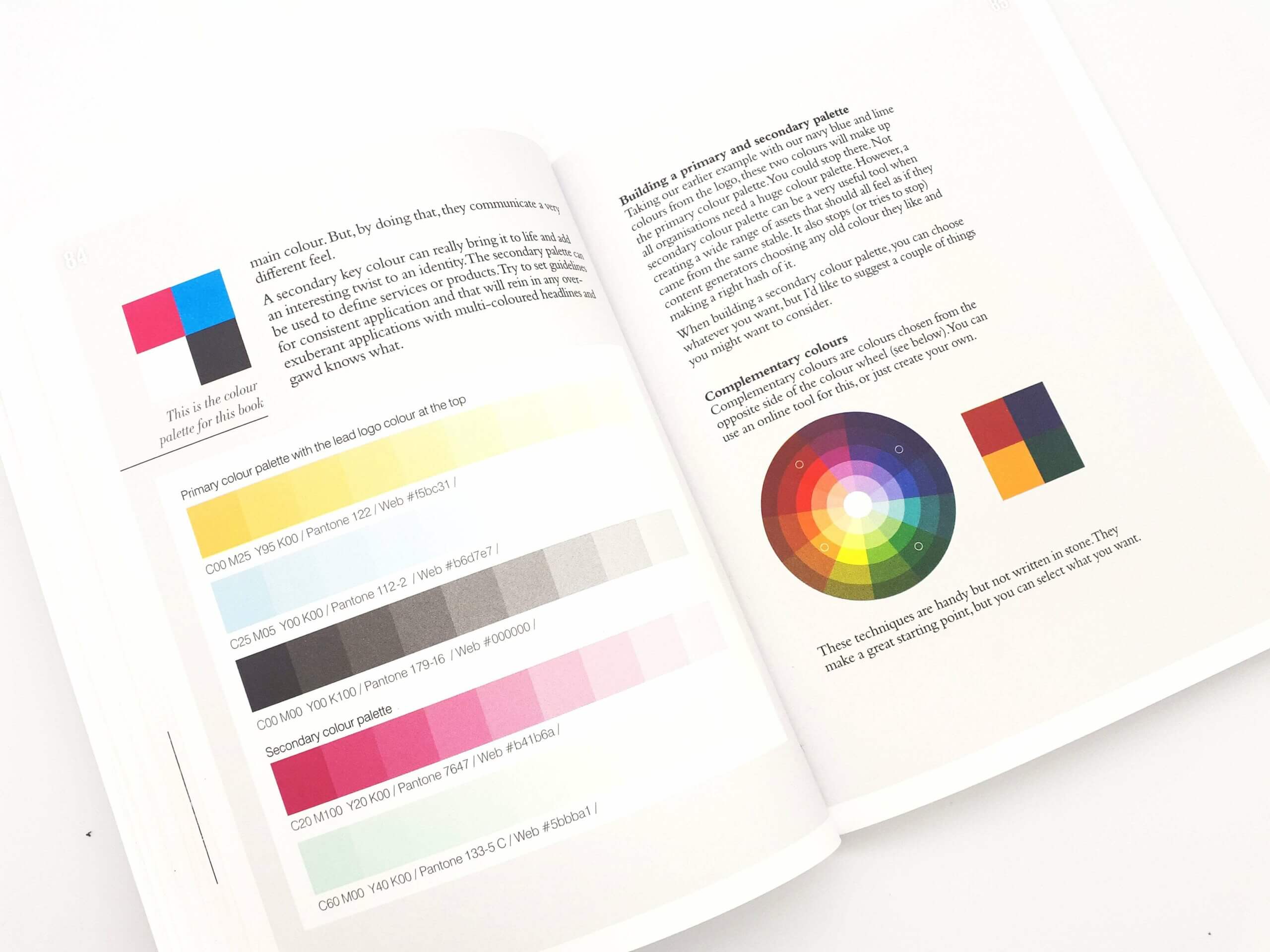
Starting with pen and paper and the importance of sketching and the ideation stage, longevity and trends, development and the anatomy of a logo, and approaches you can take when designing through to colour exploration again another packed section.
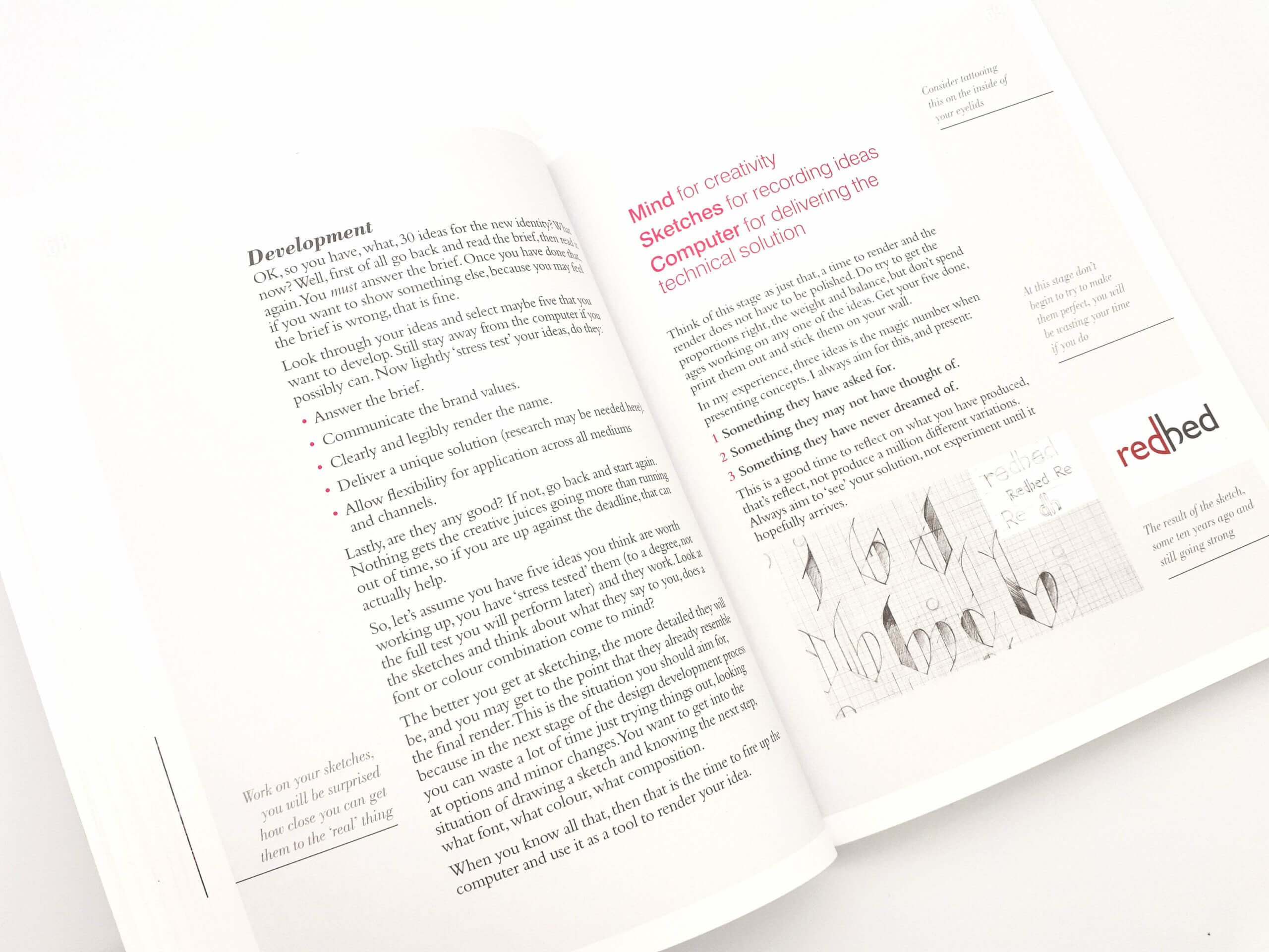
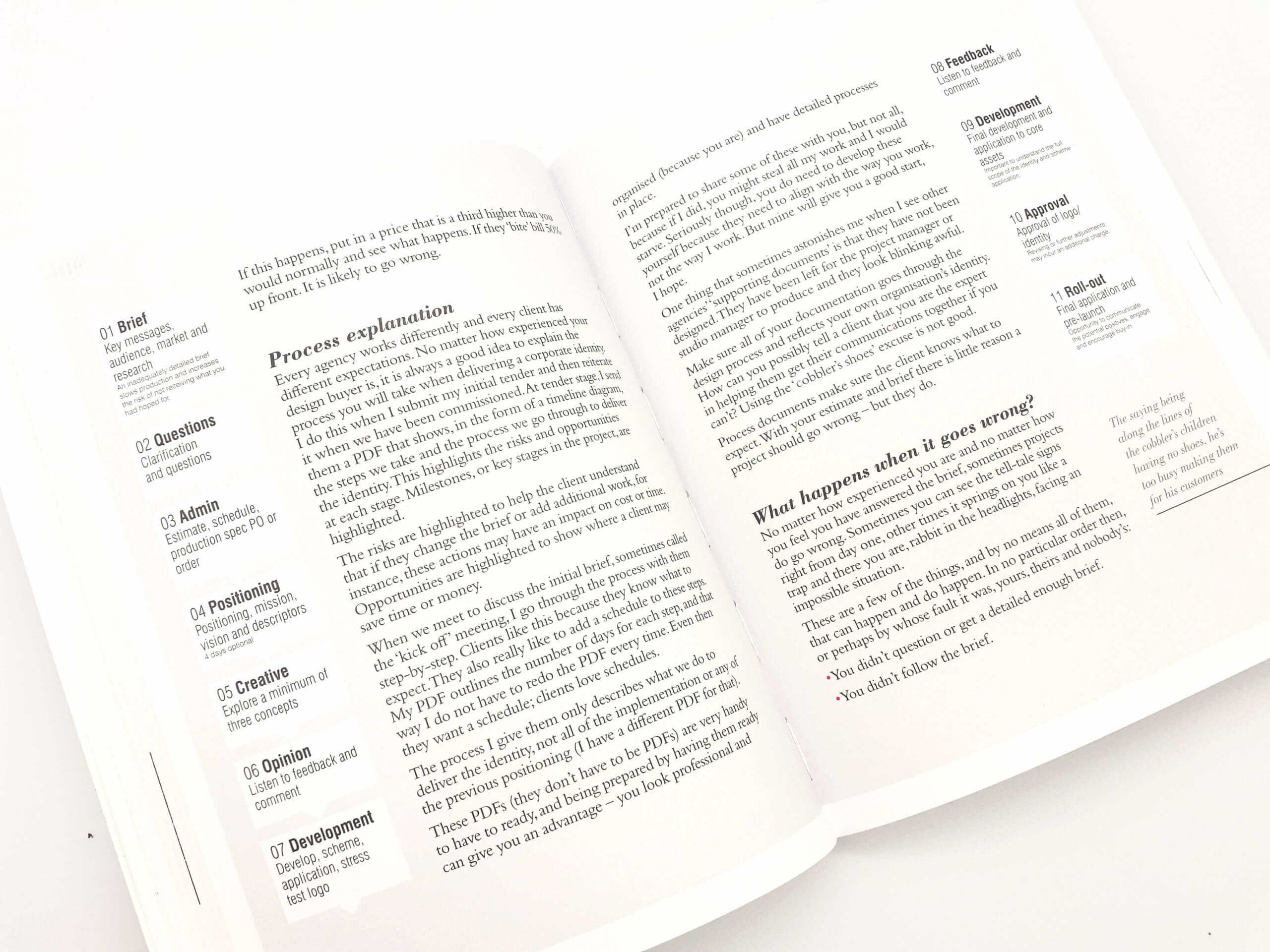
The fourth section is about managing client relationships, knowing who it is you are dealing with, estimating and c=budgets, explaining your process, what happens if things go wrong, dealing with feedback
The fifth section goes into trademarks, doing a trademark search, protecting your registered mark and applying internationally.
The book then moves onto a real world case study for the British Council Identity as Drew interviewed Tony Bains, who is head of brand and identity at the British council it discusses and explains the problems, thinking and review of the global organisations logo and wider identity. It’s an interesting section.
It also covers presentation and presenting concepts, structuring a presentation, reiterating the brief, explaining the thinking behind the decision, and what to include in the presentation.
The final section is Consistency which discusses the elements that need to remain consistent and when you can allow flexibility when rolling out a new identity project.
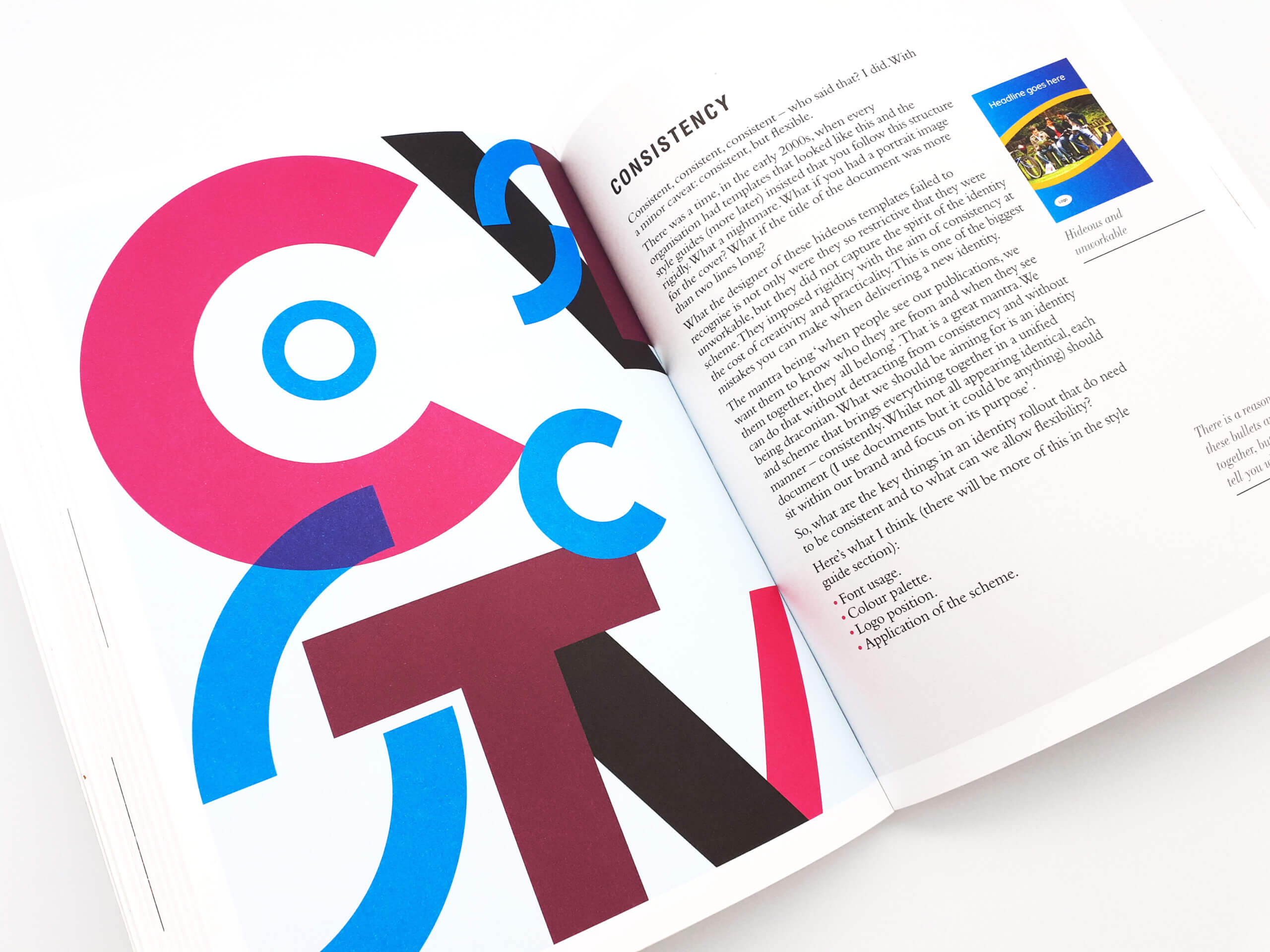
Elements such as font usage, colour palette, logo position, and application of the scheme.
The section also covers when designing for sub-brands and what you need to bear in mind, and when you’re creating a style guide and the questions you need to ask your client to determine what needs to be included within the document.
This section really does go into detail including a host of questions you need to be asking for different areas such as Language, Logo, Colour, Typography, Photography, Illustration, and Application.
It then moves on to creating a style guide and the best practices when doing so.
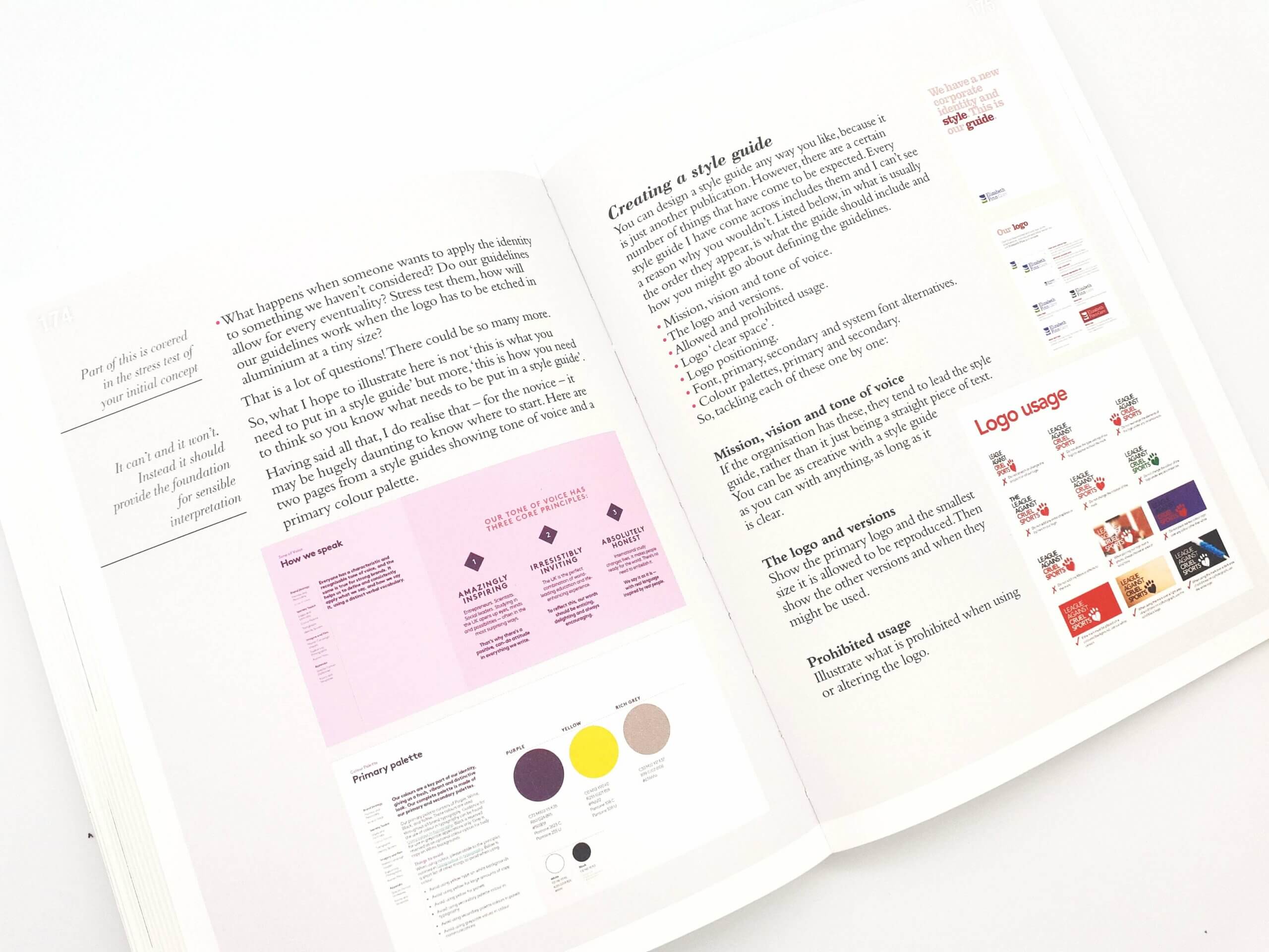
If you are familiar with the previous books you will be pleased to know that the layout is same as the previous books with the handy little snippets that include bullet points regarding certain areas that include tips and insights.
There are also the familiar notes and sketches areas at the end of the book for you to make notes on should you wish to do so.
Know Your Onions – Corporate Identity is jam packed with the information you need to understand what goes into designing a corporate identity.
Drew’s books are always enjoyable and a pleasure to read, I did read the book twice before writing this review as there is so much to learn and I love Drew’s style of writing.
A Quick Interview with Drew de Soto
The Logo Creative – What inspired you to write Know Your Onions: Corporate Identity?
Drew de Soto – Increasingly the Know Your Onions range of books are drilling down into design disciplines. But that does not make them specialist books. In this book (Corporate Identity) I talk about a lot of activities that a graphic designer may not be involved in, but will really help them become experts if they have an understanding of the wider picture.
To be honest, I like writing books and people seem to want to buy them and without sounding (hopefully) like I’m on my own personal ‘love in’, the feedback I get inspires me to write more.
The Logo Creative – What makes Know Your Onions – Corporate Identity different from other books that are similar?
Drew de Soto – I’ve been working in identity and branding for youks now and despite there being lots of books on the subject, a lot of them, to my mind, are full of flannel. My books are written for the vast majority of designers who face the real world challenges of being a designer. I try to suppress my ego and not show work I have done, unless it illustrates a certain point that I can’t practically do otherwise. I’ll often invent a project if I need a specific example.
The book is more about delivering an identity than looking at projects that have already been done. A lot of other books are full of the author’s work, I’m not a fan of showcase books, as you probably can tell.
The Logo Creative –How do you position your books in the current market?
Drew de Soto – I looked at the other books currently available and most were showcases of other agencies’ or designers’ work. The ‘How to’ books were basic and sub-standard. I positioned my books as the go-to source of practical information to give designers the skills they need to become experts in their field.
If you know my other books (not including The Art of Parenting – wanna review that?) they are the sort of thing you sling in your bag and refer to. I’ve seen some well thumbed copies of Know Your Onions: Graphic Design knocking about and it is nice to see them well used.
The Logo Creative – What is your mission and vision for the Know Your Onions books?
Drew de Soto – This is a great question and could only be asked by someone who has read the book!.
The mission is to produce inspiring, informative books, written in a light-hearted, down to earth and practical manner.
The vision is to build on the Know Your Onions range and deliver a wider set of learning tools, to help designers be the best they can be.
Gordon Bennet, the way those two paragraphs are written hardly fit with the ethos, do they? Maybe this is better:
Have fun, write some jokes, impart some knowledge.
The Logo Creative – What advice would you give to graphic designers who want to specialise in corporate identity design?
Drew de Soto –
- Know the subject inside out.
- Realise it isn’t alchemy.
- Design for the market, not for your ego.
- Back up your thinking.
- Focus your portfolio on your passion.
- Start small but think big.
The Logo Creative – What are the biggest mistakes an identity designer might make?
Drew de Soto – There are so many, get married to young, drink on an empty stomach, underestimate the importance of being on time. But the biggie is probably working for free. Unless it is for your mate or your Mum.
The Logo Creative – How do you define the scope of one of your books?
Drew de Soto – Wow, hard question. Even though identity design is a vast subject, there are a number of principles and processes that most projects share. When I wrote the first draft of Know Your Onions: Corporate identity it was a third longer than the final printed copy. I think I could have gone on forever.
The aim with all of my books is to give the reader an understanding of the subject, get them to expert level. I could write a complete volume just about colour for instance, but where do you stop?
If I get it right, once you have read the book you’ll know what’s what and how to do it. If you want to read about colour theory, there are plenty of resources out there.
The Logo Creative – What process do you take when writing one of your books?
Drew de Soto – Pour a large scotch and… no seriously. I start with a list of the top level subjects, a content list. Underneath I add in sub sections. This bit takes no time at all. Then the next step is to write like a demon. I just bash it in filling each section like a stream of consciousness. I try to ‘talk’ to my readership – it is a conversation.
That takes a month.
Then it takes 6 months to edit it and even longer to illustrate it.
When that is done, the real work starts and the bit I hate, Proof-reader’s, checking for duplicates, sections being in the wrong place and things I have missed out. This part of the process is a bit of a slog.
When I come out of it at the end, with what is really a first proof of a book, without fail, I have self-doubt. I am convinced it is rubbish.
Through more tedium that you can imagine, after endless iterations (I think my last book was coming in at nineteen) eventually, you have the shape of a book.
I don’t recommend it really. But like giving birth – it’s worth it in the end.
The Logo Creative – Are there any other books in the pipeline?
Drew de Soto – Erm, yes, but unlike me I don’t think I can be as candid as I usually am. Why? I hear you cry. Well, writing one takes a long time and I dyslexic so I have to get it read a hundred times and then there is my publisher (who is the best) but can be a bit keen when it comes to release dates (:-)>
I’ll keep writing them if people want to read them, and people like you review them. Sound fair?

Know Your Onions; Corporate Identity by Drew de Soto is available on Amazon UK and US

