Very few managed to do for esthetic of advertisement and pop-culture of the second half of the XX century as much in general, as graphic designer Saul Ross did. Martin Scorsese called him a person who found and distilled poetic of the modern industrial world. Apart from Scorsese, the designer managed to work with Hitchcock, Preminger, Kubrick and Billy Wilder for over 40 years of his career, created about 100 of movie posters, was a filmmaker, made several the most recognizable logotypes of American corporations, which are popular until now.
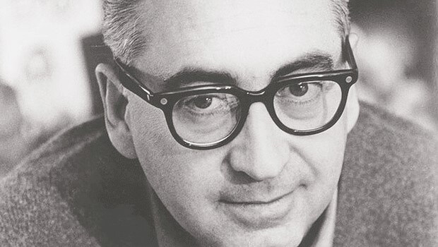
Table of Contents
Early days
Saul Bass was born on May 8, 1920 in Bronx, New York, in the family of Ukrainian Jews emigrants. He exhibited an artistic streak early in the childhood covering with sketches almost everything he could find. Graduated from James Monroe senior high school, a 15-year old Saul entered Art Students League of New York, combining it with night lectures of his main inspirer and mentor Hungarian artist венгерского художника Gyorgy Kepes. Literally, after a few simple advertising projects, Bass gets a permanent job in Warner Bros New York office.
In the year 1946, Bass moved to Los-Angeles. In erstwhile capital of architectural and designer modernism, the list of his employees filled in with such big names as TWA and Paramount very fast. Back then, Saul took on very simple projects: chevrons for aircraft tails, шевроны на самолётные хвосты, Art & Architecture magazine covers, record covers (the most remarkable is Tone Poems of Color by Sinatra record cover, which has become classic) and posters of Chaplin`s Monsieur Verdoux tragicomedy.
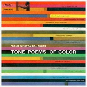
frank Sinatra
Tone Poems of Color
Such a high productivity led to the birth of Saul Bass & Associates company in 1952, under the aegis of which many independent projects of Saul were released. Also, back in those time, Bass was a fine participant of many conferences on design where he was speaking about ideas of his main inspirers Arts and Crafts and Bauhaus movements could be improved esthetically and ethically and changed environment and society.
Cinema impact
Closer to the middle of 1950`s, Bass was in active search of form, which would be able to satisfy his creative hunger better than logotypes of corporations and advertisement projects did and successfully found the answer in cinema production. Substantially, in his famous entrance full motion videos, the style of which is recognizable by practically everyone: human hands whittled out of a paper, disposed around nervously jumping in beat with blunt jazz lyrics soundtrack never before such official, it would seem, things as opening credits were so bright and tone giving to the whole picture before it even starts.
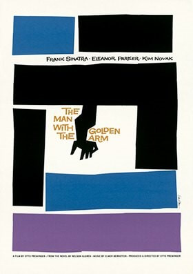
The Man With The Golden Arm
When it comes to titles and posters design, Saul Bass used more of an iconographic kind of approach, making a point to set the mood before anything else, which made it to where he moved away a lot from traditional narrative literacy. Naturally, such an innovation made a much-needed figure in Hollywood out of the designer: in 1954, he created animation for The Man With The Golden Arm by Otto Preminger`s opening credits, stories about heroin addiction of jazz musician, whom Frank Sinatra played; at the same time, credits for The Big Knife dark noir of Robert Eldritch came out and a The Seven-Year Itch light-minded comedy with Marilyn Monroe.
His collaborations with Alfred Hitchcock are considered to be the most recognizable. The designer created posters and credits to numerous films of the film producer including the great Vertigo, North by Northwest and Psycho, and for the latter Bass personally wrote a few symbolic scenes, including the famous shower scene with Janet Leigh and Martin Balsam on the stairs. Apart from works with Hitchcock, Saul Bass was mentioned as visual consultant in credits of the pictures of such film producers as Kubrick, Frankenheimer and Weisz.
Apart from classified handicraft things, Bass took for big kinoforms. In the middle of the 1960`s, he began directing documentaries successfully: in 1968-м his picture Why Man Creates was rewarded with Oscar for the Best Documentary, right after which three other nominations followed. In 1974 Bass shoot his first full-length feature film Phase IV, a classic Sci-fi about humanity and well-developed ants race struggling.
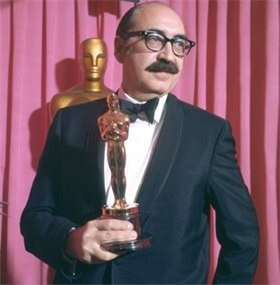
Saul Bass with Oscar for his
Why Man Creates film.
Coming round to the roots and back
During the period from the year 1970 to 1986, Bass, in a point of fact, took a break in work on cinema: created by him opening scenes can be count on one hand who`s left; those are Such Good Friends, Rosebud, That’s Entertainment Part II and The Human Factor. The designer explained the break in the interview for Sight & Sound magazine in 1995: «At some point, the opening credits format kind of ran out of control and it seemed as if someone just came out and tap-danced instead. Nice credits became rather tribute to fashion but not a practical usefulness; this was the time when I have decided on pulling out of the deal.
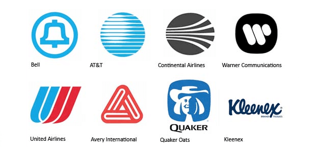
Continuing working on movie production of his own, Bass got back to his designer roots successfully implementing the most different corporative projects: Bell logotype with a recognizable bell opened a huge number of big corporations in front of the designer, which were in the list of the new brand image. Interestingly enough, that even doing tasks for the biggest companies such as United Airlines and Warner Communications, Saul Bass could create symbolic for United Way and YMCA non-commercial organizations along.
In 1987, a screenwriter and filmmaker James L. Brooks managed to lure Bass back in design of opening credits and posters for films and works for Broadcast News comedy hit opened the doors into the world of movie design for Saul. Appeared in a year in Big comedy block-buster by Penny Marshall, the designer turned back to nervosity and darkness of criminal movies through a long-lasting collaboration with Martin Scorsese, going through noir again with a remake of Cape Fear affecting classic mafia-style stylistic in Goodfellas and Casino. Scorsese and Brooks belonged to the army of relatively young film producers and designers who considered Bass to be one of the main inspirers. And who desperately wanted to work with an alderman of the movie design whose status has just established in the beginning of 1990`s when the designer`s works were exhibited in New York Visual Art Museum. Nevertheless, Bass reacted positively far on all favors: thus, in 1995 designer threatened Spike Lee with court for using originals of Bass`s designs for Anatomy of a Murder in the advertisements of his own Clockers picture. Due to media buzz, Lee had to come up with a campaign for promotion his movie all over again.
As is the case with any indisputably productive figure, Saul Bass`s death is hard to perceive as sudden and unexpected. The great designer died on April 25, 1996 of Hodgkin’s lymphoma, leaving a huge ideological and artistic heritage.
Impact On Young designers
Saul Bass has become an inspiration for innumerable number of young designers to rethink posters and films credits, which motivated to create a tumblr gathering all the examples and boards alike in Pinterest.
On Bass`s birthday, Google made an interactive doodle, clearly inspired by the designer`s works in cinema. Here is what doodle maker has to say: “As it turned out in the correspondence with Jennifer Bass, Saul Bass was a fan of Dave Brubeck. Although I did not synchronize animation and music, we found the track, which fit in within the beat”
 Author Bio
Melisa Marzett who happens to be a movie lover and a huge fan of Alfred Hitchcock appreciates Saul Bass`s help in work with the legendary filmmaker. Currently working for star-writers.com, she provides with masterpieces in the area of guest posting dreaming of becoming at least half as legendary in the sphere of writing as Saul Bass was in his field of activity.

