Before we go any further, let’s get one thing straight, I AM NOT A GRAPHIC DESIGNER.
Now we’ve shone a spotlight on the elephant in the room, he can go and eat sugar cane and relax.
“So”, you may ask, “what the holy-heck is a non-graphic designer doing writing a post for The Logo Creative?”.
Beyond the shameless quest for publicity, I thought it might be refreshing to offer a slightly different perspective on the world of branding.
First, here’s a peek at my credentials, just to prove I’m not totally unqualified:
I studied Graphic Design – for four flippin’ years, surely that’s got to be worth something.
I’ve worked as an Art Director and Copywriter in London advertising agencies.
I was a partner and Creative Director of a design and advertising agency for 14 years – yes F-O-U-R-T-E-E-N – WHOLE – Y-E-A-R-S.
And now I’m freelancing – concepts/copy/alternative thinking (oh and I designed my own logo below, so that should give you something to point and giggle at).

I am most definitely not a Graphic Designer, but with all that under my belt, I reckon I’m at least allowed an opinion.

Table of Contents
The cornerstone of a brand
What’s the most important asset a brand has? “Its logo” I hear you cry.
Well, there’s no denying the importance of a logo. Online, offline, at the back of the cupboard behind that old jar of marmalade – your logo goes everywhere the brand goes. Yes, a great logo is the cornerstone of a successful brand. But, I would argue, it is no more important than a brand’s attitude, the tone of voice and language.
To illustrate my point and prove that I’m not totally mad, let’s look at a couple of well-established logos that we’re all very familiar with.
McDonald’s
Go on, what do you think of when you think of Maccy D’s? I’m not talking about the food, I’m talking about their values and the feeling that you get when you start to conjure up their place in the universe. Putting any negatives aside, I’d argue that McDonald’s = youthful, cheerful, a bit cheeky, light-hearted and for the people.
So if we look at their logo, the world-famous golden arches (introduced in 1962) and assume we have no prior knowledge of the company, not even what they’re selling, what would the takeout be?
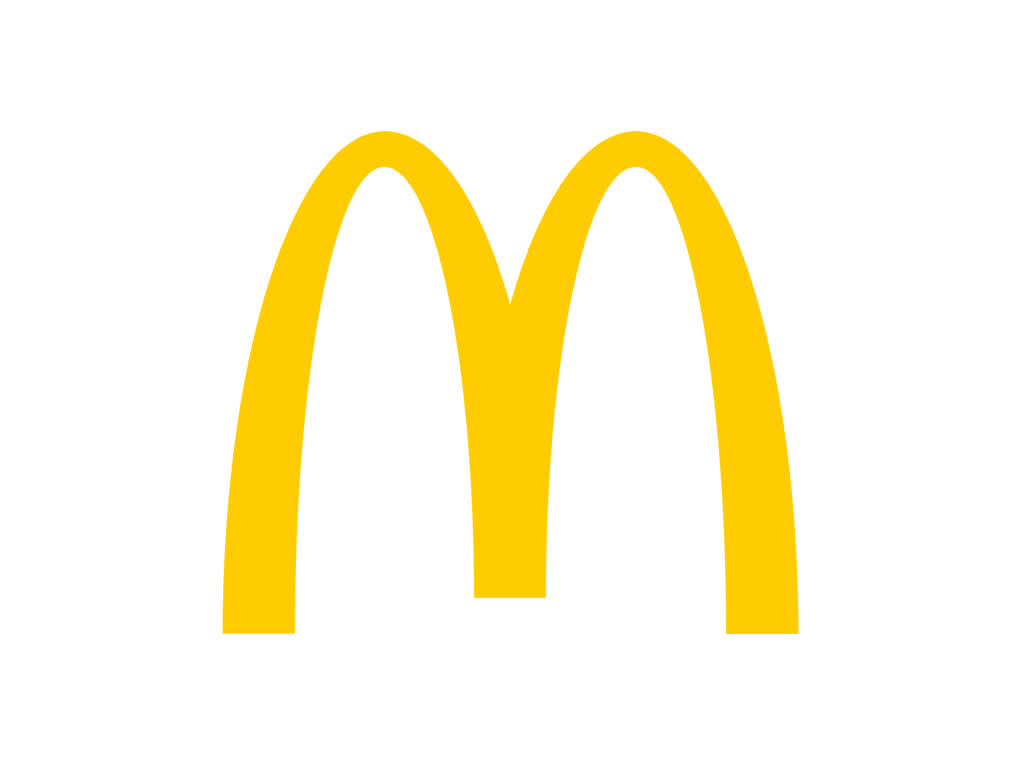
I can only go with my opinion on this (if you disagree, that’s what the comments section’s for), but looking at it cold, I’d go with McDonald’s = cheap and cheerful, a bit old fashioned and on a similar aesthetic level to Poundland.
Now, if we attach the logo to recent marketing materials (the bit where the brand’s language can shine), we get a very different picture.
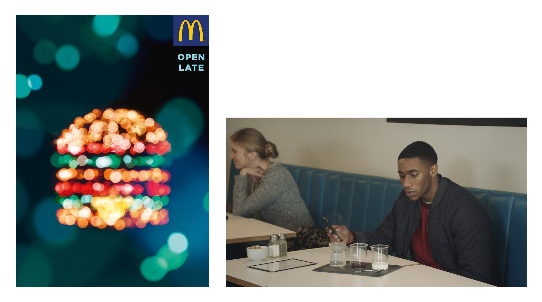 A ‘bit old fashioned’ has been transformed into witty, intelligent and charming.
Try doing that with just a logo.
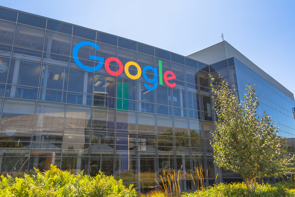
Brands don’t come much bigger than Google. But let’s look at their logo in isolation.
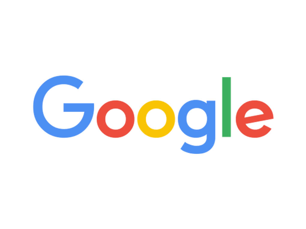
If I wipe my memory clean of everything I already know about Google, my gut reaction is: naïve, council-run nursery school and a bit dull.
As we all know, Google is pretty much the opposite of all that. Their brand language and personality are really what Google is all about. Modern, intelligent, vibrant, confident, open, the human side of technology…
Their core cultural values, aka ‘Ten Things We Know’, say it all:
1. Focus on the user and all else will follow.
2. It’s best to do one thing really, really well.
3. Fast is better than slow.
4. Democracy on the web works.
5. You don’t need to be at your desk to need an answer.
6. You can make money without doing evil.
7. There’s always more information out there.
8. The need for information crosses all borders.
9. You can be serious without a suit.
10. Great just isn’t good enough.
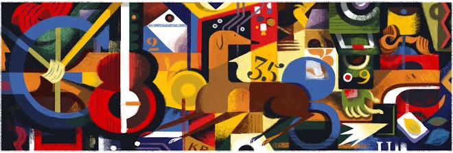
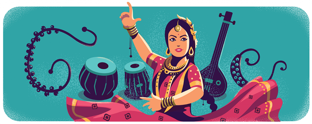
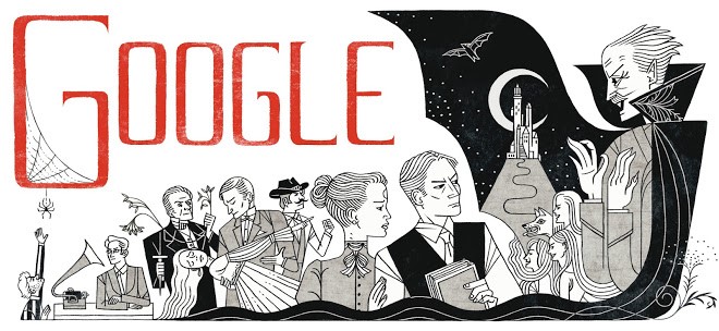
This ‘challenge the norm’ approach makes little things like Google doodles possible. Just compare these to the core logo and see where brand attitude can take you.
Where do you start without a brand personality?
I had a meeting the other day with a business owner. During the conversation, he proudly announced that his company had re-branded. He excitedly handed over a very smart looking business card, resplendent with their new logo.
As the meeting went on, he said that he was concerned that although the company was doing OK, they had no real presence on social media. Their blog was also dead in the water and their website hadn’t been updated for ages. “We’d like you to help us get our brand out there with great content that people want to share”.
‘My first two questions were, “Do you know what your brand stands for? and Have you decided on a tone of voice?”
The blank stare said it all.
They have a lovely, shiny new logo, colour palette and typefaces, but a gaping hole where their brand’s personality should be. Without this, how can they judge if the content they are pushing out is right for them?
Know your voice
In my opinion, a branding exercise isn’t about creating a new logo. It’s much more than this, and defining the brand’s tone of voice is a key part of the process.
Two or three generations ago, Art Directors sat in one part of an ad agency (in an oak-panelled room, smoking pipes) and the Copywriters sat in another department (dressed in tweed and sporting comb-overs). The Art Directors came up with visual ideas and then fed them through to the writers, so they could throw some clever words at them, and vice versa.
Then some bright spark said, “Hey, why don’t we get the Art guys to sit with the Copy guys (sorry, but they were all guys back then) and see what happens. And bingo, the creative team was invented. This creative structure may have broken down over recent years, but I would still argue that the Art ‘guys’ and the Copy ‘guys’ need to work together more closely.
A brand is made up of basic building blocks – colours, shapes, pictures and words. Each one, as important as the next. Get them all just right and you’ll make something magical.
So, next time a client says they need a new logo, remember to call the writer.

Author Bio
Jonathan Wilcock has worked in London advertising and design agencies as both Copywriter and Art Director. He was Creative Director on the P&O Ferries account and a Partner at Remedy Creative. He is now freelancing as a Conceptual Copywriter/Content Writer/Creative Director/Art Director (“Call me what you want, just call me”) for advertising and design agencies across London and the South East under the So, What If… brand. www.sowhatif.co.uk

