When designing a logo there are many factors that go into creating a brand’s visual identity. Below is a list of areas a logo/brand identity designer should take into consideration when creating a logo design. Let’s take a look How To Level Up Your Logo Design Skills.
Table of Contents
Research, Research, Research!!!
Whenever you are starting a project for a client its imperative that you research their business and their competitors. It’s your job as a designer to understand what it is your client does and how to visually represent them to their target audience. You also what them to stand out from the crowd of competitors within there market.
Creating a Mind Map to Get Ideas Out Quickly
Mind Maps are a great way of visually organizing your ideas into a visual diagram. I like to write the company name in the middle of a piece of paper and branch off this with words associated to what the business does. There are no right or incorrect answers or ideas at this stage until you put them into practice it’s just a brain dump on paper of associated words to help with the ideation stage.
If your not a fan of using pen and paper then a great alternative is to use a service such as mindmeister.com this also gives you calibration abilities to share ideas with a team
Remember its a brain dump so just empty your head of all those ideas that pop up on to a mind map and this will enable you to join the dots at a later stage.
Create a Mood Board To Help Gather Inspiration
The overall goal when creating a mood board is to establish a particular style or concept by collecting images or words that best convey the character of the brand. I like to use a mind map for the collection of words and a mood board of the visual side of the project.
The mind map can help you a lot in clarifying what to search for. Think of patterns, textures, colors, shapes, fonts, people, objects, products, etc. but don’t just dump images randomly, be mindful of what they mean in regards with the client brief. Sometimes you don’t need the whole picture as the reference, only a piece you particularly like. So, save it, crop it, add it.
After you’re done with your selections, curate every single image and throw everything that’s it’s not aligned with the brief. 10 to 20 images will be enough to clarify the direction in which you visually want the brand to go. There are lots of tools you can use, you can start with Pinterest or Invision. I recommend making your mood boards Secret if you use Pinterest.
Your Best Friend is a Pencil and a Sketch Book
As a designer, you need to get all those ideas that are floating around in your head out on paper so you can visualise them clearly this helps eliminate the weaker ideas and expand the better ones. Don’t be tempted to digital first as you will miss the bigger picture.
The point of sketching is to communicate the essence of the ideas it’s not just to make things look pretty its part of documenting the process, sketching ideas and concepts is a very valuable tool in the logo designs creative process so make sure to do this as often as possible when designing logos.
Before you start the “I can’t draw rant” that’s ok you don’t need a degree in Art to be able to doodle and sketch rough ideas in a sketchbook. Start to develop a fear of losing your ideas this way you will capture them as soon as they appear in your head.
I use a nice little app called todoist this helps me organise my ideas and projects into lists with the ability to prioritize and sync to my google calendar.
Adobe Illustrator is For Designing Logos…Not Photoshop!
The amount of times I get messages and emails from designers asking should I use Photoshop to design logos..the answer is plain and simple…“NO!” “Why? I’m used to Photoshop!” I’m sure you are but it’s not for designing logos with. A logo needs to be in vector format and scalable Illustrator makes in easier to control shapes and paths and photoshop works with pixels and deals with raster or bitmap graphics and these graphics can sometimes look jagged since raster images are made up of individual colored squares, known as pixels.
If you’re scaling something up or down LIKE A LOGO, it can lose its quality very quickly. Photoshop is a popular choice for web graphics, photo editing and designs since those projects will stay at a fixed size.
Illustrator is advanced based vector program unlike Photoshop’s pixel-based format, it uses mathematical constructs to create vector graphics. In Illustrator, a line is composed of two dots connected by a computer algorithm, instead of just a line of pixels
This is the reason illustrator is used to create logos or anything that may need to be printed or displayed at different sizes. A vector graphic will never lose its quality if it’s scaled up or down. Illustrator will also give you a better print output since it’s not resolution dependent.
Design Logos In Black and White
Let get this straight. Color is subjective so don’t let that get in the way in the inception phase. If you ask for feedback, for example, some people will judge your logo by the color…it’s just the way it is. Play safe, leave color at a later stage so go with black and white.

Reflecting The Logo
Reflecting logos vertically or horizontally helps you to see inconsistencies and kerning issues but mainly force your brain to see shapes this applies to the word mark and also the symbol. So its a good idea to flip them now and then.
Running Out Of Ideas? Don’t Force it! Take a Step Back and Relax!
When you empty all those ideas out of your head, you can sometimes hit a roadblock. Don’t worry this is normal and expected, Try not to overdo it. Take a step back and have a break it’s as easy as it sounds.
Just disconnect yourself, Listen to some music Go for a walk in the woods sit by the lake or on the beach this will help clear your mind ready for the next step. It can also fuel inspiration at the drop of a hat you’ll be surprised. After you cleared your head, get back to the drawing board with fresh ideas. Good things take time.
Size Really Does Matter!
You need to take into consideration the logos size and adaptability when designing logos. The logo will be used in many applications such as huge signage and display boards to an app size icon all the way down to a favicon in the address bar of their website.
Make sure it looks good at various sizes to scale it down and print it out then refine and repeat the process

Logos Should Have Meaning
Behind every Logo there should be a story, great branding is good storytelling it strengthens your brand as a whole.
Emotional branding is a progressive marketing strategy that has the potential to drive revenue and increase customer retention. How a person feels about your brand typically determines whether they buy your product. A brand is a matter of perception. When you tell a story that embodies human challenges, you create an experience that resonates with your customers.
logos should be able to stand alone anywhere and people should know what and who it represents. A logo should be a harmonious combination of design elements that will be used to determine the rest of an identity. The shapes, colors, typography, and composition of a logo should be the foundation for every design element throughout a company. Whether it be the die cut of a business card, the nameplate on the corner office or the color of the company golf shirt. When people interact with those elements, they should be reminded of that logo and subsequently who and what it represents. If a logo can’t stand alone, then all of the accompanying elements will seem like a grab bag of random thoughts and your entire message will be overcome by user confusion.
Don’t Confuse Designing a Logo With Branding
There is a huge difference between the two and a topic and debate that has been talked about a lot of the years but to keep it simple I’ll explain the two.
- A logo also is known as the visual identity – Identity is a systematic package of illustrative devices that a business entity makes use of to convey information about its brand. These visual devices could be a logo, fonts or even a color system. Visual identity or visual identity system. So identity has to do with how your brand looks to your target audience. Being consistent also allows your target market to create or form a memory structure about who you are as well as what value you offer to them to make their lives better or happier. This is all part of the visual identity that showcases your organization to your audience.
- Branding – A personal connection, relationship that your organization or product has with its target audience or market. A brand condenses the most important features of the existence of an entity and translates its uniqueness to consumers. Brands (and the act of helping curate a brand: branding) are for building credibility and trust over a period of time with its premeditated target audience. It is a relationship that lives on. In a few words, a brand is your company’s “personality.” A brand, however, is earned, not made. It is the reward you get for building real and passionate relationships (which is the foundation for creating and delivering value in the marketplace today) with your target market over time.
Keep It Simple not Simplistic
Don’t try to over complicate a logo! Don’t try to convey several concepts into one. You will confuse people including consumers and potential customers. You need to focus on one design concept at a time. Define the idea and work around it.
Colour Meaning

The colour you like might not be the colour your client likes, Colour is very subjective. It’s important to not to just throw random colours into a design because they look good or another competitors logo has them.
It’s important to ask your clients if they have colour preferences and research colour meaning and does it align with the problem you are trying to solve. For example, the colour Blue is associated with professionalism, a trustworthy colour, Red is a very bold colour and can mean danger, or sexy etc.
Using Lose and Tight tracking
![]()
When designing type for a logo don’t just leave the font with the default spacing. Logos need their own personality, use tight (negative) or loose (positive) tracking (equal space between the letters) add that flair to your lettering make if different and unique to your design by combining tracking with uppercase and lowercase characters to see what works best.
Selecting Fonts
If your like many other designers out there that finds selecting fonts troublesome to make life easier below are some fonts that you can use in your logos.
Akzidenz / Avant Garde / Avenir / Bell Gothic / Bembo / Bodoni / Caslon / Clarendon / Courier Std / DIN Std / Eurostile / Franklin Gothic / Frutiger / Futura / Garamond / Gill Sans / Gotham / Helvetica / Rockwell / Sabon LT Std / Trade Gothic / Univers
If your wanting to use a free font try Google Fonts or there are sites like fontsquirrel.com and dafont.com Just make sure the font is free to use commercially as the majority of fonts downloaded from such sites can only be used for personal use only.
I personally love DesignCuts they have premium design resources including font bundles and the prices are fantastic plus they have a design bundle deals that include lots of different things that they practically give away at the price, it’s well worth checking out and the team over at Designcuts who are awesome and always happy to help. We use them personally and always get good deals.
*Word of advice “Free” is not always equal in quality and “Free” doesn’t always mean free when using them for client work so always check the licensing when thinking of using free fonts.
Logo Grids

Credit: Paul Von Excite
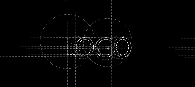
A logo grid or construction guide is a popular starting point for many designers looking to create a logo. The use of a grid system, especially for a design that might often render at extreme sizes – very large or small can help you create something that has visual harmony, an organized aesthetic and purposeful design.
Some logos are very complex designs and well executed in their presentation, with visible and logic construction lines, but many logos out there are not so good. If you don’t understand how composition works then all those smooth dotted lines, circles and to top it off with a golden ratio then to those people it becomes a gimmick or as I have heard so-called creative professional refer to it as “Making things look fancy”
But in reality, a logo grid is used to help aid the creation of shapes with geometric harmony in the logo building process.

Credit: Paul Von Excite
Logo grids are often made from an actual square grid, such as those used for grid paper like you used in school. But the structure of a logo grid can be expanded to much more. Some designers use circular logo grids and others create a unique grid system for each project that includes “invisible” lines for heights, the spacing between elements and whitespace.

The common factor in all logo grids is that they employ a sort of mathematical approach, where space and filled space is aided by placement along the grid in the design process.
Logo Function

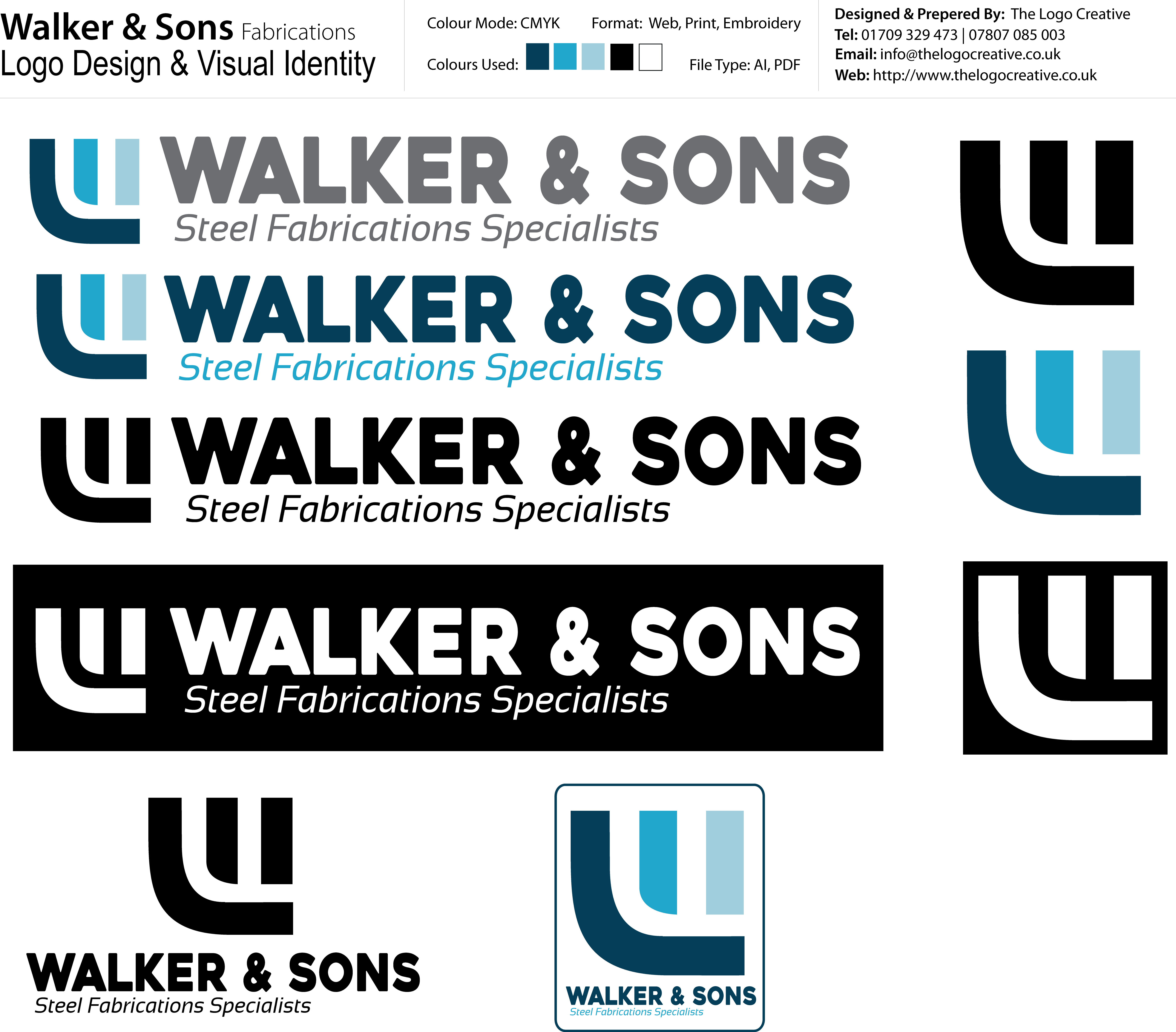
*Walker & Sons by The Logo Creative
Logs need to function in various situations so taking into consideration. The most common and obvious is how well does the logo work in black and white without colour. Logos displayed on black backgrounds can reveal inconsistencies and unwanted shapes, also check how well the logo renders on the brand colours displaying in horizontal and vertical alignment.
Horizontal and vertical logo positioning
Logos require great attention to detail as we need to think about how it will adapt to various situations and the materials its been displayed on. Readability and scalability and how the icon will look positioned above or at the side of the wordmark known as logo lockups.

The most powerful thing is context and making the logo “believable” and achieving this by applying it to a variety of mockups such as close up shots, business stationary like business cards, and letterheads, huge banners and shop signs.
Design Cuts have a tone of mockups plus new ones that get added regularly in their bundles (You get a lot for your money!!!) the resolution of these images are extraordinary there are some on the ak Financial portfolio with full resolution but the ones below have been shrunk for the purpose of this article to give you an idea.

We would highly recommend this great service from Design Cuts they really do have fantastic Design Mockup Bundles available.
Don’t just simply apply the logo and think this will sell it to the client, the mockup is your foundation on which you build so bring in colours, patterns, fonts and custom background images. Mockups do help sell the logo but the main purpose is so the client can see how it’s going to look in the real world you still need to educate your client and solve their problem.
Accept Client Changes and Critique
I know its easier said than done but hear me out, Critique is fundamental! and as designers, we are like leeches and attach ourselves to our designs and we dislike when someone hurts our feelings.
If you have ever had anyone say something bad about your work and you have been so ambitious to put them in their place and prove them wrong then your likely to accept those critiques and use them to your advantage.
One thing I can’t stand is when designers throw up a post on social media or in some group and ask for feedback I think this is really unprofessional and insulting to the client as they will be able to see this. My advice is to stop doing this! I know you want other opinions but there are better and more professional ways of obtaining feedback you can share it with a couple of designers privately that you get along with and trust or with a colleague in the office over a coffee. by doing it publically you’re setting your self up to those that just want to criticize and start something off so be mindful and respectful when doing this.
And the thing that I hate to see even more than that is when designers respond with “I don’t like any” or one-word answers like “none” or “crap” you know who you are and those kinds of answers don’t help anyone! and just make them look pathetic so its obverse that they just want to criticize or trying to look big. Sorry for the little rant but it is what it is if your doing this professionally then be professional!
Join The Logo Community
I hope this article has been helpful in learning how to Level Up Your Logo Design Skills and thanks for reading.
If you would like more personal tips, advice, insights, and access to our community threads and other goodies join me in our community. You can comment directly on posts and have a discussion.
*TIP – Looking to learn logo design online? We recommend you take the Logo Design Online Masterclass.


