What if logos could speak? Welcome to the fascinating world of literal logo design, were we share 15 brands with literal logo design at its finest!
These logos don’t just represent but literally embody what they stand for! Welcome to the fascinating world of Literal Logos, where design isn’t just about art; it’s about telling a story, capturing an essence, and sometimes, quite literally, spelling it out.
Table of Contents
The Art of Literal Logo Design
Logos are the visual DNA of brands—powerful communication tools that compress entire narratives into single, breath-taking symbols. Some brands have achieved something truly extraordinary: transforming their names into brilliant, memorable designs that speak volumes without uttering a single word.
In this fun yet insightful article, we’ll explore 15 iconic logos that have mastered the art of literal symbolic representation, revealing the intricate dance between typography, brand identity, and visual storytelling.
The Design Philosophy Behind Literal Logos
What Makes a Logo Truly Remarkable?
An exceptional logo is more than a graphic. It’s a:
- Cognitive shortcut
- Emotional trigger
- Brand narrative compressed into visual poetry
- Strategic communication platform
15 Iconic literal logo design Examples: A Global Minimal Perspective
When we think of minimal logo design, most people think simple logo mark or logotype, but it’s also in a brands name and how that name is presented visually, but what if a name could be spoken by a simple mark itself with no type? Now that takes minimal to a different level of design, and simplicity is now on a whole new level of visual communication.
Let’s take a look at 15 brands that have embraced their identity with such clarity and impact that their logo design is their name. In a world where complexity often overshadows essence, these brands have found a unique way to stand out by reducing their visual identity to the bare essentials.
Check out these 15 brands where the logo isn’t just a symbol; it’s literally their name!
1. Shell: The Geometric Shell of Energy 
The Shell logo is a masterpiece of simplistic symbolism, the current version was designed in 1971 by Raymond Loewy, it derived from an actual seashell, the design transforms a natural form into a global energy brand symbol. Its scalloped edges and geometric precision represent:
- Natural inspiration
- Industrial sophistication
- Global reach
- Elegant simplicity
2. Target: The Bullseye of Retail Precision 
The target logo was designed by creative director Stewart K. Widdess and his team, they came up with the brands name in a matter of weeks, just a few months before the store opened, and the bullseye target logo was in planning stages from the get-go.
This second version with less circles was introduced in 1968 with the type changing over the years.
Target’s logo is perhaps the most literal interpretation of its name. The bold red bullseye isn’t just a logo—it’s a strategic design that:
- Communicates precision
- Creates instant brand recognition
- Symbolizes accuracy and consumer focus
- Transcends typical retail branding
3. Apple: The Bite of Innovation 
The 1977 apple logo designed by Rob Janoff is properly the world’s most recognised symbol, but its more than a fruit silhouette, Apple’s logo represents:
- Technological rebellion
- Minimalist design philosophy
- Playful innovation
- Global technological leadership
The subtle bite mark transforms a simple apple into a complex narrative of curiosity and disruption.
4. Dove: Symbolic Purity and Softness 
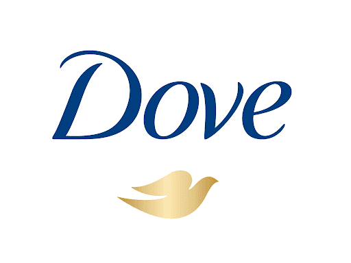
The Dove logo is iconic and it made its debut in 1957, with the vision to challenge societal beauty standards and uplift women’s self-esteem Dove’s logo goes beyond a mere bird symbol. It represents:
- Gentleness
- Emotional softness
- Natural beauty
- Inclusive brand messaging
The elegant dove silhouette communicates purity and grace, perfectly aligning with the brand’s personal care philosophy.
5. Red Cross: Universal Symbol of Humanitarian Aid ✚
The International Red Cross and Red Crescent Movement started in 1863 and was inspired by Swiss businessman Henry Dunant.
The suffering of thousands of men on both sides of the Battle of Solferino in 1859 upset Dunant. Many were left to die due to lack of care.
A perfect literal representation—a red cross that transcends language and cultural barriers. It symbolises:
- Global medical assistance
- Humanitarian neutrality
- Emergency response
- Human compassion
6. Blue Apron: Culinary Craftsmanship Visualised 
Blue Apron arose as a homage to world-renowned chefs who wore blue aprons whilst learning the art of cooking.
Transforming a simple cooking accessory into a brand identity, Blue Apron’s logo represents:
- Culinary creativity
- Home cooking revolution
- Ingredient storytelling
- Modern meal preparation
7. Puma: The Athletic Leap 
The puma logo symbolises the brands vision of strength, agility which are characteristics that Rudolf Dassler wanted his products to embody.
More than an animal silhouette, Puma’s logo captures:
- Dynamic motion
- Athletic performance
- Predatory precision
- Brand agility
8. Jaguar: Automotive Elegance and Power
The original leaping Jaguar symbol meets the core values of a performance-luxury brand, representing grace, elegance, performance, power and ambition to leap forward.
The original leaping jaguar symbolises:
- Speed
- Luxury
- Predatory performance
- Automotive excellence
9. Red Bull: Energetic Symbolism 
The Red Bull logo represents exhilaration and energy, first founded in Australia in 1984.
The drink was first crafted for Muay Thai fighters, the warriors of Thailand’s ancient martial art. The logo? It’s a vivid scene where two red bulls stand poised for battle, a sight as iconic to Thailand as the temples of Bangkok.
Here, the bulls aren’t just animals; they’re symbols of raw strength. The colour red? That’s the spirit of perseverance, the never-give-up attitude of the fighters. And behind them, the sun rises in a burst of bright yellow, signalling a new day, a new challenge, and a new fight.
Dietrich Mateschitz, with his keen eye for cultural meanings, masterfully wove these elements into the Red Bull logo, preserving the essence of Thai culture while creating a global icon.
Two bulls locked in dynamic tension represent:
- Extreme energy
- Competitive spirit
- Market-disrupting philosophy
- Youth-oriented branding
10. Python: Coding Elegance 
There is no official or clear explanation for the two snake icon, from my research I have read it may have been based on the ancient Mayan drawings, but I suppose naming the programming language company Python it makes sense to include a snake, so why not include two instead.
The colour blue and yellow is a reflection of professionalism and creativity, evoking a sense of confidence and stability.
The python snake logo symbolises:
- Programming simplicity
- Elegant code design
- Technical creativity
- Open-source philosophy
11. FireFox: Digital Navigation
The idea behind the Firefox logo is straightforward, and really doesn’t need an explanation, but according to Wikipedia
“The Firefox logo depicts an orange fox partially surrounding and overlooking a globe.
While the initial design of the logo depicted a phoenix, it was changed to depict a fox after the name of the web browser was changed from Phoenix to Firefox. This logo was updated three times: in 2009, in 2013, and in 2017. Over the course of these redesigns, the logo transitioned to a more flat and texture less version.”
A fox wrapping around a global sphere represents:
- Web exploration
- Digital speed
- Global connectivity
- Technological adaptability
12. Penguin: Literary Tradition 
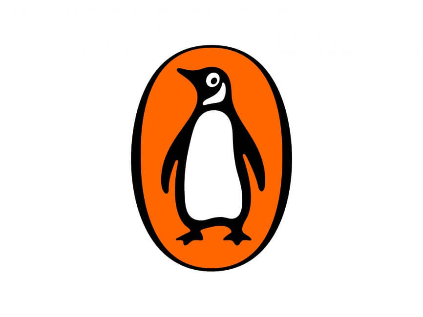
According to Penguins website the story behind this Iconic logo is in 1935 21 year old Edward Young went on a trip to London Zoo, and the birds he went to see became his inspiration for the book company’s logo.
The penguin logo symbolises:
- Publishing heritage
- Intellectual curiosity
- Classic storytelling
- Literary innovation
13. Domino’s: Game-Inspired Branding 
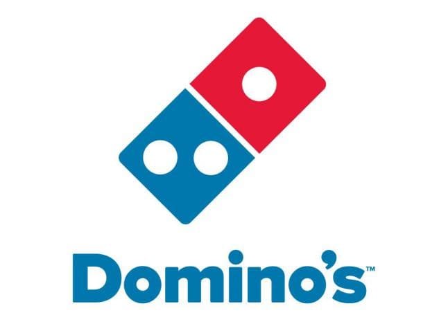
A domino tile transformed into a pizza delivery narrative:
- Playful brand identity
- Strategic visual messaging
- Cultural connection
- Food service innovation
14. Acorns: Financial Growth Metaphor 

A simple acorn represents:
- Financial potential
- Investment growth
- Natural investment philosophy
- Organic financial planning
15. Panda Security: Protective Technological Elegance 
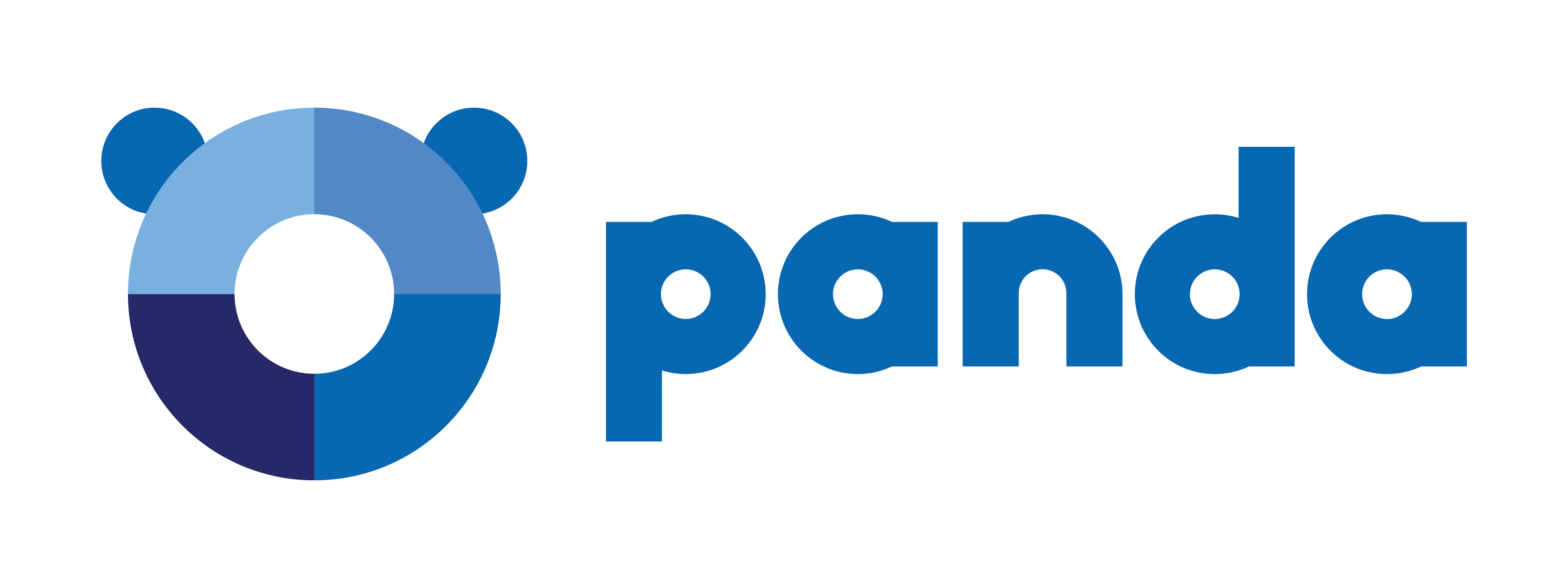
A panda symbol communicates:
- Digital protection
- Gentle yet powerful security
- Approachable technology
- Global cybersecurity
Conclusion: Beyond Graphics, Toward Narrative
These 15 literal logos prove that design is never just about looking good. It’s about telling a story, creating an emotional connection, and communicating complex ideas through elegant simplicity.
Design is a language. These logos? They’re visual poetry.
Logo design enthusiasts, which logo speaks to you most? Share your insights and join the conversation in our community chat about the power of visual storytelling! 

Join The Logo Community
We hope you have enjoyed this article about Literal Logo Design. If you would like more personal tips, advice, insights, and access to our community threads and other goodies, join us in our community.
You can comment directly on posts, access our community threads, have a discussion and ask questions with our founder Andrew.
If you’re looking to learn more about brand strategy, we highly recommend eRESONAID with our friend and acclaimed brand strategist and author Fabian Geyrhalter, it’s packed full of knowledge and insights you will need to learn to become a brand strategist or apply what you learn within your own business.


Author Bio
Andrew Marriott is the owner and founder of The Logo Creative™. He is an award-winning designer with over two decades of experience designing logos and specialising in branding for companies worldwide.
FAQ – Literal Logo Design
What makes a logo design "cross-cultural"?
A cross-cultural logo successfully maintains its meaning, appeal, and effectiveness across different cultural contexts while avoiding offensive or inappropriate elements in any market. It considers cultural symbolism, colour associations, and linguistic interpretations across various regions.
Why is cross-cultural logo design important for global brands?
Cross-cultural design is crucial because a logo that works well in one market might be ineffective or even offensive in another. Poor cultural adaptation can lead to costly rebranding efforts and damage to brand reputation. Successful cross-cultural logos help brands maintain consistent global recognition while respecting local sensitivities.
What common mistakes do brands make in cross-cultural logo design?
Common pitfalls include using culturally insensitive symbols, not checking linguistic meanings in different languages, ignoring colour associations in various cultures, and failing to consider religious or traditional taboos. Some brands have had to redesign their logos after discovering unintended negative connotations in certain markets.
How do successful global brands research cross-cultural implications?
They typically employ extensive market research, consult with local cultural experts, conduct focus groups in target markets, and perform linguistic checks across multiple languages. Many brands also test their logos with diverse focus groups before launch.
Can you provide examples of logos that needed cultural adaptation?
While some brands maintain consistent global logos, others adapt their designs for specific markets. For instance, some companies modify their logos’ colours or typography to better resonate with local audiences while maintaining their core design elements.
What elements make a logo more likely to succeed across cultures?
Successful cross-cultural logos often feature simple, clean designs that rely on universal symbols or concepts. They avoid complex cultural references and typically use shapes and colours that have positive or neutral associations across different societies.
How long does it typically take to develop a cross-cultural logo?
The process can take several months to a year, including research, design, testing, and refinement phases. This timeline allows for thorough cultural validation and necessary adjustments based on feedback from different markets.