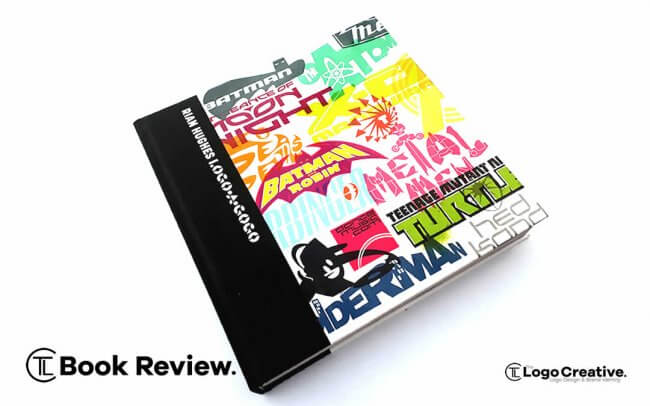
Logo-a-gogo is a logo book that’s Jam Packed with almost 5,000 images, Logo-a-gogo is an inspirational visual history of the iconic brand identities created by British designer Rian Hughes who has over three decades of experience as a comic book illustrator and type designer. The book was released in the UK in April 2018.
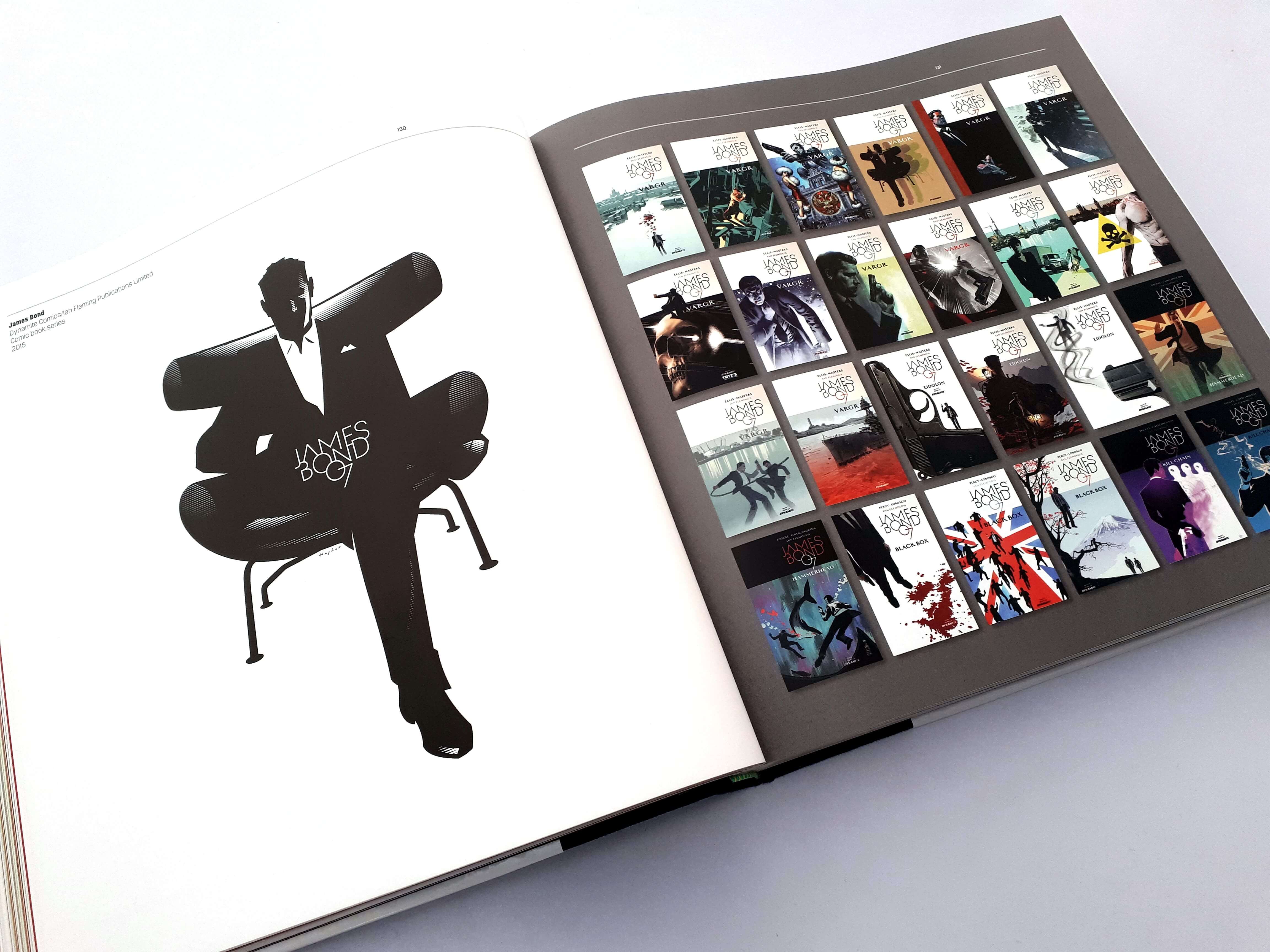
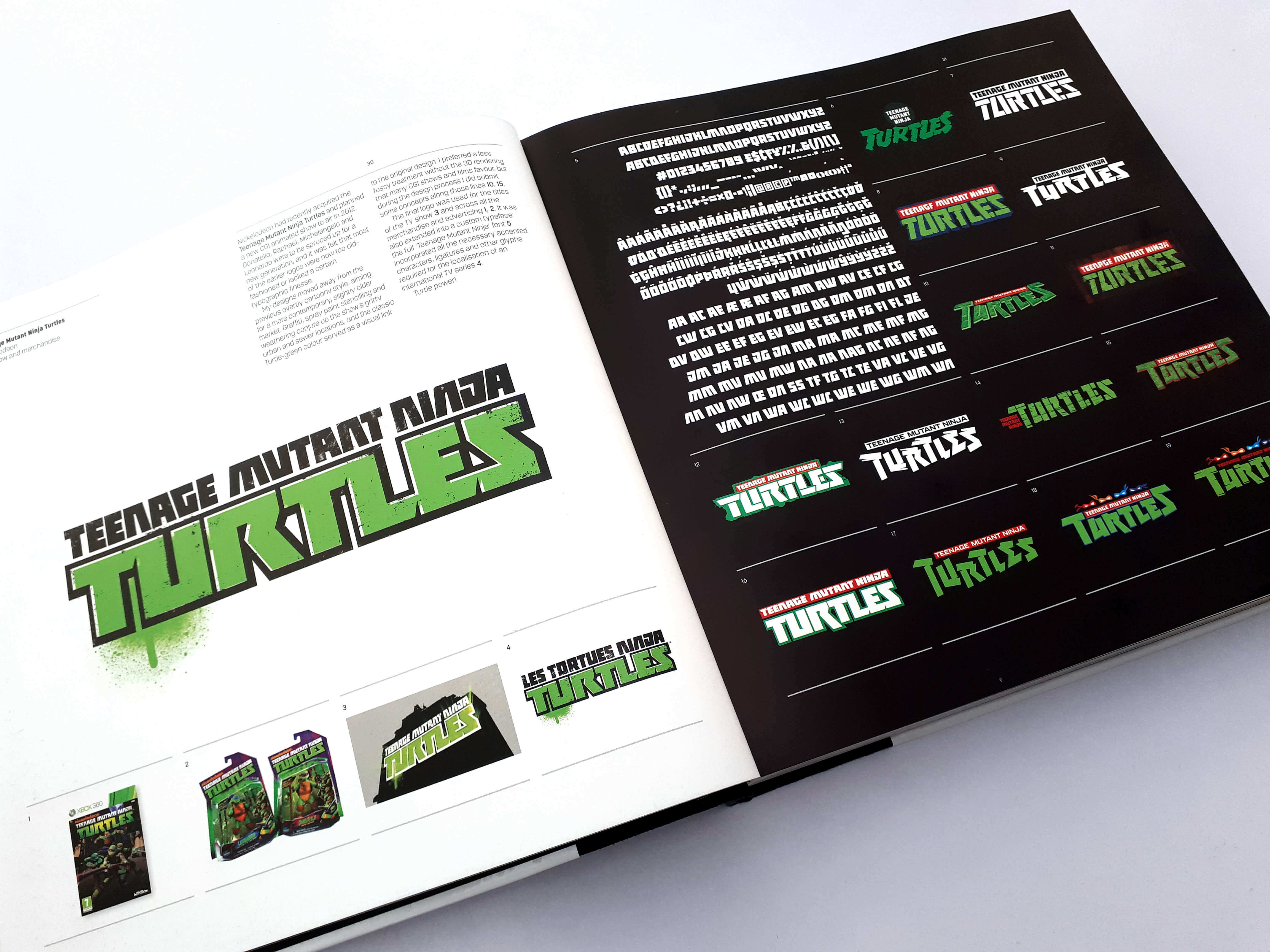
It features iconic characters and brands such as Batman, Hed Kandi, Spider-Man, James Bond, The Avengers, and Teenage Mutant Ninja Turtles.
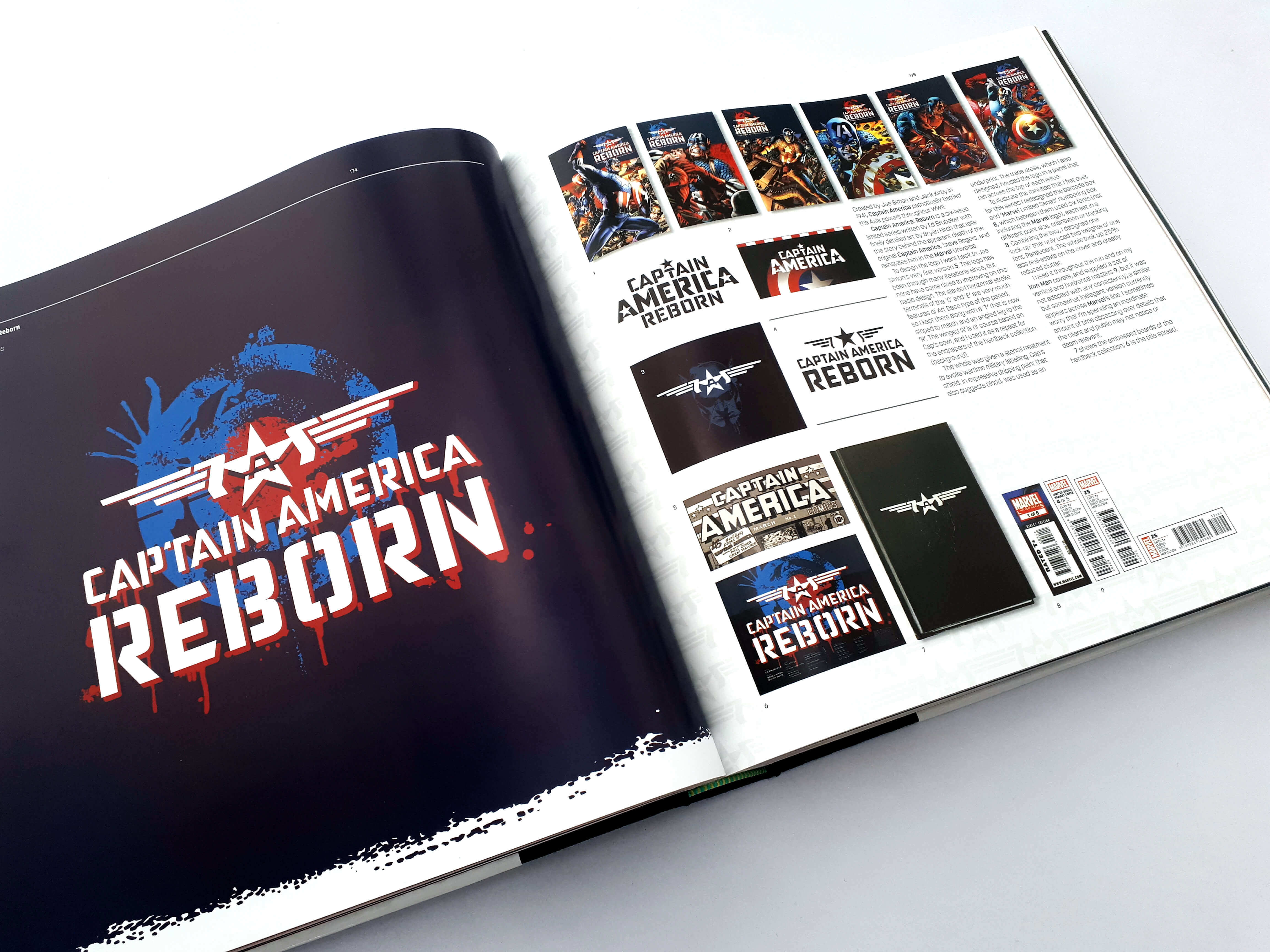
It features a host of case studies revealing the makings behind his famous comic book logos – including Batman and Robin, Spider-Man, the X-Men, Captain America, Wolverine and those for his other diverse range of clients including bands, Toys, Television, Book Covers, Magazines, Music Artists and fashion retailers to international corporations.
I would like to thank Rian Hughes and Korero Press who were kind enough to send us a copy, and it was nice to chat with them on the phone as they took a great interest in what we do here at The Logo Creative for our readers.
I would also like to thank Rian for taking the time to answer our question which can be found after the book review.
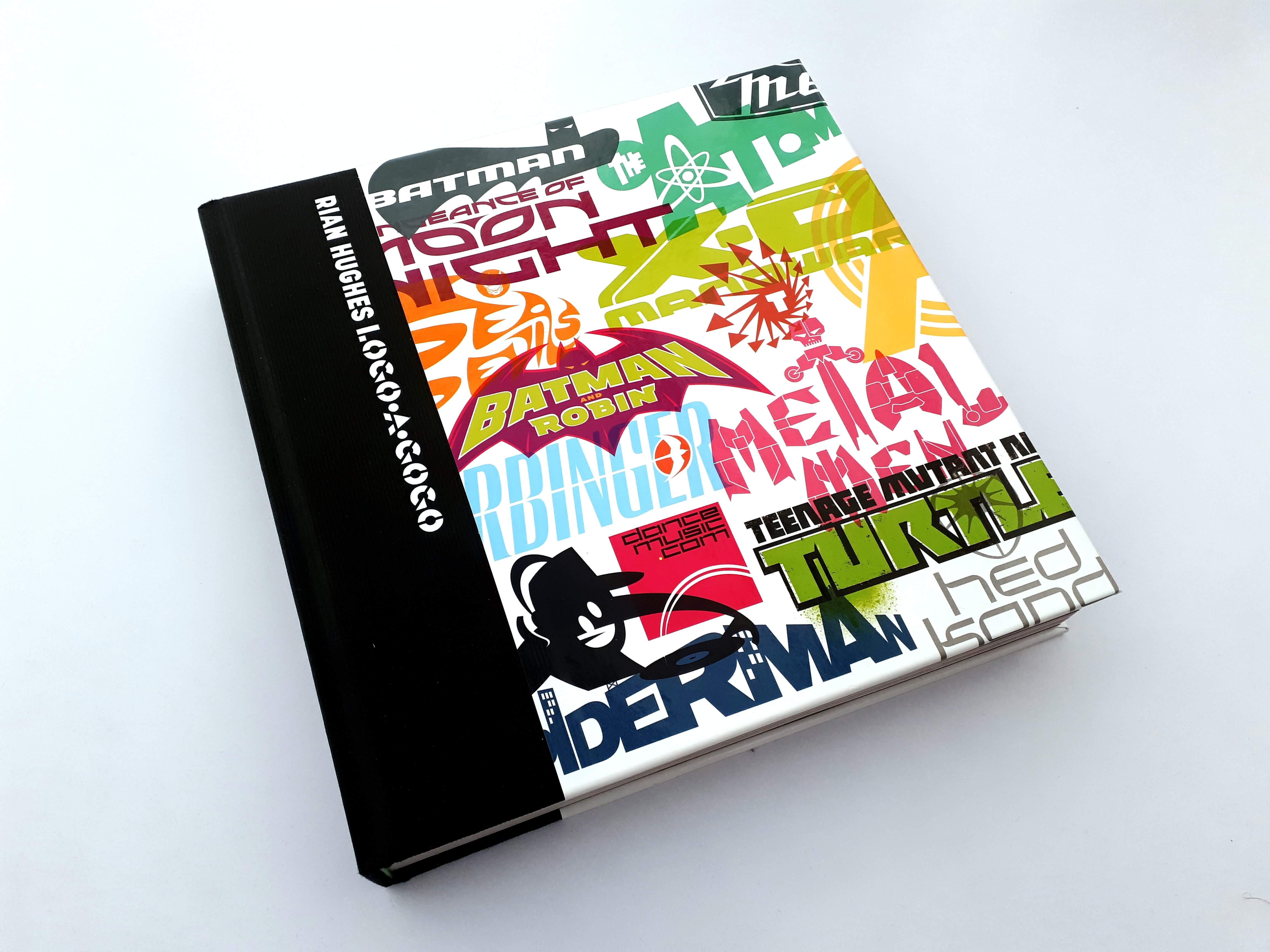
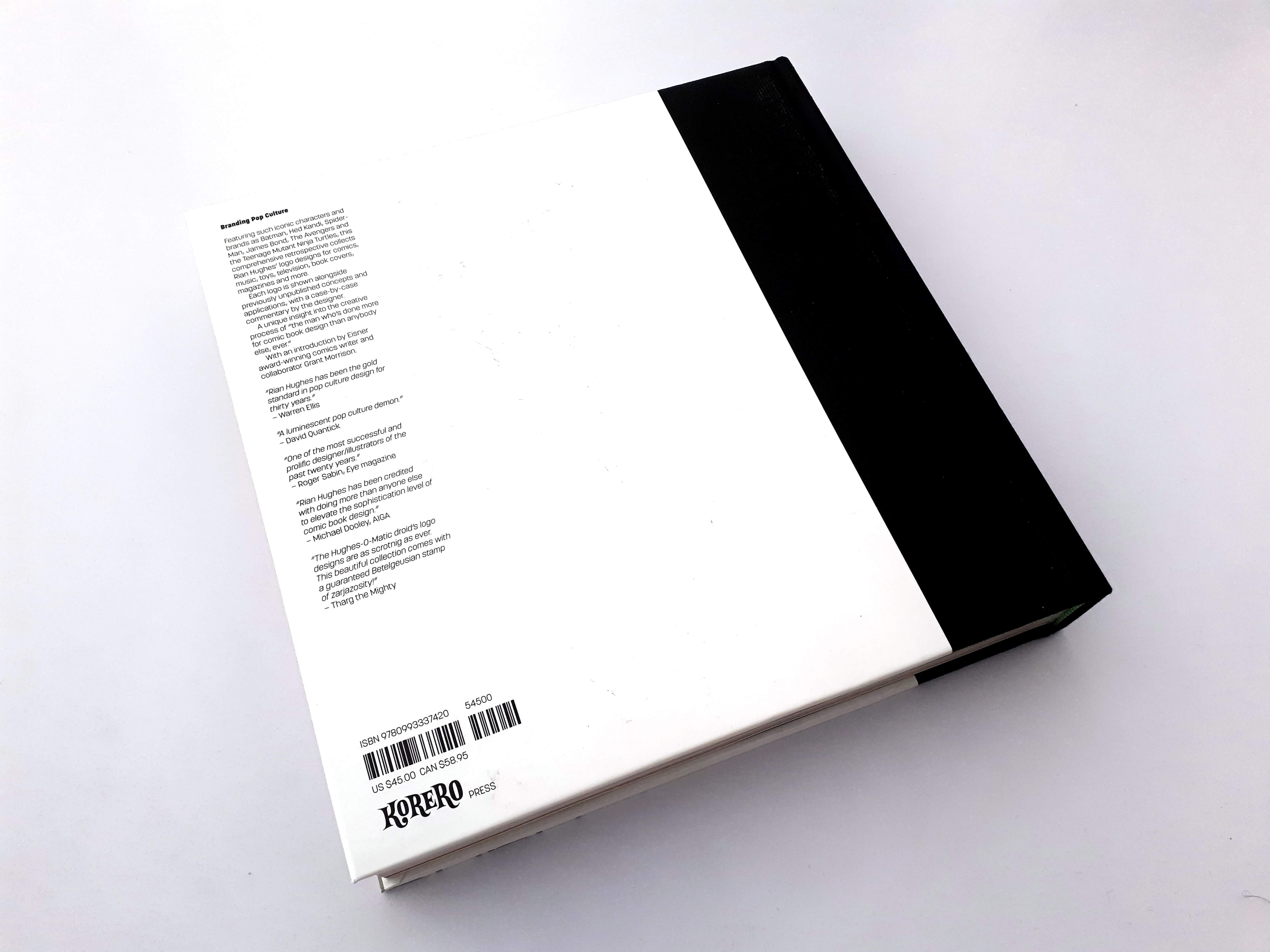
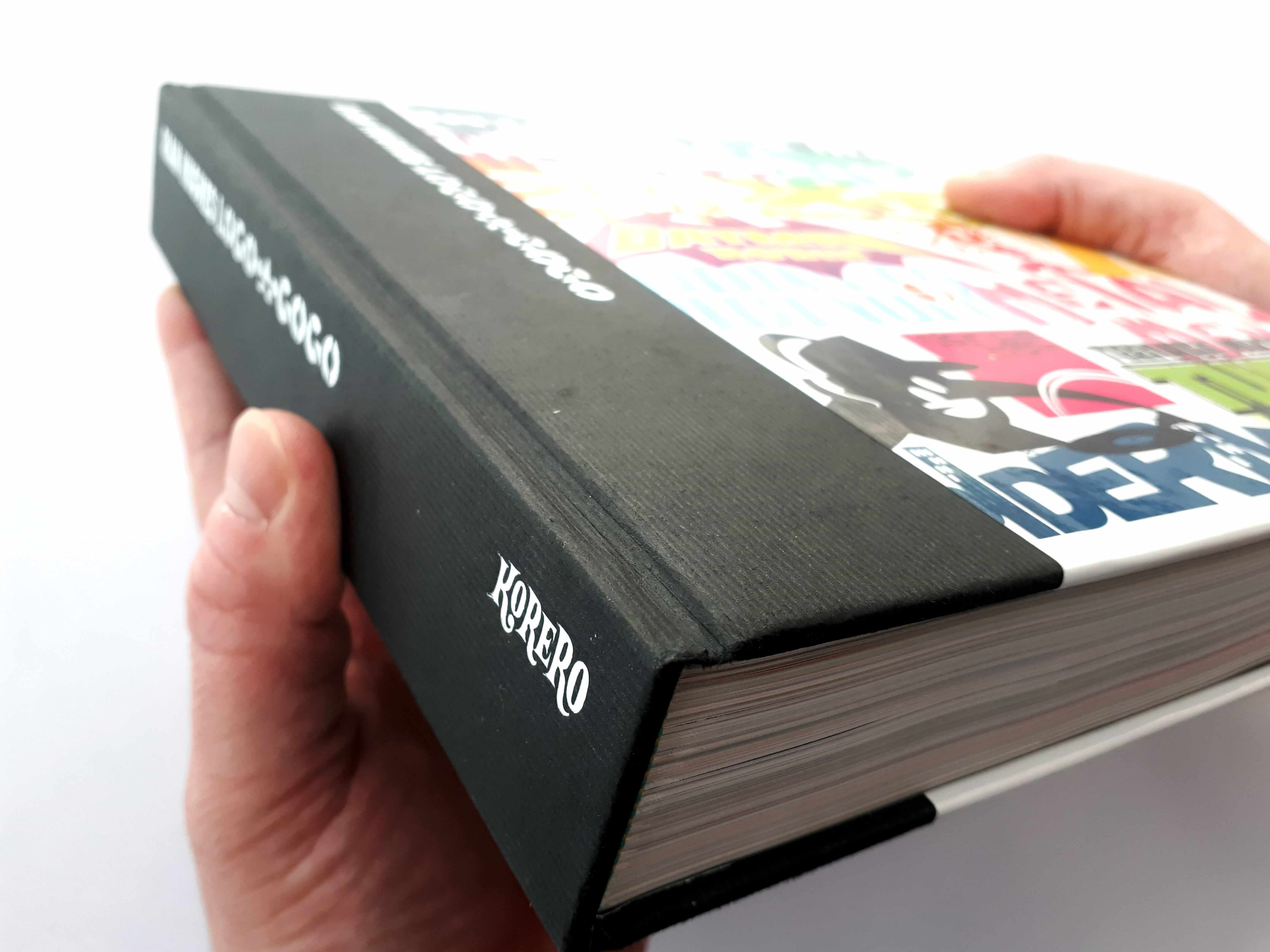
As I do with all our book review I’ll start with the physical book and cover design.
The book is very well made with a premium feel and quite heavy with its near 600 pages. The spine of the book is solid and very strong as it will need to be as you flick through the book millions of times as its just pure eye candy to look at.
The cover of the book is bright and colourful displaying some of the logos Rian has designed which perfectly sets the tone for what you will find inside.
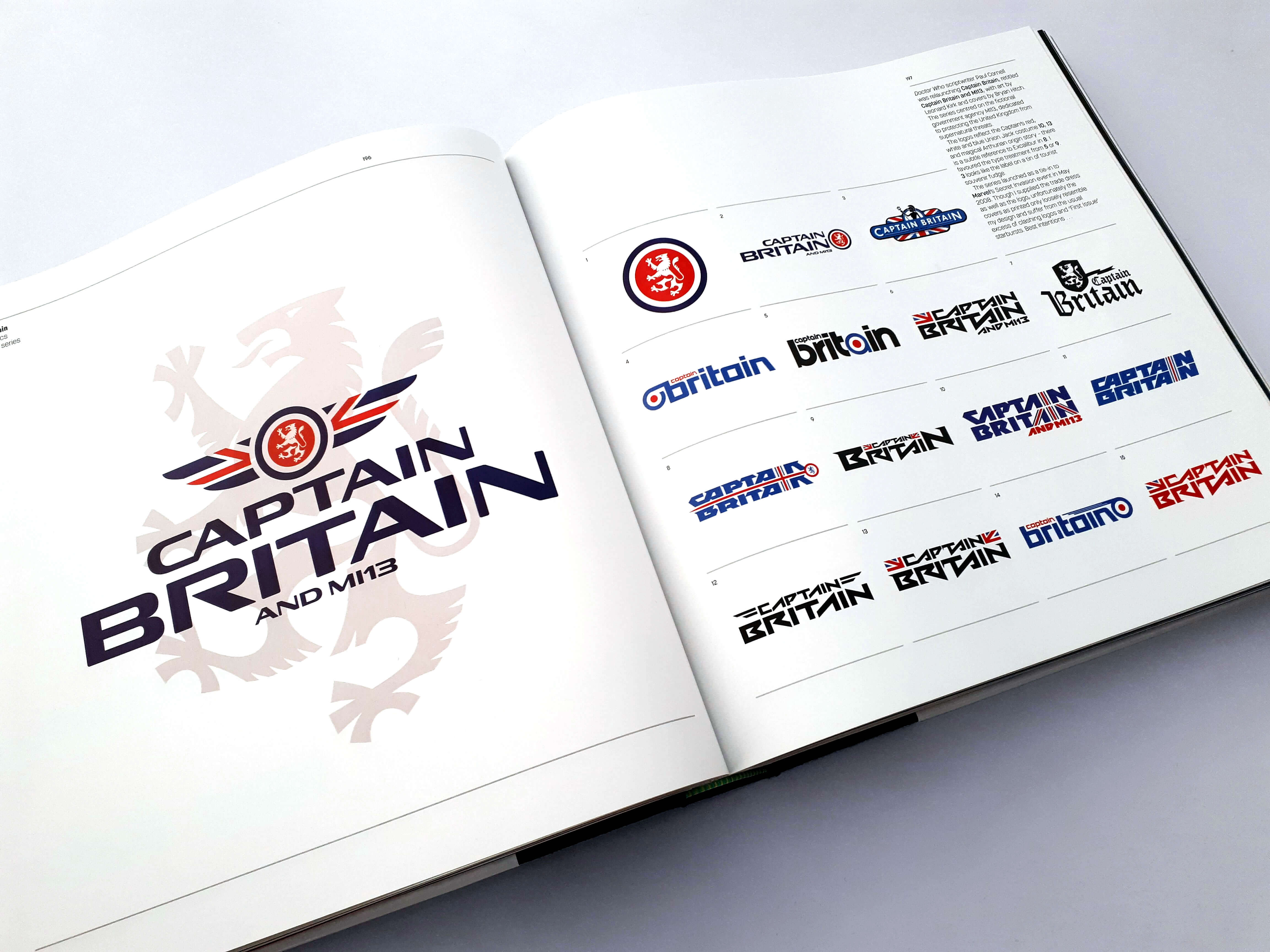
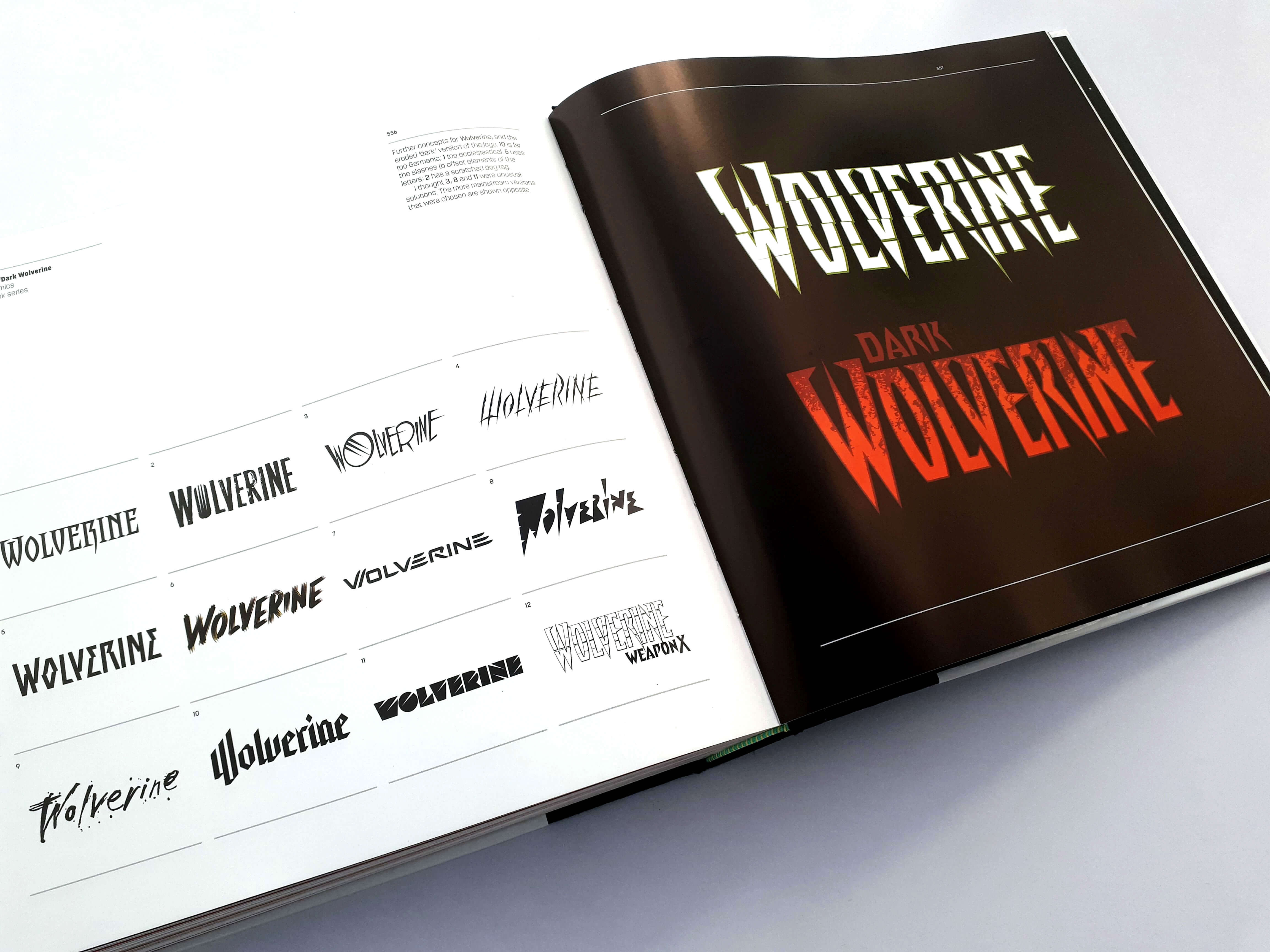
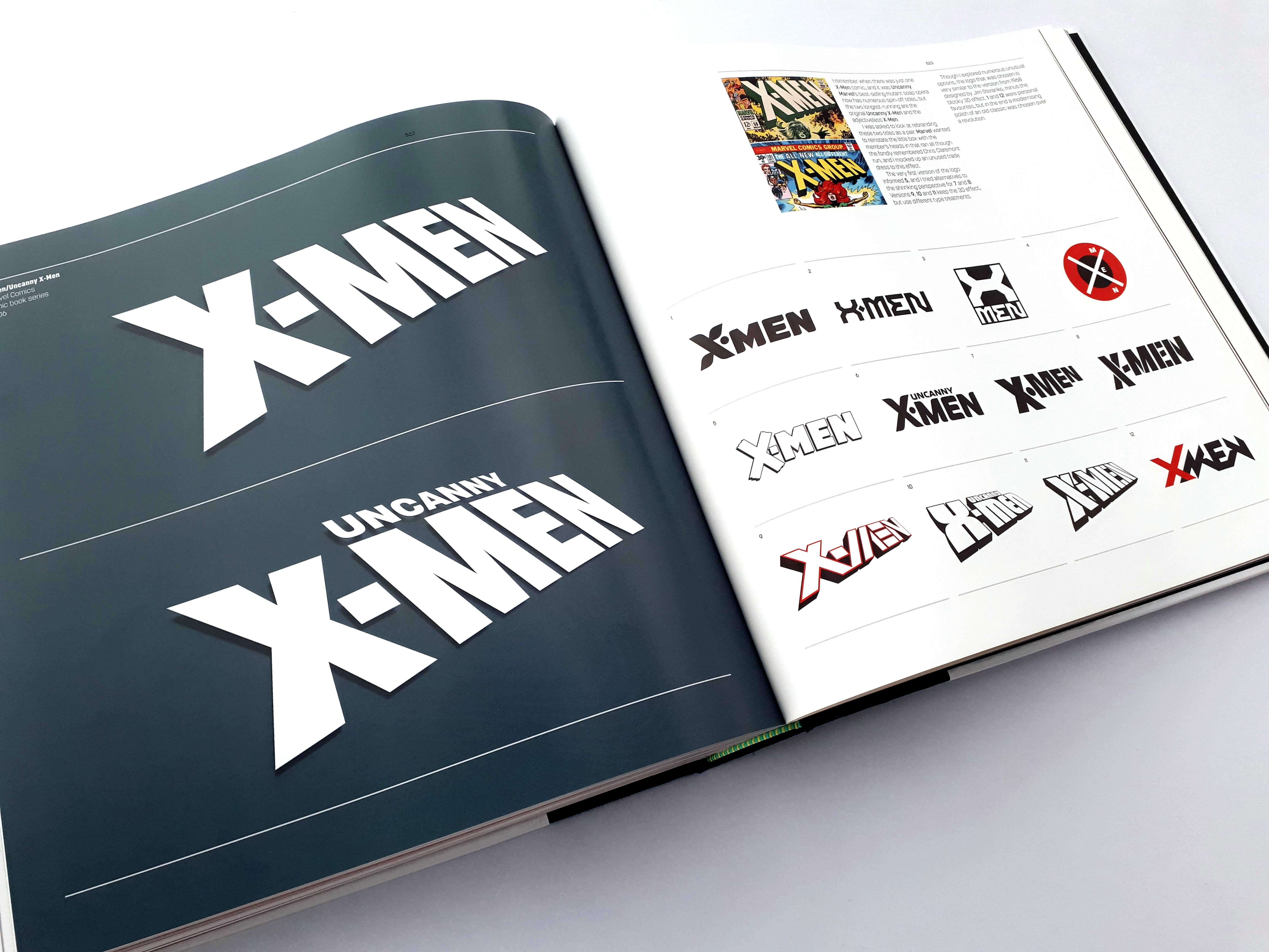
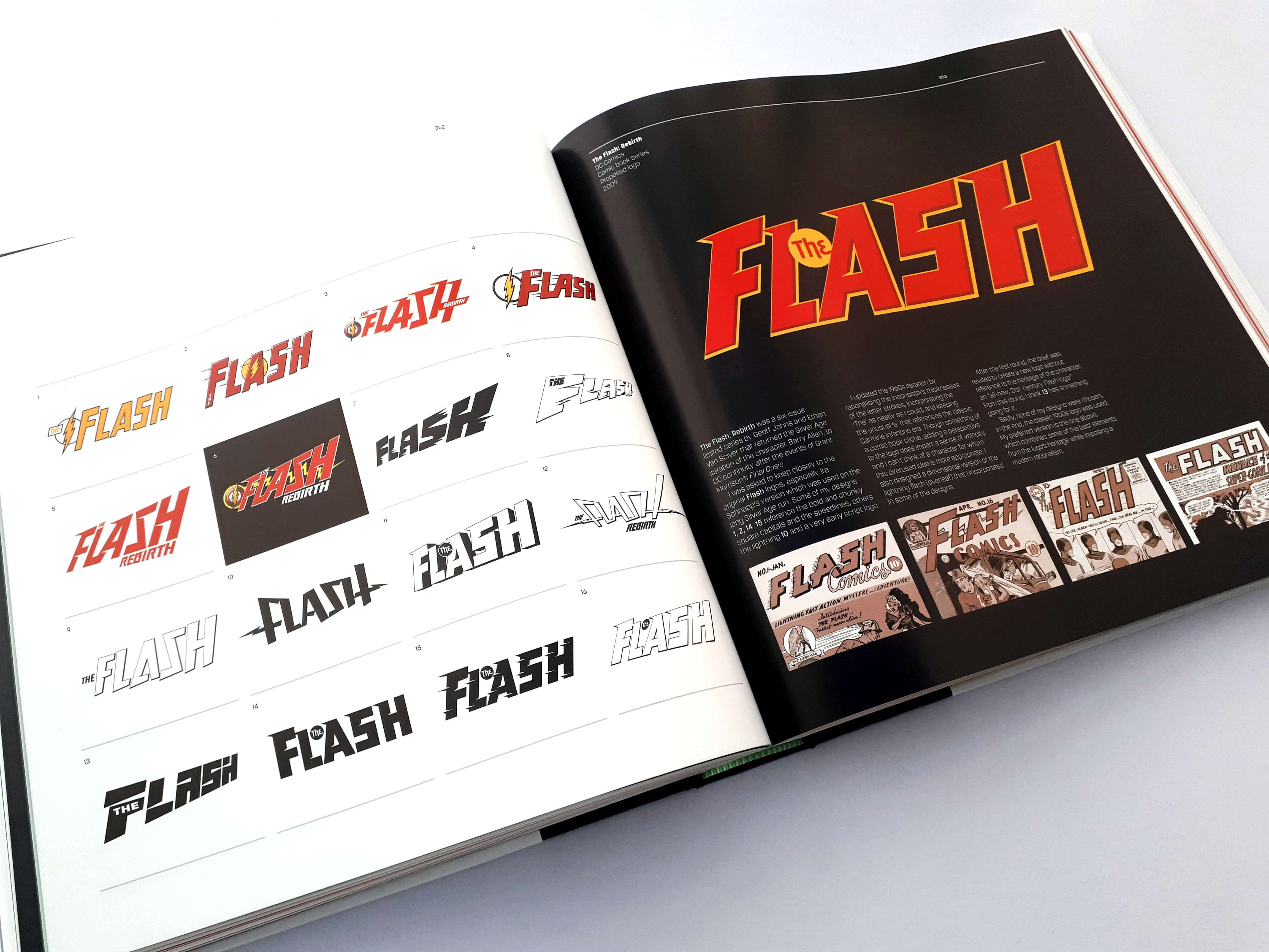
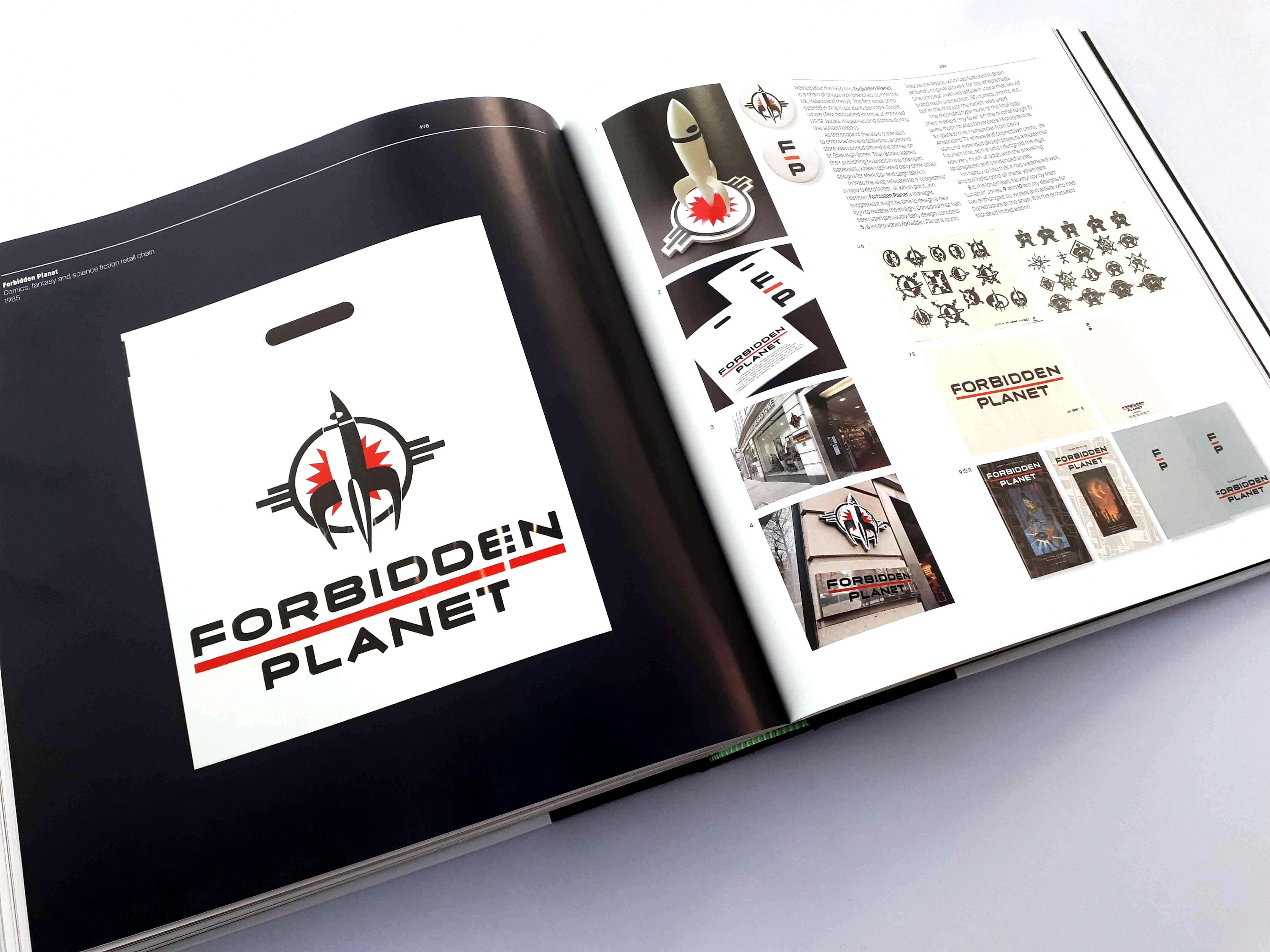
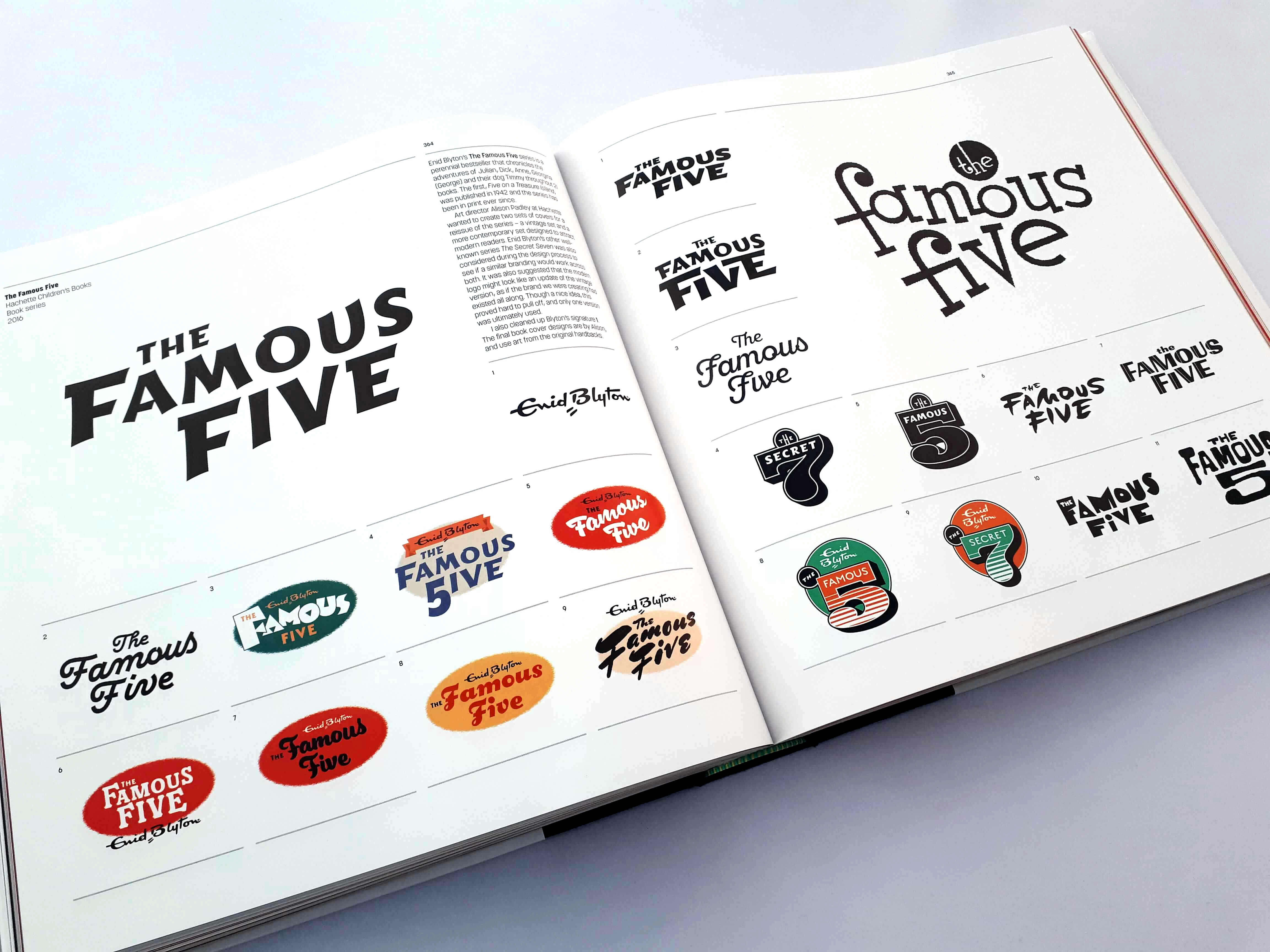
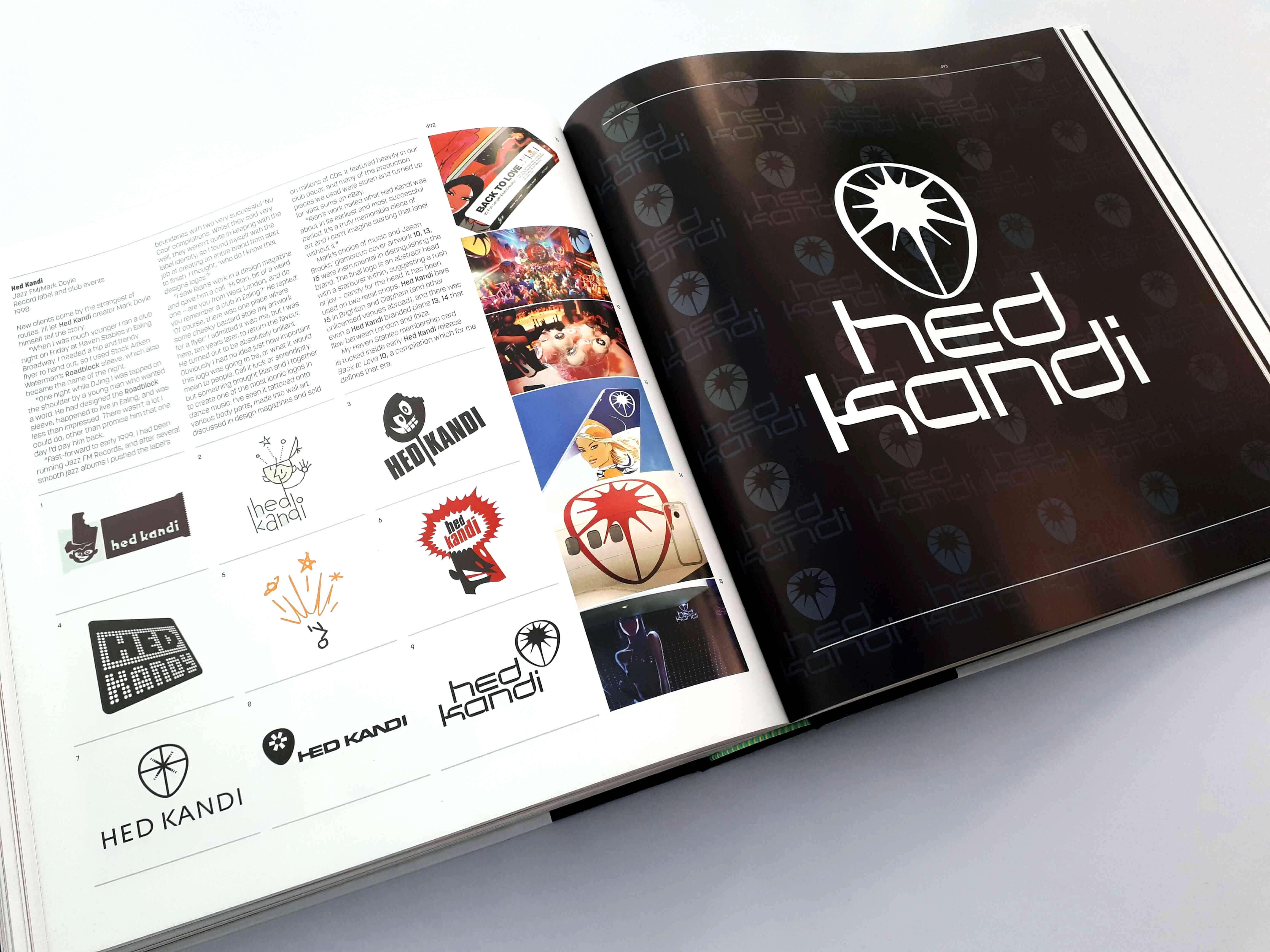
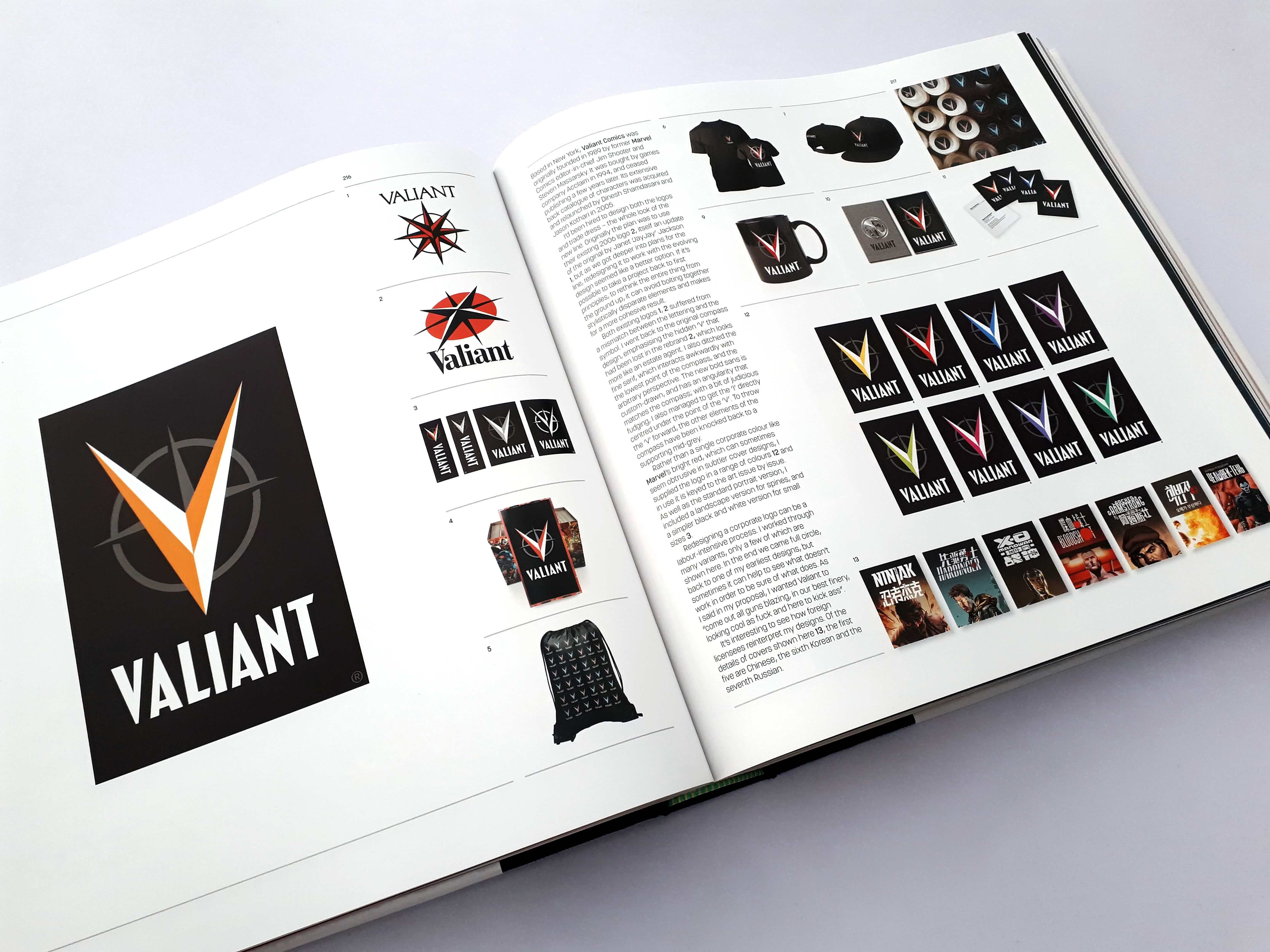
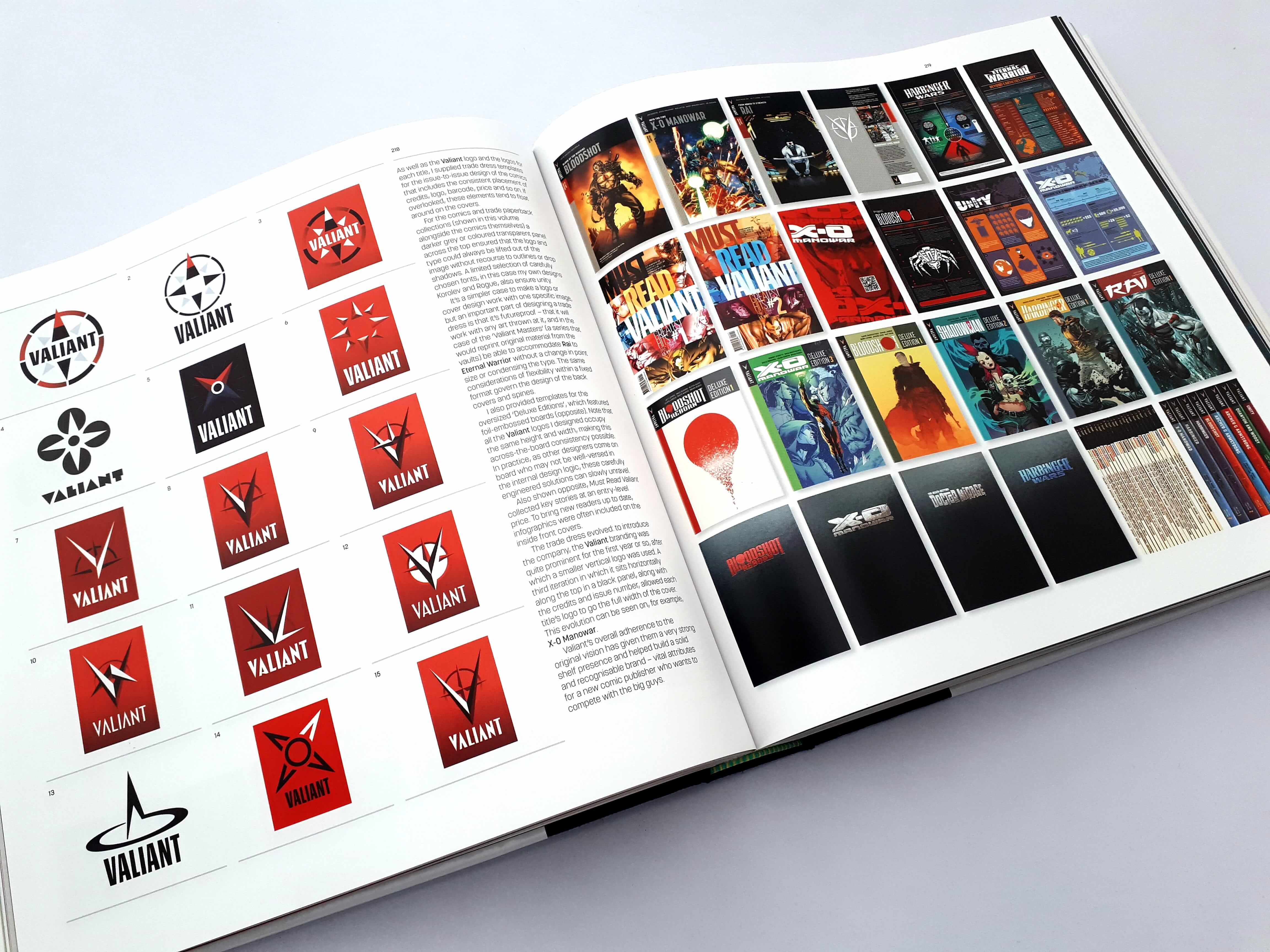
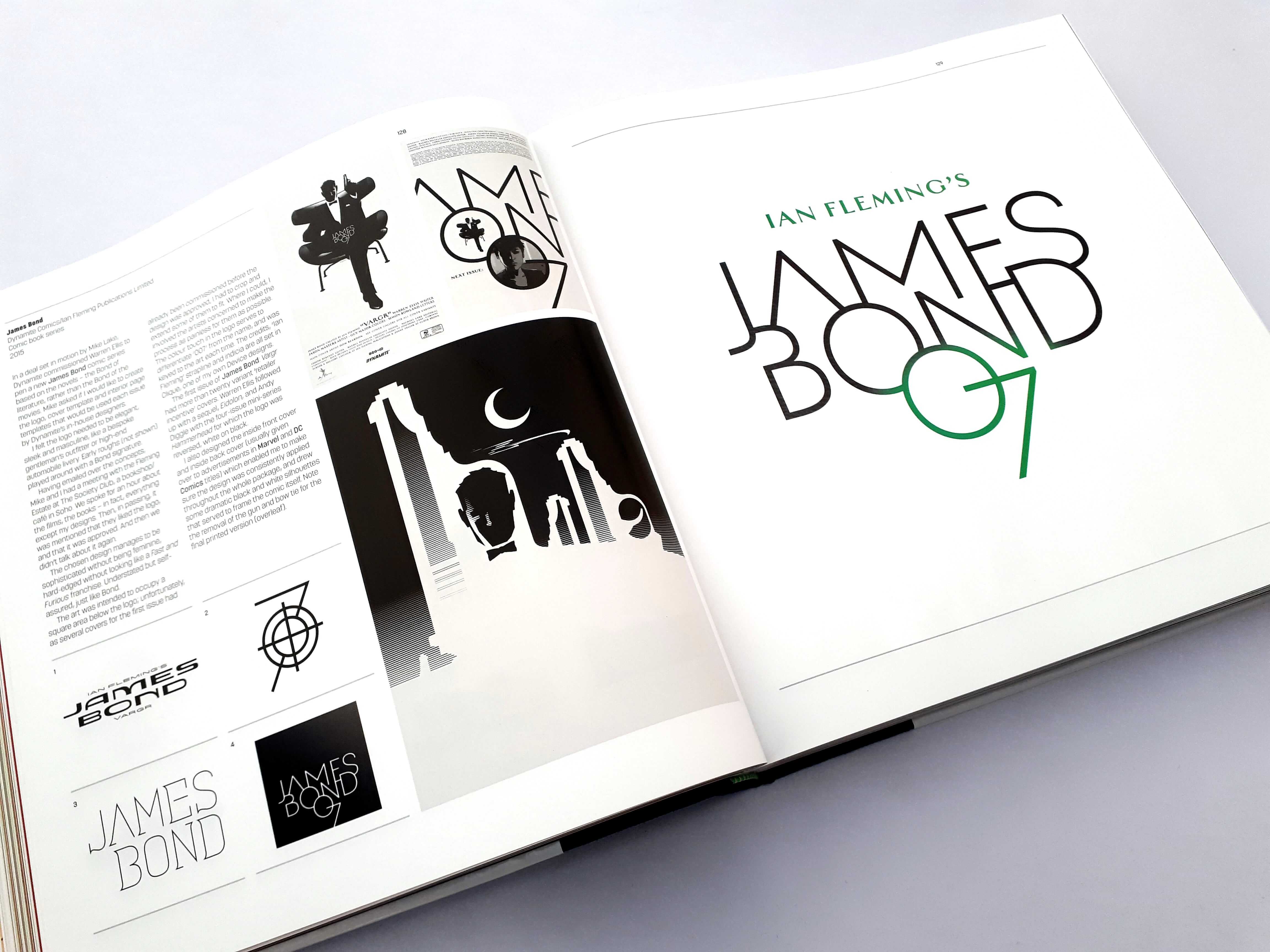
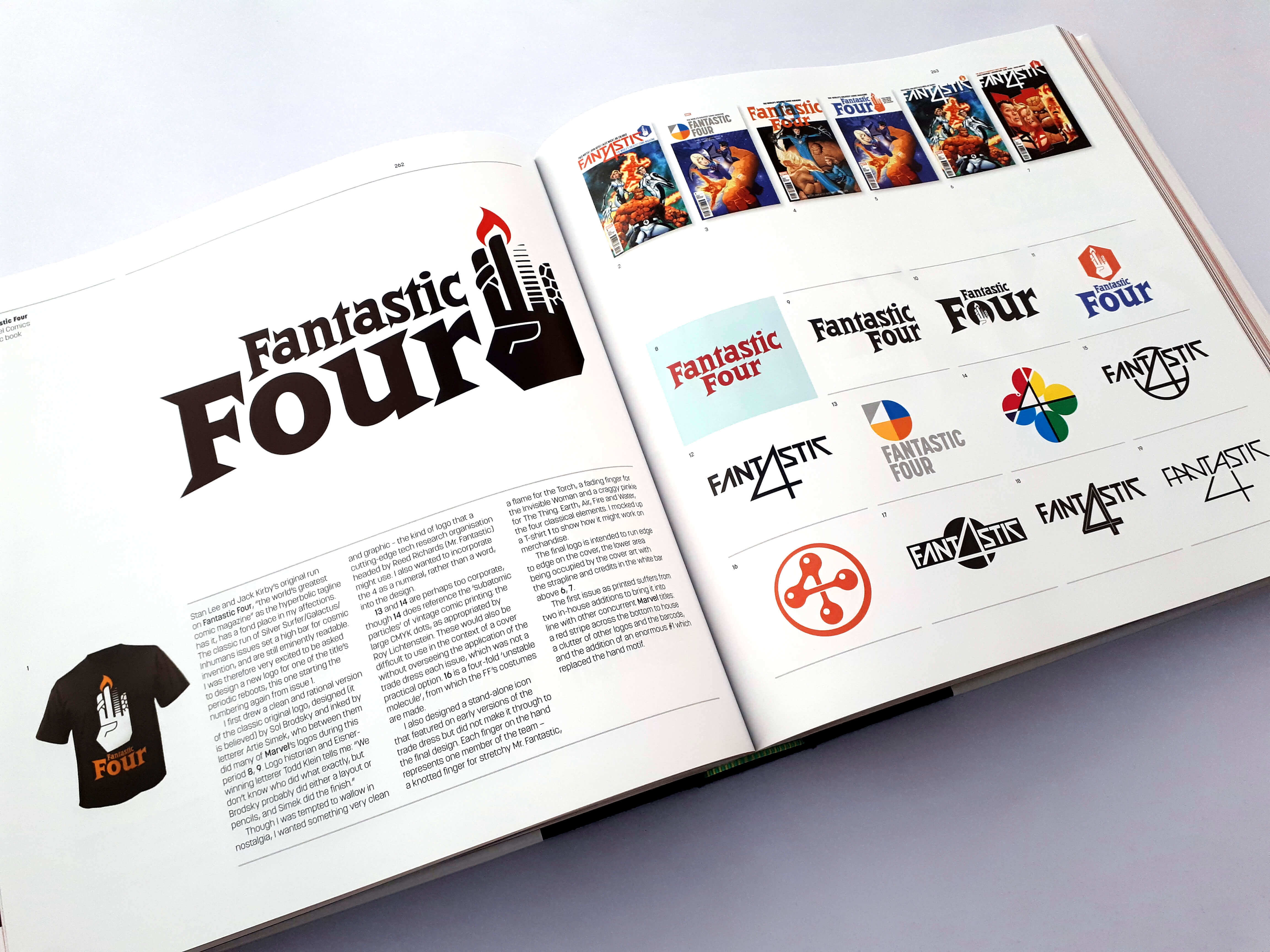
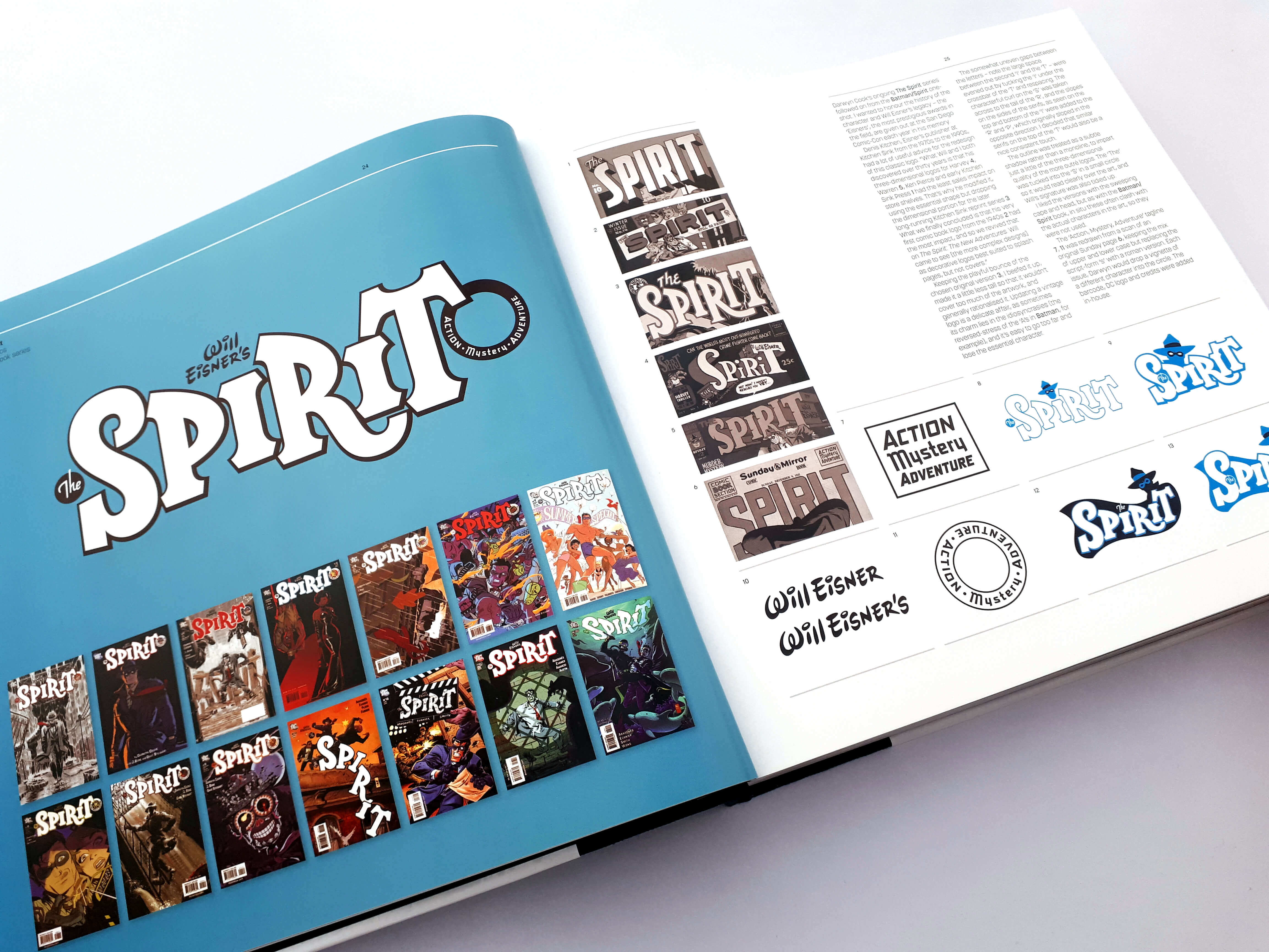
The pages of the book feature a range of preliminary sketches and alternative concepts that appear alongside the final designs, and Rian Hughes is open about his experience of meeting briefs and finding creative solutions by sharing insider stories on the highs and the lows and giving invaluable tips for getting brand identity right.
Rian Hughes explains the process on a case by case basis by showing some of the ideas that were rejected, either by Rian himself that the client never got to see and others that were rejected by the client also explaining how others took the design in a new direction and explaining how the final version came to be.
With an introduction by Grant Morrison, the Eisner award-winning comic’s writer and longtime collaborator with Rian Hughes, this book is absolutely fantastic and a truly amazing resource for designers, typographers, and comic book illustrators to draw on in brand identity and other graphic design projects.
My experience of reading this book is…Let’s say I was blown away! And that was only a few pages in.
I was well aware of who Rian Hughes is but while looking through the logos within the book there were some I did not even realise he designed which was a nice surprise a sort of wow he designed that? I never realised only to turn the page and there be another and he designed that also!
Rain did not only design comic logos but also things like The Forbidden Planet logo, My Little Pony, Hed Kandi, The Famous Five – and a cleanup of Enid Blyton’s signature, so many albums and events, books and designs that will at some point in time filled your life at one point or another.
One of the big take awayS that I personally like about Logo-a-gogo is as well as the final logo being displayed, each is shown with an impressive array of other unused concepts and I’m sure each one has a logo you would have preferred. You get to see thousands of directions not chosen and gain a great degree of respect for the work that goes into something that so many take for granted. As a logo designer I know first-hand the amount of work that goes into designing a visual identity and I know a lot of my readers who are also identity designers do as well, and this book really does demonstrate this amount and the workings behind designing a logo.
Another part in the book that stood out to me that further supports the amount of work that goes into designing logos even in their purest form is this section that Rian explains.
“Every font choice must mean something. Every line must serve a purpose, and you must be able to articulate that purpose – to explain to the non-designer why it’s there. Logo design is one of the purest and simplest forms of communication, and you need just the right amount of stuff on the page to be able to say what you need to say (or avoid saying something else) and no more. If you can’t justify it, take it out.”
Rian further explains.
“A logo should first and foremost work ‘Bare’, like a good tune without the orchestral backing. You can’t polish a turd, though some visually tone-deaf client do love aqua effect and a drop shadow!
“ Appropriate design emerges from an understanding of the conceptual underpinning of the project itself”
This further supports the importance of research and understanding your client and the scope of the work.
I could go on quoting the fantastic advice and insights given by Rian throughout the book but I highly recommend reading it yourself and enjoying every single page.
It’s a unique insight into the creative process of “the man who’s done for comic book design than anybody else, ever!”
As Michael Dooley of AIGA Says “Rian Hughes has been credited with doing more than anyone else to elevate the sophistication level of comic book design”
Throughout the book, you find out some really interesting stuff about Rian Hughes such as around 1996 he turned down an offer to draw Batman for a new series at DC Comics because he was seriously overworked, and a decision that Rian thought long and hard about but would regret deep down.
Seventeen years later he got an email out of the blue: Batman Black and White were returning for a fourth volume, and could he stop playing hard to get and this time write and draw a story for them this time around? As Rian explains a second chance! Of course! And said yes. The series even featured the Batmobile he designed for the strip was produced as a die-cast-model – and Rian explained this could be his career high-water mark.
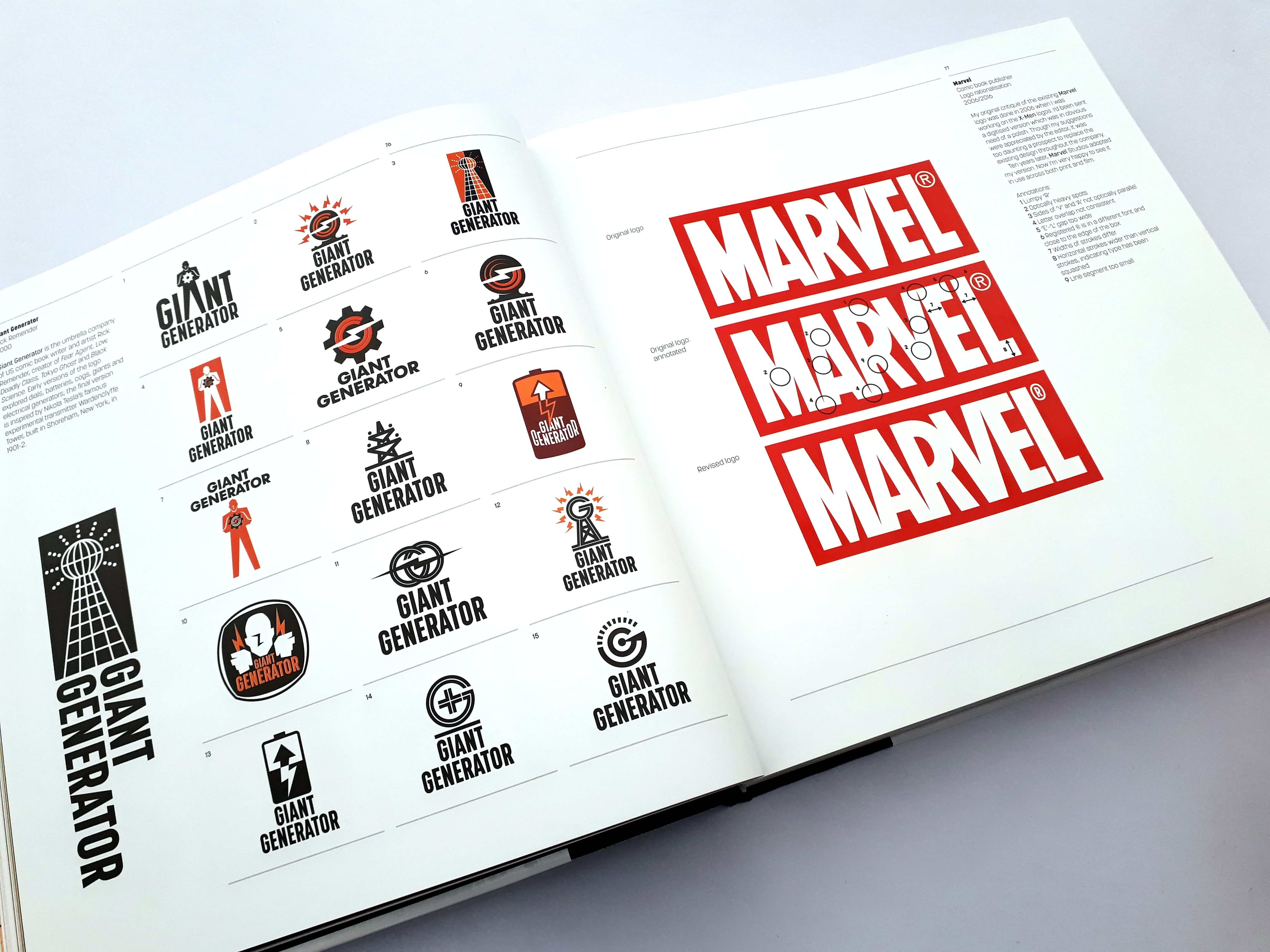
Not to mention that the current Marvel logo in use today is Rian’s critique of the original design. He did the critique back in 2006 when he was working on the X-Men logos and he was sent a digitised version which was in obvious need of a polish which can be seen below and what Rian did for the logo that comic fans have become so accustomed to.
His suggestions were appreciated by the editor, at the time it was too daunting a prospect to replace the original design throughout the company. Ten years later in 2016, Marvel Studios adopted Rian’s version and as he explains in the book he is very happy to see it in use across both print and film.
As with all good things that happen in a designers career there are always the lows of when a designers work is used incorrectly and not displayed as it is intended to be. As a designer, it’s hard to see your work ruined!
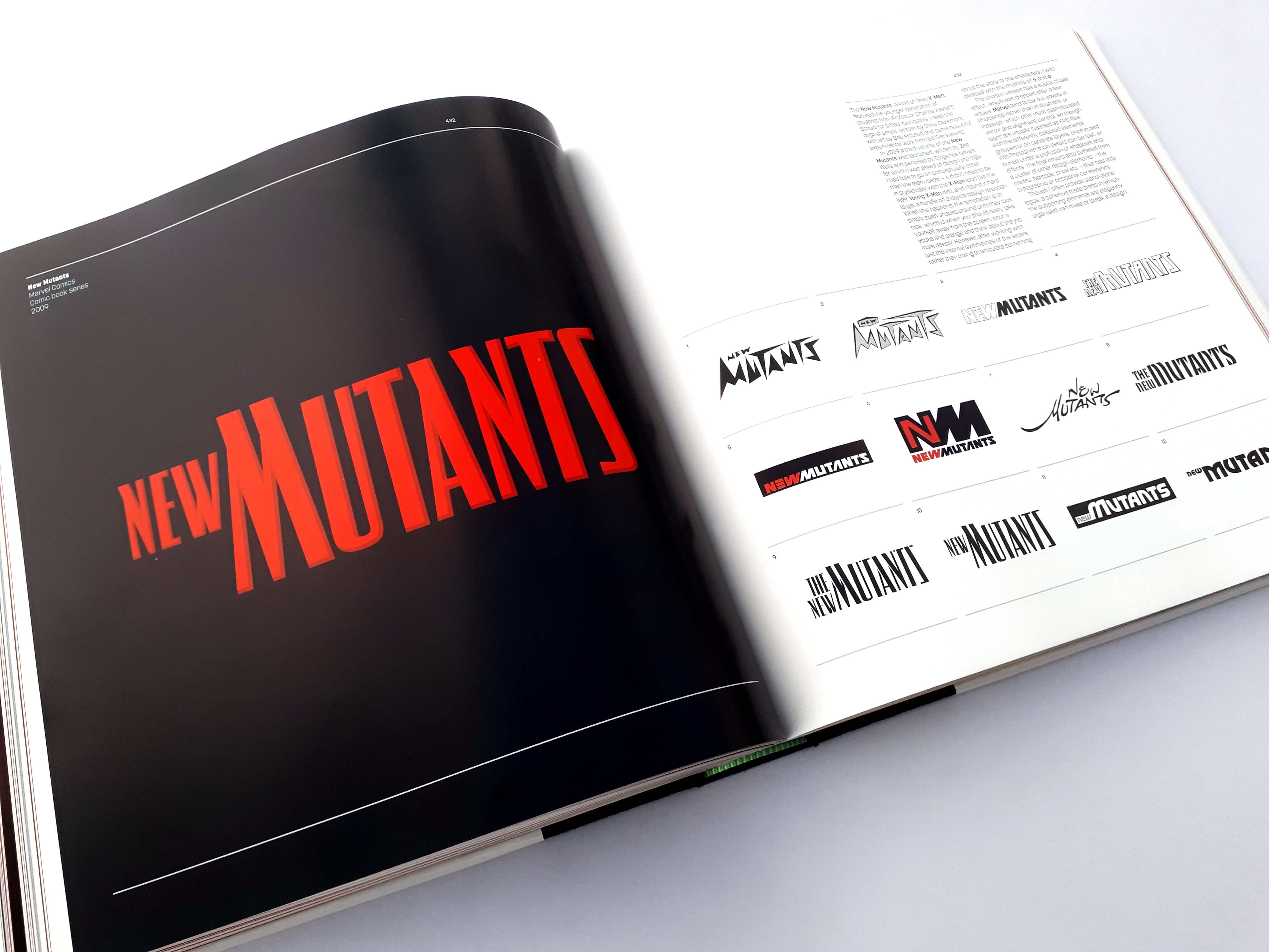
Rian is open about how his New Mutants logo for Marvel Comics was ruined by the fact that Marvel themselves layout covers in Photoshop rather than Illustrator or InDesign and as a designer knows these programs offer a more sophisticated vector and alignment control, and logos are supplied as EPS files with differently coloured elements grouped or on separate layers, once taken into Photoshop those details can be lost, or buried under profusion of shadow and effects.
The book is loaded with colourful fun and playful images including logos, illustrations and comic book covers with lots of insights given by Rian himself.
It really is an amazing book that not only deserves to be flicked through but read as well as it’s one of those special books that should be cherished by all logo lovers especially comic book and illustration fans. The book was Published by Korero Press, you properly won’t find it in many comic book stores which also makes it the perfect gift.
We had a chat with Rian and asked him some question about the book, being a designer and growing up around comics as a kid.
The Logo Creative – At what age did you realize you had a gift for drawing?
Rian Hughes – I have drawn for as long as I could hold a pencil. I think it’s in the DNA.
The Logo Creative – What do you remember about reading comics as a kid? And what interested you in the comic’s medium?
Rian Hughes – I read a science fiction comic called Countdown as a kid. It contained TV21 reprints – work by such British comics greats as Ron Embleton and Frank Bellamy. Later, of course , I read 2000AD. I came to US comics even later, through Millers’ Daredevil and Sienkevitch’s Moon Knight. It’s the combination of art and storytelling, the graphic mechanics of time laid out in two dimensions… this is an essay in itself!
The Logo Creative – Did you have any favourite comic book characters?
Rian Hughes – I had a Batman annual – poor quality late ‘60s strips that looked like they’d been faxed to the printers. There was a character in there – Tal Dar – who I resurrected for my recent Batman: Black and White strip. I don’t think he ever surfaced in the intervening years.
The Logo Creative – What was the experience like working with big publishers like Marvel, DC and Valiant Comics?
Rian Hughes – Some publishers have experienced art directors that are trained designers and who you can discuss the niceties of a serif or a particular colour combination with; at other publishers you may be dealing with well-meaning editors who you gently have to school in the basics of typography, if only to stop them adding starbursts to your carefully designed cover in Comic Sans, or rest your “last issue” page in some free font they found online. But mostly, they’ve been very appreciative of what I can bring to a project, for which I’m eternally grateful.
The Logo Creative – The book LOGO-A-GOGO is amazing what was it like working with Korero Press putting the book together? And how long was the process?
Rian Hughes – All in all it took around two and a half years to pull together, then there was an intensive proofing and proofreading period just before we went to press. This was done around the usual projects that go through the studio, so there were a lot of late nights. Korero have done a lovely job – the print quality is spot on.
The Logo Creative – What medium(s) do you work in?
Rian Hughes – Adobe Illustrator, mostly – with the occasional foray into Photoshop and Glyphs for font design.
The Logo Creative – Is there anything unusual and interesting about your process?
Rian Hughes – Not that I’m aware – but then I don’t know how other designers work!
The Logo Creative – What made you switch from comic illustrations to focus on typography?
Rian Hughes – I’m still drawing comics – my graphic novel, I AM A NUMBER came out earlier this year. This was the first graphic novel I’ve both written and drawn. I’m also releasing a slew of new fonts via Myfonts and Typekit (now relabelled Adobe Fonts). I try and spread my time between illustration, comics, design and type design.
The Logo Creative – I understand you occasionally give your fonts humorous names, how do you come up with naming a font?
Rian Hughes – Generally, the font itself will suggest a suitable name, one that sums up its character or the use to which it can be put.
The Logo Creative – Do you have any advice for aspiring comic book illustrators and graphic designers looking to get into typography design?
Rian Hughes – Work hard. Be original. Don’t forget to invoice.

