It happens every year. January rolls around and brands and designers are looking for ways to keep their style fresh, compelling, and contemporary. Being aware of the current trends is important, even if you’re not planning on adhering to them per se, as the general trajectory of the world of graphic design will inform how brands and brand identity evolve as we move forward. Once again we have a great article from our friends over at 99designs about Logo design trends in 2019.
What makes a logo special? Is it utility? Style? How many people like it? In order to maintain relevance, all of these things need to be considered as well as the general evolution of design trends. At 99designs, we spend a lot of our time thinking about, researching and analysing what’s what in the world of logo design (as well as graphic design trends in general), so we’re happy to share with you our predictions for the logo design trends you’ll be seeing in 2019.
Table of Contents
Variable logo design
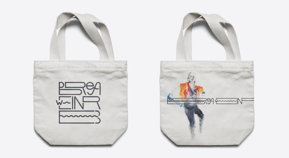
Variable logo for Brea Weinreb
This logo for artist Brea Weinreb can be stretched, changed, condensed or combined with artwork, depending on where it appears and who it’s intended for.
A logo has got to work, and it’s got to work across a huge variety of platforms. Scalability is not enough anymore, as brands are looking to go well past how a logo looks on different platforms and strive to use their brand to build closer and more personable relationships with often times vastly divergent audiences. Want to speak to both baby boomers and millennials? The variable logo trend is all about designing a chameleonic and adaptable logo that can be stretched, pulled, inverted, simplified, complexified, and tailored to use-cases in a way that allows brands to speak in the best way possible to the right audience for each situation.
Cleverly selected iconography, custom typography, and letter forms, and thoughtful formatting all serve to frame strengthen and deepen the connection between an audience’s specific need and the way a brand can fill said need, all by positioning themselves intelligently with their brand identity.
New Age Geometry
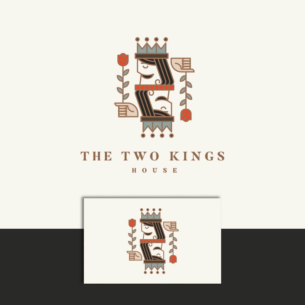
New Age Geometry logo for The Two Kings House Via E·the·re·al”
When many people think of a geometric logo, there tends to be an association with a cold, mathematic, and even soulless style and composition. This is largely because once a trend is instantly recognisable (read: on its way out), it tends to be deduced to one basic thing. While this may be the case with the geometric trend of the past several years, we anticipate seeing unique takes on this style, riffing off the minimalistic and rigid approach of recent years with vibrant colors, friendlier compositions, and warm textures to offset this association.
“Mix bold geometric shapes with colorful palettes. Clean and minimal but strong,” suggests designer Claudia C., on how to inject this style with a breath of fresh air. It’s all about giving life to something people have seen a lot of already.”
Deceptive Perspective
Distortion and perspective in logo design. Via reza ernanda
Playing with new and innovative ways that a logo can be perceived as an easy way to disrupt the norms of logo design. Creating the illusion of three-dimensionality and distorting depth perception gives a logo an intrinsically unique and tailormade feel, especially in respect to how it interacts with physical spaces.
Printing a logo on a corner so that it appears broken from one angle and flush from another is one way to achieve this. Doing something as simple as altering kerning or overemphasizing elements can achieve this effect as well. Warping the thickness of each letter to create phasing is something we’re seeing a lot of (not only in logo design but also in packaging and print design) to add visual interest to otherwise minimal designs.
Elevated negative space
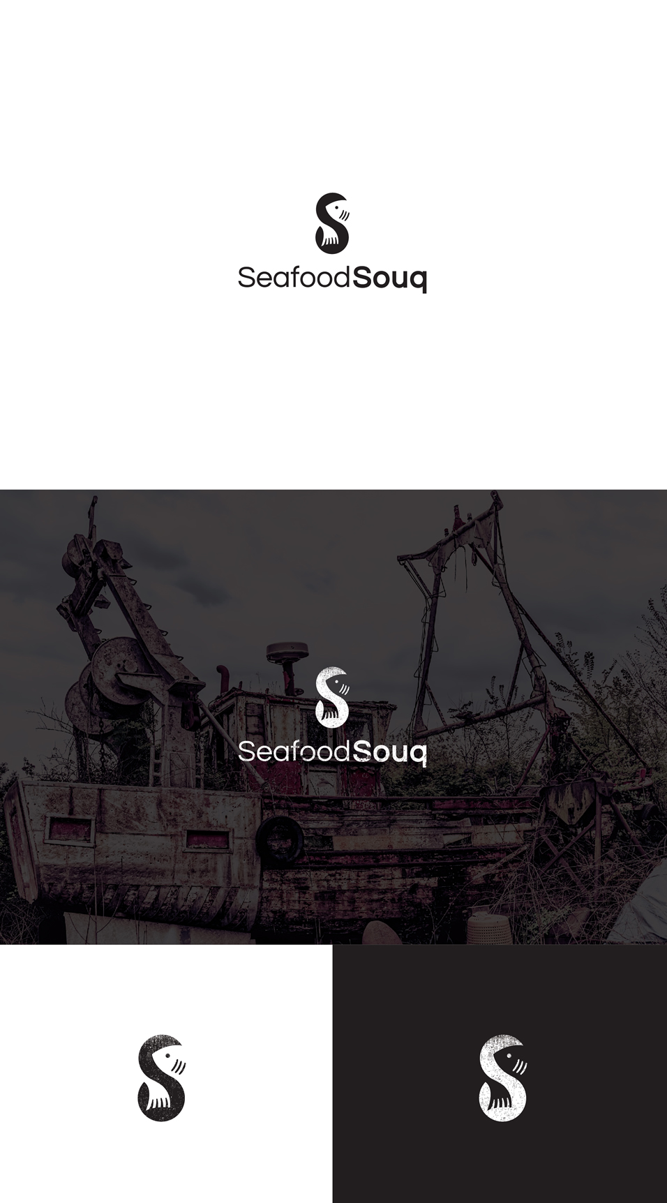
Example of elevated negative space. by Ocelittle,
When you think of negative space in logos, Lindon Leader’s design for FedEx is usually one that comes to mind. The hidden arrow pulling together the E and X cleverly represents the fundamental element of FedEx’s services: delivering packages.
Considering negative space is often a fundamental element in logo design, and finding ways to push this concept to its limits is a practice that designers are embracing more and more as we move into 2019. Finding an elegant way to add meaning when subtracting shapes from a logo mark inherently strengthens a logo’s intrinsic value. Designers are leveraging the very minimalist practice of simplifying a logo mark as much as possible in a way that actually adds to how a logo is perceived.
Taking, for example, the letter S in the above logo for SeafoodSouq. The shape of the animal is clearly and legibly distinct from the form of the S but effortlessly and almost invisibly hugs the curves of the letter to give the logo a new level of unconventionality, simplicity, and meaning.
Shift in minimalism
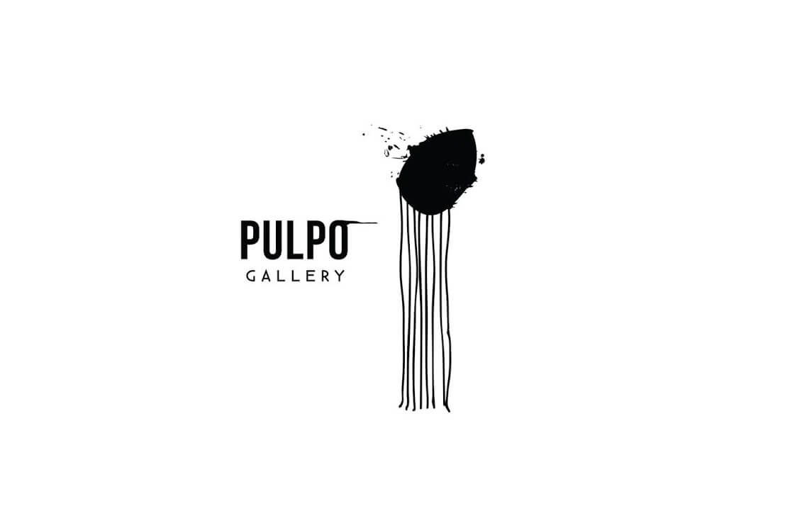 Avant-garde minimalist octopus logo by Fahrenheit 32
We’ve been asking ourselves whether minimalism is really a trend or a new standard of logo design. It’s hard to imagine a world in which a decent percentage of clients ask for something minimal, simple or something along those lines. It’s been decades since the minimalist movement first revolutionized the design world circa 1970, but the ways in which this aesthetic is used by brands and organizations haven’t stopped evolving, becoming in and of themselves more complicated. As the practice of stripping design to its core elements becomes a more nuanced and creative endeavor, it’s becoming arguably more abstract.
“Minimalism is less a style than a weapon; clearing away noise so a message shines through, clean and naked,” says designer Ian Douglas. “It gives just enough to create an anchor, without weighing down the imagination.”
Iva Ron’s logo for Pulpo Gallery is anchored exactly so in an inky, avant-garde, minimalist take on an octopus, but it’s not quite as simple as clearing away the noise in this case. “This piece is broken into two main pieces, black ink and tentacles, simplified to exaggerate their complementary characteristics,” Iva says. “This contrast is meant to be questioned by the perceiver. Why did I recognize an animal here? Could it be something else?”
This is where minimalism takes a turn, as designers allow themselves to add non-semantic, stylistic layers to the fundamental core of minimalist representation and play with personal questions of interpretation.
Logos with pedigree
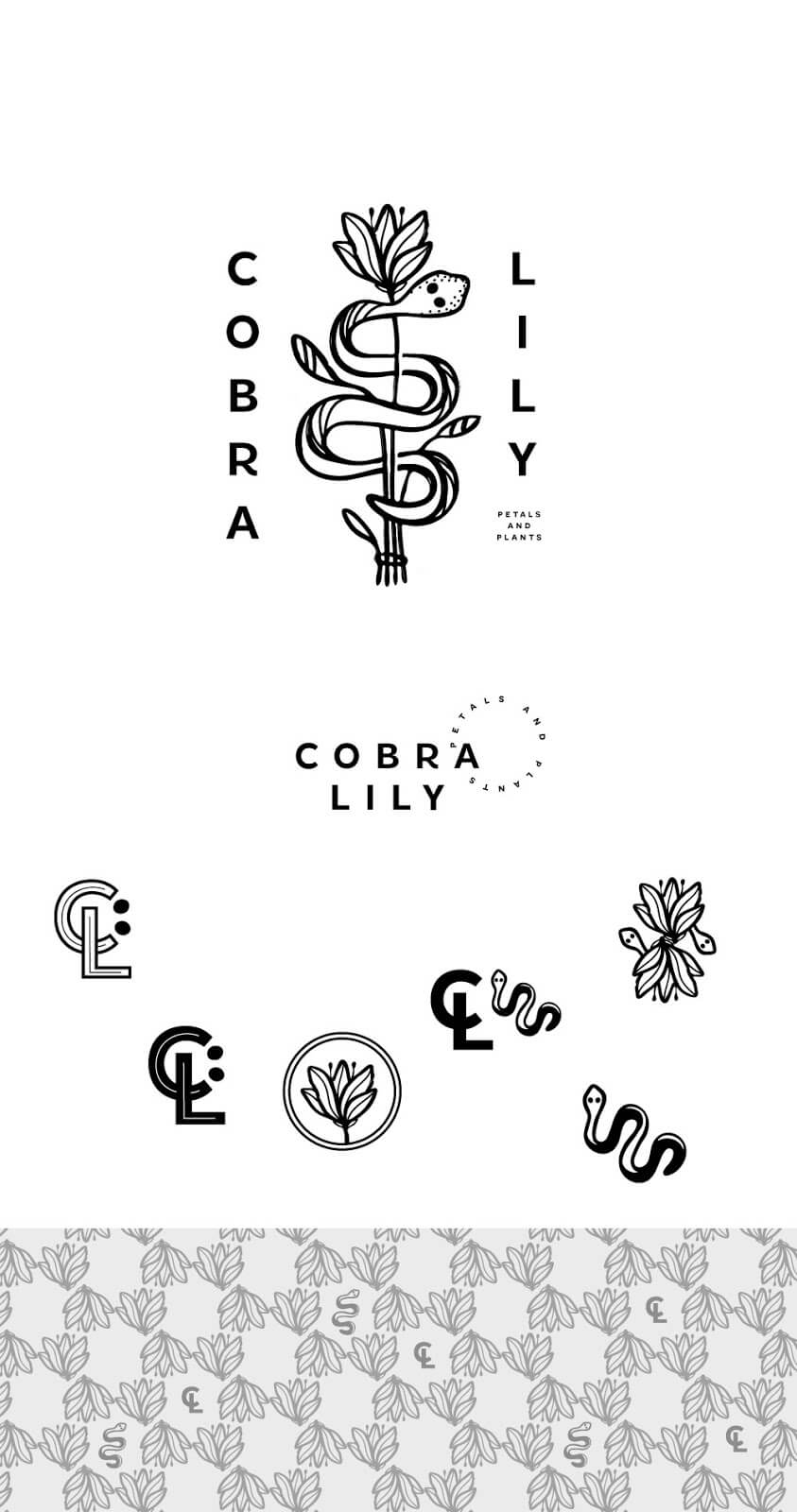
Logo design for Cobra Lily with modern pedigree. by extrafin
Every designer has heard a brand ask for a logo that will last them decades. This isn’t going anywhere—no one wants to redesign their logo every year.
In 2019 brands will continue to favor authenticity and longevity. This prioritisation of recognisability and trustworthiness means brands are pushing for “new classics” that will carry their lineage and pedigree over the years. Think vintage textures, artisanal touches, precise line work and even the modernisation of the crest.
For this logo for Cobra Lily, designer extrafin said they “aimed for an authentic, vintage look and wanted the logo to be simple, to correspond with trends like stick and poke tattoos and nature illustrations. I used a selection of digital brushes for an added organic feel.” This gives the logo a connection to history with an almost stamp like feel while maintaining the cleanliness of digital design and linework.
Overlapping elements
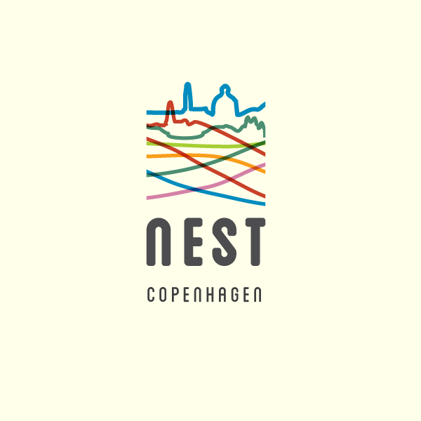
Overlapping elements in logo design. by extrafin
Creatives are starting to embrace the overlapping elements trend, as popularised by major brands like PayPal. By utilising opacity and simple, compelling shapes to synthesise vibrant and unique logos, designers are pushing into spaces we haven’t seen explored extensively in the past. This will, of course, borrow from other trends on this list, so expect to see lots of play with geometry, bold color, and negative space.
PayPal’s 2014 redesign relies on two overlapping P’s that lend themselves well to a much more complex variety of treatments, tying this trend closely in with an increased emphasis on the flexibility and variability of branding. Expect more clever experimentation with opacity and meticulous kerning as 2019 hurdles around the corner.
Maximizing details
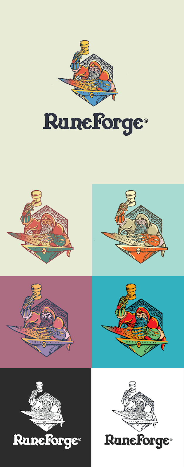
Attention to detail gives this logo for RuneForge depth and personality. by Creative Spirit ®
Logos are conventionally rather small pieces of design, necessarily small canvases within which designers must be careful to maximise space and meaning, using their imagination to tell the story of who a brand is and what their values are. Factoring in responsiveness and the need for logos to function on a wide variety of screens and sizes, it might seem illogical for designers to have an increased emphasis on attention to detail. The pendulum does, however, have a propensity for swinging back, and this might be a response to the increased demand for minimalism, geometry, and scalability.
We’re anticipating that designers will be doing just that, to a degree at least and that 2019 could have a revitalisation of rich detail in logo marks. Despite simultaneously highlighting a continued demand for minimalism, this rival trend seems to be cropping up left and right. This logo for RuneForge, for example, harkens back to the detail-rich niches of graphic novels and video game design, putting much more emphasis on a nostalgic pathos over whether or not this same logo can function as a favicon.
Get excited, because these trends are not only co-existing, they’re developing symbiotic relationships. Somehow it makes a whole lot of sense for minimalist and abstract design to rely on variable design and vice versa. Or for negative space and overlapping elements to give an ostensibly simple design layer of meaning or visual appeal. As more and more companies are putting thought and money into complex and individualistic brand personalities, designers respond in turn by cleverly blending contrasting trends in open defiance of a saturated graphic design landscape. We’re always keen to turn an analytical eye on the ways designers are filling niches in this competitive global economy, so we can’t wait to see what 2019 brings!
 Author Bio
Calvin works as a Marketing Coordinator for 99designs’ Berlin office, focusing on campaign production, partnerships, and social media. He moved from California to Berlin in 2015 with degrees from U.C. Berkeley. Interests include world cuisine, serif fonts, music production, historical documentaries, and fashion branding.

