Do you still think that your business doesn’t need a logo? This article was made to prove you wrong and give you some useful information about creating one. But most importantly What is the Logo lmpact Within Brand Recognition and Popularity in the 21st Century?
When starting a business, every entrepreneur is facing the issue of its identification on the market. In other words – what will make a business recognizable. This is not only about the marketing-trick, a good strategic campaign of the product or service that will be sold. It is also about a visual image – in its own, unique corporate style that customers will connect with the company. One of the most important components of corporate identity is the logo that is placed on most if not all marketing collateral such as a business card, Flyer, Letterhead, corporate clothing, vehicles Livery, building signage the list goes on.
Table of Contents
The Right Start
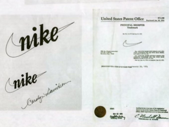
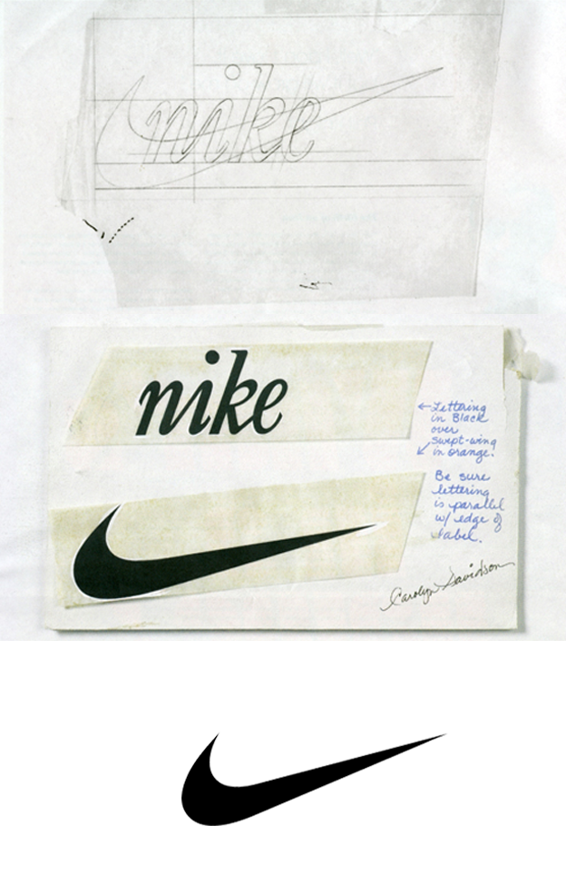
The success of the logo does not lay in expensive design but in the quality of the creation. For example, in 1971, a student at Portland University, Caroline Davidson, for a modest fee ($ 35) designed a logo for an unknown company. It was Nike. Was the Nike logo worth a lot of money then? No!. Does it work? Yes!. And there are many other examples.
A brand is a corporate image of a company, which consists of history, reputation, traditions, and values positioned by it.
The brand is created by the efforts of a huge number of people, among whom are not only the creators and employees of the company. The consumer himself, as it were, participates in “co-authorship”, joining the brand, using goods of this brand and often even broadcasting his emotional involvement to the community of people who own the product.
The corporate identity (including the logo as its symbol) is the external quickly recognizable sign of the brand; it appears ideally as a consequence of the existence of the brand or at least as a consequence of the brand idea.
In addition to the logo, corporate identity is reflected in the external and internal design of all aspects of the brand:
- promotional materials;
- the style of interior design;
- clothes of employees;
- product packaging;
- the specifics of channels for transmitting information about the brand (visual range, sound, smell, etc.).
A logo is a quick recognizable visual sign. And if the brand itself or the idea associated with it appears gradually and, as a rule, with the intellectual and creative participation of a certain number of people, then the logo is a symbol created by one designer or a special program; the generation of logo options can even be automated if desired.
For example, Apple is a brand of a manufacturer of digital products focused on convenient, comfortable consumer use and closely related to the social life of people around the world. And the silhouette of a bitten apple is the logo of this brand.
Logo Story
Symbols and signs were not invented in the 21st or even in the 20th century: monograms and pictograms have existed since the times of Ancient Greece and Ancient Rome. Monograms were left on coins, medals, works of art and jewelry in the Middle Ages. And in the XIX century, the first brands became popular, precisely because of their recognizable signs, symbols.
In recent decades, the concepts of “brand” and “logo” suddenly began to mix. Perhaps this was due to the oversaturation of the information space with visual signs: with the development of technology, the consumer is in continuous contact with various types of advertising and all kinds of logos are more likely to catch the eye than the products themselves.
The Subtleties of Creating a Logo and its Connection With the Brand Idea
There are many requirements for creating a company’s trademark. Just a beautiful symbolic picture that does not have criteria for a good logo will not be associated with the brand. Marketers and branding experts highlight the following signs of an effective logo.
Uniqueness and Recognition
Ideally, the logo should reflect the essence of the company as well as the brand as a whole. A professionally executed logo can reflect services or products, testify to the main mission and brand values. The appearance of the Apple logo is associated with the legend of Newton, whose strength of thought helped to open the law of universal gravitation after the ripe fruit fell on the scientist’s head. And the unusual shape of a bitten apple hints at the uniqueness of Apple’s digital products, completely unlike other gadgets.
The Nike Swoosh, checkmark-shaped brand, symbolizes speed and rapid movement. At the same time being one of the recognition marks of the Millenials.
The Toyota logo is the eye of a needle through which a thread is passed. This is no accident because the company started with the production of sewing machines.
The modern world of fashion does not appear without the participation of Giorgio Armani – a famous designer. Italian company Giorgio Armani S.p.A. produces clothes, accessories, and shoes that have been popular for more than a dozen years. The company logo is headed by an eagle with the initials of Giorgio Armani – GA. Eagle is a tribute to the largest trading partner – the United States.
Pasabahce has repeatedly updated its brand. The previous oval shape of the logo turned into two drops. The new logo is designed to reflect the power of Pasabahce, accumulated over three-quarters of a century. The new logo was inspired by the image of glass in a liquid state, emphasizing the natural purity and environmental friendliness of glass products. The first drop in the logo represents water, emphasizing the role of nature and the environment in the production and use of cookware; the second symbolizes glass in a liquid state. The oval shape is saved from the previous logo. The white field in the middle in the form of the letter “P” stands for Pasabahce.
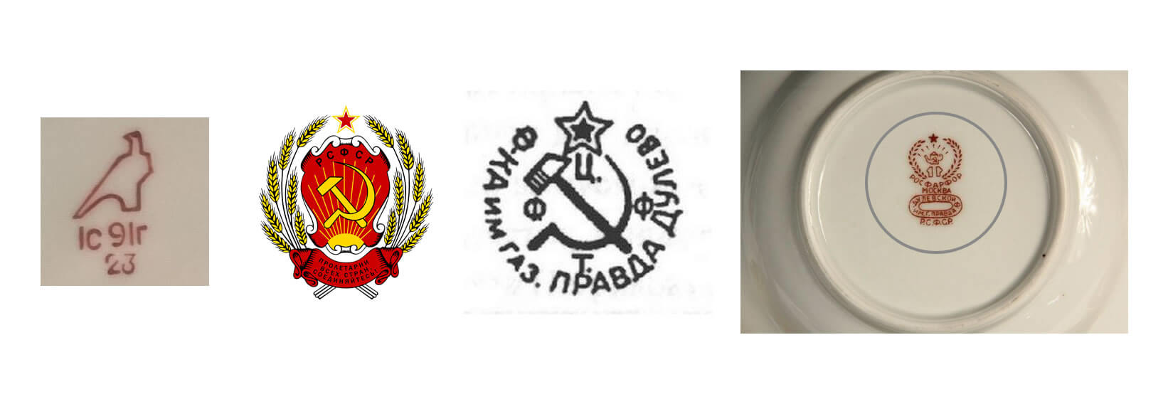
The familiar logo of the Dulevo Porcelain Factory – the falcon – appeared in 1958. Previously, the dishes of this Russian factory were branded differently, starting with the pre-revolutionary brand of the MS factory. Kuznetsov before the images peculiar to the USSR. This is an image of the coat of arms of the Soviet Union, hammer and sickle, star, abbreviation RSFSR. Other abbreviations were also present on the hallmarks, for example, CFTF (Centrofarfortrest) or RTF (Rosfarfortrest).
The Adidas company on the other hand, does not lose popularity and recognition in any, even black and white color: and three sloping mountain-shaped strips on sports shoes, and trefoil on clothes symbolize the difficulties that a person who is interested in sports overcomes with ease.
Sticking to the sports industry, the online bookmaker platform – Pari Match, used in their logo another interesting technique. By giving the Pari Match logo first letters of the brand (P & M) the hint of fast movement they refer to the characteristics of this specific business sector. To win (to be successful) in sport bets, you need to make quick decisions and have proper reflexes, to act elastically, relative to the events on the pitch or ring.
The Correct Combination of Graphics and Font Selection
Sometimes it’s enough for a recognizable logo to choose the right textual solution: the font itself becomes a brand name, as, for example, it happened with the Coca-Cola logo: fans around the world easily recognize elegant italics that hint at the movement and energy received thanks to the tonic drink. The blue oval of Ford Motor Company is also remembered for its outline of letters.
Simplicity
LG is one of the largest household appliance companies in the world. The LG logo means ‘life is good’. The symbol consists of two letters that resemble a human face, red color symbolizes the love of its customers.
The Right Color Palette
The correctly used color palette is also important when creating a logo. For example, the McDonald’s logo, which has undergone a whole evolution of change, once consisted simply of black lettering.

But today, a white inscription on a red background and two golden arches are associated with the chain of the leading fast-food restaurant. The red color is considered appetizing, and the golden arches that make up the letter M remind fast food lovers about big mac or french fries.
Since 2006, McDonald’s has minimized its symbol to one golden letter M. But given the fact that the logo should be read not only on labels and things but also on black and white documents, manufacturers often minimize the color palette to black and white.
Again the sports industry may be a good example here. Sport is a specific sphere where only winning counts. To be the best, usually, you need to be or the strongest or the fastest (sometimes both). Nowadays, like never before, fans like to identify themselves with the team they support, for example by wearing clothes of associating colors.
Colors not only matter due to fashion trends but also psychology and the meaning of each color. The colors should mean something subconsciously and affect the enemy or enemy team, causing fear or respect towards the opponent(s). Whether it is white (purity) and gold (royalness) like in the case of Real Madrid FC or black (strength) and yellow (energy) used by Borussia Dortmund.
A correctly selected logo can quickly help to promote the brand and can play a big role in its promotion and development. This is evidenced by the stories of all world-famous companies: a spectacular symbol can take hold of consumer consciousness for decades. Therefore, marketers and branding experts put the logo on one of the first places in the list of tools to promote a business.
We hope you have enjoyed this article discussion about Logo lmpact Within Brand Recognition and Popularity in the 21st Century, please be sure to leave your comments below, as we love hearing from our readers.
Useful Links & Great Deals
- The Equipment We Use & Recommend
- Quality Design Bundles
- Get 2 Months free Skillshare
- Get an Exclusive 20% off Logo Package Express
- Learn Logo Design Online
Author Bio
Hello there! My name is Leyla Malone and I’m 35 years old. I’m here to share with you my passion for the sport in general and sports betting. I’m a journalist and I love to write and I never think that bets might be that interesting before I tried! ‘Do what you love- love what you do’ that’s my goal and that’s what I’m doing. I’ve been making bets on Parimatch for a really long time so my experience in this area is huge.

