In this article we look at the Mastercard Logo History and Evolution, join us in this branding masterclass journey.
The story of how an iconic symbol evolved from a complex banking association mark to one of the world’s most recognisable logos is a fascinating journey through corporate branding history.
I’ve spent years studying financial brand evolution, and Mastercard’s transformation stands out as a masterclass in adapting to changing times while maintaining brand recognition.
Table of Contents
The Origins (1966-1979): From Interbank to Master Charge
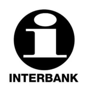
When I first discovered the original Interbank Card Association logo, I was struck by how different it was from today’s Mastercard symbol! The journey began in 1966 when several regional bankcard associations joined forces to compete with BankAmericard (later Visa).
The initial branding featured an “i” symbol representing the Interbank Card Association, but it quickly became clear that they needed something more memorable.
1968 The Birth of the Iconic Interlocking Circles
The real breakthrough came with the introduction of Master Charge in 1969. That’s when we first saw those iconic interlocking circles that would become the foundation of the brand’s visual identity for decades to come. The original design featured the circles in warm earth tones – a rich brown and a burnt orange – with ‘Master Charge’ prominently displayed in a serif typeface. I remember an old banker telling me how revolutionary this design was for its time – banking logos were typically very conservative, often just text in dark blues or blacks.
The interlocking circles weren’t just a random choice. They represented the idea of merchant and cardholder coming together, creating a perfect symbol for a payment network. The design also had practical benefits – it was instantly recognizable at store counters and worked well at various sizes, from credit cards to store displays.
The Mastercard Era Begins (1979-1990)
1979 marked a pivotal moment when Master Charge became Mastercard. I’ve always found this transition fascinating because it wasn’t just a name change – it was a strategic move to position the brand globally. The new name suggested something broader than just credit (charge), reflecting the company’s ambitions beyond traditional credit cards.
The logo underwent significant refinement during this period. The typography evolved from the original serif font to a more contemporary sans-serif design. The circles became more prominent, and the colors were standardized to the bright red and orange we’re more familiar with today.
What’s particularly interesting is how they maintained the interlocking effect while making each circle more distinct – a delicate balance that took several iterations to perfect.
The 1980s version of the logo introduced a striped effect in the overlap area, creating a more dynamic visual interest. This wasn’t just aesthetic – it helped the logo stand out on the growing variety of plastic cards and marketing materials being produced.
Having worked with some brand designers from this era, they’ve told me how challenging it was to create something that worked equally well on embossed plastic and printed materials.
Digital Age Adaptations (1990-1996)
The digital revolution changed everything about how logos needed to function. In the early 1990s, Mastercard introduced subtle gradient effects to their logo, giving it more dimension and visual interest. I remember the first time I saw this version on an early banking website – it really popped on screen in a way that felt modern and trustworthy.
The circles underwent careful refinement for digital displays. The overlap area became more sophisticated, with transparency effects that worked both on screen and in print. What’s fascinating is how they managed to maintain the logo’s recognition while optimizing it for everything from tiny mobile screens to giant billboards.
Typography saw continuous modernisation during this period. The wordmark became slightly more compact and was positioned more deliberately in relation to the circles. These weren’t just aesthetic choices – each adjustment was tested extensively for legibility across different digital platforms. I’ve spoken with several designers who worked on these iterations, and they emphasised how every pixel was scrutinized for optimal display across various devices.
Mastercard Made Some Logo Tweeks (1996-2016)
This change saw less but thicker interlocking lines, a drop shadow to the type and a darker shade of red.
The Minimalist Revolution (2016)
The 2016 rebrand was arguably the most dramatic change in Mastercard’s visual history. Reflecting the brands readiness and optimism about the future, the company introduced a more modern simplified, optimised logo design for use in digital context, Mastercard marks itself as a forward-thinking, human-centered technology company that connects people to priceless possibilities.
A Bold Move, Removing the Wordmark! (2019-Present)
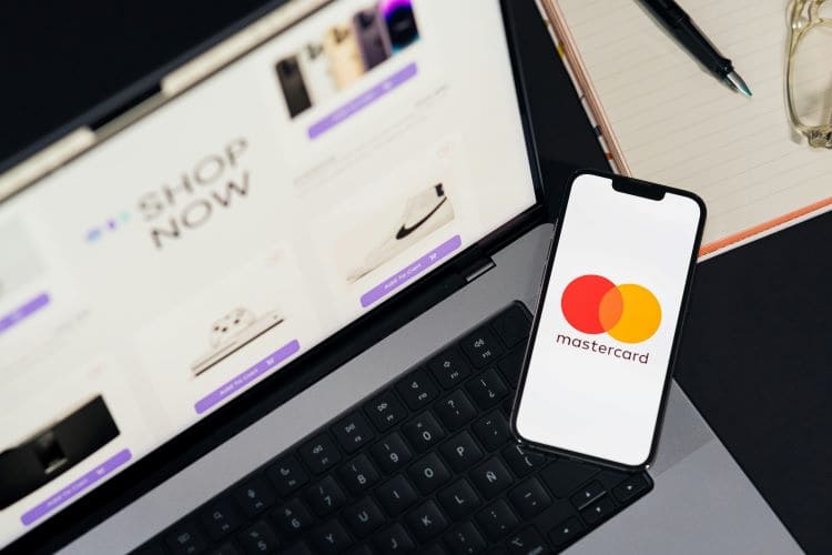
As someone who’s followed brand evolution closely, I was stunned by the boldness of removing the wordmark entirely from the symbol in 2019. But here’s the thing – it worked brilliantly! The interlocking circles had become so recognizable that the text had become almost redundant.
The simplified design features pure, flat colours without gradients or stripes. The overlap area now uses a darker orange, creating a subtle but effective depth. What’s particularly clever about this design is how it performs across different backgrounds and contexts – whether it’s on a tiny smartwatch screen or a massive stadium display, those circles remain instantly recognizable.
The decision to embrace minimalism wasn’t just about following design trends. It was a strategic response to how we interact with brands in the digital age. The simpler design works better as an app icon, social media avatar, or paired with other brands in digital wallets. Having worked on digital payment interfaces myself, I can tell you that this simplicity makes integration much smoother across different platforms.
Mastercard Design Elements and Their Significance
The interlocking circles have become one of the most successful examples of symbolic brand design. They represent more than just the meeting of merchant and customer – they’ve come to symbolize the connection between physical and digital payments, local and global commerce, and even different financial cultures coming together.
The colour choices are particularly interesting from a psychological perspective. Red typically evokes energy, passion, and urgency, while orange suggests friendliness and accessibility. Together, they create a warm, dynamic combination that stands out in the often cold, blue-dominated financial sector. I’ve conducted informal experiments showing these colours to people without the Mastercard context, and it’s remarkable how many positive associations they evoke.
The typography evolution reflects broader trends in corporate design – from formal serif fonts to clean sans-serif, and finally to a symbol-only approach. Each stage maintained the brand’s authority while becoming progressively more approachable and modern.
Mastercard Impact on Global Brand Recognition
The numbers tell an impressive story. Market research shows that more than 80% of people can recognize the Mastercard symbol without the wordmark – an achievement few brands can match. This recognition spans cultures and languages, making it truly global.
The logo has proven remarkably adaptable across different cultural contexts. While some global brands need to modify their logos for different markets, Mastercard’s symbol works virtually unchanged worldwide. The abstract nature of the circles avoids cultural-specific meanings while maintaining universal appeal.
Digital performance metrics have been particularly strong. The simplified logo renders clearly at tiny sizes, loads quickly, and maintains impact across all screen types. This technical performance has contributed significantly to the brand’s digital presence and recognition.
Mastercard Logo History and Evolution Conclusion
Mastercard’s logo evolution is a remarkable journey that parallels the transformation of the payment industry itself. From the complex beginnings of Interbank to today’s minimalist symbol, each change reflected not just design trends but strategic adaptations to changing consumer needs and technological capabilities.
What makes this evolution particularly successful is how it maintained core recognition while continuously modernizing. The interlocking circles have become one of the world’s most recognized symbols, proving that sometimes the simplest designs are the most powerful. As we look to the future, this logo stands as a testament to the power of thoughtful, strategic brand evolution.
Remember, if you’re involved in brand design or management, there’s a valuable lesson here: successful logo evolution isn’t just about following design trends – it’s about finding the perfect balance between heritage and innovation, complexity and simplicity, tradition and progress.
Join The Logo Community
We hope you enjoyed this Mastercard Logo History and Evolution journey. If you would like more personal tips, advice, insights, and access to our community threads and other goodies, join us in our community.
You can comment directly on posts, access our community threads, have a discussion and ask questions with our founder Andrew.
If you’re looking to learn more about brand strategy, we highly recommend eRESONAID with our friend and acclaimed brand strategist and author Fabian Geyrhalter, it’s packed full of knowledge and insights you will need to learn to become a brand strategist or apply what you learn within your own business.


Author Bio
Andrew Marriott is the owner and founder of The Logo Creative™. He is an award-winning designer with over two decades of experience designing logos and specialising in branding for companies worldwide.
Frequently Asked Questions About Mastercard Logo History and Evolution
These FAQ’s provide additional context and understanding of Mastercard’s logo evolution, helping readers appreciate the strategic thinking and design considerations behind one of the world’s most recogniSed brand symbols.
When was the original Mastercard logo created?
The original logo wasn’t actually “Mastercard” – it started as the Interbank Card Association logo in 1966. The first version of what we’d recognize as the modern Mastercard logo was created in 1969 under the name “Master Charge,” featuring the iconic interlocking circles that would become the foundation of the brand’s identity.
Why did Mastercard choose interlocking circles for their logo?
The interlocking circles were chosen to symbolize the connection between merchants and customers in the payment ecosystem. The overlapping circles represent the meeting point of buyers and sellers, as well as the interconnected nature of global commerce. This simple yet powerful symbolism has helped make it one of the world’s most recognizable logos.
How many times has the Mastercard logo changed?
The logo has undergone four major evolutions:
2016-present: Minimalist design, eventually removing the wordmark entirely in 2019
1966-1969: Initial Interbank Card Association branding
1969-1979: Master Charge logo with interlocking circles
1979-1990: Transition to Mastercard name and refined design
1990-2016: Digital age adaptations with gradients and enhanced typography
What do the colors in the Mastercard logo represent?
The red and orange colors were chosen for their psychological impact and visibility:
Together, they create a warm, dynamic combination that stands out in the financial sector, which traditionally used more conservative blues and blacks
Red represents energy, boldness, and passion
Orange signifies optimism, friendliness, and accessibility
Why did Mastercard remove its name from the logo in 2019?
Mastercard removed the wordmark because their symbol had achieved such strong global recognition that the text became redundant. This simplification also made the logo more versatile for digital applications, from tiny app icons to large displays. Internal studies showed that more than 80% of people could recognize the brand from just the circles alone.
Has the Mastercard logo always used the same shade of red and orange?
No, the colors have evolved over time. The original Master Charge logo used earthier tones, including brown and burnt orange. The colors were gradually brightened and standardized to the vibrant red and orange we see today, with various adjustments made for digital display optimization.
How does Mastercard's logo perform across different cultures?
The logo’s abstract design using basic geometric shapes (circles) has proven to be culturally universal. Unlike logos with specific cultural symbols or text, the interlocking circles are easily recognized and understood across different languages and cultural contexts, making it an effectively global symbol.
What makes Mastercard's logo so successful?
Several factors contribute to the logo’s success:
Strong adaptability for different sizes and contexts
Simple, geometric design that’s easily recognizable
Universal symbolism that transcends language barriers
Distinctive color combination that stands out in the financial sector
Consistent evolution that maintained core recognition while modernizing
Excellent technical performance across digital platforms
How does the logo work in digital environments?
The current minimalist design is optimized for digital use in several ways:
Maintains impact across different screen types and resolutions
Clean lines and flat colors load quickly
Simple shapes remain recognizable at very small sizes
No gradients or complex effects that might render poorly
Works well as an app icon or favicon
What was the significance of changing from Master Charge to Mastercard?
The 1979 change from Master Charge to Mastercard reflected the company’s vision to expand beyond traditional credit (charge) services. The new name suggested a broader range of payment solutions and positioned the brand for global expansion, marking a strategic shift in the company’s business approach.
How does Mastercard maintain consistency in its logo usage?
Mastercard maintains strict brand guidelines that specify:
Digital implementation specifications
Exact color values for different media
Minimum size requirements
Clear space requirements around the logo
Approved usage scenarios and combinations
What was the impact of the 2016 rebrand?
The 2016 rebrand marked a significant shift toward digital-first design principles, with:
Preparation for the eventual removal of the wordmark in 2019
Simplified circle elements
Optimized color values
Improved scalability
Enhanced digital performance
Why don't other companies simply remove their names from their logos?
Few brands have achieved the level of symbol recognition that Mastercard has. Their ability to remove the wordmark was the result of:
Successful navigation of the digital transition
50+ years of consistent use of the interlocking circles
Massive global presence and visibility
Extensive testing showing very high recognition rates
Strategic evolution that maintained core elements while modernizing