Today Designer Spotlight: Medium Brand Identity Spotlight
“Medium is an online publishing platform developed by Evan Williams, and launched in August 2012. It is owned by A Medium Corporation. The platform is an example of social journalism, having a hybrid collection of amateur and professional people and publications, or exclusive blogs or publishers on Medium, and is regularly regarded as a blog host.” (Wikipedia)
The new identity has been designed by Manual (San Francisco, CA) and In-house and it looks like they have gone back to their old roots with the original logo that was released back in 2014
Towards the end of 2015 Medium updated it visual identity to appear like this:
“we pursued the concept that our logo could be made of a series of interconnected ideas or shapes that, when joined together, form a new thought. A logo that flows, unfurls, and builds like a great and memorable conversation.
At last, we were on to something! This simple geometric interpretation of the M felt fun — like a delightful game or a deeply satisfying puzzle. We couldn’t stop ourselves from playing with all the different treatments, mutations, and colour combinations it was practically begging for.”
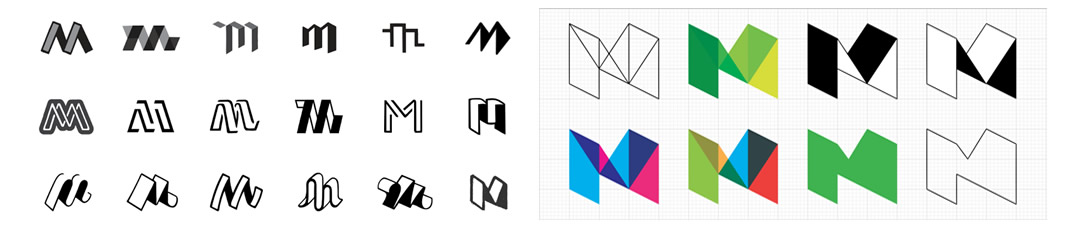
“We began to see the four planes of the logo as overlapping strains of a conversation. A conversation whose tone and direction shift as the planes come into contact with each other.”
The story behind the Medium 2015 Logo
Then came the announcement of the new logo for 2017 I must admit i was a little puzzled when i first saw it and the feeling of déjà vu to the original logo design. It took me some time to actually like this as with allot of other people out there i had grown fond of the green “M” icon but now i have had time to look and appreciate what has been done here its a nice serif wordmark and the monogram has an elegant and premium feel to it despite it looking generic.
I understand that Medium wants to monetise it’s product and be more like premium content and they need to appear more premium and upmarket, appeal to journalism be trendy like a magazine, by reverting back to the old colour scheme it gives the feeling of a news paper. It brings back strength to the brand a place where ideas are expressed through writing and writing is honoured and the typography is very nice also so it may age well as the company grows so give it time as i believe this is a good move.
Ok so lets take a look at the new Medium identity design taken from their Branding Guidelines:
Table of Contents
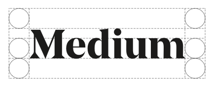
Wordmark
The Medium wordmark is an important expression of our brand identity. It should in no way be distorted or redrawn when applied to communications. Because the wordmark is such a recognizable and highly visible brand asset, it is vital that it is always applied consistently.

Monogram
Our monogram is the reduced form of our wordmark. It should only be used when the wordmark is too small to achieve maximum impact.
Clear Space and Positioning
The wordmark should always be surrounded by generous white space. The diagram below defines the minimum amount of clear space needed, which is based on the x-height in the wordmark.
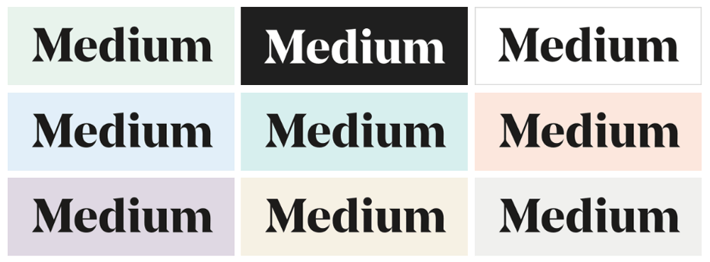
Color
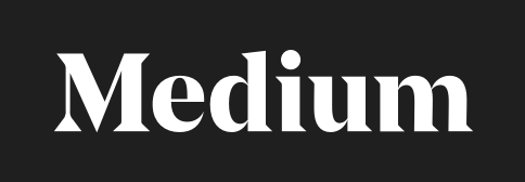
Primary Usage: our wordmark is primarily used in black. It can sit on top of the light green or white background. It can also be used in white over black.
Discretionary Usage: in rare cases where there is already a strong presence of our light green colour, the wordmark may be used on top of a colour from our secondary palette.
Incorrect Color Usage: our wordmark should never be used in white on top of any light colors. Additionally it shouldn’t be used with our dark colors, neither coloring it with a dark color, or using our primary black over a dark background.
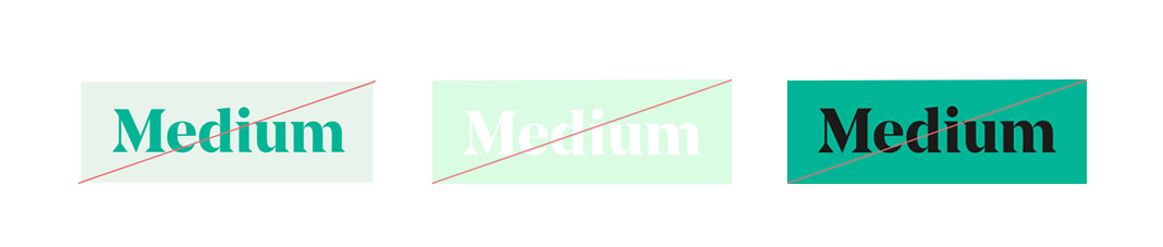
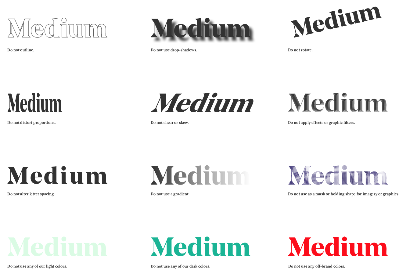
Dont’s
The examples shown here illustrate incorrect uses of the wordmark.