In this edition of Brand Spotlight, we take a look at Ministry of Sound Brand Spotlight
For many 90s kids, Ministry of Sound represents great music, pounding rhythm, and a great night out. Since their founding in 1991, Ministry of Sound has been providing music for the dance floor for many clubs and discos around the world, including their own nightclub in London. Their record company has been behind some great live music acts, while their compilation albums have amassed over 50 million sales worldwide. Ministry of Sound is definitely a behemoth in the music industry and are known all over the world.

To some the fact that Ministry of Sound have celebrated their 25th birthday will make them feel old. That is also what the owners of Ministry of Sound thought. So to mark their quarter-century the design company Spin were asked to modernise the company’s logo and bring it up to date.

This is was Spin had to say about their work with Ministry of Sound on their new logo:
“Ministry of Sound is a legendary London nightclub and (formerly) independent record label with a strong global reputation. To celebrate its 25th birthday, we were asked to help bring the identity up to date. Our proposal was to have the old, established marque working in partnership with our new contemporary identity.”
The new logo would not be used everywhere, but for club and other related activities, the old logo would be used on everything else as well as recordings.
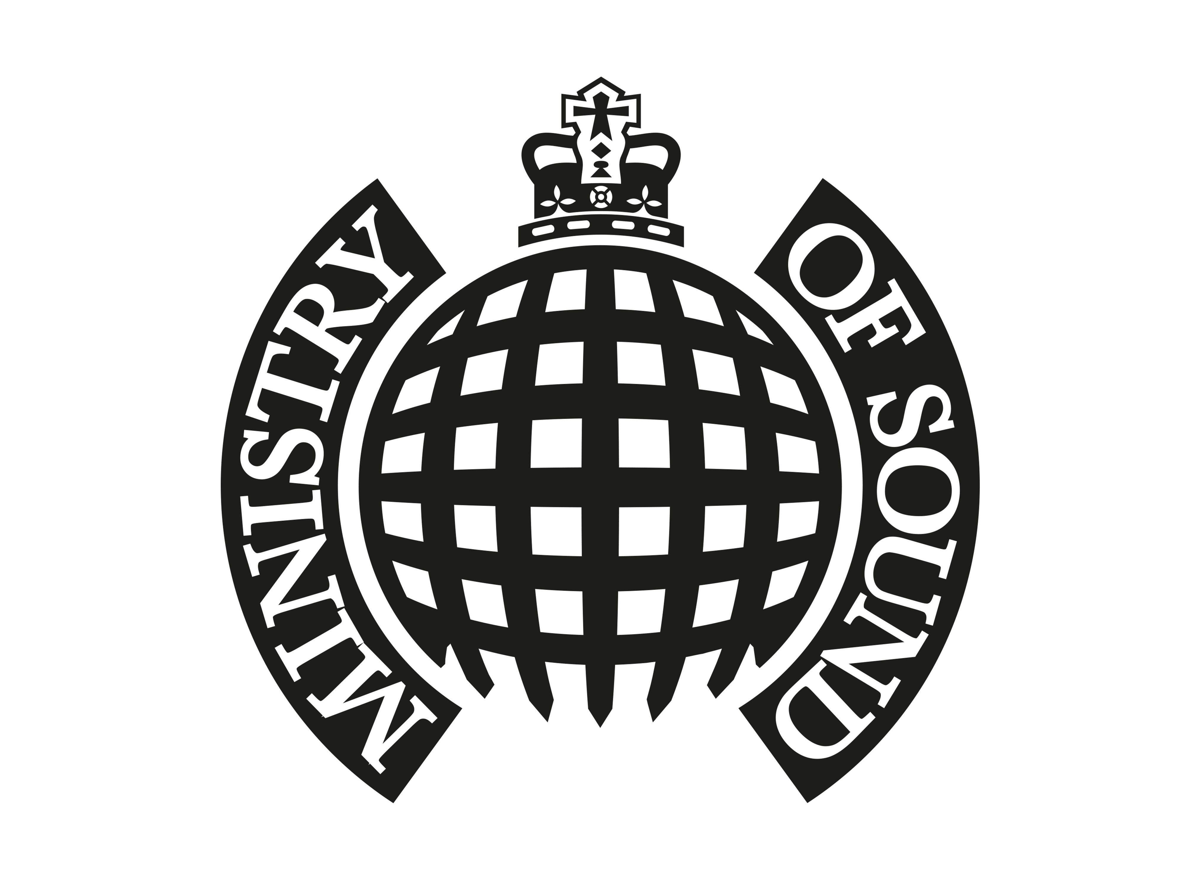
The old logo plays on the name of the company. The company takes the nomenclature from the various departments of the government; Ministry of Defense, Ministry of Agriculture, and Ministry of Education to name just a few. Why not a Ministry of Sound? Hence the style of the old logo takes elements from the official crests of the UK government.
 The Original Ministry of Sound LogoThe original logo looks a lot like a crest or seal. It shows authority and power to those who see it. The old logo has almost become a seal of approval on music. If you see the logo it must be good. This was a very clever design that made the whole company look official and that they were the last word on any subject pertaining to good music. The crest is a single colour design, so would not clash with any material that it would be used on. The portcullis design has been fitted into a circle with the type pleasingly around the edge. This also matches the style of the crests used for government agencies. The crown on top adds some more detail to the overall design as well as a badge of quality. The font choice was clever too. The original designer chose a traditional serif font, adding to the belief that the logo had been around for many years.

Right, let’s talk about the new logo. Spin was attempting to take the brand into a modern era. But have they done this? I would certainly say so. The current style of modern logos involves abstract shapes and simple designs. Gone are the portcullis, crown, and even the text. While a simple triangular “M” comes in. This fits in perfectly with the digital age. You only have to look at current logos and icons for music and tech companies to see that a simple geometric design is popular. As much as I like the old logo and all that it represents, the new brandmark can be used in far more scenarios.
Spin has not completely ruined the heritage of the brand, just simply moved it forward. The two arcs still represent the old crest, while simplifying it too. The logo is still a single colour, so can work on any background; a common feature on modern logos. Overall the simple, geometric designs works well for a logo in the 21st century. I believe that Spin has done a good job for the Ministry of Sound’s new logo, however, the proof is in the pudding, and with the old logo still in use we shall wait and see how much the new logo gets used.
If you enjoyed this article check out The Brand Spotlight Section for more articles about the biggest company rebrands.

