Today Designer Spotlight: Penta Cafe Brand Identity Spotlight
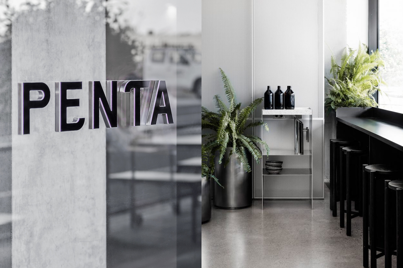
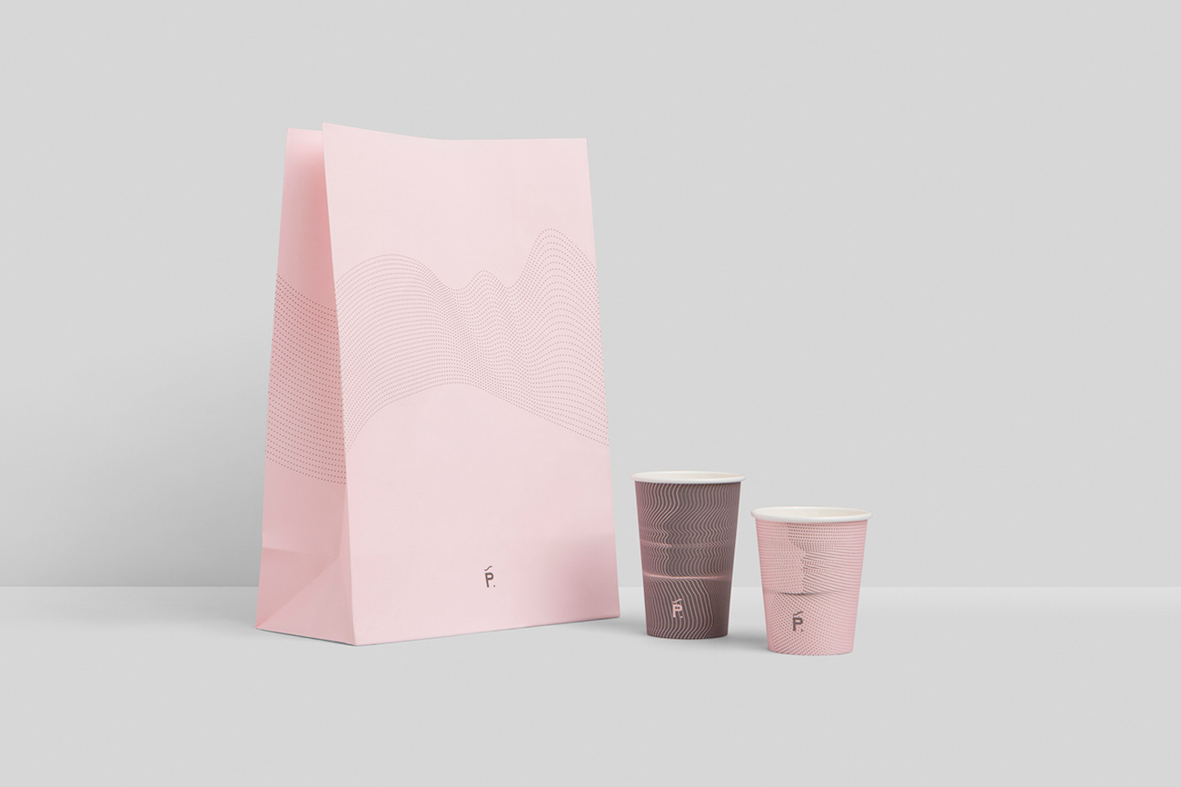
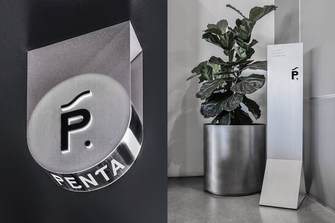
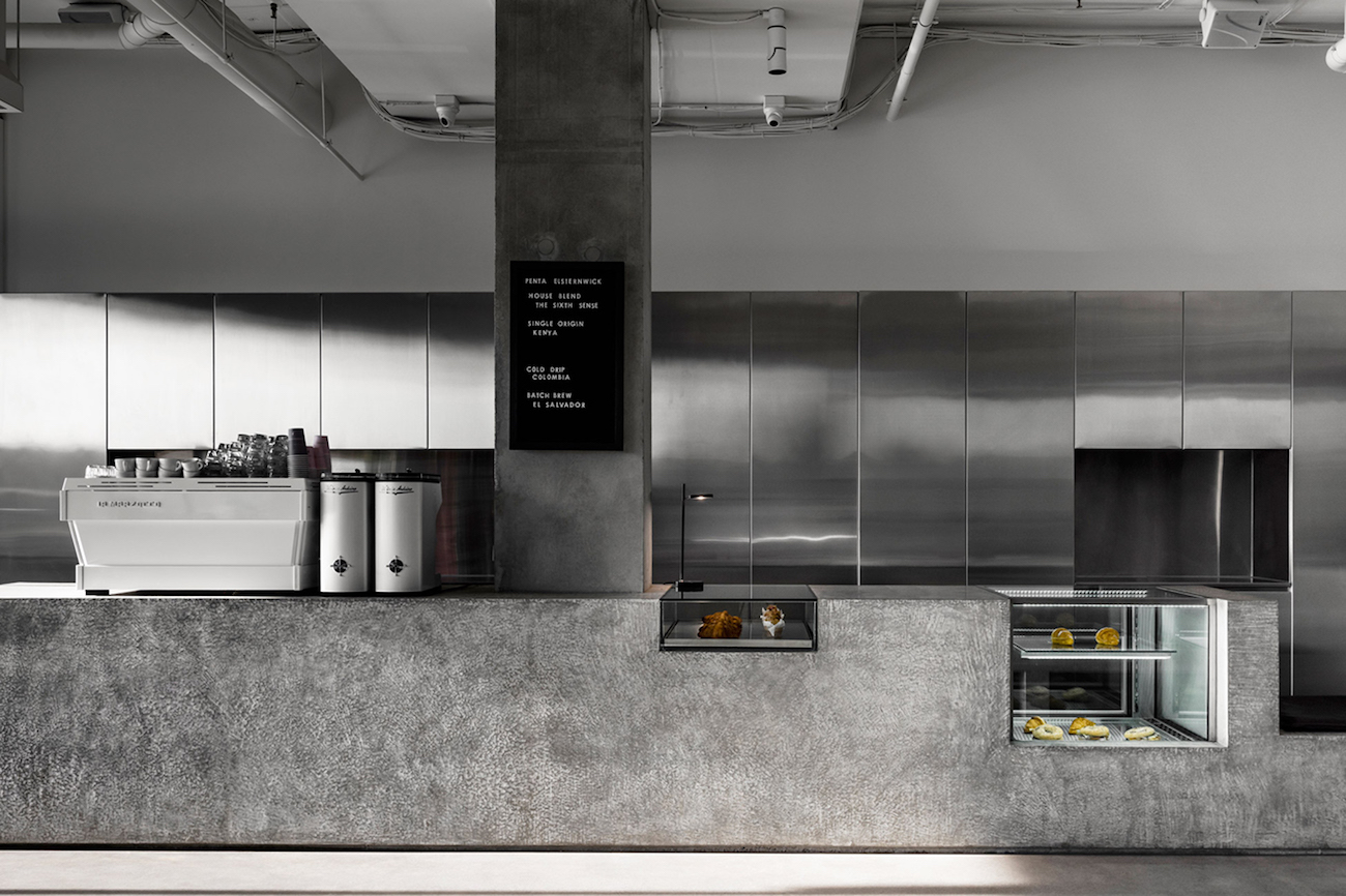
Penta Cafe is a modern cafe in the heart of Melbourne, Australia. Pop & Pac studio branded the cafe’s identity with an elegant, feminine aesthetic that counters the dark, monochrome interior design.
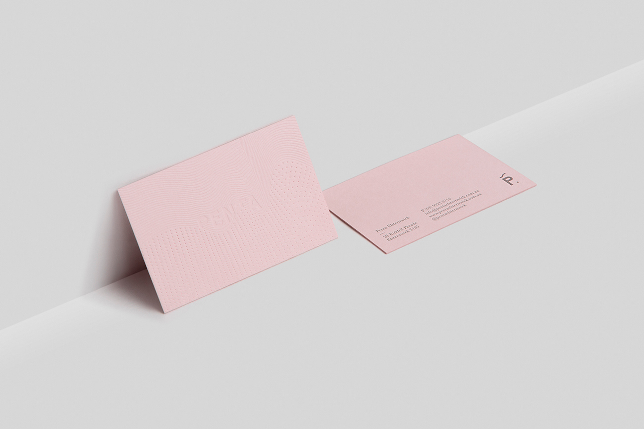
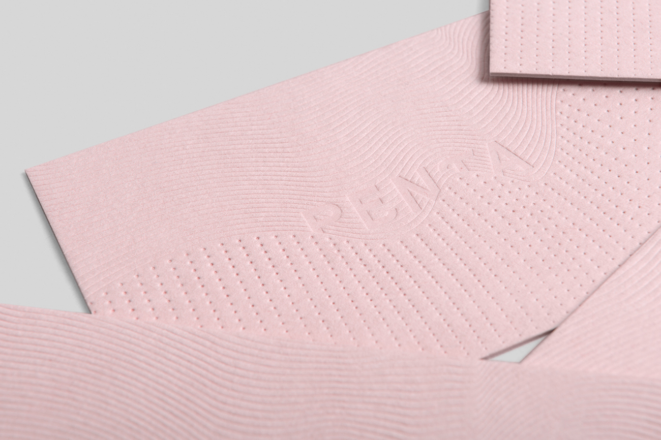
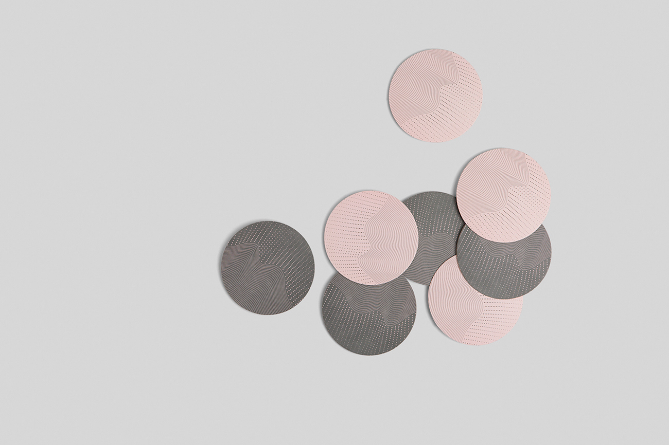
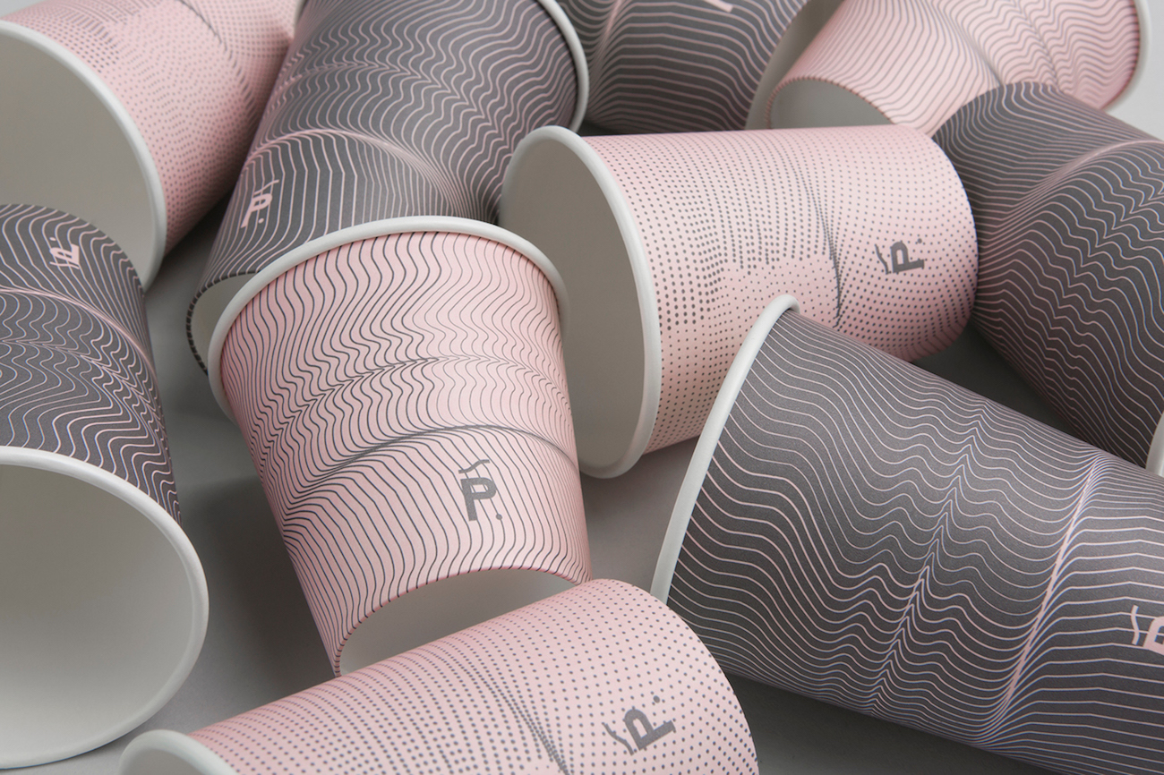
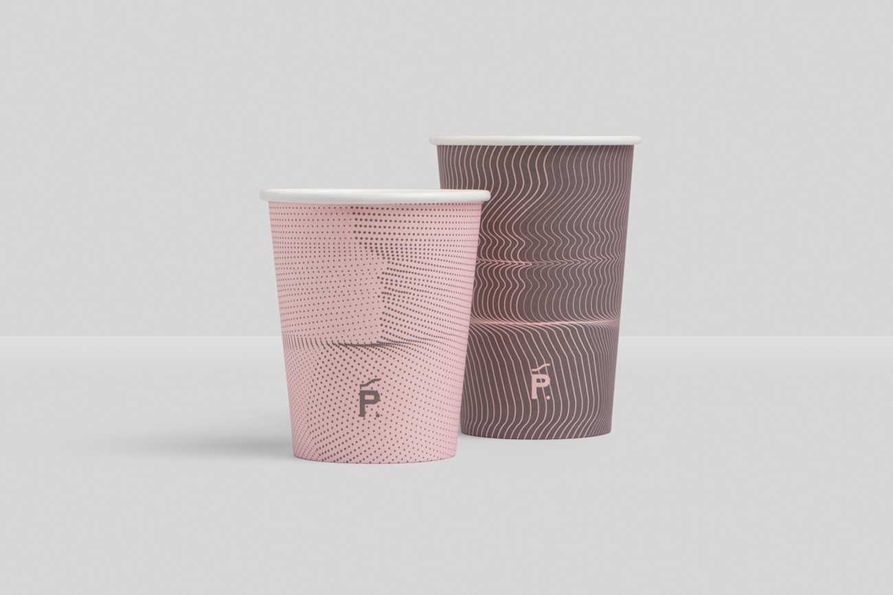
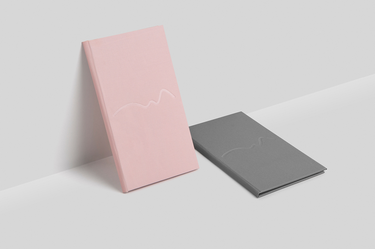
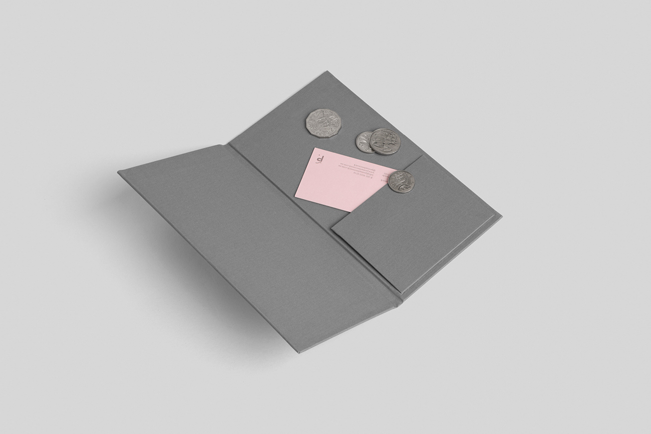
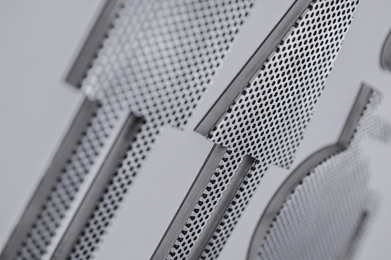
The interior’s steel and concrete tones are softened by a lighter colour scheme of pastel pink and contrasting dark grey used in its collateral design. Simple line patterns and a clean logomark keep the style simple, but Pop & Pac’s detail-oriented approach gives the cafe a contemporary and creative feel. The logotype and signage feature custom typography, and linear patterns and pointillism techniques are used in its packaging to create subtle visuals. On its takeaway cups, a delicate silhouette of a feminine profile comes into view, and smooth waves feature across the rest of its packaging. Its bright business cards have an added luxe touch, with a blind emboss effect on the lettering and pattern designs.
Credits: Pop & Pac
