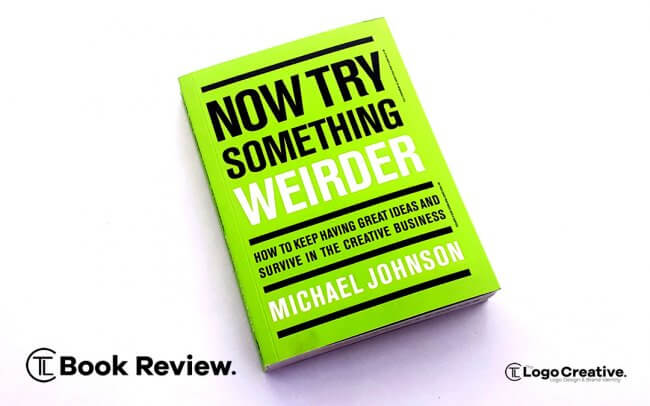
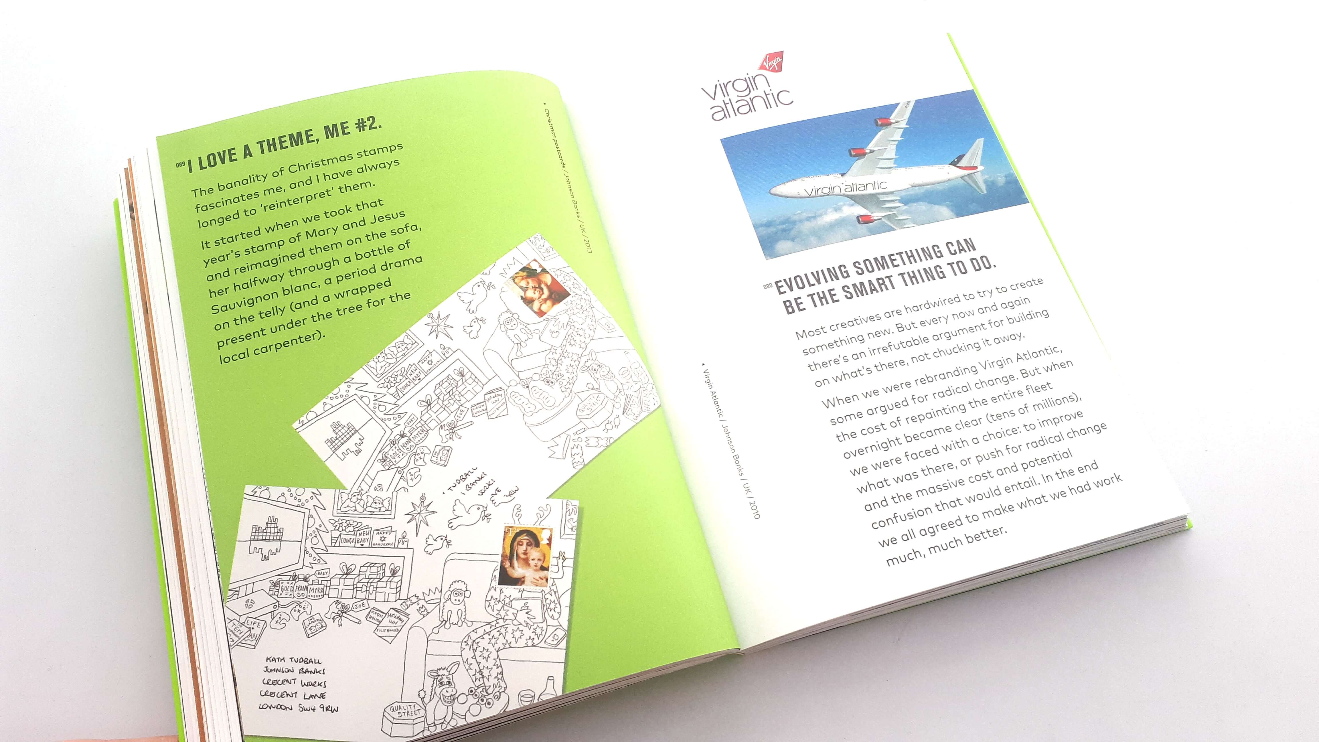
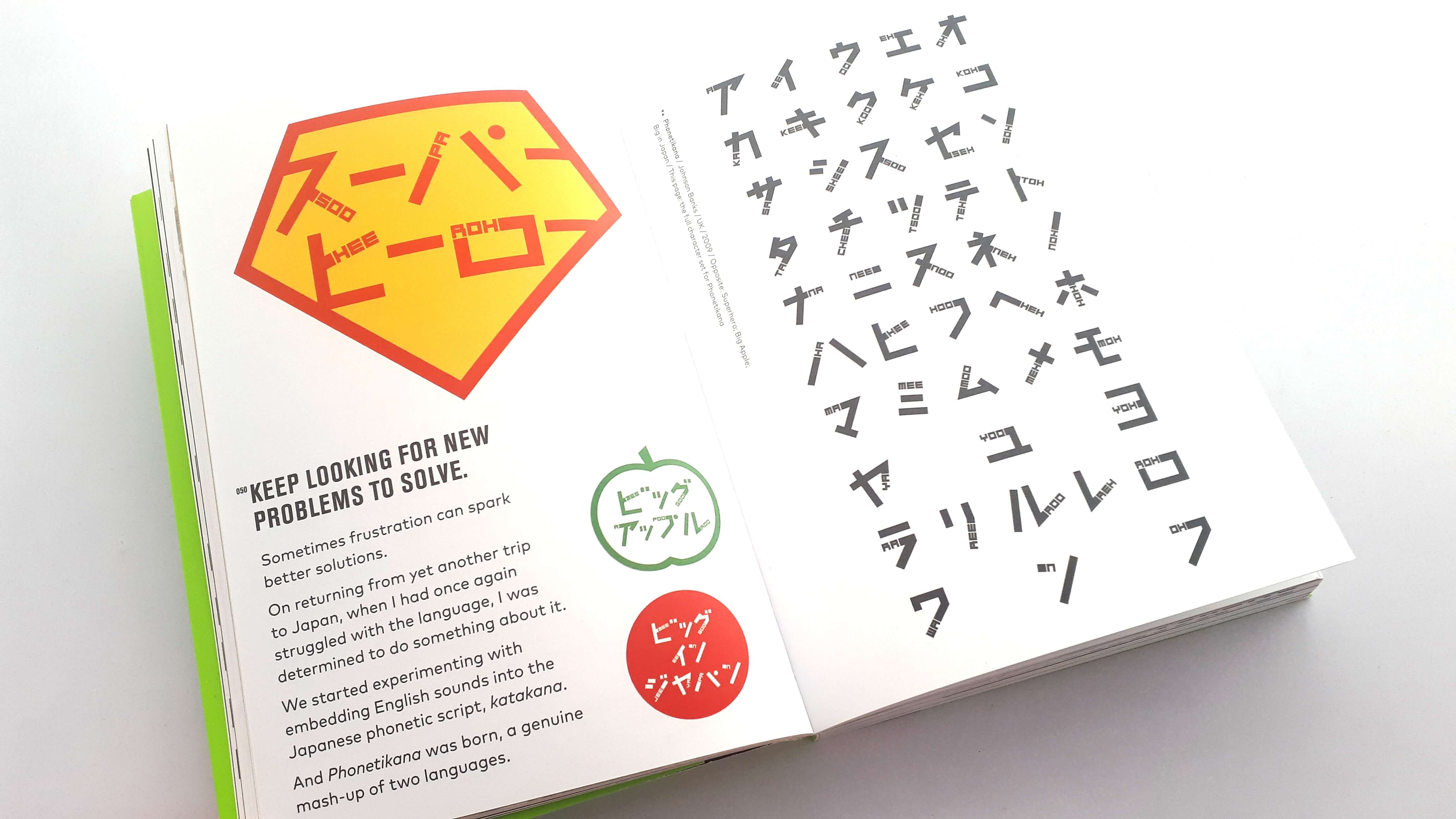
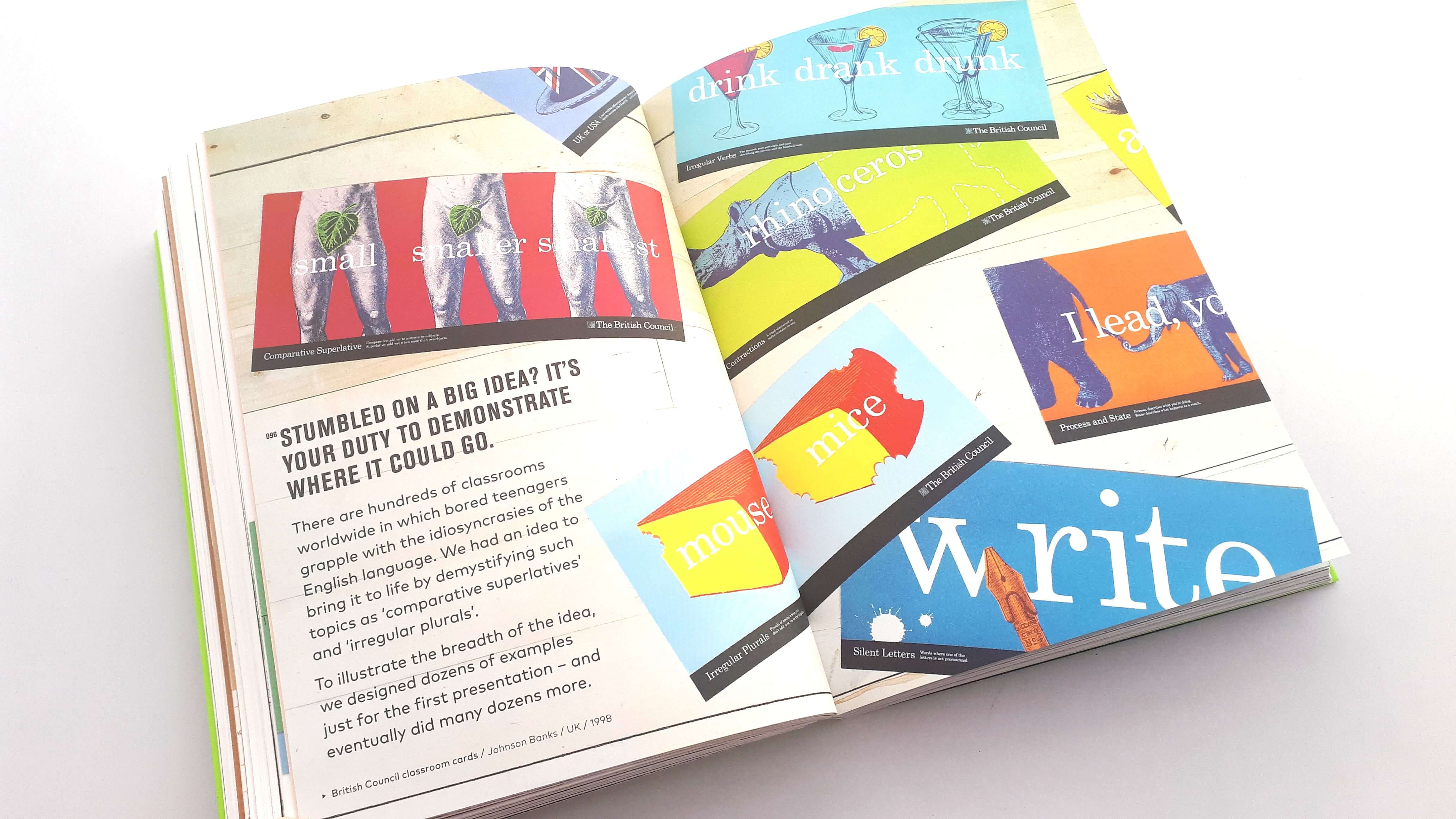
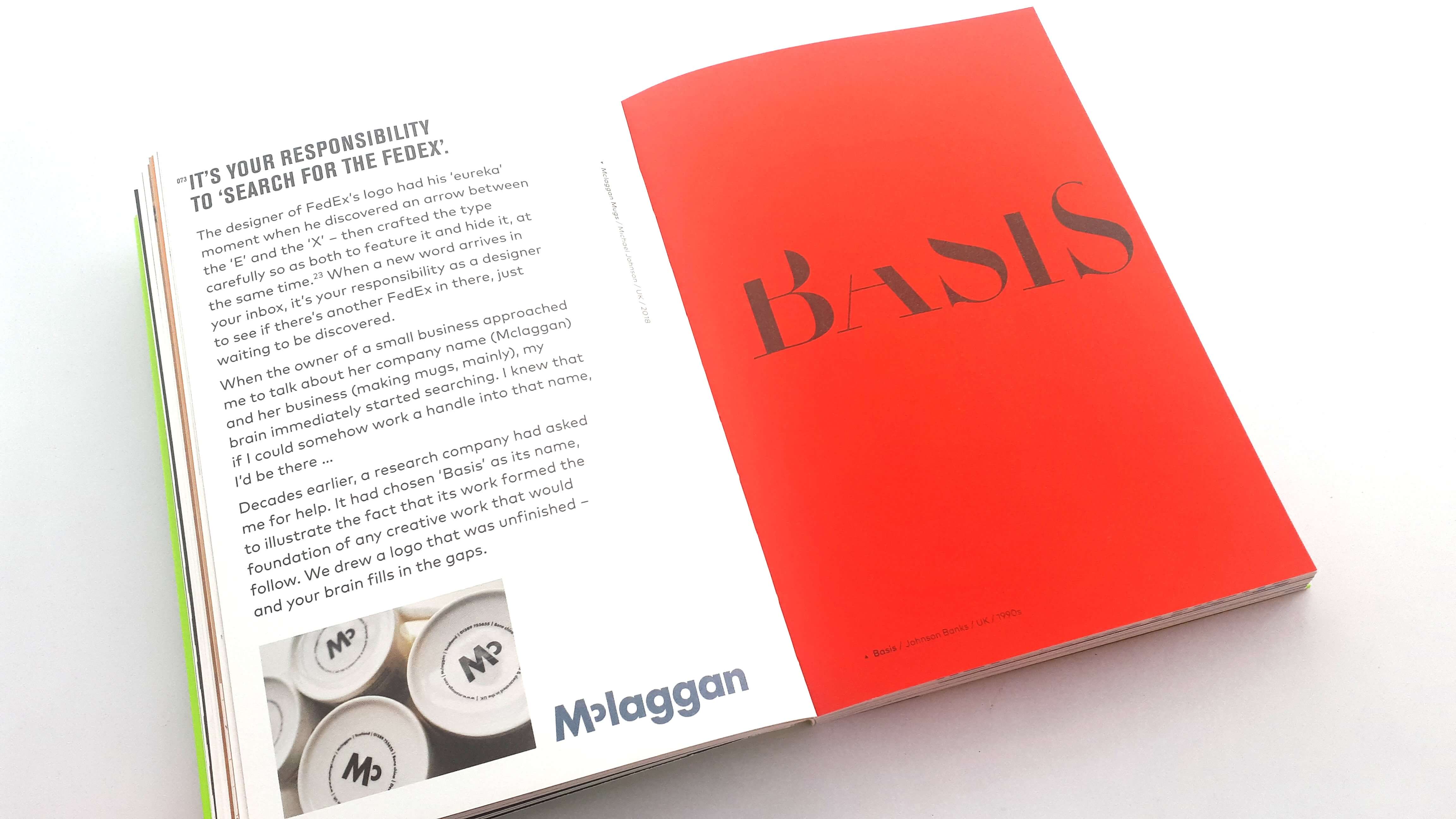
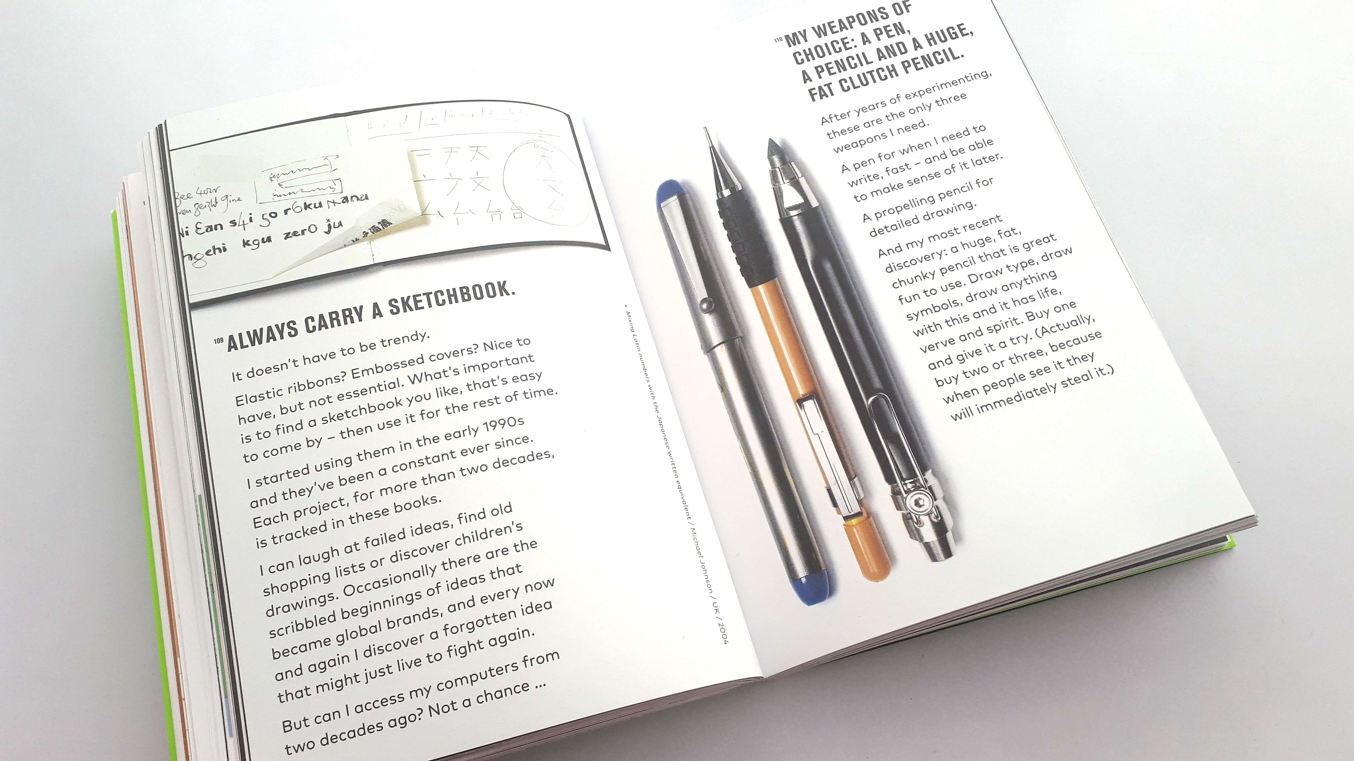
Now try something weirder – How to keep having great ideas and survive in the creative business by Michael Johnson of Johnson banks and published by Laurence King due for release on 20th May 2019 is jam-packed with essential advice for designers and creatives of all disciplines, written by a world-renowned designer.
“I took what I was convinced was the ‘perfect’ solution to my then creative director. ‘Nice’ he said. ‘Now’ try something weirder.” – Michael Johnson
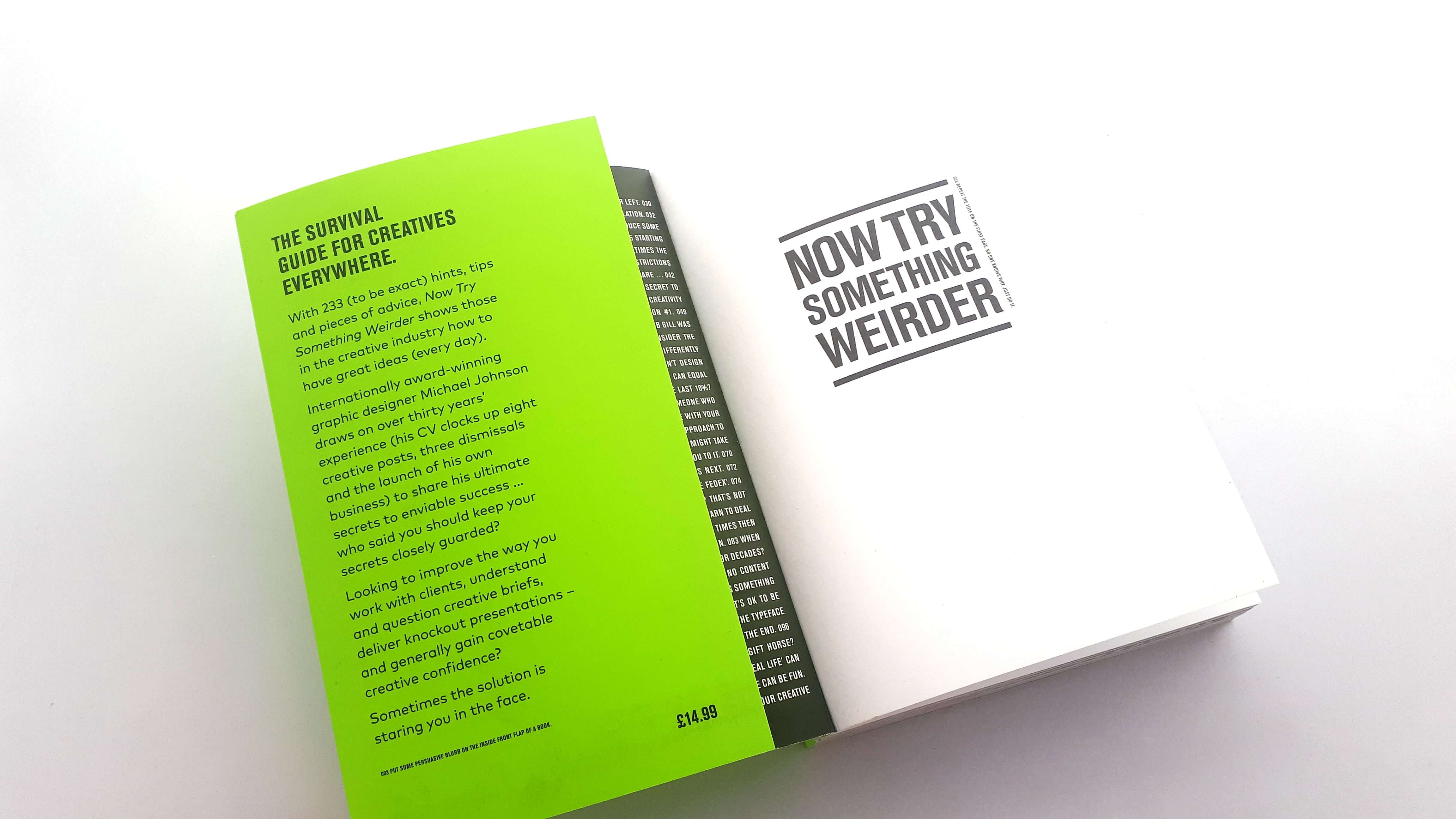
The book has 233 (to be exact) hints, tips and pieces of advice, Now Try Something Weirder shows those in the creative industry how to have great ideas every day.
Internationally award-winning graphic designer Michael Johnson draws on more than 30 years’ experience (his CV clocks up eight creative posts, three dismissals and the launch of his own business) to share his ultimate secrets to enviable success. Michael has also won many sought after prizes, including seven yellow and one’black’ pencil from D&AD. He received its lifetime achievement award in 2017 and he is also the author of problem solved in 2002 and Branding in five and a half steps in 2016
The book is perfect for those looking to improve the way they work with clients, understand and question design briefs, deliver knockout presentations – and generally gain covetable creative confidence. Sometimes the solution is staring you right in the face.
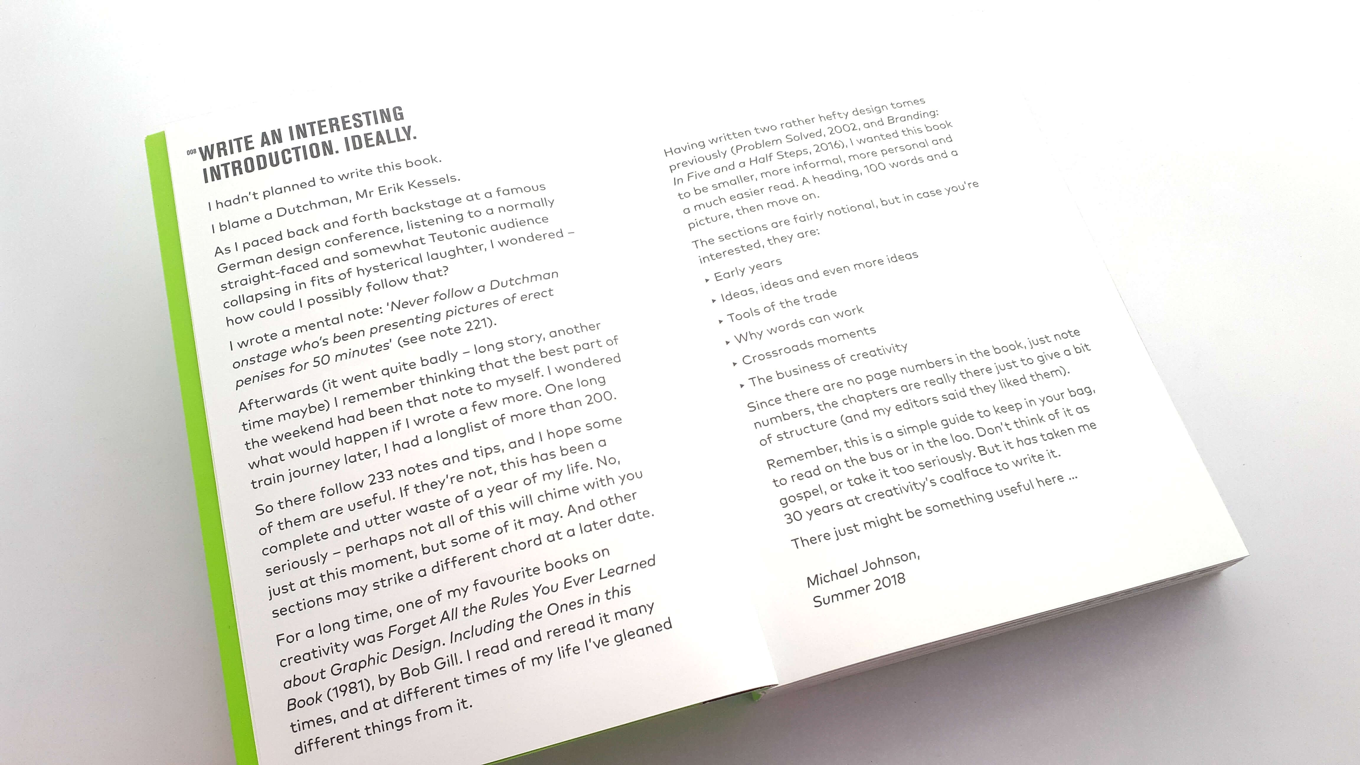
How did the idea for this book come to be? As Michael Johnson explains in the introduction of the book. He had not planned to write the book, Michael was at a German design conference and while he was backstage waiting to go out and speak he could hear the audience collapsing in fits of hysterical laughter, and was wondering how he could possibly follow that?
The person who was speaking was a Mr. Erik Kessels who was on stage presenting pictures of erect penises, Michael wrote a mental note to himself “Never follow a Dutchman onstage who’s been presenting pictures of erect penises for 50 minutes.” Afterwards Michael remembered that the best part of the weekend was his mental note and wondered what would happen if he wrote a few more. One long train journey later, he had a list of more than 200 notes and one year later a simple guide to keep in your bag, to read on the bus or in the loo or in my case on vacation. As Michael explains don’t think of it as gospel, or take it too seriously. It’s taken him 30 years at creativities coalface to write it and there might be something useful here …
Before we jump into this book I would personally like to thank Laurence King and Michael Johnson for sending me an advanced copy to enjoy reading and I certainly did!
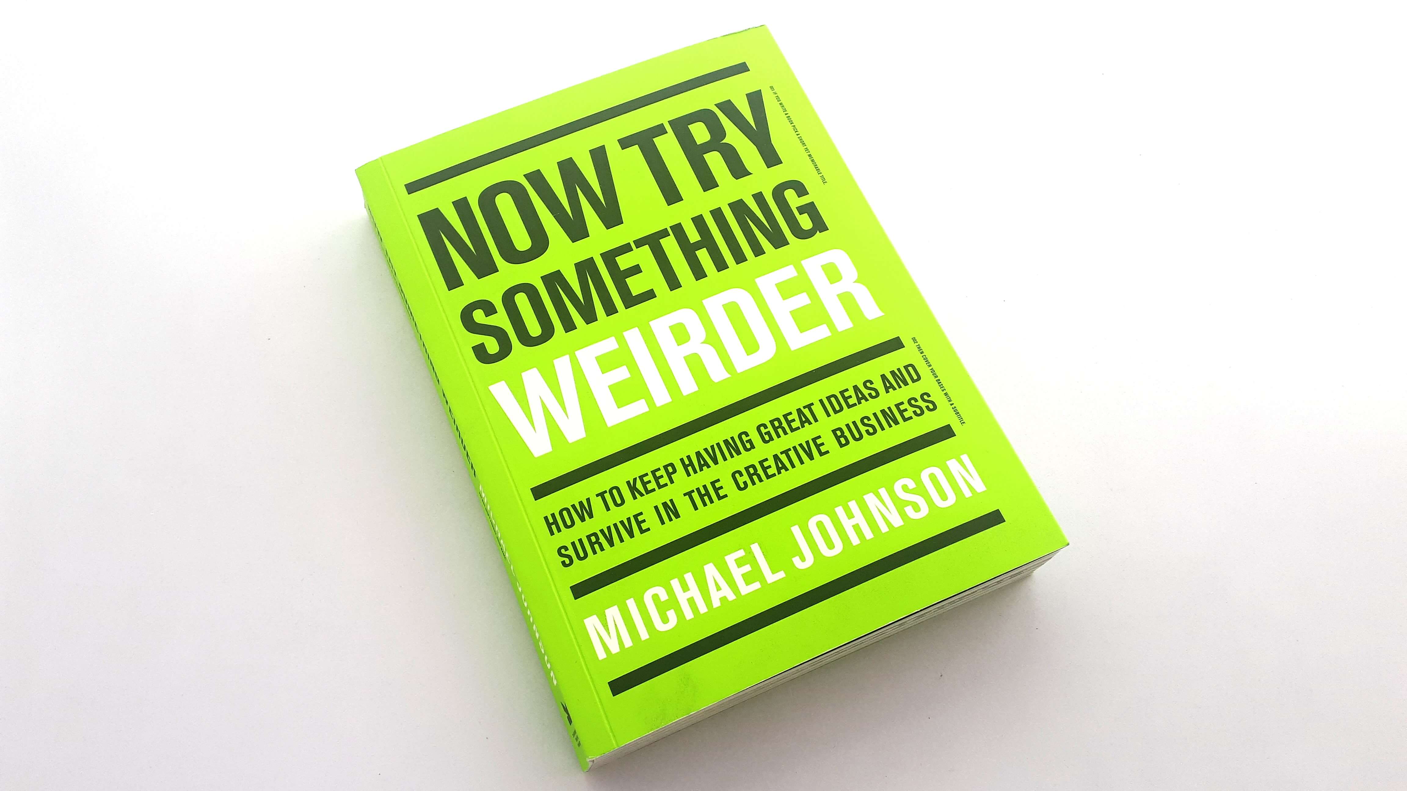
As I do with all book reviews before we get to the content I start with the physical book and cover design. The first element of the book that stands out is the bright green colour which I believe is a great colour choice for this book.
Green is normally representative of healthy, and a natural colour so maybe it’s saying the book is good for you who knows? The big bold text is eye-catching and straight to the point and notorious for a Michael Johnson book.
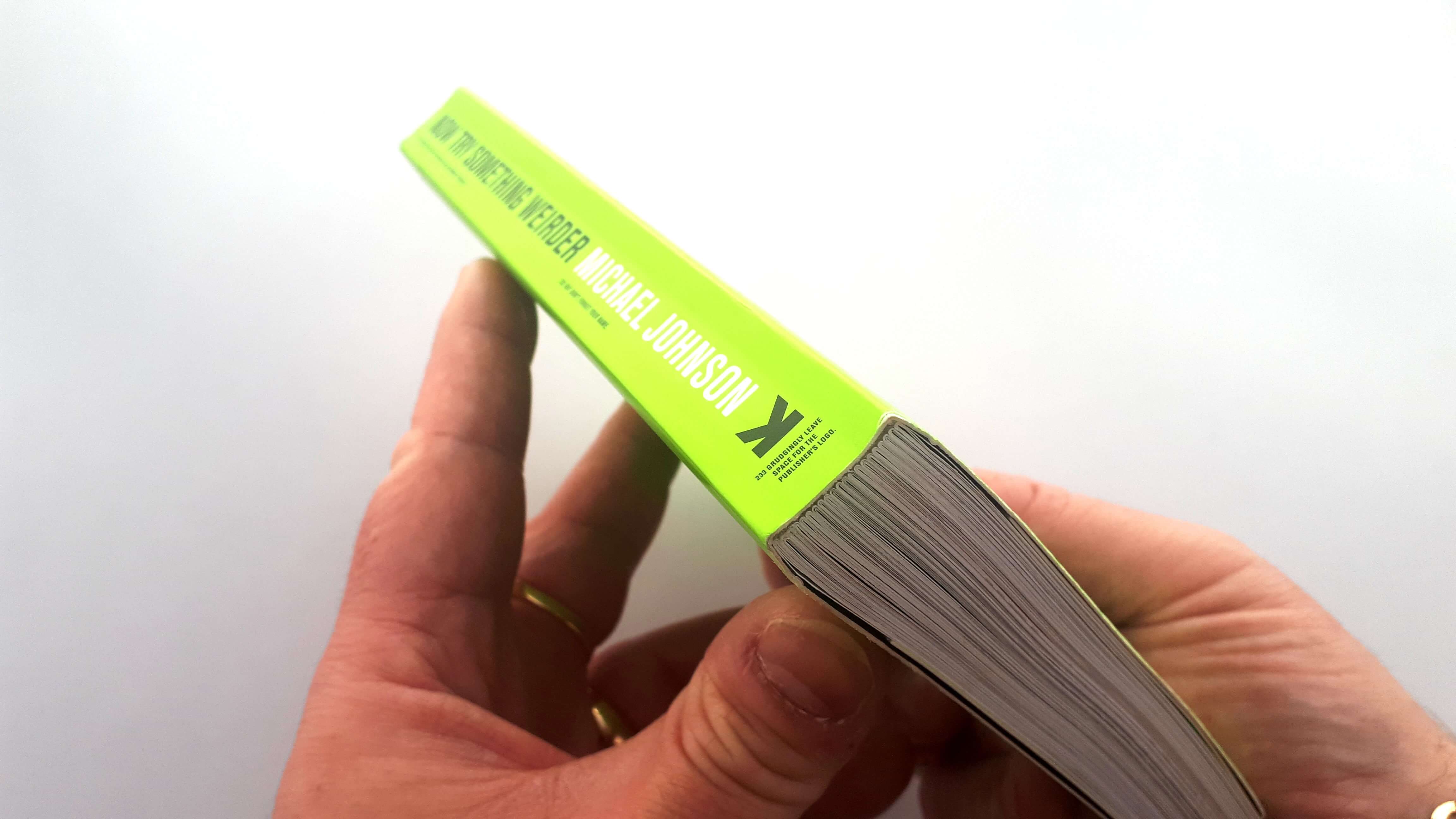
The book is paperback that is bound very well, and overall well made with a quality solid feel which is what we can expect from a Laurence King Publication. It features 294 illustrations packed inside the 185 x 135 mm book that is smaller than Michaels previous books but delivers on all levels and the perfect size to carry around which is what I actually did as I read the book while on vacation and thoroughly enjoyed reading it, so let’s jump inside this gem of a book.
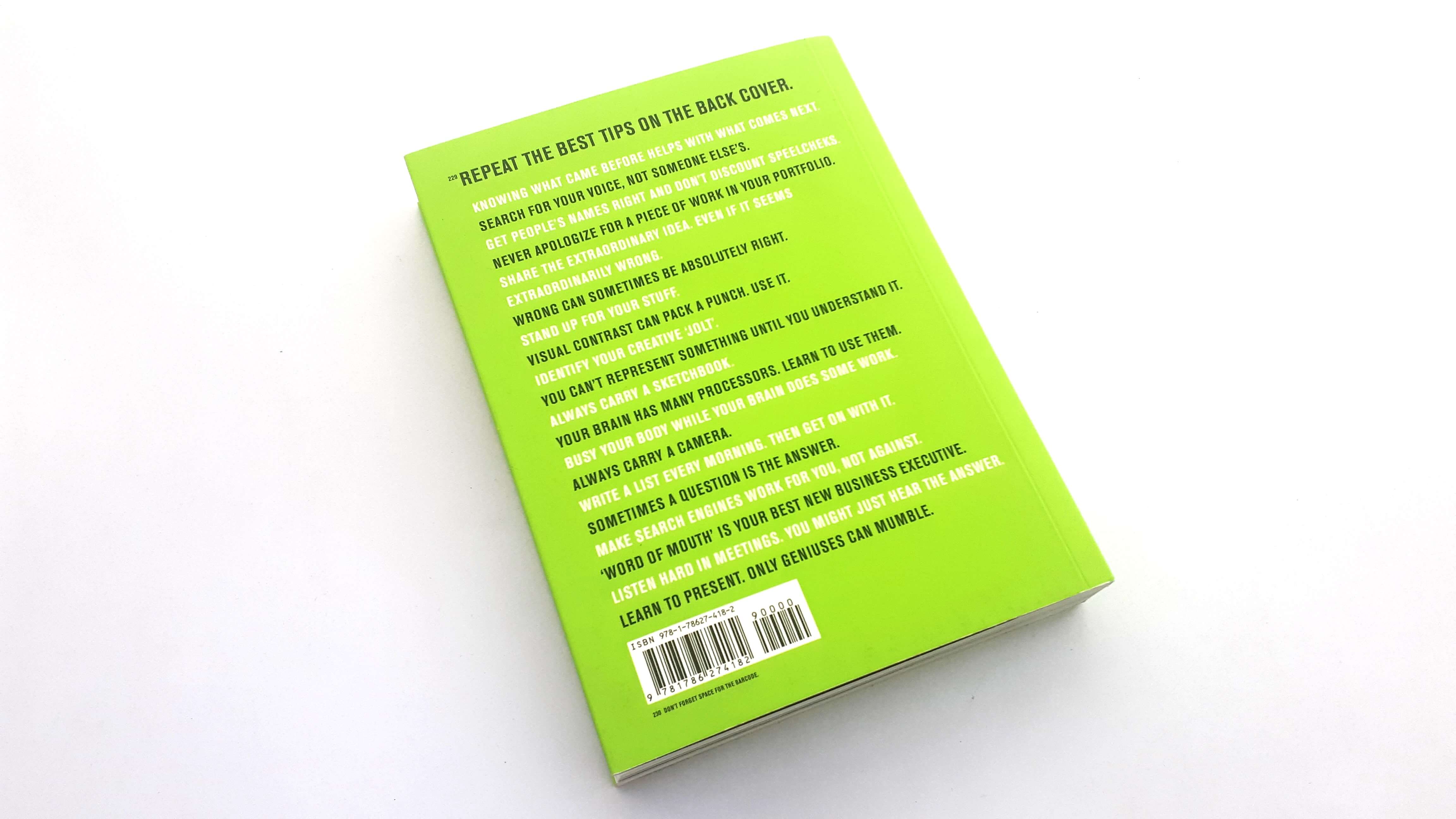
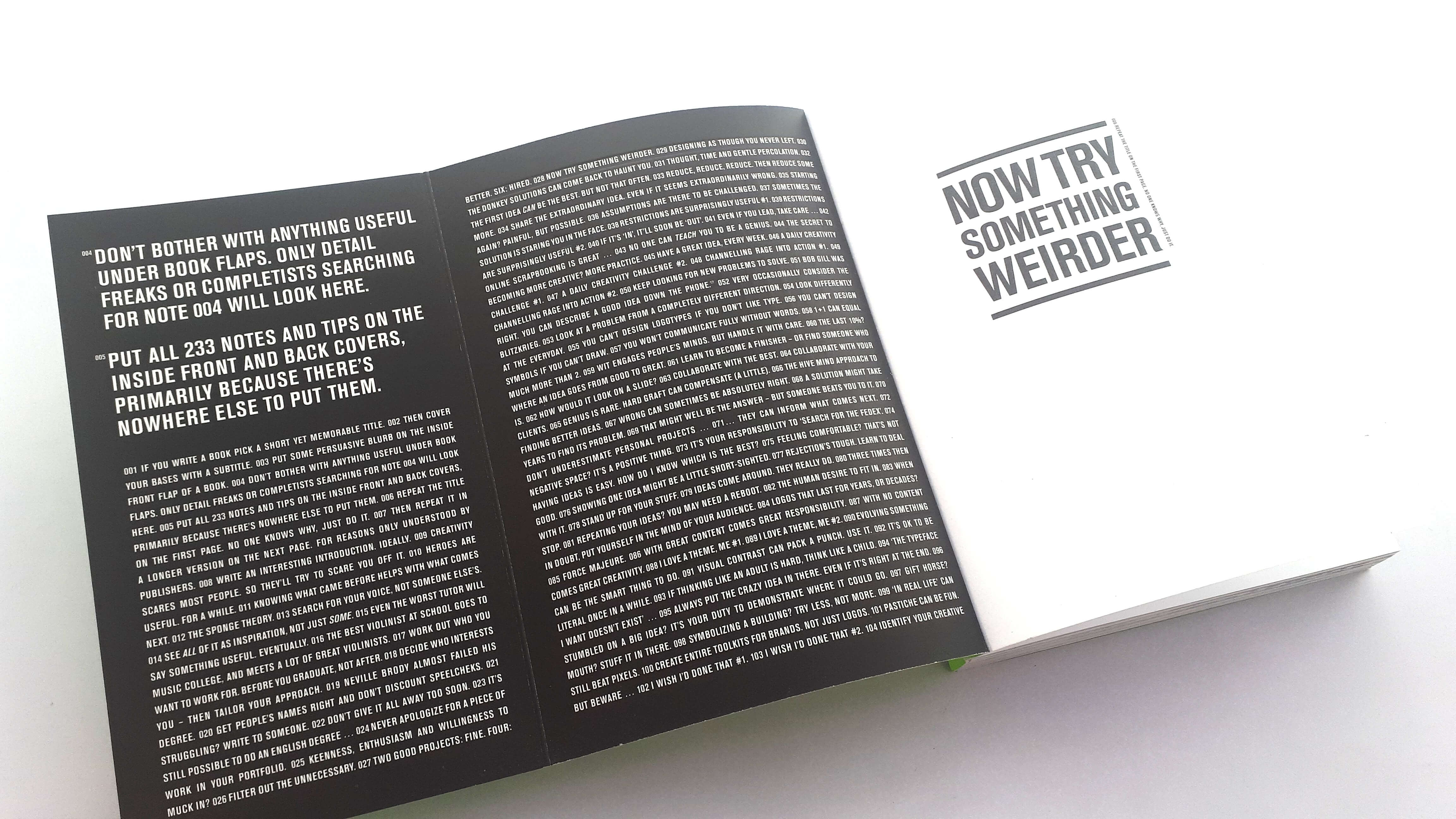
As you progress through the book starting on the cover (you will notice in tiny text tip one and two begins and these tips progress through the book then onto the back cover and around the spine of the book which is a nice design element these are known as note numbers as the book contains no page numbers.
The book’s concept reminds me of Paul Arden’s book it’s not how good you are its how good you want to be but aimed at graphic designers and designers specialising in branding and identity design the book is also longer containing a lot more information.
While reading I shared some snippets from the book on Twitter and members of the design community agreed with the advice that has been presented within the book and it really is packed with golden nuggets of insightful tips and knowledge.
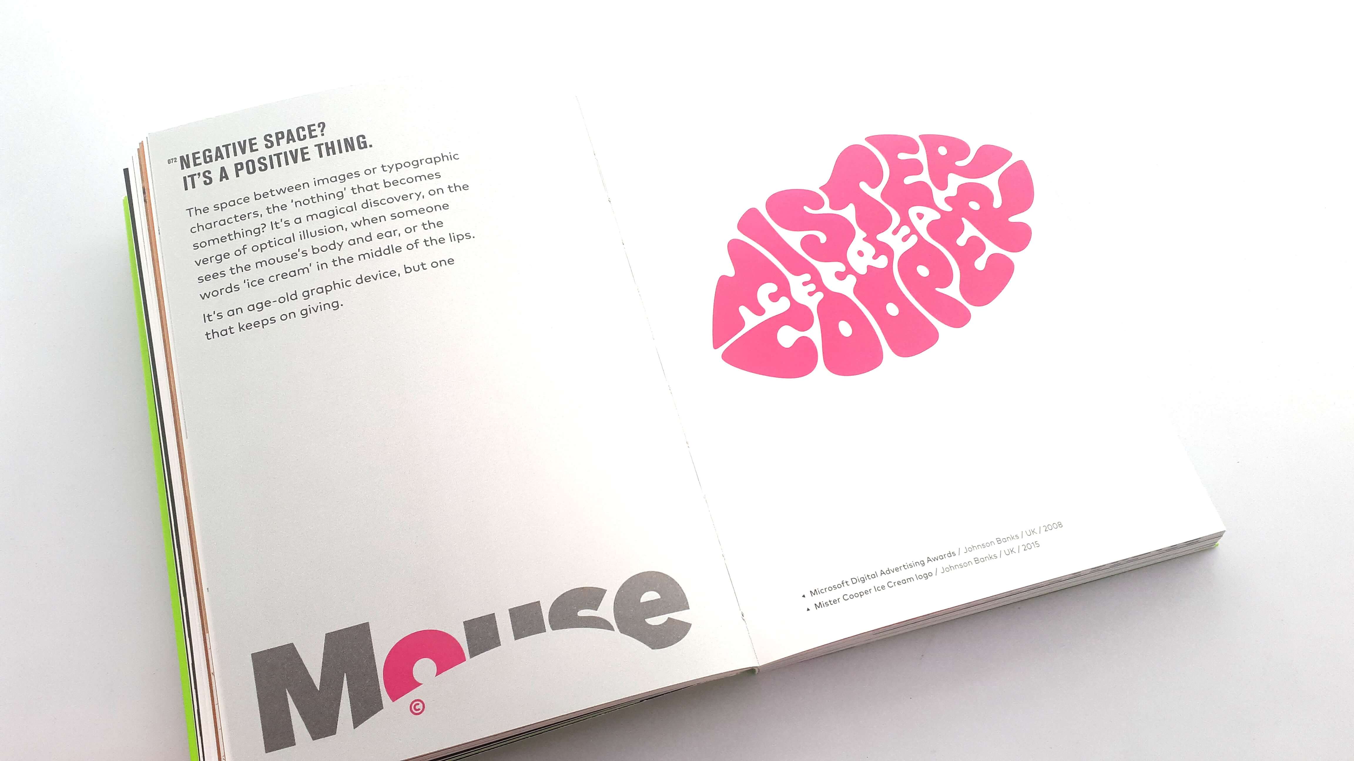
Everyone loves negative space, it’s clever creativity!
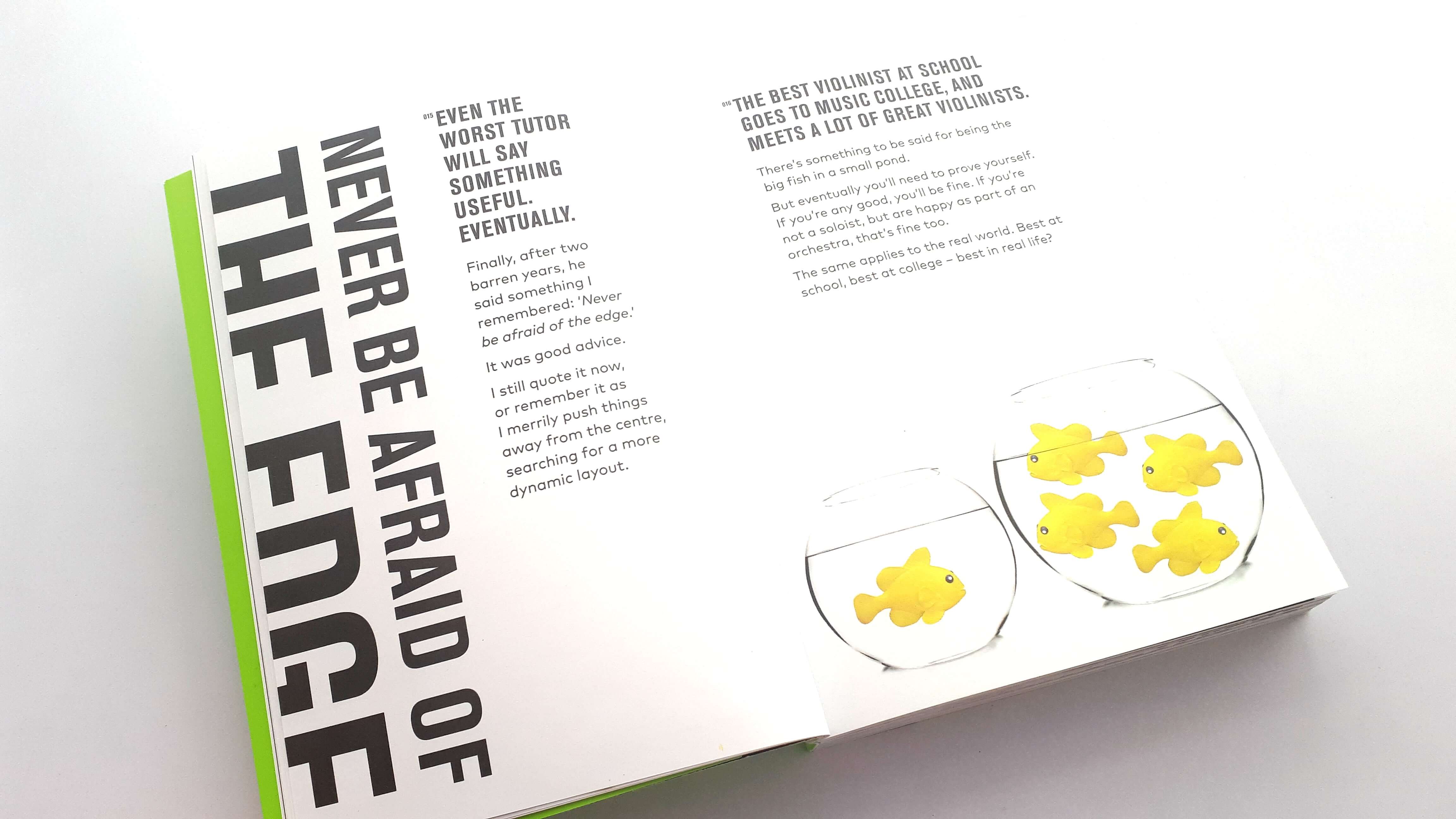
Negative space is a positive design element. The space between images and typographic characters is ‘nothing’ that becomes something. It’s a magical discovery, on the verge of optical illusion.
*Now Try Something Weirder by Michael Johnson pic.twitter.com/beHd1atfWe
— The Logo Creative™ (@thelogocreative) 12 May 2019
When tweeting about not pitching design ideas and giving your ideas away for free.
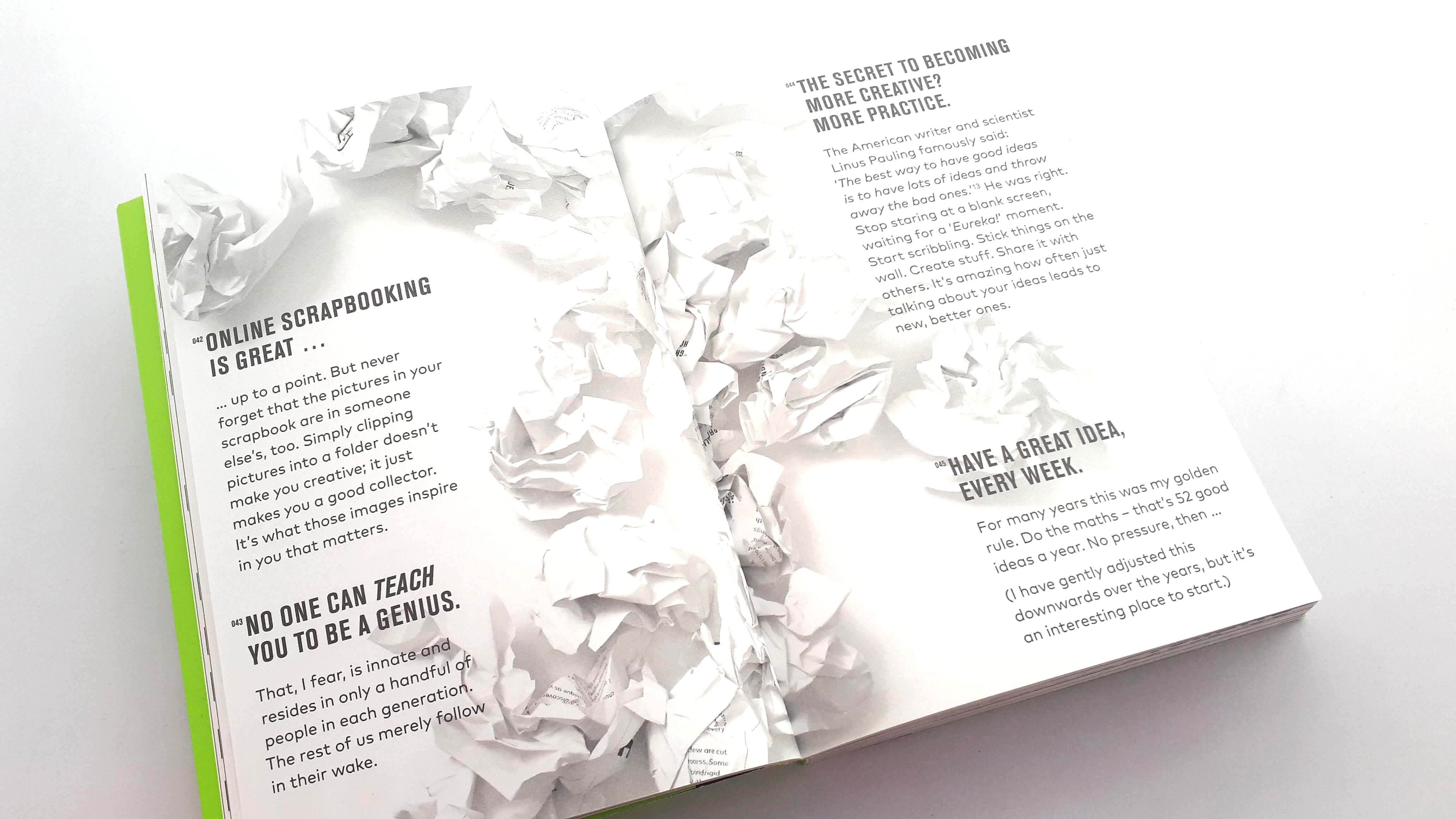
“Pitching Design Ideas For Free just Demeans You.”
Something I have never done or will ever do, neither would I recommend it! Being a creative is a tough profession so be professional and don’t give away ideas for free! pic.twitter.com/K4EgcF3GLr
— The Logo Creative™ (@thelogocreative) 14 May 2019
Some of the designers in the community agreed with the advice given.
If you’re doing it, stop it. https://t.co/YMJAkgYWmR
— Jonathan Wilcock Freelance Copywriter (@Jonathan50Wh4t1) 14 May 2019
100%! https://t.co/5kZy92iaLt
— Burrows | Logo & Brand Identity Design (@burrowsdesignco) 14 May 2019
Can’t agree more! https://t.co/k6bqDFfTXv
— dipx design (@dipx_design) 14 May 2019
It was great to get the design community involved while reading this great book!
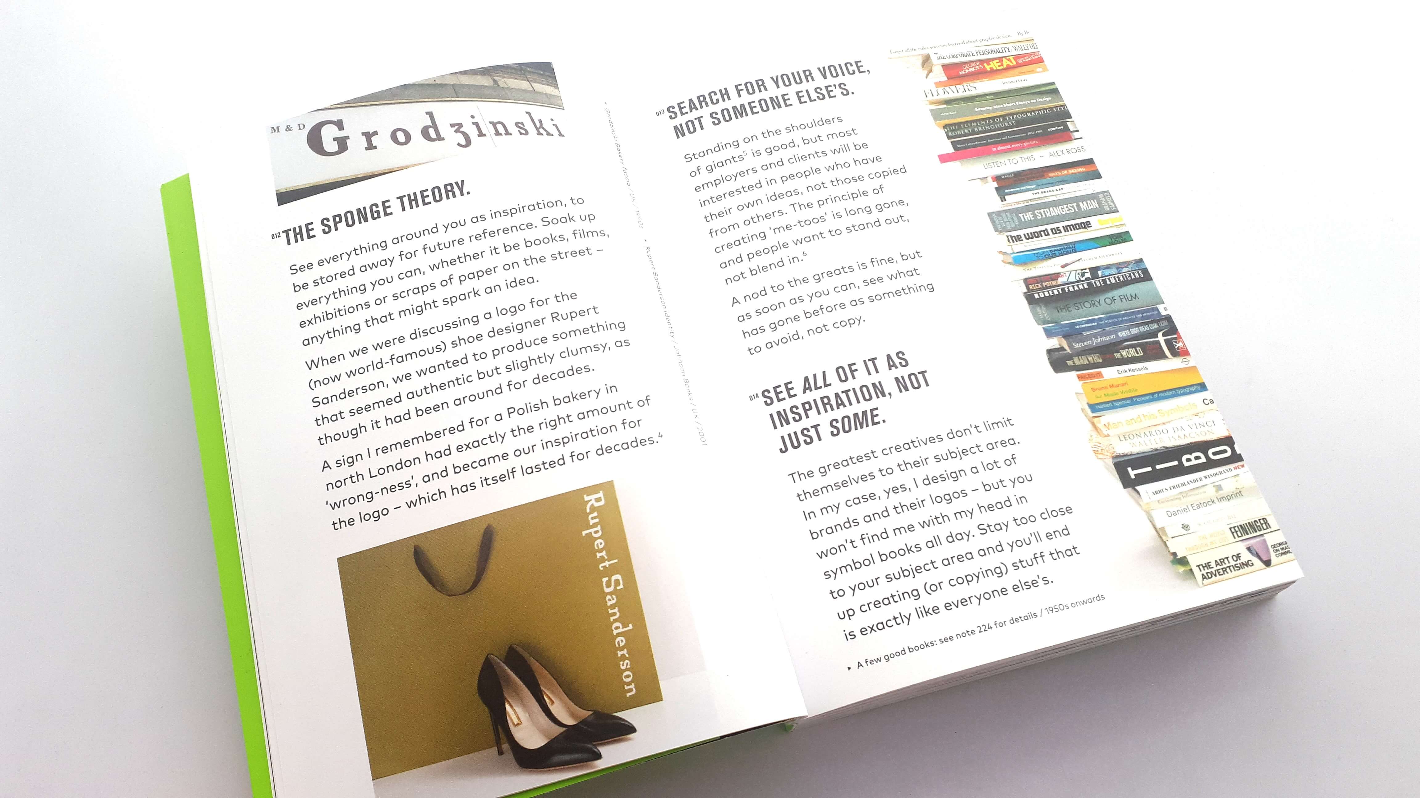
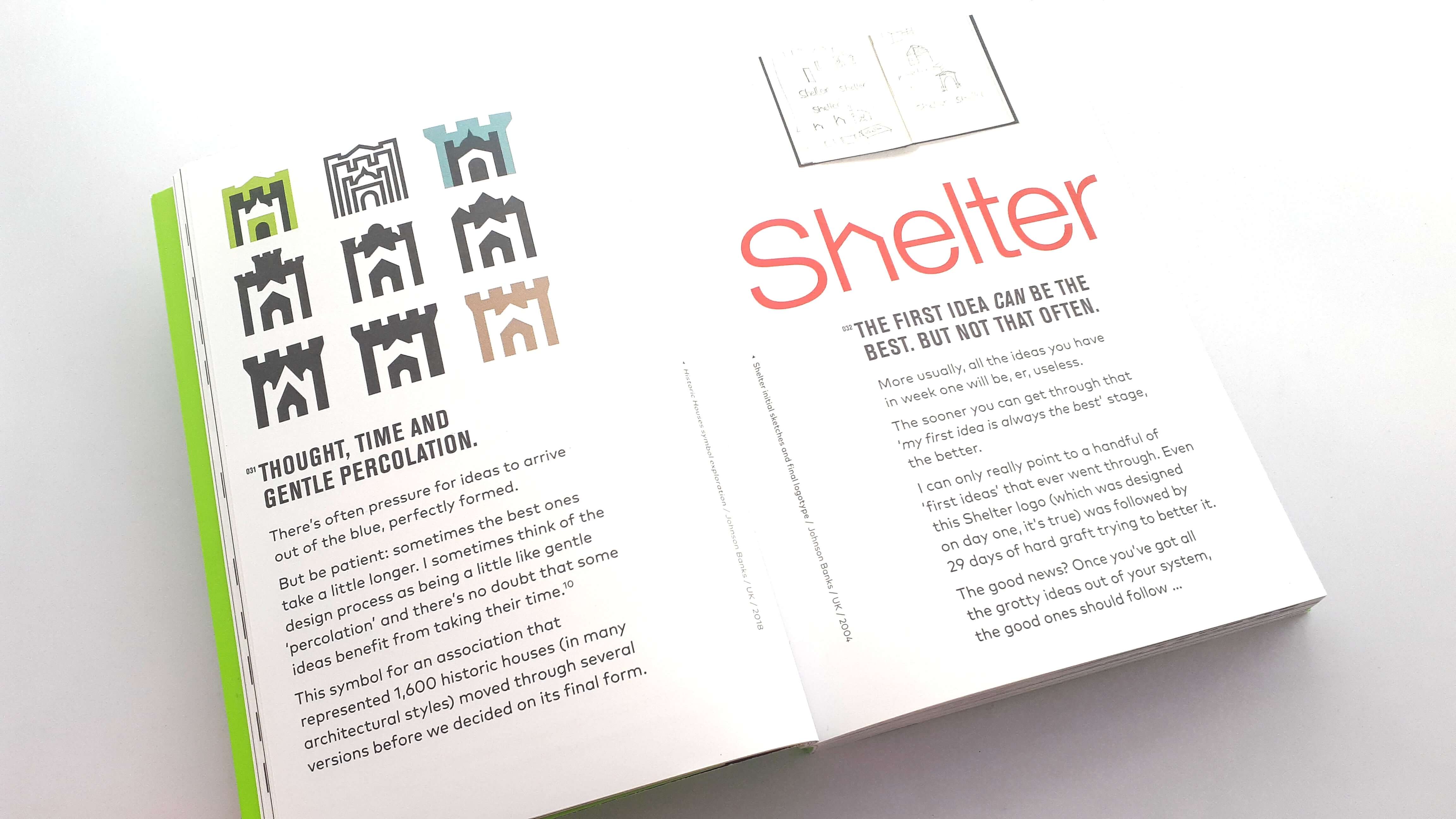
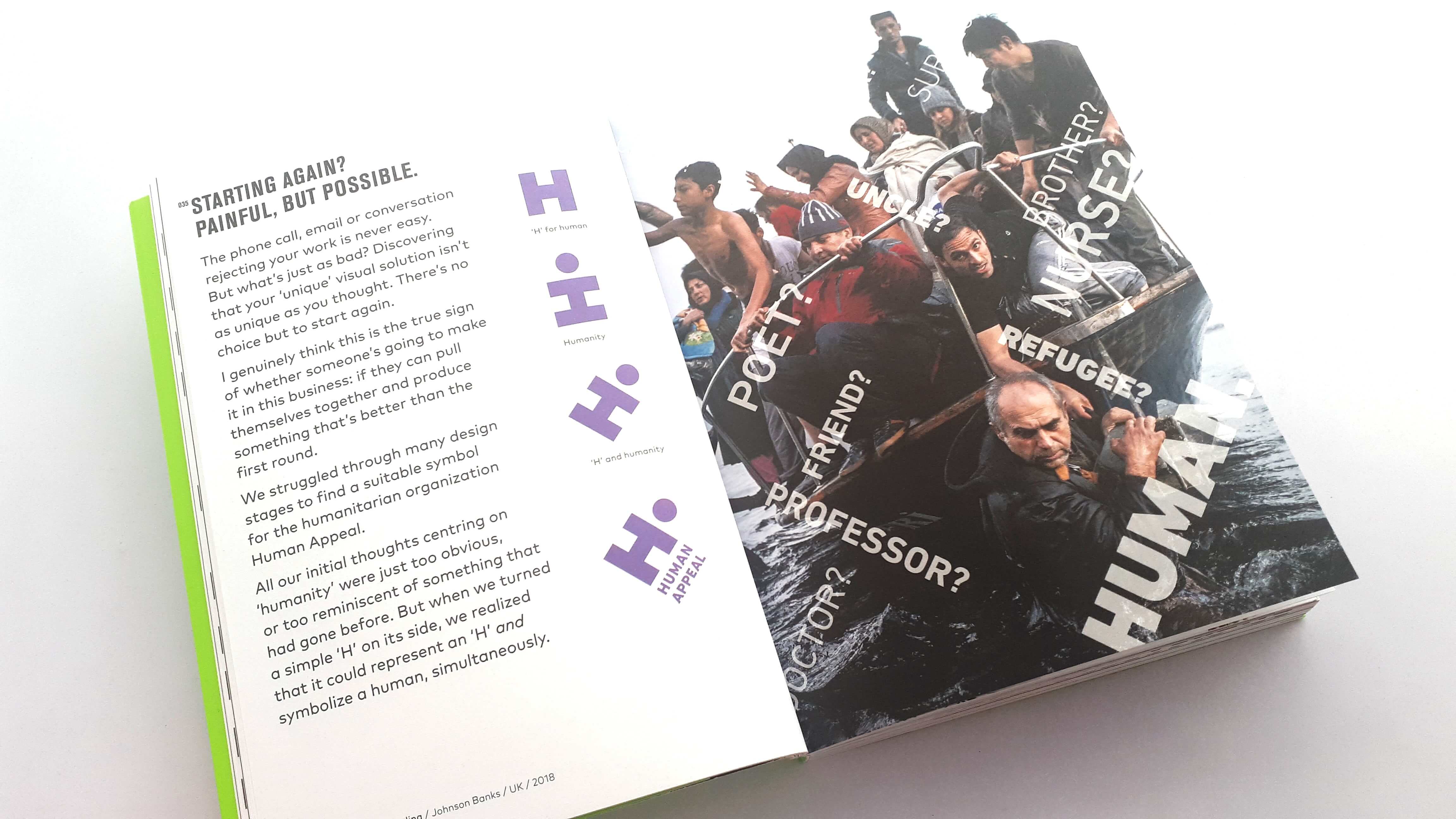
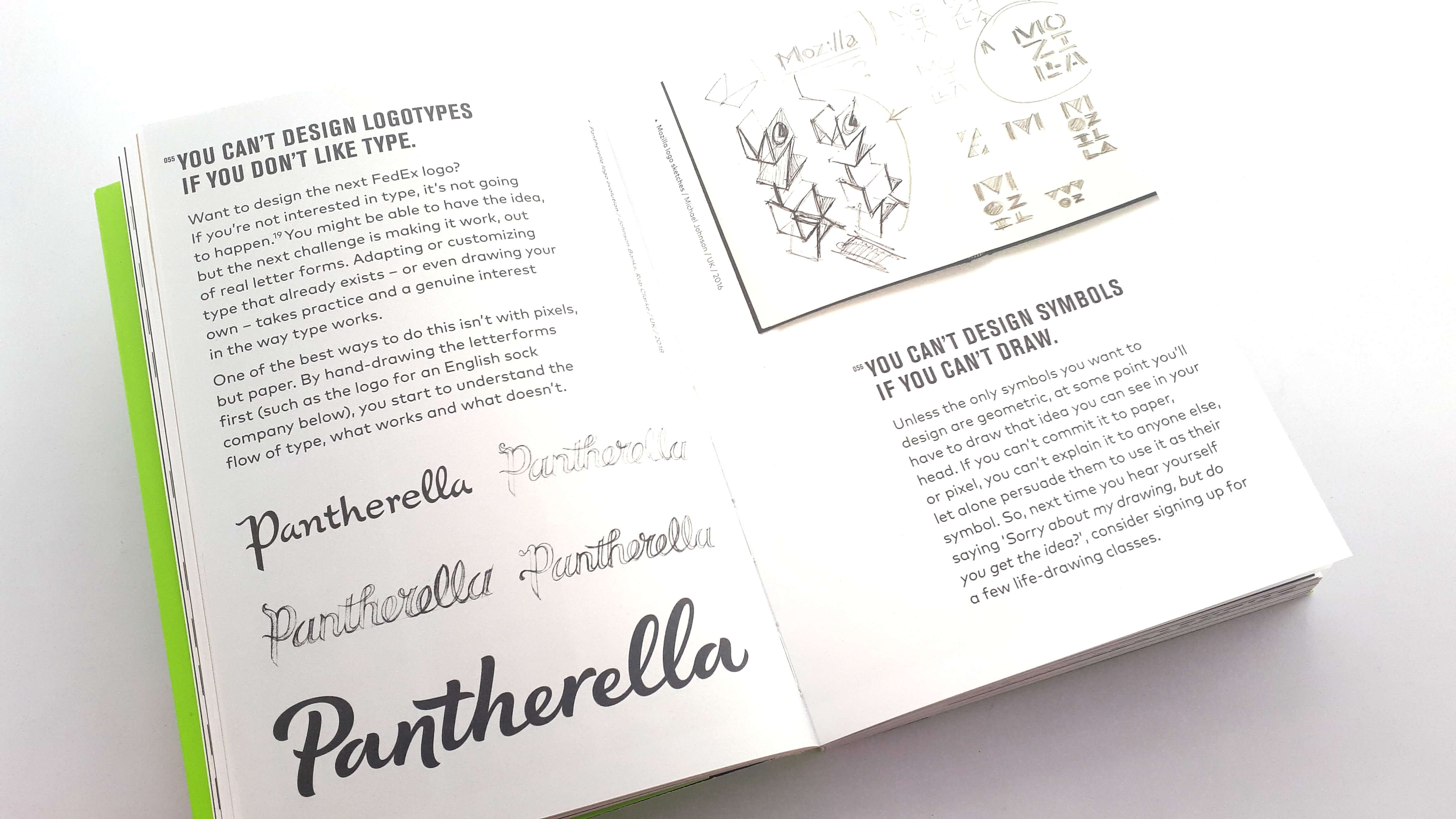
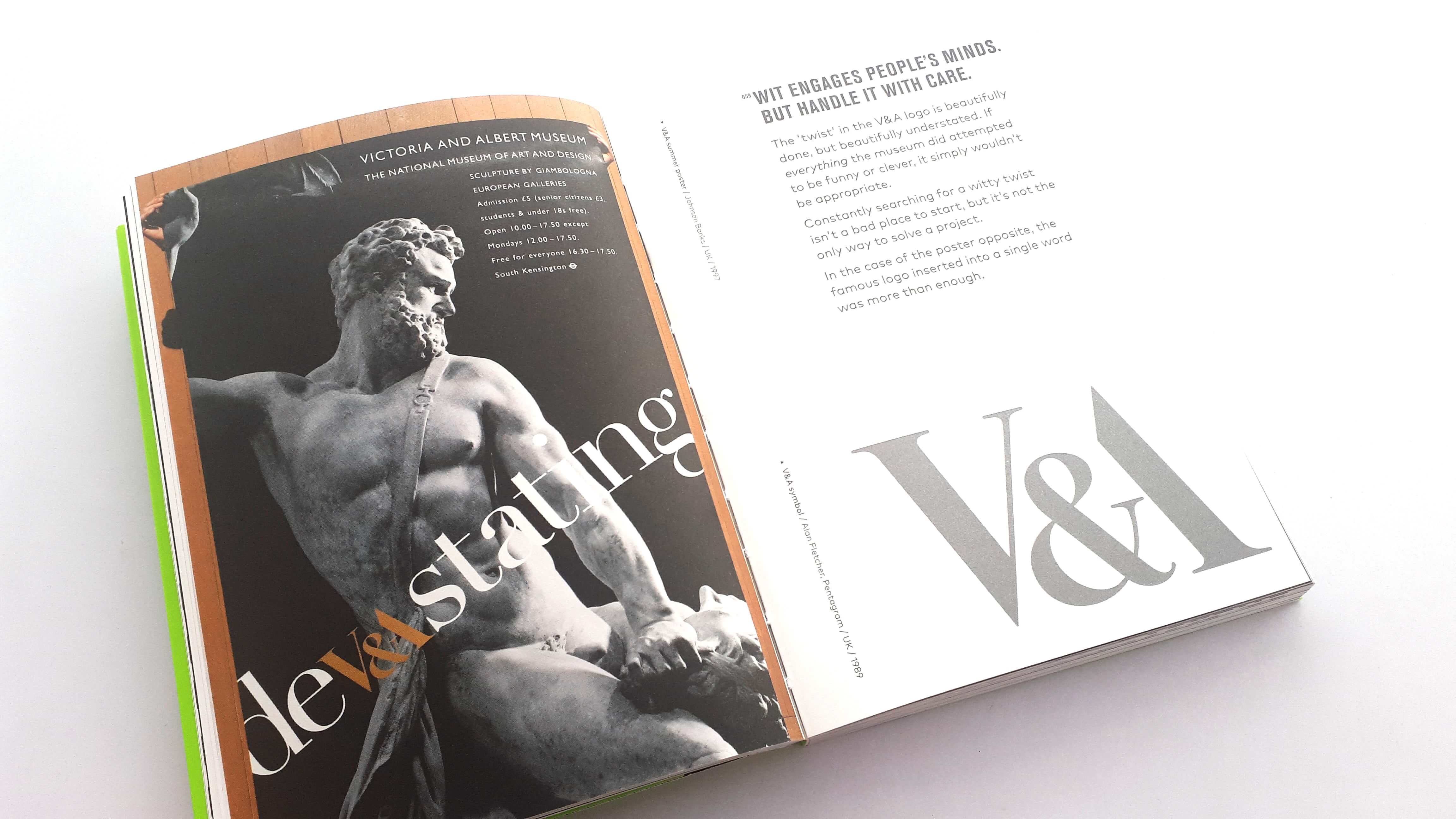
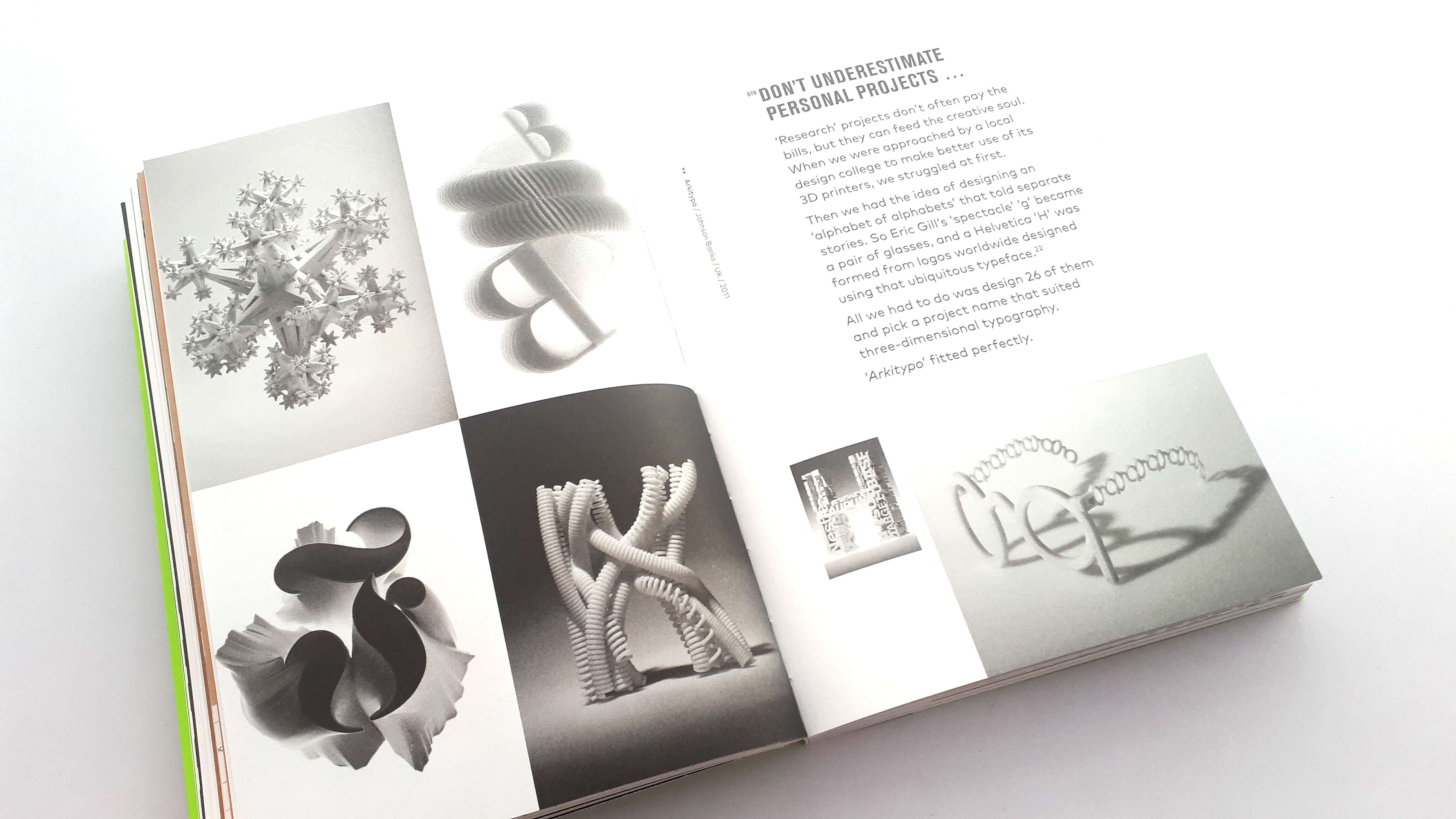
Another element I like about this book is that not only are you getting advice from Michael Johnson himself but its also showcasing the branding work of JohnsonBanks as the notes relate to certain projects the company has done over the years, and it’s a nice little behind the scene look into Michael Johnsons working life and where the advice came from. there is also some other work from other designers and agencies featured within.
I can’t recommend this book enough it was a great read, and I highly recommend you get yourself a copy its one of those books you can refer back to time and time again.
Interview With The Author Michael Johnson
We had a chat to Michael Johnson the author of Now Try Something Weirder about his latest book, his design career, and the evolution of his agency Johnson Banks.
The Logo Creative – Congrats on the new book Michael I read it while I was on vacation last week, and really enjoyed it. It’s been my favourite book I have read this year!.
Michael Johnson – That’s great Andrew really pleased and glad you enjoyed it! I’m looking forward to the review.
The Logo Creative – What made you want to go into the graphic design field?
Michael Johnson – I think was always drawn to it – I was the typical kid at school designing everyone’s band posters, screenprinting typeface designs, borrowing the woodwork teachers design magazines, etc, etc. Then I did A-level design and that kind of sealed it for me.
The Logo Creative – What attracted you to want to specialise in branding?
Michael Johnson – I started researching it at college, and then my first job was at Wolff Olins. What fascinated then and now was the realisation that the best branding solutions are a combination of smart strategic thinking AND great graphic design. That makes the area very appealing to me – your ideas can be so much more enduring and powerful than day-to-day graphic design that might be gone in the blink of an eye.
Also, to do this work well, you HAVE to be in the boardroom, making the case for change, presenting clear and coherent ideas. Do that well and you can make a truly massive impact – our Cambridge project has raised £1.5 billion in just over three years as a public campaign. That’s a huge impact.
The Logo Creative – Could you tell us about the evolution of Johnson Banks?
Michael Johnson – When we started in 1992 we were just any other graphic design company trying to get by. But by the turn of the century we began to do larger identity projects such as More Th>n and then Shelter. For the last ten to fifteen years we’ve concentrated on all aspects of branding – and we’ve intentionally limited our work for people, companies and organisations whose ethos we either believe in or can help shape – designing for good, not bad.
The Logo Creative – I have noticed that Johnson Banks uses words within its design very effectively creating great communication design and tone of voice, is it the words that inspire new ideas a lot of the time?
Michael Johnson – I’ve always been quite a ‘verbal’ designer – the glory period of US and UK advertising from the 60s and 70s was very inspirational for me.
Then I discovered that many other graphic designers steer away from or are uncomfortable with words and copy – so this initially became a way for my work to stand out. And for well over a decade we’ve been talking about both ‘verbal’ and ‘visual’ branding – if you can do both you can build stronger end-products.
Yes, sometimes (but not always) an entire scheme might start with just a few words or a written observation. Both our schemes for Livability and Cystic Fibrosis started exactly like this (notes 167 and 168 in the book).
The Logo Creative – What are your thoughts on specialisation vs generalisation within graphic design?
Michael Johnson – I’m still a fan of being as generalist as possible. Yes, we concentrate on branding, but we try to ensure that we’re working in multiple sectors – education, not-for-profit, philanthropy, culture, technology…
I understand WHY people become sector specialists, but it can become dangerous and before you know it, you’re pigeonholed. We got a bit ‘stuck’ doing annual reports 20 years ago – in the end we just had to stop doing them. We’ve done three big children’s charities – should we do another? Possibly not.
We also try to keep a mixture of project types of different scale coming through the studio at any one time so keep us all on our toes – I guess my only regret is that the demand for posters (my other great love) has really dwindled. Shame.
The Logo Creative – What do you think are the biggest developments within identity design over the last few years?
Michael Johnson – Every year the palette that we can work with gets broader and broader. For example, we’ve just finished another series of events for Cambridge University across the world where we controlled and supplied the animations, the backdrops, multiple films, the posters, the programmes – we even wrote most of the speeches. That’s an extraordinary range of applications, but the Dear World… Yours, Cambridge project seems to have that kind of breadth. We keep searching for more projects that can stretch us in that way – and clients now search for us because of the bandwidth of what we can offer.
The Logo Creative – Laurence King publish many great design books, what was it like putting the book idea across to them and working together to get it published?
Michael Johnson – This is my third book and the big thing I’ve learned with the last two is that both a good idea AND a very carefully thought through synopsis are critical. That’s how decisions are made. Gone are the days of getting a book deal over lunch with an idea scribbled on a napkin.
Once I’d had the initial thought for Now Try Something Weirder two years ago, I spent that summer working up a bullet-proof, 15 page ‘pitch’, shared it with three publishers and two were interested.
In the end Laurence King’s experience in producing and marketing smaller, more informal books like this swung it for me. In terms of process, we pretty much controlled everything but LK’s editing and copy/proofing input was invaluable as we got to the later stages. Now they are being especially helpful as we prepare for the book’s actual launch.
Below is the video Book Review.

