Over the past few years, companies have tried their absolute best to stay ahead of their competitors. They make use of marketing strategies and blueprints to develop their brand and product image, use digital marketing to drive more traffic to their websites and work hard to gain the attention of the customers. Continuous development of their products and services followed by a strong online marketing strategy earns them a strong position in the market and in the heart of the customers. In this article, we are going to be looking at Optical corrections every logo designer should know about
The logo becomes an eminent tool when it comes to promoting products and services. Each logo must have a unique design that incorporates all aspects of a particular business concept and customization with colors and elements in such a manner that it makes a positive impression on the potential customers.
The logo and graphic designer of the company should keep a few important things in mind before designing an appropriate logo for the company. The logo should be describable, memorable and should contain all the necessary elements of the company. Apart from that, the most important feature a logo should have is the scalability. Since a logo will not only be used on the website but also used on small-scale ratios like business cards, portfolios and large-scale areas such as advertising billboards, etc.
A logo designer can make use of proper grids, guides and other tools to make sure his logo is in symmetry and in proportion. They might sometimes need to apply what is called “Optical Corrections” to their designs. An optical correction refers to a slight alteration of the geometric lines for the intent of making them appear correct to the eye for visual purposes.
Even when the logo design is in proper shape and symmetry of the gridlines, a redesigning is required to make it visually stand out from the rest. One can make use of the gridlines to make the logo appear in proportion but they have to make alterations again for the purpose of making it optically correct to the viewer.
Table of Contents
Overshoot
The way we perceive and discern the things around us isn’t completely accurate and neither is it mathematically appropriate. It all comes down to a war of perception vs. mathematically accurate visions. This means that even we perceive things to look in proportion and mathematically precise, it doesn’t prove that it has any level of visual or perceptual balance. Composition and white space play an integral part here. Mathematically positioning each character based on its metric height and area of mass will make the entire word appear superfluous and disproportionate in terms of its visual perception and appearance.
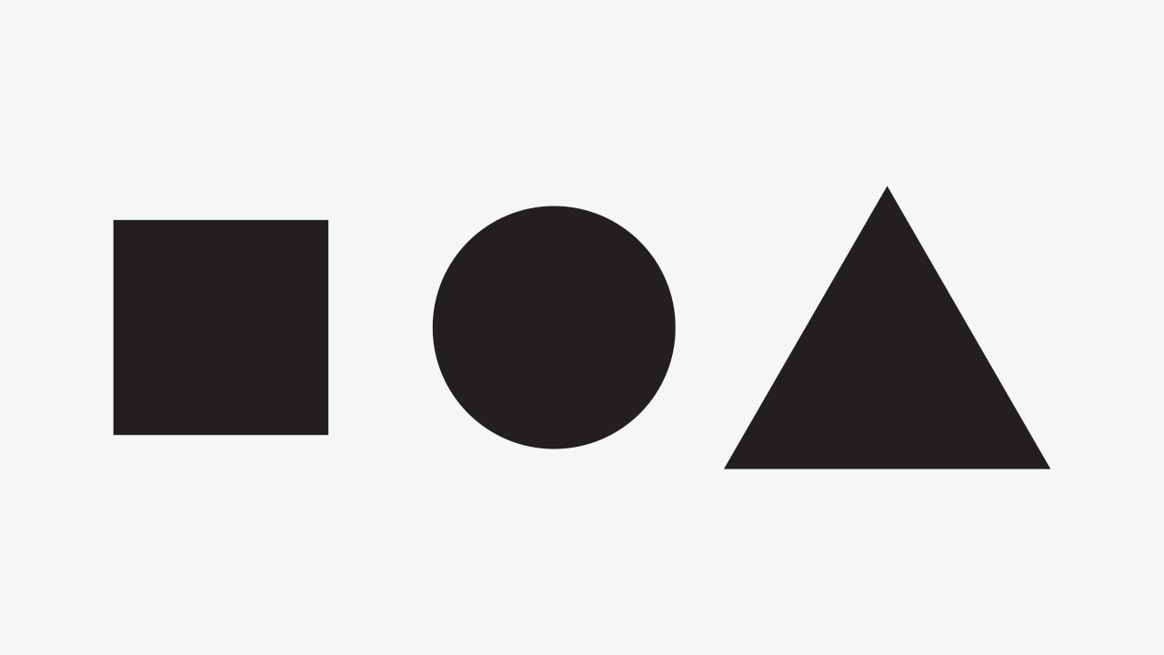
Overshoot refers to the art of typography in which the round shapes are extended over the flat shapes of the alphabets to make it look more visually appealing. Look at the following image.

It might seem like the two shapes are equal. It, in fact, has the same height and proportion but has a different area, mass, and visual appeal. If both the shapes had a similar visual mass and area, it would be perceived to look completely different. This is what it would look like.

Graphic and logo designers should pay attention to small details like these before designing a pertinent logo for their company.
The phenomenon of irradiation
Most of the logo and graphic designers think that it is appropriate to create a logo first in a black and white format. It should look equally impressive and eye-catching to the viewers in black and white. This is mainly because when your company’s logo gets printed in a newspaper or a magazine, they mainly zone out on the colors and use black and white.
When the illustrator creates a white image or logo on a black background it looks perfect. But when he has to do the same on a white background, it completely changes the aspect ratio. The letters and shapes seem fatter and thick. Further
Changes will be required to the logo at that point of time too. This is called the phenomenon of irradiation and should be contemplated by a logo designer.
Jastrow Illusion
Look at the image below. What do you see?

There are two curved objects named A and B. While shape A seems to be smaller than shape B when placed together, they are equal in proportion. This is called as the Jastrow illusion. While designing a logo a graphic designer has to work with different shapes and slices and cuts of shapes. The simplest explanation that can be provided to this illusion is that our brain has the ability to perceive different shapes but has no ability to differentiate between their mass and area of the radius.
Triangle-bisection
Logos and icons need to be properly aligned to the Centre of any shape. This alignment becomes even more difficult when it has to be placed within curved objects. In triangle bisection, the angle bisector of any particular angle of the triangle bisects the entire shape and divides the opposite side into 2 equal segments that are proportional to the other sides of the triangle. For instance, the most famous YouTube icon. The white triangle is placed inside a rectangular box with curved edges. The graphic designers focused on this aspect and tried to place the triangle in the center by calculating the centroid of the triangle to create the perfect balance.
Logo designing is definitely a hectic task for the designers, but when studied carefully and implementing creative methods by keeping certain things in mind, one can make the best out of this profession while having fun.
We hope this article about Optical corrections every logo designer should know about has been helpful and be sure to leave your comments below. If you’re looking to learn new skills online we highly recommend Skillshare to learn at your own pace and in the comfort of your own home or working environment.
Author Bio
This article was contributed by Sharda University which is organised across 13 universities compromising a broad range of disciplines, through a wide range of academic programs. They are focused on paving the way for solutions to complex global issues impacting upon health, environment, technology, and culture.

