Logo Design & Visual Identity for Electrical Ironmongery
Electrical Ironmongery is an online company specialising in the supply and distribution of steel conduit cable management, fitting, and accessories. The company was established in 2015 by managing director Chris Barstow
Chris is a qualified commercial electrician and was self-employed as one for over 20 years before setting up Electrical Ironmongery. The idea for the Electrical Ironmongery venture came about when Chris became extremely frustrated with the lack of range and availability of conventional wholesalers for this type of product.
He said the quality was sometimes very poor and often required modifications in installation jobs to get the products to fit. He often wondered if other professional tradesmen were having the same issues in trying to maintain high installation standards with quality products.
What started off as a part-time venture has now grown to be Chris’s full-time job and the company he is now directing. The business is distributed all over the UK, with customers ranging from hobbyists, electrical firms, Formula 1 teams, national rail franchises, oil rigs to many varied applications.
The Project
Create a new logo / visual identity for Electrical Ironmongery
Important information points gathered from the Logo design meeting and brief
- One definition of “Ironmongery” is ‘made of metal’ and “Electrical” refers to the industrial sector. Hence the name Electrical Ironmongery.
- Business (currently) sells metal electrical cable containment products
- Supplying the industrial electrical sector for use in civil and construction projects
- Operating for 3 years in May 2018
- E-commerce sales through website and eBay trading
- Increase brand awareness through website sales so people can identify where they’re sourcing their product from
- Target is to increase stock holdings of much more of their supplier’s range
- Some outlets like Screwfix and Toolstation sell the same products as them and offer delivery but we can beat them on product price, delivery cost, and quality.
- They sell a vast range of products but they specialise in a niche sector of the industry and offer 20 years of product experience through use as a consumer and retailer.
Project Scope
Main Goals
Create a visual identity for Electrical Ironmongery that represents the company and what they do in a clear and professional way that also positions them as a reputable choice for first brand interaction.
The Company & Challenge
Electrical Ironmongery is an online sales concept created by founder and company director Chris Barstow in May 2015. It’s currently a small online company specialising in the supply and distribution of steel conduit cable management fittings and accessories.
Chris has seen an increasing turnover every month since operating the business full time.The company has a niche product and a niche market of buyers that requires a niche formula to get it to operate profitably which Chris has been implementing into his business and seeing growth happening.
He realised he needed a new visual identity that would take the business to the next level to visually stand up against his competitors and the more established suppliers.
Already having a better quality product than the likes of Screwfix and Toolstation and also being able to beat them on price, Chris knew he had to visually stand out and communicate it to his target market.
Opportunity & Process
This was quite a challenging project as Chris knew his product very well and wanted it visually represented within the logo.
Chris wanted to represent some of the parts he supplies in a hand-drawn way but also for the logo to look solid like the bigger brands he could already compete with on price and quality.
Research & Concepts
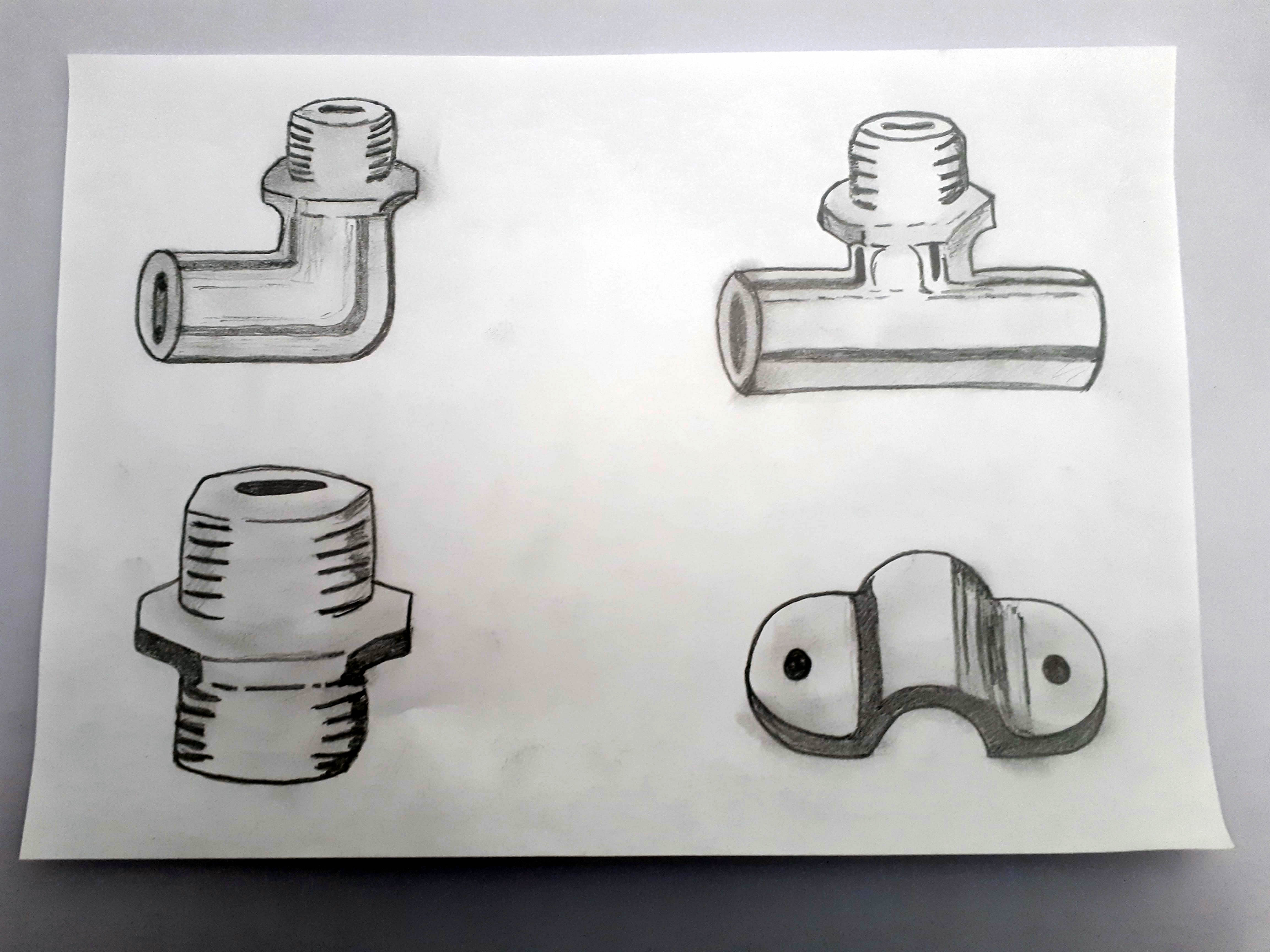
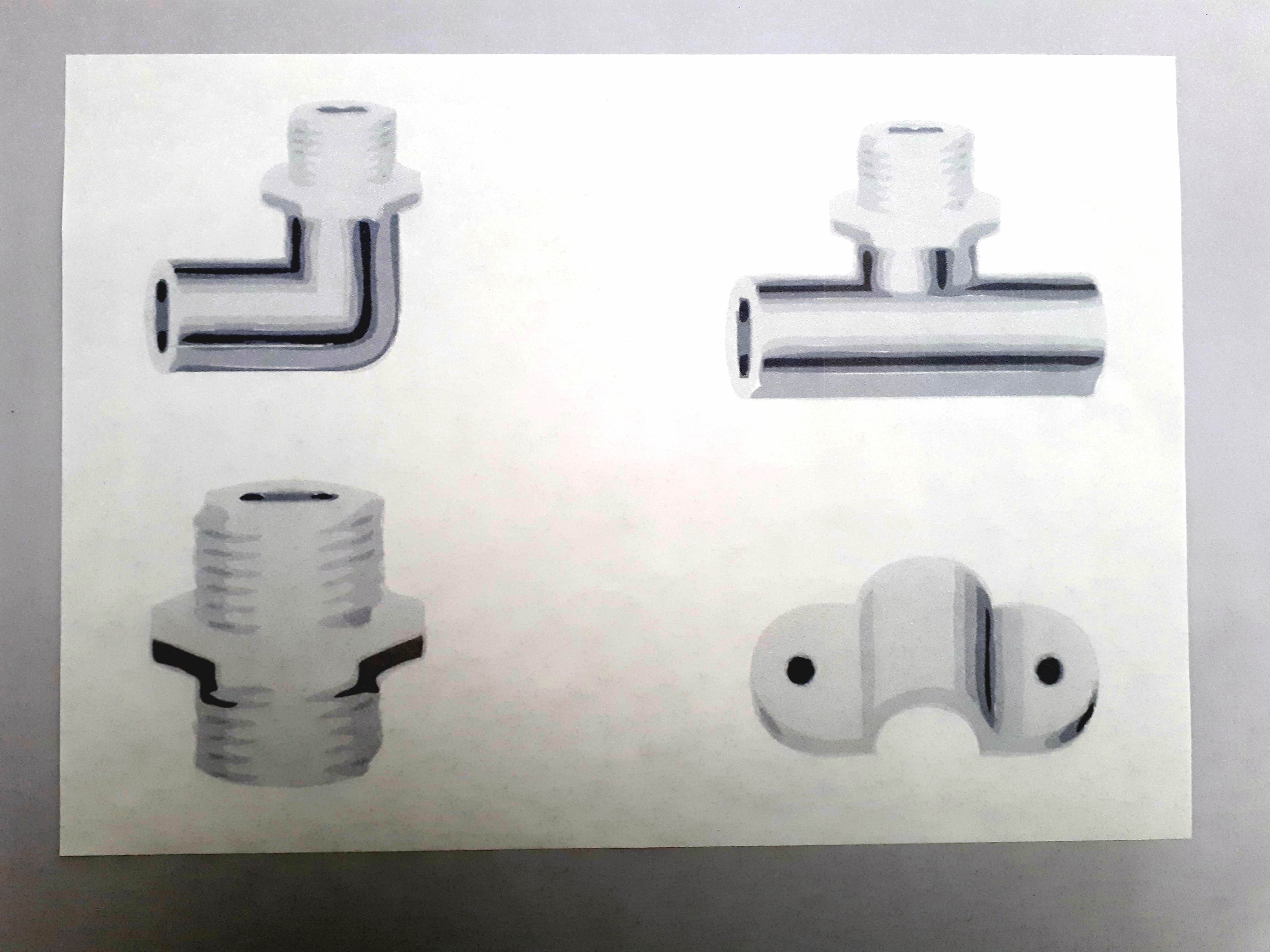
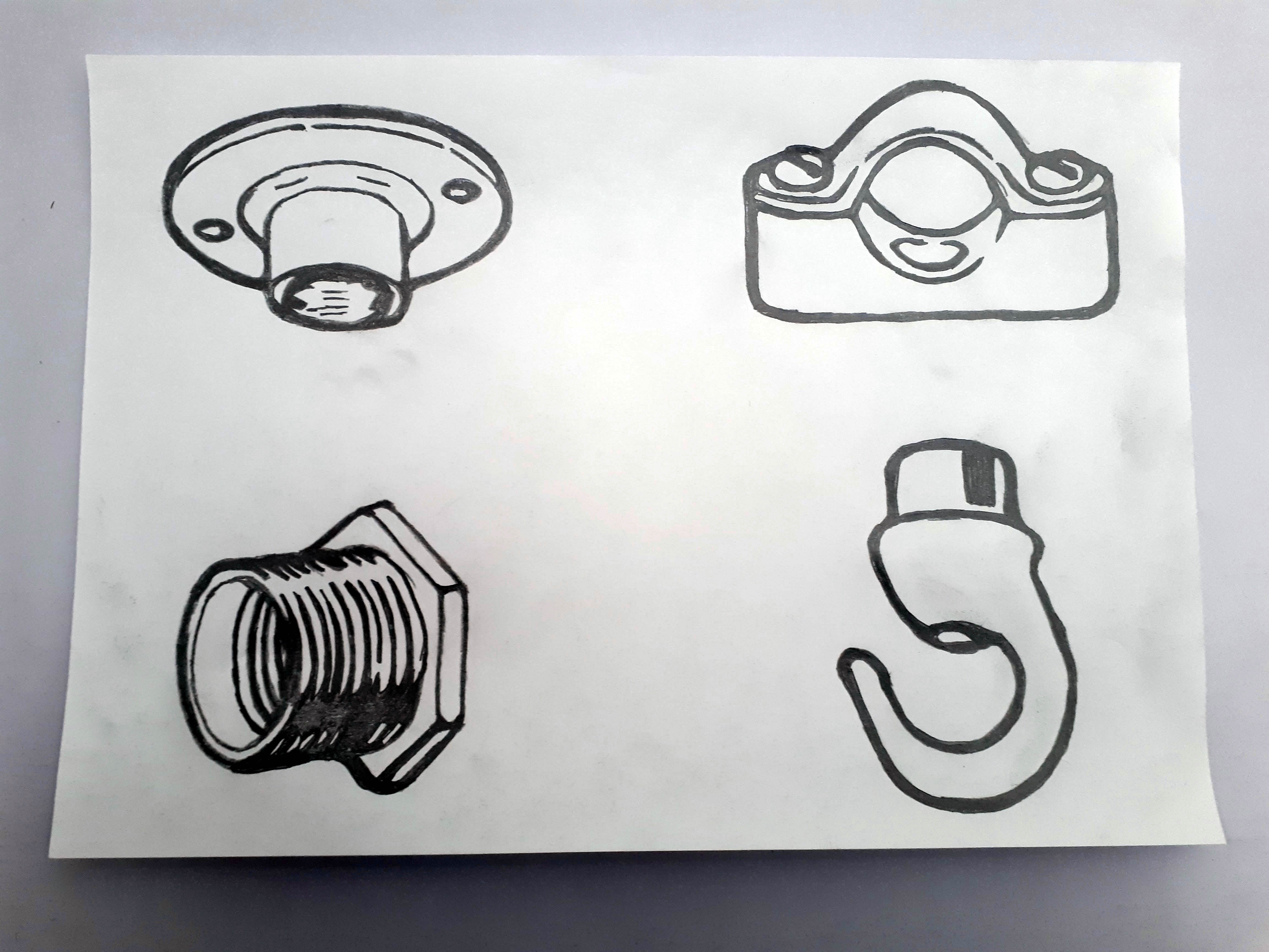
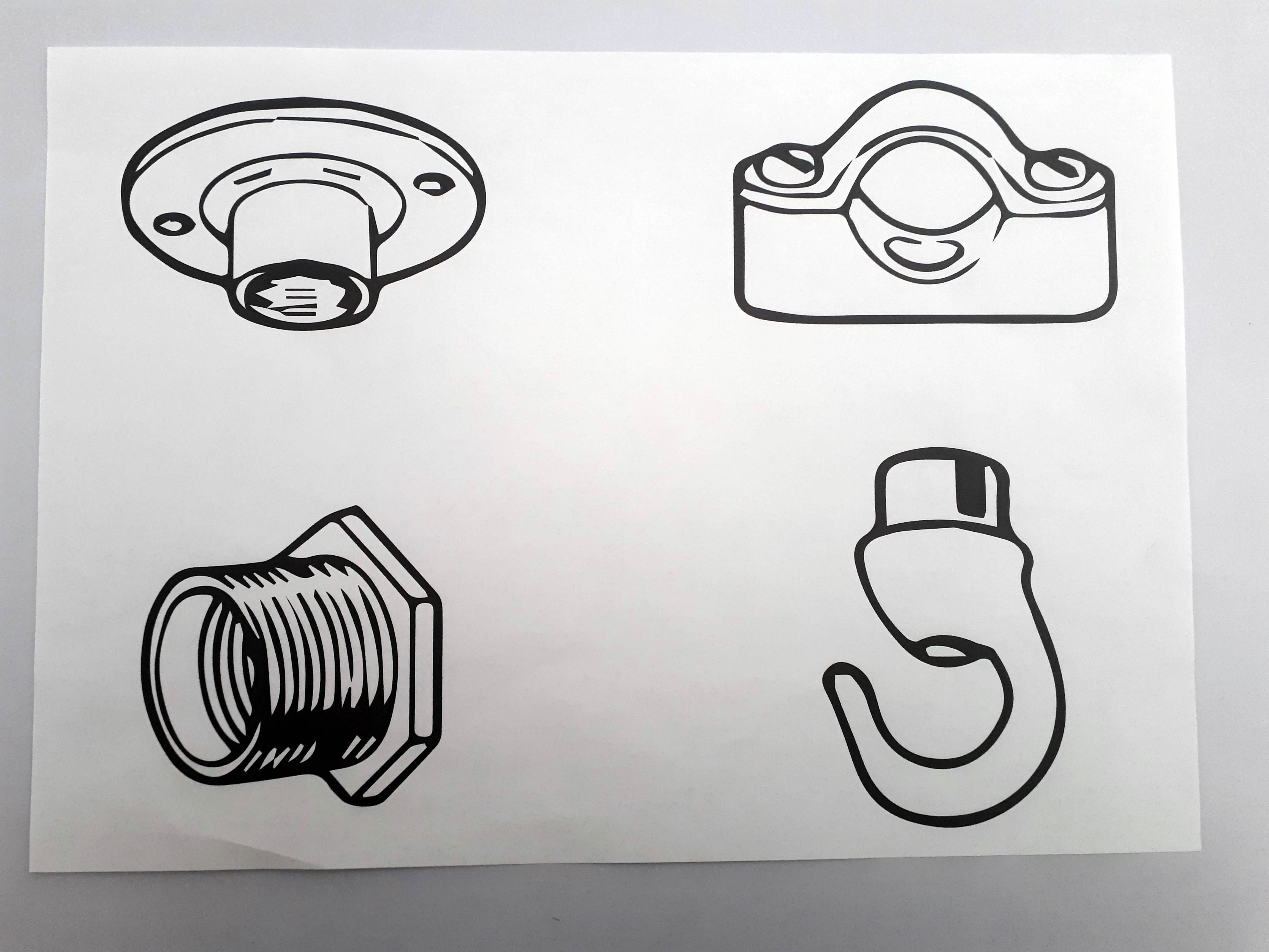
We created 8 sketched icons of the products Chris wanted representing in the logo design first by sketching and then digitizing, The first set Chris felt that they were too detailed with shading. For the second set, we choose 4 different icons from a new range agin sketching and then digitizing ready to be included in the final identity.
What We Accomplished
Getting the sketches of the parts was the most challenging part, the first round of sketches that we digitised were eventually changed to the second set. Due to changes in the companies’ catalogue.
The final result is a logo that gives a personal connection with the use of hand-drawn parts that the company supplies and the consumer is used to seeing when looking to purchase these unique fittings.
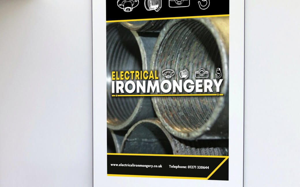
The final identity captures attention visually, works well in black and white and any other colour if applied. It remains legible at a range of different sizes and the “Part icons” works well on their own as brand marks.
The overall logo’s end result combines the hand-drawn fixtures and fittings that the company supplies, the brand’s colour palette with solid typography that is easily read and displays what the company supplies to its consumers instantly.
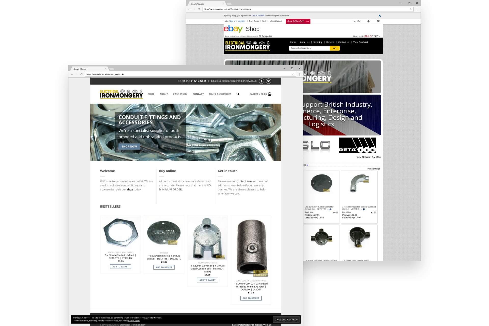
The new identity has now been applied to their current website and ebay store which has greatly improved the brand online appearance and has seen an increase in monthly profits since the rebrand.
Client Feedback
“I approached Andrew to redesign my Logo having felt that I couldn’t find much between very cheap logo design and way beyond my budget. I wanted someone to create and move my vision forward but not to lose touch with my original idea. I didn’t want someone else’s interpretation of my business represented in my logo, I wanted my businesses personality and identity in my logo. Andrew took this on board and created exactly what I required and asked for, except he took the detail to another level. The result was very pleasing and the various formats he presented the end design in have enabled me to use variations of the logo in many differing scenarios. None of which would have been possible with a cheaper alternative.”

