Logo Design & Visual Identity for Manor Welding Technology Ltd
Manor Welding Technology Ltd launched in 2015 and is a company that provides a high standard of welding, engineers providing welding engineering and technology training services to a range of key industry sectors. They inspect and standardise the level of quality that welding companies are achieving.
They do this by monitoring welding engineers skill level and work quality they are doing and providing a high standard of training to industry standards.
The Project
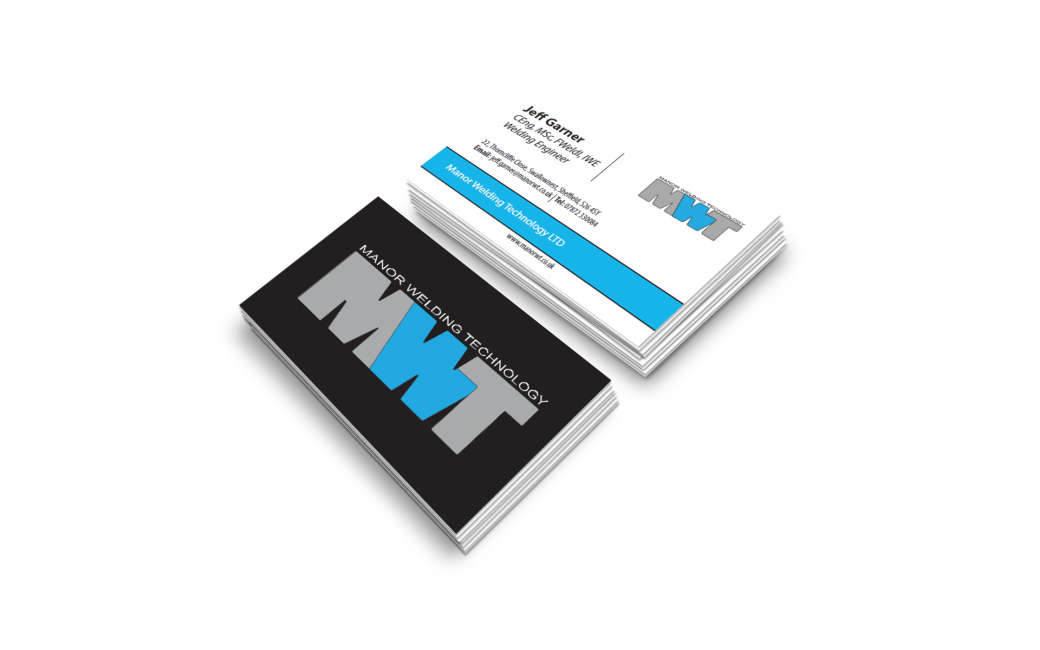
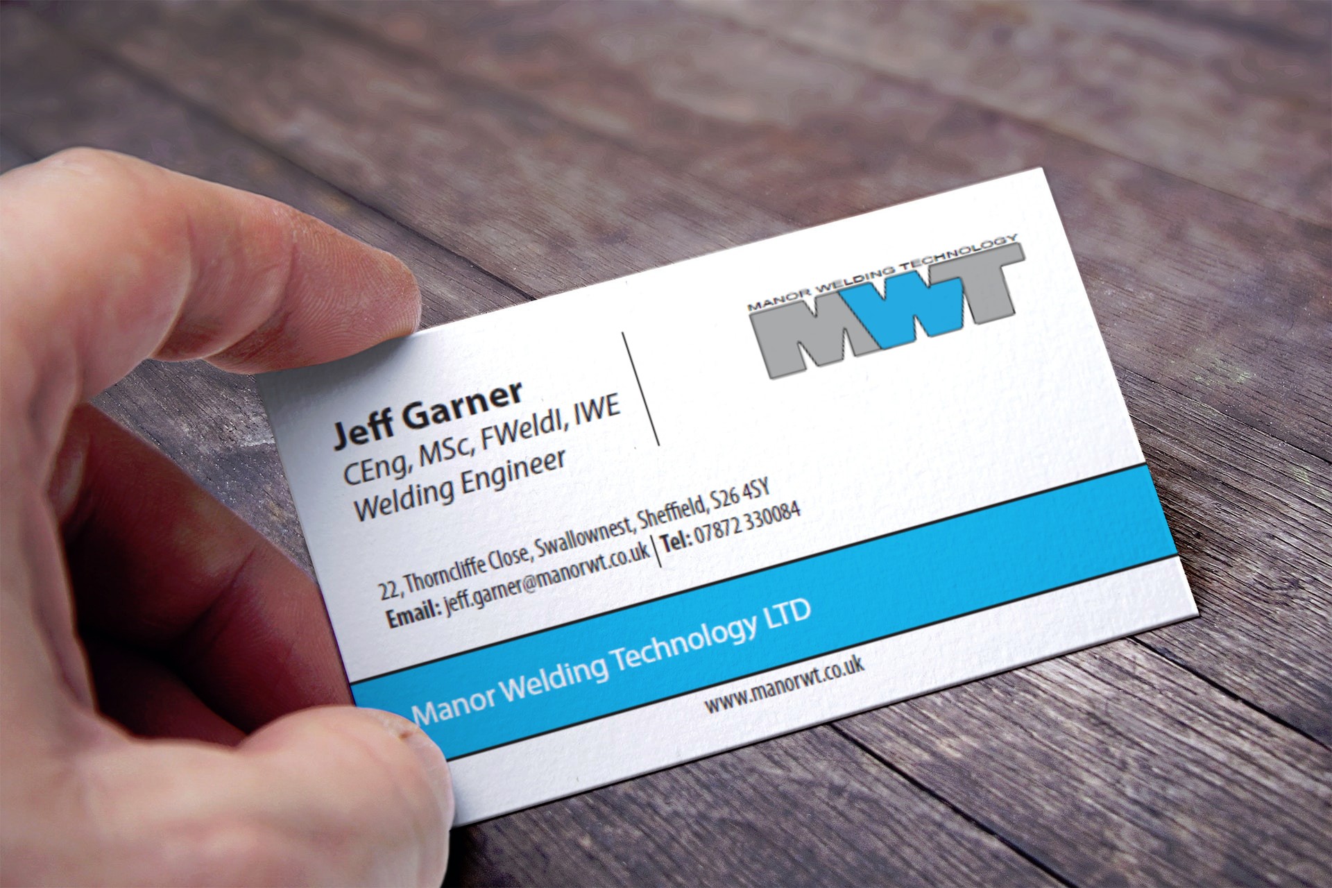
Manor Welding Technology Ltd approached us back in 2015 when they were just preparing to launch we recently made some tweaks to the logo design in 2018. They also required a personal business card for Jeff the company director and a promotional flyer design.
Important information points gathered from the Logo design meeting and brief
- Clean and simple design required
- Must show full name and the letters “MWT”
- Simple representation of welding required within the design
- Colours are blue and grey but must work well in black and white
- Business card for Jeff company director to also be designed
- Simple promotional leaflet design for the company
Project Scope
Main Goals
To create a simple visual identity, business card and flyer for Manor Welding Technology Ltd represents their company in its simplest form also to incorporate welding within the visual mark that communicates visually within seconds.
The Challenge
Manor Welding Technology Ltd is a company that provides professionally qualified Welding Engineers providing welding engineering and technology training services to a range of key industry sectors.
At the time they were just launching back in 2015 they wanted us to design them an identity that was simple and communicated what they represented visually in a simple form.
They did not want to look like the average welding service company rather a professional engineering company who is highly skilled and trained to inspect other professionals and provide a high class and quality training program to industry standards.
Opportunity & Process
We met directly with the company directors Jeff Garner and his wife for a face to face meeting to discuss the scope of the project and requirements.
As stated in the important point gathered from the meetings brief they required a minimal and clean identity that communicated a simple representation of welding within the visual mark.
At first, this was challenging without creating an icon and only using the business name and letters “MWT” Lots of research was need moving forward.
Research & Concepts
The most vital stage in this project was the research stage and as I always say “The most simplistic and minimal ideas are normally the most challenging to conceptualize.
After researching the companies industry we started the ideation stage.
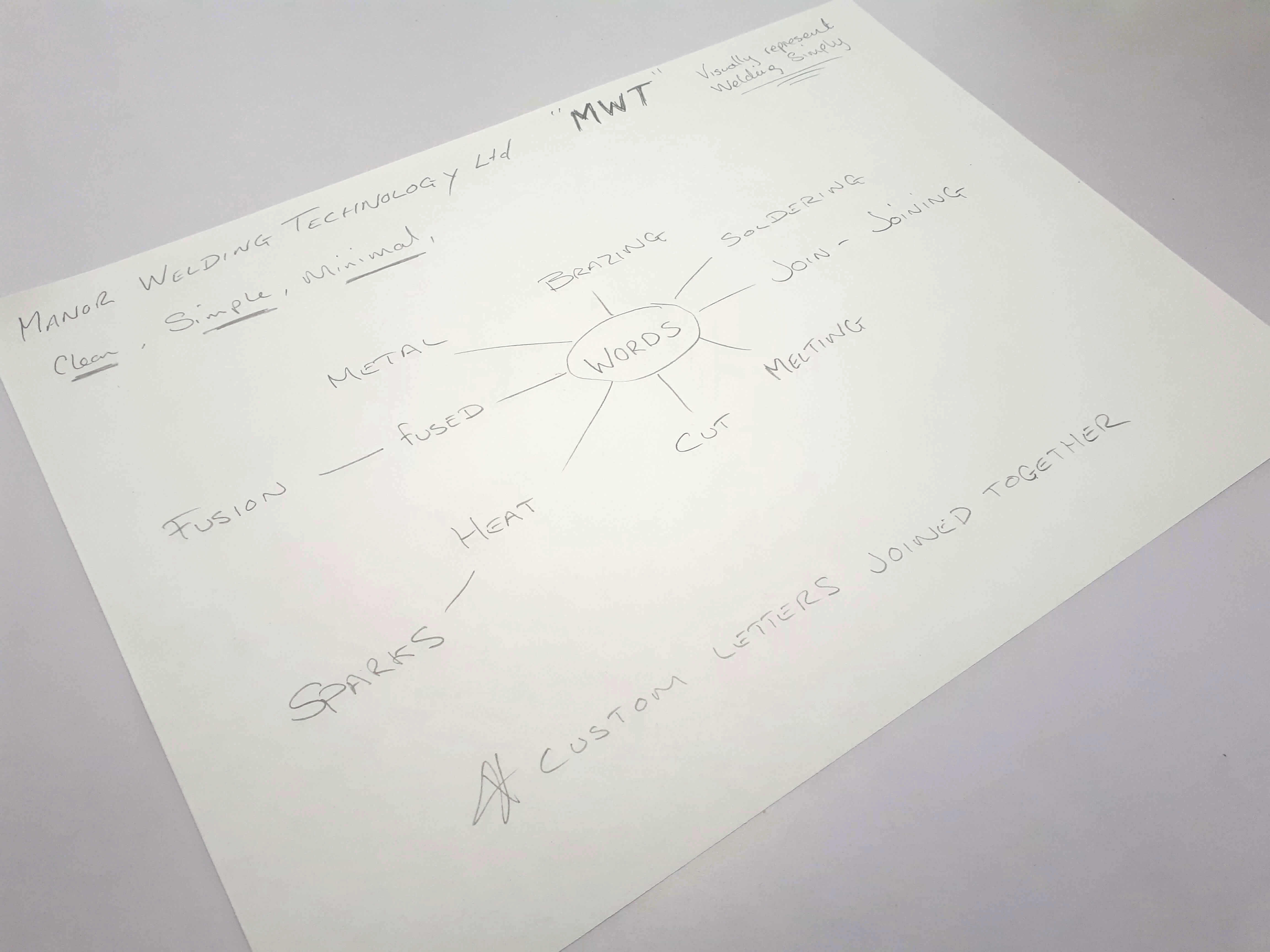
We wrote down word that is associated with welding such as
- Heat
- Cut
- Melting
- Join / Joining
- Fusion / Fused
- Brazing
- Soldering
I took the basic definition of the word welding which is:
“A fabrication or sculptural process that joins materials, usually metals or thermoplastics, by causing fusion, which is distinct from lower temperature metal-joining techniques such as brazing and soldering, which do not melt the base metal.”
The definition included all the keywords I had wrote down that led to the idea of welding the letters together to represent a welding effect showing the letters fused together with a visual representation in its simplest form.
What We Accomplished
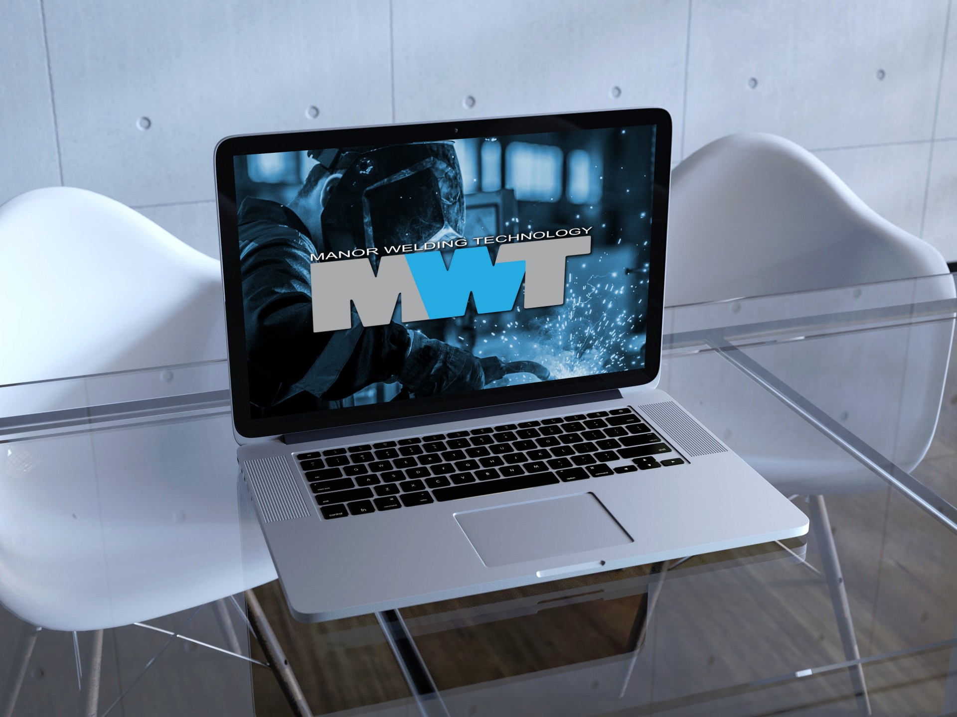
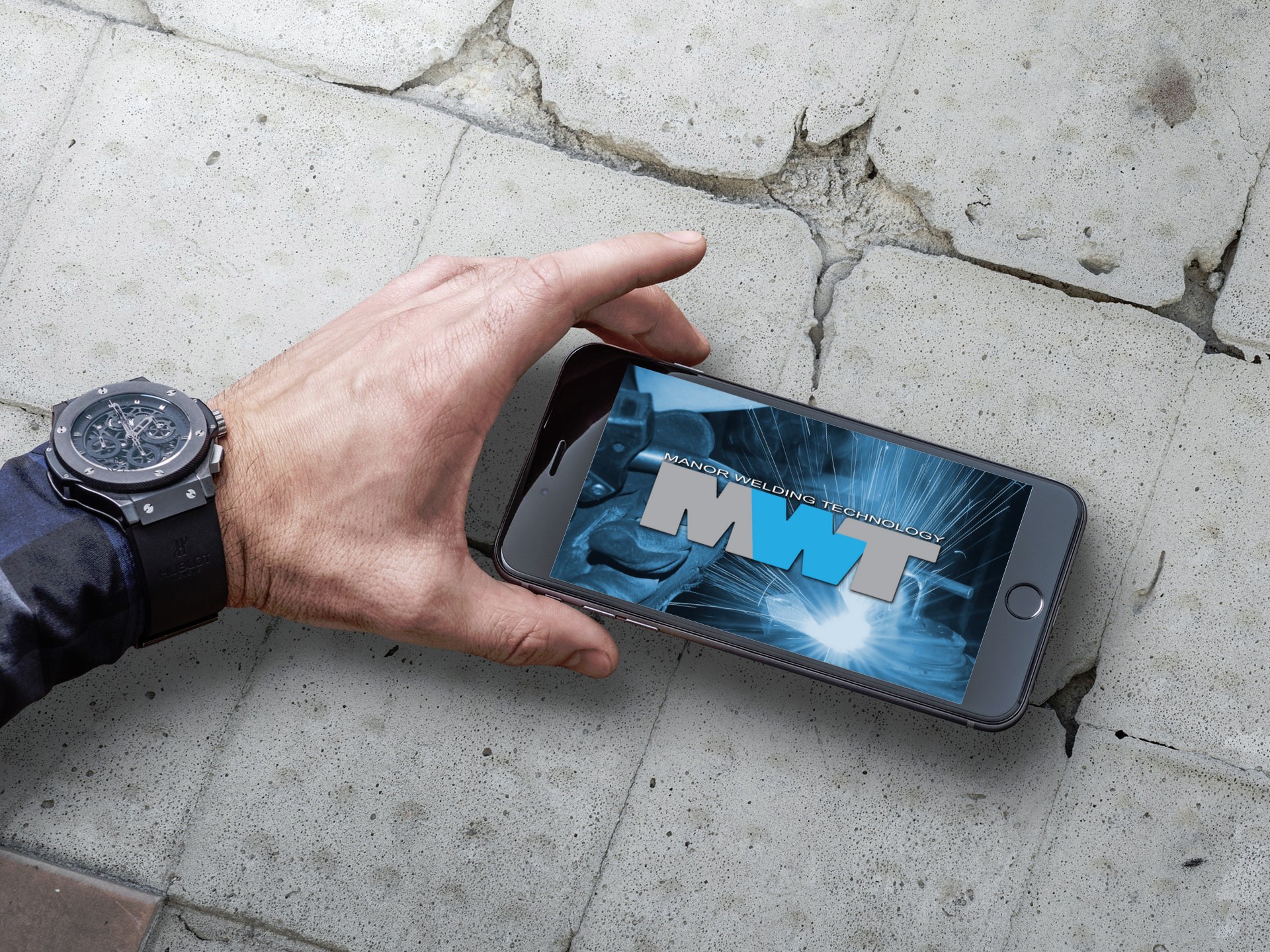
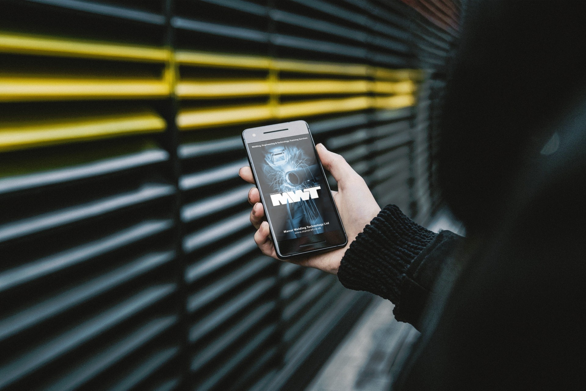
The end result incorporated everything required in the identity in a clean and simplistic way. We created a custom font for the “MWT” and the idea behind the letters been fused together is to represent a welded feel.
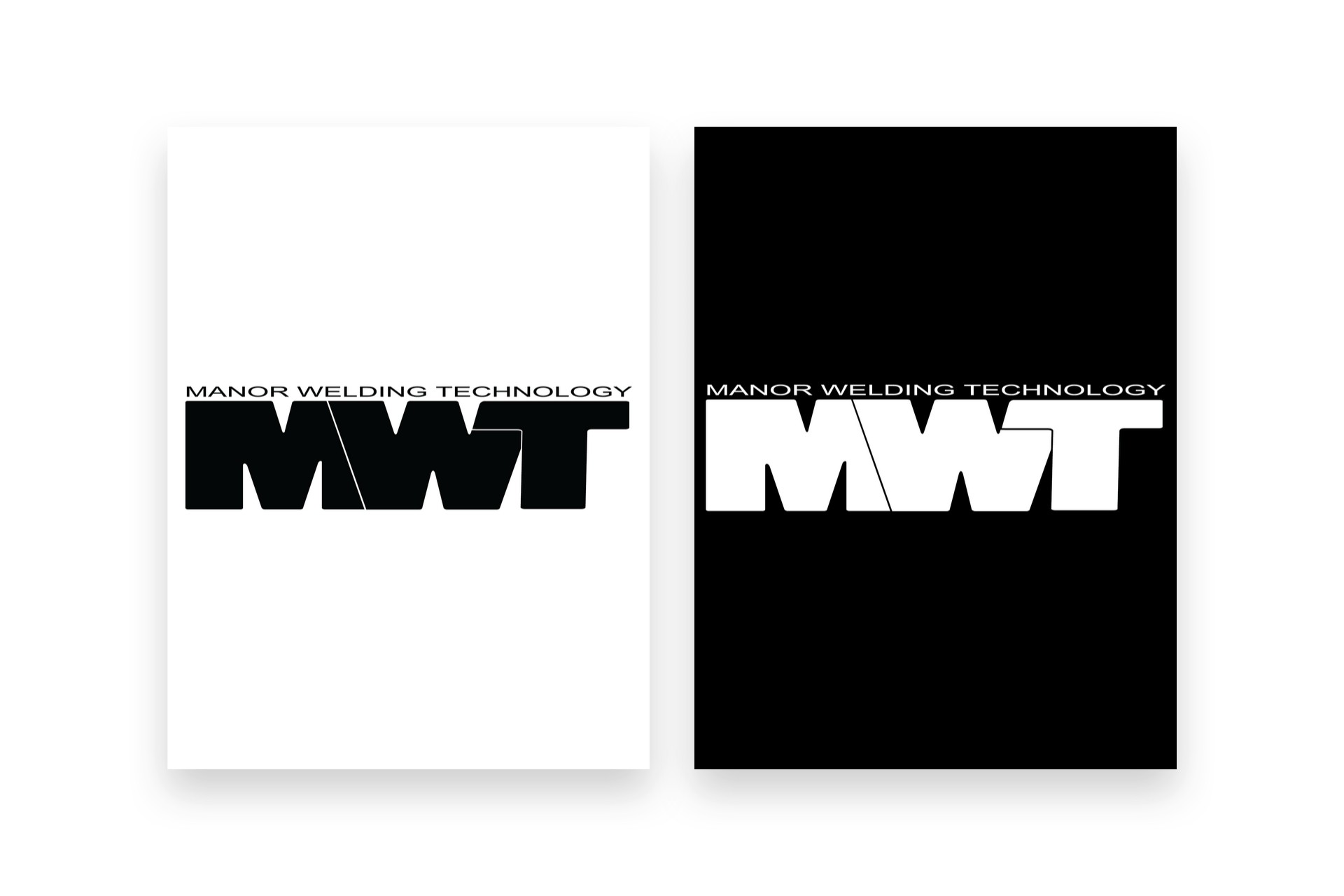
The logo works very well as a solid black or white colour to be used on a letterhead if printed with a mono printer or as a solid white mark to be used on promotional materials such as posters and flyers to draw attention to other elements with the design while still retaining the focus.
Client Feedback
After scouring the internet for graphic design services for my new company logo, I contacted Andrew. Andrew set to work with the minimum design brief and came up with just what I was looking for. So pleased with the logo, I also used Andrew for my business card design. Andrew provided a fast, efficient and friendly service that I’ll have no hesitation using again.
Jeff Garner – Manor Welding Technology Limited

