Logo Design & Visual Identity for Peer Mentors – Children’s Mentoring Project
Important information points gathered from the Logo design brief :-
- The company was a children’s mentoring project providing valuable support for students at critical points in their student life, it offers a host of other benefits for young people and their learning development.
- The logo must emphasis on what the project does.
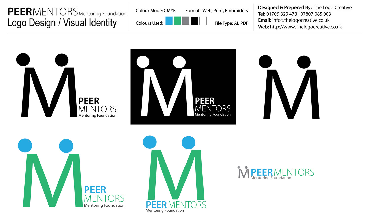
- Creative control over colour choice the branding colours i choose were “green” and “blue”. Green is associated with Balance, growth, restore and safety. and Blue means spirit, control, rescue, goals, ambition these words describe qualities the organisation strive for.
- The Logo must work well as a black and white concept.
- Nature of the organisations project must be reflected and creates a professional and friendly image. The idea behind the “M” and the blue dots where to create an image of two people holding hands, to show guidance from one person to another.
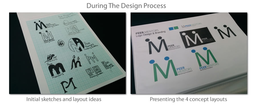
The image below is the Master logo design sheet that is supplied to the client for final approval before the design project is finalised and signed off.
