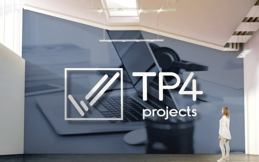
New Logo Design for Project Management Consultancy TP4 Projects
TP4 Projects is a project management consultancy brand that has a modern, fresh, non-traditional approach to Project Management that draws from a passion for keeping things simple and efficient. Their information and reporting style to clients is fresh, eye-catching and “cool”.
The consultancy was first founded in 2016 and appeals predominantly to the retail industry, in keeping with the latest fashion and trends, whilst being transferrable to other industry sectors such as financial services, healthcare
A “less is more” approach to reporting, utilizing intuitive and eye-catching Dashboard reporting instead of a heavily paper-based reports.
Their consultancy services include,
- Total programme management for retail store rollouts
- Office Interiors / installations
- Due diligence advise
- A “one stop shop” for property and construction management needs across all sectors.
Project
Create a new logo / visual identity for TP4 Projects Ltd
Important information points gathered from the Logo design meeting and brief
- The idea behind the name came from the founder’s name and project management (4 = four pillars of Project Management – time, cost, quality, and risk.)
- The consultancy delivers construction, programme, and rollout project management consultancy predominantly to retail and corporate interiors, banks
- Covers other business sectors such as healthcare, residential, commercial and industrial but the focus is targeting retail companies and financial service, clients.
- Reporting style is fresh eye-catching and cool.
- They are looking for something clean and corporate but fun with meaning.
- They have a less is more approach with a creative and tailored approach to project delivery and reporting
- They are not paper pushers and take responsibility and get the job done.
- They focus on doing whatever it takes to get the job done.
Project Scope
Main Goals
We had full creative control over the development of the identity. after the research stage was completed we wanted to create a simple icon-based around the 4 pillars of project management.
The Company & Challenge
The company was incorporated in 2016 and now taking a different direction in focusing on targeting retail companies and financial service clients. A cleaner and more corporate look and feel would be required. As the company prides itself on being a modern, fresh with a non-traditional approach to Project Management services that draw from their passion for keeping things simple and efficient. And the information and reporting style for their clients is fresh, eye-catching and “cool”. We wanted to give the visual identity the same feeling of simple, fresh and eye-catching that also has meaning.
Opportunity & Process
What seemed challenging at first our vision for the identity became clearer through correct research and time to fully understand their business and brand we knew the way forward was to represent what the company does and the characteristics of how they do it within an icon and further develop custom typography to match.
Research & Concepts
During the research stage, we did quite a lot of research into the industry as a whole and the other companies within the market. We analyzed the business and overall brand, How they worked and communicated with their clients so we understood how the company operated.
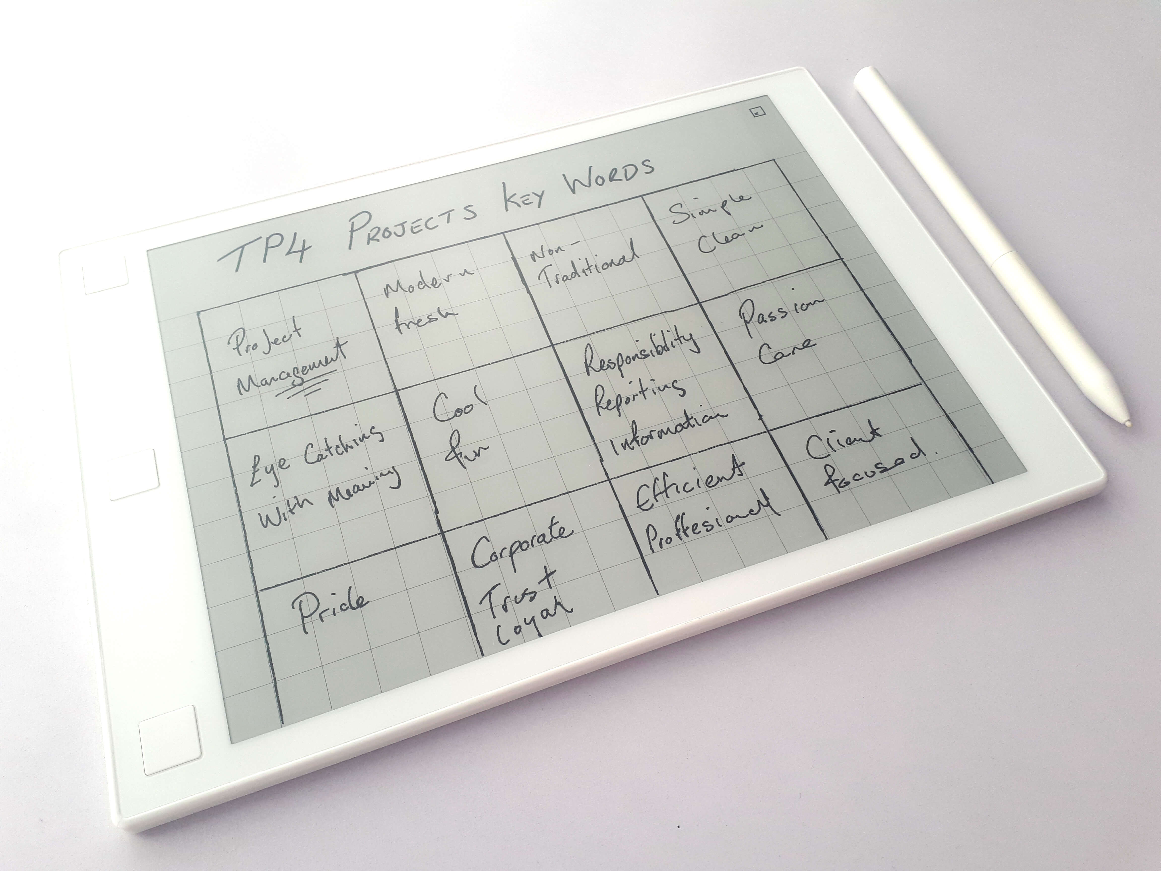
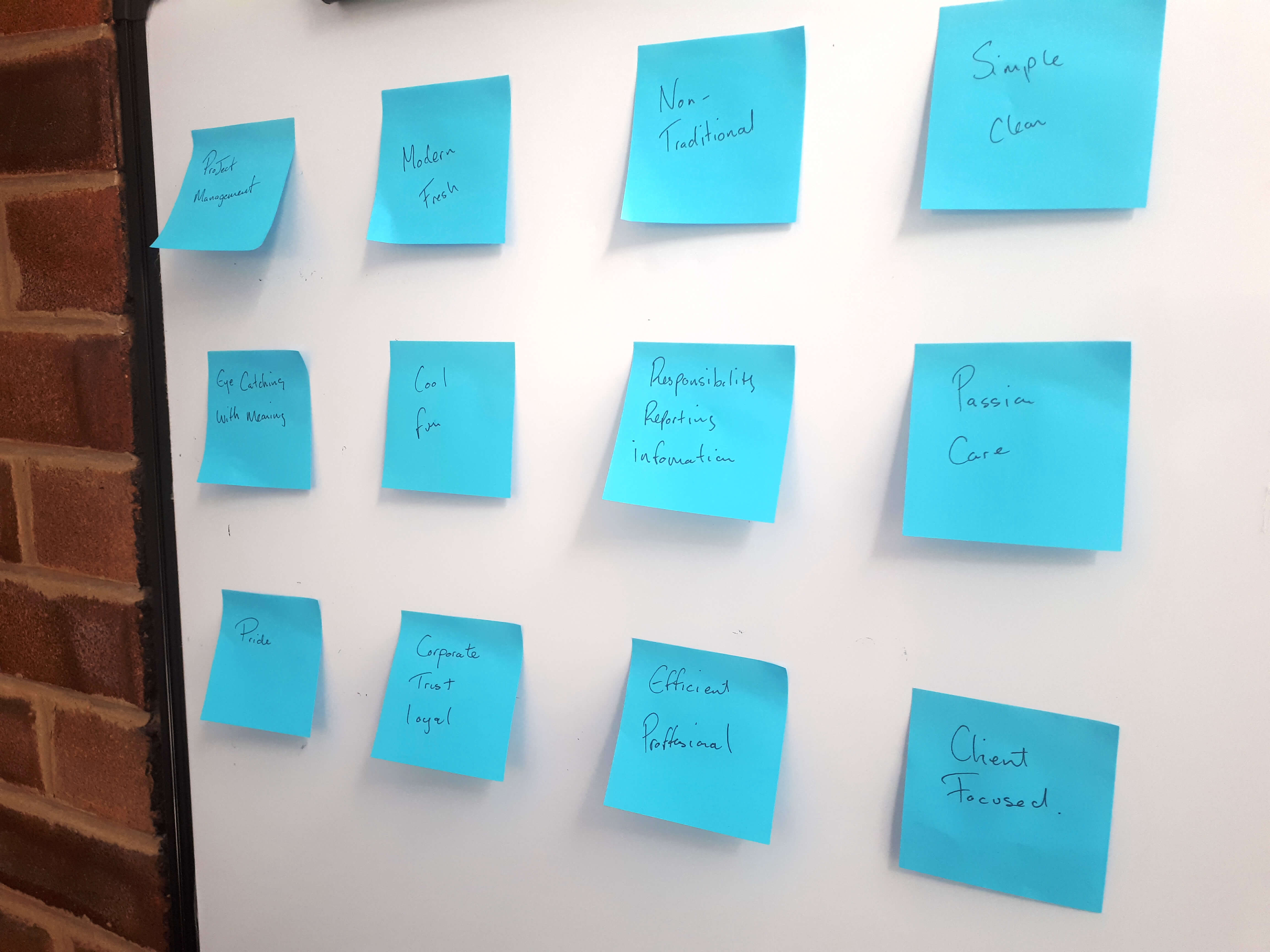
We created a keyword chart to pinpoint keywords associated with the brand. We wanted to capture the viewer’s attention visually and a manner that represented the company. We wanted the keywords to be visible at all time in the studio while we worked on sketching concepts so we wrote them out on postit notes and stuck them towhiteboardboard this helped keep the keywords in the Forefront of your mind so we did not loose direction.
We did a range of quick sketches to arrive at the final icon concept to be taken forward, These were quick sketches nothing polished just getting those ideas out on paper. The page of the sketchbook showing the final concept is below.
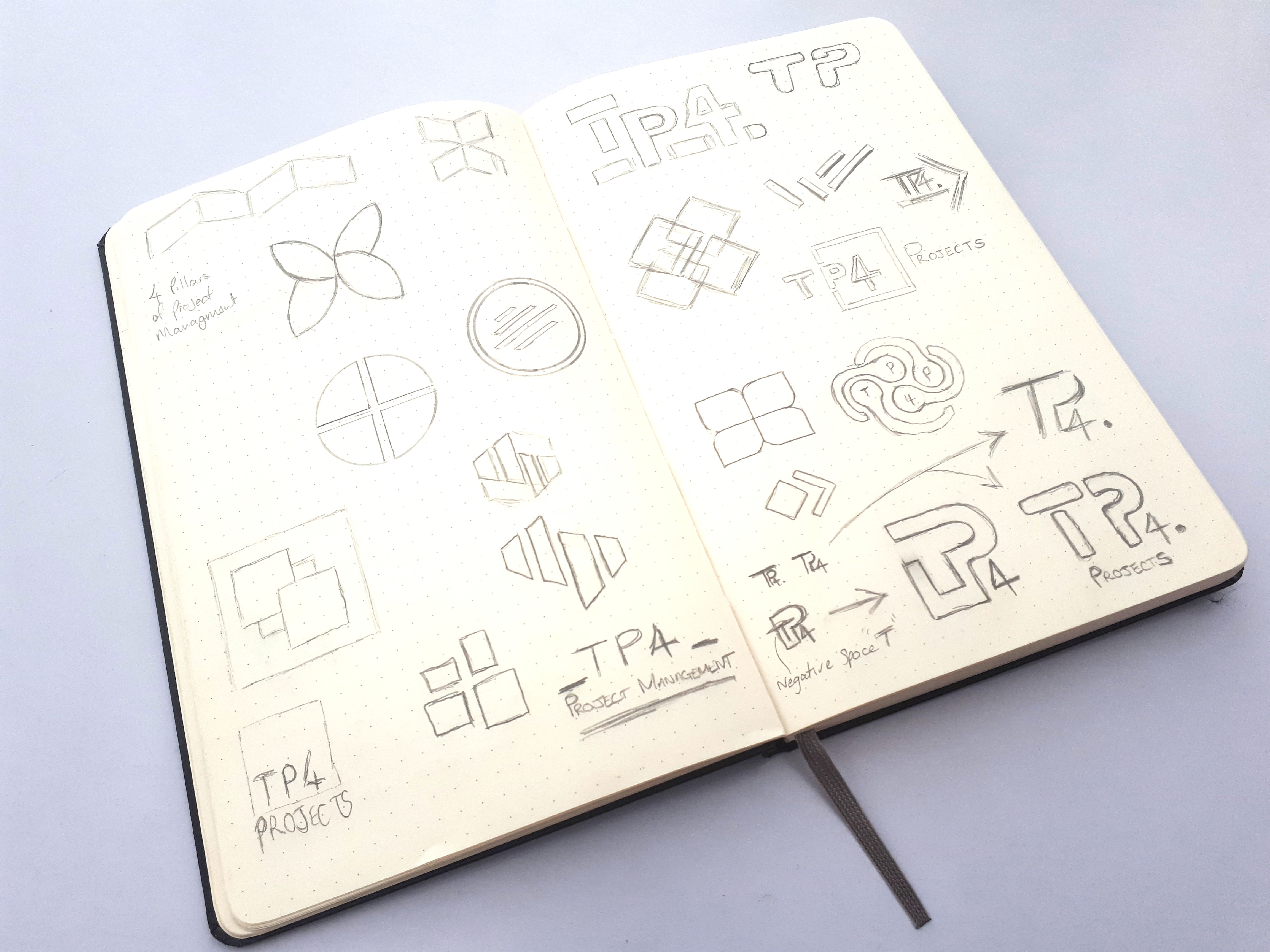
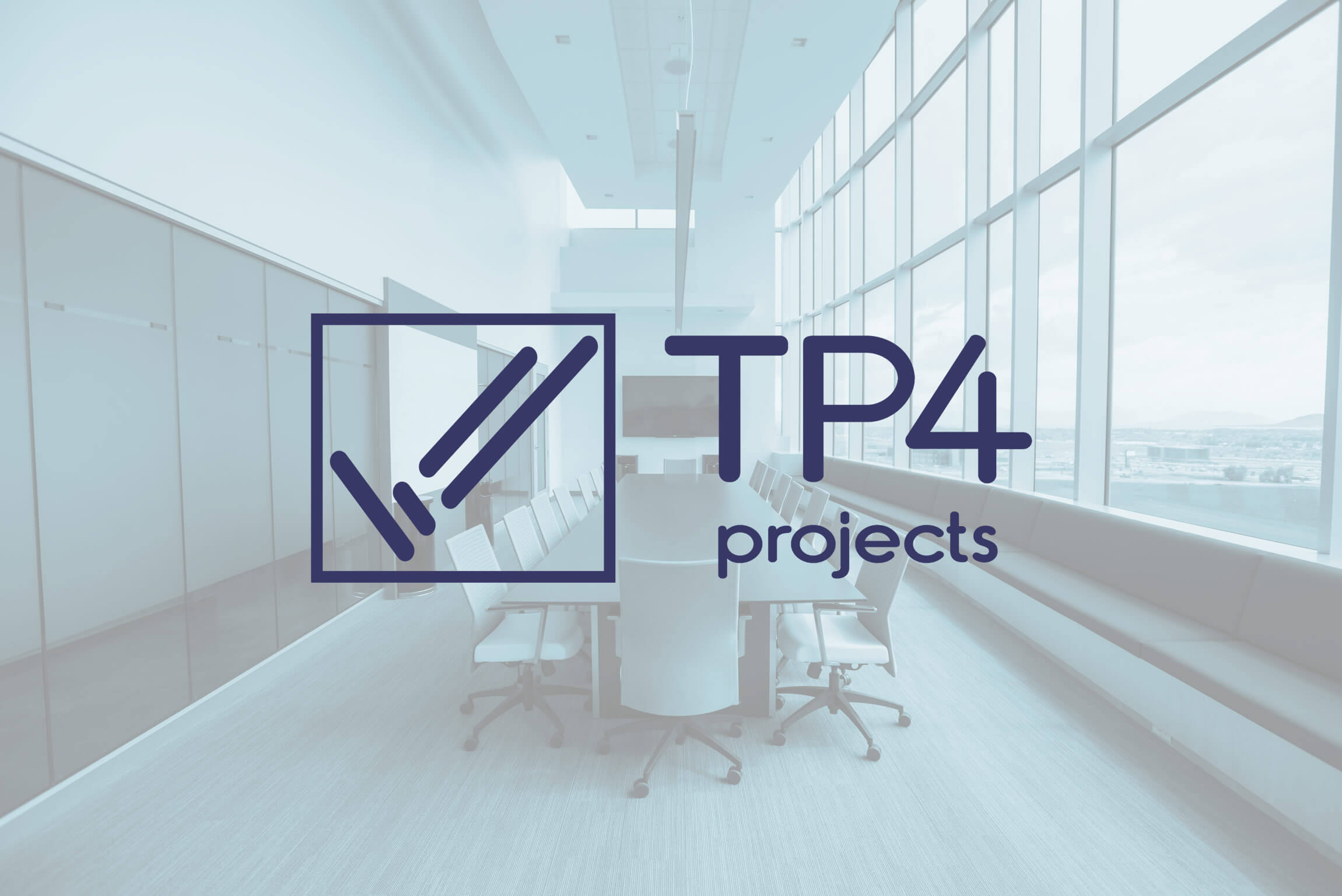
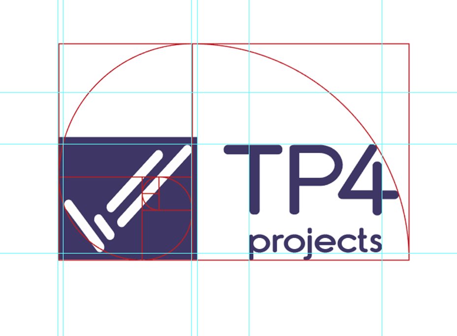
We then moved on to sketching a polished version of the icon and a custom typeface to match the icon. We wanted to create something completely unique for TP4. We also designed it to the golden ratio for good alignment and symmetrically balanced improving the overall symmetry of the logo. The end result was a well-balanced proportioned logo design.
What We Accomplished
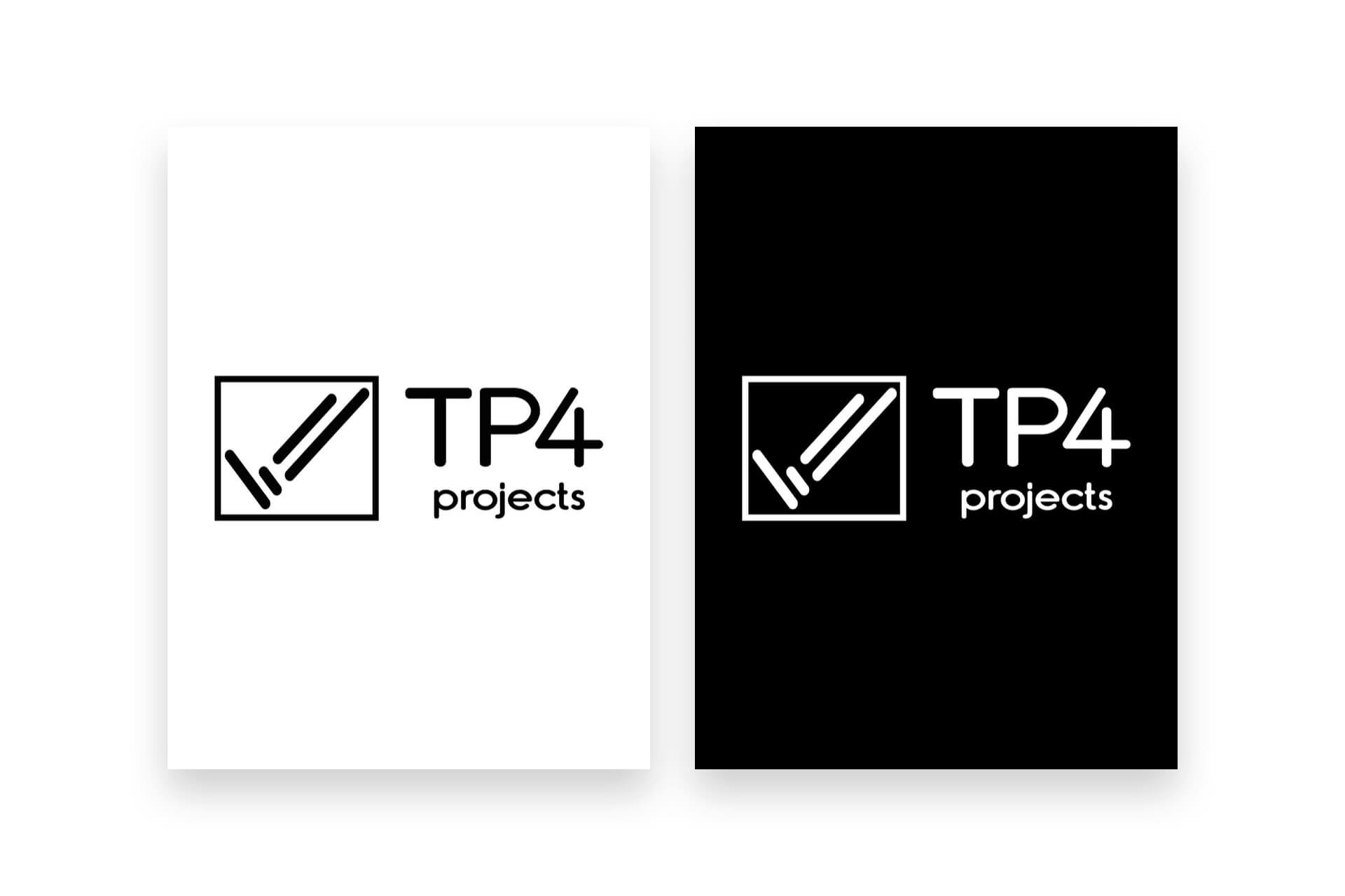
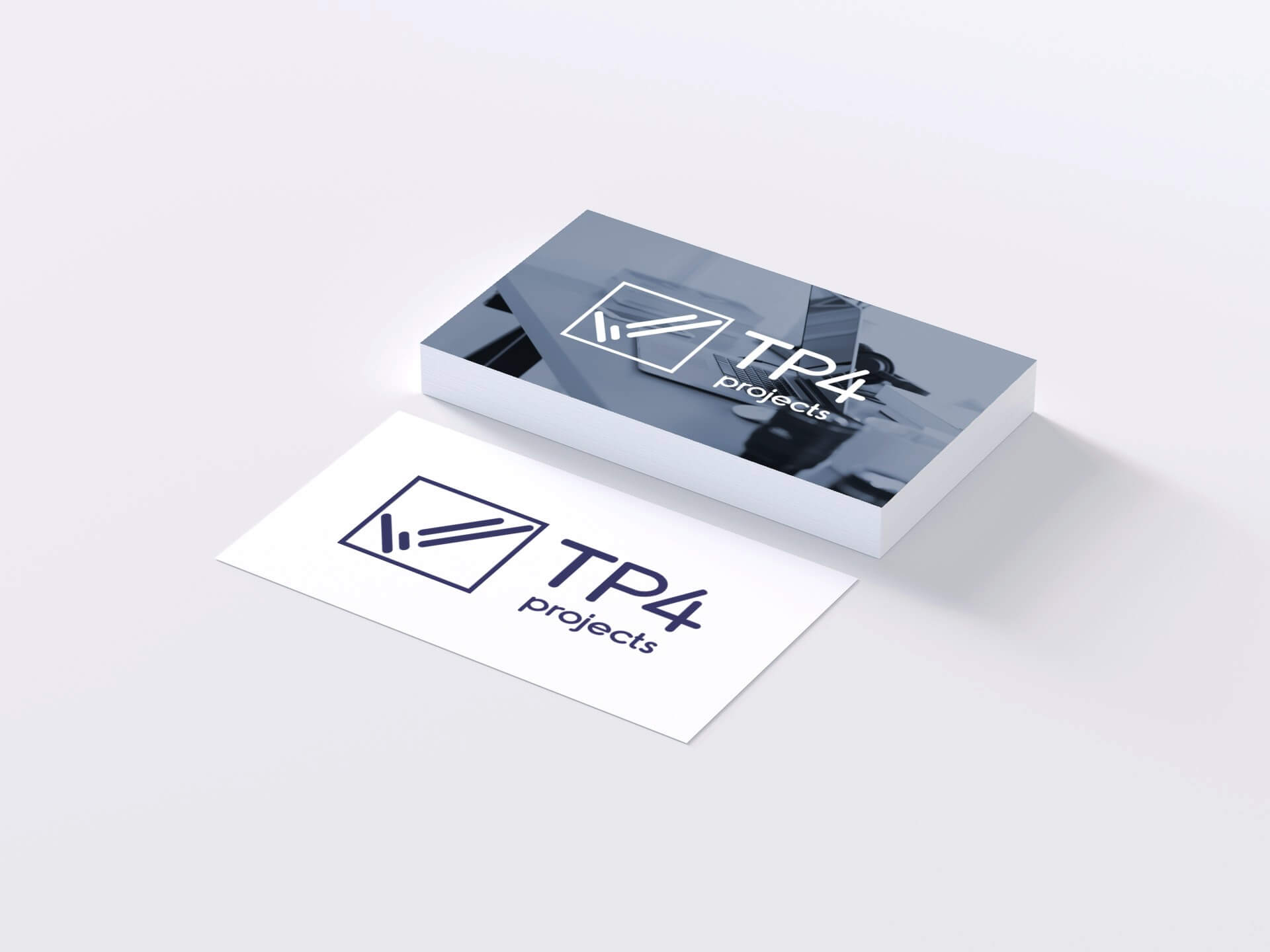

When we had finished the final logo we made sure it was all in proportion and aligned as perfect as it could be, due to the company offering services such as Office Interiors / fitouts we wanted to display the logo in a well-proportioned state and when placing the golden ratio over the logo it shows it is a well-balanced design.
Client Feedback
“Andrew had some good initial ideas that came out of the research conducted, I particularly liked the 4 “rods” that made the tick icon and think it looks really strong, the custom type works really well, you produced a good end result thanks for this Andrew appreciate your time, all look great and happy with the final result!”
TP4 Projects Ltd.

