Branding is crucial for both well-established companies and young startups. Your company’s brand is more than distinctive colours and logo, it reflects the values of your business and represents an image your consumers can relate to. When consumers associate certain values and principles with your brand, it gains influence and attracts new customers, while also increasing loyalty and engagement among the existing ones. In this article we discuss Rebrand vs Brand Refresh vs Redesign: 4 Signs That You Need to Update Your Logo
In the modern world, it’s not enough to just convert prospects into customers. A strong modern brand is an influencer that understands the needs of the audience. You have to tell a brand story that is interesting for customers, in order to build a strong connection between them and the company. This goal is impossible to achieve if you don’t stay in touch with your audience and don’t adjust your brand to its preferences, which constantly change. In other words, your brand should be relevant, that’s why companies often have to choose between rebranding or redesigning and brand refreshing.
Table of Contents
Rebrand, Brand Refresh, and Redesign: What’s the Difference?
Many people who don’t have experience in design often get confused when they see these terms. You see many successful companies change with time, adjusting their brands to the market, but what do they do? Is it called rebranding or refreshing? These terms indeed have a lot in common, however, they are also quite different if you look closer.
A brand refresh isn’t a fundamental change, it’s mostly focused on the appearance of your logo and some minor details, adjusting them according to the current trends. On the other hand, a brand redesign involves more serious changes. It often implies creating a completely new logo and visuals. A complete rebrand is aimed at changing the message of your brand and its identity, which often means creating and implementing an absolutely new marketing strategy.
You may need to refresh your brand if you want to update it and make it more appealing to your current audience. It will also be a good solution if you face a need to address certain market conditions, or if the connection between your brand and your offerings is lost. Refreshing may include changing your slogan, tweaking your logo and fonts, adjusting the colours, and updating marketing materials. If a brand is not completely outdated, companies often choose refreshing instead of complete rebranding. This way, they can preserve the integrity of the existing brand while making it more relevant and reaching a wider audience.
Rebranding is a much more complex process that requires serious preparation. It goes beyond changing the design of your website or logo. Rebranding is intended to completely change the image of your business. It requires you to come up with a brand new story and philosophy. Sometimes, rebranding also means targeting a new market. You may opt for a rebrand if you see that the current brand is no longer effective for the necessary audience, or if you fundamentally change your business. Rebranding is necessary when companies merge or when they plan to conquer a new industry. It will also be a good solution if your established brand lacks consistency or fails to communicate its message.
Obviously, rebranding is also risky. There’s nothing worse for your business than a poor rebrand. Your audience shouldn’t be confused. You should take into account your brand equity and make sure that the existing customers won’t feel betrayed. In addition, it’s important to deliver a new, clear brand message instead of messing up what you already have. It’s also important to make sure your team resonates with the new brand image.
Best Logo Rebranding Examples of Recent Times
Uber

Uber approached the rebranding process carefully, conducting an audit and collecting all the necessary information on how people perceive the brand. First, Uber decided to change the logo. The logo is the “face” of the brand and it’s most meaningful part. The old logo was written in all caps and looked somewhat pretentious. At some point, the Uber team realised that their brand should be simpler and more approachable. The new logo creates a more positive image and also allows for better brand recognition.
Badoo
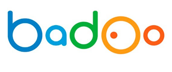

Badoo needed rebranding because it has updated the app, making it safer, expanding the functionality, and improving usability. Therefore, the new visual identity should also reflect these improvements. The company decided to get rid of flashy colours and added a new symbol — a simple heart, which reflects the nature of the brand. The new font is minimalistic and recognisable. The heart symbol contributes to building a new distinctive brand identity. In addition, Badoo introduced a new colour palette, which makes this brand stand out from its main competitors: Bumble and Tinder. A new branding not only reflects improvements in user experience but also signals that the company enters a new era, replacing the outdated dating website model with a geolocation app.
Dunkin’
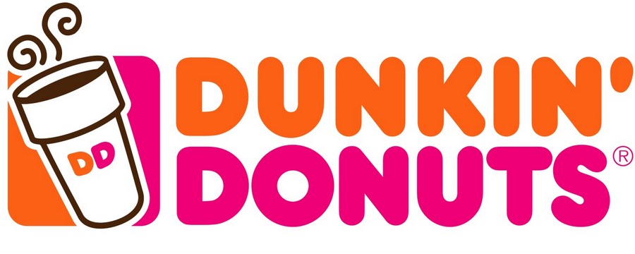
This is an example of a good brand refresh. Dunkin’ didn’t change the iconic colours and font but made its name shorter and so easier to remember. The fresh brand also shows us that this company isn’t specialised in doughnuts only. During the last few years, Dunkin’ coffee became very popular so the company decided to help new customers avoid confusion. The brand no longer belongs to a specific niche, so the customers shouldn’t wonder whether they can buy something other than doughnuts. Dunkin’ proves that sometimes, brands don’t need to change a lot or to start from scratch. Sometimes, even minor details may help you achieve your goals.
Signs that You Need to Update Your Logo
- Your logo doesn’t correspond to your brand values
Your logo should reflect your brand values, explaining what your company stands for. However, there are many businesses that don’t have a clear concept of their brand values. Therefore, their whole brand identity is weak, and their customers cannot associate such a brand with anything in particular. Your logo design is the most important part of your brand so it should be connected to your core values. Properly chosen fonts, symbols, and colours can help customers build the necessary associations. - Your brand faces an identity crisis
Quite often, small businesses try to create a new image when they start a new project. Even though such an approach may seem simple, the truth is that it can only prevent your brand from further development. We suggest that you think of your long-term goals and embrace the fact that your brand identity should steadily evolve with you. Your logo creates the first impression of our brand identity, and the first impression is what always matters. If your customers notice that your brand image no longer reflects your message, you will lose them quickly. Don’t forget to consider everything that features your brand identity: your website, advertisements, vehicles, coffee mugs, etc. - Your logo doesn’t fit with marketing materials
As your company evolves, the overall aesthetics of your brand may change. Sometimes, companies feel the necessity of refreshing their brand, changing some colours or fonts, and then realise that their logo doesn’t work well with some of these improvements. Given that your logo should be the key element of your identity, it must determine the direction in which the overall concept goes. However, if the overall look changes significantly, it may turn out that your logo must change as well. You should be proud of your logo, and you should feel comfortable when using it within your marketing strategy. - The shape of your logo no longer fits your needs
For example, your logo may be too big for a header on your new website, or it may look bad in your mobile app. In this case, you may either redesign the logo to make it more universal, or you can create an alternative in order to use it for those specific purposes. You may want to choose the second option if your logo isn’t completely outdated. However, it’s important to make sure that the alternative version of your logo is similar to the main version so that your audience won’t be confused. The best way to be consistent with your logos is to create a distinctive symbol.
Conclusion
Companies grow and change, markets change, and so do preferences of customers. It’s important to stay in touch with your audience and to keep up with the latest trends in design. Your brand should be relevant so you should be ready to refresh it, if necessary. Sometimes, all you need to do is just change some minor details in order to make your brand more appealing to customers. Sometimes, you may need to redesign your logo, especially if you cannot comfortably use it anymore, or if it looks outdated. Companies may also opt for a complete rebrand, reaching out to a new type of audience or preparing for a new market. The main thing is to keep in mind the importance of your brand logo and to make sure it represents your brand image properly.
We hope you have enjoyed this article about Rebrand vs Brand Refresh vs Redesign: 4 Signs That You Need to Update Your Logo.
If you would like more personal tips, advice, insights, and access to our community threads and other goodies join me in our community. You can comment directly on posts and have a discussion.
Author Bio
Berta Melder is a talented brand manager, experienced content strategist and co-founder of Masterra. Being passionate about her job and additional career development opportunities, she cooperates with different education courses covering a broad range of digital topics as a guest lecturer.

