As many freelancers and agency workers know, Slack is the go-to platform for live business chat and tools. It is the best way of collaborating with colleagues from other countries and time zones. It was originally used as an internal piece of software used in the development of a video game. The game didn’t see the light of day, but the tools used have now become what we know as Slack.
Slack launched in August 2013 to much interest and immediately started receiving customers. Their first logo and branding from launch were used until January this year. The design agency Pentagram was tasked with creating new branding for Slack; bringing them up to date with the latest design trends. First of all, let’s have a look at the logo and branding that served Slack for over 6 years.
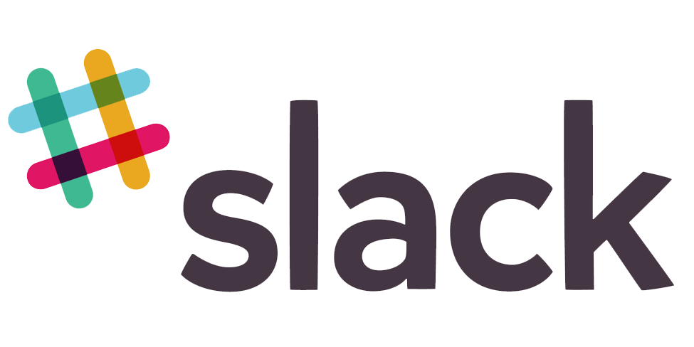
The old logo is now recognisable to everyone who has used the platform. A hashtag moniker was used to represent the chat and social element of Slack. The logo is simple with just 4 colours and 4 rounded strokes. A transparent element was also added to give the overlap of the strokes an extra colour. The design is simple, fun, and conveys the message very well. Although it is essentially a flat colour design, the faux transparency adds depth Seeing a multicoloured hash symbol immediately says “social,” “communal,” and “teamwork.” Perfect for a business messaging app. The text of the design is clean and bold. A san-serif font is much easier to read at smaller sizes. It also follows the current trend of using lowercase letters rather than a mix of upper and lowercase.
I also love the way they used the old logo on their app and browser icons. The zoomed in design includes all the colours of the main design and the faint idea of the hash symbol is still apparent.
@SlackHQ introduces new #logodesign created by their in-house design together with @michaelbierut and the team from @Pentagram, they worked to create a new and more cohesive visual identity
https://t.co/q8YSdtZTod pic.twitter.com/4dSPamjppI— The Logo Creative™ (@thelogocreative) January 17, 2019
The new logo and branding design were created by Pentagram working in conjunction with the in house creative team at Slack. Their final design bears a resemblance of the old design still featuring a hashtag or octothorpe (the name before the internet age.) Slack hired the agency to create their new identity as they felt the old one was hard to recreate and was not used consistently throughout their platforms.
In my eyes, that seems like a silly reason to change your branding. The old logo wasn’t too complicated and probably about the same level as the new one. If they had created a brand style guide to solve the inconsistencies in their design it might have saved them time and money on a rebrand. However some companies just feel like a change to keep up with newer trends. It also helps market the company as people like ourselves feature their brand in articles and features.

The new design uses the same four simple colours as the previous logo. There are no overlapping elements, so no transparency or other colours are involved. This also creates a flat design without any depth. A simpler palette makes it easier to use the design on different background colours other than white and black. This is what the designers have said about their design:
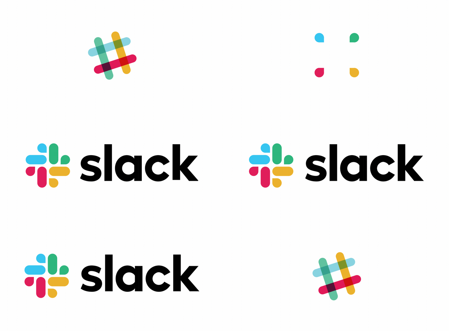
“Derived from the original logo and built on a grid, the new octothorpe is comprised of two basic geometric shapes––a speech bubble and lozenge––that can be extracted and used as graphic elements. The speech bubble evokes communication and connectivity, and will form the basis of a system of customised icons, illustrations and motifs with rounded corners that echo the shapes of the logo.”
![]()
As they have said, the new design uses two distinct shapes; a rounded rectangle (lozenge) and a pointed circle (speech bubble). These represent the core business of Slack. Text chat and speech. In my opinion, these added elements make the overall hashtag design disappear. At a quick glance, the logo doesn’t scream hashtag. I suppose the added meaning on the extra shapes adds the same message as the simple hash symbol. Slack’s marketing endeavors can use the logo’s elements separately, whereas the previous logo’s design had fewer uses. The text still follows the trends of using all lowercase letters. The font has been straightened up losing the rounded corners of the previous design.
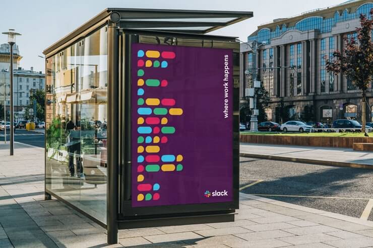
Overall I don’t mind the new design. It adds new elements they can exploit in other media and marketing. The new design will also be easier to use in various locations. In my mind, the old logo was good enough and was recognisable as slack even though the symbol was a universal one. The new logo is more abstract and could easily be used for any similar platform or business. As usual, the internet has blown up with condemnation and humour towards their new design. In most occasions, companies stick to their guns and keep the logo no matter how bad the backlash is. Sometimes this could prove the old adage. If it isn’t broke don’t fix it.
Pentagram partner Michael Bierut explains that his initial question to Slack was “Why change?” and the Brief that was presented to him was pretty much the best one he had ever received.
Why change? When @SlackHQ approached us for a new logo, that was my first question. What they told us was pretty much the best brief I’ve ever received. You can read it here. Thanks to @stewart & team for being great collaborators https://t.co/9YFW9BZqa4
— Michael Bierut (@michaelbierut) January 17, 2019
For more info about the new logo, you can read Slack’s blog as they explain the reason for the change. The Media Kit is available here

