The design world is diverse and as much as it is diverse; there is a whole lot to explore within this world. In this article we look at Starting Out as a Graphic Designer? Keep These Important Typography Tips in Mind.
The best thing about the design world is that nothing, big or small, is unimportant. Each element used exist in a perfect symbiosis and if one thing is out of the box, everything topples.
It can seriously hurt the entire look and feel of the design.
If you ever get the chance to have a detailed discussion with a professional designer, then you will learn that even the most minor and unnoticed element requires a certain amount of attention.
Take for example, Typography.
From the sound of it, it might represent that all you have to do is take care of the fonts and sizes. And this particular assessment is quite true but not entirely true.
For a designer who has just stepped into the design world, understanding typography plays a vital role in the entire design.
Neil Patel, in his latest video, talked about the quality of content. According to him most websites are basically publishing a lot of quantity but they are not focusing on content presentation.
Nowadays, those websites which are soaring above the cloud are the ones focusing their attention on improving the presentation. One way of polishing up your content presentation is by working on the typography.
Wondering how you can work on your typography? Here are some interesting tips to help you improve that none interesting element and turn it into an interesting one.
Table of Contents
Using Bold Typefaces
Do you want to give your text a completely unique personality?
Then, you can always make use of the bold typefaces. You will simply be amazed to learn how bold typefaces are incredibly trending. In fact, these bold typefaces are so much in trend that certain types of websites and graphic layouts are using the bold font typography as a major design element.
They have successfully replaced interactive graphics and high definition images with creatively designed bold type fonts effectively.
For example, check out this amazing example.

See how beautifully this website has made use of bold typeface in its design.
As more and more creativity is getting introduced, several non-important elements have suddenly started taking the centre stage. For mobile optimized version of content, images and videos are becoming a tragic nuisance.
And here, creative typography is making an amazing impact on the world of website design.
Never Overdo It
Isn’t it your everlasting desire that your website or graphic design may stand above the competition? Don’t you just want it to become a trump card on the entire Internet? Here’s what you need to keep in mind.
Don’t overdo the font design.
All you have to do is choose a specific number of fonts to use within your design but while choosing them you need to make sure that you pick out the right ones.
Unless, if you are creating a design which specialises in font designs, then it is a completely different story. However, until then, keep it to a minimal suggested 2 and 3 at the very most.
I am not disagreeing with the fact that introducing diversity in design is not an attraction. But, sometimes, playing too much with the fonts can end up trashing the entire design and you won’t even realize this particular fact.
Adding diversity is good, but not when you are dealing with primary fonts.
Introducing Kinetic Typography
Gone are the days when typography was all about grid, page, and screen. In the year 2019, typography has grown out of its classic pillars of traditionally static elements used within a website in particular.
Typefaces today are becoming more of an inspiration traveling from the world of augmented reality. It is turning fonts into 3D objects which are highly interactive and can be successfully integrated with the surrounding environment.
Take, for example, apps such as Weird Type which makes typography in your everyday surrounding more realistic in a mixed reality environment. You can now find letters being animated & becoming a spatial parts of your mobile screen. You can now bend the fonts, swirl them, tilt them, whirl them, etc.
Check this out:
Mix & Match, Big and Small Fonts Altogether
It is completely an undeniable fact that the fonts which are of the same size attract the most attention. But, it is not a hidden fact that big and small fonts used together isn’t actually a completely new thing.
In fact, over the past years, they have taken a significant toll and have become a major reason of grasping the viewers attention. Ask a modern day designer and he will tell you how merging big and small fonts play a better role in grasping the attention of the viewer far more frequently than just a simply written boring paragraph with a single font type.
Additionally, using mixed font strategy often highlights the relevance of your logo or graphic design in the most exquisite manner.
We asked Andrew the owner and founder here at The Logo Creative™ on his opinions about Typography in design:
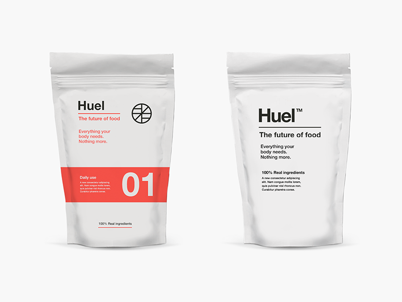
“Typography can be very powerful even on its own without any other graphical elements to support it for, example take a look at this clean and simple typography based packaging design by Salih Küçükağa below, and you can see how large and small fonts are professionally used to visually draw the viewers attention to certain details of the product, don’t overdo it, think about the user think about what you are trying to visually communicate, think minimal and don’t over do it!, Less is more!, simplicity is key in visual communication”
Andrew – The Logo Creative™

Expressive Typography in Broken Grid Layouts
With expressive typography reaching the market forefront, the creative use of typography will groom out from simple brush lettering. Now audiences are more interested in watching attractive illustrations. These can be 3D elements or cropped out manipulated fonts with animation. When websites bring different font letters to life; it becomes interestingly amazing giving the entire composition a unique look.
Check out this amazing video on how expressive typography works:
In result, designs will simply break away from the classical grid layouts and without having any second thoughts, allow text to adapt to better compositions within the overall editorial design.
This has truly become possible because of the progressive standardisation of Flexbox and CSS Grids for digital layouts.
Businesses which makes the best use case of typography are the ones winning the hearts of their customers. After all, in the design world, it is all about making your customers feel they are special.
Customers crave for newer and much interactive experiences. And believe it or not, they are bored viewing designs that have the same type of design elements every now and then.
What they are looking for is something unique, something more impactful or interactive when it comes to the digital world, something which expresses persona.
With the right typographic element used with the modern day software tools, you can actually make an experience for your customers, the one they never forget. So what are you waiting for? Start designing.
Join The Logo Community
We hope you have enjoyed this article about Starting Out as a Graphic Designer? Keep These Important Typography Tips in Mind. If you would like more personal tips, advice, insights, and access to our community threads and other goodies join me in our community. You can comment directly on posts and have a discussion.
*TIP – We use and recommend Pixel Surplus because they have some really nice quality font bundles.
Author Bio
Irfan Ak is a digital marketing strategist at Branex and Taskque & a guest blogger. He creates value for companies by helping them with their marketing strategies.

