We are surrounded by logos on a daily basis they are everywhere we look and typically found on everything from food, clothes, cars, toys, electrical equipment such as our televisions, games consoles, radios, cookers, and fridges. Even when walking down the street and when a bus passes by they are literally everywhere we look. Let’s look at some Superhero Logos and Symbols, Communicating Visually.
A logo is a brands symbol a trademark that a company uses that differentiates them from the other brands. As the old saying goes “Pictures are worth a thousand words” and the human brain remembers simple shapes and images compared to words and text.
And for this reason, companies should be striving to get a perfect logo design for their brand that distinguishes them from the competition.
Creating a logo design is a challenge within graphic design and most people just don’t realise the process and what goes into the creative process to get that logo design just right and the goal is to take an idea and condense it down to a symbol that will be instantly recognisable and stay forefront in a viewers mind.
It’s a little like been a superhero you want the public to recognise you as a leader and a figure in the industry someone who they think “yes I know who can help!” Now, these Superhero Logos and Symbols can market themselves like a company does, so these protectors of humanity have to express the fact through a wordless mark a symbol to identify them.
Superhero Logos and Symbols, Communicating Visually
The perfect Superhero Logos and Symbols that comes to mind is the Batman Logo which has a lot of personal meaning to Bruce Wayne who is Batman. I’m pretty sure we all know the story of Batman but if you don’t i’ll give you some insight into the story and how the symbol came to be.
Bruce Wayne is the son of Dr. Thomas Wayne and his wife Martha, two very wealthy and charitable people living in Gotham City. Bruce Wayne as a child was afraid of Bats. This refers to the incident when Bruce Wayne as I child fell down into the Wayne house pit and had an encounter with the Bats inside and this event scared him, memories of which got inked deeply into his mind & soul. To comfort him his father Thomas Wayne says to him “Why do we fall bruce? So we can learn to pick ourselves back up!”
Bruce leads a happy and privileged existence until the age of eight when his parents are killed by a small-time criminal on their way home from the movie theatre.
Bruce Wayne, therefore, swears an oath to rid the city of the evil that had taken his parents’ lives. He engages in intense intellectual and physical training;
Henri Ducard/Ra’s Al Ghul the leader of the League of Shadows, quoted “Men fear most what they cannot see” while Bruce Wayne is training to fight against the evil of Gotham City. He is made to realize his fears and to stand up against each one of them. “To conquer fear, you must become fear.”
One of the scenes of the Ninja training, actually tests him to overcome his fear. In the effect of the ‘Blue Flower’ (which is a fear-intensifying hallucinogenic drug), Bruce Wayne gets a surprise encounter with a bunch of bats when he opens a box. That’s the moment for him where he realizes, that very moment, he needs to get beyond this haunting.
“If you make yourself more than just a man, if you devote yourself to an ideal and if they can’t stop you, you become something else entirely – legend, Mr Wayne.”
However, he realises that these skills alone would not be enough. “Criminals are a superstitious and cowardly lot”, Wayne remarks, “as a symbol, I can be corruptible, I can be everlasting” referring to the symbol “Something elemental, terrifying” in the comic books all us superhero fans used to read as kids, I remember him saying“my disguise must be able to strike terror into their hearts. I must be a creature of the night, black, terrible…”
This inspires Bruce to assume the persona of Batman. the Logo is a symbol that communicates visually. I personally feel, a person knows his weakness after some introspection and uses that as a focus to keep themselves motivated and instigated to fight/achieve. Bruce Wayne might keep BAT’s as that motivation/reminder to go that extra mile to achieve his goal.
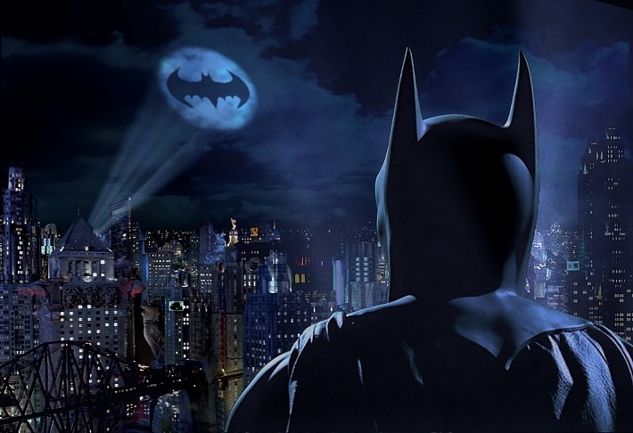
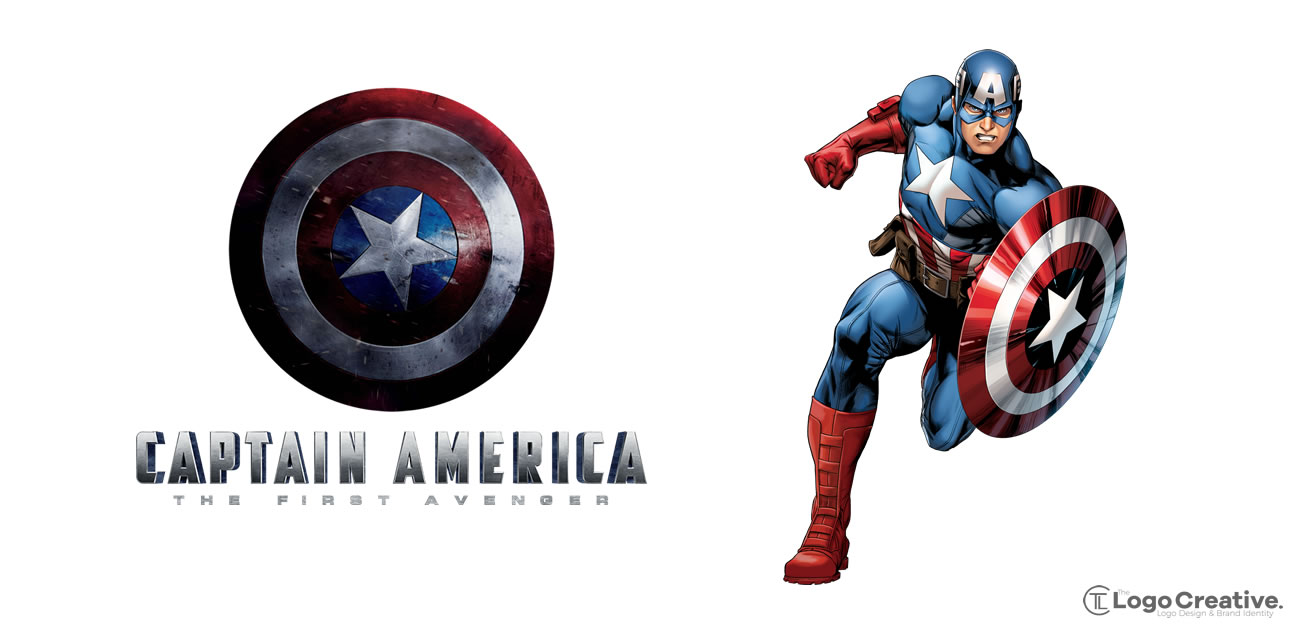
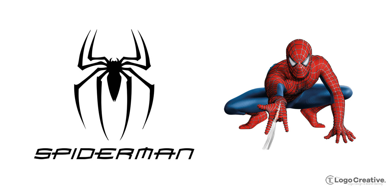
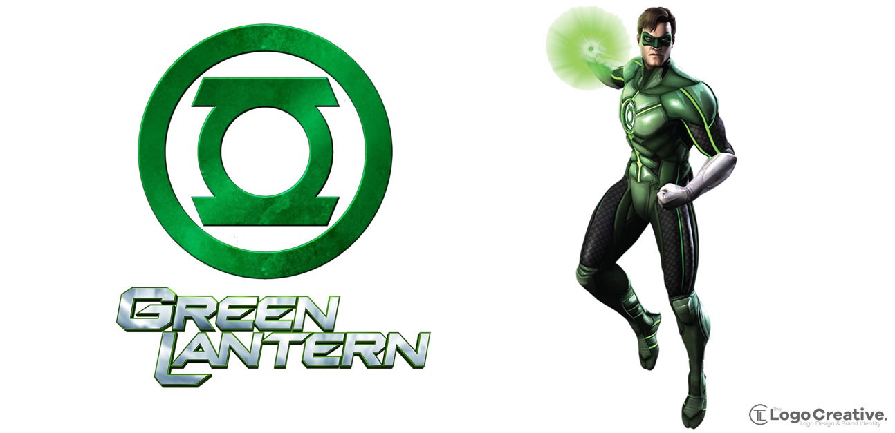
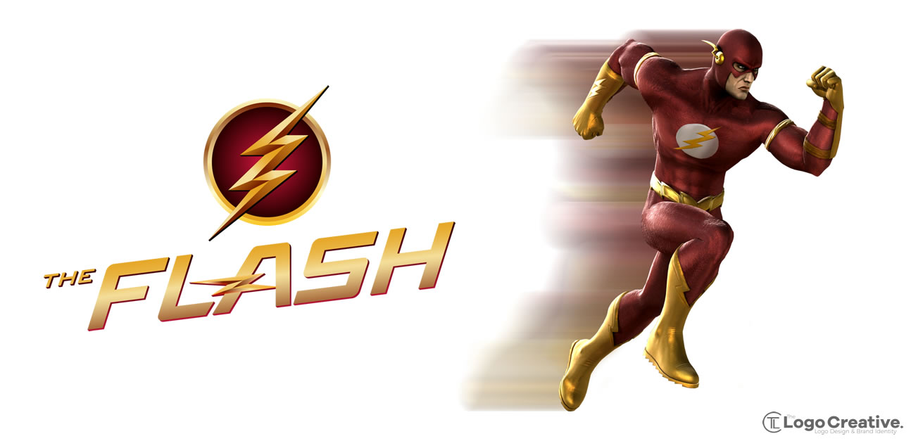
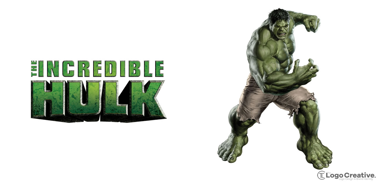
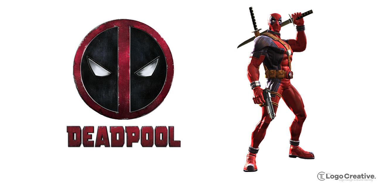
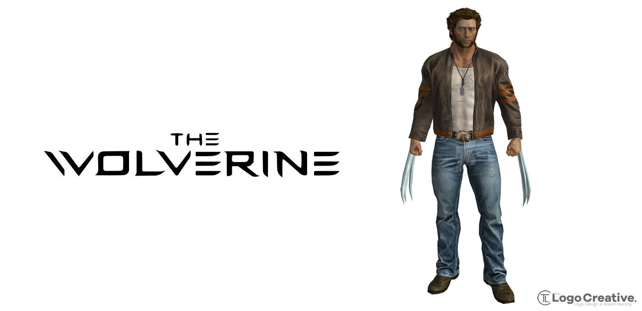
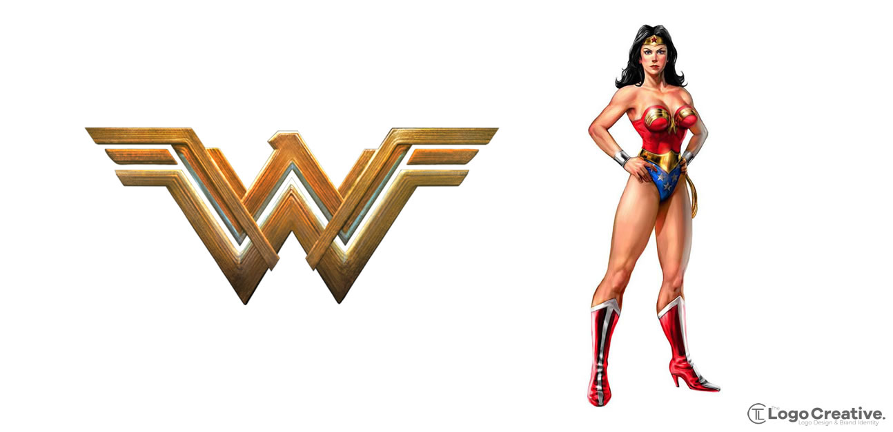
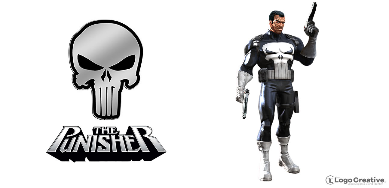
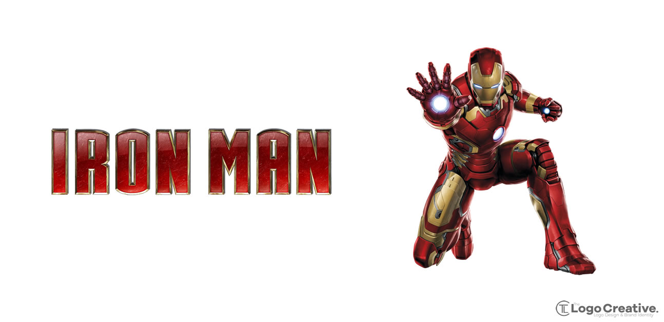
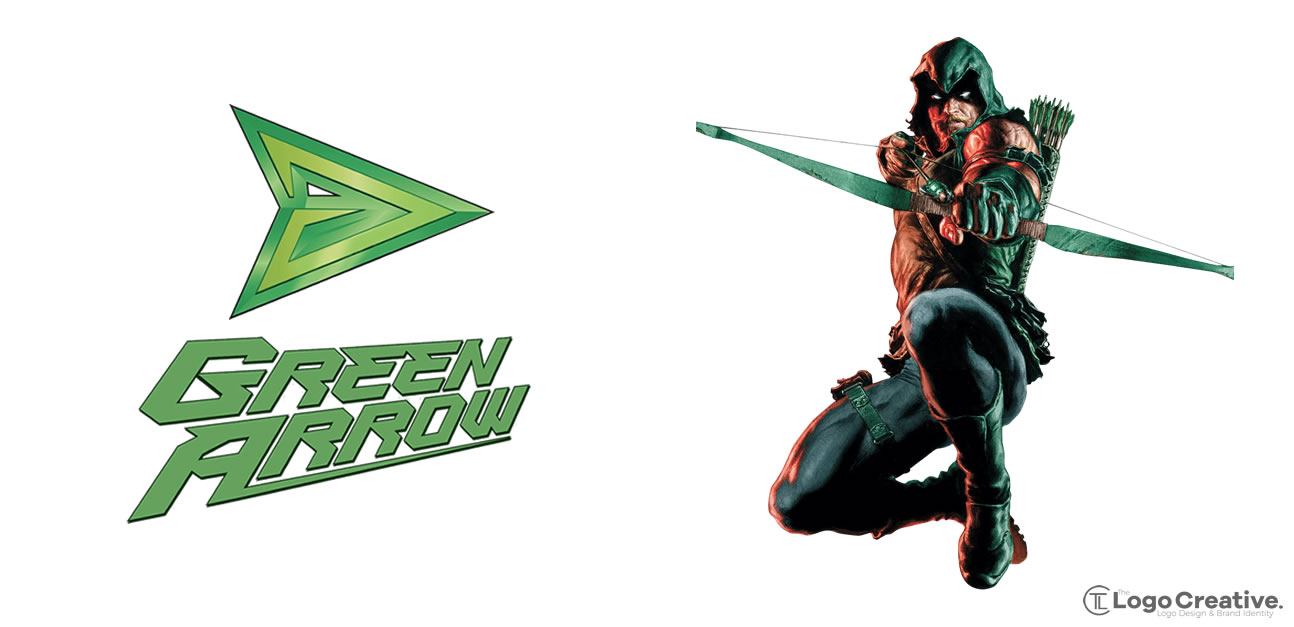
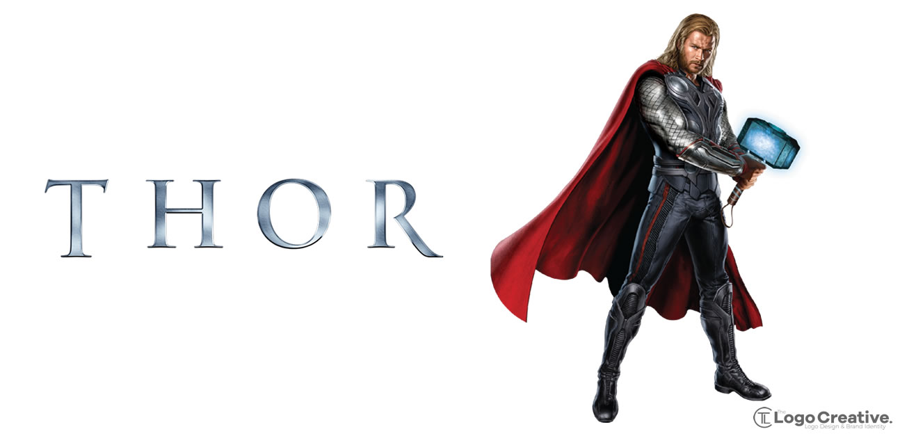
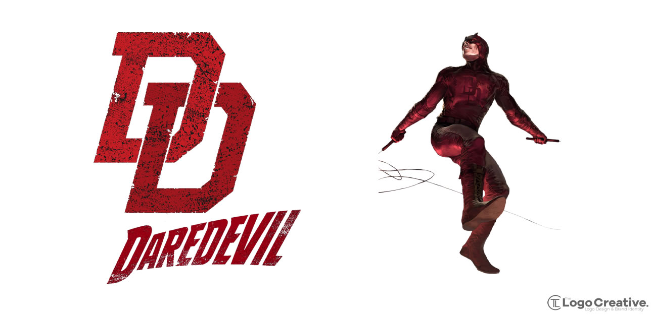
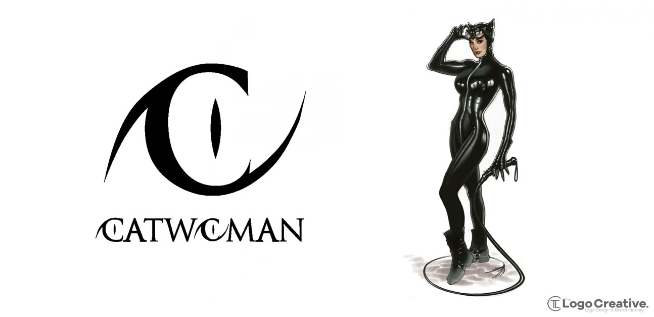
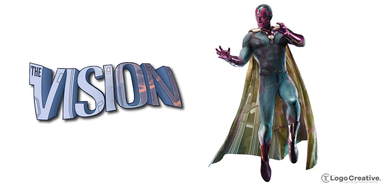
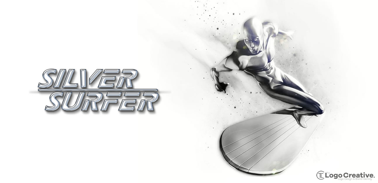
All superheroes have their own story and background to the reason why their who they are some of them have their own symbols that represent something about them that communicate a visual message and others just have a fancy typeface that is instantly recognizable with each character, other factors come in to play that represent the branding of each character such as colour and a distinctive look to represent their visual identity.
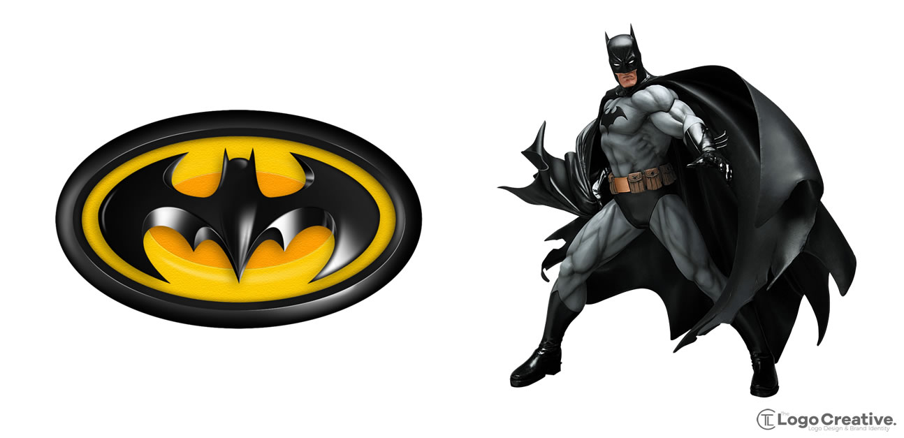
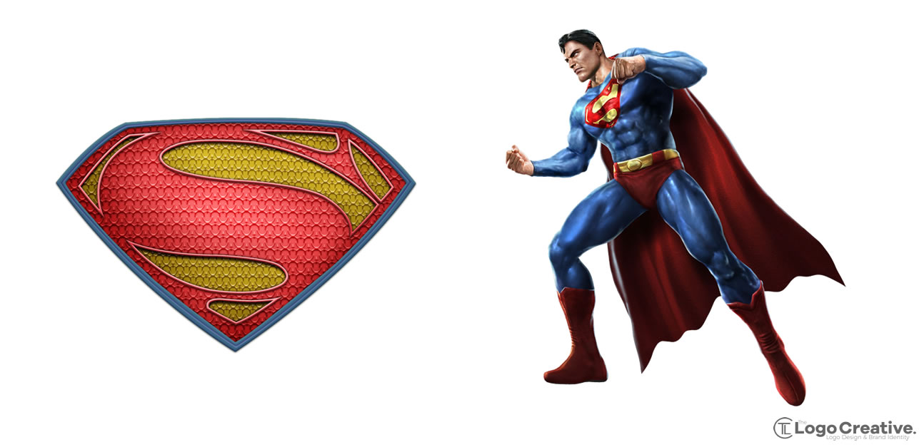
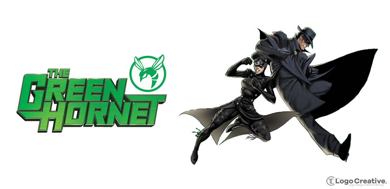
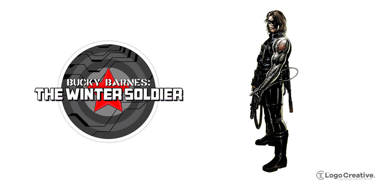
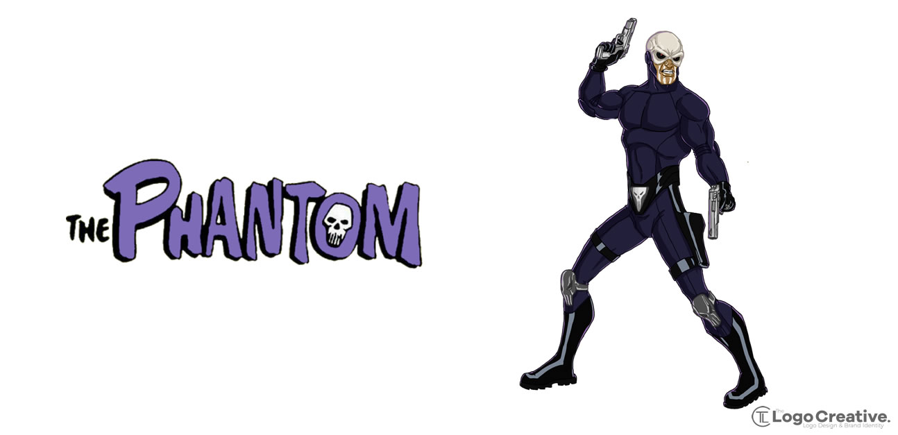
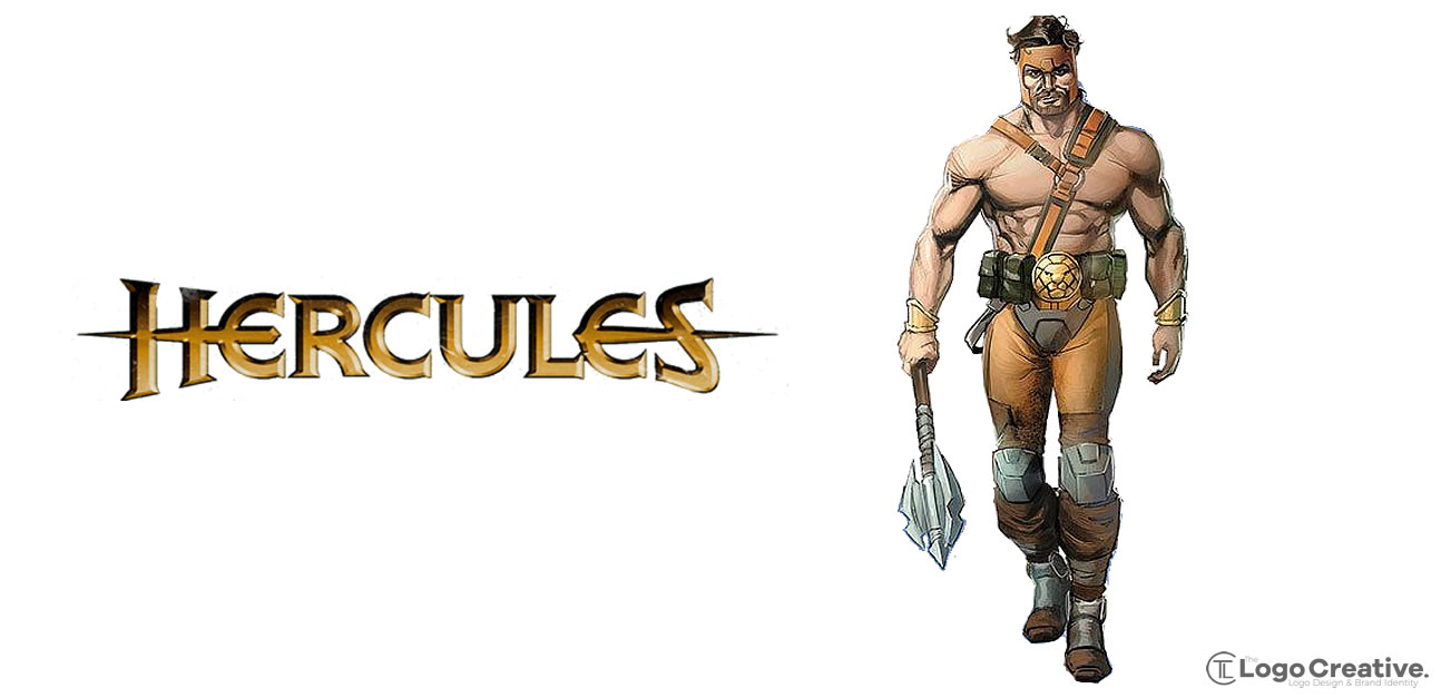
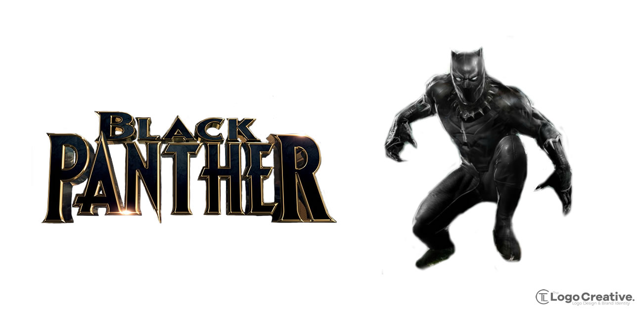
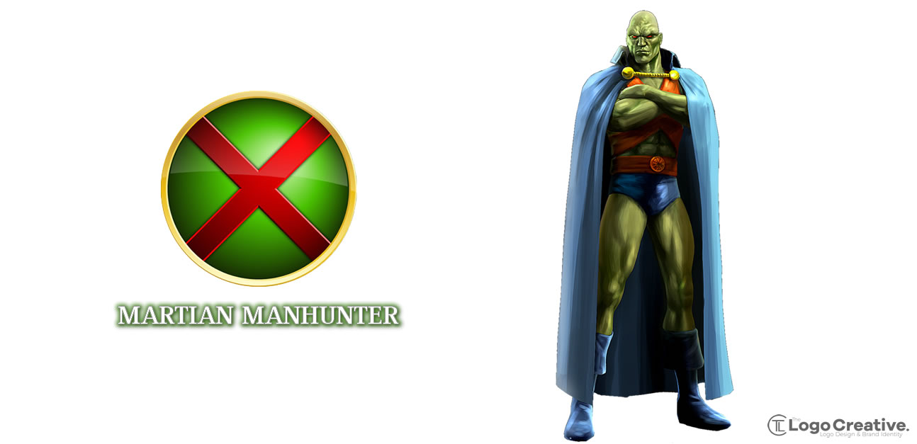
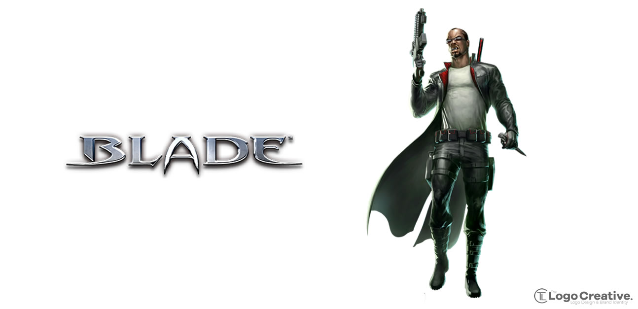
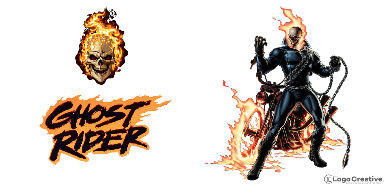
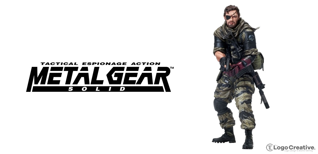
I’m not going to write about each character about below I have put together some images displaying the icon, symbol and character model next to each other so you can see. I also wanted to make this article as visual as I can because that’s the idea of the whole topic of this post, communicating visually!.
43 Superhero Logos and Symbols
Here are a mix of Marvel and Dc superhero logos and symbols that also iclude the character.
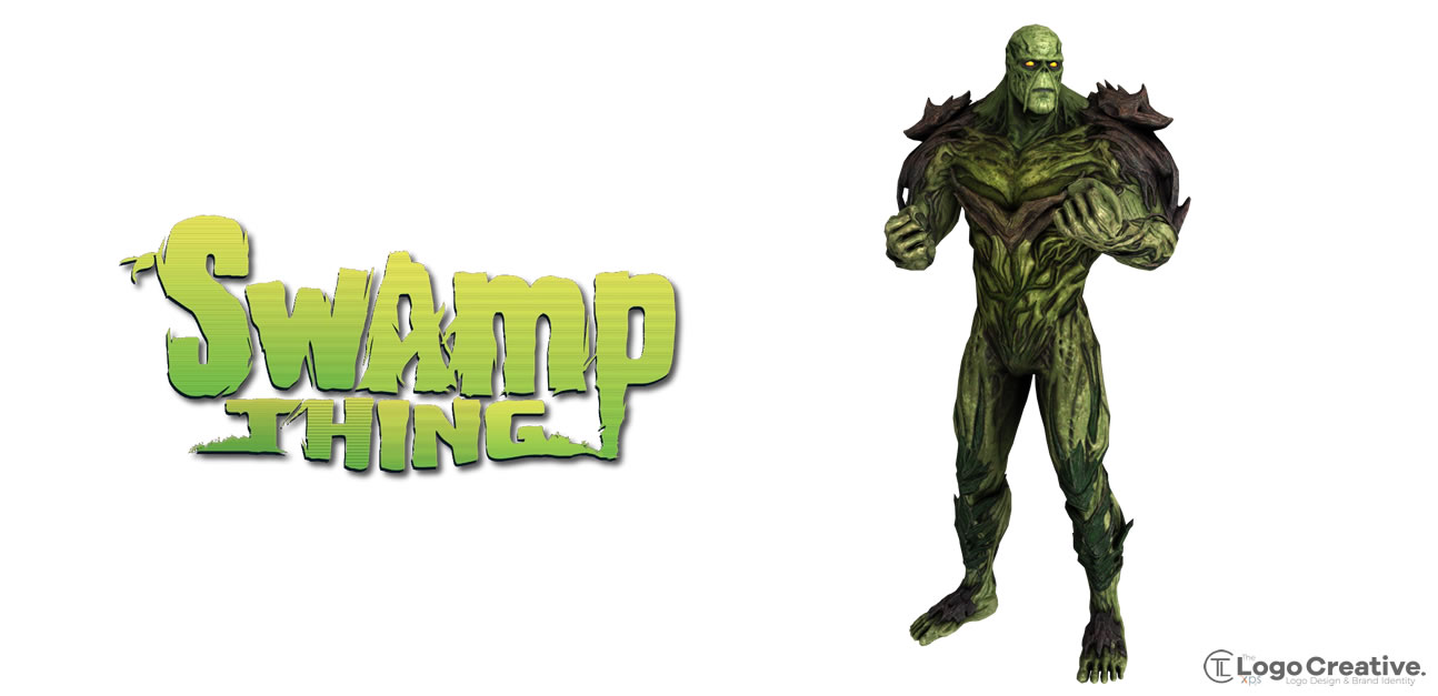
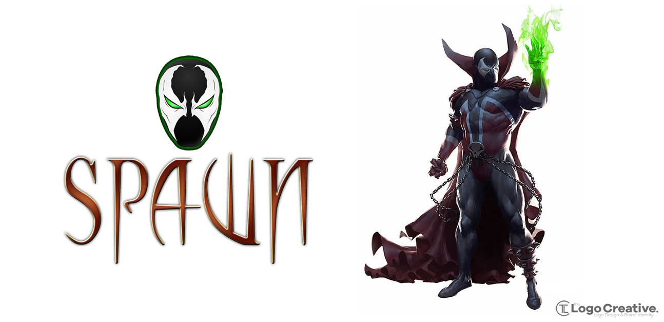
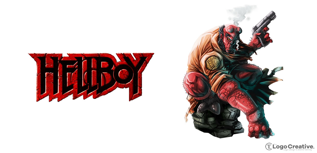
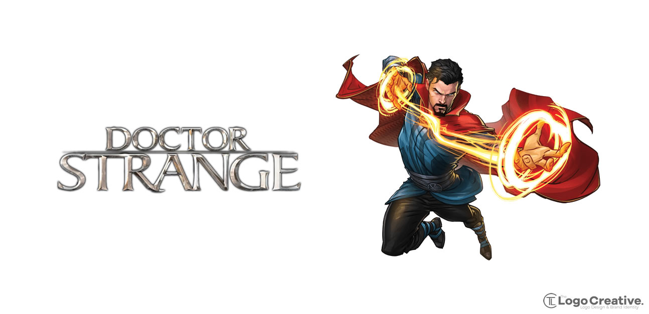
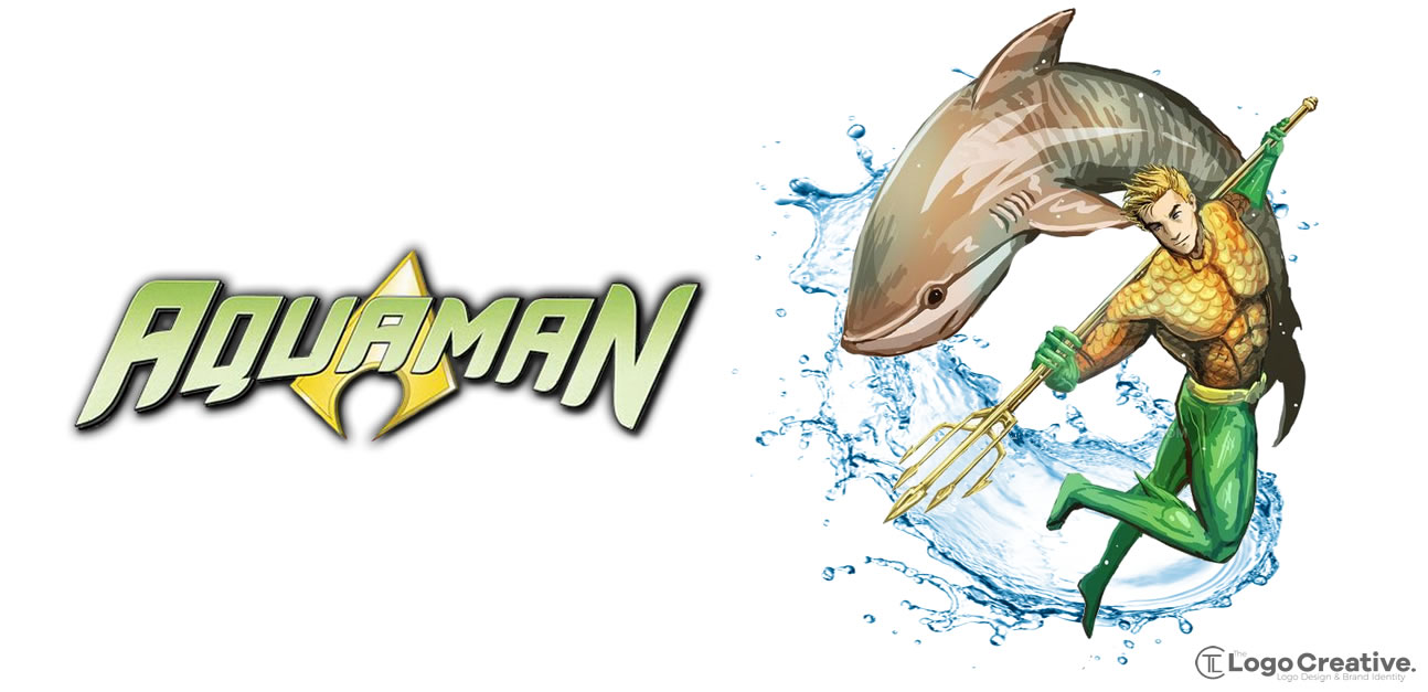
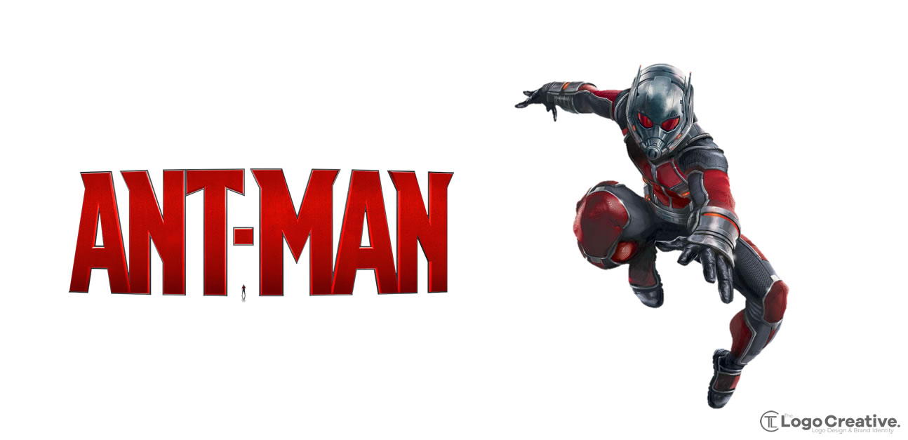
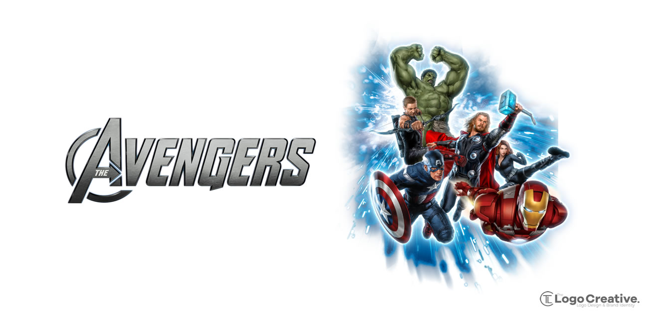
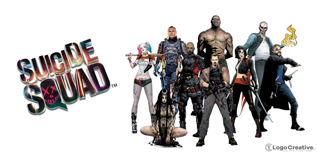
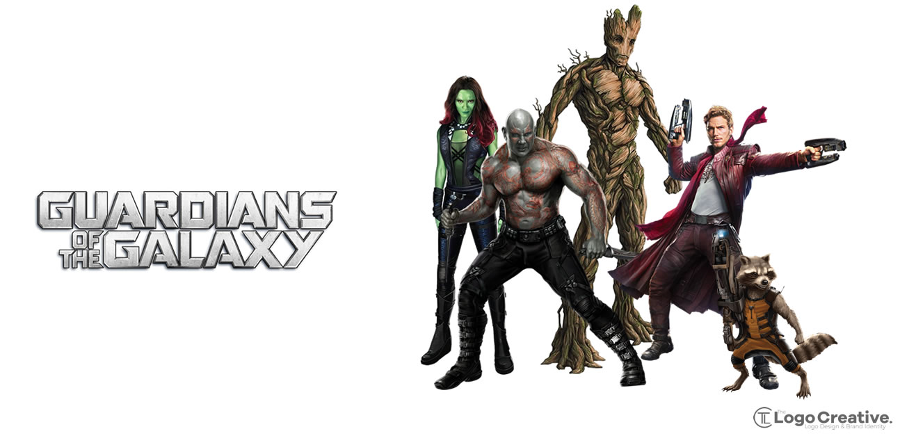
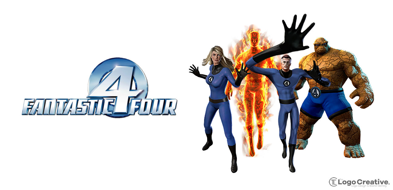
It’s not just individual superheroes that have identities when superheroes align to create alliances and become a faction they also have a team logo.
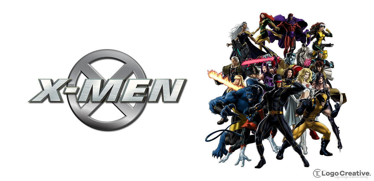
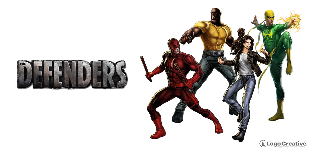
BONUS: Not classed as superheroes but I would call them super characters.
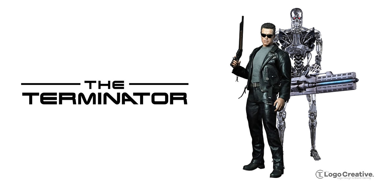
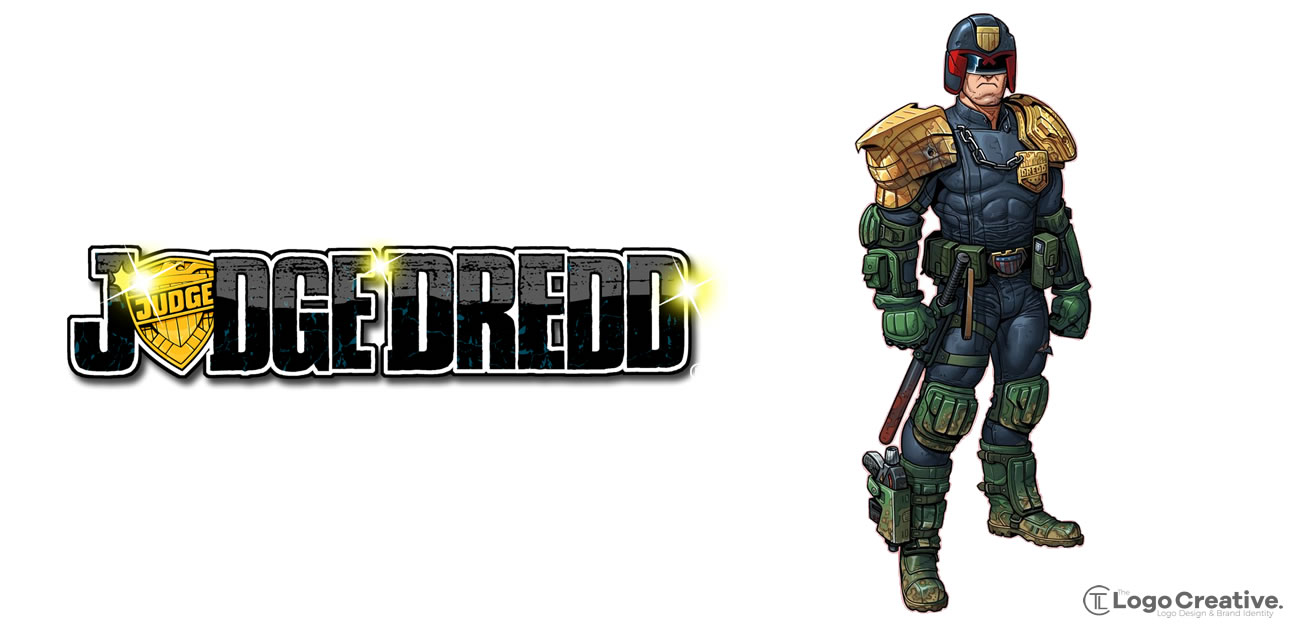
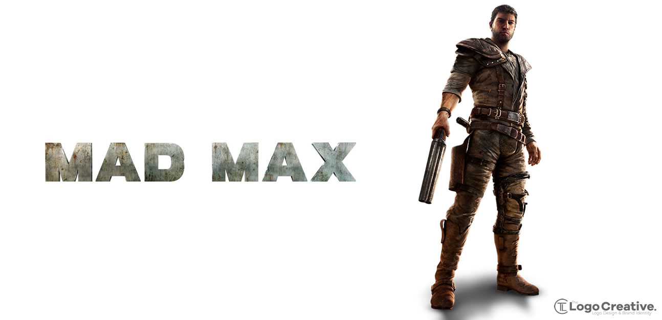
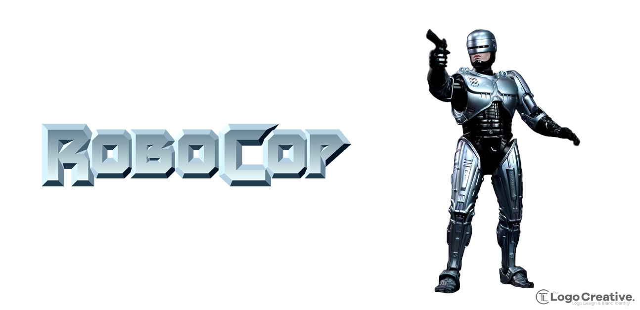
Hope you have enjoyed these Superhero Logos and Symbols, If you think any more superheroes or charaters need adding to this list feel free to let me know and ill look at adding them.

