Today Designer Spotlight: SŽDC Brand Identity Spotlight
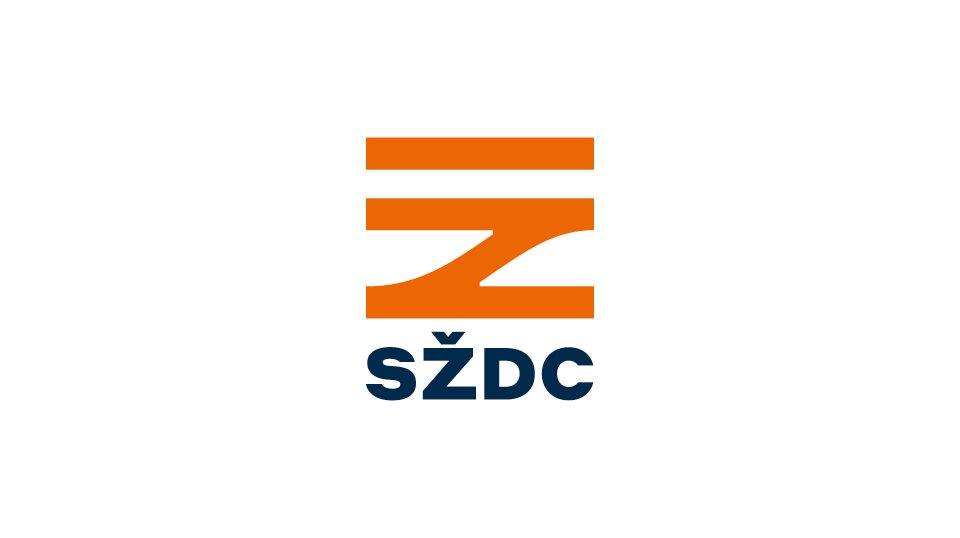
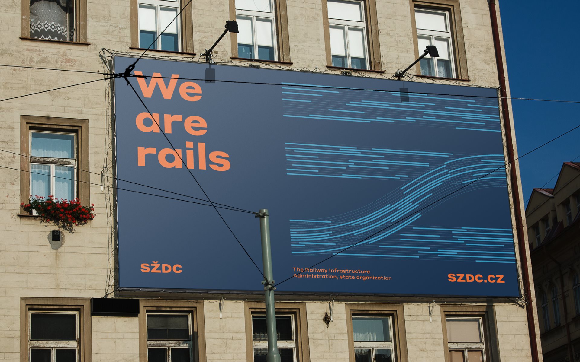
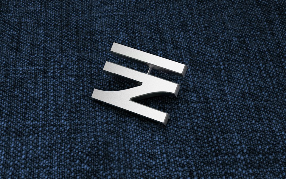
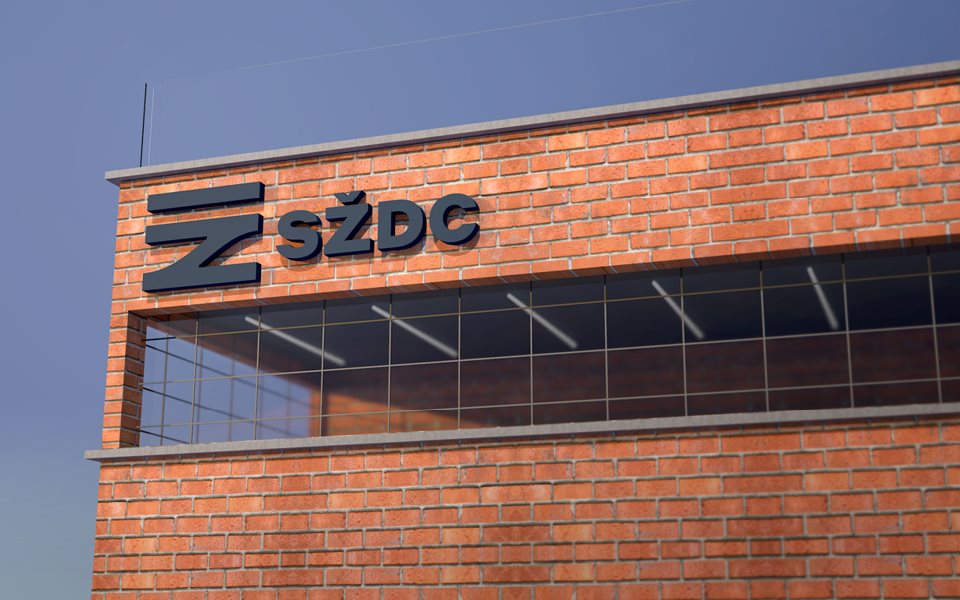
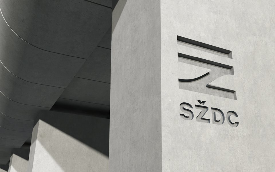
SŽDC stands for Správa Železniční Dopravní Cesty in Czech — “The Railway Infrastructure Administration” in English. It’s currently the Czech Republic’s largest railway carrier, and the new monogram, designed by Prague-based Studio Marvil, is a massive improvement on the outgoing identity.
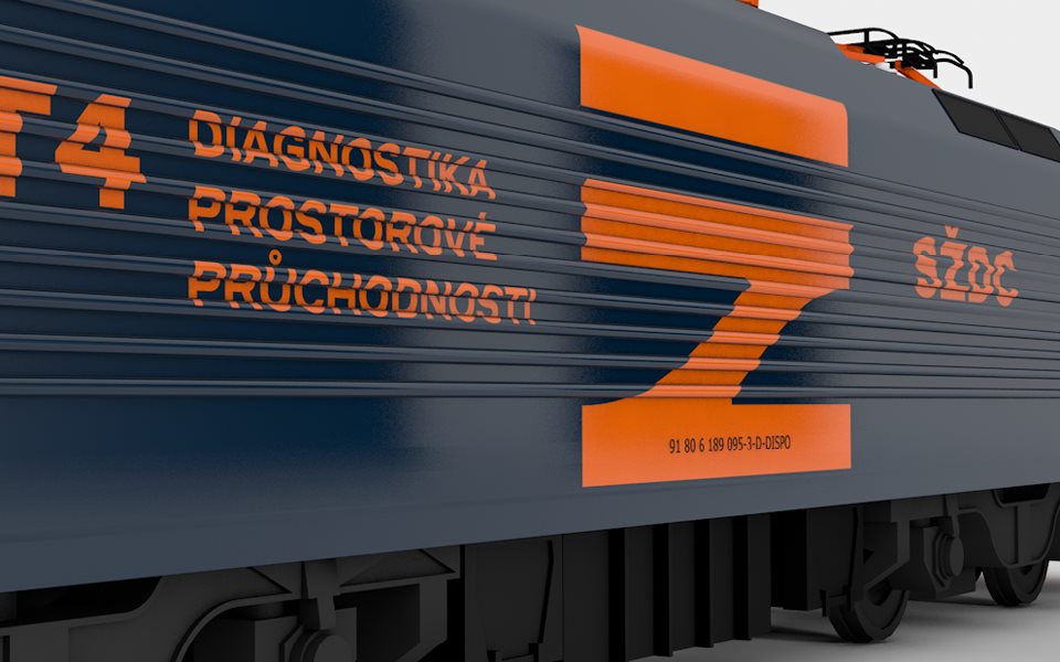
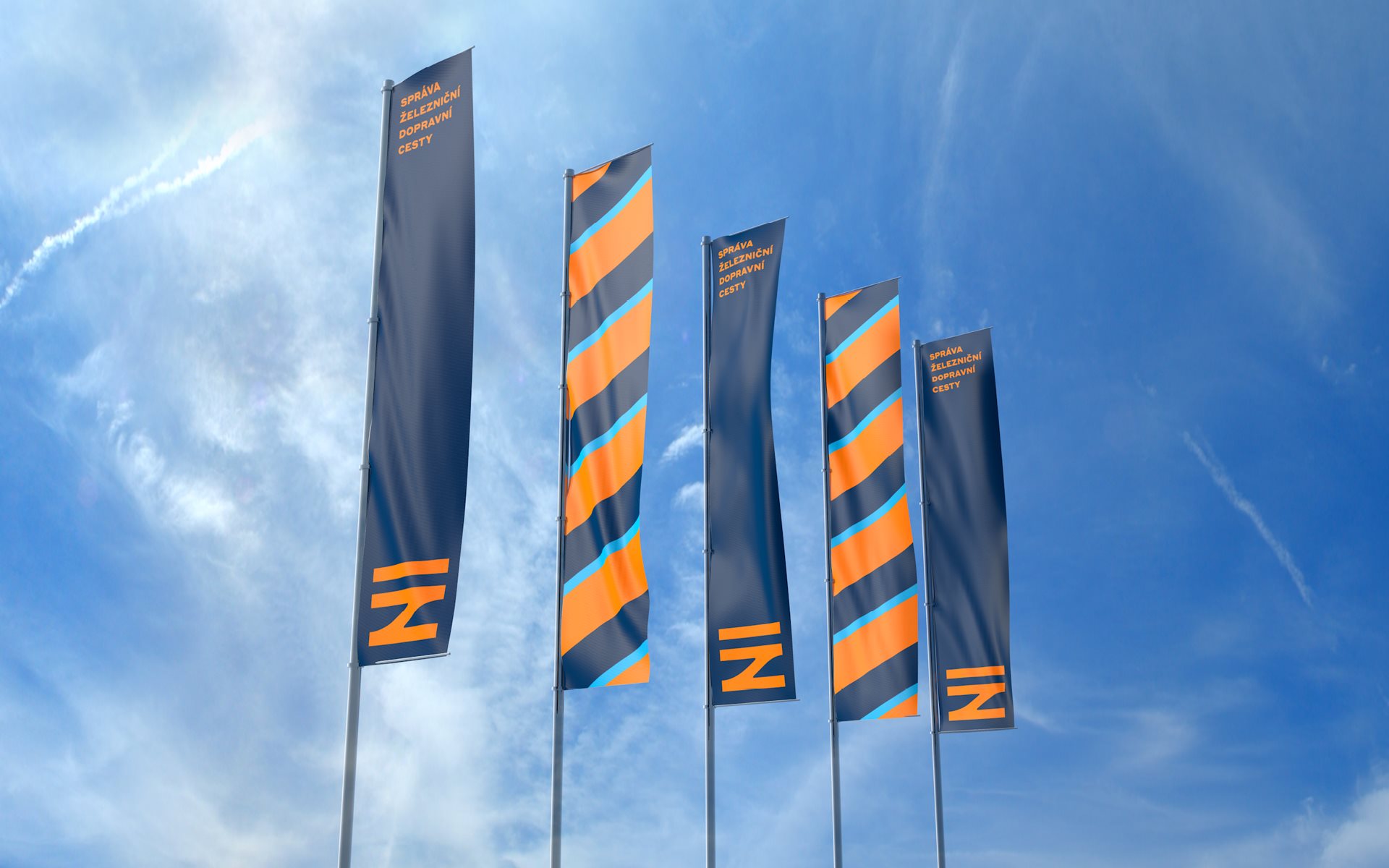
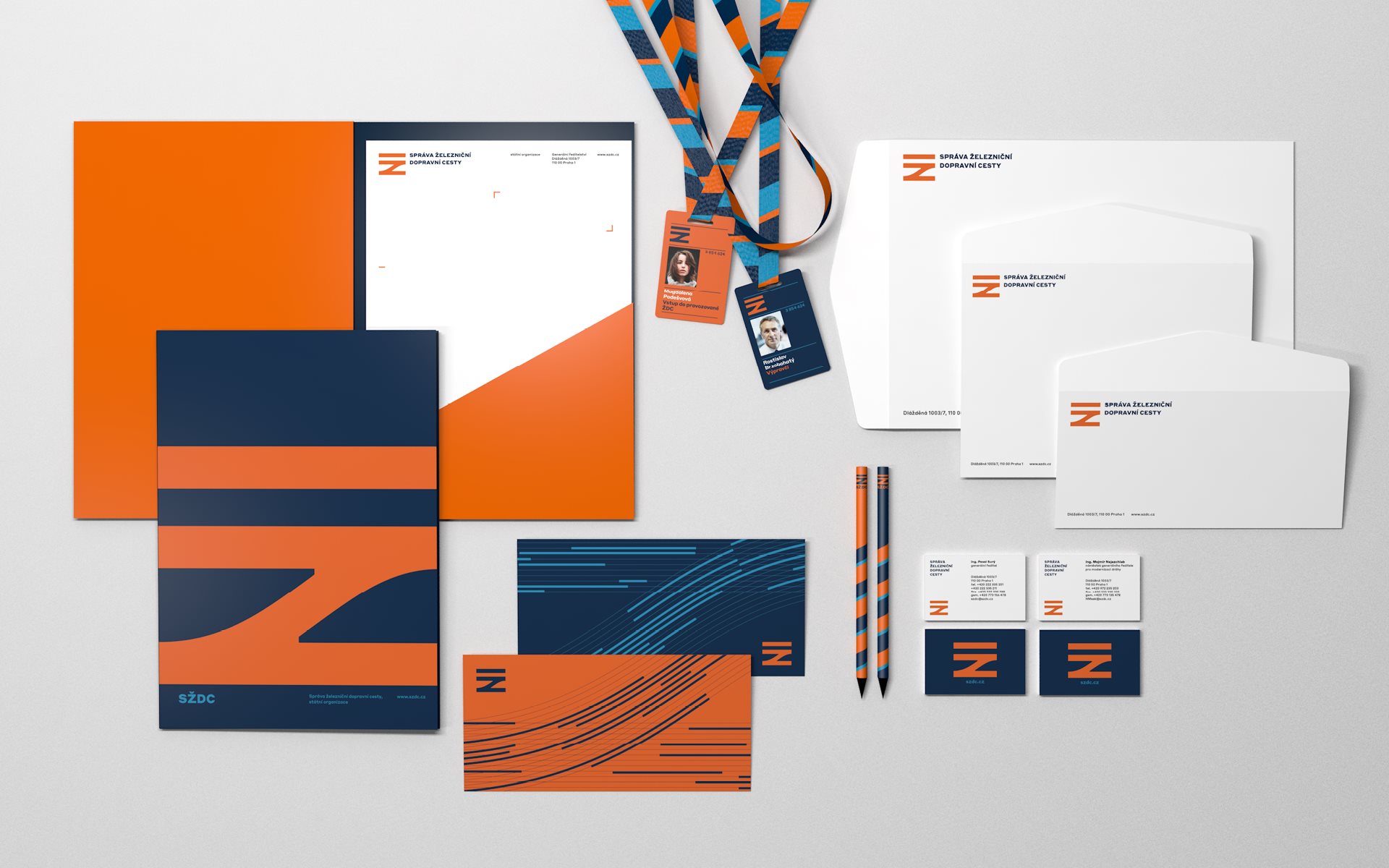
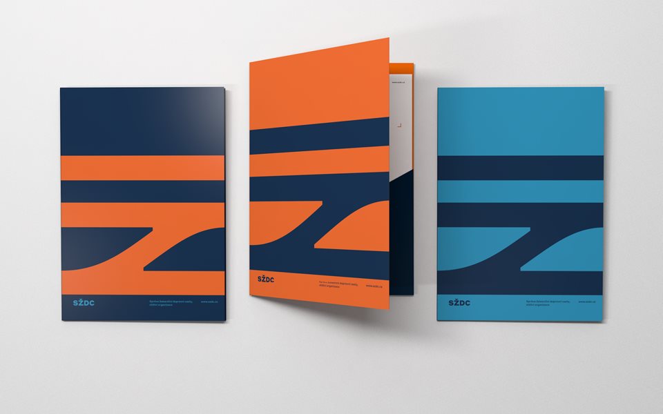
According to Pavel Zelenka, partner at Studio Marvil, the official name is nearly impossible to remember, even for native Czech speakers, so the designers aimed for a simple symbol that was easy to recall. It’s based on the letter Ž for Železniční (“railway” in English), and symbolises railway lines linked by a track switch.
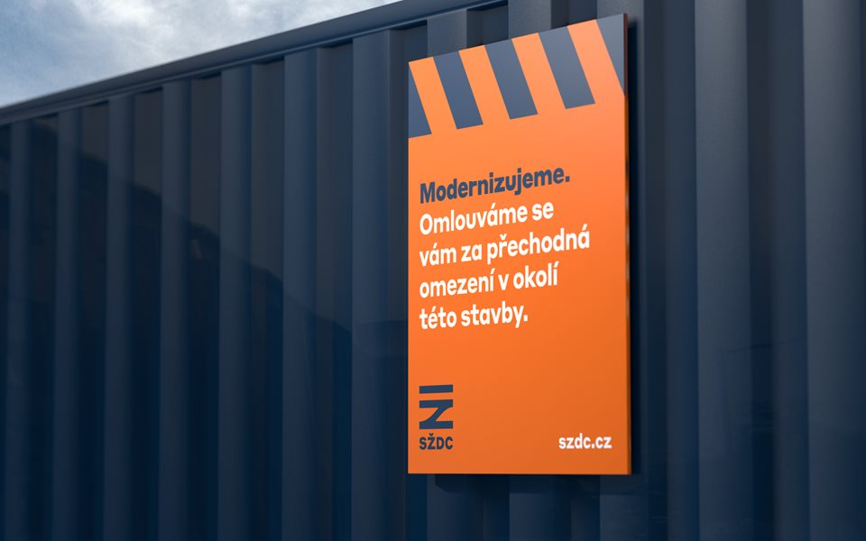
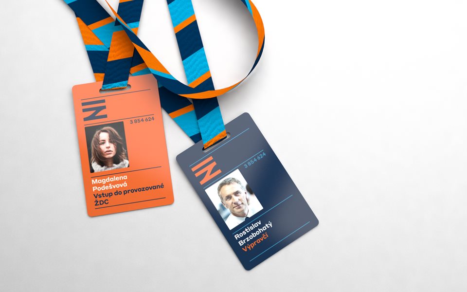
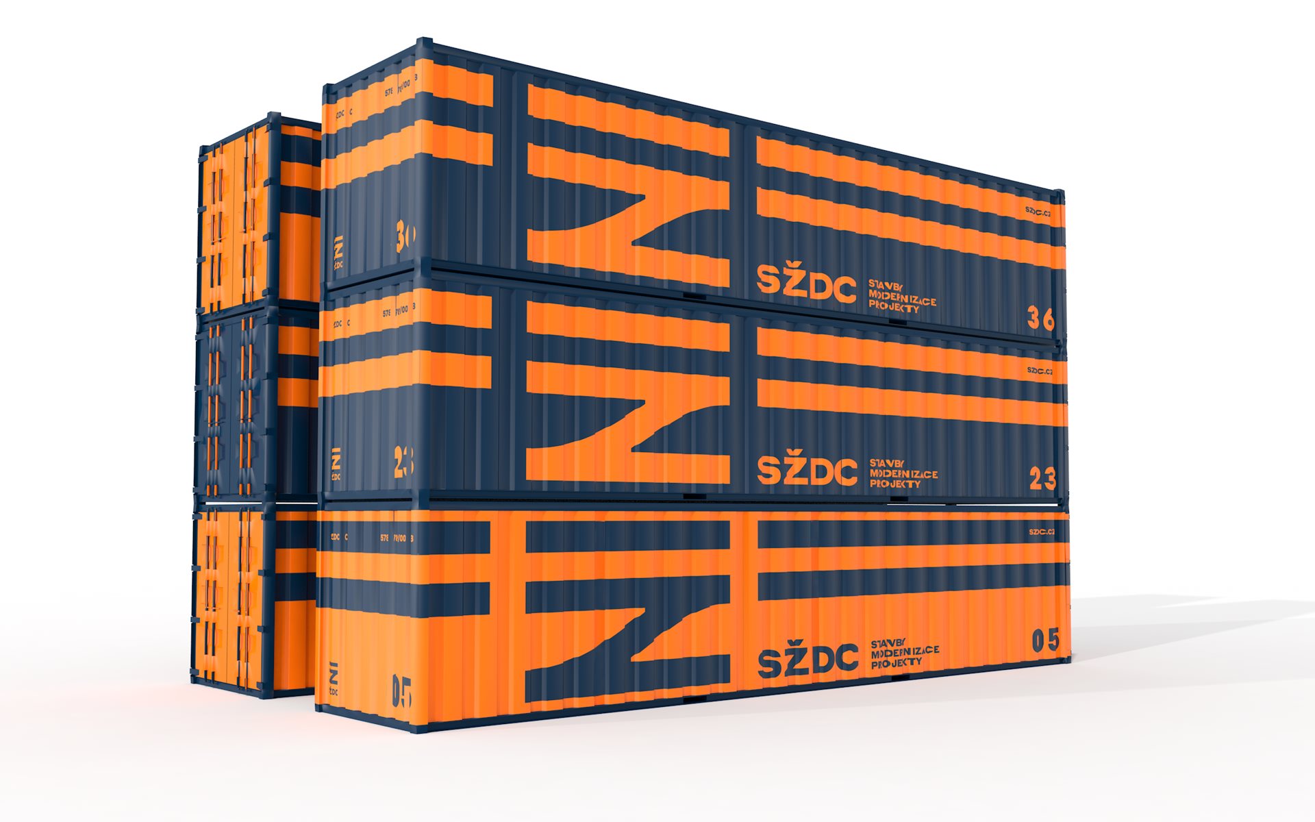
“We wanted to use a high contrast colour scheme. Deep blue is traditionally associated with railways in Czechia, and orange was a rational choice because it is not used by companies operating on Czech railroads. Cyan was added to expand the palette for web, animation and corporate clothing.”
Typography from the Styrene Collection by Commercial Type.
The new visual identity is been rolled out on print collateral, Uniform and the train livery, By checking the SŽDC website its yet to make an appearance.
I think this new identity is brilliant work and defiantly an iconic mark that will last a lifetime for the company.
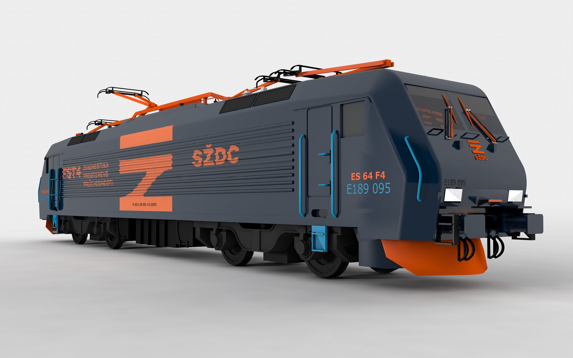
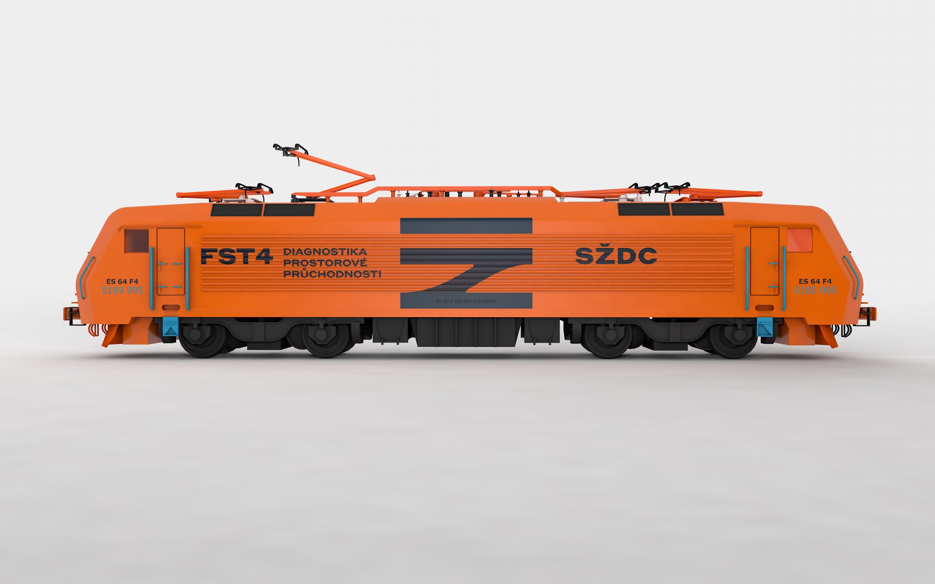
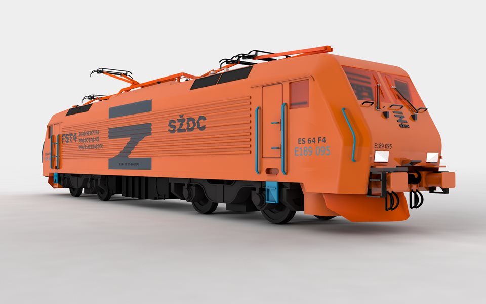
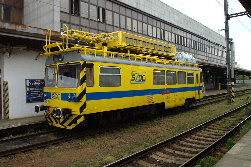
Above The SŽDC train livery that will be replaced.
See more from Prague-based Studio Marvil, established 1995. Brand New also have a post with opinions about the design.

