To capture a brands personality and make it stand out above the competition it needs an eye-catching logo that is not only representative but also identifiably unique, memorable, adaptable and timeless. In this article, we take a look at The Art of Logo Design
Lots of research into the brand must be conducted in order to understand who the brand is and what they stand for, their purpose, values and why they do what they do. These finer details must be researched in order to understand why the logo is needed. Once the purpose of a logo is defined it will change the whole perception and the approach the designer will take when designing. During the design stage. Careful consideration and iterations must also be done during the design stages. A brands logo is the first visual connection a consumer will see when engaging with a brand either on a tiny business card, promotional flyer or large scale above a storefront. A brand logo is everywhere and a vital visual in making that good first impression.
The significance of quality, appropriate logo in branding should never be underestimated. The brand’s logo will influence consumers opinions of the brand and it can even within the first few seconds of viewing it affect whether the person decides to engage and do business with that brand. A person can form an opinion in their mind about a brand within a few seconds just on the logo alone.
The reason we are stating this is to enforce the topic of why logo design is not an easy process when done correctly and the process is followed. Sure anyone can design a logo with minimal skills but that means nothing in the long run.
The idea and concept of the logo need to be appropriate, the reasoning behind why the logo is needed needs to be clear and fully understood.
The design direction and execution of the design concept need to be perfect in every way. Just designing for pure eye candy is not enough it’s meaningless which makes it unappropriated with no direction to why it exists. The logo needs to be the product of innovative thought and well-planned design.
Table of Contents
Known the brand and create a brief
To be able to design a meaningful logo that is appropriate and fit for purpose, you must first understand the brand it’s being designed for. Research is a vital key step in the design process and many skip it all entirely and just design for eye candy basically this is pointless.
You need to research and find out as much as possible to understand the brand you are designing the logo for.
A design brief is always a must and you must gather basic information from the initial first stages of engagement with the client in question.
This basic information can then set you up for further research and build a more in-depth and complex brief you and the client can refer to. The brief will help direct the project and if things start to go off the path you can steer back on to the brief.
Document Your Logo Ideas
When you get to the ideation stage this should be one of the first things you should be doing in the logo design process which is documenting your ideas and Finding logo design inspiration
Before you even think about the computer and the digital stage the concept must be there and have been tested. To me, logo design is not about the computer or the software that is used to digitise the logo its about the idea and the process that is taken to get to that idea.
I want to design the logo before I even turn on the computer I want to see a solid concept in my sketchbook first. I understand that not all designers can draw but this is not the issue and you don’t need to be an artist to be able to do some simple sketching and arrive at a solid logo concept. There are no excuses for not sketching everyone can draw simple lines, curves, and shapes. Using a sketchbook to design logos is also a vital stage in ideation don’t worry if your drawing is messy just get those ideas on paper and do a brain dump of those ideas from pencil to paper release what’s there and build up as you go.
My first initial sketches are really rough then once a concept has been found I do a neat sketch in a grid to outline in black ready to digitise. The computer and its software is just a tool it does not design for you. Ideas come from within, the concepts are executed by the designer before a computer is even turned on.
Avoid cliché ideas and focusing on trends
Year after year we see innovative logo design trends and yes it’s good to keep on top of these trends and experiment with them, but don’t be ruled by them we see time and time again designers using the same trends over and over again and their portfolios become unique and just repetitive.
For instance, gradients are something to keep tabs on but for years using gradients in logo design was a bad idea and designers used to avoid like a bad smell. But now gradients are back in the limelight and been given a new lease of life.
The gradient trend came bouncing back into the design scene in 2018, and lots of graphic designers were stunned by this, especially when larger brands such as Instagram jumped on the band wagon.
Lots of people thought that the implementation of gradients was too much of a throwback. Nostalgia was one thing, but would people really connect with a trend we’d seen before?
In the end, people loved it particularly because the 2018 gradient trend is not old-fashioned after all. It feels sophisticated and high-end (whether it be backgrounds, textures or overlays). These newer gradients use bright, luminous colours and very interesting colour combinations that make the design feel fresh and modern.
And apart from the nostalgia factor, people are going crazy for the gradient trend for a larger purpose. With the vast amount of content, consumers are exposed to on a daily basis, todays brands need to find ways to stand out and grab consumer’s attention. Gradients are versatile and really do add the interest factor and exciting colour to a design being the perfect way to make a brands logo stand out.
That been said use sparingly and not in every logo you design otherwise your portfolio will look repetitive and you don’t want to be known as the designer that uses gradients all the time or any other so called trend for that matter.
In the long run, it’s safer to stick to solid design principles to avoid clichés
Embrace unique logo design and originality
Something that all logo designers should be striving for is a unique logo design. By being unique and original makes it far easier to grab the viewers’ attention and be memorable.
Custom hand lettering is a good example that embodies both traits, and as the lettering is custom to the brand is harder to copy or be used by a rival brand if it’s a common font type.
Prime examples of custom hand lettering are, of course, Coca Cola

The Coca Cola brand is one of the world’s oldest well established and beloved brands that has stood the test of time and is instantly recognisable.
Other examples of word famous brands with custom typography are:
Design logos in black and white to solidify the concept
Colour is not important at the very early stage of designing the concept. You should always start designing a logo concept in black and white even if at a later stage you know the logo will appear in full colour.
It’s normal for the colour to be a part of the final concept of the logo, but a logo should never rely on colour to work. A logo should rely on shape and form, and starting and finishing the logo concept in black and white will allow you to focus on the concept itself. If the concept will not work in black and white it’s not really going to work in colour and the aim is developing the idea into a concept in its basic form, and later in the design process colour treatment can be implemented.
The end result is all about adaptability and the logo being fit for purpose for instance even a logo that’s printed in colour on paper might be reproduced in a single colour for some applications such as 3D wall signs.
There are still a large amount of companies who send faxes, use black and white copier machines, receipt printers that print in black and white (the next time you go to McDonalds look at the receipt and you will see the famous McDonald’s arches logo in pure monochrome format. It simply could be a case that the company does not want to pay for colour printing to keep business cost down which is understandable and they may request a black and white version of the logo design so if your like us and design purely in black and white first that version is always available.
Even if a company does everything in colour and digital formats, their logo may be requested by others such as print suppliers or for certain media and they may have the desire for a pure black and white version for those printouts to appropriately represent their brand mark in black and white.
Its good design practice to design in black and white as mentioned previously the focus is the concept not the colour.
Don’t underestimate colour in logos
In the previous section, we discussed the importance of designing logos in black and white which is vital in getting a strong concept that is un-reliant and nondependent on colour, once you have this solid concept don’t underestimate the power of colour and the effect it can have from a visual perspective.
Even though logos can work very well in pure black and white colour can play an integral role in logo design, and its importance cannot be understated. A brand’s colour palette can set the tone for its visual communication, and people often remember a logo or brand in particular by its colours.
For instance, these brands colours are engrained in our hearts and something we emotionally connect with on a daily basis.
Creating a sense of motion in your logos
Creating motion in a logo design gives it an energetic feel and it’s possible to create a dynamic logos that invoke the sense of motion without actually moving.
The advantage of this over, say, a GIF design is that GIFs aren’t supported in every medium—like print, for example. Creating a sense of motion in a still image will help to preserve the brand message everywhere.

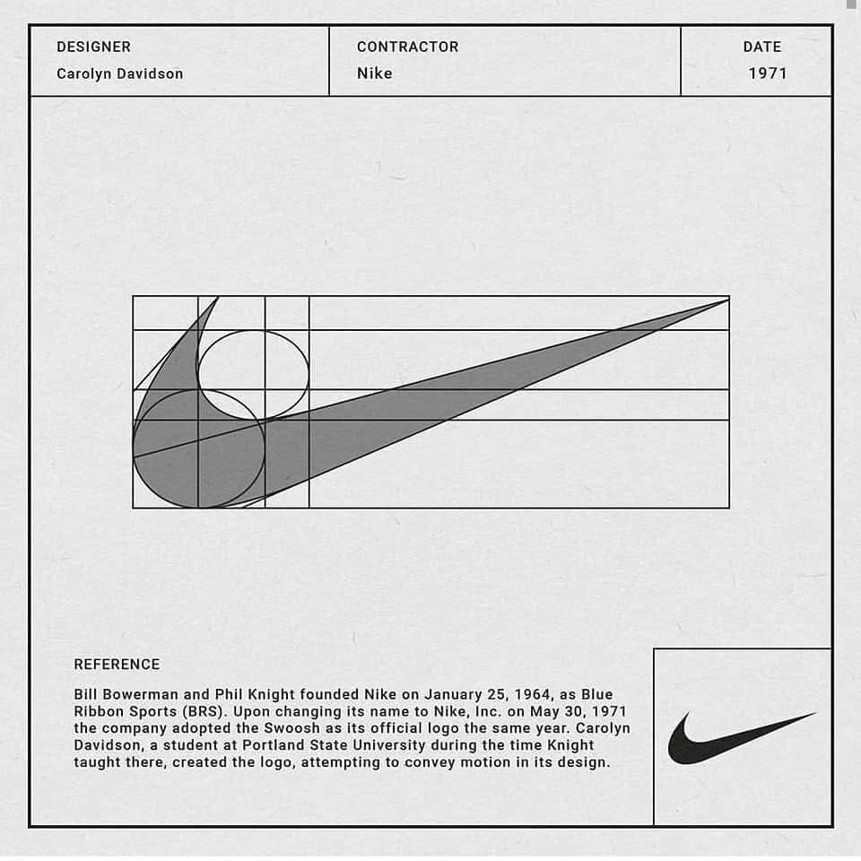
The Nike swoosh logo is a prime example representing speed and energy and even in the layout of the mark when writing a tick it’s a fast motion. The Formular 1 logo also represents speed as the mark is slanted giving it a fast motion look.
Twitter’s logo is another great example of this and can also be part of the brand story behind the logo design.

In early versions of the logo, the bird icon was standing still in a passive stance. Now it’s moving upward in flight, this can be seen as reflecting Twitter’s speed and its use of the application quick short blasts of information and its evolving technology. This type of tactic works extremely well for brands that have incorporated a mascot.
Clever use of negative space is always a treat
Negative space in logo design is not always instantly obvious, but we have all looked at a logo that seemed simple in design, and upon closer inspection, we see the clever use of negative space.
These clever logos create subtle messaging and add depth by taking advantage of the negative space around them.
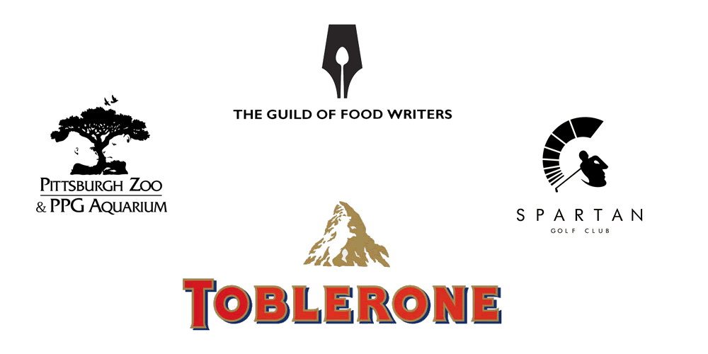
In a lot of cases, empty space around a logo is left unused and designers instead focus on the logo’s main subject, either the type or icon in the middle. However, by utilising the empty area, designers can make logos that can communicate with viewers on both a direct level and a subtler layer.
There are many advantages of using negative space in a logo design, for instance, it includes the added layer of visual communication the overall composition of the design is simpler and in turn more effective. It’s not always possible to implement a negative space aspect to a logo design but when an opportunity presents itself its always work exploring. When you have the opportunity to work with negative space it can really highlight your creativity and ability to think outside the box and be original and unique.
By creating optical negative space tricks it gives the designer opotunities to include hidden messages in the logo design, it’s a fun and engaging way to drive consumers to a brand
These clever negative space logos can become timeless and also very memorable aside from the more obvious and generic designs.
Always strive for simplicity
In logo design striving for simplicity is sort of a design principle rule that all logo designers should be aiming for.
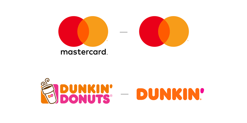
A simple, impactful logo are always the top winners in the end with the big brands simplifying their logos even more. For example, the resent changes of Matercard saw them drop thir name entirely for the logo showing how memorable and timeless their simple mark has become. The other example is Dunkin Donuts who dropped the word “donuts” from the logo to be simply know as “Dunkin”.
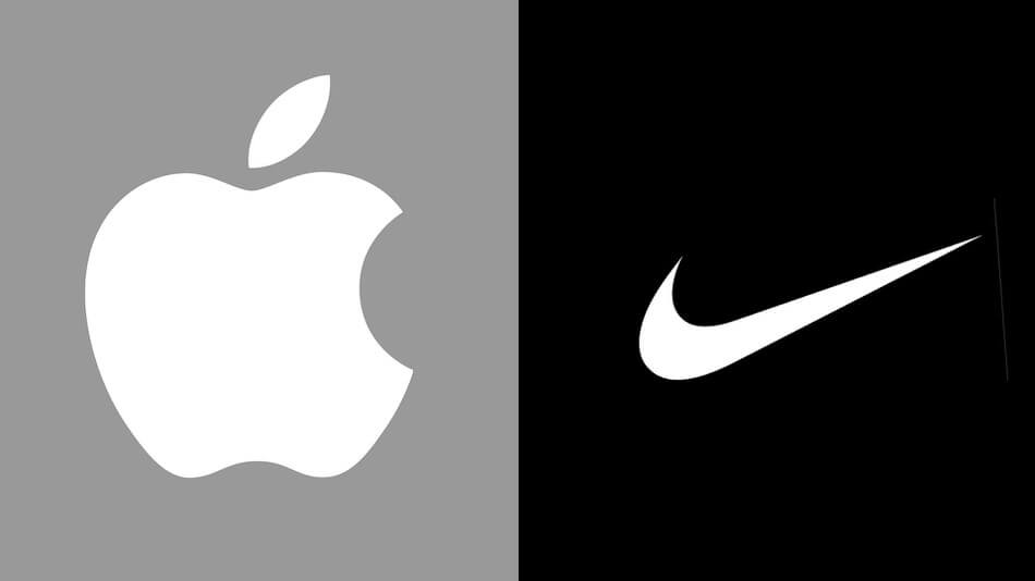
Other Great examples of the simplist big brand logos that have become very memorable and timeless are Apple and Nike.
Balance and Symmetry are important
Looking at the previous examples such as Apple and Nike and keeping them in mind, you can see that balance and symmetry are vital factors in logo design.
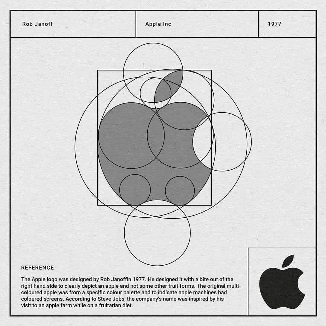
Look at how Apple’s logo employs proportionate circles along with symmetry to maintain balance and aesthetic quality.
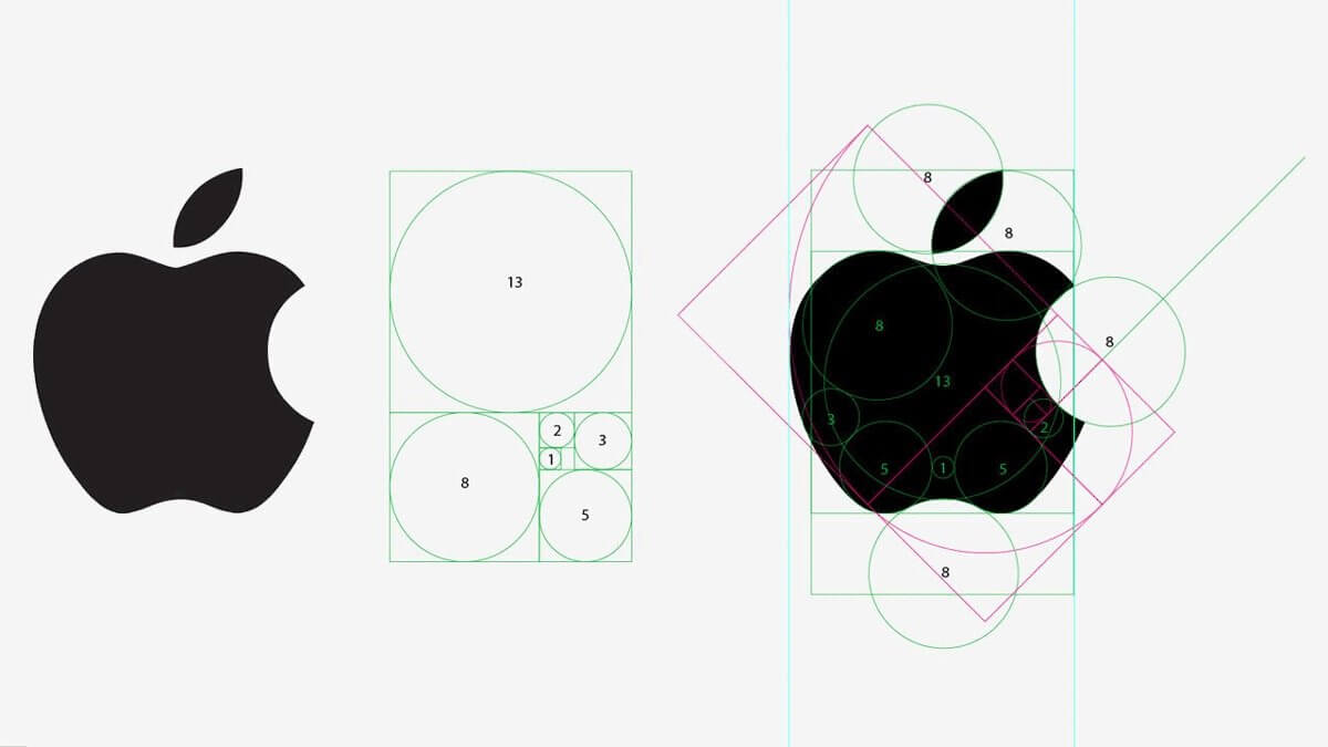
The best way to achieve a balance between symmetry and asymmetry is by using the principle of the Golden Ratio.
“In mathematics, two quantities are in the golden ratio if their ratio is the same as the ratio of their sum to the larger of the two quantities.” Wikipedia
The golden ratio in logo design has been used for decades but way before then it’s been in design since ancient times especially in architecture and painting, and a lot of other art forms.
Shapes of nature have always inspired artists and they use them in their artwork. And as we already know some of the worlds most established, recognised and famous logos today are made on the principle of the golden ratio.
Using the golden ratio principle in the creation of logo designs is highly recommended as this gives the impression of symmetry the design appearance. Some of the design elements can be displaced slightly to disrupt the monotony and visually attract viewers attention.
A symmetrical logo is reliable as it’s solid and stable giving the impression of security while asymmetric possesses an element of uncertainty, being more playful and mysterious.
When accessing the logo design process, these are areas that should be kept in mind, because in some cases, the scope of the project for which the logo is being designed for, can suggest whether to approach a symmetrical or asymmetric logo design.
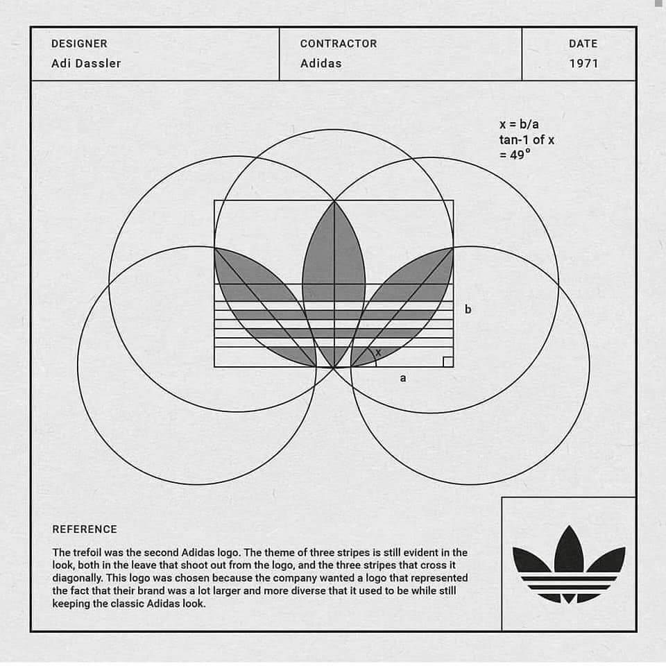
Achieving symmetry or asymmetry in the logo design process, a logo design grid is normally used. Good examples are below showing the Nike and Adidas logos.
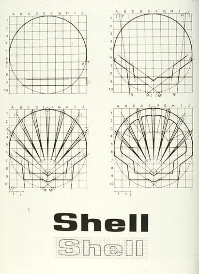
The Grid is a tool that consists of the vertical and horizontal lines equally distributed according to which the geometric shape or letters can be constructed late. Paper with a grid makes it much easier to draw the correct shapes and makes it possible to use the angles correctly.
One of the best examples of using a grid to design a symmetric logo that is timeless in this case is the Shell Oil logo which was created by Raymond Loewy in 1971.
Design with meaning and tell the story behind the logo
Every logo has a story behind it. In some cases, the story can almost be as interesting as the logo itself and this gives purpose and meaning to a logo design, it makes it more engaging for the viewer creating an emotional connection. Storytelling is a very powerful tool in branding it draws people’s attention to your brand, design with meaning and purpose and make it count.
The story behind Apple’s logo is an interesting one! Ronald Wayne (Also known as Apple’s third founder in the early days in 1976) created a logo that included Isaac Newton sat under a tree, and he had a bright apple shining above his head. How did this come to be? Isaac Newton was the man who revolutionised science with his discoveries on gravity. How did he figure it out? An apple fell on his head! Apple’s first logo was a depiction of this event.
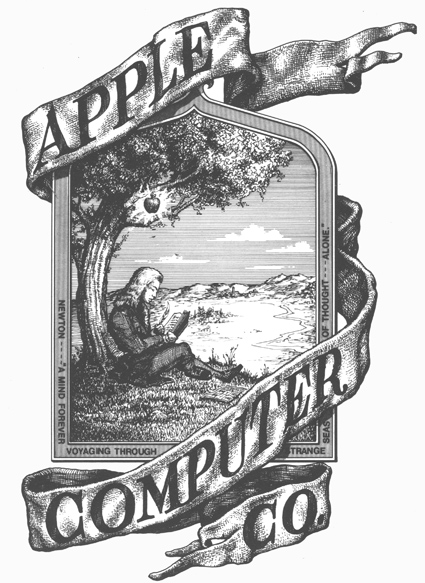
One year later, Steve Jobs decided to explore new options and wanted something new for the brand as the current logo was old fashioned and considered un-adaptable and hard to scale to a small size considering its detail. Steve commissioned Rob Janoff to create a new logo. Janoff created the now classic and world-renowned logo of the bitten apple
Why does it have a bite showing in the apple?
According to Janoff, the “bite” in the Apple logo was originally implemented so that people would know that it represented an apple and not a cherry tomato. It also lent itself to a nerdy play on words (bite/byte), a fitting reference for a tech company.
Always keep practicing and never stop learning
If you’re like me then logo design is a real passion and something you can’t turn off from. Like a lot of people say “practice makes perfect” and that goes for everything we do in order to learn something and become better at doing it we must practice.
You may be an immense artistic creative but that will not be enough! Designing and creating logos is not an easy task when done at a professional level; It requires lots of time to research and prepare, knowledge and understanding of design principles and experience with advanced and specialist vector software which is a huge learning curve and not something you can grasp in a short period of time.
Just because you’re good at painting or work in another creative area, does not mean you can design perfect logos from the start. Study other brand logos, learn about other designers and their process (our designer interviews are packed with useful knowledge and insights from other logo designers), read books and insert as much information as you can (We have some great book reviews you will find interesting). You may have been designing logos for years but there is always something to learn and ways to improve.
I hope you have enjoyed reading this article and found it of value. By following this advice and learning everything you can you will be on your way. I also hope that it will educate clients into understanding the work involved and the time-consuming process professional logo designers have to follow.
Resources For Logo Designers
To end this article I would like to share some logo design resources to you that will help in your logo design career. We have a dedicated Logo Design Resources section where we have listed everything from software tools, books, learning logo design online, useful applications and tools and everything else we can think of.
My top suggestions would be learning at your own pace and learning online in comfortable surroundings is the best way to go.
Reading is also very important and something I do daily. I could list hundreds of books here but your best looking on the resources page under books. I will list a few below that are good to have.
- The Ultimate Guide to Logo Design (By fellow designer Kyle Courtright)
- Logo Modernism (Huge and popular book packed full of logos. Get it while it’s still in production!)
- Logo: The Reference Guide to Symbols and Logotypes (Like Logo Modernism but way smaller by our friend Michael Evamy)
- Logo Design Love (A must have book by our friend and fellow designer David Airey)
If your looking for Graphic Design Resources such as fonts, textures, backgrounds, mockups, icons, illustrations there is only one place to go!
- Designcuts – There is no better place to go than to our friends at Designcuts they will take care of you and have everything you could possibly need as a graphic designer is right here!
I appreciate everyone who purchases through our links as we put everything back into The Logo Creative Project to make it better for our readers and followers.
If you would like more personal tips, advice, insights, and access to our community threads and other goodies join me in our community. You can comment directly on posts and have a discussion.
Useful Links & Great Deals
- The Equipment We Use & Recommend
- Quality Design Bundles
- Get 2 Months free Skillshare
- Get an Exclusive 20% off Logo Package Express
- Learn Logo Design Online

