A logo is one of the most important facets of your brand. While people want your products and will eventually use them, a logo is how you establish the first impression. Indubitably, it has to be unique, uncanny and able to represent your brand and nothing else. In this article, we discuss The Best Logo Size: Short Guidelines for Websites and Social.
An effective logo act as a game-changer. A logo defines the way how people view your brand and how easy it is for them to interact with you. However, there is something that perplexes marketers, designers and brand managers – the size of the logo.
Really, how big should your logo be? What sizes are good and what sizes shouldn’t be used? In this article, we will cover all the essential factors that influence logo sizing. Afterward, you will know how to size the most representative part of your brand.
Through careful planning, you will be able to make your entire vision much more memorable and visible for your clients and customers alike. Let’s explore more:
Table of Contents
Why is it important to size your logo for every occasion?
Before, brands couldn’t market themselves over a multitude of channels. The only visual representations of each brand revolved around billboards, magazine ads, and TV ads. Not only was this a minimal choice, but marketers and designers didn’t have to adapt their logo too much. Instead, they just calibrated the size and went with it.
However, this era has seen a rise in different marketing channels. Websites and social media are the main drivers of brand popularity and require a perfect logo presence. A major factor in this presence is the size of the logo.
Having every logo of yours scaled up or down creates a professional feel. For that reason, you have to adjust the logo according to its place on your website or on social media.
In the next sections, we will discuss every important place where your logo should be and what is the best logo size. The guidelines will be short and implementing them will give you instant success.
The best logo size for your website
Everything begins with your website. Unlike social media, where interaction is the focus, your website is a dedicated space for your brand and your brand only. Therefore, you have to ensure that your logo is well-placed and well sized. One mistake many marketers and designers make is “plastering“ their logo all over the website.
Do not oversaturate any space with your logo. The purpose of having a logo is marking your content and establishing an impression with your visitors, not spamming. What are some website facets you should focus on? Let’s see.
Starting from the basics, you have to have your logo in two places before anything else – the header and the favicon. If you’re not familiar with the term, a favicon is a small icon left of the address bar on your browser.
- The favicon should be the simplest version of your logo. Make it hi-res and anywhere between 32x32px and 16x16px. By doing so, you ensure that your website will be marked with a clear logo that can be seen immediately upon entry. It should be a small icon that people can recognise the moment they see it.
What about the header then? For the best possible effect, we would advise you to place your logo on the left-hand side, next to the top navigation bar. Make the navigation bar steady and permanent.
A lot of websites have their navigation bar disappear upon scrolling, to make space for more content. This is wrong – your logo should be ever-present.
The maximum height should be anywhere between 20-30px, while the width depends on the length of your brand name.
For longer, multi-word brand names, the best solution would be a logo that visually represents the name or an acronym. Never have your logo too big that it reduces the space for navigation options.
Additional ideas for logo placement on your website
Michelle Stone, who has designed logos for many freelancer sites and cheap writing services suggests something that has always worked for her.
She says, ‘’I’ve mostly dealt with academic-related websites, and they are a perfect example of the importance of logo placement. The right placement adds a new aesthetic appeal to both websites and social media channels. It influences visibility and sends a message of professionalism, showing your visitors and customers that you thought about everything. Without placing your logo in the right place, you will lose valuable business growth. “
A good idea for logo placement on your website would be the section under every page. There, you have trademark information, helpful links, and other things. Make sure you add a small, 50x50px logo for brand consistency.
The idea is to form a consistent line of logos. The favicon is followed by the header, while the content of the page provides a transition to the lower part.
Depending on the content on each page, you can decide whether or not to include the logo on the background as well. Our advice will be to only have small outlines that form a pattern, or one 50x50px logo on each side if you want additional branding.
Keep in mind that these details depend on so many other things. It’s entirely up to you and your vision for the website.
The importance of the logo and its size for social media
Once you’ve chosen the right logo size on your website, it’s time for the second part of your journey to choosing the perfect logo sizes.
Social media is increasingly important for brand awareness, due to the ability to interact with your customers. There are so many social media channels that it’s hard to maintain brand consistency.
However, it is your duty to showcase your brand with a consistent logo presence. Of course, the overwhelming number of spaces can confuse any marketer or designer. To solve this conundrum, we’ve decided to cover Facebook, Instagram, and Twitter, as the most prominent channels. Additionally, other useful tips will be included.
Choosing the right logo size for Facebook
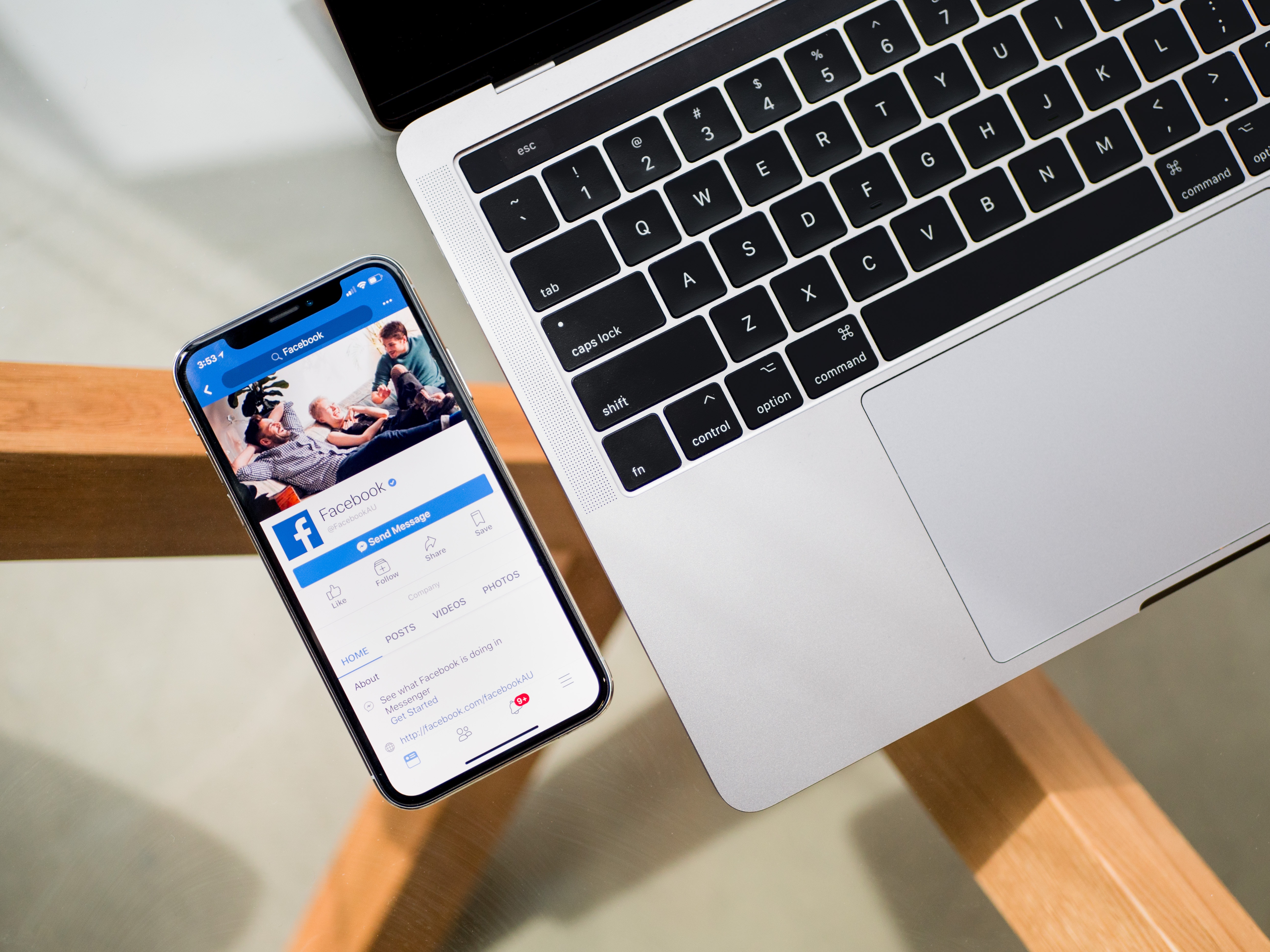
Facebook has multiple places in which you can place your logo. We’re going to cover them, to help you choose the right logo size.
- The profile picture should be 200x200px for better clarity. Make sure that the entire picture is taken over by the logo, but with a border. Separation from the frame is a key component in making your logo more visible.
- Never make your logo your cover photo. Choose a stunning or calming photograph and place a logo in the lower right corner of the cover photo. By doing so, you create separation and logo consistency at the same time. The size should be
- Logo placement on image posts is an underrated part of logo use. Separation is the theme here as well. Since your logo is your profile picture, make sure the logo on the picture is as far away as possible – in the lower right corner, sized 50x50px.
Instagram and the way you should structure your logo size
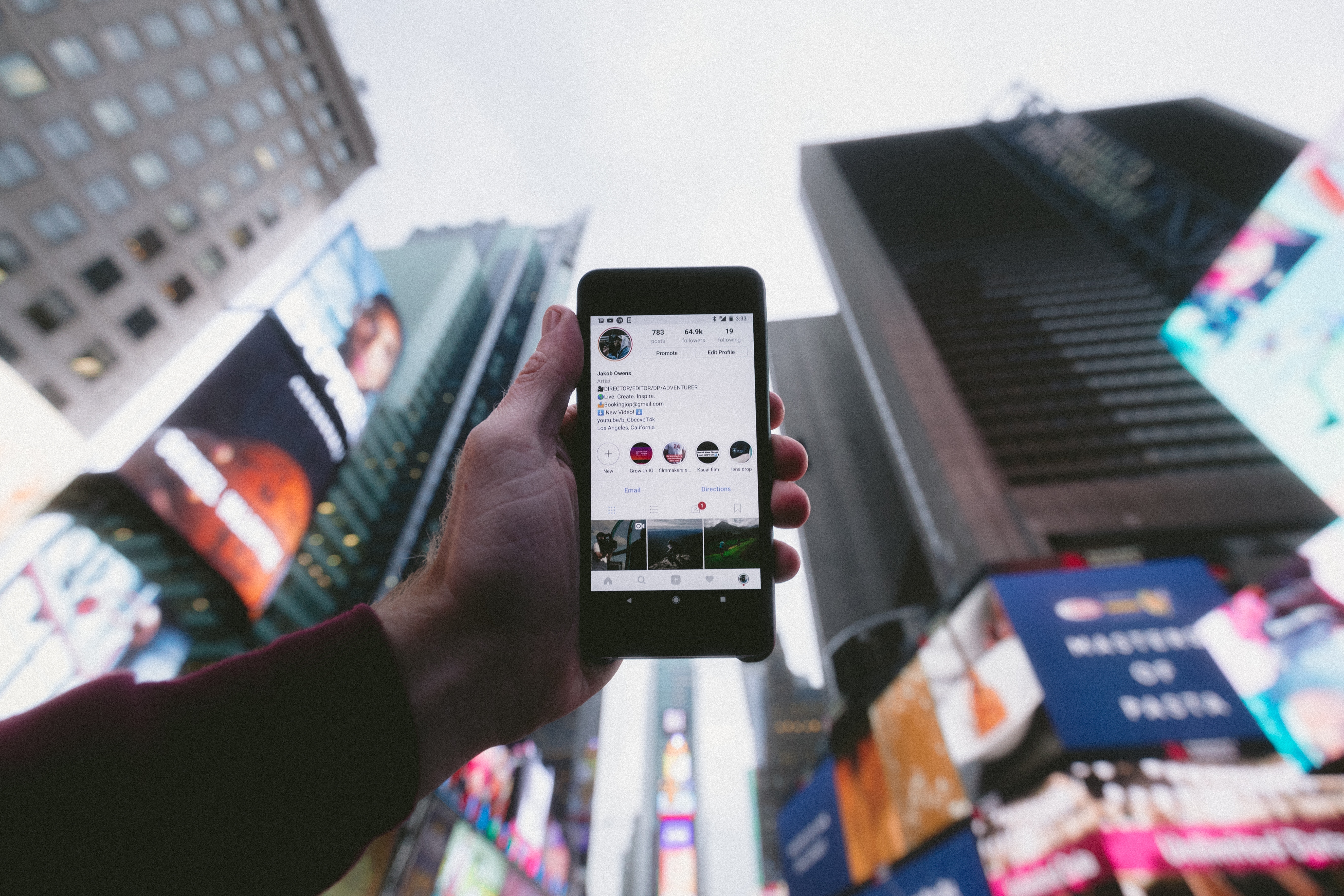
- Instagram is much easier to calibrate in terms of logo size. The only emphasis is on the profile image, which should contain a clear and hi-res image of your logo. Keep in mind that it should be separated from the borders, for a better focus. An ideal size would be 110x110px.
- We often advise people against “plastering” their logo on every post, but Instagram stories are a great way of increasing your presence. Since they are temporary, you won’t oversaturate people with your logo. Keep the logo small, 30x30px at most and make sure it’s on a contrasting surface in the lower right corner.
Twitter and the challenges of picking the right logo size
Just like Facebook, Twitter presents a challenge when it comes to choosing the right logo size. There are several elements that you have to pay attention to.
- For the profile picture, you have to upload a logo of approximately 400x400px. Like with other social networks, you have to pay attention to the borders for better clarity.
- The cover photo should be uploaded according to the same principles as your Facebook cover photo. A small hint of your brand’s presence should be enough, especially paired with your existing profile photo. 50x50px should be the ideal size.
- What about adding your logo to image posts while on Facebook? The situation is somewhat different than Facebook because frequent posts are more common on Twitter. To avoid oversaturation and too much promotion, only 33-60% of your posts on a monthly basis should include your logo on them.
YouTube, creating apps and more…
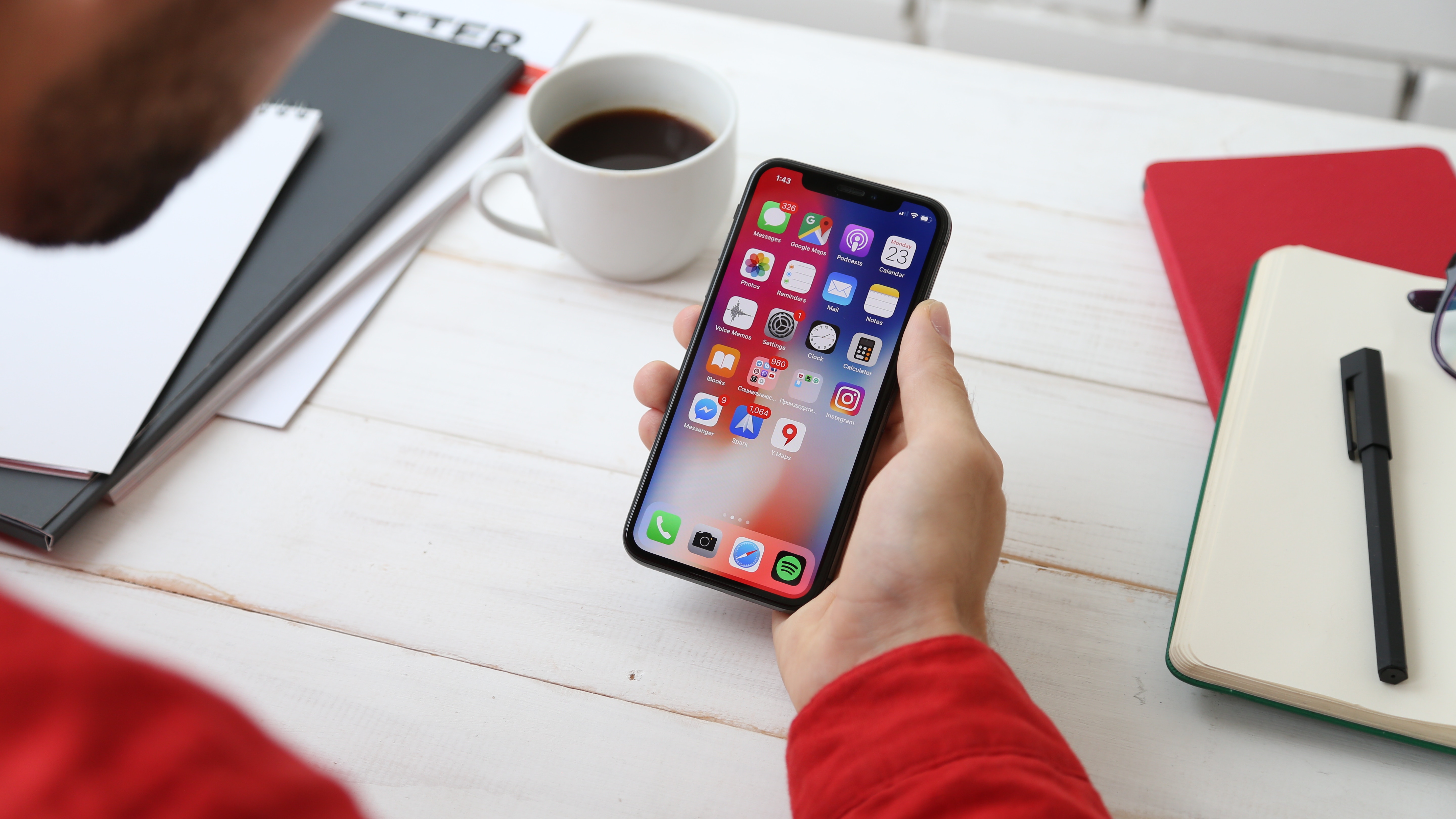
If you’ve set the right logo on the aforementioned channels, you should be set to go. However, you shouldn’t stop there if your brand has a presence on more platforms. Brand presence is only effective if it’s done thoroughly and on all platforms.
YouTube is one important platform if you wish to post business videos and other related content. Where should you place your logo, then? The first place you should be looking at is the channel icon.
An ideal size would be approximately 800x800px for better clarity. Thumbnails should also include your logo, but only an outline that covers the entire background.
LinkedIn is also important for having a stable and constant brand presence online. The profile photo requires you to upload a logo that’s about 400x400px. As for the cover photo, the same rule remains for LinkedIn – avoid oversaturation.
Another important thing that brands can focus on is creating apps. Stores, service providers and other brands launch apps that facilitate the customers’ use of their service. For mobile app icons, the size should go something like this:
- iPhone (6S, 6+, 7+, 8, 8+, X, XS, XS Max) – 180x180px
- iPad (regular, Mini and Pro) – 152x152px
- Android – 192x192px
- MacOS – 186x186px
Any other platform, site or service follows about the same modus operandi for choosing the logo size. If you need to stretch out the logo for a particular placement, avoid doing so. Instead, add more details to the image so that the basis of your logo stays intact.
Concluding thoughts
Choosing the best logo size for your websites and social media channels is the basic element of your brand presence. Having ideally-fitting logos placed strategically gives your brand a much “cleaner” and more serious image. Remember to not overdo it by placing your logo and to alternate between different versions. Holidays, special occasions and events are great occasions for a redesign.
We hope this article about The Best Logo Size: Short Guidelines for Websites and Social has been helpful, and be sure to leave any comments below.
Useful Links & Great Deals
- The Equipment We Use & Recommend
- Quality Design Bundles
- Get 2 Months free Skillshare
- Get an Exclusive 20% off Logo Package Express
- Learn Logo Design Online
 Author Bio
Tiffany Harper is a talented writer from New York, an extremely active woman, and a real leader. She began her career as a journalist in the publishing house and later proceeded it as writer and editor. Now she works as an experienced freelance writer, mostly in business, technology and education areas. Please do not hesitate to contact her on Twitter.


