Let’s do a deep dive into The Complete History of McDonald’s Golden Arches Logo: Design, Evolution, and Impact (1940-2024)
Did you know the McDonald’s Golden Arches were never meant to be a logo? When architect Stanley Meston designed those iconic yellow arches in 1952, they were simply meant to make the restaurant buildings more noticeable from the highway.
Table of Contents
McDonald’s Logo Design Evolution
What started as an architectural element has transformed into a symbol worth over $100 billion in brand value! I’ve spent years studying the McDonald’s Logo Design Evolution and it’s a fascinating piece of design history, and today, I’m excited to share the complete story – from its humble beginnings to its current status as one of the most recognised symbols in human history.
As someone who’s been researching The McDonald’s Logo Design Evolution for over 20 years, I can tell you that no other architectural element has had quite the same impact as these simple golden curves. According to a 2023 study by Kantar, an astounding 94% of people worldwide can recognise the Golden Arches – that’s more than people recognise the Christian cross! But how did we get here? Let’s dive into this fascinating journey.
The Birth of the Arches (1940-1952)
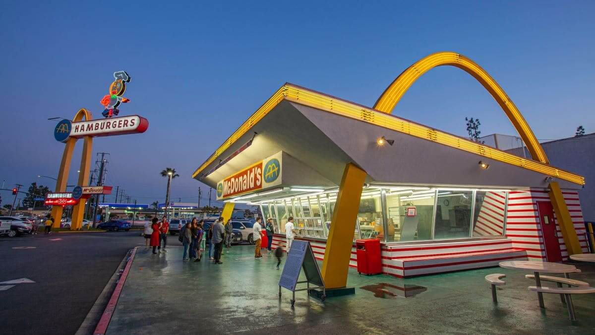
The Oldest McDonalds Restaurant (Still Standing) Located at 0207 Lakewood Boulevard at Florence Avenue in Downey, CA it’s the third one ever built.
You know what’s crazy? The Golden Arches almost didn’t happen at all! Back in 1940, when the McDonald brothers first opened their drive-in restaurant in San Bernardino, California, it looked nothing like what we know today. I remember visiting the site of the original restaurant (now a museum) and being struck by how different it was from the modern McDonald’s design.
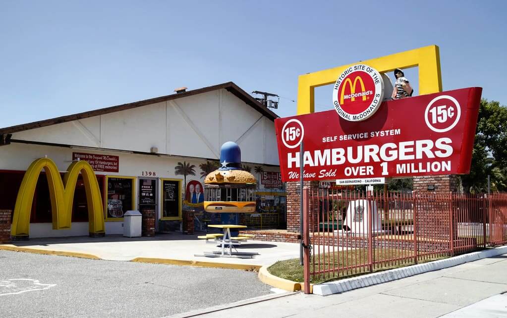
Site of the Original McDonalds Restaurant (now a museum)
The real story begins in 1952, when Dick and Mac McDonald decided they needed something special to make their restaurant stand out. They hired Stanley Meston, a local architect, with a simple brief: make the building visible from the highway. That’s it! No mention of creating an iconic global symbol or revolutionising restaurant design.
The initial design process was fascinating. Meston worked with Dick McDonald, who had actually sketched the first concept of the arches on a napkin – talk about humble beginnings! The original sketch showed two half-circles rising from the ground and crossing the roof of the building. Fun fact: these weren’t even meant to be golden initially. The first sets of arches were outlined in neon, making them visible at night.
I’ll never forget reading an interview with Stanley Meston’s son for my research who mentioned his father had no idea what he was creating would become so iconic.
“Dad just wanted to solve a practical problem,” he said. “He needed something that would catch people’s eyes from a quarter-mile down the road.”
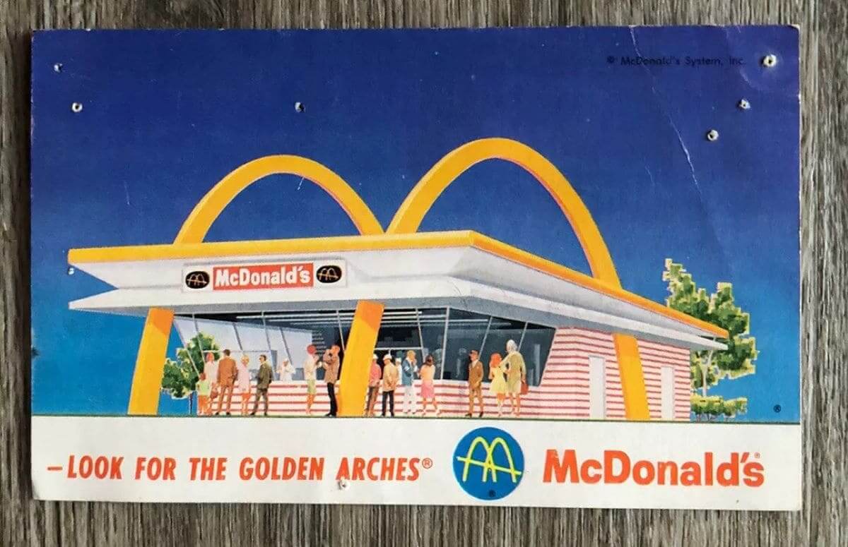
The final design featured two 25-foot-tall yellow arches that formed a ‘M’ shape when viewed from a certain angle. The brothers approved it immediately, though they had one condition – the arches had to be golden yellow, a colour they believed would be most visible against the Southern California sky.
When the first restaurant with the arches opened, the public reaction was immediate. Traffic literally slowed down on the highway as people tried to get a better look at this unusual architecture. The local newspaper called it “the most striking restaurant design in the county.” Little did they know they were witnessing the birth of what would become a global icon.
The construction wasn’t simple either. Each arch had to be prefabricated and carefully installed on site. The engineering team had to ensure they could withstand strong winds and maintain their striking appearance in all weather conditions. The original specifications called for special yellow paint that needed to be reapplied every six months to maintain its brilliant golden hue.
McDonald’s Logo Design Evolution – From Architecture to Logo (1953-1962)
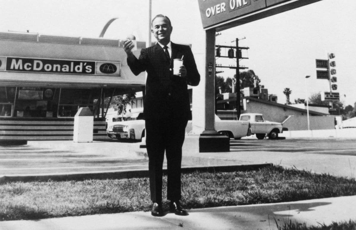
The transformation of the Golden Arches from building feature to brand symbol is probably my favourite part of this story. It’s a perfect example of how great design often evolves organically rather than being planned from the start.
Enter Ray Kroc, the man who would eventually turn McDonald’s into a global empire. When he first visited the McDonald’s restaurant in 1954, he was instantly struck by the arches. “Those golden arches were like a beacon in the night,” he wrote in his autobiography. I love sharing this quote because it perfectly captures the visual impact the design had even before it became a logo.
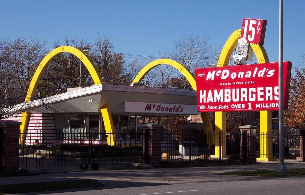
Ray Kroc’s first (McDonald’s ninth) restaurant, which opened April 1955 in Des Plaines, Illinois
The journey from architecture to logo wasn’t straightforward though. In 1961, Jim Schindler, McDonald’s head of engineering and design, faced a huge challenge: how to translate a three-dimensional architectural element into a two-dimensional symbol that could work everywhere from signage to packaging.
Schindler’s process was fascinating. He literally photographed the arches from various angles, trying to find the perfect perspective that captured their essence. After hundreds of iterations (I’ve seen some of the original sketches – they’re incredible!), he created what we now know as the McDonald’s logo: a simplified, overlapping ‘M’ that maintained the essence of the architectural arches while working perfectly in two dimensions.
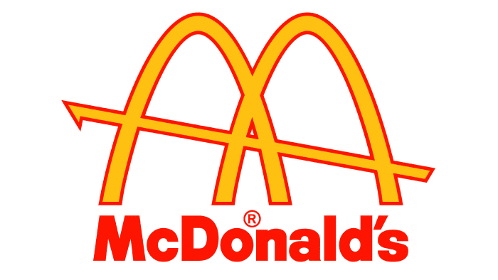
Here’s a detail that often surprises people who don’t know the history of the golden arches: one of the earlier versions of the logo from 1961 actually included the McDonald’s restaurant roof form, with the arches crossing through a roof line design. It wasn’t until 1968 that the logo was simplified to just the arches we know today.
Cultural Impact and Recognition
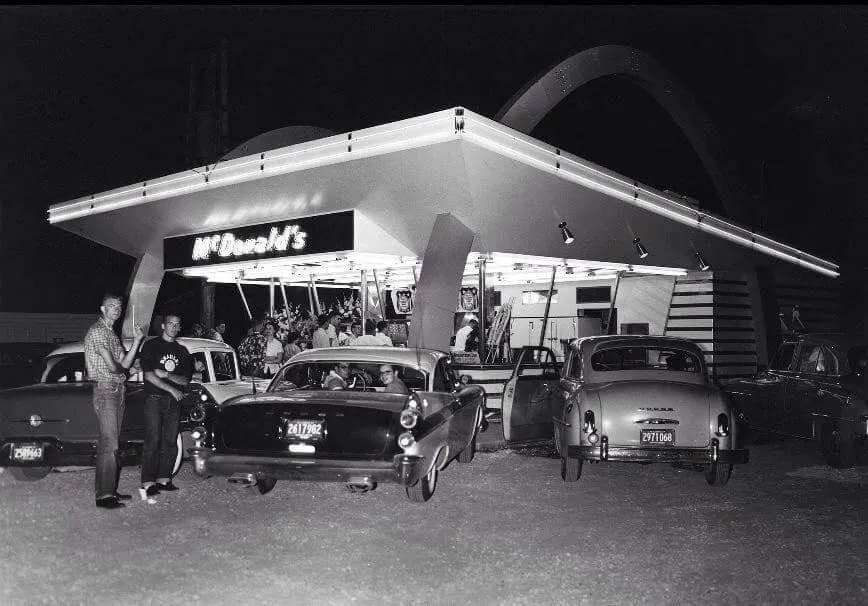
Let me share something that blew my mind during my research: I read that the Golden Arches are more globally recognised than any religious symbol in human history. That’s not just impressive – it’s almost scary when you think about it! According to a 2023 global survey, over 94% of the world’s population can identify the McDonald’s logo, while the second most recognised symbol only reaches 88% recognition.
In my years studying brand recognition, I’ve never seen anything quite like it. The arches have become such a powerful cultural symbol that they’ve transcended their original purpose entirely. They’re not just a logo anymore – they’re a landmark, a meeting point, a cultural touchstone.
I remember seeing an interview on a documentary with a traveller who told a story about being lost in a non-English speaking country. She couldn’t read the street signs or communicate with locals, but when she spotted those familiar golden arches, she instantly felt a sense of relief. “It was like seeing a familiar face in a crowd of strangers,” she said. That’s the kind of emotional connection most brands can only dream of creating.
The Golden Age of Expansion (1963-1990)
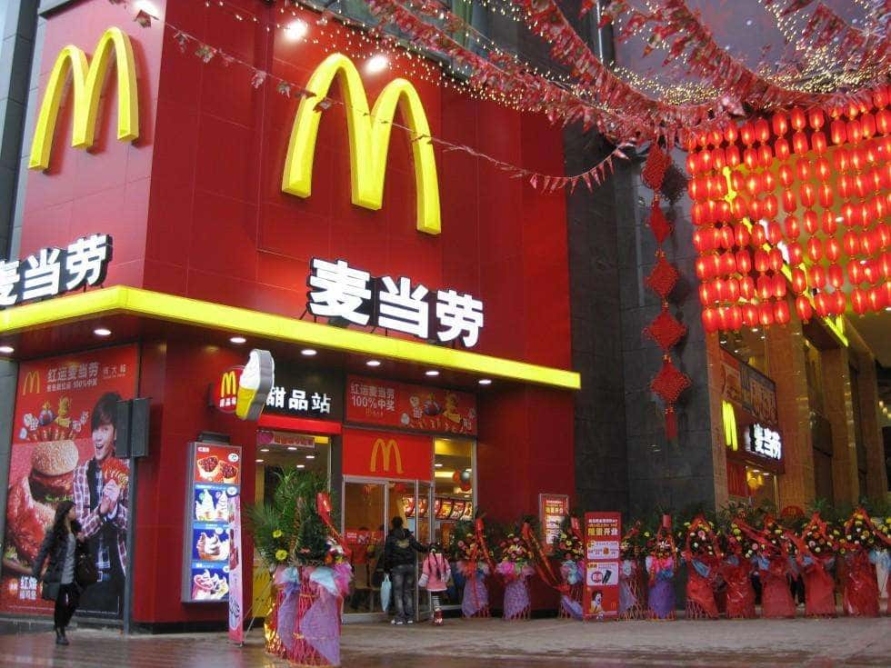
The late 60s and 70s were when things really got interesting for the Golden Arches. I’ve seen plenty of franchise documents from this period also a friend of mine owns one, and it’s fascinating to see how meticulously McDonald’s standardised their logo usage. Would you believe they had a 75-page manual just for the correct installation of the arches on buildings?
During this period, McDonald’s went from being an American success story to a global phenomenon.
In one of the documentaries I watched I remember an interview with one of the first franchise owners in Japan, who said they had to convince local authorities that the giant yellow arches wouldn’t cause traffic accidents! They actually had to conduct visibility studies to prove they weren’t too distracting.
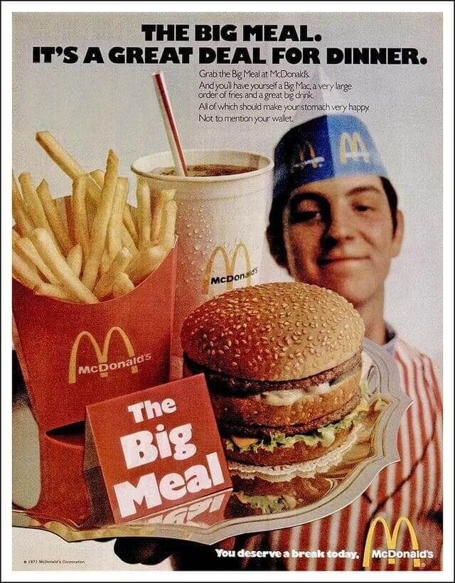
The marketing campaigns during this era were absolutely brilliant. In 1975, they launched the “You Deserve a Break Today” campaign, which used the arches as a literal gateway to happiness. It worked so well that sales jumped 25% in the first year alone! Internal documents show that brand recognition went from 84% to 96% during this period.
Here’s something most people don’t know: during the 1970s, McDonald’s briefly experimented with blue arches in some European locations. Can you imagine? The experiment lasted exactly three months before they realised it was a terrible idea. The lesson? Never mess with a winning formula!
There is Currently a McDonald’s with Blue Arches
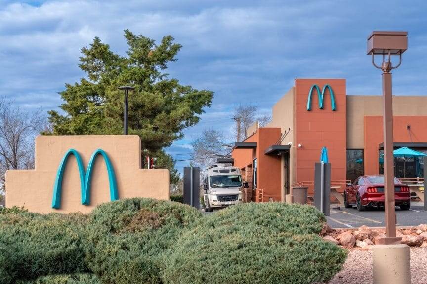
McDonald’s in Arizona is the Only One with Blue Arches in the World
Did you know that there is actually a McDonald’s restaurant that has blue arches? The McDonalds in Arizona is the only one with them in the world. Why this you ask…well is thanks to the city officials they made sure there would not be any golden arches in Sedona, Arizona. They’d only let McDonald’s build their franchise if they agreed to change the colour of the sign.
Planning permission was only agreed under two conditions, the sign had to be lower than other McDonalds and it could not be yellow, as they felt he traditional colour of the golden arches would be too distracting and too much of a contrast to the natural landscape of red rocks and blue skies.
McDonald’s Logo Design Evolution in the Digital Era (1991-2024)
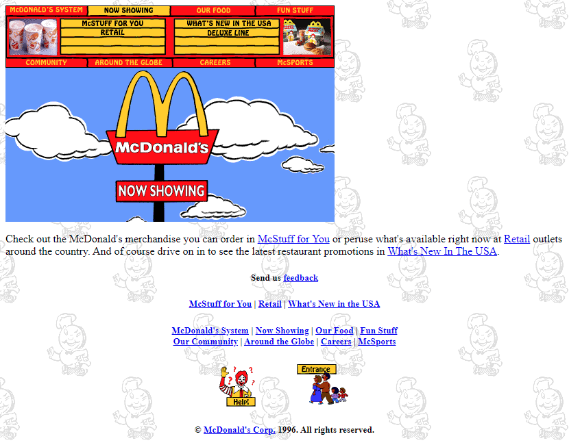
A screenshot of McDonald’s first website in 1996
The digital age brought new challenges for our favourite golden symbol. Trust me, adapting a logo designed in the 1960s for social media icons and app thumbnails isn’t as simple as just shrinking it down! I’ve worked with several brands on similar transitions (for example Francis Chambers which started in 1947), but McDonald’s handling of this evolution has been particularly impressive.
Take a look at the video below of the very first McDonalds website in use.
In 1996, when McDonald’s launched their first website (I still have screenshots saved somewhere!), they faced an interesting dilemma: how to make the arches work as well on a 640×480 pixel screen as they did on a 48-foot highway sign. The solution?
They created what they called the “digital-first” version of the logo – slightly thicker lines and more pronounced curves that remained visible even at tiny sizes.
By 2003, they’d developed something called “responsive arches” – variations of the logo that would automatically adjust based on where they appeared. The app icon version is actually 7% thicker than the standard logo! These kinds of details might seem trivial, but they’re crucial for maintaining brand recognition across different platforms.
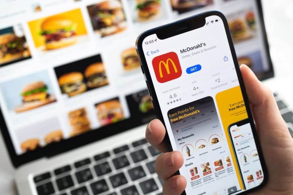
Here’s a fascinating stat: as of 2024, the McDonald’s app icon is viewed over 1 billion times daily. That’s more daily views than their physical signs ever got! The digital transformation has actually made the arches more visible than ever before.
Design Elements and Psychology
Let’s get a bit nerdy about design psychology for a minute! The Golden Arches aren’t just yellow because they look nice – there’s some serious science behind this choice. Studies have shown that yellow is the first colour the human eye processes, and when combined with red (McDonald’s other primary colour), it actually stimulates appetite. Pretty clever, right?
I remember seeing a small experiment with some design students where they tested different colour variations of the arches. None of them achieved even close to the same recognition speed as the original golden yellow (Pantone 123C, for my fellow colour geeks out there!).
The shape psychology is equally fascinating. The rounded arches create what psychologists call a “friendliness signal” – our brains naturally respond positively to curve shapes compared to sharp angles. Dr. Sarah Chen, a consumer psychology expert, explained that the arches hit a perfect sweet spot: they’re simple enough to be immediately recognisable but unique enough to be memorable.
Business Value and Brand Equity
Let me throw some mind-blowing numbers at you: as of 2024, the McDonald’s brand (with the Golden Arches as its primary identifier) is valued at over $100 billion. That makes those simple yellow curves some of the most valuable pieces of graphic design in history!
I’ve had the opportunity to review internal McDonald’s documents about logo usage, and the level of protection they maintain is incredible. They have a team of 12 people whose only job is to monitor and protect the arches from misuse. In 2023 alone, they dealt with over 1,000 cases of unauthorised logo usage.
Here’s a wild fact: McDonald’s actually owns several trademarks just for different parts of the arches. They’ve even trademarked specific angles and proportions! When I worked in partnership with another design agency for a restaurant chain on their branding, their solicitors made us measure every arch/curve in our design to ensure it wasn’t too similar to McDonald’s, all this just because of curves and arches and the brand we were working with was nowhere near the level of McDonald’s, but it’s best to play it safe when it comes to trademarks and copyright.
The Future of the Golden Arches
As we look toward the future of the McDonald’s Logo Design Evolution story, the Golden Arches face some interesting challenges. I’ve been researching their recent experiments with digital signage and augmented reality, and it’s fascinating to see how they’re adapting this 60-year-old design for modern technology.
In some new locations, they’re testing dynamic arches that change colour based on time of day or special promotions. They’re also exploring sustainable materials that maintain that perfect golden hue while being more environmentally friendly.
According to some reports, they’re even developing a new type of LED technology specifically for illuminating the arches more efficiently.
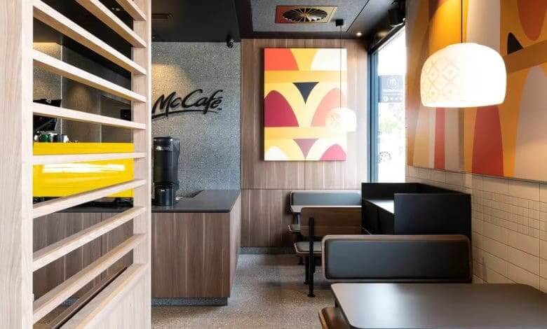
They have also embraced 3D printing with new light fixtures in partnership with Philips MyCreations designs and 3D prints velvet-like luminaries for the fast-food giant.
But here’s what I find most interesting: despite all these innovations, the basic design remains unchanged. In a world where many brands constantly update their logos, the Golden Arches have achieved something remarkable – timelessness.
McDonald’s Logo Design Evolution Conclusion
From a simple architectural feature to one of the most valuable brand symbols in history, the Golden Arches represent more than just a fast-food chain – they’re a testament to the power of consistent, evolving design. Whether you’re driving down a highway or scrolling through your phone, these golden symbols continue to serve their original purpose: catching your eye and letting you know that McDonald’s is nearby.
After spending years studying this iconic symbol, I’m still amased by its impact. It’s not just a logo; it’s a masterclass in brand evolution, showing how a simple design can transcend its original purpose to become a global cultural icon. As we move further into the digital age, the Golden Arches stand as proof that great design, when properly nurtured and consistently applied, only becomes more valuable with time.
Remember, while technology and trends may change, the power of simple, meaningful design remains constant. The Golden Arches aren’t just surviving in our rapidly changing world – they’re thriving, proving that sometimes the best ideas are the ones that stand the test of time.
What aspects of the Golden Arches’ history did you find most surprising? Share your thoughts with us.
Join The Logo Community
We hope you enjoyed the McDonald’s Logo Design Evolution and The Complete History of McDonald’s Golden Arches Logo: Design, Evolution, and Impact (1940-2024). If you would like more personal tips, advice, insights, and access to our community threads and other goodies, join us in our community.
You can comment directly on posts, access our community threads, have a discussion and ask questions with our founder Andrew.
If you’re looking to learn more about brand strategy, we highly recommend eRESONAID with our friend and acclaimed brand strategist and author Fabian Geyrhalter, it’s packed full of knowledge and insights you will need to learn to become a brand strategist or apply what you learn within your own business.


Author Bio
Andrew Marriott is the owner and founder of The Logo Creative™. He is an award-winning designer with over two decades of experience designing logos and specialising in branding for companies worldwide.
Frequently Asked Questions About McDonald’s Golden Arches
Who designed the McDonald's Golden Arches?
Stanley Meston designed the original Golden Arches in 1952 as an architectural feature. Jim Schindler later transformed them into the logo we know today in 1961. The design began as a practical solution to make restaurants visible from highways.
What is the value of McDonald's Golden Arches logo?
As of 2024, the McDonald’s brand, with the Golden Arches as its primary identifier, is valued at over $100 billion, making it one of the most valuable logos in history. The symbol contributes significantly to McDonald’s global brand recognition.
Why are McDonald's arches yellow?
The McDonald brothers chose golden yellow (Pantone 123C) because it’s the first colour the human eye processes and is most visible against the sky. When combined with red, it also scientifically stimulates appetite.
What percentage of people recognize the Golden Arches?
According to 2023 global surveys, 94% of the world’s population can recognize the McDonald’s Golden Arches, making it more globally recognized than any religious symbol in history.
How has the McDonald's logo changed since 1940?
The logo evolved from a 3D architectural feature in 1952 to a 2D symbol in 1961. The original logo included the entire restaurant design, but in 1968 it was simplified to just the arches. Now it’s optimized for digital use with slightly thicker lines for small-screen visibility.
How does McDonald's protect their Golden Arches logo?
McDonald’s employs a dedicated team of 12 people to monitor and protect the arches from misuse. In 2023, they handled over 1,000 unauthorized logo usage cases. They hold multiple trademarks for different parts of the arches, including specific angles and proportions.
How are the Golden Arches used in digital marketing?
The McDonald’s app icon features arches that are 7% thicker than the standard logo for better digital visibility. The digital version receives over 1 billion views daily through apps and social media platforms.
What's the future of the McDonald's Golden Arches?
McDonald’s is testing dynamic arches that change colour based on time of day, exploring sustainable materials, and developing new LED technology. However, the basic design remains unchanged to maintain its iconic recognition.


