The 1980s was the decade in which we saw rapid growth in the quality of visual forms, especially in multimedia. From this perspective, some of them look quite outdated but in comparison with the 1970s, the development of design, fashion and video content was tremendous. The arrival of the IBM PC and the Macintosh paved the way to the further development of IT-visuals. Join us in this article about The Explosion of Visual Arts in the 1980s – 7 Best Brand Logos of the Decade.
Moreover, the launch of MTV in 1981 marked the beginning of a new era in the way visual arts are expressed on television. This is also the decade in which many of the distinguished global brands took shape, as well as their visual identity.
In this article, we’re going to talk about the most significant logos and brand identities of the 1980s.
Table of Contents
Apple, Inc – Love at first bite
One of the most powerful companies in the world started its quest on the global market back in the 1980s. The first logo of Apple, Inc. was the image of Isaac Newton sitting under an apple tree, created in 1976.
The following year, Jobs and Wozniak decided to come up with a new identity. This is when the popular bitten apple logo got its shape, together with the word Apple next to it.
The written part was removed from this logo in the colors of the rainbow in 1984. That’s the key moment in the development of the logo because the only later iteration was the removal of the colors in 1998. So, the current logo is based on the version from 1984, just without the colors.
CNN
Launched in 1980, at the dawn of the 1980s, Cable News Network (CNN) set numerous standards in the following decades.
Not only that they’ve been shaping public opinion for almost forty years, but they’ve also influenced the way other TV-channels built their visual identities.
Among other things, one of the reasons why CNN became such a memorable news source is their logo. Based on the three letters that make the acronym of the channel name, it hasn’t changed much since the 1980s.
What underwent several changes is the color of the logo. First, it went from yellow with a black line inside the letters in 1980 to grey in 1984. In 1989, the letters of the logo were white, with a curvy red line what was drawn through the letters.
After that, there have been several iterations between yellow and white iteration. Today, the CNN logo is dominated by red color, with a white and grey line that goes through the letters.
HBO

Home Box Office was launched in 1972. The first logo of this company consisted of a TV box-like frame and the full company name inside it. Already in 1975, they created a brand new logo. This was when the well-known acronym-based logo was introduced for the first time.
As HBOwas becoming more and more popular toward the end of the 1970s, its managers wanted to leave a stronger visual impression on their viewers.
So, in 1980, they presented the redesigned version of the 1975 logo. In the old iteration, the letter O partly overlapped with the letter B. In the improved version, each of the letters stood alone. Also, the white line inside the letter O was made more visible in the new version.
Since 1980, HBO has changed the rules of the trade many times and produced some of the best TV-programs ever made. But they still use the logo designed in 1980, since it has stood the test of time.
Nintendo
One of the pillars of the gaming industry, Nintendo started out as a manufacturer of playing cards in 1889.
They’ve changed numerous logos and brand identities since that time. However, one of the most notable Nintendo logos was the one from 1983: the name Nintendo written in red and a red elliptic line around the name.
That was the logo of this company when it became a household name for video games in the 1980s and 1990s. That same logo was active until 2008 when the managers retained the shape but replaced red color with grey.
Simple and yet playful, it remains the ultimate gaming association for generations of kids growing up in the 1980s, 1990s, and 2000s.
ESPN
 Entertainment and Sports Programming Network (ESPN) was launched in 1979. It has become one of the leadingsports channels on a global scale.
Just like HBO, it developed rapidly in the 1980s, especially after ABC bought ESPN and made it possible for this brand to broadcast the key sports events in the USA.
Another similarity between ESPN and HBO is the story of the logo.
The first ESPN logo was launched in 1979. The acronym ESPN served as a logo. It was placed inside and elliptic orange line.
In 1985, they redesigned the logo. Now the line was removed and there was only the acronym, with a white line drawn through the upper part of all the four letters. That has been the official company logo from 1985 to the present time.
Microsoft
Ever since its inception in 1975, Microsoft has always tried to keep things simple but impactful in terms of design.
Several different versions of the Microsoft logo were launched between 1975 and 1987. Each of them consisted of the word Microsoft written in different shades of black with slight variations in looks.
And then in 1987, the company came up with the logo that was their trademark for 25 years, until 2012. Again, it was only the company name written in black color, with the formatting addition of bold and italic.
That year, they kept the word Microsoft and just added the four squares in different colors.
As explained by the logo design Houston specialists, a logo that stands the test of time is an invaluable marketing asset of the brand in question. Microsoft is among those brands that succeeded in creating a durable logo.
Warner Home Video

Warner Home Video was established in 1979, on the cusp of the change in the way people accessed movies and video content. They were one of the largest distributors of VHS-tapes in the 1980s, which earned them a place among the most successful business brand of the decade.
They walked with the times and started releasing DVDs in the 1990s, as well as Blu-Ray editions in the last decade.
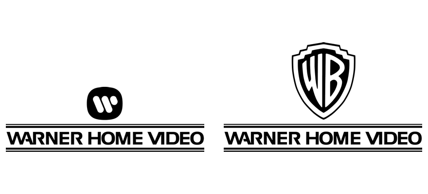
Apart from the business aspect, they also paid great attention to their logos. The initial version consisted of the Warner Bros logo from the 1970s and the title WCI Home Video.
Then in 1980, they removed the WB logo and just left the title Warner Bros Video, with two parallel horizontal lines, one above and one below the title.
That way their trademark during the 1980s and 1990s, when they became the most powerful global distributor of video- cassettes.
Conclusion
If we can pinpoint to one decade and call it the 2010s before the 2010s, it would be the 1980s.
The technological progress in that decade was enormous, especially if we compare it with the decade before. Now everybody was able to listen to their own music and choose from different programs on cable TV.
Also, the 1980s sowed the seeds of the IT revolution that has taken the world by storm in the last two decades. To top it all off, all those advancements enabled designers to speak in a free and bold way through their work.
The fact that most of the renowned logos from the 1980s are still active today shows how important that decade was for visual arts. That’s why we should keep searching for inspiration in the penultimate decade of the 20th century and look up to their graphics solutions.
We hope you have enjoyed this article about The Explosion of Visual Arts in the 1980s – 7 Best Brand Logos of the Decade, and be sure to leave a comment as we love hearing from our readers.
Useful Links & Great Deals
- The Equipment We Use & Recommend
- Quality Design Bundles
- Get 2 Months free Skillshare
- Get an Exclusive 20% off Logo Package Express
- Learn Logo Design Online
Author Bio
Liam Collins is a tech pundit and Web enthusiast working at TuiSpace.com. He spends most of his time reading and writing about the current affairs in the world of information technology. When he isn’t working, he likes going for long bike rides and walks in nature.


