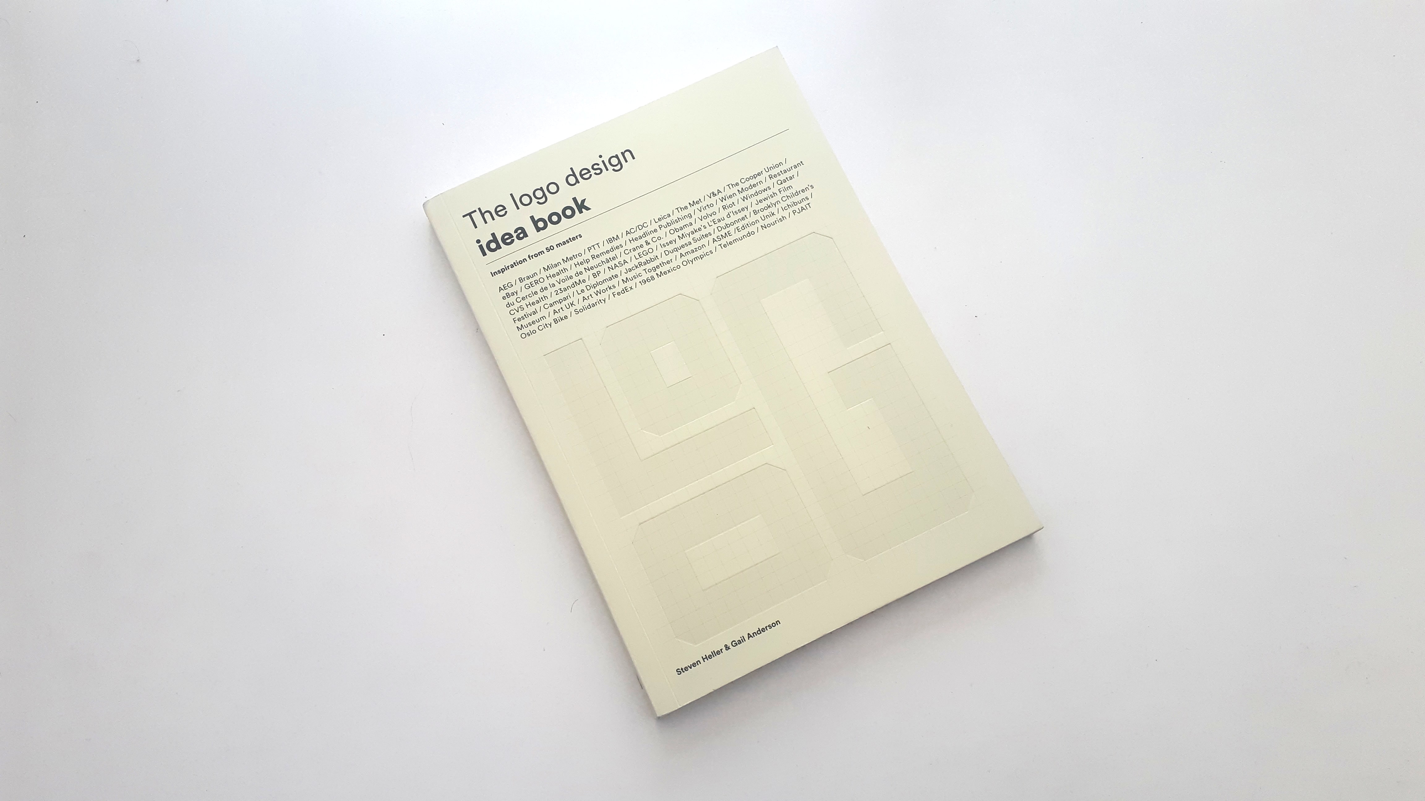
The logo design idea book by Steven Heller and Gail Anderson and published by Laurence King on 5th August 2019 is an accessible introduction to the key elements of good logo design including insights into the logos of iconic brands.
Before we jump into this book I would personally like to thank Laurence King for sending me an advanced copy of the book yet again another super book that I enjoyed reading and highly recommend for all logo design lovers.
Before we jump into the content of this book, as always, let’s take a look at the cover design.
What I like about this cover design is the simplicity of the design and straight to the point with a clear title and list of the logos, you can expect to find within the pages of the book.
It also features the word “LOGO” embossed in monogram form within a grid layout. I really like this design element on the front cover as it gives a logo design construction and process feel before you get to the content, the overall cover design is very well done in my opinion.
The book has a premium and quality well-made feel as you can expect from a Laurence King publication.
The book is written by Steven Heller who is the co-chair of the MFA Design/Designer as Author + Entrepreneur program at the School of Visual Arts in New York. He is the author of more than 170 books on design and popular culture and the recipient of the 2011 Smithsonian National Design Award.
And Gail Anderson, who is the director of design and digital media at SVA’s Visual Arts Press. She is a designer, writer, and educator who has lectured about design at organizations and conferences around the world.
So let’s dive in and take a look at The Logo Design – idea book, you can expect to see
Arrows, swashes, swooshes, globes, sunbursts and parallel, vertical and horizontal lines, words, letters, shapes, and pictures. But in all seriousness, it contains far more than pretty pictures of logos.
Logos are the most ubiquitous and essential of all graphic design devices, representing ideas, beliefs and, of course, things. They primarily identify products, businesses, and institutions, but they are also associated, hopefully in a positive way, with the ethos or philosophy of those entities.
The book is a paperback with 128 pages containing 50 illustrated logos that are examples of good ideas in the service of representation, reputation, and identification. Such logos
as IBM, AC/DC, V&A, EBAY, BP, LEGO, FEDEX and the 1968 Mexico Olympics logo by Lance Wyman
After you have read about the history and ideas behind the 50 logos featured there is a nice glossary section that explains the meaning of certain words and terms used by designers such as “Logotype – An identifying symbol, letters, or words. And finally to follow a further reading section with titles of books for you to read next which is always a nice touch when you have just finished reading a nice book and looking for your next read.
I really enjoyed reading this book you can read through it in one sitting or standing however you prefer to read or you can take your time and read about several logos a day so if your not a big reader and love logos it still caters for you too.
As a logo designer myself I can definitely recommend it to all others who love logo design it’s a great book that deserves to have a rightful place on your bookshelf
You don’t need to be a logo designer to enjoy this one it’s nice to learn about logo history and especially about the ideas behind them.
We asked Steven Heller and Gail Anderson the authors of The Logo Design idea book some questions below.
_
The Logo Creative – Where did the idea to create the book come from?
Steven Heller – This book is the fourth in a four-book series for Laurence King called The Logo Design Idea Book. They came to us to suggest the Graphic Design IDEA BOOK and we thought about what other themes could fit into the series. So we did Typography, Illustration and ta-da, Logo!
The Logo Creative – Was there a process you had to choose the 50 logos featured in the book?
Steven Heller – We had a couple of parameters. 1/ Old and New. There had to be a balance between classic that everyone knows or thinks they know. 2/ There had to be logos that originated in places other the United States. Then they each had to have an interesting backstory.
Gail Anderson – This was a tough little book to research! Steve and I worked closely with our colleague at SVA, Brian E. Smith, who was one of our grad students way back when. He’s also my design director at Visual Arts Press. We sifted through folder after folder of contemporary and historical images, knowing that we wanted to find marks that represent the new classics. It was important to balance out the greatest hits with some surprises from around the world. We edited, examined, and re-edited every time Steve stopped by on his way home from work. Fifty is a pretty unforgiving number.
The Logo Creative – What’s the best logo you’ve ever seen that the clients DIDN’T go for?
Steven Heller – That is a difficult question. To answer it without being flip, you have to understand the history of the times in relation to the logo (ie. Economy, politics, aesthetics. Etc’) and determine whether or not the tradition has bee preserved or violated and final whether or not it works for the product or institution. There are many logos that were radical departures from the norms that were handled in such a clever way, that their similarity with the past is transformed into something current or timeless. So in answer to your question, I’ve seen lots of good attempts that went nowhere because the product failed, the people failed the product and the craft behind the execution was faulty.
The Logo Creative – What are some of your favourite logos and why?
Steven Heller – My favorite logos usually go hand-in-hand with the quality of the product. When I was a kid Little Lulu (the comic character) was the trademark for Kleenex tissue. I loved lulu. But I also like Kleenex because it took care of my bothersome runny nose.
Gail Anderson – It’s a pretty obvious answer, but I remember the moment when I “got” the FedEx arrow. I was walking along 50th Street with my then-boss at Rolling Stone, Fred Woodward. He told me to look closely at the FedEx trucks sporting the brand-new logo. We paused and I had my AHA moment of recognition and he cracked up laughing. It doesn’t get better than that.
The Logo Creative – In your professional opinion what makes a great logo design?
Steven Heller – In my professional opinion a great logo design Is memorable yet unobtrusive. It is just the right combination of design elements that makes you feel proud while having some fun with it. IBM is born of a vintage slab, that stands high up for the company. But it is also like a toy or folly that the viewer can interact with.
Gail Anderson – I love a simple mark that with a clever twist. That’s not a professional opinion, of course, but more of a personal preference because I recognize how next to impossible it is to pull off. Clever is a pretty high bar, and when you throw in simple and it all comes together, I tip my hat.
The Logo Creative – For designers who really want to learn about the history of logo design what would be your recommendations for resources etc?
Steven Heller – The Taschen Modern Logo books are excellent. But to learn about logos and their relationship(s) to business and institutions it is an idea to read corporate identity manuals. Paul Rand has a few in his books and Unit Editions has published two compendiums of them. Also the indie publisher Standards Manual has published the Vignelli Metropolitan Transportation manual and Danne and Blackburn’s NASA manual. The best way to learn is to see and analyse the ones that work ….. the work some out yourself.


