Logo failures are hard to recover from if they aren’t detected on time. This is a known fact that a logo is a vital identity mark that highlights a brand distinguishing it from others. In this article we share The Ultimate Logo Check To Detect A Failing Logo.
A well designed logo indicates that your business is professional, reliable, and provides quality products or services. Whereas, a faulty logo directly damages the reputation of your brand, creating a hindrance in its growth.
Table of Contents
What is a Bad Logo?
A bad logo design is one that is outdated, unprofessionally designed, conveys the wrong message about your brand and products, or simply does not belong to your brand.
Some bad logos are very easy to detect, even people with no professional background in logo design can detect them through their flashy colour combinations or poor design.
While on the other hand, some bad logos don’t look horrible but still lack efficiency.
So how do you recognize a bad logo?
Detecting flaws in logo design is not rocket science. If you think your logo is struggling to highlight your brand effectively, it is time to look at the following key features of your logo to detect where it is lacking.
8 Most Important Elements That Make Or Break A Logo
-
Raster Format
If your logo is made in raster format (PNG, JPG, JPEG, ETC.) it is going to suffer quality loss whenever it is enlarged. To check it by yourself maximize your logo image as much as you can and then notice its edges, they will look inconsistent and blurry.
Though raster formats can come into use where the resolution is low such as using a logo on a website, they fail to display a logo properly on big spaces like banners and billboards.
The best solution to this problem is to make your logo in vector format. Vector formats include AI, SVG, EPS, AND PDF and are best to print your logo on a billboard or banner which requires it to be printed in enormous size.
-
Common Design
There are hundreds or thousands of people selling the same service or product you are selling and the chances of them using the same elements to indicate their niche through their logo are huge. You must be doing an equivalent too.
In order to check the presence of similar logos on the internet, do a Google image search of your logo. After doing so, you will see all the images that look similar to yours.
Now the question arises: how will you stand out if you and your competitors are using similar logos? The answer is you won’t.
The best solution to be unique is to pick an original character or symbol that will set you apart from the competition. But do not go to extremes by choosing a character that does not go along with or is completely opposite to what you are offering.
-
Imperfect Colour Scheme
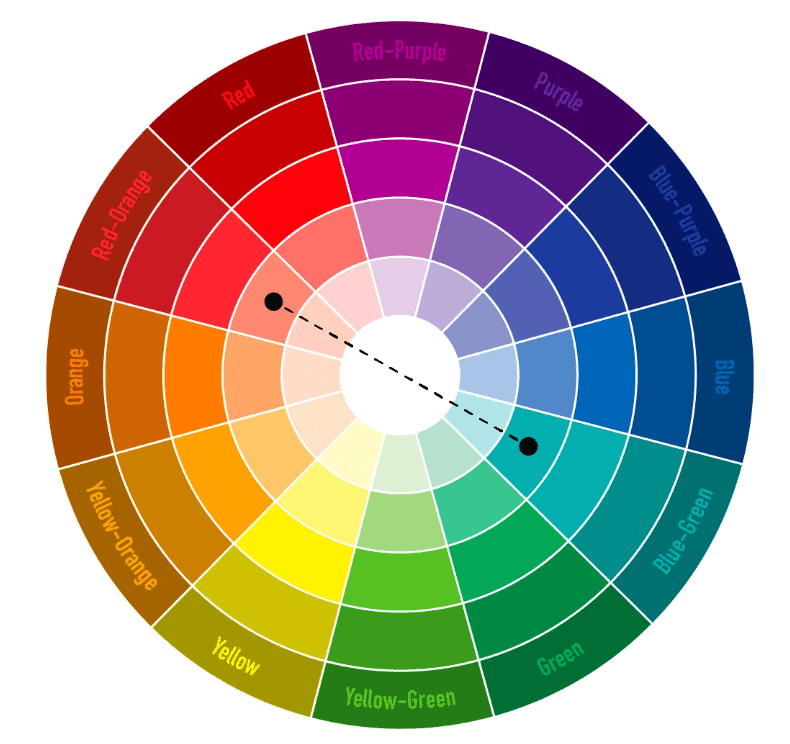
Colours play a huge role in evoking the right emotion in the viewer. They can help you portray the right message and keep your logo aligned with your mission and goals. The following colour wheel will help you choose the best shades for your creative logo design.

-
Monochrome Version
A good logo is workable even without its colours. To check whether your logo is the one, make a black and white version of your logo. If your logo remains recognizable and readable, then your logo is a good one.
Otherwise, it is not. To improve your logo design for the black and white version, use fewer gradients and shades. If that doesn’t work well, try increasing the contrast as well.
-
Unintelligible Typography
If you do not have the correct typography on your logo people won’t be able to read it. As a result, they won’t bother knowing more about your brand. If your logo contains hard-to-read fonts, multiple font styles, then it does lack clear typography and is craving a change in its font.
Using a font that is readable even in smaller sizes, Sans-serif font types are a great example. They are perfectly readable even on digital platforms where your logo is going to be used the most.
Make sure you do not incorporate more than two font styles as it would make your logo very confusing and hard to read.
-
Design Complexity
If your logo is telling too many stories, there is a possibility that it is failing to convey even one of them. This is because the more elements you will put into your logo, your logo will become too complex and hence, confusing.
This will result in making the viewer confused, making him/her forget your logo easily. Try drawing your logo from your memory, if you are able to do so with a few imperfections, congrats!
Your logo design has passed the complexity test. But if that is not the case then you need to redesign your logo, otherwise, people will not be able to distinguish your brand logo easily.
-
Incorrect Display on Various media
Your logo is going to be used on multiple platforms ranging from your products, letterheads, business cards, apps, presentations, etc for it to fit perfectly on all of them, your logo should be highly scalable.
This means it can be sized up or down according to the need without losing the quality.
To save your logo from being unfit on various media, keep the design simple so that it won’t lose any vital details when scaling up or down.
Along with that, also prepare its horizontal and vertical orientation to check how your logo looks on paper and on digital platforms
-
Trendy Design
Trendy elements are hard to resist because they are found everywhere. But the fact that they remain on trend for a limited amount of time makes them a bad choice to be included in a logo design.
Therefore, don’t shorten the lifespan of your logo by infusing trends into it. Because trends are temporary while your logo needs to stay for a long time.
You can check for the latest or outdated logo trends online and see if you have any of them included in your logo design. There are various online logo design services that post about the latest logo design trends on their website in the blogs section.
You can take help from there and check your logo accordingly. Eliminate all the trends you detect in your logo because they will make your logo look outdated if not now then after some time.
As a result, you will have to redesign your logo again and again which will make your brand look inconsistent. Not only will it indicate a high level of unprofessionalism, but it will also make it harder for your customers to recognize your brand.
Some key notes to consider while redesigning your logo
- Keep it simple
- Design for long term
- Design a vector graphic version
- Use colour psychology effectively
- Use Sans Serif font types (not more than two)
- Make it unique
- Keep it highly scalable
- Do not infuse any trends
Detecting logo design faults is crucial for every company due to the significance of a logo for brand identity. If you have tried all the methods mentioned above but are still confused about planning your next steps or need help in redesigning your logo, it is best to opt for a professional logo design service.
Join The Logo Community
We hope you have enjoyed The Ultimate Logo Check To Detect A Failing Logo. If you would like more personal tips, advice, insights, and access to our community threads and other goodies, join me in our community.
Learn from our Founder Andrew who personally writes our community newsletter. You can also comment directly on posts and have a discussion.
*TIP – Looking to learn logo design? We recommend the Logo Design Online Masterclass, it will teach you how to plan, design and execute logo designs. The course has also had great feedback from the design community.
 Author Bio
Abigail Adams works as a senior graphic designer at The Web Factory and loves what she does. Most of her professional life she has been recognised as the one who brought her creative ideas to life. At the web factory, I have the opportunity to lead and manage various sorts of design projects. Since I am a team player, I love working with my colleagues on new and challenging assignments.


