Human beings are visual creatures. Since the advent of advertising, marketers have taken advantage of this fact to help sell their wares.
That’s why, for many of us, the first thing we think about when we think of a brand is its logo. McDonald’s arches are arguably more famous than Ronald McDonald himself, while Coca-Cola’s swooping text is recognizable the world over. Let’s dive in and look at Things Most Of Us Were Unaware Of About These Famous Brand Logos.
These corporate calling cards aren’t just loosely improvised graphics thrown on storefronts and websites on a whim, rather they have been meticulously analysed, designed, market-tested, and redesigned before they reach our eyes.
Experts spend countless hours thinking up ways to play with shape, colours, and psychology to make the perfect logo.
790uiokik, For instance, according to Small Biz Trends, Red is used to create urgency, making it particularly effective for businesses like department stores. Just look at Target’s red circles for a prime example.
Blue is often used by conservative brands to indicate a sense of reliability and to promote trust in products, while Purple is frequently used to promote things like beauty and anti-aging products thanks to its common association with wisdom and creativity.
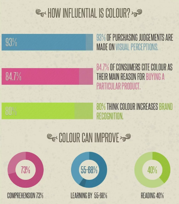
Additionally, shapes play a big role in the psychology of logos. Straight-edged logo shapes like squares and triangles promote stability and imply balance, while the circular logo tends to demonstrate a positive emotional message.
Moreover, triangles are considered masculine while circular objects are considered feminine.
Indeed, many logos have hidden meanings and messages that take example of these principles. With all the psychology and study that’s gone into logo design, you might imagine it’s very easy to design a logo these days.
But that’s not the case. Just like other arts, designing too requires natural skills. It starts right when you’re a kid. That’s when you love playing with colors, designing a scrapbook, drawing cartoon characters and what not.
Today, it’s easy to find a designer but difficult to find a good one. Designers still make a lot of mistakes, including not designing for the proper audience, over-complicated designs, following trends TOO closely, and more.
Below are a few of the most successful examples of logos that contain interesting facts you probably weren’t aware of.
Table of Contents
FedEx
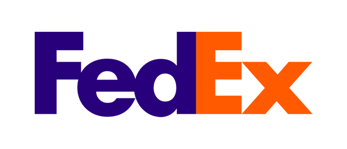
The international shipping company’s famous logo is probably one of the best examples for using hidden images in its design.
If you take a look at the area between the “E” and the “X,” you may notice a pointed image. That’s because the logo makes use of negative space to form the shape of an arrow.
“The arrow could connote forward direction, speed, and precision, and if it remained hidden, there might be an element of surprise, that aha moment,” Lindon Leader, the logo’s designer, told Fast Company.
The design world agreed, awarding the FedEx design more than 40 prizes and ranking it among the eight best logos of the last 35 years, according to Rolling Stone.
Airbnb
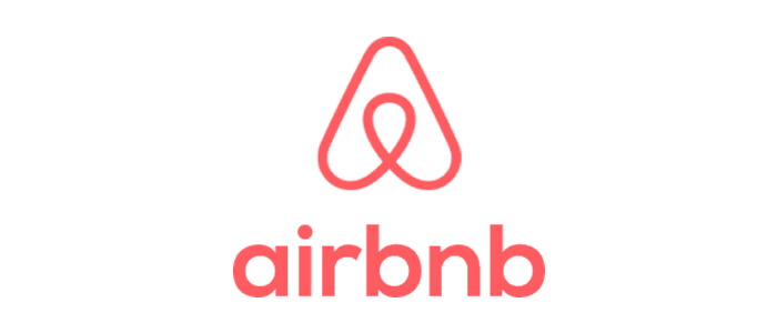
Airbnb’s logo also makes use of hidden images. The image, which the company calls The Bélo, came together after a year of planning between the company’s three co-founders.
Eventually, they came to the conclusion to focus on “belonging,” which they said was meant to represent the idea that, by using their service, travelers can feel at home anywhere in the world.
First, we must consider Airbnb’s business: the company helps people find places to stay all over the globe.
Some people may think the company’s logo resembles some sort of paper clip, but in reality, the image combines four fundamental elements to create a distinctive design.
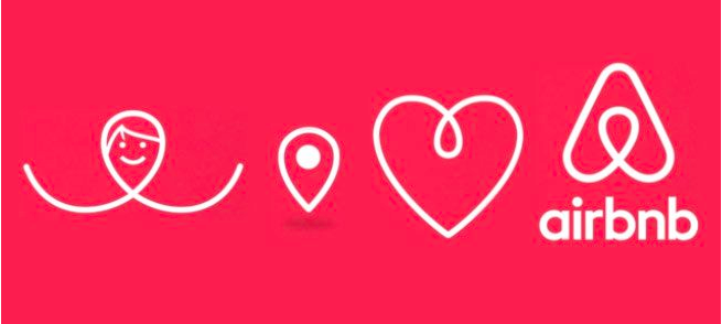
The first is a person’s head, representing the user of the site; the second is the sign for a location on a map, which represents the location of the house or apartment; a heart is used to connote the feeling of love; and all of those symbols come together to make up the letter A for Airbnb.
Wendy’s
 Wendy’s restaurant was famously founded by Dave Thomas. Of course, Thomas named the company after his daughter and it now boasts more than 6,500 restaurants around the globe.
In 2013, the company did a redesign of its logo as it tried to push the brand’s identity towards a personal and “home-cooked” feel. Now, look closely at Wendy’s collar and you should be able to notice the word “mom.”
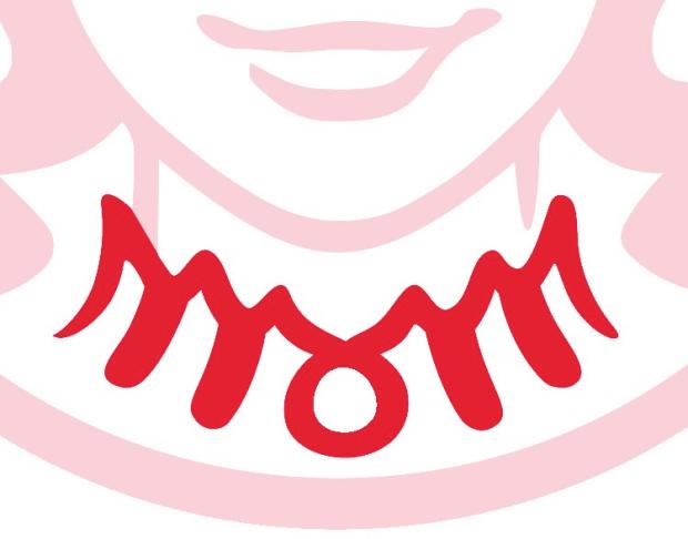
This is something you may not notice consciously for years, but unconsciously it will leave an imprint on your brain and you will associate it with the brand.
What makes this story even more unique and interesting is that the logo’s designer says the secret message was ‘unintentional.’ Now that’s what I call the beauty of designer logos. You never know what’s comes out of their Logo sketchbook.
In fact, after Stocklogos posted its story, Denny Lynch, a spokesperson for the fast food restaurant released a statement saying, “We are aware of this and find it interesting that it appears our Wendy cameo has ‘mom’ on her ruffled collar. We can assure you it was unintentional.”
Lynch went on to say that a design firm created the logo for the company.
Toblerone
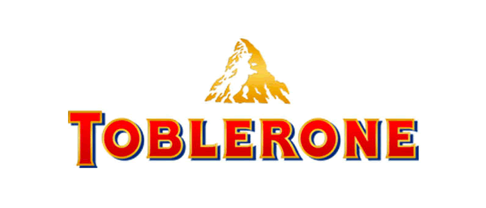
Toblerone, which is owned by Mondelēz International (formerly known as Kraft Foods), began its life in Bern, Switzerland. Bern is famous for its association with bears. In fact, the town’s coat of arms has a bear featured prominently.
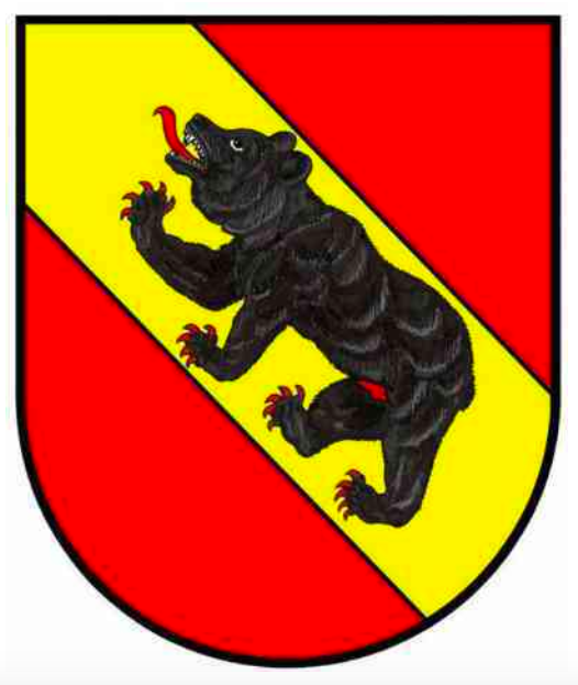
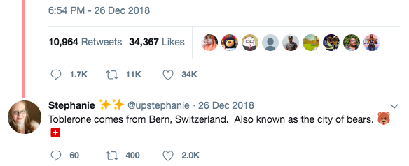
Well, someone must have informed the folks designing Toblerone’s logo. If you look closely at the mountain in the image you should notice the silhouette of a furry little creature standing on its hind legs.
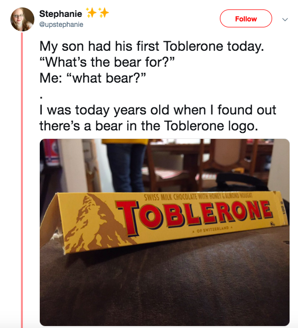
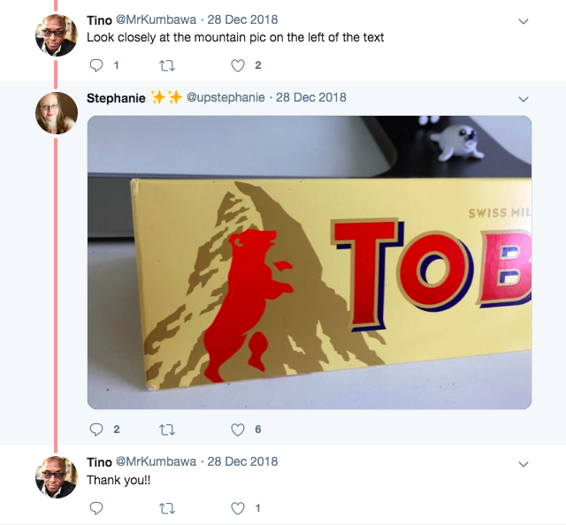
Indeed, the Toblerone logo is still used in commercial art classes to teach the intelligent use of “negative space.”
Formula 1
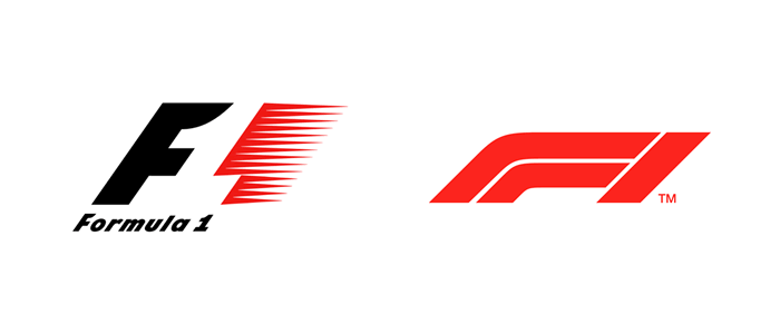
Speaking of negative space in logo design, Formula One racing is another organization that takes advantage of the principle.
The space between the two main focal points of the design is clearly a number one. But this logo takes into account additional elements of design. For instance, the use of red represents passion and energy, while the black F represents power and determination.
I was also informed by Andrew at The Logo Creative that the new F1 logo also incorporates a negative space “1” as you can see the inner white line between the red “1” , and the new logo also has a race track representation while also representing speed as the logo is on a slant like the previous version.
Tour de France
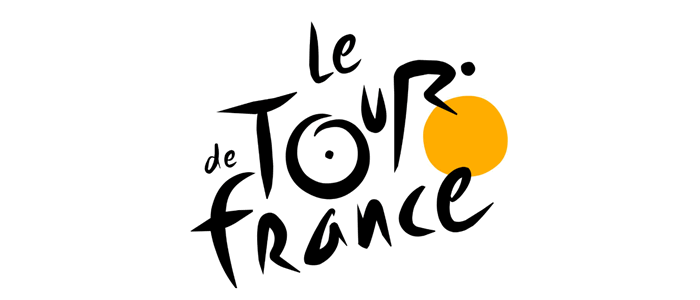
Much like the Formula One design, the Tour de France logo takes into account some of the sport’s core values and implements within the graphic.
The current logo was designed by French artist Joel Guenoun in 2002 to commemorate the race’s 100th birthday.
The playful brush scripts give the design a distinctly Gallic feel, while the dash of yellow is meant to embody the infamous yellow jersey award to the winners of each stage.
In 2002, a 100e (French for 100th) was cleverly formed by superimposing the letter ‘e’ in grey over the ‘e’ in the last letter of the word France, creating a drop shadow effect. The logo dropped the 100e after the anniversary, but otherwise, the logo has gone unchanged since its unveiling.
Additionally, there is a typographical sketch in the form of a cyclist formed by the letters in the word “Tour.”
Toyota
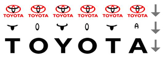
 The car manufacturer’s logo manages to combine a number of elements to create a deceptively simple image. The company says the three overlapping ovals on its American vehicles “symbolize the unification of the hearts of our customers and the heart of Toyota products.
The background space represents Toyota’s technological advancement and the boundless opportunities ahead.” What you’ll likely find even more interesting, and perhaps some eagle-eyed viewers have already made this connection, but those overlapping ovals also manage to spell the word “Toyota.”
Mastercard
 International payment system MasterCard is another company that made use of color psychology in the design of its logo.
In this instance, red is meant to represent bravery, passion, and remind you of actions that bring you joy. The bright yellow is there to make you think of prosperity. According to MasterCard, these are the necessary qualities for people who want to become rich, which is why the colors in the logo meet in the middle.
Conclusion
Companies dedicate a lot of time and money into designing images that we associate with their brands. The shapes, colors, and psychology that are used are all very intentional.
As you can see, there are many elements of design that go into creating company logos, some obvious and some barely noticeable if you’re not paying attention. We hope these Things Most Of Us Were Unaware Of About These Famous Brand Logos has been intresting, and be sure to leave your comments below.
 Author Bio
Roberto Garvin is the co-founder of Mofluid/Snewscms. It is absolutely amazing to see how technology continues to evolve, from email to browsers, search engines, mobile, AI and now blockchain. I’m fortunate to witness it all. Really excited to see what’s next.

