Skip to content
Home
Menu Menu
  • Home
  • About
    • The Logo Creative
    • Logo Design
    • Our Process
    • What’s Included
    • Testimonials
    • FAQ
    • Terms of Service
  • Contact Us
    • General Enquiry
    • Hire Me
  • Case Studies
    • Logo Portfolio
  • Blog
  • Community
    • Contribute & Advertise
    • Mindful Creative Insights
    • Logo Design Resources
    • Shop
    • Designer Interview
    • LogoTalk Podcast
    • Book Review: Logo Design
    • Designer Spotlight
    • Freelance & Marketing
    • Brand Spotlight
    • Famous Logos
    • Instagram
Tinder Brand Identity Spotlight

Tinder Brand Identity Spotlight

  • 02/09/201701/09/2017
  • by The Logo Creative
  • Today Designer Spotlight: Tinder Brand Identity Spotlight

    Tinder Brand Identity Spotlight

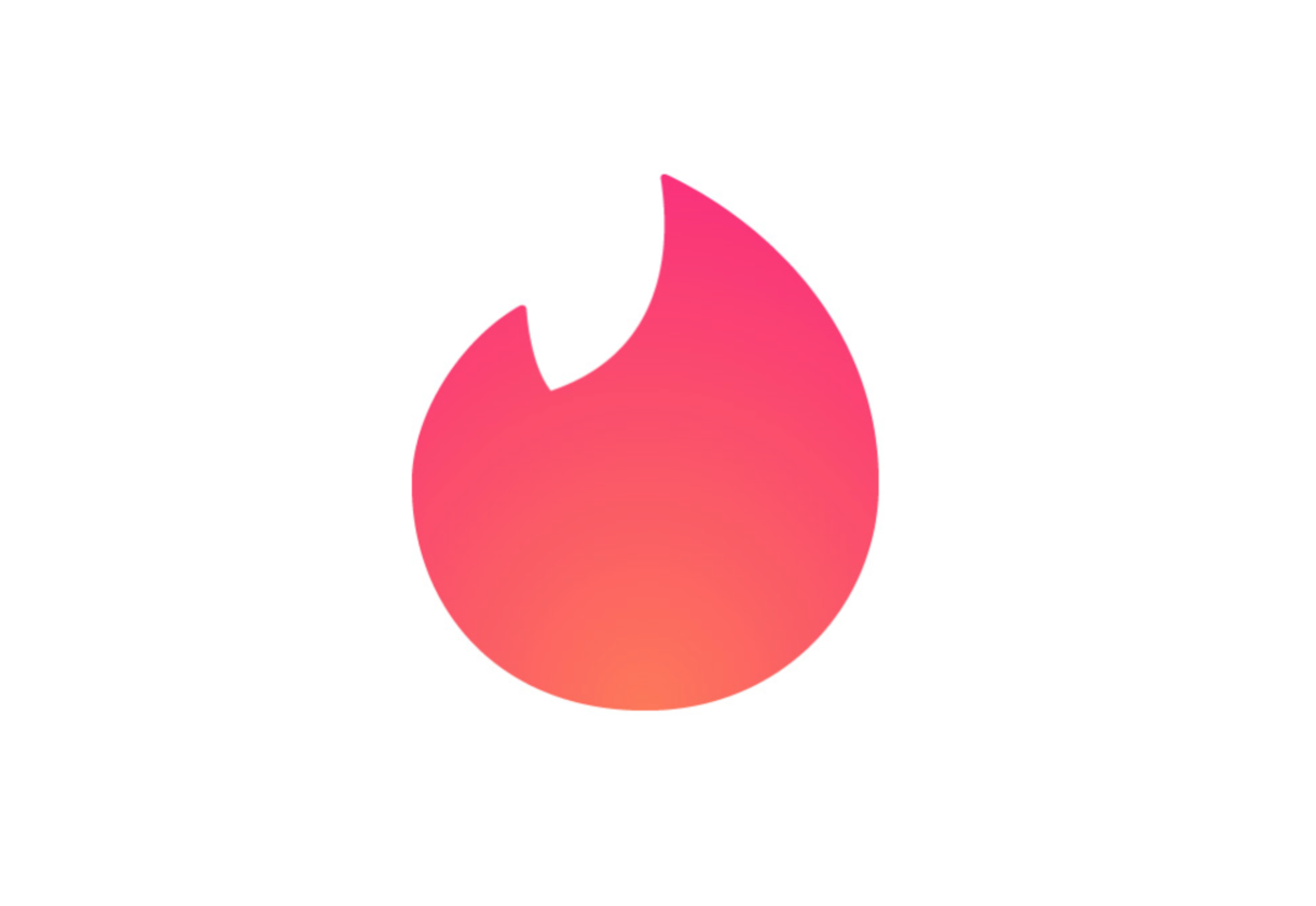
    Tinder has updated the design of its distinctive flame logo. The new logo is more rounded and has a gradient effect on the flame.

    Speaking about the new logo, editor and branding specialist of Under Consideration, Armin Vit, said:

    “Probably unbeknown to anyone, the flame became, literally, the hottest app icon on people’s phones and, now, reaching Nike Swoosh status, Tinder has decided to forego a wordmark and let the flame do all the brand heavy lifting.”

    And it works. I have never used Tinder and even I get the power of the flame and its ability to stand on its own.”

    Tinder Brand Identity Spotlight

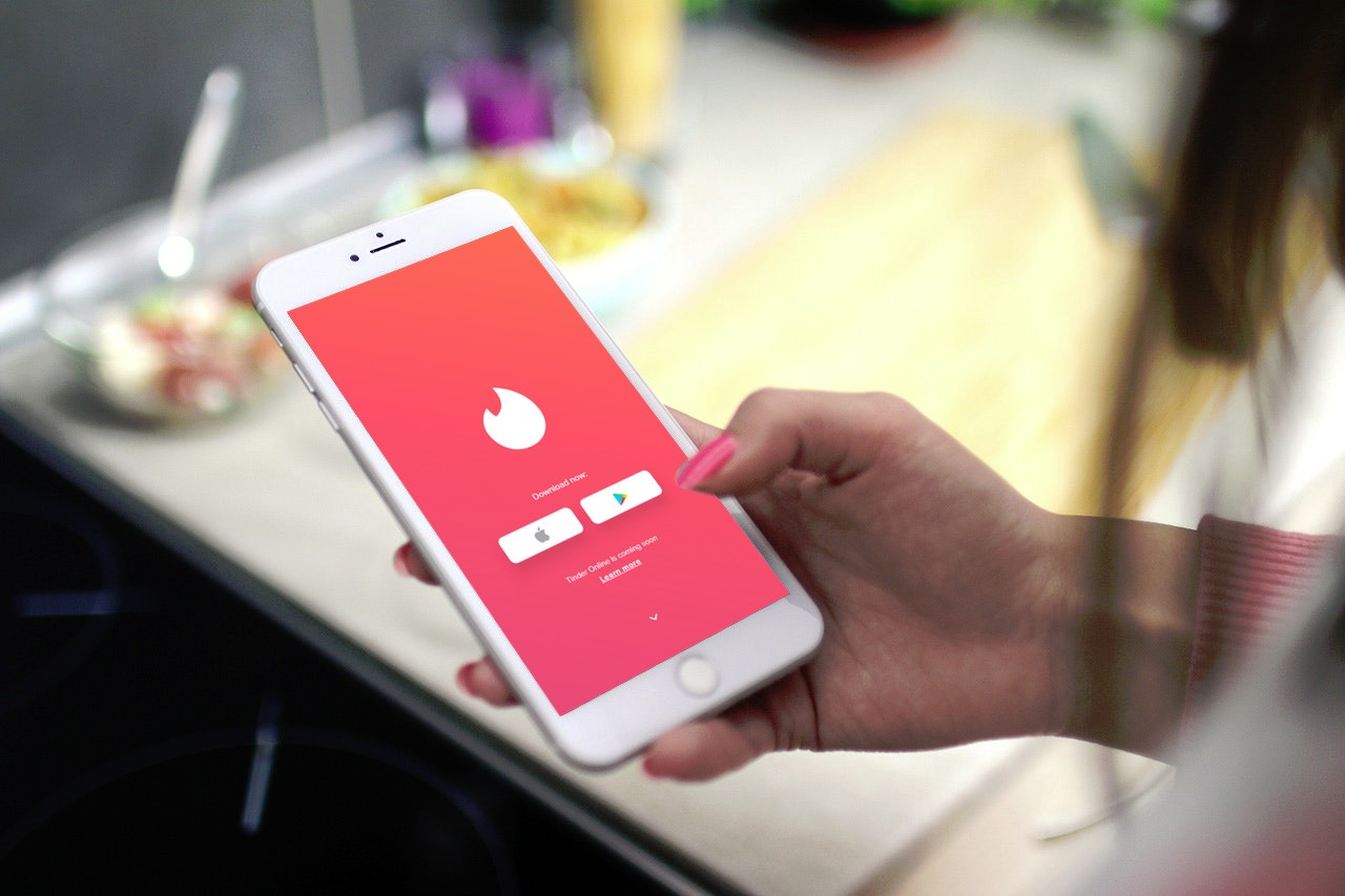
    Tinder is a location-based application with an estimated 50 million active users.It specialises in matching people through photo and brief bio. Tinder first launched in 2012 and has commonly become the worlds hottest dating app . Nonetheless, Tinder provides other services as to generalise the app to other social media. Now what’s new from this popular dating app is their makeover. Tinder’s logo transformation has users swipe right immediately.

    Over last few years, Tinder used their orange-flame-coloured app logo but Tinder’s new appearance has changed a bit. Tinder still use their old icon but there is a slight different on the shape and colour. The new logo has a touch of pinkish gradient with pointier upper part compared to the old one. Also, the lower part is now too round.

    It’s somewhat reminiscent of Instagram’s 2016 logo redesign, which saw the social network replace its retro camera symbol with a pink, orange and purple gradient icon.


    Me personally i think the logo is good considering Tinder is more app based. The gradient would be expected for this type of app but colour choice is nice and just right for Tinder to show passion and their modern romance vision.

    The new flame is nicer in that it has pointier flames but the overall shape looks a little too round considering its a flame, making it look less like a rising flame. Overall, it’s a nice crisp implementation and confident improvement that cements the high-level position Tinder holds in the social landscape.

    Tinder Brand Identity Spotlight


    Sharing Logo Design, Brand Identity Inspiration

    Posted in Designer Spotlight, Inspiration
    BrandBrandingDesignDesignerdesigner spotlightGraphicgraphic designidentityLogoLogo DesignpackagingPrint DesignTypographyvisual

    Post navigation

    Medium Brand Identity Spotlight
    The Music Shop Inc Brand Identity Spotlight

    Categories

    Interactive Email With Insights

    Weekly Blog Digest


    Best Logo Design Blogs

    Best Branding Design Blogs

    LOGO DESIGN NEWS

    Tweets by thelogocreative

    Video Converter

    mazzine.com


    The Logo Creative - International Strategic Logo and Brand Identity Design Studio

    The Logo Creative™
    Logo & Brand Identity Studio

    Part of The AJR Group™

    International Design Studio
    info[at]thelogocreative.co.uk
    Phone: +44 (0) 7807 085 003

    INSIGHTS FROM THE BLOG

    • Is Your Tech Undermining Your Brand? IT Fixes You Can’t Ignore 10/05/2025
    • What Is DLP And Why Should Your Brand Care In 2025 09/05/2025
    Copyright © 2025 The Logo Creative | International Logo Design & Branding Studio | ♡ In Loving Memory Dad (Ray Marriott) | The Logo Creative.
    Scroll to top
    Interested In Writing an Article To Be Featured On The Logo Creative™ ? Contribute!
    0000d
    0000h
    0000m
    0000s
    Coming Soon - Designer Interview With Von Glitschka View Previous Interviews