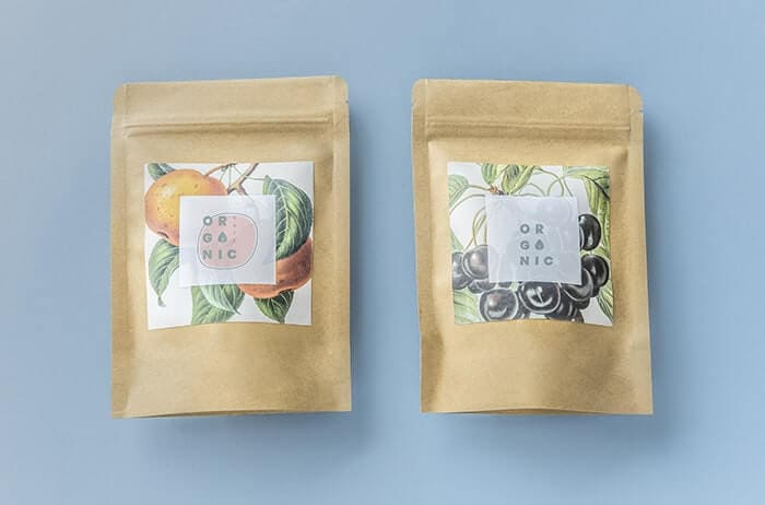
Product packaging is a key marketing tool for small businesses. It helps customers identify not only the product, but also the brand in general. That’s why product packaging has to be unique, memorable, and attractive. It’s an incredible way of boosting your sales. In this article we give you Tips For Choosing A Good Logo For Your Product Packaging Ideas.
An important component of product packaging is the logo design of your business. Establishing a good rapport with your audience becomes possible with a perfectly created logo. It can make or break your business prospects in the market.
This post reveals how to choose a good logo for your product packaging ideas. Check out some useful tips below.

Table of Contents
Know and Understand Your Brand
Make sure that you have a very good understanding of your brand before you set out to choose a logo design and create a copy for your product packaging.
Keep in mind that these aspects of your packaging must reach a certain set of people—your target market and customers. You can check out an article on packaging trends for this year to find out how to better position your logo and copy.
Ultimately, you have to review your market, brand, and business. Write down all the important details that describe them.
Find out about your brand ideology and the inspirations your business holds for the future.
Do you have a tough or soft brand in terms of its tone? It’s also important to know your brand’s personality. How do you want to project it amid your market and customers?
These details will serve as your guide in choosing a logo that’s right for your product packaging ideas. They have to be ready beforehand. Consider all the essential information about your brand in picking your logo elements.
Aim For Something Easy To Recall
There are so many brands that are competing for the attention of your target market. Simplicity is the key if you want to be recognized.
You don’t want to have an overly detailed design if the aim is to give prospects and new customers the chance to recall your mark after only a glance at your product packaging.
It’s a logo design mistake that you have to avoid at all times. The logo of your business has to focus on the concept and should have a single story. Avoid complicating the trademark you’ll put into your product packaging.
Make Sure That The Logo Is Unique
The market and the customers of your business should develop a great and lasting first impression based on your logo design.
They have to be mesmerized just by glancing at your logo.
The logo in your product packaging should function by enticing your customers to try your offerings again and again. It should encourage brand loyalty after your customers’ first encounter with your business.
The design of your logo should be based on an entirely new concept. Choose one that stands out in the sea of logos in the market.
Making sure that your product packaging logo is unique is important to create an impression. In addition to being unique, your logo design must also be better than those of your competitors.
Choose One That Makes Effective Use Of Colors
How quickly and easily your brand’s message can be determined by your customers and prospects boils down to the colors used in your product packaging and logo design.
For example, if you use blue as your logo’s main color, it sends a message that your brand evokes feelings of togetherness and intelligence. That’s the reason why most social media channels have logos in blue.
Prime examples are Facebook and Twitter. If red is the chief color, it presents your brand as being energetic, passionate, and aggressive. That could signify that your business intends to target young consumers.
If you want to grab people’s attention, make use of bright and bold colors. Just keep in mind that these colors also speak about the personality of your brand.
Every color sends a unique message to your viewers or customers because each of them evokes an emotion. Yes, there’s science behind colors, and you should consider it as you choose a logo for your product packaging.
The Aspect Ratio Must Be Proportionate
Aspect ratio is key in any logo design. Avoid logos for your product packaging ideas that are too wide and short, or too tall and skinny as they’re generally not visually pleasing.
It can also be difficult to use the logo in many layouts if the design’s height and width aren’t proportionate to each other. Ideally, a logo should fall within a circle or square aspect ratio.
Rectangular proportions that are similar to a business card or a standard sheet of paper will also do.
Conclusion
There’s no blueprint for a flawless logo design. Arriving at something that fits your product packaging perfectly requires a lot of thinking and revising.
However, if you take the five tips above into consideration and if you’re willing to test before implementing a final design, you’ll surely have an effective product packaging logo in no time.
Join The Logo Community
We hope you have enjoyed these Tips For Choosing A Good Logo For Your Product Packaging Ideas. If you would like more personal tips, advice, insights, and access to our community threads and other goodies join me in our community. You can comment directly on posts and have a discussion.
*TIP – We recommend to Learn Logo Design with the online masterclass


