TM: Trademarks Designed by Chermayeff & Geismar is more than just a book. It is identity and brand design history at its best. The constant high level and eternity of their work is admirable. Their work is an example for everyone into brand and corporate design.
The book was originally published in 2000 by Princeton Architectural Press. In 2001, it was republished by Lars Müller Publishers. The book contains 288 pages of pure delight and its hardback cover with linen finishing is a beautiful tricolor combination of the colors purple, yellow and red.
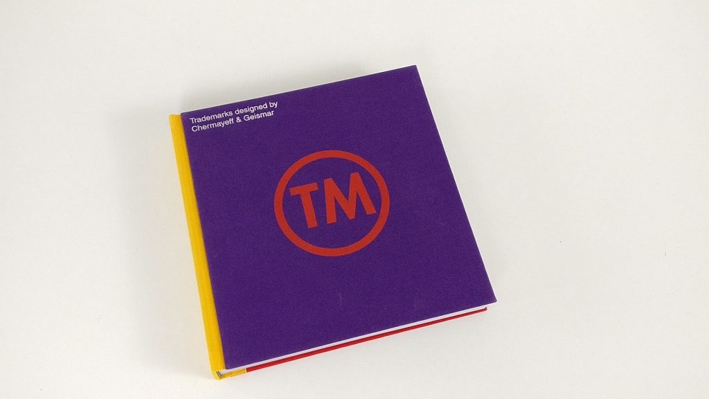

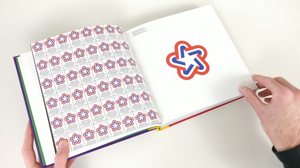

The build quality of the book itself is amazing and feels great while holding it. Without being too biased by the names of the designers and the publisher, the soul and quality of Chermayeff & Geismar there work is truly reflected throughout this book.
The superior quality and simplicity of the logos is striking. Some works might look too simple to be perceived as creative by some. Yet the work was not made to be creative. It was made to solve a problem in a creative way. Simplicity is key in the work of Chermayeff & Geismar and that is what made and still makes the agency one of the best. The prove of that lays in the fact that a lot of these logos are still in use today.

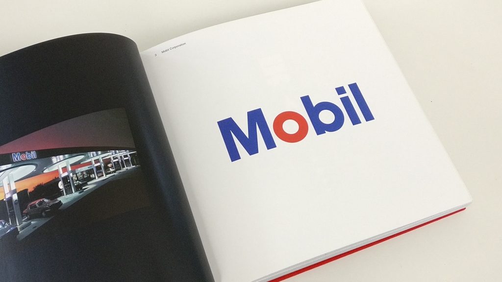
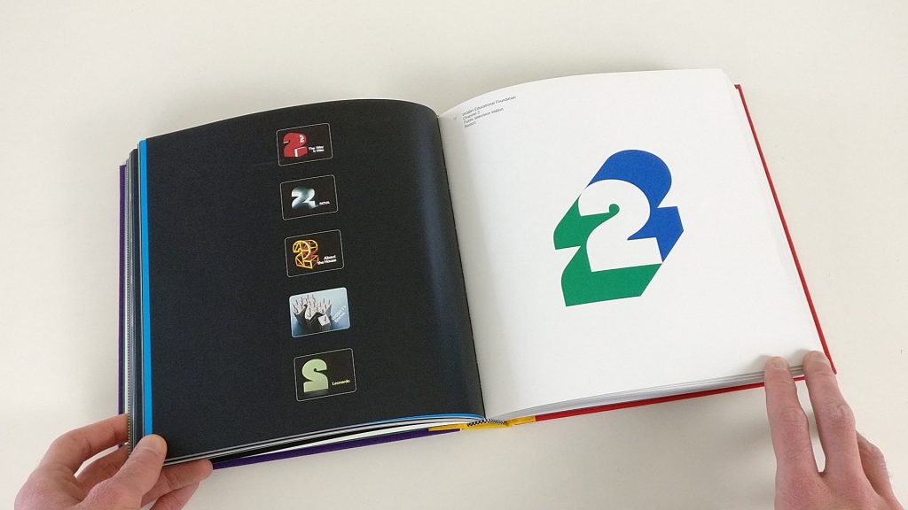
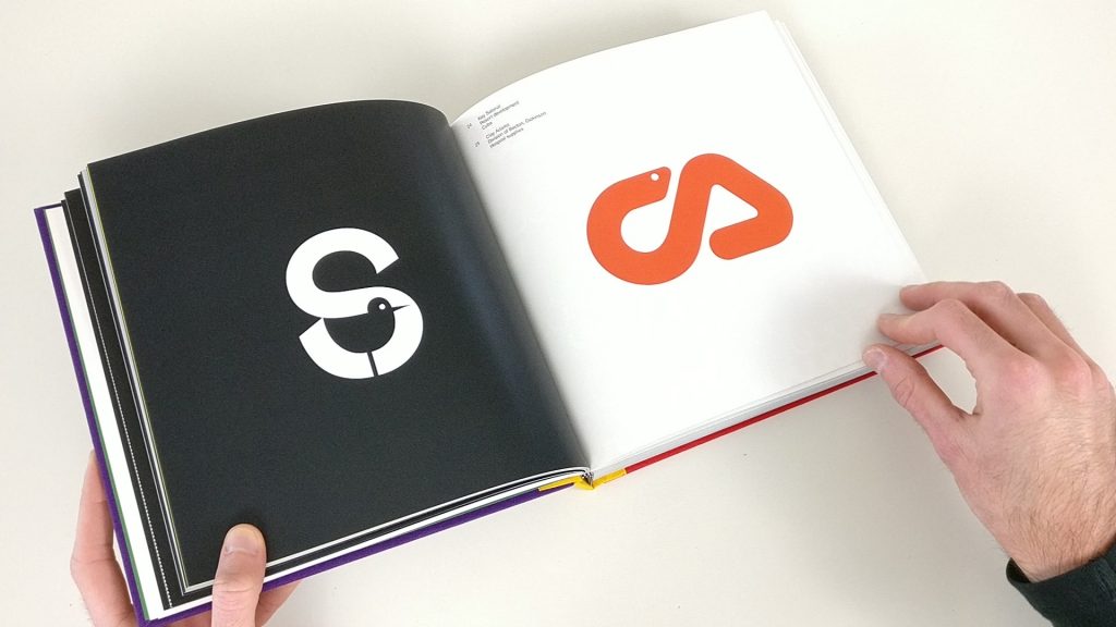
Although the work in this book is truly amazing, it’s a real pity that it doesn’t come with any explanation on the logos. TM: Trademarks designed by Chermayeff & Geismar is a purely visual portfolio of their work.
In 2011 there was luckily published another book on the work of Chermayeff, Geismar & Haviv called Identify: Basic Principles of Identity Design in the Iconic Trademarks of Chermayeff & Geismar. This book contains most of the work featured in TM: Trademarks designed by Chermayeff & Geismar and every logo with a brief or more extended description on the work.

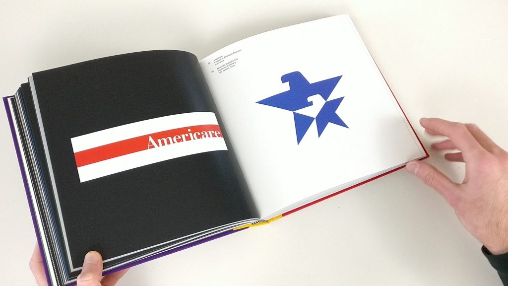

TM: Trademarks designed by Chermayeff & Geismar is a magnificent book showing the admirable history of the agency. Unlike a human, the work of Chermayeff & Geismar remains eternal.

