You cannot underestimate the power of a logo and the ability it can have to influence someone to use a service or purchase a product. Of course, they also have the power to do the opposite. A poorly designed logo can make a company look amateurish and repel potential customers.
Some logos are purely functional and others are almost small pieces of art. Some companies fiddle with their logos over the years at great time and expense, and other companies have such iconic designs that you couldn’t imagine them ever being changed.
Some industries lend themselves to great artistic freedom when it comes to graphic design and creating a logo. Skateboard companies, graphic novel titles, clothes brands, and video games can be areas that give the artist a lot of freedom to work in.
Other industries are more rigid; think of funeral directors, for instance.
Personal Injury Lawyers are another example of an industry where you might think there is little creativity in the logos used, but here is a group of companies who have managed to provide something a little better than just a name in a serif typeface.
Table of Contents
The Problem With Designing Logos For Law Firms
While designing a logo for a business you may have a certain amount of freedom to try out different ideas. You might try something abstract or a pictorial logo. Of course, try a combination logo or just a wordmark.
There are some great examples of powerful global branding but lawyers are not among them.
Law firms tend to have less opportunity for designers to play with them. The companies themselves are often named after the partners that started the business, and a group of names followed by a description won’t inspire much in many artists.
For example, imagine a company named Higson, Maycote, Maycote and Jackson, Personal Injury Lawyers, Massachusetts. Now try and design something interesting.
Of course, many law firms do have good logos and you will see some soon but Personal Injury Lawyers are often more restricted.
The logos can often end up with a red cross or white cross in red as part of the logo.
Ambulances and elements of speed are also often incorporated. This can lead the logos to look, well, tacky, and in a business that is expected to be worth $38 billion this year that might not be good enough to compete.
Ten Logos For Personal Injury Lawyers That Are Better Than The Rest
 While these logos are nowhere near been groundbreaking, they offer something different from the usual plain serif list of lawyer names above a straight line and the city they practice in.
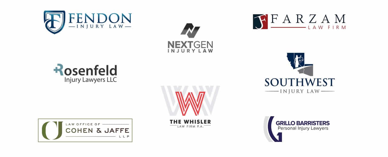
Fendon Injury Law
Here is an example of a company that changes its logo when they feel the need to freshen up. Corporate colors are always retained and while the previous logo was perhaps stronger, the new one follows a classic path.
A strong image of a shield depicting protection for their clients with the design based around the ‘f’ of Fenton along with the name and then very clearly stating what the firm does.
NextGen Injury Law
While there could be a few grumbles at the logo, they have tried to do something different with their name and logo style.
NextGen is an unusual (and maybe not the best) name for a law firm, however, it is clear they are trying to distance themselves from the older style of lawyers and attract a younger market.
The bronze gradient could happily be left off though, we changed it to black for the purpose of this image as you can’t see it very well on a white background.
Farzam Law Firm
The Los Angeles Personal Injury Lawyer has taken an interesting approach. Combining blue and red, which most other companies here seem to have avoided plus the logo has both a monogram logo and a wordmark.
This means the monogram part can be separated for use where the whole logo may not fit so well such as a favicon or on the back of a business card.
Whisler Law Firm
An intersecting W in dark red dominates this law firm’s logo. The wording is in sans-serif dark grey and stands out against many other law companies.
Whether the extra-large W behind the red one is needed is questionable.
Grillo Law/Barristers
The two-tone blue of the Grillo logo seems to be a popular combination for lawyers; see Southwest Injury and Fendon also. A simple logo making use of an emblematic G.
Rosenfeld Injury Lawyers
A simple logo displaying the company name but playing with the R to depict the red cross symbol, without actually using red. They have however used blue again, what is it with these guys?
Southwest Injury Law
Perhaps a strange one in that they followed the traditional route of using a serif font with the name of the company followed by who they are but they have included a quite detailed image with it.
The logo which is in blue and grey, depicts the scales of justice, possibly a road heading into the future all in the shape of Arizona state. At least it is different.
Cohen & Jaffe Lawyers
Using a similar monogram style as Farzam, what is unusual for a law firm is the coloring. Instead of going with blue, which seems to be the choice for many, they have gone for an olive, dark green, and gray appearance.
Staver Accident Injury Lawyers
Staver has gone for a red abstract design along with a clean sans-serif logo simply stating Staver in caps that wouldn’t look out of place on a pharmaceutical company.
APIL
If you are looking for a personal injury lawyer then there is one more logo you need to look for. In the UK, the APIL or Association of Personal Injury Lawyers logo means that the company you are hiring for is a not-for-profit organization that helps people get the help they need. In the US it is Board Certified.
5 Law Firms That Don’t Necessarily Deal With Personal Injury
There are five over law firms that have logos worth checking out. They are not listed as personal injury lawyers but they have logos that are different from the run of the mill:
- Littler – a simple lime green and cyan combination
- Wint Law Firm – the word WINT with an abstract image of a dove above the name
- Winckworth Sherwood – a name mark using both serif and sans-serif to display the two different partners of the business
- Hopgood Gamin – a simple emblem type logo combining the letters h & g
- McCarthy Tetrault – lower case with simple but effective typography
Summary
Law firms have a certain image they need to give off to the public. They must look trustworthy, professional, and caring. Too often law firms are seen as being faceless corporations and of course, this is not always the case. Getting the right logo design can help to attract clients and create brand awareness which leads to trust and loyalty.
Although designing logos for lawyers may not be at the top of the list of creative jobs for artists, you may still be asked to produce one someday. Bread and butter work for many designers won’t involve the most expensive logos that cost millions. Instead, it is likely to be producing flyers, posters, website revamps, and even personal injury law logos.
Join The Logo Community
We hope you have enjoyed these Top 10 Personal Injury Law Firm Logos We’ve Ever Seen. If you would like more personal tips, advice, insights, and access to our community threads and other goodies, join me in our community.
You can comment directly on the posts and have a discussion with Andrew, the Founder of The Logo Creative.
*TIP – We recommend Skillshare to learn online. There are tons of classes for everything including graphic design, web design, marketing, branding and business related courses. Get a free trial with our link and you won’t regret it Trust us!


