We saw some great logo design rebrands last year and with some older logo design trends taking centre stage, there’s no doubt we will be seeing some carry over this year in the Top 12 Logo Design Trends For 2022.
We have researched logo design trends from logo designers around the world who we have interviewed in our designer interviews and from popular platform logo designers display their work on.
A logo design is the first thing people see when engaging with your brand, the logo is the face of the brand that forms the brand identity design.
It’s fair to say that logo design is the brand’s most valuable asset.
In this article we will tell you exactly what you can expect to see in the world of logo design in 2022, along with examples from the past year.
Creating unique logo design ideas and concepts is no easy task, and when it comes to creating a logo that has the potential to become iconic and instantly recognisable is a true challenge for any professional logo designer.
Some of our predictions will be no surprise, plus it’s no secret that minimalism is continuing on the rise and most of these styles will be used with minimalism in mind.
These Top 12 Logo Design Trends For 2022 will help you in the ideation stage of creating your next logo design.
Table of Contents
Minimalism & Simplicity in Logo Design
Having a simple logo design is not just a logo design trend for 2022, simplicity in logo design is now a principle and best practice to follow when designing a logo.
Simplification in logo design has been on the rise for many years and it continues to be a popular trend to follow moving forward in 2022.
A great formula for success when aiming for simplicity in logo design, is to follow the three pillars which are Practicality – Comfort – Aesthetics.
Keeping the logo design simple helps it become quicker to identify, and helps keep it memorable in the minds of consumers.
The logos primary job is to identify and not to explain.
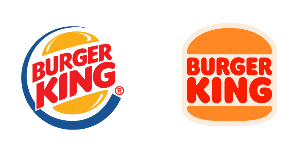
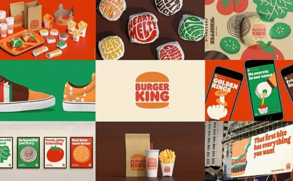
For example, one of our favourite logo redesigns of 2021 was properly one of the most memorable for a lot of people and that was Burger King as they started off the year with a whopper of a rebrand.
It’s a prime example of minimalism and simplifying a logo design. The overall identity design has also been elevated with simplification and memorability.
Another great example from the food industry is Papa Johns and their logo and brand identity redesign from last year. I would agree that it’s not everyone’s favourite rebrand, it does show a move forward in simplification and minimalism when it comes to brand logo design and overall brand identity design.
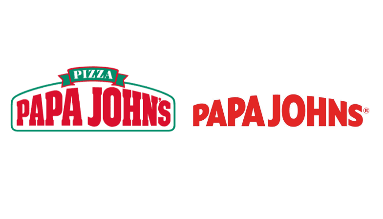
And while ignoring the rules of grammar by dropping apostrophe from “Johns” I suppose it does distance the brand from its former CEO.
From a design perspective… the use of a sans serif typeface and brighter shade of red over the older one gives the brand a cleaner and fresh logo and overall identity design.

Over the last few years we have seen a lot of brands simplifying their logo design, and In particular car bands such as Audi, Citron, VW, Nissan, Mini and Toyota.
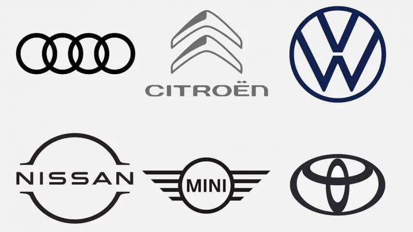
Originally in the 80’s and 90’s these companies were branded with three-dimensional, chrome-affect logos and now we have seen a change in design direction to a more simplified flat design and monochrome approach.
The change was due to simplified logos working better digitally on screens and miniature icons. Most recently Volvo and Renault joined the club with their simplified versions.
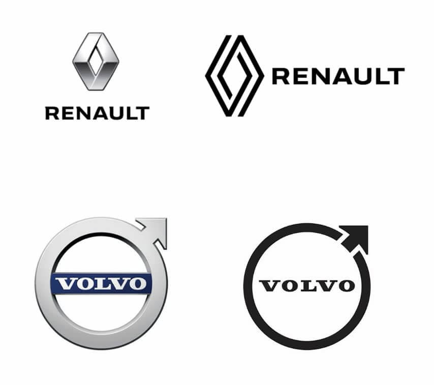
Every logo designer should strive to create something as simple as possible as the old saying goes “less is more”, it’s not about what you can add, but what you can take away and still be as relevant. It’s defiantly a logo design trend to follow in 2022.
Harmony and Balance in Logo Design
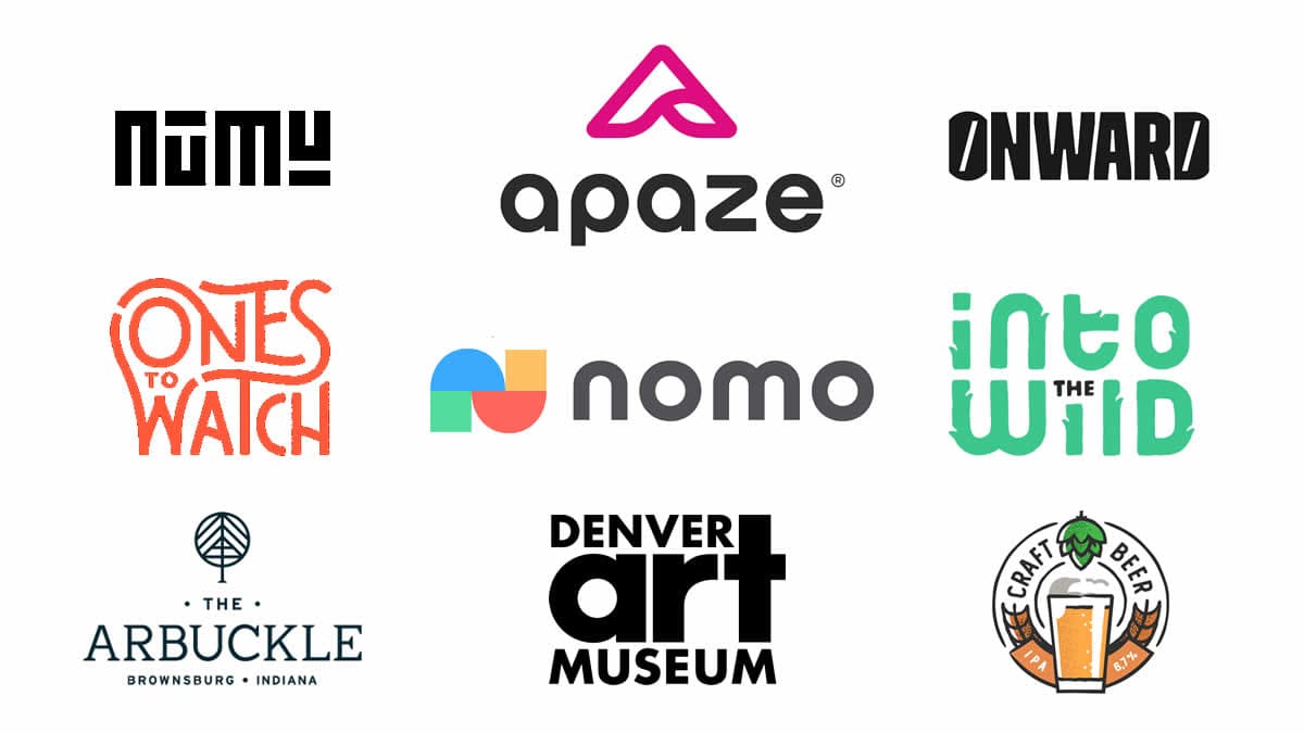
When designing logos a key design principle is to consider harmony and balance within the design. Much like in life, maintaining good balance will have an effect on how we perform in our lives.
Having a good balance between different design elements such as colour, type, shape and so on will help the logo stand out literally in the eyes of consumers while also evoking trust and confidence in the brand.
A well balanced logo design is also a more memorable and easier logo to identify, so Harmony and Balance continues to be a top logo design trend in 2022.
Symmetry – Symmetrical Logo Design
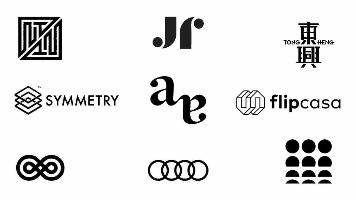
Speaking of balance as a principle of design and its essentialness when designing logos, symmetry and symmetrical logo design is a big expression of the balance principle.
The symmetrical logo design is exactly the same on both sides (mirror image) if you were to cut it straight down the middle.
A symmetrical design is all about strength, just like a building, whether tall or complex in its design, they are designed to be solid on the ground and hold, and this is achieved through the perfectly symmetrical balance.
Negative White Space
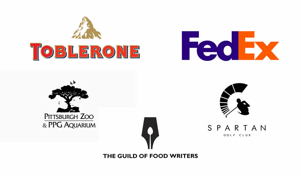
White space within a logo design is also known as negative space, more often than not within a design its normally blank space.
The negative space is the empty space between in and around type and symbols. Negative space design is always on the rise and shows no signs of losing relevance.
With thought and clever design implementation, you can use a lot of negative space to create a unique logo design that speaks volumes.
Some of the best negative space logo design examples over the years are still highly relevant and a joy to look at.
In 2022 we are going to continue to see logo designers manipulating white space in amazing versatile ways and this makes this top logo design trend a must in 2022.
Typography and Experimental Type
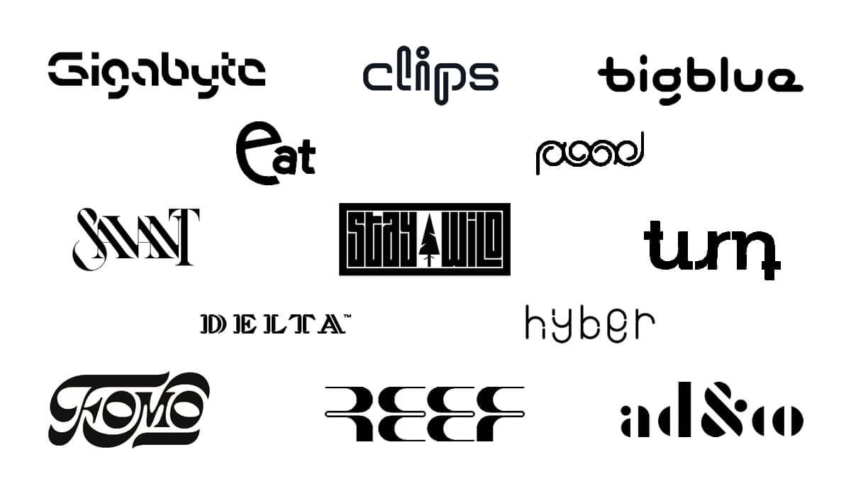
Typography has always been a popular design element, but now in 2022 it’s becoming even more popular.
With the rise of experimental type, logo designers have been going against the rules of traditional typography by breaking the rules and experimenting with type.
As logo designers we love to break the rules of design when we can, and go against the status quo challenging ourselves to create something unique.
When incorporating this design technique, beware of maintaining a balance between creativity and the logo purpose.
It’s one thing to be unique and creative, but logo designers need to convey the right message and evoke an emotional response from the target audience for it to be perfectly legible and work as intended.
Typography will always be relevant as it’s how we read and communicate, but if you can experiment and manipulate type to be a unique viewable experience communicating a visual message and emotion for the viewer then the sky’s the limit for this logo design trends 2022.
Lowercase Lettering
When it comes to typography and the rise of wordmark logo design we have been seeing a lot of designers favouring the use of lowercase type rather than all caps.
I must admit it does look friendlier and cleaner in its appearance. Obviously using this approach will all depend on whether the brand name meets the visual standards and usage to pull it off?
Designers are going to have to be careful on the choice of typeface they use as choosing any type will not work as effectively.
Avoid using lots of design elements to maximize impact and opt for a heavier weight, creating balance with a thicker stroke weight. Readability, contrast is key!
Symbols as Letters Logo Design
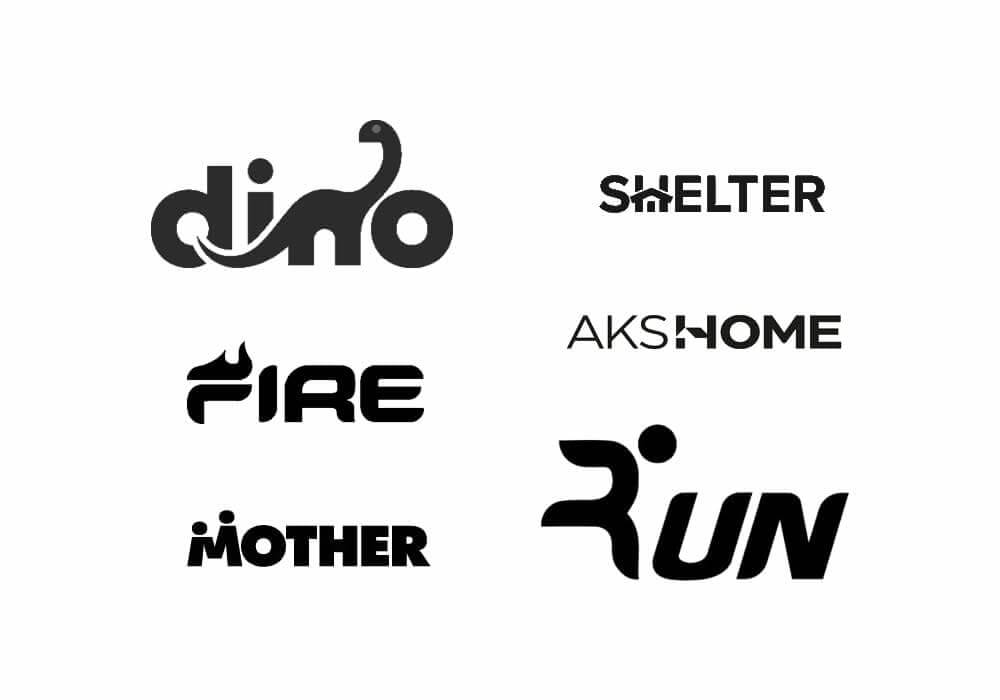
When designing logos there are a variety of ways to design different types of logo design such as an emblem, lettermark, wordmark, symbol or combination of a wordmark and symbol together.
Combination logos are great and quite a popular choice when designing a logo design. But why stop there?
During the last year we have seen the rise of Symbols as Letters Logo Design, this technique involves including the symbol within the logotype acting as a letter within the word.
Similar to negative space and also tricky to pull off. If done right, it can make a logo design truly unique and adaptive, while also a great way to convey emotion and feeling within a logo design.
I’m confident we will be seeing more of Symbols as Letters logo design trend in 2022.
Overlapping Elements
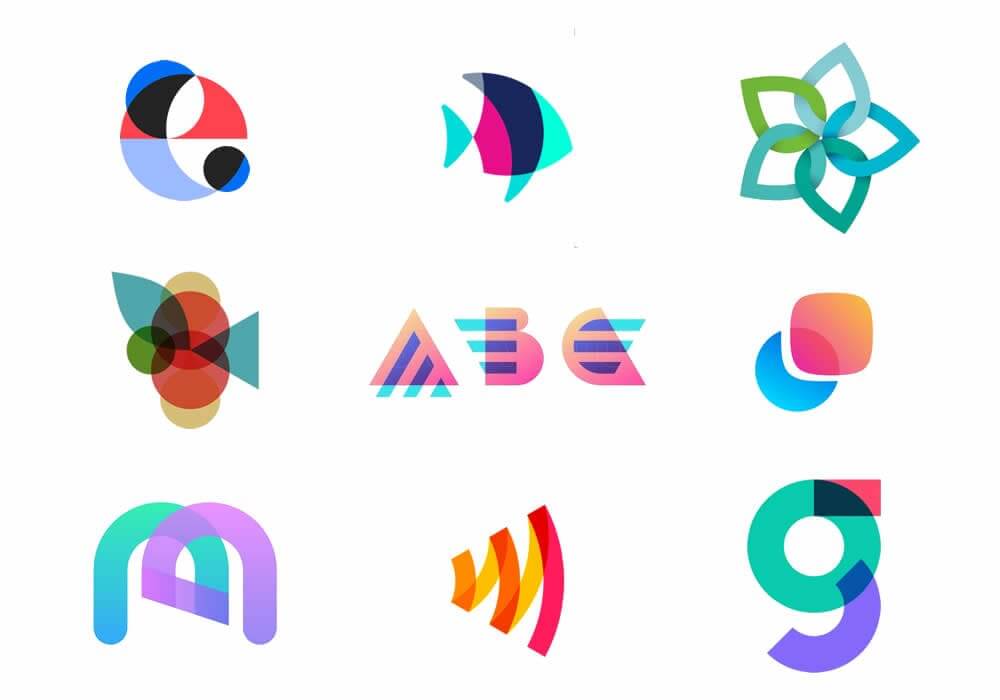
With overlapping design elements, you can open up a range of creative design opportunities and directions for a logo design concept.
A logo designer can use many elements such as type, geometric shapes, colour and symbols to create overlapping effects. Overlapping is a time-tested approach dating back many years and a logo design trend that you can go wrong with.
Taking this logo design approach, you can really add some creative depth and volume to your logo design by highlighting certain areas and the connections between design elements.
Gradients & Vivid Colours
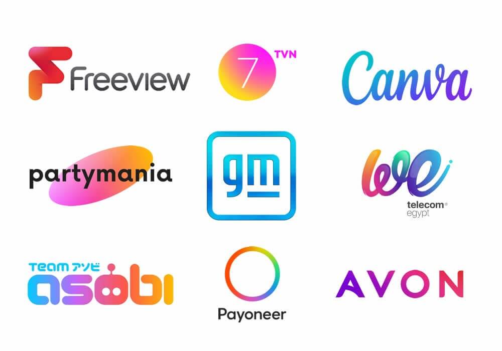
For the last few years gradients have been on the rise especially since last year we saw a huge amount of logos designed with gradients, even icon designers have been slapping a random type face next to their brilliantly designed gradient icons and creating logos.
Gradients play a big part in all areas of design, these visually striking gradient colour transitions are also a big web UI design trend for 2022.
Colour can play a big part in logo design. It adds depth, volume and dynamics really grabbing the viewers’ attention, but it’s good practice not to rely on it too much on colour, make sure your logo is legible and works well in black and white first.
Geometric shapes
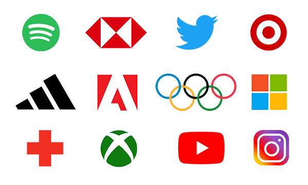
The best thing about geometric shapes is they are simple and easy to remember when going for a recognisable and memorable logo design. Geometric logos can be bold, versatile, and very well balanced and easily scalable.
Adding other 2022 logo design trends such as gradients and overlapping is a really creative way of making a logo design stand out. Geometric shapes have been around forever, but we are confident they will continue to be a popular design element for logo design in 2022.
Optic Illusion
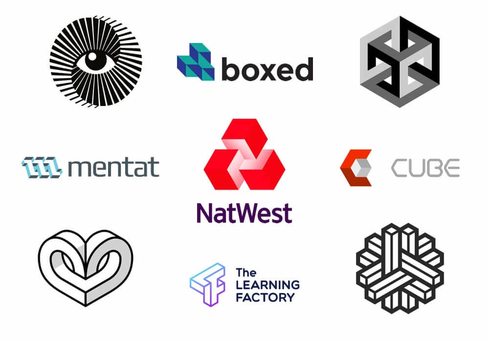
For a logo designer to be able to create a logo design that has an optical illusion, they need to experiment with colours, geometry, and perspective. Seeing a unique visual that makes the viewer thing and study keeps them looking at the details until it clicks and they have that wow moment.
Hand Drawn Logo Design
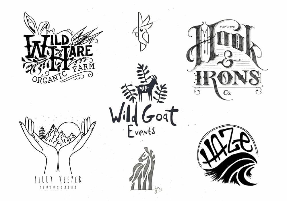
When it comes to designing logos, the most important factor to consider is to design something unique and different to what is already out there.
Similar to a person’s signature, a custom hand drawn logo concept is truly one of a kind inscription allowing the ultimate creative freedom to express brand values and personality in the most accurate ways.
There is no doubt that hand drawn elements bring that human and personal touch to a brand logo design. These types of logos are very approachable for those who interact with them.
We saw a big shift in hand drawn logos over the last couple of years with more and more designers brushing up on their drawing skills to create some really unique ideas and concepts.
The beauty of hand drawn logos is that we can appreciate the tiny imperfections and details allowing authenticity to shine through. This approach is unique and organic, giving a sense of realness to a logo design.
When it comes to logo design ideation there is no better way to start than with a pencil and paper.
Sketching gives the designer freedom and flow to ideate ideas directly from their mind onto paper, these ideas can then be brought to life digitally as a hand drawn logo design.
Be ready to see more of this logo design trend in 2022.
Join The Logo Community
We hope you have enjoyed the Top 12 Logo Design Trends For 2022. If you would like more personal tips, advice, insights, and access to our community threads and other goodies, join me in our community. You can comment directly on posts and have a discussion.
*TIP – We use and recommend DesignCuts for all your fonts, mockups and design bundles.

