Last year was not the best year and it’s been challenging for everyone, after a less than ideal start to the new decade it’s already screaming for a rebrand itself. In this article we discuss the Top 20 Logo Design Trends For 2021.
We have been researching logo design trends from designers we have interviewed from around the world and popular platform logo designers display their work.
In last year’s article for logo design trends for 2020 innovation was at a peak with the focus being on reinvention through new technologies, while this year it’s innovative with constraints. The world feels it and so do a lot of businesses around the world.
Some of these predictions will not be a surprise to you and it’s no secret that minimalism is continuing to be on the rise and each of these styles will be used in a minimalistic way.
When it comes to rebrands in 2021 brands will be playing it safe and thinking smart, relying a lot on old favourite design styles. You can also read our article about the top 17 brand design trends we’ll see in 2021.
Table of Contents
Simplicity and Minimal Logo Design
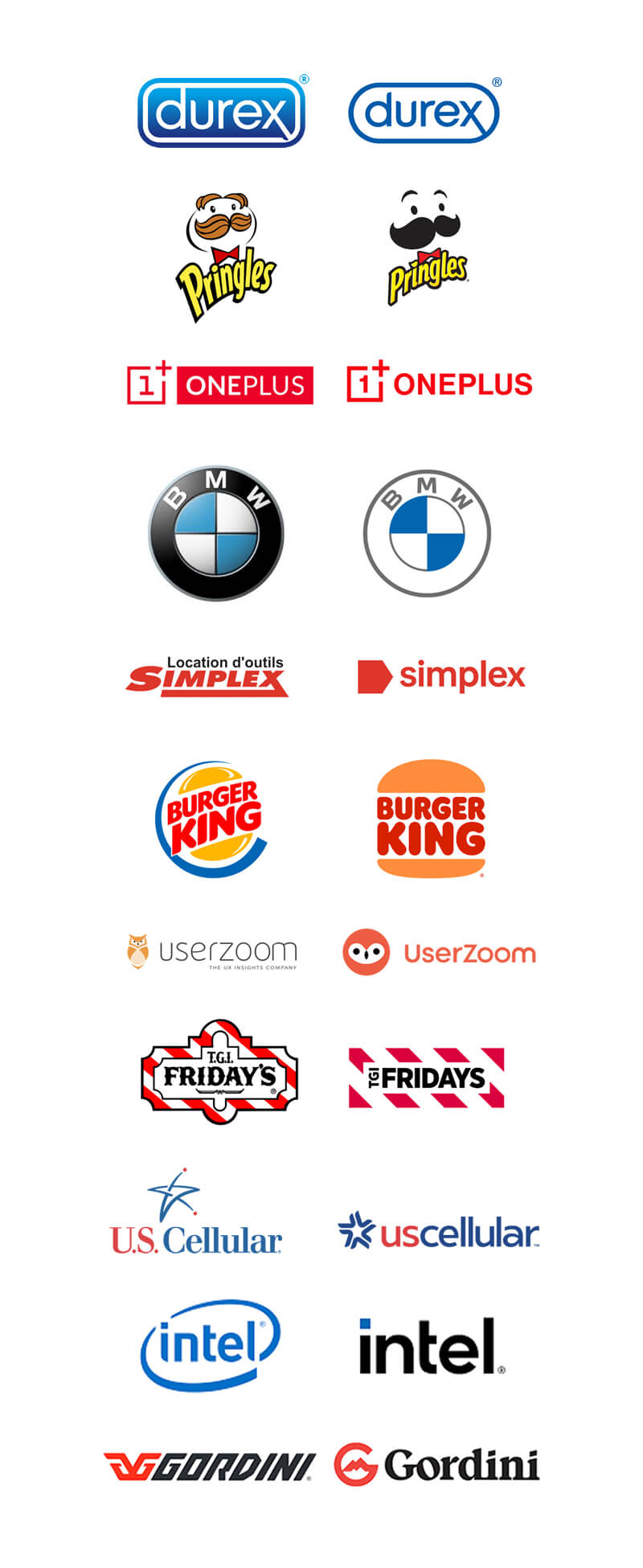 It’s no secret the over complicated logos are not the way to go, simplicity and minimal logo design has been popular for quite some time now and logos are getting simpler as the years go on.
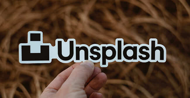
If you have a new logo design, re-promote it and let your audiences rediscover it. Branded merch, such as custom stickers, can help you out. Unsplash team created a new simplified logo; the team turn the logo into stickers and distribute to the contributors, who are happy to incorporate the new touchable and portable “logo” into their photography, and this campaign worked well and received a good response.
The long-standing trend of making the logo simpler is not going away anytime soon, and we have seen a lot of companies making their logos simpler so expect to see more minimal logo design concepts in 2021.
Simplicity in design to me is a principle of design and as a designer I always look for ways to make it as simple as possible without overcomplicating things.
Especially in logo design it’s not about what you can add but what you can take away and still communicate effectively and be memorable, while also remaining appropriate and legible and to me that’s what good design is all about.
Wordmark Logos
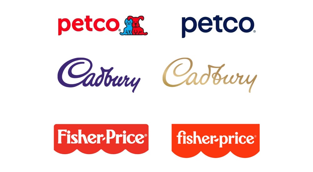 Wordmarks have been around forever so it’s not a new style on the rise.
The design concept of a wordmark is to use the brand name (text /lettering) but styling it in a unique way to make it unique to the brand as the brand name as a mark, hence the term “wordmark”
Logo designers are always looking for ways to push the boundaries with wordmark logo design and it never gets old.
We have seen more and more brands dropping their icons and opting to go the wordmark route, adjusting their custom type and overall cleaning their designs up for a more simplistic feel and this will continue in 2021 as a well-designed wordmark when done right works a treat for the brand as they are remarkably recognizable forms of logos.
Inventive Typography
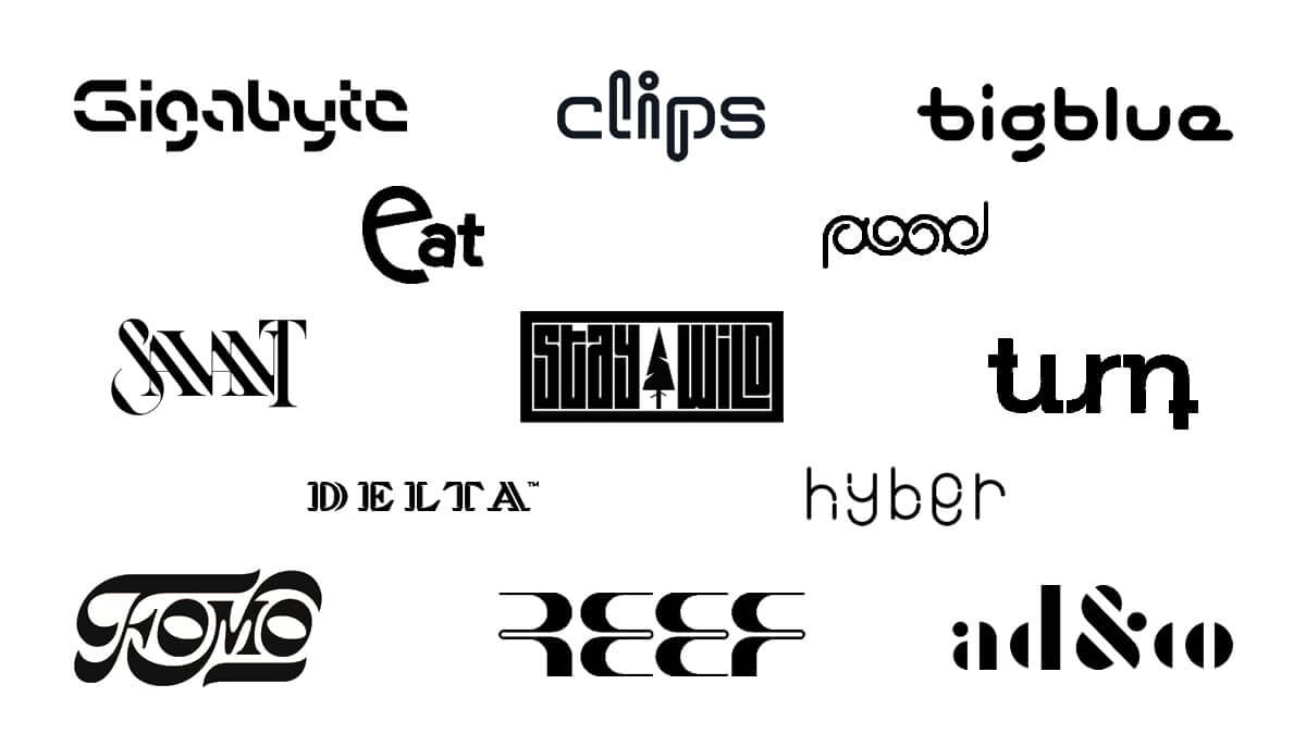
While on the subject of wordmark logo design, we have noticed a big shift in inventive typography.
By having a wordmark logo, logo designers are getting creative with typography to emphasize a brand personality with an inventive typography solution.
What’s great about inventive typography is that with the simplest of standard fonts, you can create the most obscure logo concepts.
The key with inventive typography is your imagination! Let the creative juices flow, but remember that a logo design must be legible and easy to perceive in the eyes of the consumers.
Disappearing Letters

While on the subject of manipulating typography with your own inventive type, we have seen a rise in wordmark logos with parts of letters missing.
It’s a unique way of grabbing attention with a wordmark logo by simply fading its colour or leaving a line unfinished.
It’s visually appealing and can be a tricky technique to pull off. It’s one of those styles that you need to be careful with as you risk if you go too far losing legibility within your logo design. You just need to be aware of how far to go with it to remain legible.
Black and White Logo Design
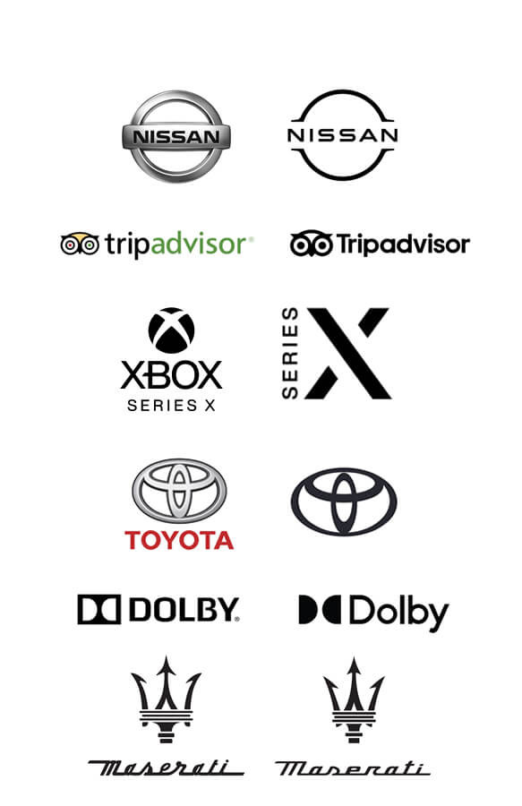
I’m a sucker for black and white logos but that’s not the reason it’s on this list.
These classic black and white logo designs never get old and always inspire a clean, minimalistic design.
It’s no secret that a well-executed black and white logo will win every time, its direct and sophisticated while still moving forward with new styles.
Black and white will be another major style that we will continue to see in logo design in 2021 as its simple and minimalist while sparking maximum style and huge impact.
It’s been rater popular with car brands and we have also seen a lot of other companies going for clean black and white logo designs.
Gradients and Vivid Colours
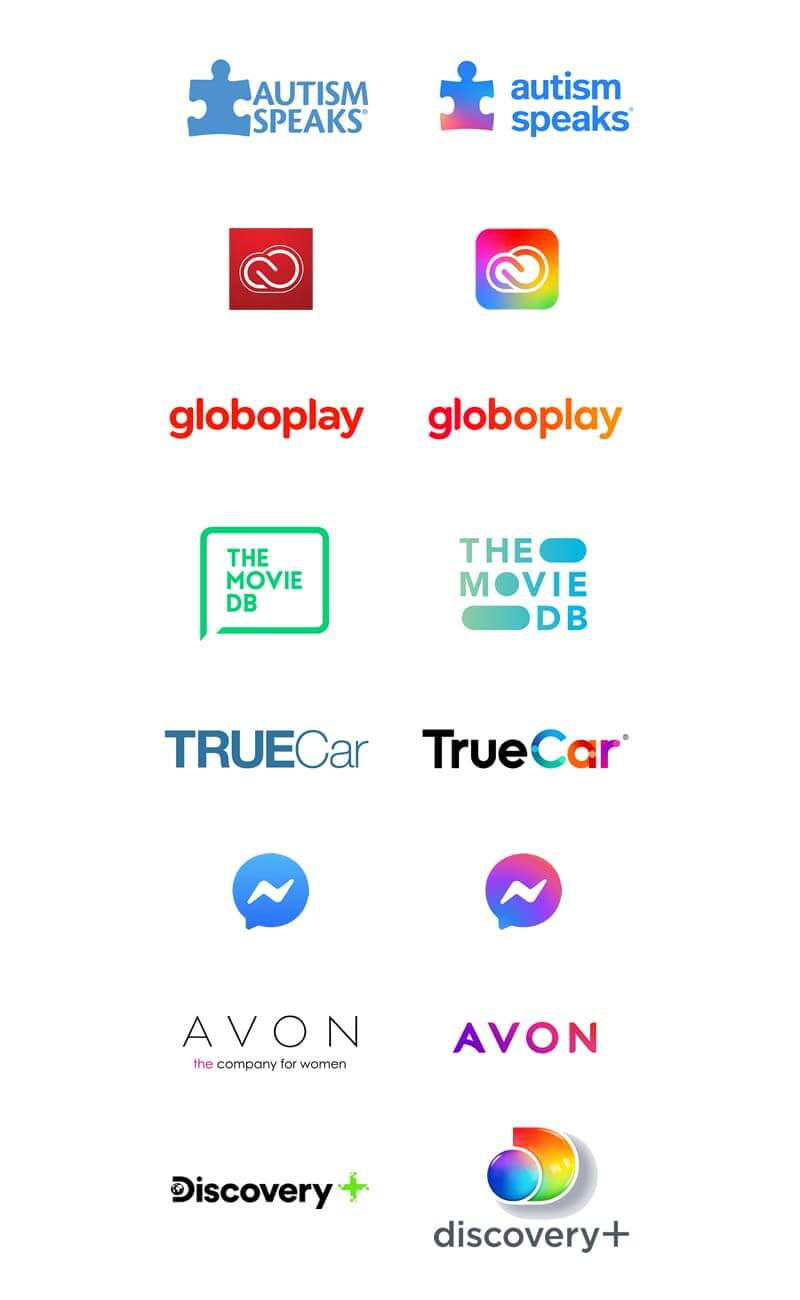 Even though black and white logos are a classic style that’s hard to beat, colour in graphic design is such an important element in creating visual emotion and feeling towards a design especially logo design.
Gradients and vivid colours are more than a fly by style and trend of design, I truly believe that gradients have finally returned with both feet firmly under the table.
There was a time when gradients and bright vivid colours were unpopular among designers and consumers but over the last few years they seem to be a popular style among logo designers.
I must admit they are not always appropriate and I hate seeing logo designers designing gradient logos all the time as it makes them look like a one trick pony and unoriginal.
But having said that, I find some really nice designs out there where the gradient and vivid colour concept works well for the brand it’s been designed for but giving it a solid visual impact.
Some older out of touch logos that are out there could benefit from a gradient bringing them in today and transforming them into a new look.
Fine Lines
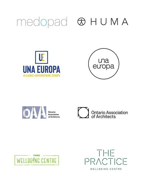 A fine line logo is like a logo design that has been neatly drawn with a super sharp fine line tip.
The fine line logos are super sharp and crisp. When executed correctly it’s a beautiful technique that relies heavily on the use of sans-serif type and some simple geometry.
Using fine lines only, the outcome will be an easy to scale, elegant piece of design that will look equally perfect across multiple surfaces.
Monogram Logo Design
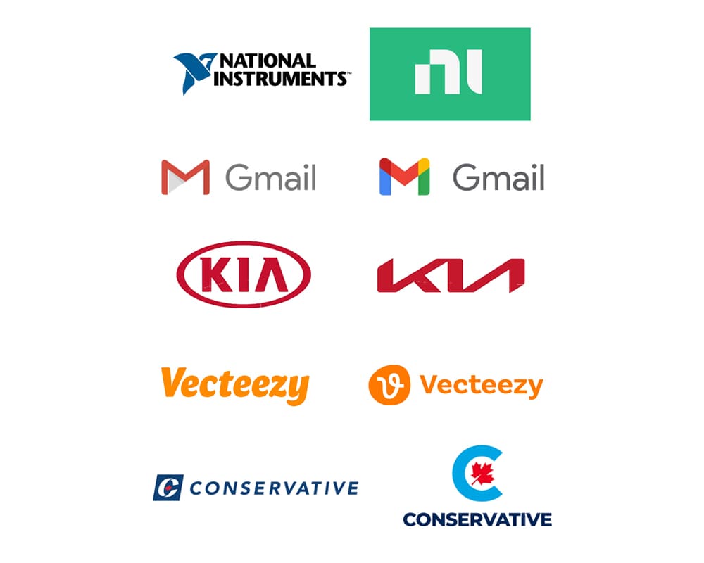 Monogram logo design has always been a staple style since they became popular in the 19th century. A lot of logo designers turn to creating monograms when creating a logo so it’s not a new style in the logo design world.
We are seeing a rise in monogram style logos, especially with enhanced negative space, bold geometry and stacked elements.
Monograms will always be a popular style and with this method of design you have a great chance of creating something memorable for a brand.
Simplistic geometry
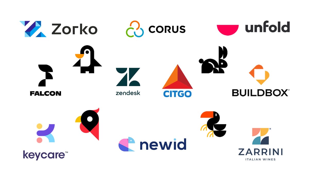 The power of simple shapes such as squares, circles and triangles form the foundation for solid imagery.
Never underestimate the power of pure simplicity in design. Graphic designers especially in logo design, will be taking full advantage in 2021 as simplicity in graphic design is on the rise.
Overlapping Geometry
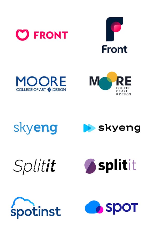 Simple geometry is on the rise and so is overlapping geometry, and it’s a great way to go about a bold logo design concept.
Simple geometric shapes in logo design have been around forever and never really faded but we are seeing a major rise in simplicity and simple geometric shapes are being used more and more.
Designers get creative with simple geometric shapes by overlapping them and creating some pretty cool looking shapes and images by simply overlapping and merging shapes, leaving some really unique effects and colour blends.
Think MasterCard logo!
Symmetry – Symmetrical Logo Design
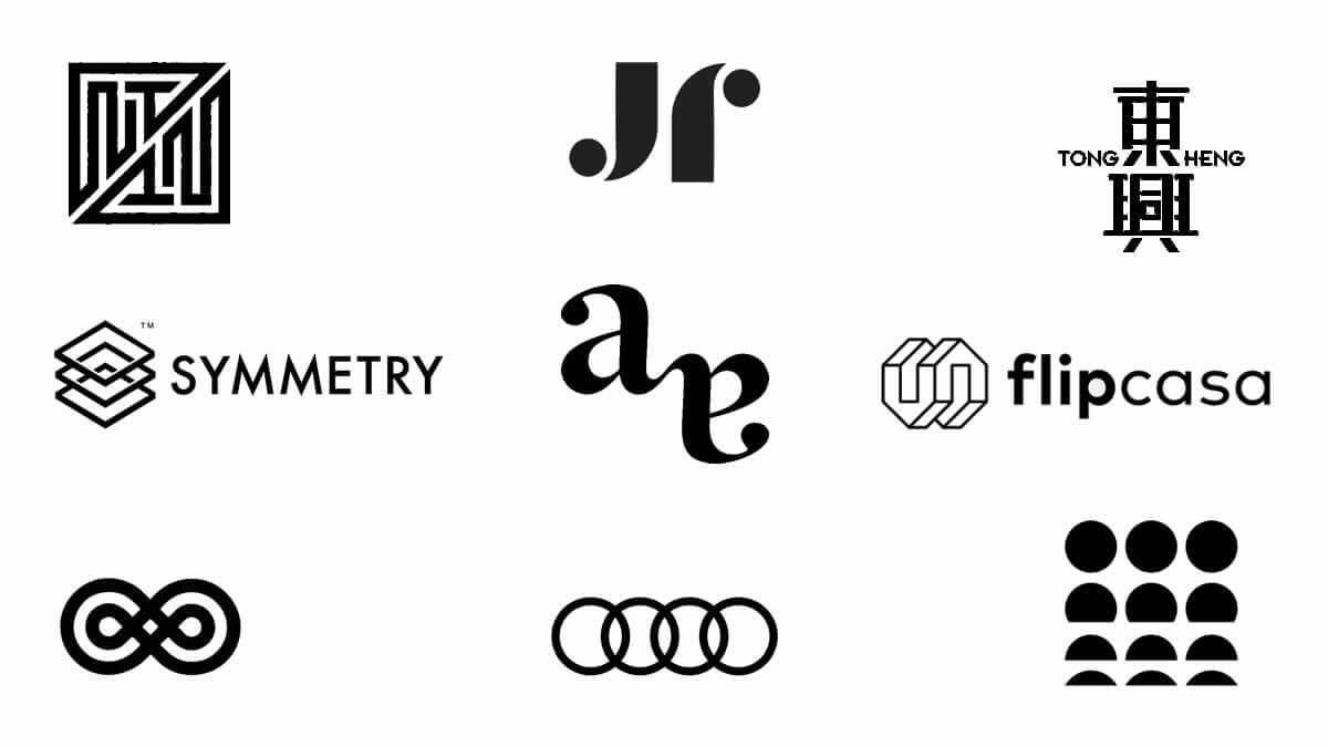
There are a range of design principles and balance is an essential element when it comes to logo design.
Symmetry is perhaps the biggest expression of balance. The symmetrical logo design is identical on both sides when you cut it down the middle.
A symmetrical design is all about strength, similar to a building no matter how tall or complex they may be in their design, they are designed to be firm on the foundation and stand their ground, and this is achieved through the perfect symmetrical balance.
Well Balanced Logos
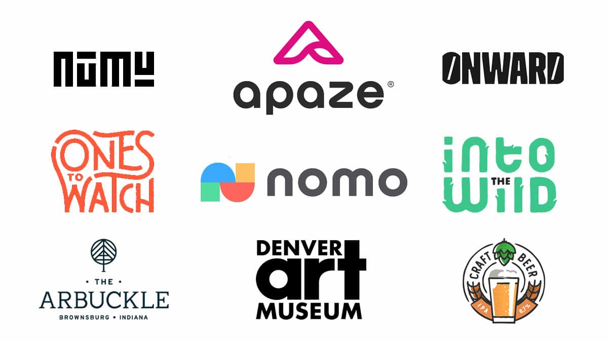
Speaking of balance…Balance has always been important in graphic design especially logos, a well-balanced logo is easier on the eyes and gives the feeling of reliability and a solid brand in the eyes of the consumer.
A clean, well balanced logo design uses a sans-serif typeface and symmetric arrangement creating a clean and simply formed logo concept.
Not exactly a trend, but balance is a principle all good logo designs aim to adhere to, and with the rise of simplicity, balance will play a major role.
Negative Space Logo Design
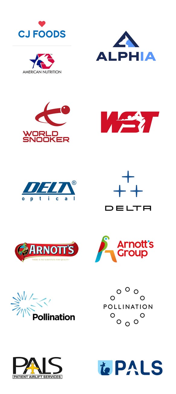
While negative space logos can appear simple, they are quite technical to pull off. This clever form of design is like wizardry and when it works well its hypnotizing to the viewer drawing attention and sparking some major impact.
Negative space logo design is a blank space section of a logo inside or around a graphic element or letter from, and this blank space can really work like magic if pulled off as a clever concept.
The great thing about a well-executed negative space logo design although they are tricky and technical to pull off, once finished they don’t look complicated in their design and still marry well with simplistic and minimal logo design.
Negative space logos are not a new style of design as they have been around for years. This type of logo style is permanently at the top of the table and we will continue to see more and more of these clever logos being executed and mesmerizing our minds.
Flat Based Logo Designs
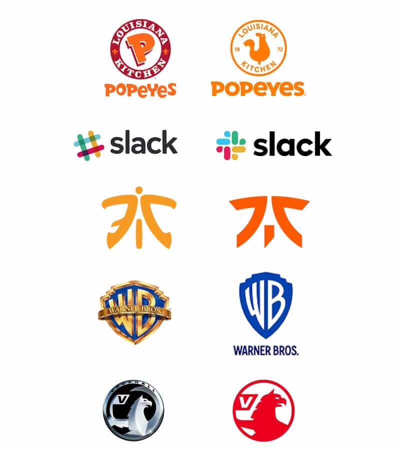
Flat design has been making its comeback for quite a few years now and it does not seem to be slowing down.
A flat design is a design that does not attempt to create an illusion of depth or dimension in any shape of form.
When it comes to logo design there was a time when logo designers moved away from retro style and started using 3D effects and incorporating gradients in the process.
Although great at the time… these logo design styles look outdated.
Logo designers today opt for a cleaner flat logo design style, staying away from unnecessary details that overcrowd and clutter the logo design.
Flat logo design has become the standard among logo designers.
The great thing about flat design is it’s cleaner and simpler and easier to replicate on a wider variety of backgrounds, textures and surfaces.
This style and method adds to making the logo more versatile and functional, looking more modern in the eyes of consumers.
The style of the flat design is not going away as it’s become a standard in logo design, keeping brands looking relevant in their respective industries.
Static Motion
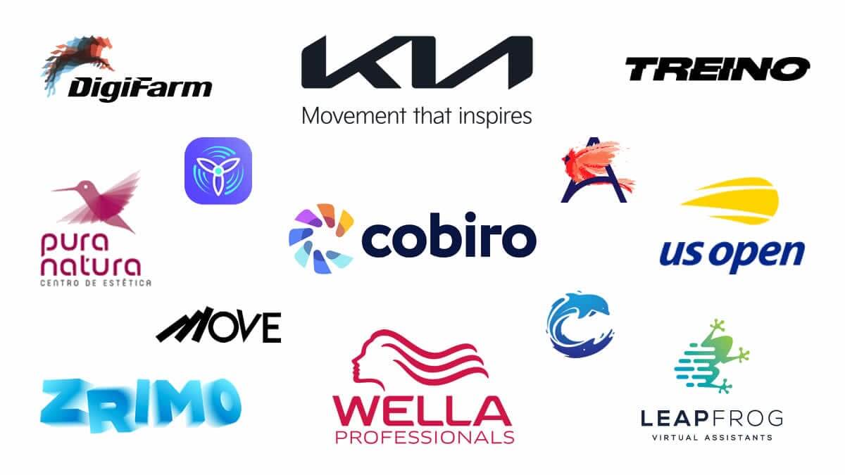
We have seen the rise of animated motion logos rise in popularity.
As technology advances it’s become easier for these motion-based logos to be brought to life.
Logo design in 2021 will challenge logo designers to create static motion effects in their logo designs giving a sense of motion in a motionless logo design.
It is becoming increasingly popular with tech-based brands looking to innovate in their industry. It also reminds consumers that a brand is much more than products and services it’s a living entity.
Animated logos
Even though static motion logos are on the rise animated logos will still be popular as we saw a rise of motion logos last year.
A well-designed logo that is animated appropriately does draw the eye and hold the viewer’s interest.
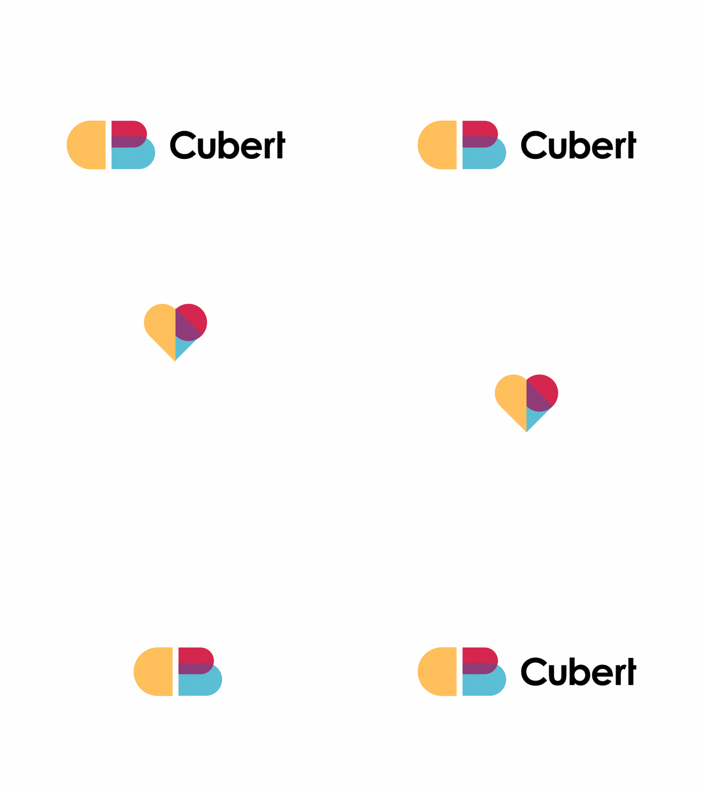
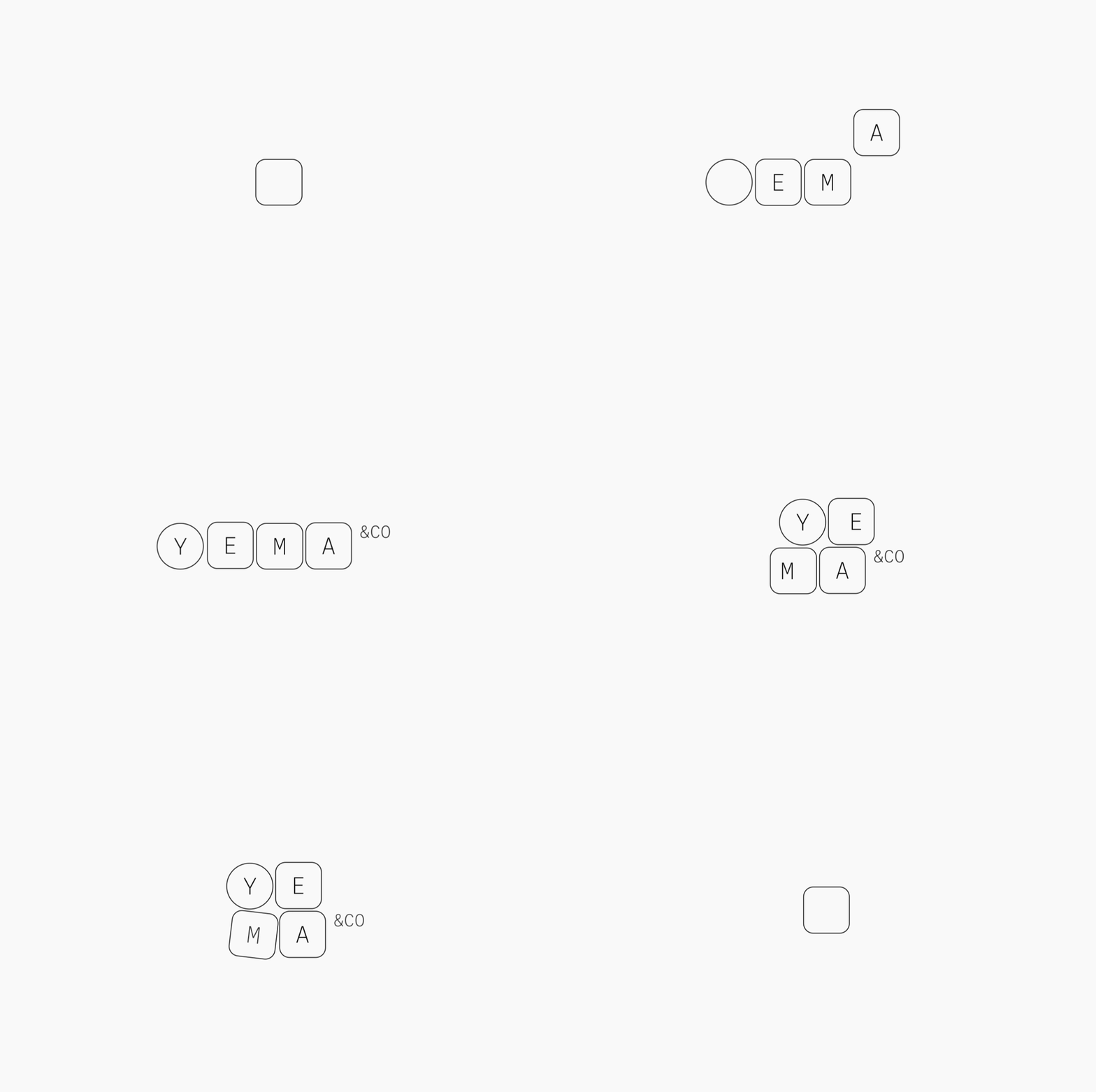
Even though a logo is motion designed, as you can see below from Cubert and Yema & Co the use of other styles such as simple geometric shapes, overlapping geometry and thin lines can be incorporated into a design keeping it in line with current styles. Another example is GoDaddy’s Logo Icon which also uses an overlapping geometric style.

Analogous colour schemes
With every year that passes by we as graphic designers expect to see certain techniques that amaze and dazzle our eyes. Such design techniques that could possibly revolutionise graphic design.
Analogous colour schemes are something a student graphic designer will be taught during their early years in colour theory.
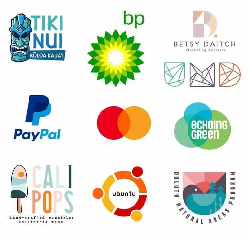
This essentially means pairing colours that are next to one another on the colour wheel, and the result is a scientific approach to creating harmony (in place of the contrast of opposing colours).
As most graphic designers know, analogous colour schemes are not a new thing in graphic design and have been around for quite some time, but they seem to be on the rise in logo design as we see this technique being used more and more.
We know colour is such an important tool available to graphic designers, especially logo designers as it is so important in creating visual emotion and visual harmony is going to be an important factor in 2021.
Nature-inspired Logo Design
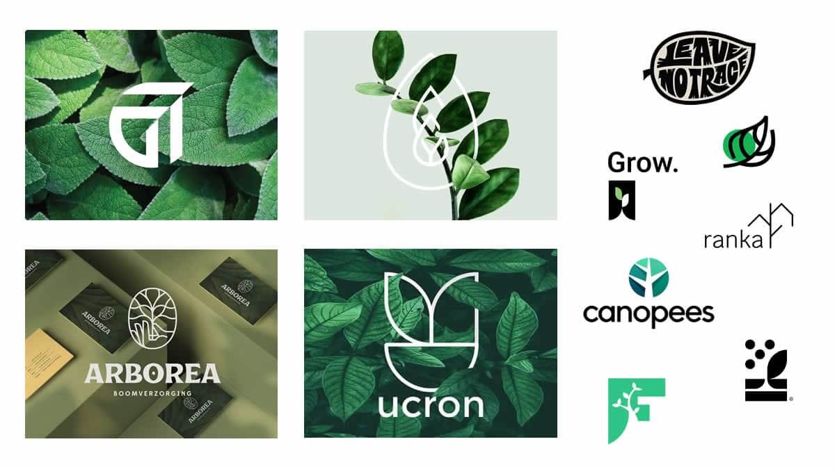
Nature inspired design has always been a thing, most of us designers get our inspiration from the great outdoors, I know I do right when you don’t expect it and from something as simple as a leaf or a funny shaped tree.
With everything that’s going on in the world and peoples freedom been taken away people are looking for a sense of calmness and harmony in their lives.
A breath of fresh air and new growth to new beginnings is what we are all looking for and I think you will all agree that this design concept is more appropriate now than ever before.
Look out, this one is going to take over like the unattended overgrown weed in your garden.
Artistic Chaos
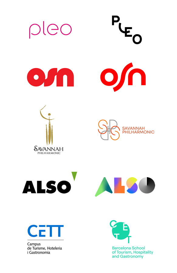
Let’s break all the rules and be unique…lets go creative crazy as we have free rein to experiment however, we want.
Manipulate your type, scatter geometric shapes on your canvas, use vivid colours and go wild with your gradients, the choice is yours, there are no rules to adhere to!
We saw the rise of Artistic Chaos last year and it’s not going away anytime soon.
Using this design technique is a great creative way of showing personality and creativity within your brand.
But bear in mind that you need to be reasonable when applying elements to your design, it still needs to be easy to read and understand by the viewer.
So don’t give them a headache and leave them confused by your design, its artistic chaos not artistic mess.
Always think about legibility with logo design!
Final Thoughts
These logo design trends or as I prefer to call them logo design styles don’t exist in isolation, and It’s also very rare that a style is limited to a single year.
It’s no secret that I am not a fan of the word “trend” as this insinuates a short life span and with logo design I aim and strive for longevity and appropriateness for years to come that is un-reliant on style but appropriate for the brand it’s representing and to me that’s icon logo design.
I’m more accustomed to the term “style” and what I like to see is new styles and methods emerging that become more than just a fly by trend that everyone jumps on because it’s popular.
A logo design style should be used because it’s appropriate for what it’s representing and this is my mind set of thinking when designing logos not style alone.
I design for the brand its representing and the people who engage with it not just for the sake of style so I can say I used the latest trend.
If I happen to use a so-called trend it’s because it’s appropriate! Don’t be tempted to follow logo design trends just for the security of knowing they are popular at the time as time moves forward so fast things that are popular now don’t always stay popular so design for the brand and its consumers not style!
I believe these logo design trends and styles will continue to be popular choices for logo designers in 2021.
It’s a pretty good list this year with a lot of firm styles that have been around for some time and will never go away anytime soon, but will be highly used throughout 2021.
A well-designed logo communicates business expertise, while a badly designed logo sends out the wrong message to your target audience and will in-turn fail to make a good first impression.
As we wrap-up this article with the final word of caution, we advise logo designers to proceed with logo design trends with care, and encourage them to seek appropriate and unique ways of getting a visual message across that will stand out but also stand the test of time.
For some further reading, checkout: 6 graphic design trends that will be huge in 2021.
Checkout some: popular sans serif fonts at Creative Fabrica
Or checkout: Top Mobile & Web design Trends in 2022
Join The Logo Community
We hope you have enjoyed these Top 20 Logo Design Trends For 2021. If you would like more personal tips, advice, insights, and access to our community threads and other goodies, join me in our community.
Learn from our Founder Andrew who personally writes our community newsletter. You can also comment directly on posts and have a discussion.
*TIP – Are you looking to Learn Adobe Illustrator CC? Look no further.
This Illustrator CC MasterClass course will set you up with a solid foundation to become a confident Illustrator CC designer. Join over 900 students who have already signed up for this course.
Normally £399 – Now only £20 for a limited time. Don’t wait – Claim Your Seat!

