In many ways, building a company is akin to raising a baby. They both start with conception, and then you nurture it/him for years while loving them more than anything else. So, it goes without saying that when you are designing a professional logo i.e. the face of the company, you want it to be the very best. You don’t want to compromise, and you shouldn’t, for the logo is more than just an attractive design that carries the name of your company, it’s the symbol for everything that the company stands for.
If you want to design a company logo that’s unique, polished, appealing to the eyes, and most of all- projects the exact message that you have in mind, then the following tips should be able to help you:
Table of Contents
Understand your colors
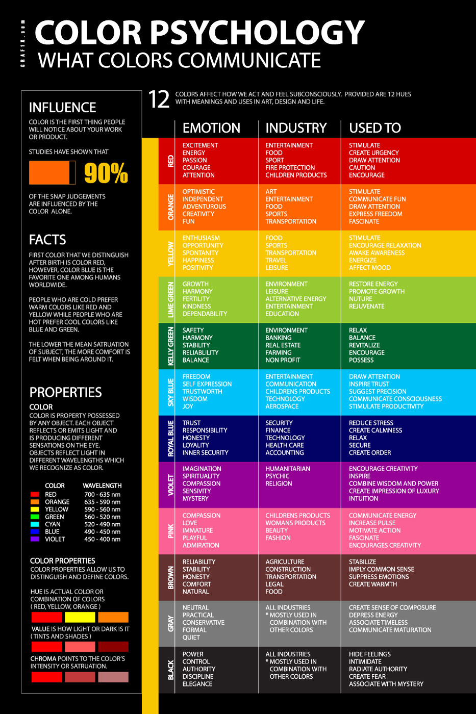
When it comes to logo designs, then you can’t pick colors as per your personal preferences. This is because each color represents something, and you want to pick the right colors to send across the right message.
Let’s take a look at a few popular colors and see how some of the most famous brands have used them properly:
- Yellow: Yellow is an optimistic and cheerful color. This is the reason why it’s been used by brands like Snapchat, Ikea, and Best Buy to suggest good customer service and brand reliance.
- Red: When you want to convey a feeling of enthusiasm, passion, and excitement, then you can’t go wrong with Red. Well, take a look at Coca-Cola whose logo is primarily based on Red. It picked it to aptly represent the passion for life which it actively uses in its marketing campaigns. The same ideology is followed by Vodafone which also uses red in its logo.
- Blue: Blue says “I am dependable, I am trustworthy”. Powerful brands which people trust their money with such as American Express, JP Morgan, etc. are case in point.
Colors have a huge impact on your brand. Furthermore, there are many ways to use color to bolster your personal brand too. Thus, you must select the color palette carefully. Additionally, the combinations should also allow for a logo to look good even when recreated in pure black and white colour.
 Use a Custom Font
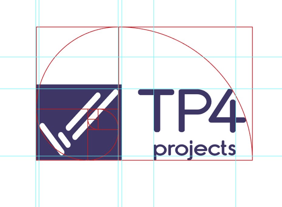
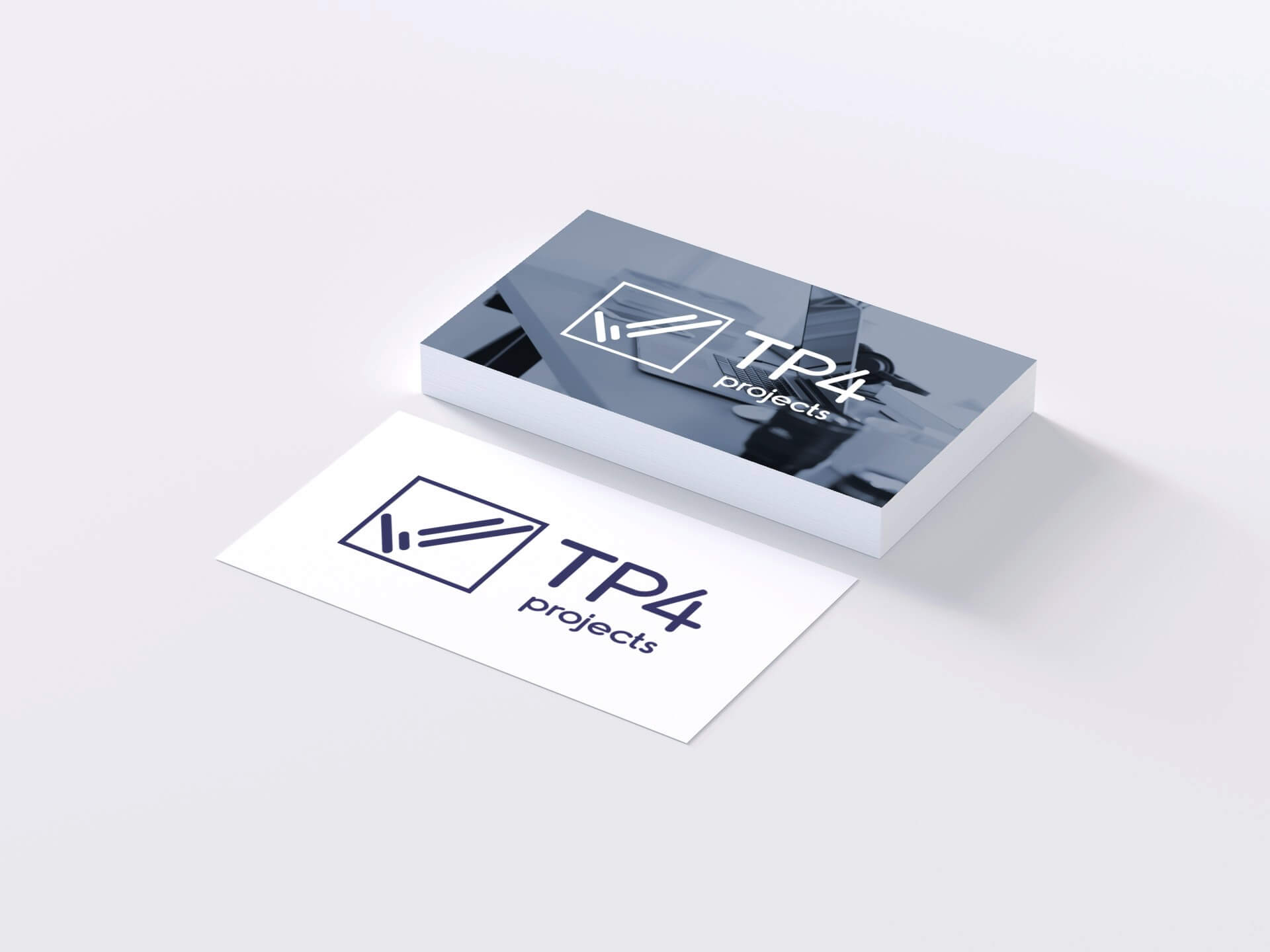
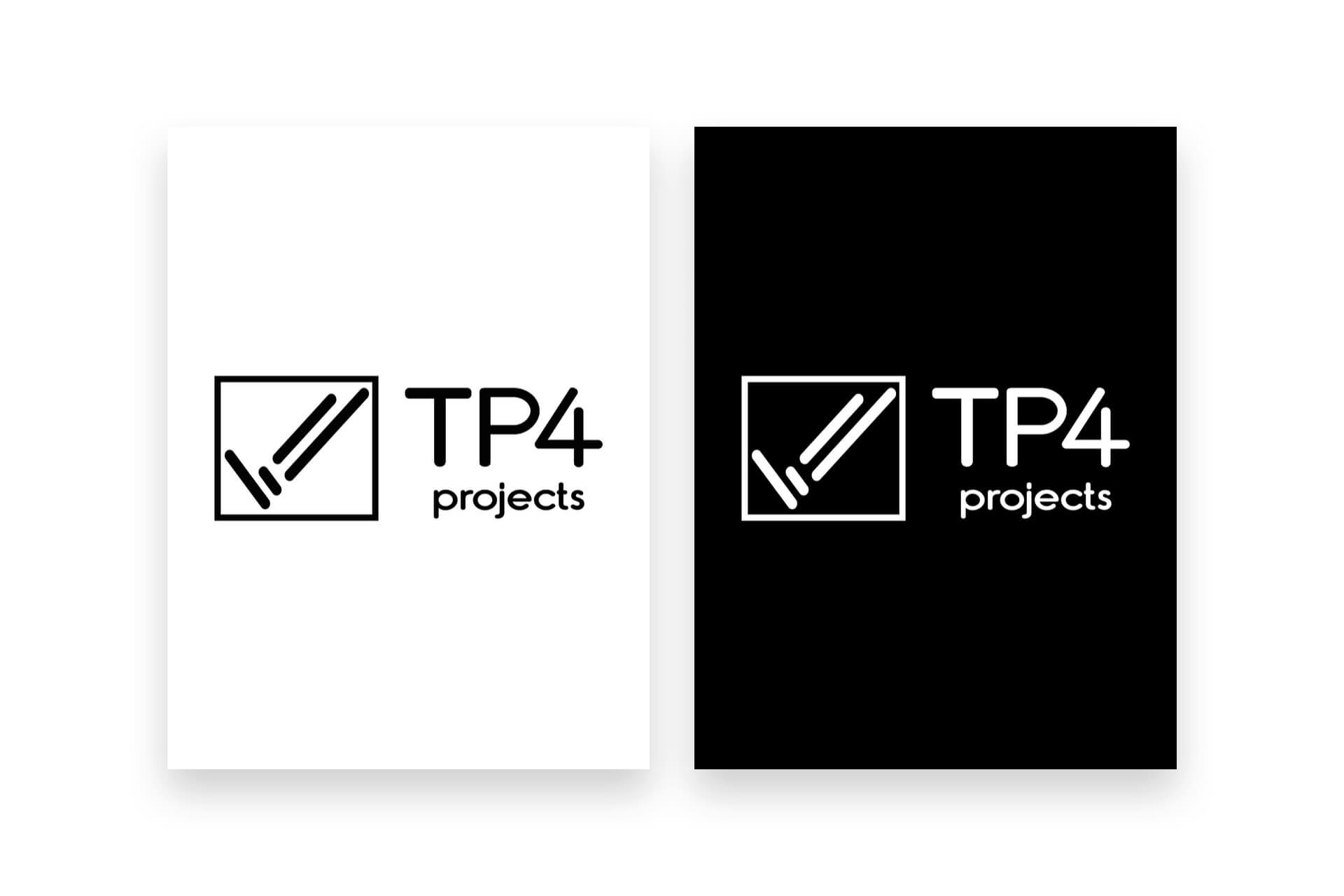
Even though you can easily find millions of fonts to choose from when designing your logo, you can’t just pick the first “decent” one that you come across. This is because the font plays a huge role in branding, especially when we talk about a wordmark or lettermark logo. The design below is what we did for TP4 Projects, we created a custom icon and typeface so its unique to their brand. You can read about the TP4 Projects Case Study.
It’s important to pick a font that touches the right emotions:
- Formal, Reliable: Didot, Georgia, Times
- Elegant, Classic: Snell Roundhand, Buttermilk, Edwardian
- Friendly, Contemporary: Josefin, Museo, Clarendon
However, it’s also important that it’s unique and attractive. After all, how else can you make your brand stand out? Creating an original design isn’t enough. You also need an uncommon or rather an original font. Just take a look at the logos of Coca-Cola, Pinterest, Disney, etc. all of which have distinct and pleasing typefaces.
Keep it Simple
You can talk to any marketing expert, and they will tell you that complicating a logo design is one of the biggest branding mistakes to avoid.
When you have the brush and palette in your hands, you may want to show your creative side and experiment with different geometries, fonts, color techniques, etc. However, the truth is that the simplest designs are the most effective.
Consider Apple Inc which is one of the biggest tech companies in the world. You would think of a tech company you don’t think of a simple fruit shape you think complicated. However, what they did was pure genius! and simplicity at its finest!… Surprise, surprise?
What you may not notice is that it’s the bite that makes the Apple logo so unique and impactful. A simple Apple icon wouldn’t have been as effective.
Another great example of a simple logo design is Nike. It’s a “tick”, a symbol that says “just do it”. This kind of brevity creates the biggest impact.
Be Bold, Avoid Cliché
It’s not hard to be creative. However, you must be willing to work for it. The thing is, the first few ideas you come up with for your logo aren’t going to be the best ones. That’s a part of the process. In fact, the first few ideas are most likely to be “ok-ish” or dull, even. However, as you will throw one unsatisfactory logo design after another in the bin, you will begin to notice the progress and eventually you will have the perfect design.
For you to harness the power of bold and simple brand ideas, you must avoid the cliché. It’s ok if you want to take inspiration from other popular designs. However, in the end, you have to create a unique product that’s unlike any other design in the market. Only then you can expect the kind of impact you want from your brand.
Conclusion
Designing a professional logo can be quite challenging if you don’t know what you are doing. A lot of people oversimplify the process and can be satisfied by slapping the brand name over a colored circle or rectangle. However, that’s a sign of a poor logo which is ineffective and simply a waste of time plus its unprofessional and will harm your brand and your business in the eyes of the consumers.
If you are serious about creating a brand, then you should hire a professional logo designer that can create a powerful logo for you. What’s important is that you don’t compromise and understand the significance of a quality company logo. Do yourself and your brand a favor and invest in a professional logo designer and don’t use an online logo maker that will basically produce a generic design that’s probably been used a number of times or a similar look and feel by different businesses using these services.
It will be cheaper at first but you get what you pay for a generated online logo that’s had no human involvement it just generates a design based on a few questions and basically has a bunch of designs set for certain answers you can do it a number of times and it produces the same result. Once you invest in a human who is a professional logo designer with experience in creating logos and it’s done correctly it will never have to be done again and you can reap the rewards!
If you would like more personal tips, advice, insights, and access to our community threads and other goodies join me in our community. You can comment directly on posts and have a discussion.

