In this article we discuss Unlocking the Magic of Logo Design: A Guide to Creating Memorable Logos.
Logos play a crucial role in establishing a strong brand identity. They serve as the visual representation of a company or organization, acting as a symbol that encapsulates its values, personality, and offerings. A well-designed logo has the power to leave a lasting impression, making it a vital asset for any business looking to stand out in a crowded marketplace.
Table of Contents
Purpose of the blog post: Creating Memorable Logos
Welcome to our comprehensive guide on Creating Memorable Logos! In this blog post, we’ll take you through the essential steps and principals involved in crafting a logo that captivates your audience and leaves a lasting impact. Whether you’re a designer, entrepreneur, or someone interested in the art of logo design, this guide will equip you with the knowledge and tools necessary to create logos that truly shine.
Our goal is to provide you with actionable insights and expert tips that will help you navigate the logo design process effectively. We’ll dive into the key elements of logo design, explore the psychology behind colours and typography, and unveil the secrets to crafting a memorable and visually appealing logo.
Throughout this guide, we’ll use a clear and concise tone, ensuring the information is easy to follow and understand. We want this blog post to be both informative and educational, empowering you to unlock the magic of logo design. So, let’s jump right in and discover the secrets to creating logos that leave a lasting impression!
In the next section, we’ll explore the fundamental elements of logo design, laying the foundation for your journey to logo greatness. So, grab a notebook and let’s get started!
Understanding the Elements of Logo Design

In the world of logo design, understanding the fundamental elements is crucial for creating memorable and impactful logos. Let’s explore these elements in detail:
1. The Power of Simplicity: Importance of Minimalistic Designs
Less is more when it comes to logo design. Simple logos have a higher chance of being memorable and versatile. Here’s why simplicity matters:
- Instant recognition: A clean and uncluttered design allows for easy recognition and quick comprehension of your brand.
- Versatility: Simple logos are more adaptable across different platforms, sizes, and applications, ensuring consistency and recognisability.
2. Colour Psychology and Its Impact on Logo Perception
Colours have the power to evoke emotions and influence perceptions. When choosing colours for your logo, consider the following:
- Brand personality: Select colours that align with your brand’s personality and values. Warm colours like red and orange convey energy, while cool colours like blue and green evoke calmness.
- Audience appeal: Different colours resonate with different target audiences. Research your audience to ensure your colour choices resonate with them effectively.
3. Typography: Choosing the Right Fonts for Your Logo
Typography plays a vital role in conveying your brand’s message and personality. Consider the following tips when selecting fonts for your logo:
- Legibility: Opt for fonts that are easy to read, even at smaller sizes or from a distance.
- Brand voice: Choose fonts that reflect your brand’s tone and personality. Playful, bold, or elegant fonts can convey different brand characteristics.
4. Scalability and Versatility: Designing for Various Applications
A memorable logo should be scalable and versatile to ensure consistent brand representation across different platforms and applications. Here’s what you need to keep in mind:
- Different sizes: Your logo should maintain its impact and legibility, whether it’s displayed on a small business card or a large billboard.
- Various mediums: Consider how your logo will appear on different mediums, such as digital screens, print materials, or promotional items. Ensure the design works effectively in each context.
Understanding and mastering these key elements of logo design will set the stage for creating logos that are not only visually appealing but also memorable. In the next section, we’ll delve into the research and concept development phase, where we’ll explore how to create a logo that truly represents your brand’s identity. So, let’s dive in and unlock the secrets to creating memorable logos!
Research and Concept Development for Creating Memorable Logos
To create a truly memorable logo, it’s essential to lay a strong foundation through research and concept development. Let’s explore the key steps involved in this crucial phase:
1. Defining Your Brand Identity and Target Audience
Before diving into logo design, it’s important to have a clear understanding of your brand’s identity and the audience you want to appeal to. Consider the following:
- Brand values: Identify the core values, mission, and vision of your brand. What sets you apart from your competitors?
- Target audience: Research and define your target audience. Understand their demographics, preferences, and needs. What would resonate with them?
2. Conducting Competitor Analysis to Identify Unique Elements
Analysing your competitors’ logos can provide valuable insights and help you differentiate your brand. Here’s what you should focus on:
- Distinctive elements: Identify the unique aspects of your competitors’ logos. This will help you steer clear of clichés and create something truly original.
- Gaps in the market: Look for opportunities where your competitors’ logos fall short. Aim to fill those gaps and create a logo that stands out from the crowd.
3. Sketching and Brainstorming Logo Ideas
Now it’s time to unleash your creativity! Start by sketching and brainstorming logo ideas based on your brand identity and target audience. Here’s how you can approach this:
- Visual associations: Think about symbols, shapes, or images that represent your brand’s essence. Sketch rough ideas that capture those associations.
- Word associations: Consider keywords related to your brand and explore how they can be visually represented in your logo. Play with different typographic styles and compositions.
4. Refining Concepts and Selecting the Strongest One
Once you have a pool of ideas, it’s time to refine and narrow down your options. Follow these steps to select the strongest logo concept:
- Eliminate weaker ideas: Evaluate each concept based on its alignment with your brand identity and target audience. Discard concepts that don’t align with your goals.
- Feedback and testing: Gather feedback from colleagues, friends, or your target audience. Test the concepts for legibility, scalability, and memorability.
- Iterate and refine: Based on feedback and testing, refine your chosen concept further. Pay attention to details like colour, typography, and overall composition.
By investing time in thorough research and concept development, you’re setting the stage for a remarkable and memorable logo. In the next section, we’ll explore the principles and techniques that will help you bring your logo design to life. So, let’s move forward on our journey to creating memorable logos!
See our case studies for examples of research and concept development.
Creating Memorable Logos

Creating Memorable Logos requires careful consideration and attention to detail. In this section, we’ll explore key principles and techniques to help you create a logo that leaves a lasting impression.
1. Focus on Uniqueness and Originality
To stand out in a sea of logos, strive for uniqueness and originality. Consider the following tips:
- Differentiate from competitors: Analyze your competitors’ logos to ensure yours is distinct and doesn’t blend in.
- Avoid clichés: Steer clear of generic symbols or overused design elements. Seek fresh ideas that reflect your brand’s unique identity.
2. Incorporating Symbolism and Visual Metaphors
Symbols and visual metaphors can add depth and meaning to your logo. Here’s how to incorporate them effectively:
- Reflect brand values: Choose symbols or metaphors that align with your brand’s values and convey its essence.
- Simplicity and clarity: Ensure the symbolism is clear and easily understood, even at a glance.
3. Balancing Aesthetics and Functionality
A successful logo strikes a balance between aesthetics and functionality. Consider the following aspects:
- Clean and readable: opt for clean lines and legible typography to enhance readability.
- Scalability: Ensure your logo maintains its visual impact and readability across different sizes and mediums.
4. Test and Gather Feedback to Ensure Effectiveness
Testing and gathering feedback are crucial steps in the logo design process. Here’s how to make the most of them:
- Feedback from target audience: Share your logo with your target audience and collect their opinions. Consider conducting surveys or focus groups to gain valuable insights.
- Iterate and refine: Based on the feedback received, make necessary adjustments to enhance the logo’s effectiveness.
Remember, creating a memorable logo is an iterative process. Don’t be afraid to explore different ideas, seek feedback, and refine your design until you achieve the desired result.
In the next section, we’ll delve into design principles and techniques that will help you bring your logo to life. So, let’s continue our journey of creating memorable logos!
Design Principles and Techniques for Creating Memorable Logos
Design principles and techniques play a vital role in creating a visually appealing and memorable logo. Let’s explore key aspects to consider when designing your logo.
1. Proportions and Balance in Logo Composition
The proportions and balance of your logo are essential for visual harmony. Here’s how to achieve it:
- Symmetry and asymmetry: Experiment with symmetrical or asymmetrical compositions to create visual interest and balance.
- Element spacing: Ensure proper spacing between elements to maintain clarity and avoid overcrowding.
2. Visual Hierarchy: Creating Focal Points and Hierarchy of Information
Creating a clear visual hierarchy helps guide the viewer’s attention and convey the intended message. Consider these tips:
- Size and scale: Emphasize key elements by making them larger or bolder, drawing attention to important aspects of the logo.
- Contrast: Utilize contrast in colour, font weight, or shape to establish a hierarchy of information within the logo.
3. Grid Systems and Alignment for Precision and Harmony
Grid systems and alignment provide a framework for precise and harmonious logo design. Here’s how they can benefit your design:
- Grid-based layouts: Use grids as a guide for organizing elements, maintaining consistency, and achieving balance.
- Alignment: Ensure proper alignment of elements to create a cohesive and professional-looking logo.
4. Effective Use of Negative Space to Create Hidden Meaning
Negative space refers to the empty spaces within and around the logo. Leveraging negative space creatively can add depth and hidden meaning to your logo:
- Symbolic interpretation: Explore how negative space can form shapes or symbols that convey additional messages related to your brand or industry.
- Simplicity and memorability: Strategic use of negative space can make your logo more memorable by creating a visual surprise or clever representation.
By applying these design principles and techniques, you can elevate your logo’s visual impact and make it truly memorable. In the next section, we’ll explore the importance of colour and typography in logo design. So, let’s continue our journey of creating memorable logos!
Choosing Colours and Typography for Creating Memorable Logos
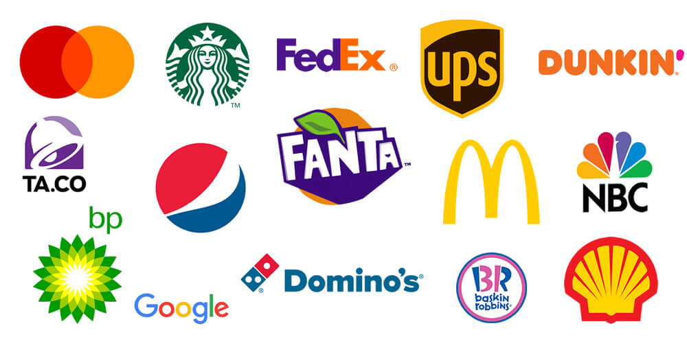
Choosing the right colours and typography is crucial for creating a memorable and impactful logo. Let’s explore key considerations when making these design choices.
1. Understanding Colour Theory and Its Impact on Emotions
Colours have the power to evoke emotions and convey messages. Here’s how to leverage colour effectively in your logo:
- Colour psychology: Familiarize yourself with colour meanings and associations to choose colours that align with your brand’s personality and message.
- Contrast and balance: Create a harmonious colour scheme by balancing contrasting colours to enhance visual appeal and readability.
2. Selecting a Colour Palette that Reflects Brand Personality
Your logo’s colour palette should align with your brand’s personality and message. Consider the following tips:
- Brand identity: Choose colours that represent your brand’s values, voice, and desired perception.
- Consistency: Ensure your logo colours are consistent with your overall brand colour palette for a cohesive and unified brand identity.
3. Typography Considerations: Legibility, Readability, and Brand Voice
Typography plays a vital role in communicating your brand’s message. Here’s what to consider when selecting fonts for your logo:
- Legibility: Choose fonts that are easy to read, even at smaller sizes or from a distance.
- Readability: Consider the readability of your chosen fonts across different mediums and backgrounds.
- Brand voice: Select fonts that align with your brand’s personality, whether it’s playful, sophisticated, or professional.
4. Creating Harmony between Colours and Typography
To create a visually appealing and cohesive logo, it’s important to establish harmony between your chosen colours and typography:
- Contrast: Ensure there is sufficient contrast between the colours and the typography for optimal legibility.
- Hierarchy: Use colour and typography to establish a hierarchy of information within your logo, guiding the viewer’s attention effectively.
By understanding colour theory, selecting a colour palette that reflects your brand’s personality, considering typography legibility and brand voice, and creating harmony between colours and typography, you can design a logo that is visually captivating and memorable. In the next section, we’ll explore the importance of scalability and versatility in logo design. So let’s continue our journey of creating memorable logos!
Read more about colour phycology in logo design.
Implementing the Logo Design
Implementing your logo design effectively is essential for ensuring its impact and consistency across different platforms and applications. Let’s explore key considerations when implementing your logo design.
1. Choosing Appropriate File Formats and Resolutions
To ensure your logo looks crisp and clear in various contexts, consider the following:
- Vector formats: Save your logo in a vector format (e.g., SVG, EPS) for scalability without loss of quality.
- Raster formats: Export raster formats (e.g., PNG, JPEG) in high resolutions for digital and print use.
2. Optimizing for Different Platforms and Devices
Your logo should be optimized for different platforms and devices to maintain its visual impact. Here’s what to keep in mind:
- Responsive design: Adapt your logo for different screen sizes, ensuring it remains legible and visually appealing on mobile devices and various digital platforms.
- Print considerations: Consider color space conversions and resolutions when preparing your logo for print materials.
3. Guidelines for Logo Usage and Placement
Establishing guidelines for logo usage and placement helps maintain consistency and brand recognition. Consider these guidelines:
- Clear space: Define the minimum clear space around your logo to ensure it stands out and isn’t crowded by other elements.
- Logo variations: Create alternative versions of your logo for different backgrounds or applications, ensuring optimal visibility.
4. Creating a Style Guide for Consistent Branding
A style guide serves as a reference to ensure consistent branding across various touchpoints. Consider including the following:
- Logo usage: Specify how and where to use your logo, including size, placement, and color variations.
- Color and typography: Outline guidelines for the use of colors and typography, ensuring consistency in brand communication.
By choosing appropriate file formats and resolutions, optimizing for different platforms, establishing logo usage guidelines, and creating a style guide, you can effectively implement your logo design and maintain a consistent and memorable brand presence. In the next section, we’ll wrap up our guide and provide a summary of the key takeaways. So let’s conclude our journey of creating memorable logos!
Case Studies: Memorable Logos and Their Success Stories
Analysing successful and iconic logos from renowned brands can provide valuable insights and inspiration for creating your own memorable logo. Let’s delve into some case studies and explore their design elements and strategies.
1. Analysing Iconic Logos from Renowned Brands
Apple Logo Design

The Apple logo is a perfect example of how simplicity and elegance can create a powerful and iconic brand identity. Let’s explore the design elements that make the Apple logo so memorable and how it has become synonymous with innovation and quality.
The Apple logo consists of a simple apple silhouette with a bite taken out of it. Here’s what makes it so effective:
- Simplicity: The Apple logo embraces minimalism, with its clean and uncluttered design. The simple apple shape is instantly recognizable, making it easy for viewers to associate it with the brand.
- Universal Symbolism: The apple is a widely recognized symbol, often associated with knowledge, innovation, and creativity. By incorporating this universal symbol into their logo, Apple taps into these positive associations and conveys their commitment to innovation and cutting-edge technology.
- Distinctive Bite: The bite taken out of the apple adds a unique touch to the logo. It not only differentiates Apple from other apple-related imagery but also adds a sense of playfulness and curiosity. This small detail has become an iconic element that sets the Apple logo apart from others.
- Versatility: The Apple logo is highly versatile and adaptable. It can be reproduced in various sizes, from the smallest of icons to large-scale displays, without losing its recognisability. This adaptability has allowed the Apple logo to be seamlessly integrated across different mediums and platforms.
- Consistency: Apple has maintained the integrity of their logo by ensuring consistent usage and adhering to a strict set of guidelines. This consistency has contributed to building brand recognition and reinforcing the association between the logo and Apple’s reputation for quality and innovation.
Over the years, the Apple logo has become more than just a symbol for a company; it has become a representation of a lifestyle, innovation, and the pursuit of excellence. It is a testament to the power of simplicity and the ability of a well-designed logo to leave a lasting impression on consumers.
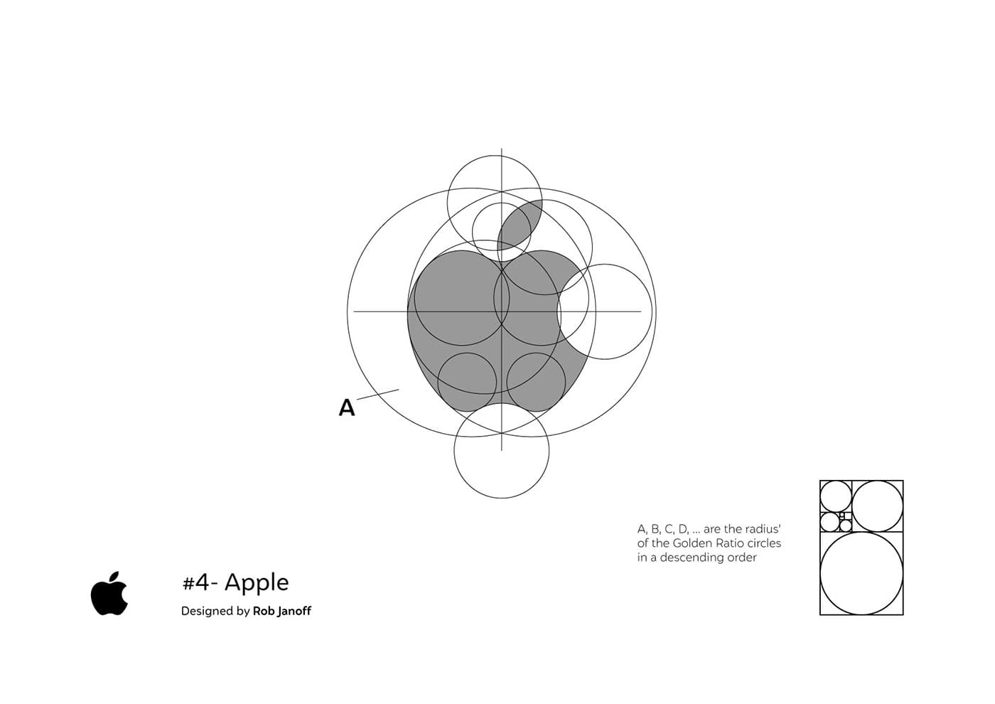
The Apple logo serves as an inspiration for logo designers, reminding us that simplicity, symbolism, and versatility are key elements in creating a logo that stands the test of time and becomes a symbol of a brand’s values and reputation.
Nike Logo Design

The Nike Swoosh logo is one of the most recognizable and iconic logos in the world, symbolizing motion, energy, and the spirit of athleticism. Let’s take a closer look at what makes the Nike Swoosh so powerful and how it has become synonymous with empowering athletes worldwide.
- Visual Symbolism: The Nike Swoosh is a simple, fluid, and dynamic curved line that resembles a checkmark or the shape of a swooshing motion. This flowing shape suggests movement, speed, and the energy of athletes in action. The visual symbolism of the Swoosh captures the essence of athleticism and embodies the brand’s mission to inspire and empower athletes.
- Minimalistic Design: The simplicity of the Nike Swoosh is a testament to the power of minimalistic design. Its clean and uncluttered form allows it to be easily recognized and associated with the Nike brand. The absence of excessive details or distractions emphasizes the strength and impact of the symbol itself.
- Strong Brand Association: Nike’s commitment to excellence and its focus on athletic performance have established a strong brand association. The Nike Swoosh has become a visual shorthand for these values, instantly evoking thoughts of sports, fitness, and dedication. Through consistent and strategic branding efforts, Nike has successfully built a powerful connection between their logo and their brand identity.
- Versatility and Adaptability: The Nike Swoosh is highly versatile and adaptable, making it suitable for various applications and marketing materials. It can be scaled, rotated, and combined with other elements while retaining its recognizable shape and impact. This flexibility allows the Nike Swoosh to be seamlessly integrated into different contexts, from apparel and footwear to advertisements and digital platforms.
- Cultural Influence: The Nike Swoosh’s association with athletic excellence and its endorsement by renowned athletes have contributed to its cultural influence. Nike’s partnerships with top athletes and sports teams have solidified the Swoosh’s status as a symbol of achievement and inspiration. This cultural influence has transcended borders and made the Nike Swoosh a globally recognized emblem of athletic prowess.
The Nike Swoosh serves as a powerful reminder that a well-designed logo can embody the values, aspirations, and spirit of a brand. It exemplifies the impact of visual symbolism, minimalistic design, and strong brand association in creating a logo that resonates with audiences on a global scale.

As logo designers, we can draw inspiration from the Nike Swoosh, understanding the importance of capturing the essence of a brand and conveying it through a simple yet powerful symbol. The Nike Swoosh stands as a testament to the ability of a logo to inspire, motivate, and empower individuals worldwide.
McDonalds Logo Design

The golden arches of the McDonald’s logo are a globally recognized symbol, representing the fast-food chain’s brand identity and serving as an iconic emblem of their presence worldwide. Let’s analyse the design and significance of the golden arches and how they reflect McDonald’s brand identity.
- Distinctive Shape: The golden arches are formed by two semi-circular shapes that resemble the letter “M.” This unique and instantly recognizable shape is synonymous with McDonald’s and sets it apart from other fast-food chains. The curvature of the arches creates a sense of familiarity and friendliness.
- Brand Association: The golden arches have become synonymous with McDonald’s, creating a strong association between the logo and the brand. Over the years, McDonald’s has built a reputation for fast service, affordability, and a family-friendly dining experience. The golden arches embody these qualities and evoke positive emotions and memories associated with the brand.
- Positive Imagery: The golden colour of the arches is symbolic of warmth, happiness, and positivity. It exudes a sense of comfort and joy that aligns with McDonald’s goal of providing a welcoming and enjoyable experience to its customers. The use of a vibrant and inviting colour scheme adds to the appeal and recognition of the logo.
- Scalability and Adaptability: The design of the golden arches allows for scalability and adaptability across various platforms and applications. Whether it’s displayed on a sign, packaging, or digital media, the logo remains easily identifiable and maintains its visual impact. This adaptability has contributed to the widespread recognition of the McDonald’s brand.
- Cultural Influence: McDonald’s has a global presence, and the golden arches have transcended cultural boundaries, becoming a symbol of American fast food and consumer culture. The arches are instantly recognizable in different countries and have become an integral part of the urban landscape.
The golden arches of the McDonald’s logo reflect the brand’s identity and values, evoking feelings of familiarity, comfort, and enjoyment. Their simplicity, distinct shape, and positive association have made them a powerful visual symbol in the fast-food industry.
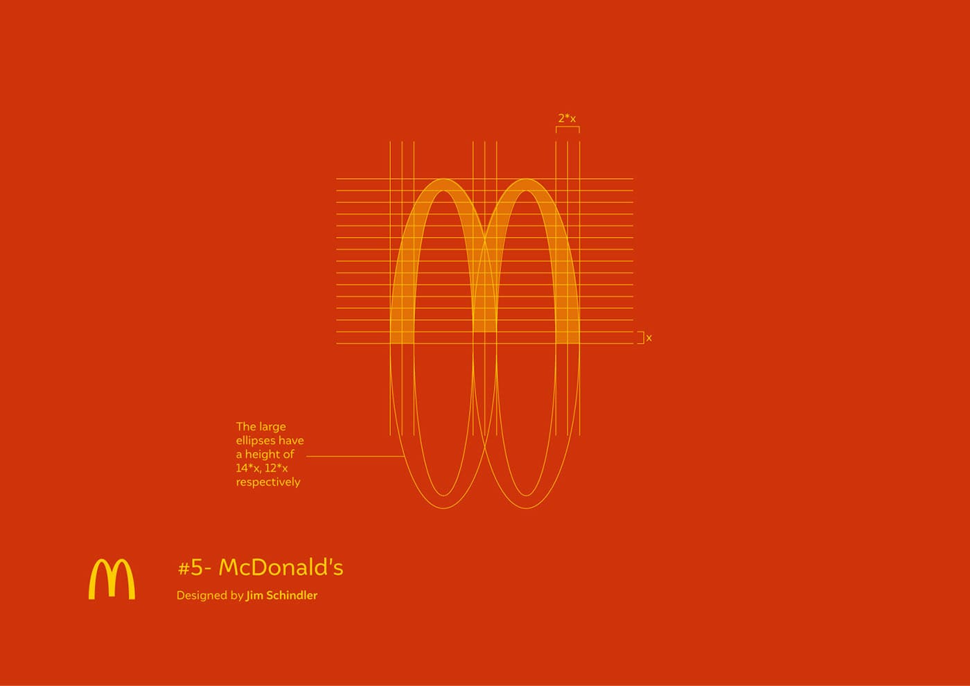
As logo designers, we can learn from the success of the McDonald’s logo by understanding the importance of creating a distinctive and memorable symbol that reflects a brand’s identity. The golden arches serve as a prime example of how a well-designed logo can become a universally recognized and iconic emblem, transcending language and cultural barriers.
The McDonald’s logo stands as a testament to the power of visual branding and the enduring impact of a simple yet effective design.
2. Highlighting Design Elements and Strategies
Let’s dive deeper into the design elements and strategies behind these iconic logos:
- Simplicity: Notice how these logos utilize minimalistic designs that are clean, memorable, and easily identifiable.
- Symbolism: Discover how symbols and visual metaphors are incorporated to convey brand values and messages effectively.
- Colour Psychology: Explore how colour choices evoke emotions and create strong brand associations.
- Typography: Examine the selection of fonts that reflect brand voice and enhance legibility and recognition.
3. Lessons Learned and Inspiration for Logo Creation
From these case studies, we can draw important lessons and find inspiration for our own logo creations:
- Simplicity is key: Strive for simplicity in your design to create a logo that is easily recognizable and memorable.
- Stay true to brand identity: Ensure that your logo reflects the essence and values of your brand.
- Embrace symbolism: Incorporate symbols or visual metaphors that convey deeper meanings related to your brand.
- Colour and typography matter: Carefully consider colour choices and typography to evoke desired emotions and convey brand personality.
By studying these successful logos and understanding the design elements and strategies behind them, you can gain valuable insights and inspiration for creating your own memorable logo.
In conclusion, logo design is a creative and strategic process that requires careful consideration of various elements. By following the guidelines and principles outlined in this guide and drawing inspiration from successful case studies, you can create a logo that effectively represents your brand and leaves a lasting impression on your audience.
Conclusion to Creating Memorable Logos
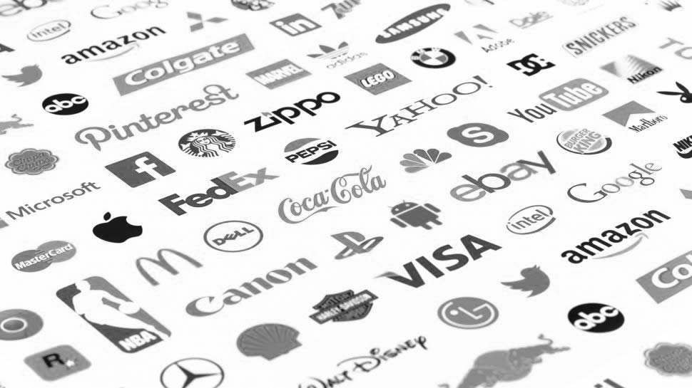
Congratulations! You have reached the end of our guide to creating memorable logos. Let’s recap the key points we discussed and encourage you to apply your newfound knowledge and unleash your creativity in logo design.
1. Recap of Key Points Discussed
Throughout this guide, we explored various aspects of creating memorable logos. Here’s a quick recap:
- Understanding the Elements of Logo Design: We emphasized the power of simplicity, the impact of colour psychology, the importance of typography, and the need for scalability and versatility in logo design.
- Research and Concept Development: We highlighted the significance of defining your brand identity and target audience, conducting competitor analysis, and refining logo concepts to select the strongest one.
- Crafting a Memorable Logo: We discussed the importance of uniqueness, symbolism, aesthetics, and gathering feedback to ensure the effectiveness of your logo design.
- Design Principles and Techniques: We explored the importance of proportions and balance, visual hierarchy, grid systems and alignment, and effective use of negative space in creating impactful logos.
- Choosing Colours and Typography: We emphasized understanding colour theory, selecting a colour palette that reflects your brand, considering typography legibility and brand voice, and creating harmony between colours and typography.
- Implementing the Logo Design: We discussed the importance of choosing appropriate file formats and resolutions, optimizing for different platforms and devices, establishing logo usage guidelines, and creating a style guide for consistent branding.
- Case Studies: Memorable Logos and Their Success Stories: We analysed iconic logos from renowned brands, highlighting their design elements and strategies to draw valuable lessons and inspiration.
2. Encouragement to Apply Knowledge and Unleash Creativity
Now that you have a solid understanding of the principles and techniques behind memorable logo design, it’s time to put your knowledge into action. Embrace your creativity and let it guide you as you embark on designing your own logo.
Remember, your logo is a visual representation of your brand’s identity, values, and personality. By incorporating the principles and strategies discussed in this guide, you can create a logo that resonates with your audience and leaves a lasting impression.
3. Importance of Continuous Improvement and Adaptation in Logo Design
Logo design is an iterative process. It’s essential to continuously seek improvement and adapt to changing trends and audience preferences. Stay updated with the latest design practices and trends, gather feedback, and be open to refining and evolving your logo over time.
Keep exploring, experimenting, and refining your logo to ensure it remains relevant and memorable in the ever-changing landscape of branding and design.
Remember, the journey of creating memorable logos is an exciting and rewarding one. So, unleash your creativity, apply the knowledge you’ve gained, and create a logo that truly represents your brand in a remarkable way.
Good luck, and may your logo leave a lasting impression!
Further Reading:
- 10 Examples of Powerful Global Branding
- Learning from the World’s Most Famous Logos
- Best Global Rebrands and Logo Redesigns of Major Brands
- Branding Beyond Borders: Elevating Your Global Presence through Impactful Logo Design
- Colours that Define Your Brand: Unlocking the Power of Colour Psychology in Logo Design
- Logo Design Trends to Watch Out for in 2023: Stay Ahead of the Curve!
- Most Expensive Logos In The World
- Every Good Logo Tells a Story! 40 Famous Brand Logos & Their Hidden Secrets
- Famous Logo Designers and Their Distinctive Style
- Using the Golden Ratio in Logo Design
- 20 Famous Brand Logos Constructed in Grid Systems
Join The Logo Community
We hope you enjoyed thi Unlocking the Magic of Logo Design: A Guide to Creating Memorable Logos. If you would like more personal tips, advice, insights, and access to our community threads and other goodies, join me in our community. You can comment directly on posts and have a discussion.
*TIP – We use and recommend DesignCuts for all your fonts, mockups and design bundles.


Author Bio
Andrew Marriott is the owner and founder of The Logo Creative™. He is an award-winning designer with over two decades of experience designing logos and specialising in branding for companies worldwide.

