
When you think of the most recognizable famous logos, certain images instantly come to mind. Whether its Apple’s bitten apple, McDonald’s golden arches, or Amazon’s smiling arrow, these logos have become iconic symbols worldwide. But why are these logos so iconic, and what makes them stand the test of time?
Logos are the visual identities of brands. They serve as the face of the company, a visual shortcut that people instantly recognize. From fast food to tech giants, some logos are so iconic that they need no introduction. But what makes a logo truly recognizable? In this article, we’ll dive into the top 20 most recognizable logos around the globe and explore why they stand out.
Table of Contents
The Power of Brand Logos
Why Logos Matter for Branding
A logo is more than just a symbol—it’s a critical component of branding. It conveys a brand’s identity, values, and purpose in a single image. The right logo design has the power to foster brand loyalty, evoke emotion, and communicate a message instantly. Think about it: you see a swoosh, and you know it’s Nike without even needing to see the brand name. That’s the power of a well-designed logo.
The Impact of a Recognizable Logo
A recognizable logo enhances a brand’s visibility and helps build trust. People tend to gravitate toward brands they recognize. This is why some logos are so crucial to the success of the company they represent. They become synonymous with quality, innovation, and reliability.
Characteristics of a Recognizable Logo


Simplicity
One common trait of highly recognizable logos is their simplicity. A complex design can be hard to remember, while a simple one sticks in the mind. For example, the Nike swoosh is one of the simplest logos out there, but it’s also one of the most iconic.
Timelessness
Another key feature of a memorable logo is its timelessness. While some logos evolve over the years, they maintain their core identity. Coca-Cola’s script has been modernized, but its essential look has remained largely the same for over a century.
Versatility
A great logo works across all mediums—whether it’s on a billboard, a website, or a T-shirt. It should be adaptable to various sizes and formats without losing its impact.
Top 20 Most Recognizable Famous Logos
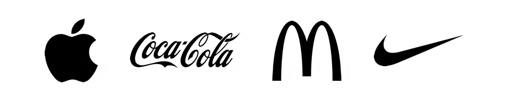
1. Apple’s Iconic Logo
The Story Behind the Apple Logo
The Apple logo, with its sleek, bitten apple silhouette, is one of the most recognizable logos in the tech world. The logo’s simplicity mirrors Apple’s philosophy of creating user-friendly, clean designs.
Evolution of the Logo
While the first Apple logo featured a detailed illustration, it was quickly simplified into the iconic bitten apple we know today, with only minor changes to the color and shading over the years.
2. McDonald’s Golden Arches
The History of the Golden Arches
McDonald’s iconic Golden Arches are a symbol of fast food globally. The logo is meant to represent a welcoming, family-friendly environment. First introduced in 1961, the arches have become synonymous with convenience and speed.
The Global Impact of the McDonald’s Logo
Today, the Golden Arches are instantly recognized in almost every country, making it one of the most powerful symbols in the fast-food industry.
3. Nike’s Swoosh
The Origin of the Swoosh
The Nike swoosh, designed in 1971, symbolizes motion and speed, reflecting the athletic nature of the brand. It’s a simple design that perfectly encapsulates Nike’s philosophy of “Just Do It.”
Nike’s Brand Philosophy
The swoosh is often paired with Nike’s slogan, emphasizing empowerment and achievement, which is why it’s so effective in building emotional connections with consumers.
4. Coca-Cola’s Timeless Script
Coca-Cola’s Logo Evolution
Coca-Cola’s logo, with its flowing script, has become an emblem of tradition and timelessness. Although the logo has seen updates, the general style has remained consistent, allowing it to transcend generations.
The Timeless Appeal of the Coca-Cola Script
The logo’s consistency and emotional connection with its audience have helped Coca-Cola maintain a powerful presence in the market.
5. Google’s Playful Wordmark
The Simplicity of Google’s Design
Google’s logo may be one of the simplest on the list, but its multicolored wordmark is unmistakable. The clean, modern font represents the brand’s straightforward and innovative nature.
Google’s Doodle Variations
One of the things that make Google’s logo unique is its playfulness. Google often changes its logo for special occasions, but its core design remains universally recognizable.
6. FedEx’s Clever Arrow
Hidden Meaning in the Logo
FedEx’s logo features a hidden arrow between the “E” and “X,” symbolizing speed and precision. This subtle design has helped make the logo memorable and indicative of their fast delivery service.
7. Adidas’ Three Stripes
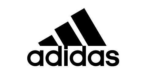
From Sportswear to Lifestyle Icon
Adidas’ three-stripe logo is more than just a design element; it’s part of the company’s identity. What started as a performance-driven sportswear brand has grown into a lifestyle icon.
The Meaning Behind the Three Stripes
The stripes represent stability and performance, aligning with Adidas’ core values of athletic excellence.
8. Starbucks’ Mermaid
The Evolution of the Starbucks Logo
The Starbucks mermaid has undergone several transformations, but the essence of the logo—representing the brand’s connection to the sea—has remained intact.
The Symbolism of the Mermaid
The mermaid symbolizes seduction and allure, reflecting the brand’s appeal and its ability to attract a wide audience globally.
9. Pepsi’s Circular Globe
Pepsi vs. Coca-Cola Logo Rivalry
Pepsi’s logo has always been in direct competition with Coca-Cola, yet it has managed to carve out its own identity. The circular globe logo represents the brand’s global reach and youthful energy.
Pepsi’s Rebranding Over the Years
Pepsi has continuously rebranded itself to keep up with the times, making its logo adaptable but always familiar.
10. Microsoft’s Four Squares
The Simplicity of Microsoft’s Modern Logo
Microsoft’s four-square logo is simple yet effective. The squares represent the company’s diverse range of products and services.
The Meaning Behind the Four Squares
Each square stands for one of Microsoft’s core products—Windows, Office, Xbox, and Bing—showing the brand’s versatility and reach.
11. Amazon’s Smiling Arrow
A symbol of Everything
Amazon’s logo is simple yet brilliant. The arrow going from A to Z not only forms a smile, representing customer satisfaction, but also highlights the wide range of products the company offers.
12. MasterCard’s Overlapping Circles
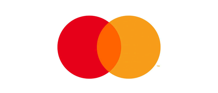
Symbolizing Trust and Connectivity
MasterCard’s logo with its two overlapping circles—red and yellow—symbolizes trust, security, and the global financial connectivity it provides. It’s a mark of reliability in payment processing.
13. Boots’ Cursive Script
A Heritage of Health and Beauty
The Boots logo, with its flowing cursive script, symbolizes over a century of history in health and beauty retail. Its traditional look appeals to trust, familiarity, and British heritage. The Boots logo has remained relatively unchanged since its inception in 1883, with only minor tweaks over time.
We interviewed type designer rob clarke about the process he went though making these adjustments to the boots logo.
Although Boots does not have physical stores in the United States, its logo is well recognized for several reasons.
Parent Company Influence: Owned by Walgreens Boots Alliance, the connection to Walgreens—a major pharmacy chain—creates brand familiarity among American consumers.
Travel Exposure: U.S. travelers visiting the UK and some other contries often encounter Boots stores in airports or tourist areas, enhancing brand recognition.
14. Kellogg’s Signature Script
Classic Breakfast Icon
Kellogg’s uses a red, flowing script that reflects its long-standing presence in the breakfast industry. The logo exudes warmth and familiarity, tying in with the comfort of a bowl of cereal.
15. Shell’s Scallop Shell
Nature Meets Energy
Shell’s logo, a bright yellow and red scallop shell, is a globally recognized symbol of the energy industry. The simplicity of the design helps ensure the logo stands out, even from afar.
16. BP’s Green Helios
Symbol of Sustainability
BP’s logo features a green and yellow sunburst, known as the Helios symbol. It reflects the company’s commitment to energy and sustainability, making it both eye-catching and meaningful.
17. UPS’s Brown Shield
The Symbol of Reliable Delivery
UPS’s logo, featuring a brown shield, symbolizes reliability and trust in delivery services. The brown color is also distinctive, setting it apart from competitors.
18. NBC’s Colorful Peacock
Symbol of Broadcast Pioneering
NBC’s peacock logo is colorful and symbolizes the network’s wide variety of programming. The feathers represent diversity and creativity in media, making it highly recognizable in the broadcasting industry.
19. YouTube’s Play Button
The Platform of Modern Media
YouTube’s logo, featuring a red play button, has become synonymous with video content and entertainment. Simple yet effective, it represents digital media consumption in the modern age.
20. Walt Disney’s Script and Castle
Magic and Imagination
The Walt Disney logo, with its iconic castle and flowing script, is associated with magic, childhood, and creativity. It evokes nostalgia and wonder, capturing the essence of the brand’s storytelling.
What Makes These Logos So Recognizable?
Consistency Across Media
These logos work because they remain consistent across platforms. Whether seen on a billboard, a mobile app, or a piece of merchandise, they’re instantly recognizable.
Cultural Significance and Longevity
Many of these logos have been around for decades, ingraining themselves into popular culture. Their long-lasting presence makes them a part of our collective memory.
Conclusion
Recognizable logos are powerful tools in building a brand’s identity and fostering loyalty. From Apple’s bite-marked logo to Nike’s swoosh, these symbols have become ingrained in global consciousness, representing much more than just a company—they represent ideas, cultures, and emotions.
Join The Logo Community
We hope you have enjoyed this article about The Future of Logo Design: What AI and Automation Mean for Designers helpful. If you would like more personal tips, advice, insights, and access to our community threads and other goodies, join us in our community.
You can comment directly on posts, access our community threads, have a discussion and ask questions with our founder Andrew.
If you’re looking to learn more about brand strategy, we highly recommend eRESONAID with our friend and acclaimed brand strategist and author Fabian Geyrhalter, it’s packed full of knowledge and insights you will need to learn to become a brand strategist or apply what you learn within your own business.

Further Reading:
- 10 Examples of Powerful Global Branding
- Learning from the World’s Most Famous Logos
- Best Global Rebrands and Logo Redesigns of Major Brands
- Logo Evolution: How Famous Logos Evolved Over Time
- The Psychology of Shapes in Logo Design
- Unlocking the Magic of Logo Design: A Guide to Creating Memorable Logos
- Branding Beyond Borders: Elevating Your Global Presence through Impactful Logo Design
- 10 Famous Brands with Minimalist Logos
- Colours that Define Your Brand: Unlocking the Power of Colour Psychology in Logo Design
- Most Expensive Logos In The World
- Every Good Logo Tells a Story! 40 Famous Brand Logos & Their Hidden Secrets
- Famous Logo Designers and Their Distinctive Style
- Using the Golden Ratio in Logo Design
- 20 Famous Brand Logos Constructed in Grid Systems
- 14 design principles of good logo design
- 10 Common Logo Design Mistakes to Avoid for Stronger Branding
- Are Logos Better Simpler?
- Famous Logos & Their Hidden Meanings Revealed
FAQs – Most Recognizable Famous Logos
What is the most famous logo in the world?
The most famous logo could arguably be Apple’s or Coca-Cola’s, both of which have transcended their industries to become globally iconic.
Why are logos important for brands?
Logos provide instant recognition for brands and help consumers identify and connect with them on an emotional level.
How do logos influence consumer perception?
A well-designed logo creates trust, evokes emotion, and reflects the brand’s values, influencing how consumers perceive the company.
What makes a logo memorable?
A memorable logo is simple, timeless, versatile, and evokes an emotional connection.
How often should a brand update its logo?
Brands should update their logo if it no longer reflects their values or is out of touch with modern design trends, typically every 10-20 years.