A brand style guide is only useful if your team refers to the guide when creating various campaigns and pieces of material which represent your brand. A style guide lays out best practices and creates consistency no matter who works on various projects and even if you hire outside freelancers to fill the gaps.
Brand consistency leaves consumers with the impression that your business is dependable. Presenting your brand consistently equals a potential 23 percent increase in revenue. Gain trust from your users by focusing on using the same style and language everywhere your brand has a presence.
Planning out your style guide now allows you to easily make adjustments as your brand grows and changes in the future. Here are eight things you should consider when creating a style guide:
Table of Contents
Study Your Competitors’ Style
Before you write your style guide, study what competitors in your niche are doing style-wise. First, visit the competitor’s website and take notes about colors, fonts, layout, and language. Pay particular attention to the images used. Next, go to their social media pages and take note of any similarities and differences between the website and social media pages.
Your style should be uniquely your own, but understanding how your competitors brand themselves allows you to stand out as unique.
Consider Largescale Platforms
Think about the different places where you represent your brand. Make a list of possible situations where consumers see you, and you make an impression on them. Your brand must be consistent both online and offline. For example, if you take out a billboard ad, does it reflect your best style guidelines? Think about the fonts used and how they translate for a largescale project such as a billboard. You should even look at elements such as the logo and make sure the image won’t appear pixelated in larger sizes.
Once you have a list of the potential points of contact, look for inconsistencies which need tweaking to better showcase who you are as a company. Wide-format printing builds awareness for your business in your local area, but if you don’t plan out the style ahead of time, you might make a poor first impression.
Speak to Your Target Audience
You’ve likely heard the advice to “know who your audience is,” but you must also speak directly to your target customer base. Create a buyer persona which represents your typical customer based on the information you’ve gathered from sources such as internal data, website analytics, and polling. Once you have a firm understanding of who your audience is, it’s much easier to choose the styles and colors which resonate with your customers.
Allow Room for Creativity
While it’s important that customers recognize your branding no matter where they encounter your work, don’t create such an extensive guide that there is zero room for creativity. Your marketing department and designers will do their best work if you allow a bit of flexibility for them. For example, if they are creating an invitation for an event you’re hosting, are they limited to only using your brand colors, or is there some flexibility as long as the logo appears on the invitation somewhere?
Create specific guidelines, but don’t get so detailed that you stifle your creative team. There are also some areas where consistency is more important than others. The articles on a blog should all have a similar look, tone, and style, but a one-time flyer or mailer may allow you to try something different and see how it resonates with your audience.
Add Examples
They saying goes that a picture is worth 1,000 words. Showing your designers examples within the stylebook may help clear up any confusion over the specific styles you prefer for your brand. If you want only images which fill the full width of the screen, show the user what you mean by that and highlight the small amount of background in the sample image. If you want the font to be at least one-third as significant as the background, show what this looks like on a website.
Explain Typographical Choices
Take the time to explain why you want a specific typeface or wish to use one type for headlines and another for body text. When designers understand your reasons, the guidelines will stick with them better and they’ll be more likely to honor your requests. A valid explanation is particularly helpful when you pull in freelancers or specialists to help with the design. However, writing your reasoning into your style guide may also help when working with clients or colleagues who may not understand your pickiness in using a particular font and text size for all headlines.
Explaining your reasoning also helps if designers must use a different font. For example, if you indicate that you want Futura font in size 16 and above to create a blocky look for the headline text, then the designer knows that if they must use a different font, it needs to be a sans-serif font with a wide letter style and available bolding.
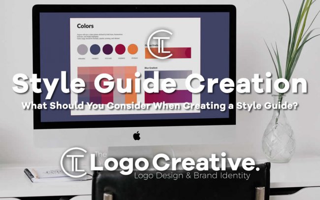
Choose a Color Palette
If your brand doesn’t already have a color palette, start by choosing colors which reflect the attitude and values of your brand. The colors must also stand out from your competitors. Then, you must also use the guide to define how those colors are used. For example, if you have the color blue in your palette, is it always used as a primary color and red as an accent color?
Define exact color choices, including hex codes and even sharing a swatch of the color for comparison. Include any adaptations for the Web, too, as colors sometimes behave differently online than in print.
Share Your Story
To fully understand your brand and the style choices you’ve made, explain your brand story. Where did the brand start and what do you stand for? How do the style elements tie into that story? Did you make style mistakes along the way? What were the missteps, and how did you change and grow over time?
People who design for you should have intimate knowledge of you. If they understand your story, they’ll be better able to tell it to others through their designs.
Change as Needed
Your brand’s style guide isn’t something you should write once and then forget. As your business changes and design best practices change, your guide will change as well. Review your guide at least once a year and check to see if you’re still using the same logo, colors and other specifics you’ve used in the past. If anything changes, note it and explain why it changed. A well-written style guide allows room for changes in the future.
 Author Bio
Lexie Lu is a designer and UX strategist. She enjoys covering topics related to UX design, web design, social media, and branding. Feel free to subscribe to her design blog, Design Roast, or follow her on Twitter @lexieludesigner