Graphic design trends come and go. Some are short-lived, while others stick around for years. How do you decide whether or not to follow a trend? Join us in this article as we dig deep into When to Use and Ignore Design Trends.
Design trends are often driven by social media platforms like Instagram and Pinterest. These sites allow designers to share their work with millions of followers. This means that designers who create great designs get noticed and gain exposure.
However, graphic design trends don’t always translate into success. Sometimes they can even hinder your brand identity.
Table of Contents
What Are The 10 Latest Design Trends to Look Out For?
A trend is usually defined as something new or popular. It’s an idea or style that becomes more common in society over time.
What makes a trend is when it starts to become widespread. If everyone is talking about a certain thing, it’s probably going to be a good one. But there are some other factors to take into consideration.
The first is how long a trend lasts. A trend may start slowly but quickly grow in popularity. Or it could fade away after a few months.
Either way, it’s essential to keep up with the times.
The second factor is the number of people using it. If a small group of people only uses a trend, it might not last very long. However, if it gets adopted by many types of businesses, it will likely continue to evolve.
Lastly, you need to know what kind of effect it has on your business. Is it helping or hurting your company? You need to make sure that whatever you choose to use is right for your brand.
So, what are some of the most recent trends in design? Here are ten trends to look out for this year:
1. Animations
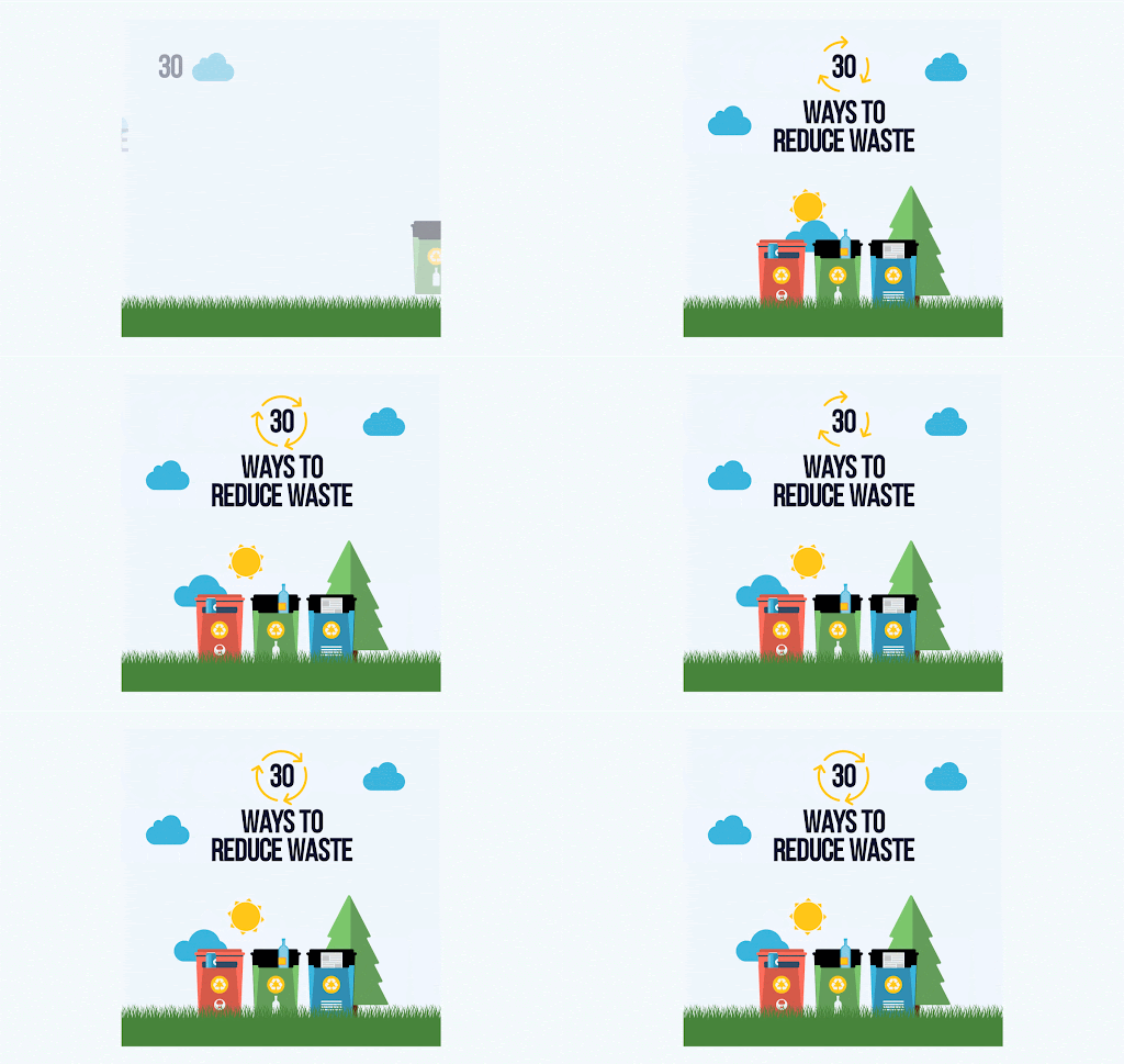
Animations in graphic design are becoming increasingly popular. They’re used to add life to static images, videos, and infographics. Animations can be created using Adobe After Effects, Animation Desk, or other software and animation tablets.
The advantages of using animations are that they can be easily edited and customized. However, they require a lot of effort up front. If you want to use them, make sure you have enough time and resources available.
2. Data Visualizations
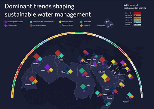
Data Visualizations in design are becoming more prevalent. They provide a way to visualize large amounts of data. They’re also helpful when it comes to communicating complex information quickly. The different data visualizations are bar charts, pie charts, line graphs, scatter plots, and maps.
Often data visualizations are used with infographics. Infographics are one of the most popular types of graphics today.
They’re easy to understand, and they provide a quick overview of a topic. They’re especially helpful for businesses that need to communicate complicated information.
3. Maximalism
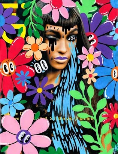
Maximalism is the opposite of minimalist art or design. Minimalist design and art focus on simplicity. It uses very few colors and shapes. It’s meant to convey a sense of calmness and tranquility. Maximalism design takes minimalism to the extreme opposite. It embraces loudness and unfamiliarity.
It’s ideal for brands that want to stand out from the crowd and assault their viewers’ senses.
4. Simplified Logos

Simplified logos are making a comeback. They’re easier to read, and they’re better for small screens. They’re also less likely to cause eyestrain. So why else are simplified logo design coming back? Simple logos are more effective than complex ones. They’re easier to remember.
Sometimes less really is more.
5. Flat Yet Colorful Illustrations and Icons
![]()
Flat design is a type of minimalist design where everything has a flat appearance. It’s not necessarily minimalistic. It’s just flat. It’s often used for mobile apps and web pages. It’s great for creating clean interfaces.
Flat designs tend to be colorful and vibrant. This helps to draw attention to the content of your page. flair.hr uses flat illustrations when creating their blog cover images – they’re simple and convey that the article is about perfectly.
6. Serif Fonts
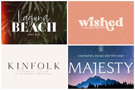
Typography is another form of graphic design. It involves choosing fonts for your text and designing the layout around those fonts. There are many different ways to use typography in design.
Some designers use it as a standalone element, while others use it within an illustration.
Serif Fonts are a type of font that features decorative strokes at the end of each letter. And for this year, that is the font that is trending, perhaps because of their familiarity or maybe because of their readability.
7. The Usage of Memes
Memes are short, funny videos that spread across social media platforms like Facebook, Twitter, Instagram, and Snapchat. These memes are usually shared by users who upload them onto their profiles. They’re then sent to friends and family members via email or messaging services.
Branded memes are a way for companies to get their name out there. A company can create a meme that looks similar to a viral video. Then they can share it on their website or social media accounts. This will help people associate their brand with something fun and entertaining.
8. Quotes for Social Proof
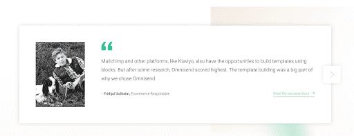
Using reviews or quotes as social proof is a great way to build trust with customers. When you have testimonials or reviews on your site, it gives potential customers confidence about buying your product.
Incorporating quotes from customers into designs can make your products look trustworthy as it shows potential customers that other people use and love your product. It can also make the design look professional. But don’t overdo it. Too much quote-based design can come off as cheesy.
9. Social Media Screenshots
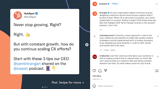
If you follow the same brand on multiple different social media platforms, you will notice that they share the same versions of their content across the channels, even though each channel comes with its own appeal and unique voice.
However, sometimes it just isn’t possible to create separate and unique content all the time.
Brands need to be able to share feedback/reviews, important announcements, potential giveaways and contests, and any new product launches at the same time across all their channels.
But how can they do this? Well, social media screencaps are one way.
By this, we mean screenshotting your tweet, giving it a graphic design makeover, and then sharing that design via your other platforms. Trust us, it works. You can take entirely text-based content and turn it into visual-based content instead.
10. 3D Designs
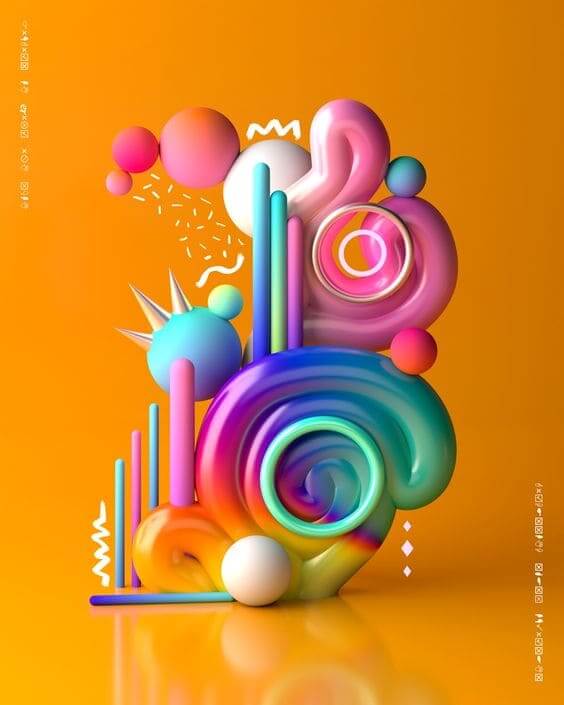
3D designs are becoming increasingly popular. 3D is a term that describes a style of graphics that uses three dimensions rather than two.
These types of graphics are very common in movies and video games. 3D designs are also being incorporated into websites. If you want to incorporate 3D into your marketing campaign, you should do so carefully.
3D designs are easy to produce (if you have the correct skillset), and they’re very eye-catching. They’re also a great way to engage your audience. The advantages of 3D design are endless.
When Should You Use the Design Trends?
You should only use a specific design trend if it will benefit your business and if it suits your brand identity (compare it against your moodboard or brand kit if you aren’t sure). There are many ways to market your business online, but not every method is effective or suitable.
The best way to know whether or not specific trends work well for your company is to test them. Try using some of these ten design trends and see which ones work best for you.
The next step is to implement those trends that worked well into your current marketing strategy. After you’ve done that, you’ll be ready to start incorporating more design trends into your campaigns.
But what if you do not have the time to sit and try out each trend?
Well, our best design tip is to not only use these trends but to know when to use them. There’s no point in using an infographic if you don’t know what information it contains. And there’s no point in creating a branded meme if you don’t understand why it would work.
Here is a list of things that indicate to you that you should use that design trend:
- It improves the aesthetic of the design
- It helps you connect with your audience better
- It makes your content easier to read and understand
- It gives your content a more professional and modern feel
- It creates a sense of urgency around your content
- It increases usability and shows users how to interact with your design
- It helps your content to flow
- It matches your brand identity
When Should You Ignore the Design Trends?
You should not use a design trend if it doesn’t fit within your brand identity or if it doesn’t help you achieve something.
For example, if you’re a company that sells coffee, you shouldn’t use data-heavy infographics because people won’t expect that from a coffee brand. Similarly, if you’re selling a product that requires technical knowledge, you shouldn’t create a meme because most people think memes are childish and silly.
There are plenty of examples where designers have used a particular design trend without considering its impact on their brand.
This can lead to a lot of wasted money and effort. So, before you spend any money on graphic design, make sure that you know exactly what type of graphic design you need.
The disadvantages of using design trends are numerous. Here are some of the most common reasons why you shouldn’t use them:
They’re too complicated
Design trends are often complex. This means that they require advanced knowledge to create. It’s hard enough to create a simple design without worrying about color palettes, typography, and other elements.
Design trends are often expensive.
This goes along with the previous reason. Creating a design trend requires a lot of money and resources. So, unless you have the budget to invest in something like this, don’t bother.
They’re too trendy
Trends come and go quickly. So, if you decide to use a particular design trend, you need to keep up with it. Otherwise, you risk looking old-fashioned.
They’re too difficult to maintain
If you choose to use a design trend, you will have to update it regularly. This can become quite a hassle. In addition, you will need to make sure that all of your clients and customers are on board with it.
Do not use a graphic design trend if:
- There is no real reason for the change or addition
- It goes against your brand identity
- It does not match your target market
- It is too expensive to implement and uses too many resources
- It isn’t accessible off multiple different devices and screen sizes
- It is offensive
- It is hard to understand
- It has already been trending for a while
What Are the Advantages of Implementing Design Trends?
The advantages of using design trends are pretty obvious. They give you an edge over your competitors by making your content look more appealing and professional.
Here are some of the benefits of using design trends:
Your content becomes more memorable
People remember things that stand out. If your content stands out, it has a better chance of being remembered. And, when someone remembers something, they tend to share it. So, if you want your content to get shared and grow your audience, you should try implementing a design trend.
You gain credibility
By using design trends, you can make your content look more professional. You can also make it appear more credible.
To gain credibility, you need to do things differently than everyone else. You show that you care about your audience by choosing a design trend. You also show that you are willing to take risks and experiment.
You increase conversions
It is known that people who use a design trend are more likely to convert their users into customers. Customer conversions are essential because they help you grow your business. Conversion rate is one of the best ways to measure how successful your website or blog is.
So, if you want to increase your conversion rate, you should consider using a trend (or two).
You attract new customers.
A design trend gives you a unique selling point.
People notice these kinds of differences very easily. As a result, they are more likely to buy from you. With design trends, you also get the attention of more people. This allows you to reach a wider audience than you would otherwise.
Using design trends makes your content easy to read. This increases the chances of someone reading your content and being interested in what you are offering.
Your content is more engaging.
With design trends, you can add interest and intrigue to your content. Engaging content means that people will be more likely to read it.
Design trends allow you to add a sense of urgency to your content. When people see something interesting or exciting, they feel compelled to click through and find out more.
Voila! Higher engagement rates.
Conclusion
In conclusion, there are many reasons you should use design trends. However, you shouldn’t just jump into them without thinking about whether or not they fit within your business model and brand personality.
There’s no doubt that graphic design trends are here to stay (at least for now). But just because they are popular doesn’t mean that you should use them all the time. Keep in mind that not everything works for everyone.
When choosing which graphic design trend to use, think about how it fits with your brand identity, target market, and overall goals.
Join The Logo Community
We hope this article has helped in understanding When to Use and Ignore Design Trends. If you would like more personal tips, advice, insights, and access to our community threads and other goodies, join me in our community. You can comment directly on posts and have a discussion.
*TIP – We use and recommend DesignCuts for all your fonts, mockups and design bundles.

