It is not easy to satisfy online users. With so many websites and online resources available for their queries, you have to do something different. And that’s why web design psychology has become more important for designers. The application of web design psychology is evidence of how enterprises care about their customers. In this article we discuss Which Psychological Laws Do You Need On Your Website.
You can’t satisfy everyone with the design of a website. But it is the duty of a designer to try their best to cater for the majority. Engaging and interacting with a wide group of audiences through a single website is not exactly a cakewalk, but some designers out there accomplish the same without breaking a sweat. Their secret? Using web design psychology.
Every element on a website leaves a lasting psychological impact on the mind of the user. Understanding what element is leaving what kind of impact among the audience is a crucial part of using design psychology.
Let’s talk about some major psychological laws and how they apply to web design.
Table of Contents
The Von Restorff Effect
The Von Restorff Effect talks about how among a group of similar-looking objects, the one with distinguishable features becomes more prominent, and therefore, more memorable.
In web design, it implies that in order to make one design element or content on the page more memorable or noticeable than the rest, you have to give it some distinguishable feature. Whether it is bolder text or a border, it needs to be different than the rest, in a subtle way. Notice the pricing page for Evernote.

Among the three subscription plans, which are laid out in similar card patterns with the same colour schemes and texts, the plan that is more popular is given a black heading, making it look bigger. This is a subtle way of making the users notice the more affordable plan they offer. If you want any element on your web page to be better noticed, then you can apply the Von Restorff Effect in your web design.
Gestalt Psychology
Before the website visitor cheques out individual details on the website, they are going to be looking at the entire web page design as a whole. Any discrepancy caused by this experience is not going to work out for your website. And this is why you need to apply Gestalt Psychology for web design.
Gestalt psychology works with how human eyes use perceptual organisation law to recognise an image with minimal effort. Through its laws of closure, proximity, figure, and symmetry, Gestalt psychology brings a sense of unity and visual pleasure to your website. So don’t forget to apply this principle to your web design.
Hicks Law
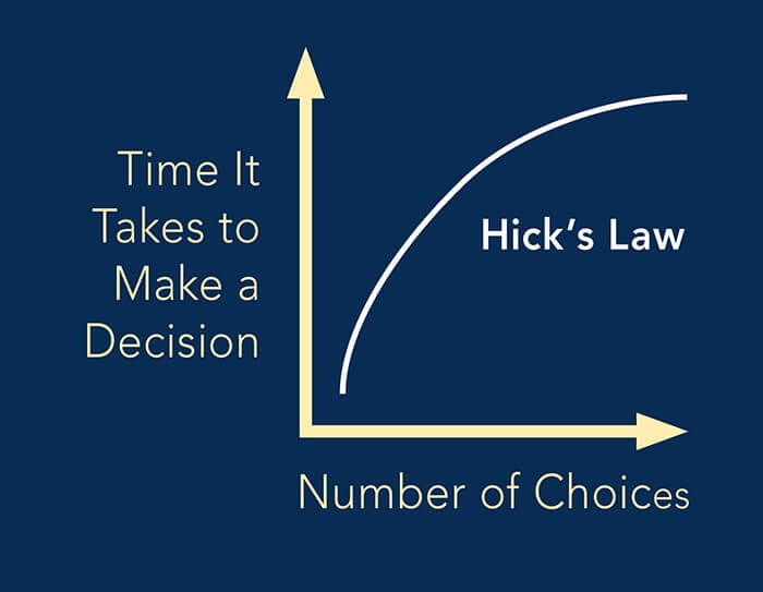
Hick’s Law relates to how website visitors make choices on a website. According to the law- the more choices there are on the website, the more time it will take for the visitors to choose among them. The ease of making the right decision is important for increasing the usability of a website.


So in order to improve the usability of the website and make it easier for the users to make fast and right decisions, simplify the larger tasks, break down complicated tasks, and make sure not to overwhelm the visitors with a lot of highlighted options.
Pareto Principle
According to the Pareto principle, 80% of entire effects are caused by only 20% of variables in the system. When applying it to web design, we will see that 80% of conversion or customer retention is caused by 20% of the features on the entire website.
The ratio can be different, such as 70/30, or 90/10. But the principle remains the same. The majority of the customer conversion on the website comes from only a smaller yet important amount of features and functionalities on the website. And the best way to determine those features, you need to dig into the website’s collected data. Applying this principle will help to increase conversion on the website without any problems.
Rule of Thirds
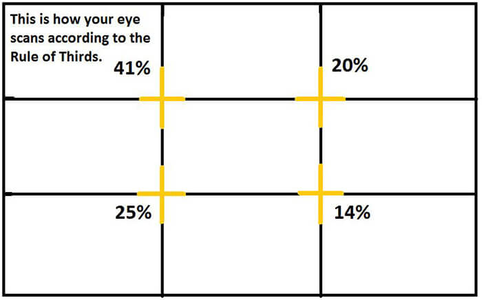
The rule of thirds has been used by artists and designers for centuries to bring out the best visual experience from a design or art. The principle works simply, with a 3 by 3 grid system. This grid system helps the designer to understand how the human eye scans and perceives the elements on the web page.

If you look at the above image, you’ll see the percentage of images and elements the human eye scans based on its position on the grid. So, to make sure that the website visitors are looking at what you want them to look at, place the important contents along the grid lines, where they concentrate the most.
Fitts Law
Fitts law is an important rule to apply for the Call to Action (CTA) buttons on the website to work perfectly. According to the law- the time it takes for the user to reach a target is determined by the size and distance of the target.
Whether the user is going to click on a subscription button or contact button entirely depends on the size of the button and how far it is placed. The size component helps the user to find the CTA easily, and the distance between the mouse pointer and the CTA establishes the amount of effort it takes for the user to get there. Optimising these two features of a CTA is going to get you more clicks than you’ve ever received before.
Occam’s Razor
According to the law of Occam’s razor- in any circumstances, the simplest solution is the best solution of all. For design purposes, it means that the simplest of all designs works best for any website.
Even though it is tempting to go for complicated yet fancy website design, it might end up being too complicated for the users. A simple website design that lets the users accomplish what they wanted to do is perfect for any business. A prime example of this will be the Dropbox website homepage.

With clean lines and simple placements of CTA, the dropbox page sports the simplest of designs. It is functional, useful, and esthetically pleasing, making the site more user friendly.
Endnotes On Web Design Psychology
Following web design, best practices, and market standards are crucial for the success of the design, but at the same time following the web design, psychological laws help you to get an edge.
Applying the above-mentioned laws will make it apparent to the users about how much you care for your clients, and increase the number of client conversion and retention.
Join The Logo Community
We hope this article has helped you understand Which Psychological Laws Do You Need On Your Website. If you would like more personal tips, advice, insights, and access to our community threads and other goodies join me in our community. You can comment directly on posts and have a discussion.
*TIP – We recommend Skillshare to learn online. There are tons of classes for everything including marketing related courses. Get a free 2 months with our link and you won’t regret it Trust us!
Author Bio
Pratip Biswas is the Founder and CEO of Unified Infotech, a New York-based web design company that has been featured in Deloitte Fast 500 | Fastest growing tech companies in 2018. His company is working with Enterprises, SMB’s and Start-ups to improve their efficiency through Digital Adoption and help them discover new possibilities through constant innovations. Pratip also writes regularly on Blockchain technology and has been published in publications like “Yourstory”, “Dzone” etc.


