We all want visitors to our website, and we want them to have a pleasant experience, but we also want them to perform certain actions such as clicking a certain button that leads to an action we want the user to complete this is known as a Call To Action, so in this article we discuss Why a Call to Action Is So Important?
Let’s be honest; we all like to push buttons. The right button appeals to our interests, our motivations, or our concerns. The right button can solve a problem, guide us, or provide us with new information. The right button screams “push me! There is something marvelous waiting for you on the other side.” Call to Action buttons come in countless forms and shapes, and in today’s online world we find them on literally every page.
Believe it or not, some people’s only job is to figure out how to get us to push the right buttons. Getting website visitors to do what they want them to do can be quite a challenge. Therefore, we want to discuss how you can make sure that your buttons lead to the desired outcome.
A business website’s power comes down to how well it can convert a prospective lead into a loyal customer, or even better, a long term client. Blog posts that have never been read, newsletters that have not been signed up for, or shopping carts that have been abandoned before any order was placed; they all have two things in common.
First of all, it is frustrating. It’s so incredibly frustrating. You put in hours of hard work and effort, which in the end does not lead anywhere. Secondly, the “Call to Action button” hasn’t been pressed, or maybe, yes maybe, it didn’t even exist to begin with.
Let’s change that. If you have ever struggled to get your audience to take action, you will be surprised at what compelling Calls to Action can do to improve your conversion rate almost overnight.
Table of Contents
So, what is a Call To Action?
Calls To Action, also known as CTAs, are specific phrases that encourage someone to take a desired action. They are the key to the success of any effective digital marketing program. CTAs typically involve a click on a button and are designed to guide users towards a particular goal or to prompt an immediate response.
The concept itself is not new at all. The idea behind a CTA is to catch a person’s attention with something exciting. A successful CTA button can vary in size and style, but always results in a conversion of some sort. The CTA is foundational for the success of any marketing initiative because it gives you the chance to motivate a visitor to take the leap towards becoming a customer or client.
This is particularly advantageous for designers—the perfect place to flaunt your most recent projects is through one of these CTAs.
The possibilities are literally endless and you are likely to encounter them all over a website (persistent headers, pop-up ads, side panels, and more are all common types of CTAs). Some key buzzwords you might hear alongside a CTA are ADD TO CART, FREE TRIAL, READ MORE, or TRY IT NOW.
Why are Calls to Action so important?
For starters, it is all about expectations. Pushing a button is psychologically satisfying, especially when pushing the button rewards you with something you want. This quirk of the human brain is something that a good CTA is able to capitalize on.
Whenever visitors land on a website, they expect some sort of direction or signpost of what to do next—without it, they feel confused. You can satisfy the user’s expectations by hyping up a product or service you offer, and promising a reward for their attention. The reward could be a free download after reading an article or the possibility of signing up for a free trial.
Most website visitors are genuinely interested in engaging with your brand and looking for CTA buttons to learn about it. These buttons make it easy for users to understand what you want them to do next and create a better user experience at the same time.
CTA buttons can vary in size, shape, design, and placement. They can be used on the main website, on a specific landing page, in an email, or at the end of an article. The goal is to get users interested and, ultimately, to make them click a visually appealing button. They can help you grab the attention of potential consumers and encourage them to seal the deal.
Additionally, CTAs emphasize the power of digital advertising and serve as transitions between the phases of a sales funnel. Securing a “soft conversion” of an email address is one primary way that CTAs move people toward purchasing your product or procuring your services.
One good way to think about this is to always exchange resources for personal data. Whether it be your design portfolio or a quick course you’ve created on logo design, exchanging resources for personal data helps to drive leads for your business.
Based on 101domain, these are the most commonly-found downloadable content from landing page CTAs:
- Webinars and presentations
- E-books and case studies
- A free trial of your service
- Giveaway and contest entries
- Event sign-up
An example from our own site is the “Free Quote” that we offer to clients who are interested in becoming clients.
Let’s Push Some Buttons
To generate new leads when a person is on the fence of taking the next step, you have to make the CTA action-oriented, include strong visuals, create a sense of urgency, and make them easy to find. Remember, even the smallest adjustments can dramatically affect conversion rates.
A CTA should aim at pushing prospects in the right direction, no matter if they consciously know what they want or if their subconscious is leading them. To find out what works best, simply ask yourself the question of what your visitors are looking for and what could be helpful for them. Think about placement, design, and message:
Where it is located: The more places you put a CTA button, the higher your conversion rate could go up. Just make sure you place your buttons strategically, and they do not confuse visitors so they end up not making a choice at all. Every page gives you the opportunity to reach your goal.
What it looks like: A CTA has to be easily recognizable as something people want to click. Its design must attract them, which can be achieved by making it fit the rest of the style of the website while remaining well-defined as a clickable button.
What it says: To book a sale, you have to ask for the purchase. Provide a clear message that matches what users anticipate, communicates the value they expect, and try to start building trust right away.
And Action!
As mentioned earlier, every website is different, and CTAs have to cater to a certain audience, but the following tips can help to generally enhance the quality of your CTA buttons:
- Grammatical first-person: Address your audience in the first person to get a better connection.
- Sense of urgency: Create a sense of urgency to make people act faster.
- Natural user flow: Keep the reading flow of the page in mind when placing your CTAs.
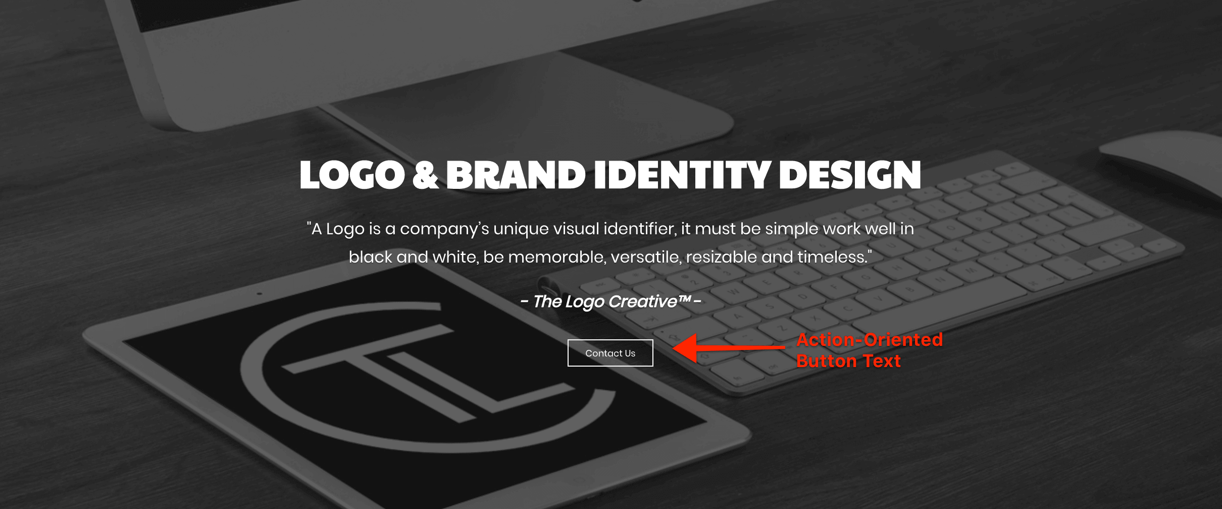
- Keep it short and simple: Only use action-oriented button text—and avoid “click here” at all costs! Even something as simple as our “Contact Us” button on the home page is enough.
- Value proposition: Only promise what you can deliver.
- Limit your choices: Fewer buttons to choose from guarantee a better user experience.
- Text size and font: Decide for a classic font and make it large enough to read without overwhelming the rest of the content.
- Button design: Be careful with the colors and shapes you pick for your button.
And, last but not least:
- Test your CTAs: This is the best advice I can give you—test everything. Something as simple as a change in color or whether or not you include a photo of a product next to “add to cart” may make a significant difference for you.
We hope you have enjoyed reading about Why a Call to Action Is So Important, use the the tips we have suggested and implement them on your own website.
If you would like more personal tips, advice, insights, and access to our community threads and other goodies join me in our community. You can comment directly on posts and have a discussion.
Useful Links & Great Deals


