Nowadays, every business, no matter how big or small, needs and gets a logo design. Sometimes also a whole brand identity design. Even places like local grocery stores and online blogs get one to make sure there’s an icon along with their business name. Is it the number of existing logos and market saturation that leads to so many similar logos?
Perhaps designers deal with too many ‘unique’ brands which, in reality, offer substitute products and share the same values? Or maybe the simplicity trend is so strong that logo designers run out of creative ideas? Reasons are multiple but not necessarily overlap with the mentioned theories.
Table of Contents
Giant’s logo resemblance
One would think that logo resemblance only happens to small businesses. Probably because of the lack of an adequate budget to head to a professional designer. In contrast to the common belief, many big companies are as bad in getting an original design. Their ‘one of a kind’ icons isn’t as rare as imagined.
But why? They should have a sufficient budget to hire a whole design agency team. Experts with lots of market and industry knowledge wouldn’t come up with or ‘copy’ an already existing project, would they? Let’s look at examples of some globally-known brands.
Pepsi vs South Korea
Pepsi, the drink company, used to have a very complex logo. With years (decades) passing and trends changing, the company kept adjusting its logo. Every version looked more modern and minimalistic. The currently used one shows an unframed circle with two shapes in it, divided by a white wave going through the diameter.
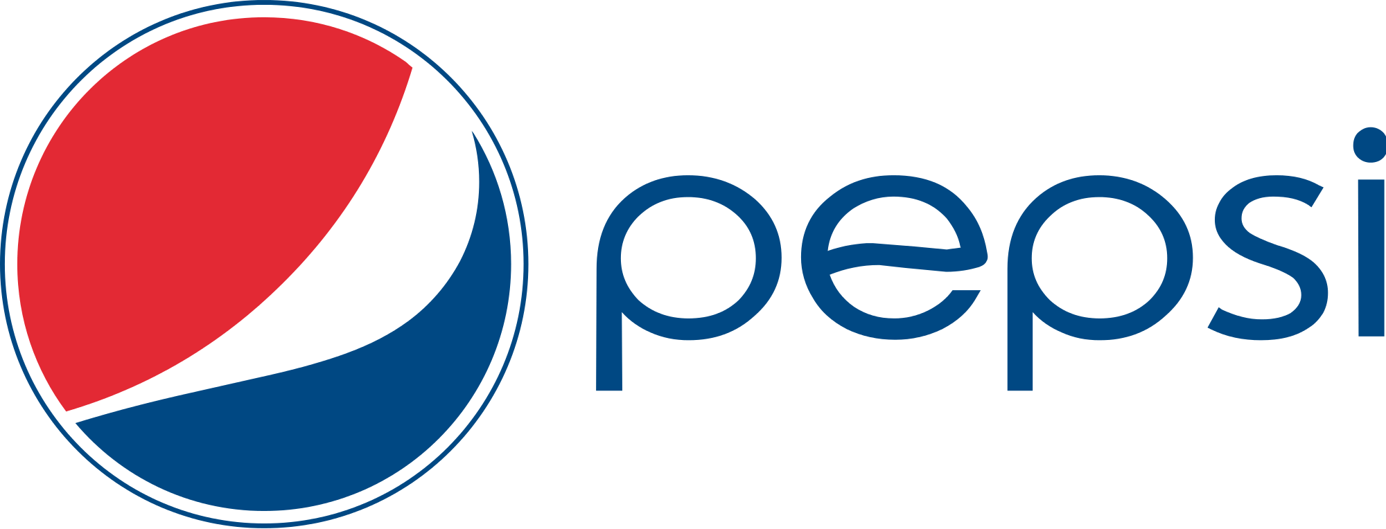
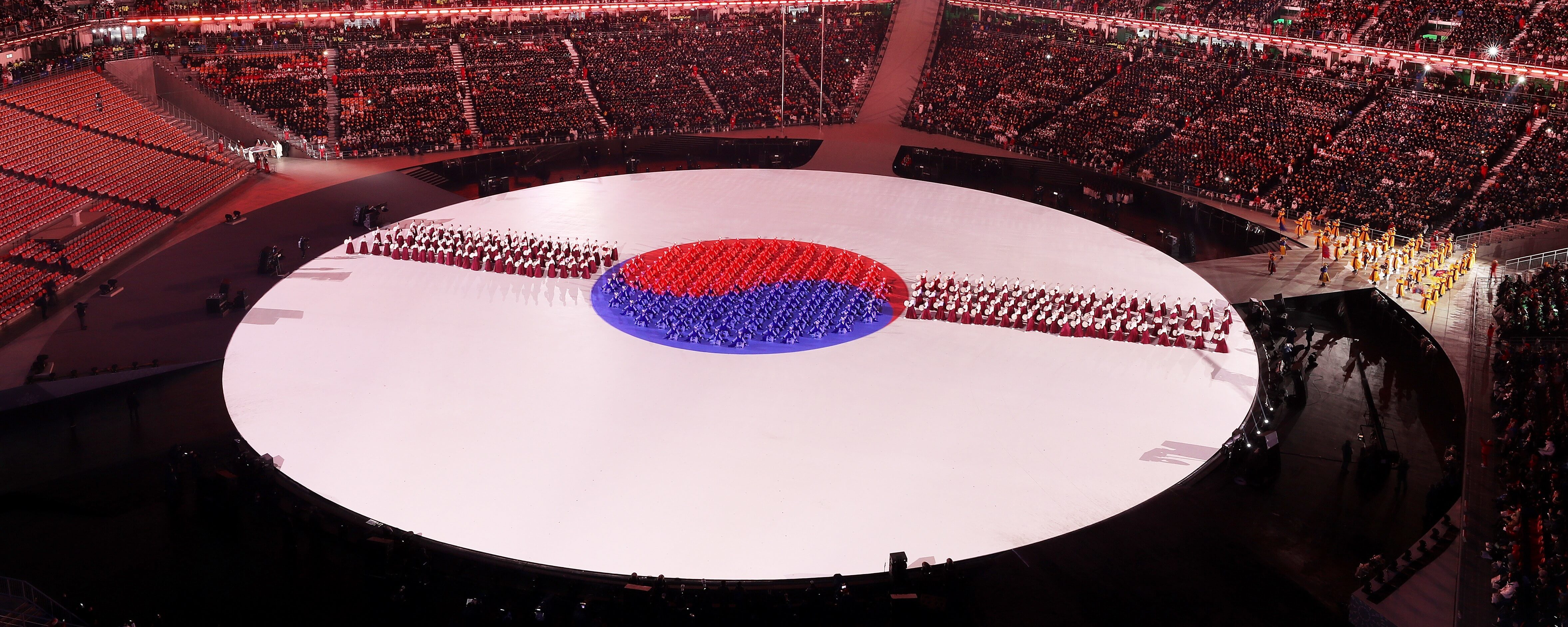
South Korea’s flag looks similar. The central design, also known as the taegeuk, shows a circle with red and blue shapes placed symmetrically. The designs look alike because of the chosen colors and shapes, of course. Yet, when placed next to each other, the two should be easily differentiated.

In 2018, during the Winter Olympics opening in Pyeongchang, South Korea presented its taegeuk and the audience, instead of connecting the design to the host country, thought of… Pepsi. The opening was apparently confused for a drink commercial.
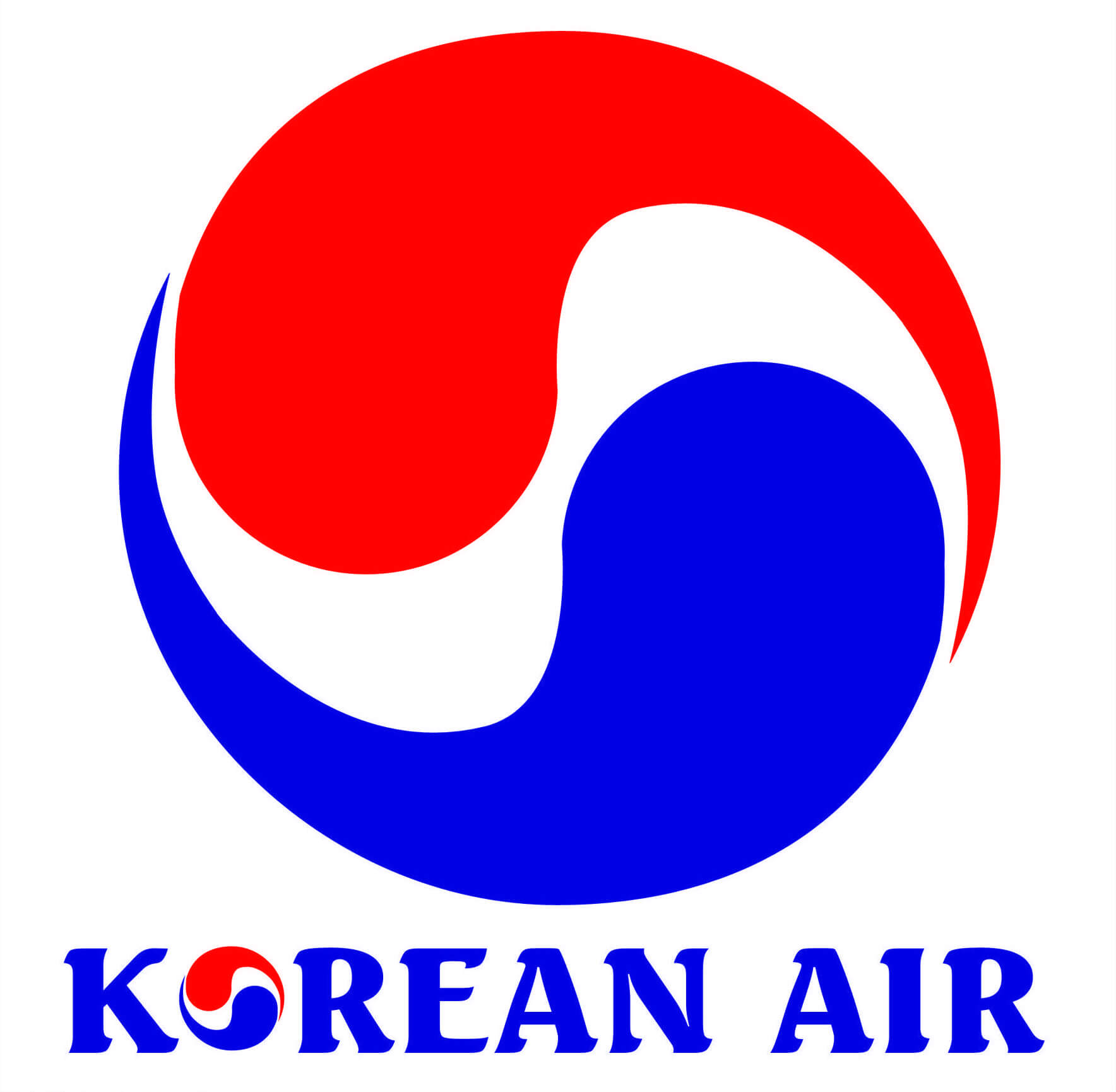
The Korean flag is one resemblance but what about the Korean Air logo? It divides the taegeuk with a white wave going through the diameter just like Pepsi’s wave. Now, the airline icon has an even higher probability of making the audience confused. However, despite the visual similarity, the messages and histories are extremely different.
Pepsi incorporated white and red colors to support American troops during the Second World War and blue to add some contrast whereas the circle comes from an old bottle cap logo design. South Korea’s taegeuk, on the other hand, is a symbol of balance, coming from Korean Taoist values.
Gucci vs Chanel
Similar logos happen even within the same industry. In this case, it Is luxury fashion. Well-known designers like Chanel and Gucci are another example of how logos can be confused when shown apart but easily differentiated when presented side by side. The confusion starts with the choice of used initials. Chanel, with one C in its name, chose CC. Gucci, with one G and two Cs, chose GG. What are the reasons behind these decisions?
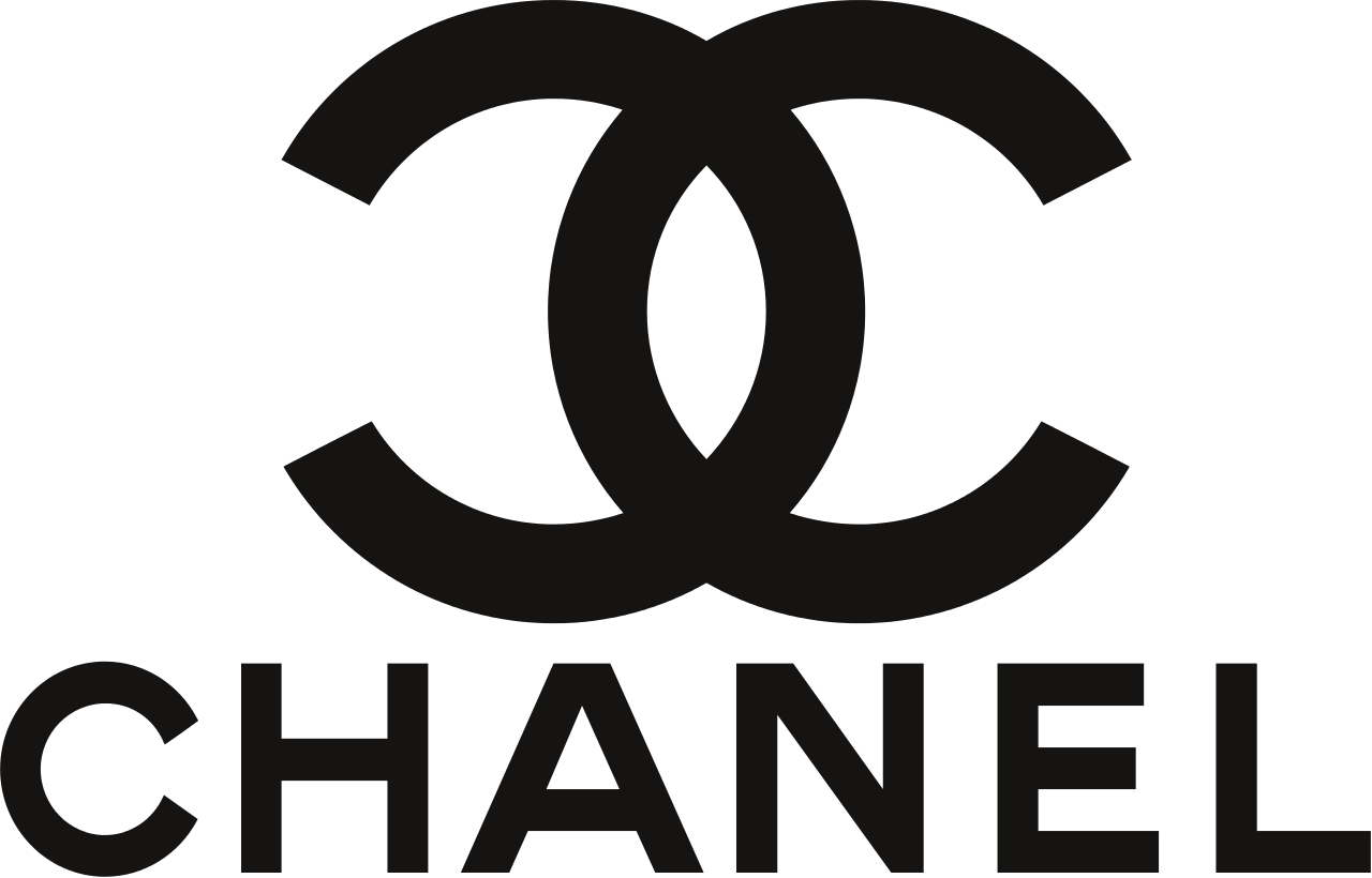
Nobody exactly knows why Chanel uses CC. Theories are numerous including the following: Coco Chanel initials form CC, the combination of Capel (from Boy Capel, Coco’s early lover) and Chanel also forms CC. The official version of the fashion house states that the CC pattern was on stained glass of a monastery orphanage in Aubazine, where Chanel grew up.

Gucci is a younger brand so one could call them the copycat. However, few know that Gucci’s first name was Guccio. Hence, the GG is simply his initials. The two-letter logo only started to be used by the brand years after Guccio’s death though.

The stories and meanings behind the logos already prove big differences between them. On top of it all, the designs themselves significantly vary from one another. Chanel’s Cs stand opposite to each other whereas Gucci’s Gs face one another. Moreover, Gucci’s logo is remarkably thinner.
Any other examples?
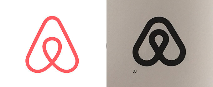
Of course, there are plenty of more companies whose logos seem almost identical. Most frequently, the case refers to big companies using logos very similar to the ones designed by their lesser known and smaller in size business colleagues. Last year, Airbnb presented their new icon called ‘Bélo’ and almost immediately the audience compares it to the Azuma Drive-In logo. Other famous examples include Medium and Metrocraft or Beats and Stadt Brühl.
Small businesses
The logos of tinier companies are either very well-designed to ensure differentiation and to stand out from the competitors or very basic and similar to one another. If the logo is done well, it means that most probably the business hired a design studio or a freelancer with significant skills and experience. In contrast to large corporations, small companies do not head to graphic design agencies simply because of budget reasons. Agencies tend to charge a fortune.
The businesses or small operations (like blogs, for example) with poor logos most probably saved the time, money and effort by either hiring a freelancer via an online platform such as Fiverr or got an automatically generated icon with an online (free) logo maker. The problem with inexperienced and/or unskilled designers is that it is difficult for them to capture the essence of the business while providing high-quality logos. The very low prices (sometimes even below $10) are reflected than in the delivered work.
Online (free) logo makers, on the other hand, are simply templates with basic icons. The options have limited manipulations resulting in logos showing absolutely no originality. After all, think about how many more people could be downloading almost the same icon (just with a different business name) at this very same moment?
Unfortunately, low-quality logos have significant effects on the performance of the business. A logo is a visual (and often first) form of communication between the company and the customer. It is responsible for future recognition like you have already learned from the Pepsi and South Korea’s Winter Olympics case. In short, the importance of a well-designed logo should never be underestimated.
 Author Bio
Natalia Raben comes from the business and management academic field and currently takes care of content marketing at a design start-up DesignBro.

