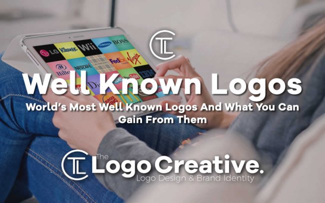
The small image or graphic known as the logo is the face of any brand, startup, and company. It defines the main motive of the firm and helps to establish the brand value. They also help you to distinguish your brand from all the other similar business. In this article, we take a look at World’s Most Well Known Logos And What You Can Gain From Them.
Today, every company is spending a considerable amount of resources in innovating and upgrading its logo. Even the large firms have to upgrade their logo to align it with the market trends and maintain high brand value.
However, there are some brands that are doing a lot better in logo designs than any other company. Their designs are not only attractive but also hides and secret meaning behind their design. The idea and the message behind them even became the reason for their future success.
Let’s have a sneak peek at some of these innovative logo designs and learn the message behind their design.
Table of Contents
Apple
Steve Jobs Company, apple is known in almost every part of the world from their ‘i’ products. They are the sole manufacturers of the iPhones, iPods, Mac books, and many more products.
The logo that this company uses is a bitten Apple. Rob Janoff designed this logo in 1977. At that time the logo used rainbow-colored strips, which later got monochrome and black.
The logo got an instant approval because of its simplicity, scalability, uniqueness, and the easy-to-remember shape. The meaning of this logo relates to the tree of knowledge of tree from the Bible. The bitten apple of the logo represented the bitten apple from this tree.
Apart from the Bible, the bitten apple also had a technical meaning. It presented the impression of a bite, which sounds the same as ‘Byte’ the unit of storage. As for the small wink on Apple, Rob adds it to create a sense of humor. He said that you could turn everything more memorable with a touch of fun to it.
![]()
BMW
The supercar company BMW uses a blue and white triangle-shaped logo that represents two different meanings. The first interpretation is that the logo represents airplane propellers. It makes sense because BMW initially started as an airplane engine manufacturing company.
The other interpretation is that it represents the blue and white flag of Bavaria, the root location of the company. No one knows precisely, which of the theory is correct. Moreover, it doesn’t matter which approach you take, the reason for its success
will remain the same.
The main principle of the logo design will compliment the fact that the company is still connected with its roots. It is this connectivity that makes the company look trustworthy and worth investing.
The custom version of ‘BMW’ Helvetica Neue Bold Font text on the top of the icon further adds to its qualities and sturdiness.
![]()
IBM
The IBM logo is very legendary in itself. The father of the modern corporate logos, Paul Rand, himself designed this eight-bar logo in 1972. Rand created it as a way to shepherd the world to a new age of modernization.
Paul hid two different meaning in this logo designs. The stripes of the logo suggested movement, speed, and rhythm. Some people also believe that the equal proportion of line and colors also represented equality. On the other hand, the overall shape of the icon, the boldfaced letters’ IBM’ are for authority and power.
So, in a way, this particular logo represented the company’s ambitions, its goals, and its brand values all at the same time.
![]()
Paramount
The dark circle of stars with the big mountain in the middle is very common for almost everyone. Paramount had been using this icon for decades and that too without much modification or changes.
The story of this logo started through a napkin paper drawing. The founder of Paramount Pictures, William Wadsworth Hodkinson created this logo, based on the Ben Lomond Mountain. The first version of this logo also had 24 stars around the mountain. William adds these stars to represent the 24 actors and actresses signed by Paramount studio. Currently, the icon has only 22 stars.
![]()
There are two practical reasons for the success of this paramount icon and why the company still uses it. The first reason is that the symbol has lived for over a century, and have a high level of exposure. The other reason for its success is the mountain in the figure.
This mountain was a well-known figure of strength, stability, and confidence that made the company look reliable.
![]()
Pepsi
The beverage brand Pepsi had been around for a long time. It was even there during the WW2, which played a role in its logo design. The company initially started with a simple logo that consists of a written text ‘Pepsi Cola’ and nothing else.
The first version of the red, white, and blue came around the time of the great WW2. Pepsi saw the sales potential in targeting patriotism and came with their first tricolor logo. They used to print the new logo on the caps of the bottles to show support to the overseas troops.
By 1945, the Pepsi globe icon became a big hit, so the company decided to use it as a permanent logo. The latest upgrade that this company logo has got was in 2009. In this year, the company molded the white middle line to create an impression of a smile.
The reason for their success (both during the war and now) is simple; their icon represents their brand value. It showed their support for their troops during the war and serves their motto ‘spread smiles,’ now.
![]()
The Final Words
Years ago the father of modern corporate logo, Paul Rand said that in the world full of look-alike products, a distinct brand logo is the best shot to distinguish your product from competitors.
The above companies have proven that Paul was right, and the icon does play a role in brand success rate. Even the painting company in Allawah believes that a good logo design is a must for any business.
Therefore, before you get started with any business, take some time to create a logo. Look for something that can serve simplicity and deliver the principal value of your brand at the same time. It will come in handy for ensuring your success and earning brand value.
We hope this article about World’s Most Well Known Logos And What You Can Gain From Them has been helpful, and be sure to leave your comments below.